10 years — 10 stories
Running a font foundry is not always a walk in the park. It's a blast! Here are 10 highlights and tales from 10 years of TypeMates: from our startup saga to sales figures, from becoming a distributor to what we love about our job that isn’t about type.

Once Upon a Time…
It all started in 2015. On a beach of the river Elbe, Jakob Runge and Nils Thomsen, had a simple idea: “do something with fonts.” There was no master plan, but there was a shared belief that together they could have more fun, be more focussed, make more fonts and — maybe — build a foundry that created stylish typefaces; a foundry that might actually succeed.
Spoiler: it worked. Our library has steadily grown and we’ve gained some well-known clients, but we won’t brag about it here, you can find out about all that here.
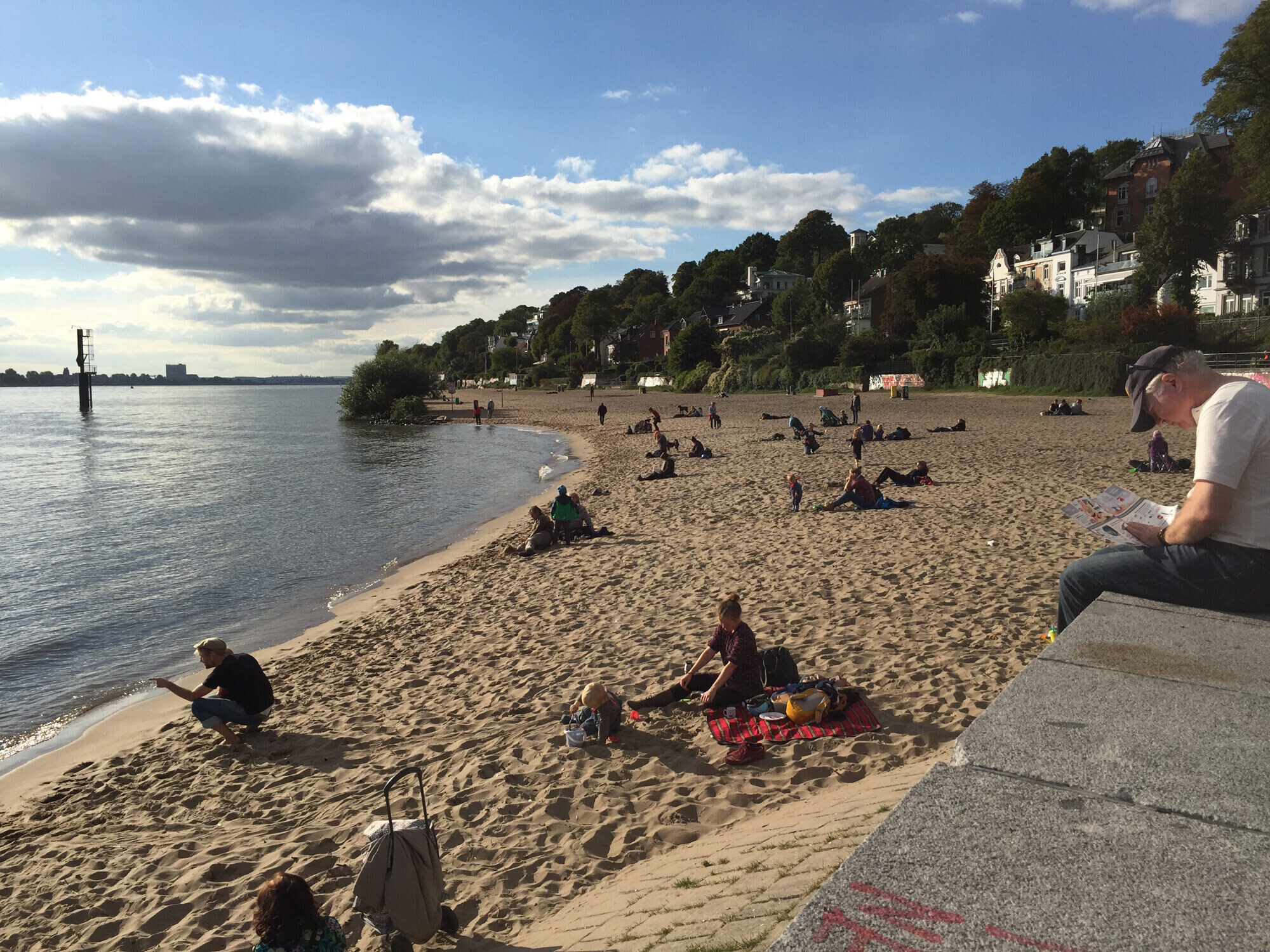
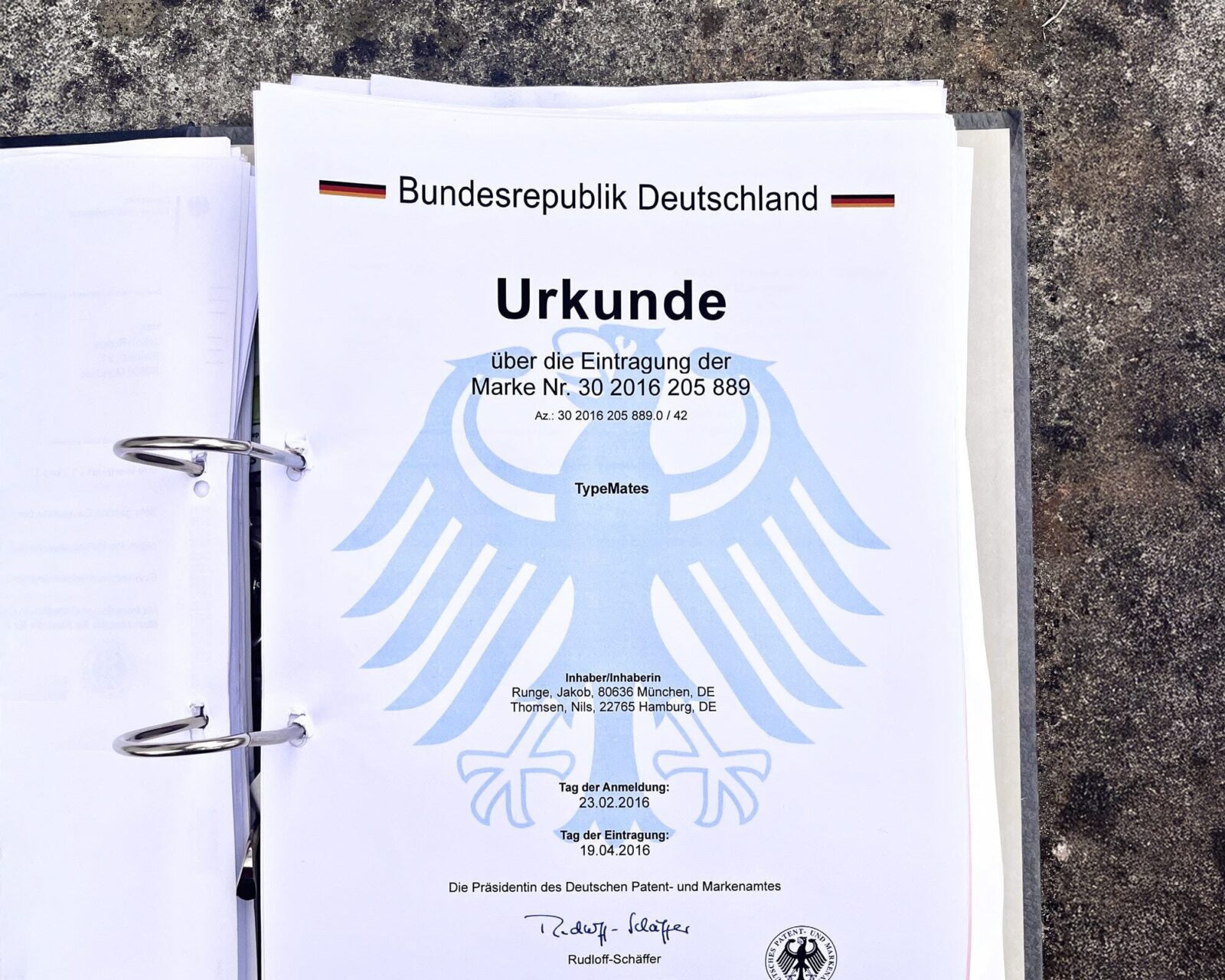
No master plan, just a shared belief that together we could achieve more. And a trademark.
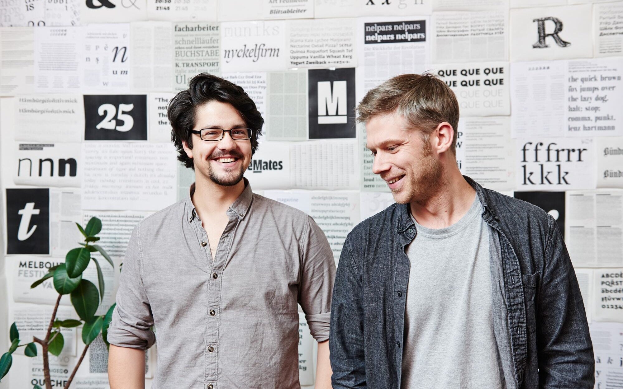
Shot by Martin Kess, in Hamburg-Altona, 2015.
After three years of testing the business, we expanded the team in 2018. Lisa Fischbach had already been working with us and now it was time to make her a partner. So, we went straight to the beach in Kiel. Business class, North Germany-style: windy, warm, and boozy. Suddenly, Lisa was not “just” support — she was officially on board. Moin!
Our transformation continued after she joined. We were no longer just two people in casual collaboration, but a proper studio. It became easier to share the growing workload and we could tackle bigger and bigger projects, all while working fully remote.
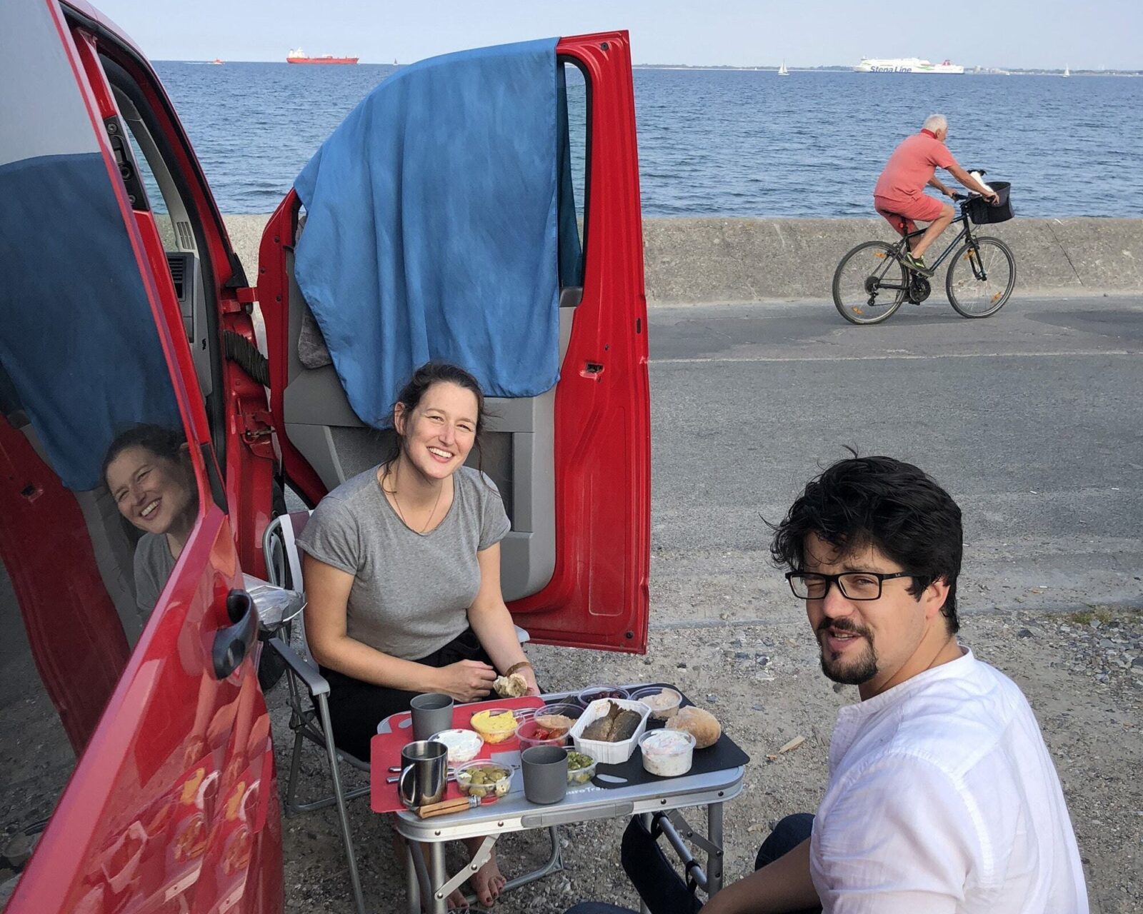
At the beach in Kiel. Moin!
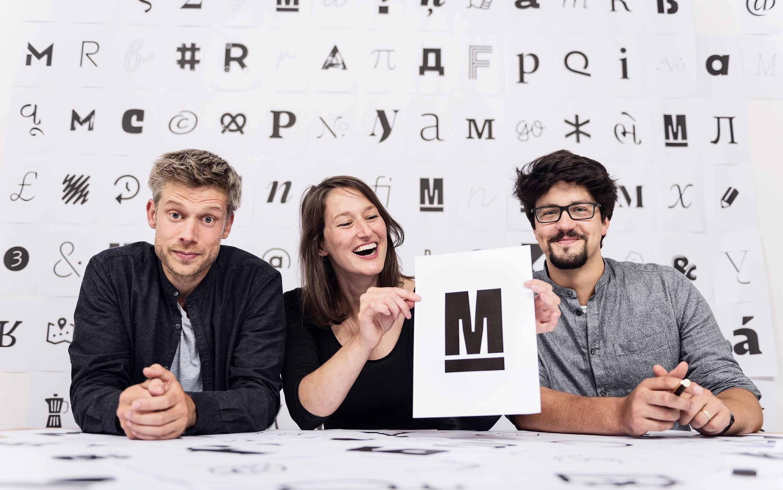
Partnership agreement signed. Photo proof by Timo Wilke
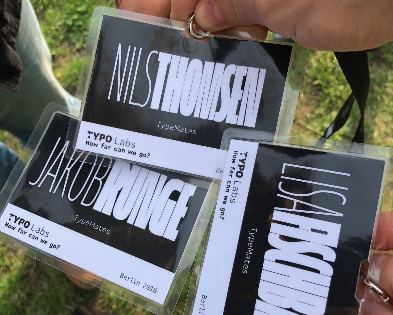
2018: Last TYPO conference in Berlin. First conference booking on our joint company.
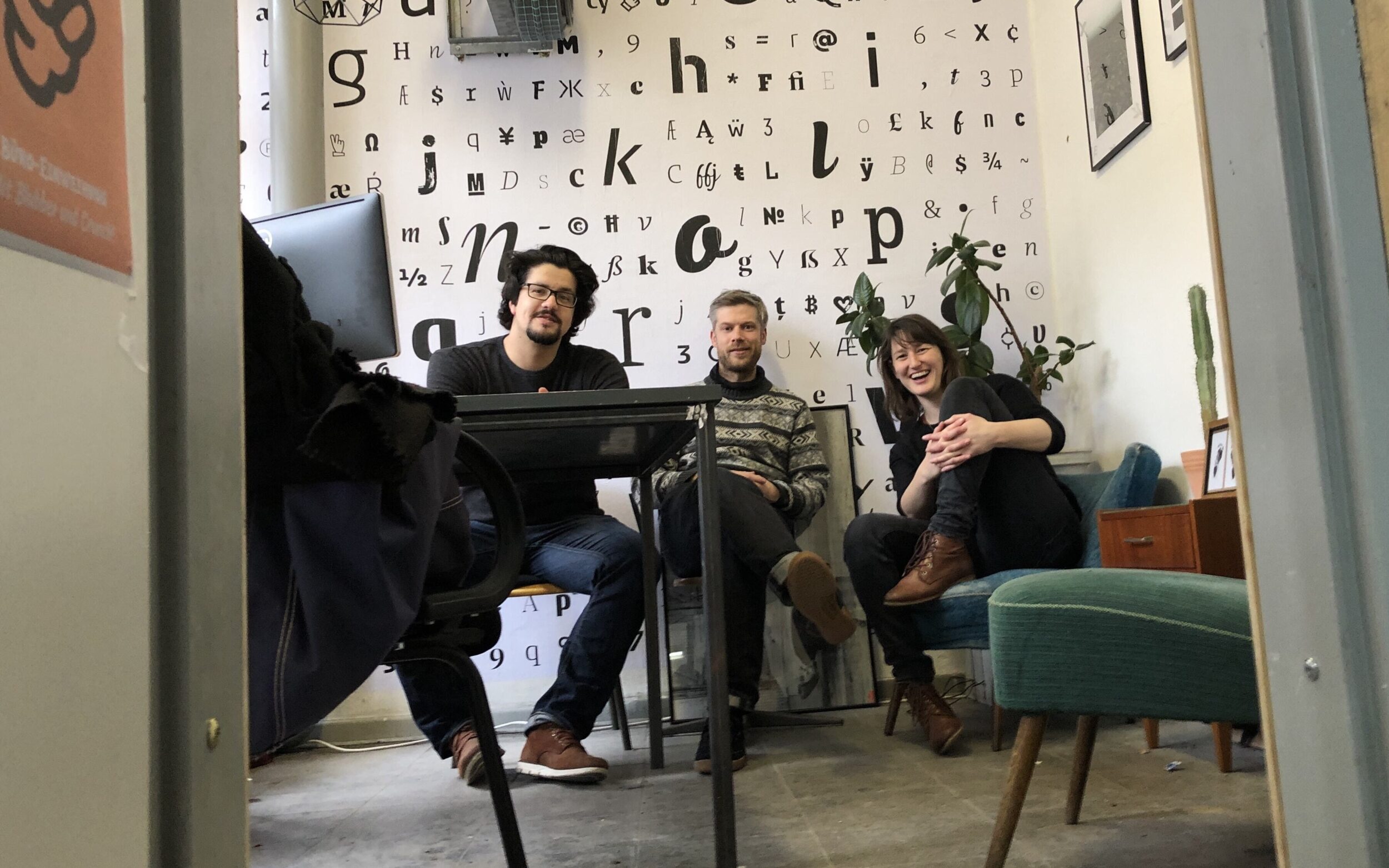
A Studio, but Remote — On Flexibility and Balance
We worked remotely out of necessity; two of our team lived at opposite ends of the country. But with its long-term rhythm, type design is a little different from graphic design and doesn’t need two people to sit side by side to spark ideas. In our early years, we actually worked just three streets from a client, but phone calls and emails handled everything. That taught us that remote works — then and now.
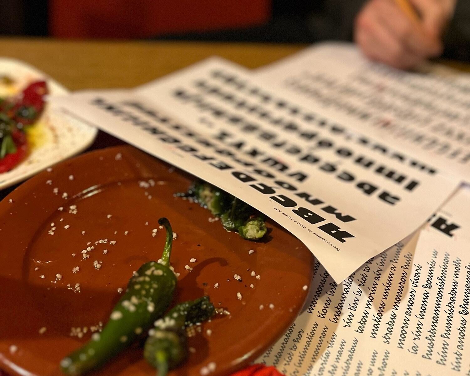
Real-life synchronisation. Sometimes.
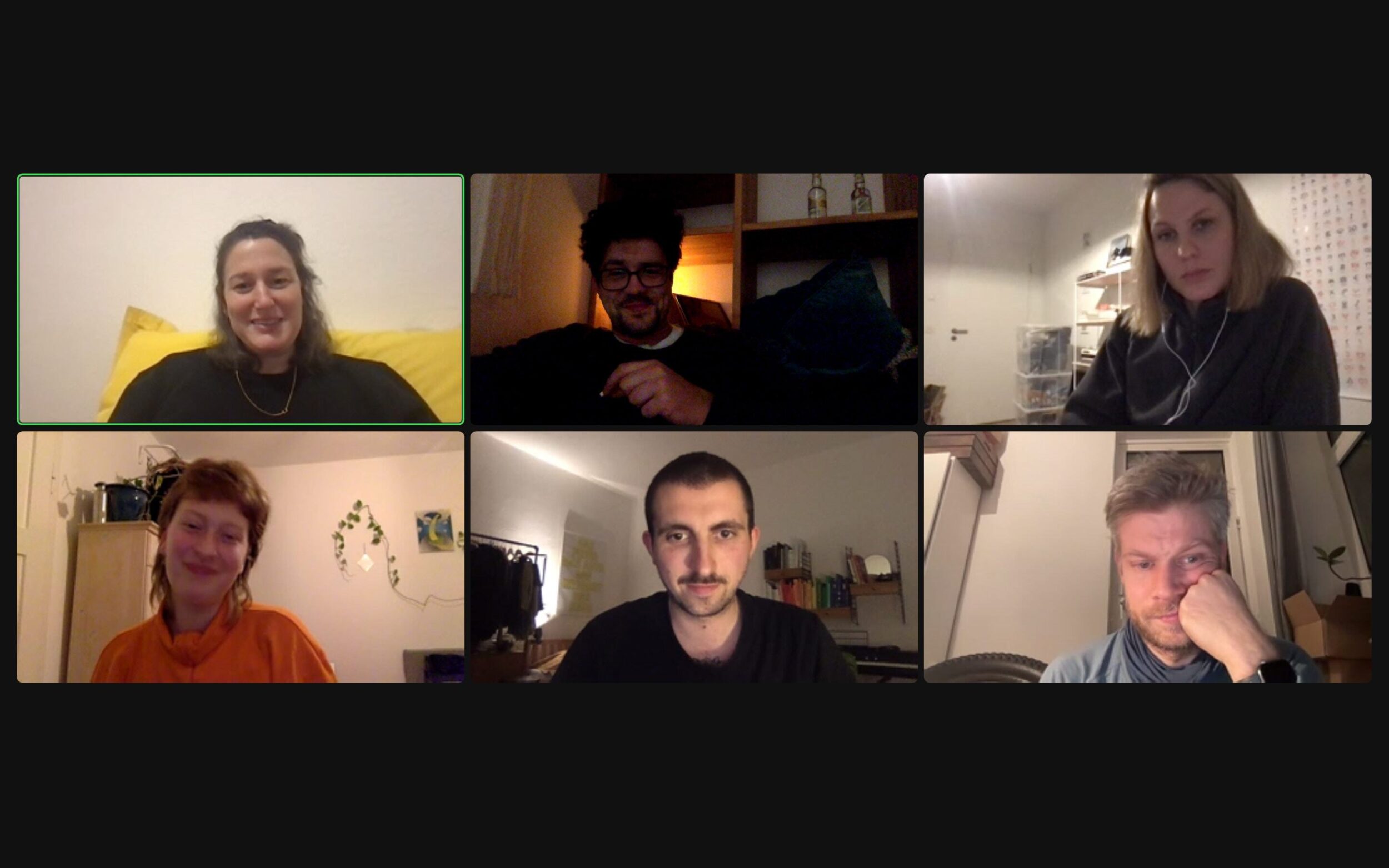
Remote, obviously. Around winter 2022.
Over time, our craft has shifted. Now it's less about letters, more about numbers. We'll return to that later. Meanwhile, our lives outside work have grown too: families, hobbies, a lot of things that keep us from working non-stop on typefaces. Our remote setup helps make this possible. Nils lives, the company is just a digital fiction: that’s maximum flexibility! For Lisa, type design offers a perfect work-life balance, with flexible hours beyond the nine-to-five. Still, it gets tricky sometimes, when family-life balance becomes the real challenge — something we'll hopefully solve by our 11th anniversary
Of course, working remotely, we know that sometimes a quick chat across a real desk might save time and part-time team members might be easier to manage face-to-face. But we enjoy the perks: living wherever we like, setting our own hours, working with full focus. We only meet when truly necessary.
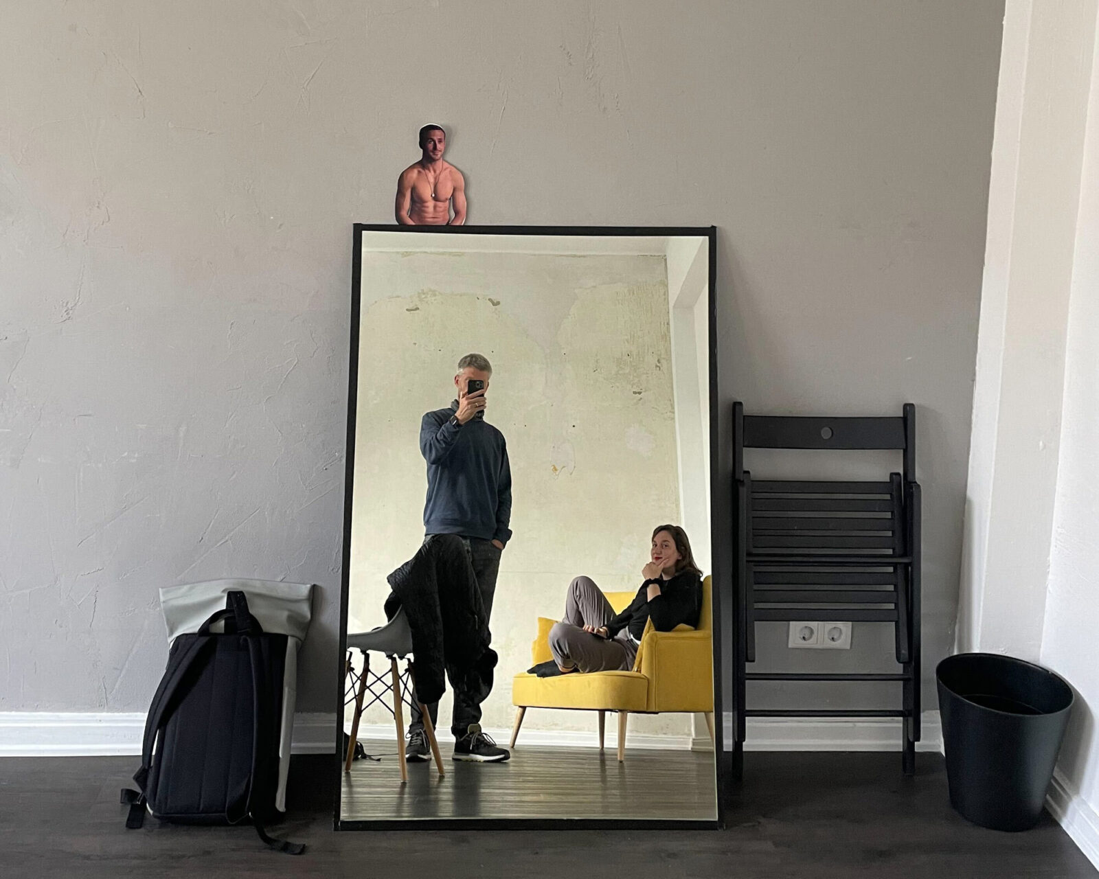
Freedom to choose where, when and with whom to work. Sorry, Ryan Gosling, but Papyrus isn't the problem.
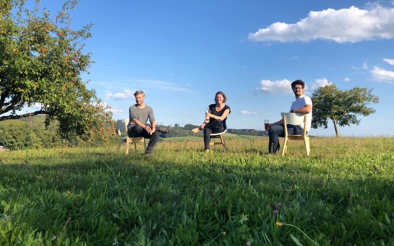
Business base in the countryside – rich in nature, light on taxes.
TypeMates calls happen from random places: phone booths, playgrounds, camper vans, family houses, gardens, and sometimes holiday homes. Natalie Rauch has an office in her flat but prefers working at the kitchen table. Today, we're located in seven different places, yet we somehow manage to look convincingly like a studio. And Laura Flethe? She's taken remote work to the next level by moving to another country.
But wait a minute, counting more than three mates? Yep! That brings us to our next chapter: working as a team with more people and diverse skills.
More People, More Possibilities: Growing the Team
With bigger projects, sharing the load became natural. We quickly realized that sometimes others simply excel at things we don't. This led to TypeMates' biggest step: hiring employees.
In 2019, three people and professional standards meant even more work, not less. So in 2021, Natalie joined us as our first permanent employee. No beach ceremony this time — just Berlin air, new structures, and someone who wonderfully pointed out our production errors. Jackpot!
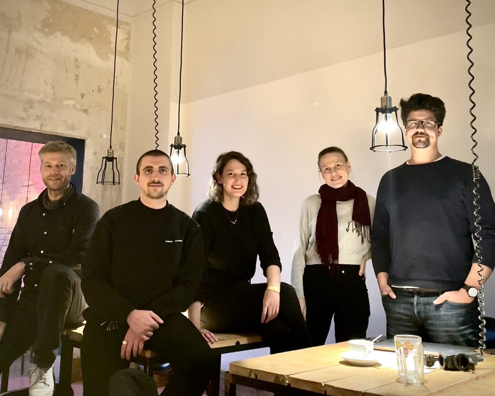
Berlin, meeting, sometime in 2019
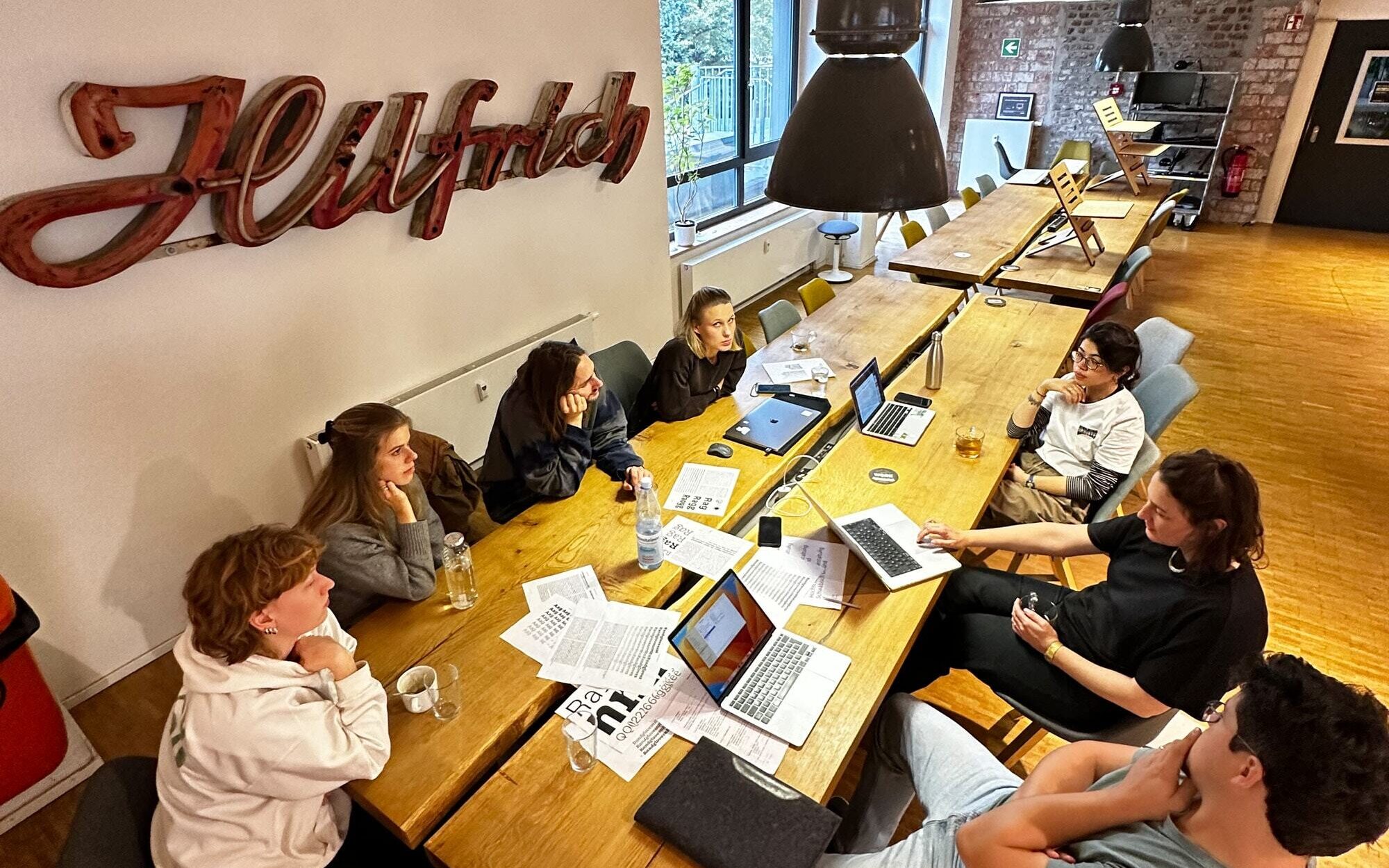
Wuppertal, 2024. Figuring out how to split a super family release. Not pictured: Nils and the tapas+bowling bar afterwards.
Paul Eslage started in 2018 as an intern. He gradually established motion and 3D as visualization tools for our fonts, expanding our horizons. After that, we realized we needed support from creative graphic students — valuable perspectives to challenge our own, which we could call focused and experienced, or limited and set in their ways. Either way, a mixed team creates more possibilities.
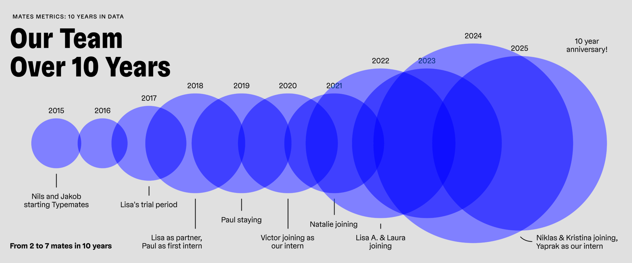
Simple stat, obvious fact: we’re growing the team.
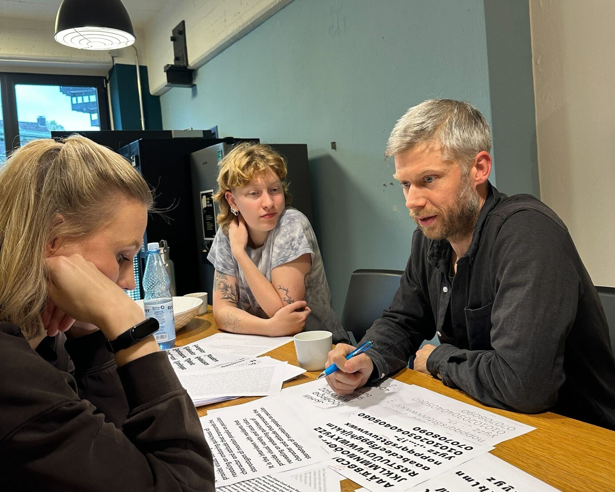
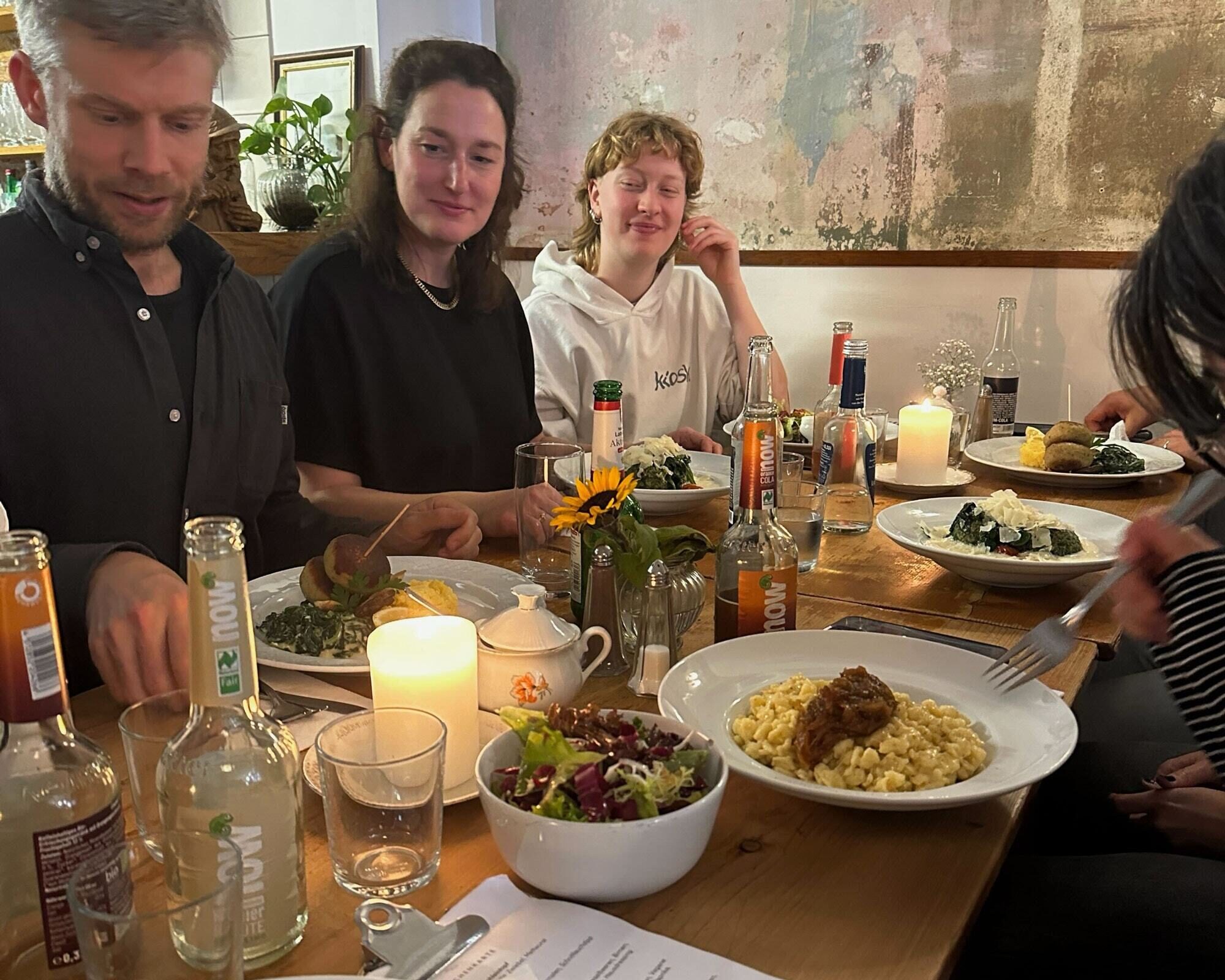
… and the fact that someone always loves to eat.
When we started we were two, and now we’re a fully-fledged studio: a permanent team supplemented by helpful students and interns. All seven of us work on type design, visuals, or communication.
With great experiences from growing our team, it was natural to ask: why not bring in fonts from others too?
#MeetOurMates: Collaborating and Becoming a Distributor
We’re celebrating ten years, but we’re actually 19! We started with a library created by just two people, but today our library has contributions from 19 type designers.
As a collective, we’ve always had a diverse style. One designer models serifs, another is an architect of constructed geometry and a third creates expressive fonts from the heart. We never had a clearly defined library ‘style’: variety was a signature from the start. Of course, there are styles we can’t shape ourselves, but others can. Working with external designers and sharing their designs alongside their own was really just a matter of time.
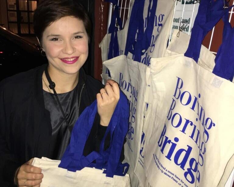
Finally, the first typeface is live! Mona celebrated with a release party. Munich, 2019.
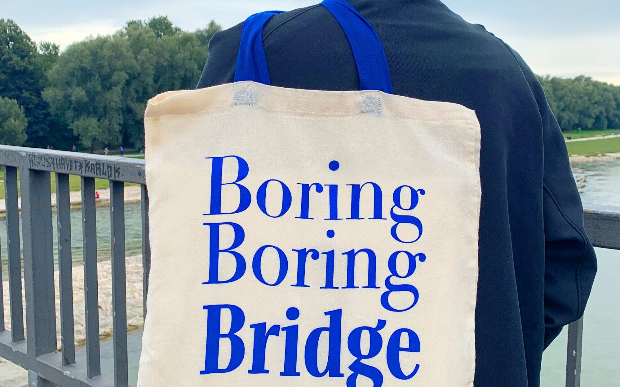
With our web shop, email support, and growing expertise in font production, we could offer opportunities to designers who want to create a typeface but don’t want to run a foundry. In 2019, we kicked off with Mona Franz's TypeMedia thesis typeface, Bridge. Shortly after came Sombra, which Paul started during his internship with us. Later, Daniel Utz trusted us with a re-release of his established FontFont Netto.
To this day, Mona and Paul’s debuts remain Lisa's personal favourite releases at TypeMates (excluding our own). Bridge is fun, full of great graphics and typography. Sombra is a font Lisa wishes she'd created herself. And one day, Jakob might steal some of the offbeat magic in Philipp Neumeyer's Elma and turn it into a proportional sans. (Knowing that stealing magic will make the design a squib)
It's all about fonts, but numbers help pay the bills. Here are some insights for everyone who likes digging into figures.
Nonlinear Lines: The Art of Selling, with Hiccups
Publishing fonts and selling them are two different things. We launched our library with 10 typeface families and now, at the end of 2025, it contains 58. Each year, our library has grown consistently, except in 2017 and 2018 when custom jobs kept our small team super busy (we barely managed 2.5 new releases). But sales growth isn’t linear. Since 2020, crises shaking our world have left their mark and looking ahead we’re curious to see how the intense discussions around AI will affect the world of type.
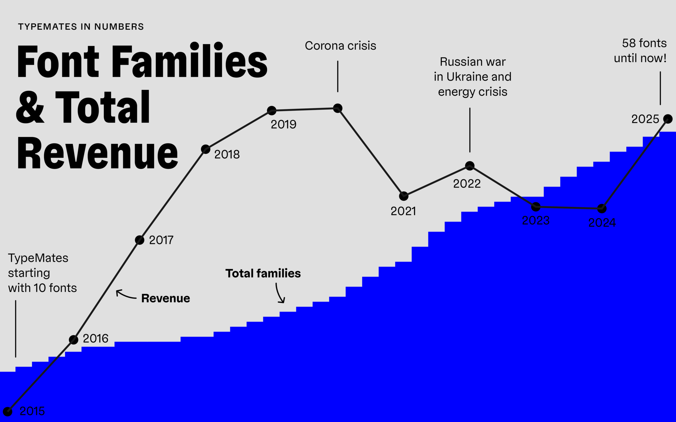
But don’t worry. Our statistics include several top sellers
that have been strong from the beginning — meaning new releases grow
sales, but proportionally are less visible in the stats.
Unfortunately,
we sell fewer licenses for our underdog typefaces than in the
beginning. In recent years, people seem to have gravitated towards more
established fonts in our library. On the other hand, after leaving
resellers like MyFonts in 2023, we rebalanced the underdog-to-bestseller
ratio: our own shop provides a better environment for lesser-known
families to thrive.
There are typefaces that remain sleepers. Others are unimpeachable examples of how the balance between bestsellers and underdog releases can shift. On our 8th birthday, we subtly mentioned that we hadn’t yet sold a single licence for Urby Soft. Happily, someone picked up on it and Urby has since graduated from no-seller to low-seller. Today we’ll mention that Alison Head and Text haven’t had any sales yet. Consider that a fairly obvious hint!
Making a living from type design is tough, and the hiccups are real. But it's possible, and there's more to the business than just numbers.
Type and the Pursuit of Happiness
We're living the dream of making a living from type design. Our recipe is simple, and it helps if you have a bit of luck as well, but it's a recipe at least. Here's how we manage the struggles:
First of all, we make it up as we go. With fast-moving tech, shifting markets and new licensing models — not to mention taxes and bookkeeping — no one really has a full plan. Same with us: we learn by doing, and keep improving as we go.
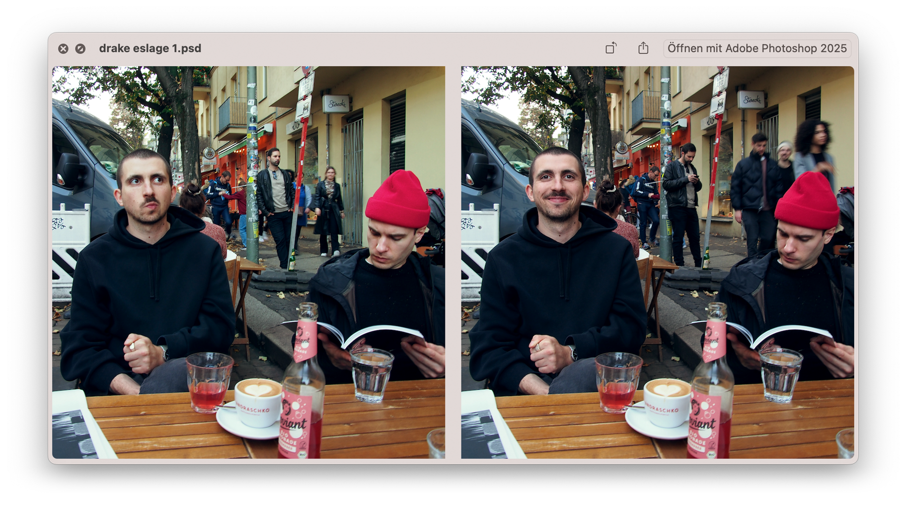
Lucky choice: Paul nailed our visual look, Philipp adds fresh ideas to custom projects and releases.
Meanwhile, we stay light-hearted about it. We invest in diverse people, explore cutting-edge technology, make wrong decisions and trust it will work out. That includes surviving 3–5 months in the red, knowing the year will still balance out. In fact, that’s nothing in the beginning, we were over two years deep in the red. If we had worried about it, we might have quit.
For sure, there's always that one project that convinces partners you know what you're doing. And that one product that actually becomes a bestseller. We had the rare privilege of having both quite early. Everything else is just hard work: start early, work hard and too much, lay back later! It will pay off!
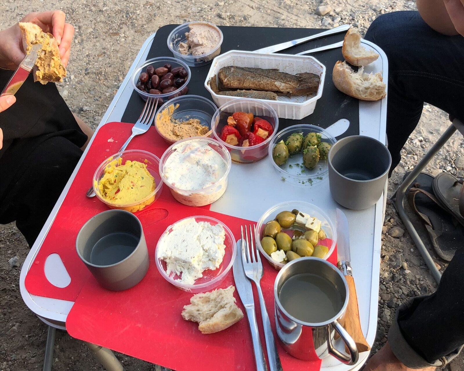
Stay light-hearted. It will work out.
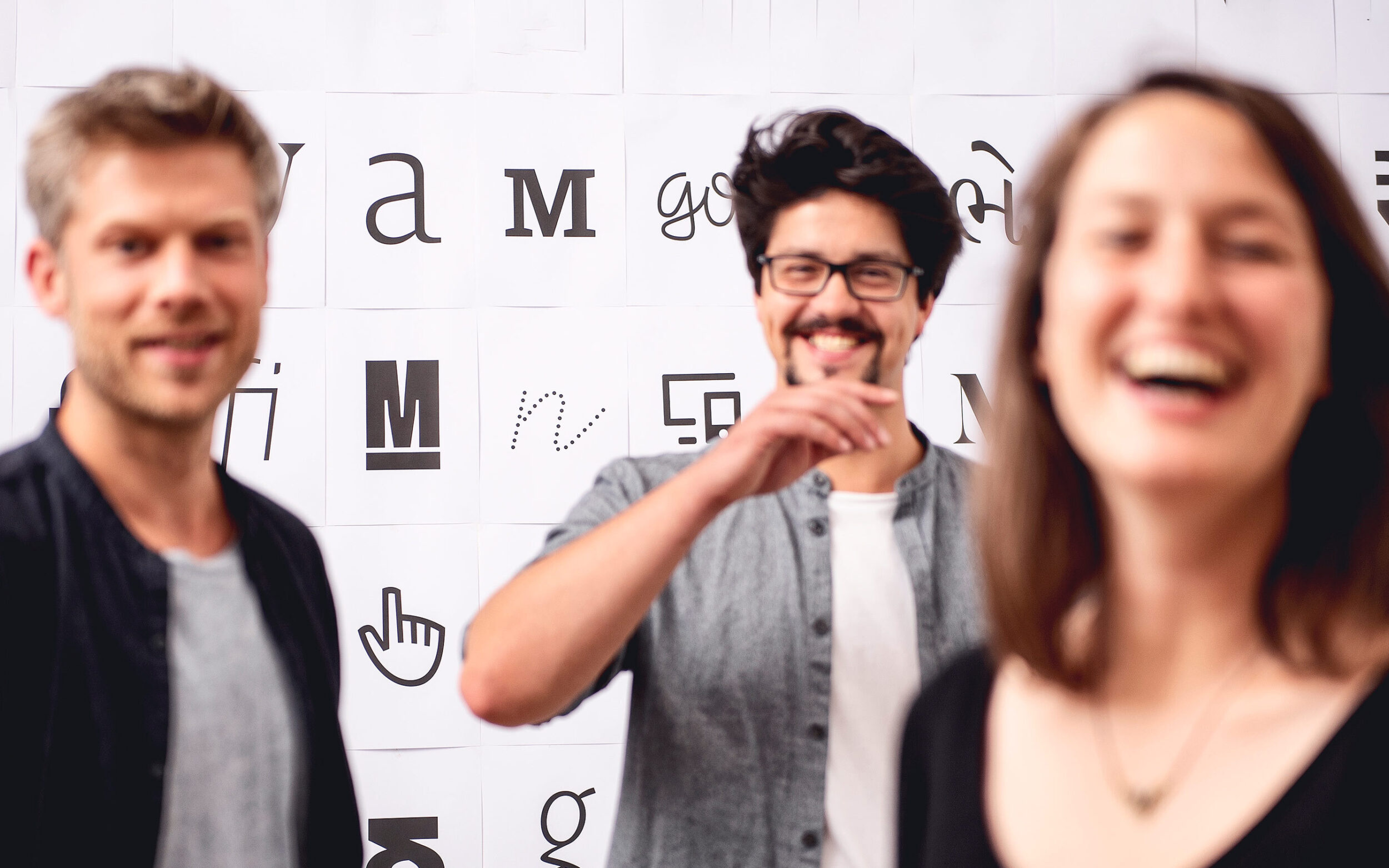
Another key ingredient? Partners with great chemistry. We're very different in aesthetics, risk tolerance, and personality. But on business goals and strategies, we often agree before the discussion even starts. It gives us the energy to discuss details even longer. And yes, long live balance. Nils rides almost as many kilometres on his bike per year as he designs letters at his desk. Jakob, making lunch for the kids, never gets stuck in the design process rabbit hole.
Some of us find happiness in hands-on work. We also print occasionally — a way to balance our digital products with something tangible.
Mates Staring at Printed Stuff
For our 6th anniversary, we released a printed celebration of our work: Type Catalogue #1. This printed specimen showcased all our retail typefaces on specially designed double pages. With carefully selected comparisons of our text fonts, it was designed by virtuoso Paul over three years (true story). The catalogue includes insights into custom projects from that period. In total: 76 pages and 28 faces, embossed and printed with fancy spot colours — Pantone Blue and Silver — on rough paper, complemented by fine thread-stitched binding and extras.
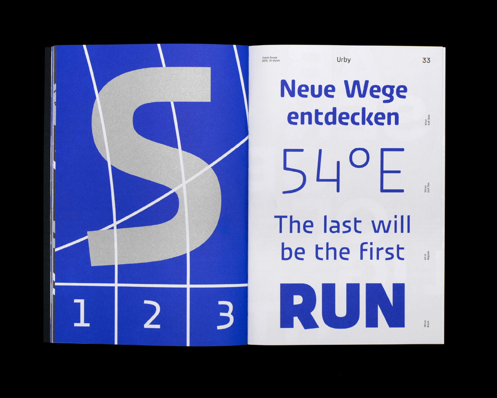
Printing costs, custom colors, hours logged… don’t ask. Not the point anyway.
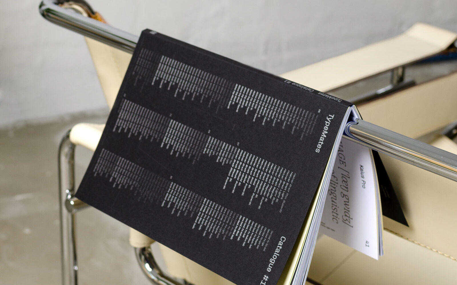
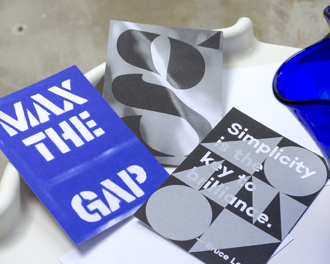
The cherry on top: our printed specimen won Gold at European Design Awards 2022 for outstanding printed self-promotion.
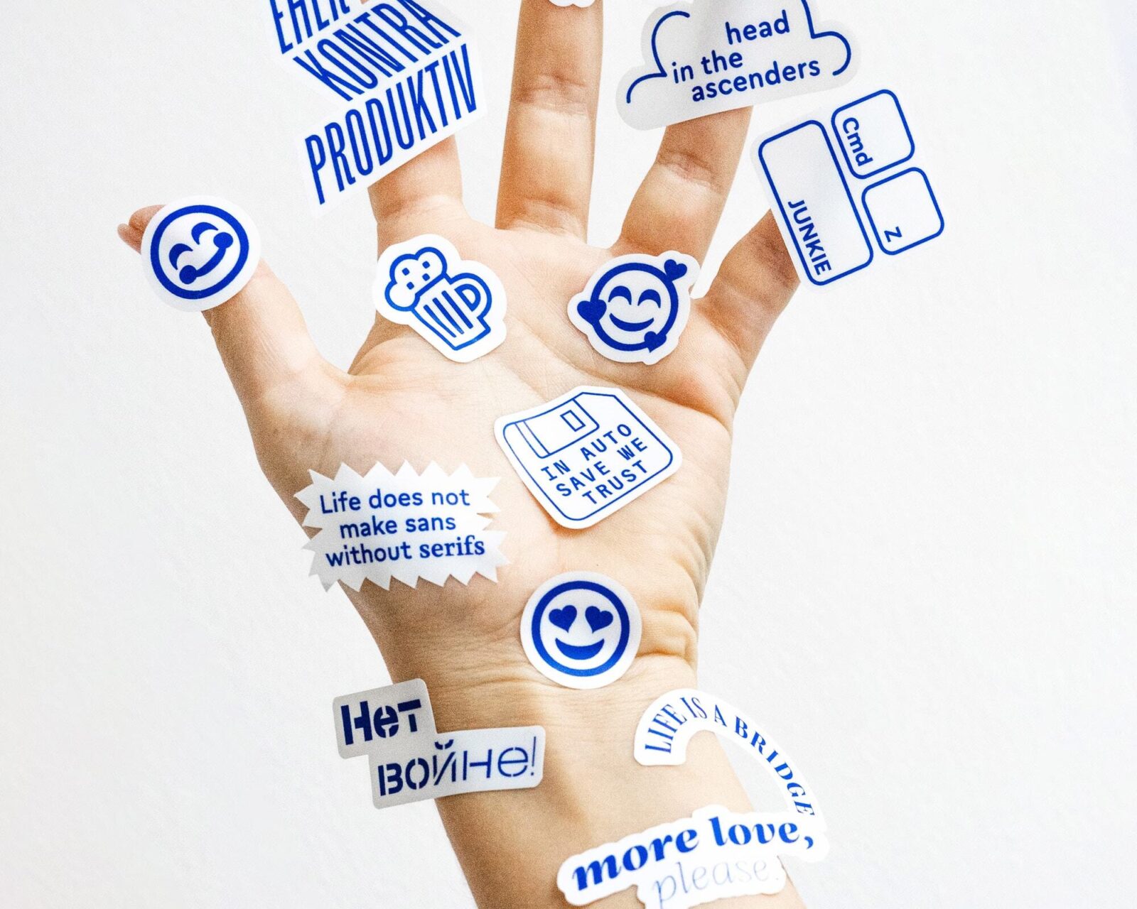
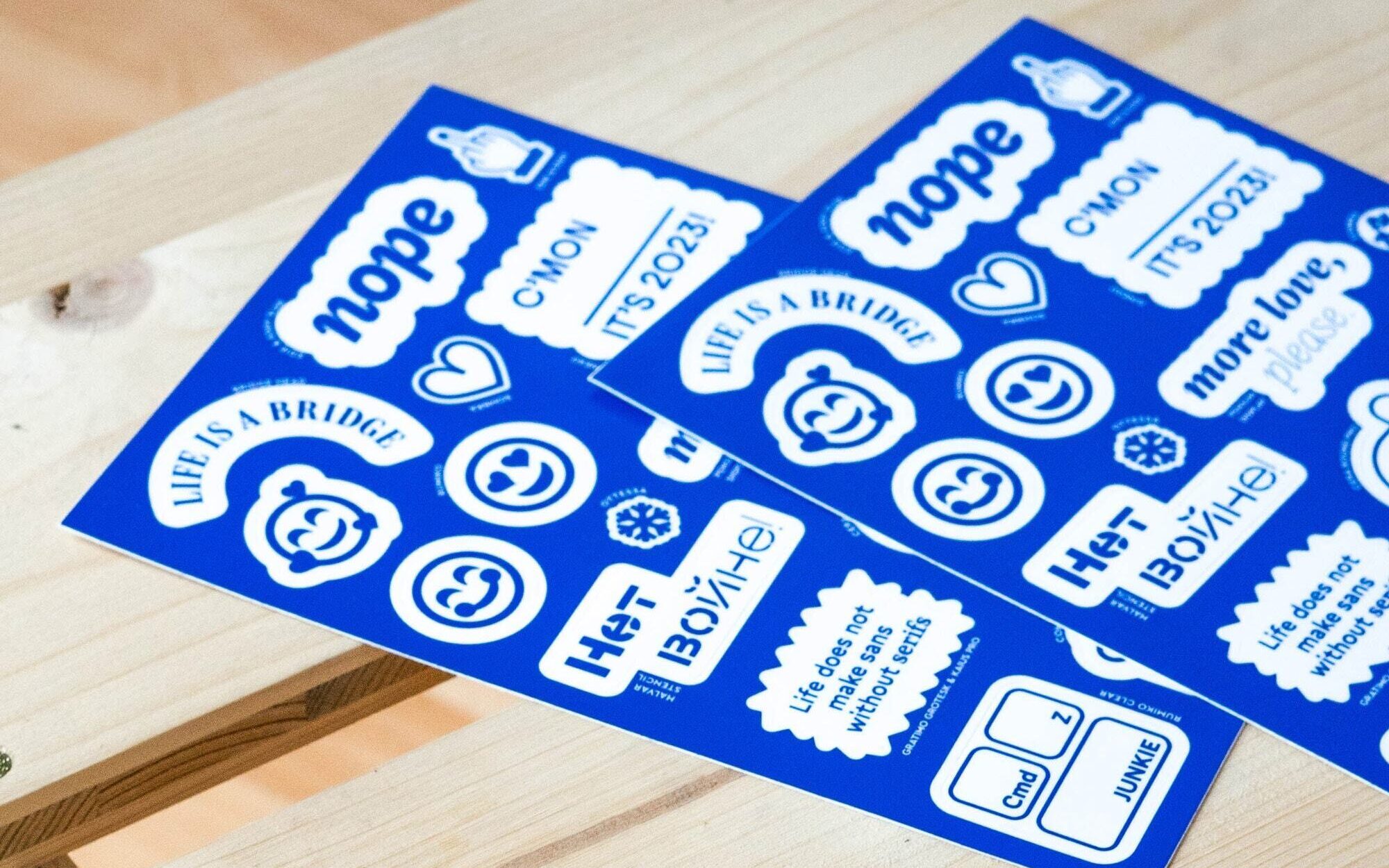
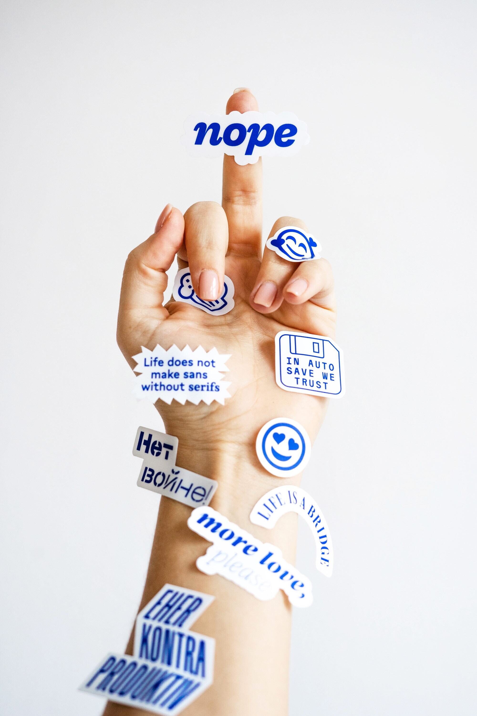
Beyond extensive print projects, there are smaller but equally refined endeavours. We only send printed Christmas cards every two years — whenever we have a particularly bright idea. One highlight was the 2023 stickers. Designed and marvellously staged by Lisa Amann. Whatever a year throws at us, it is clear our sticker greeting cards are ready for anything. Emoji-wise.
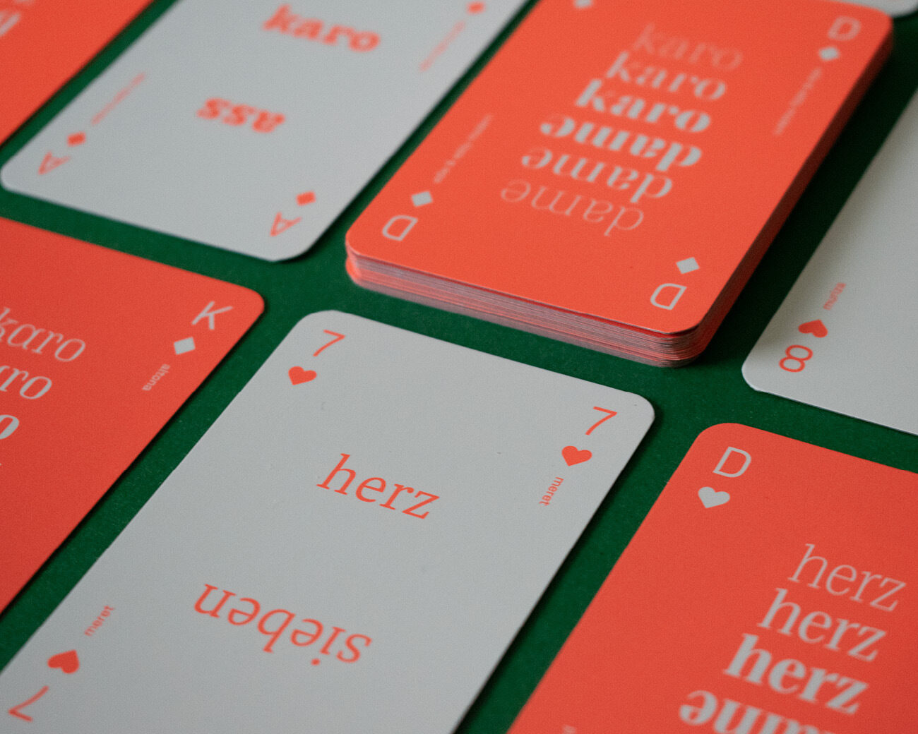
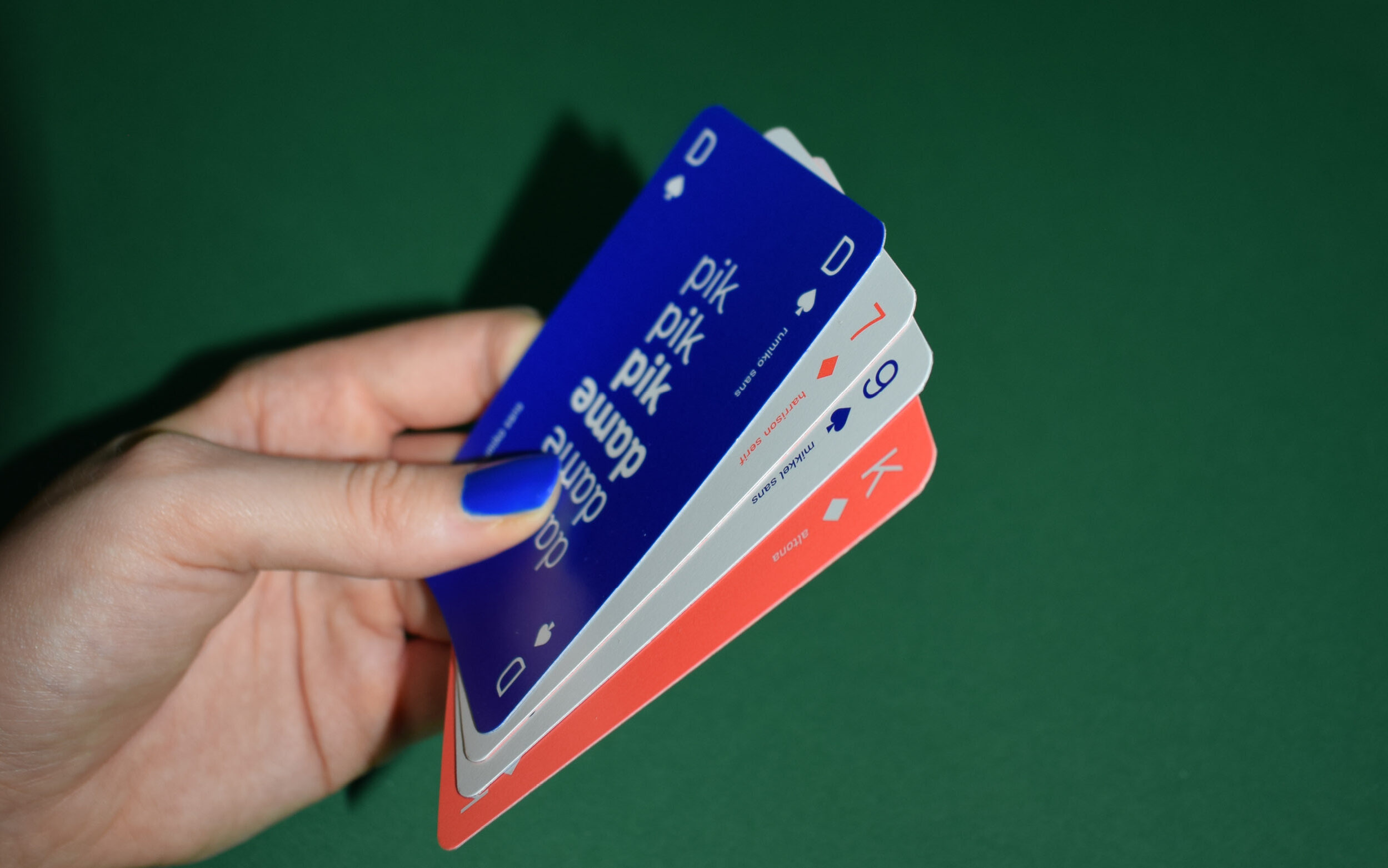
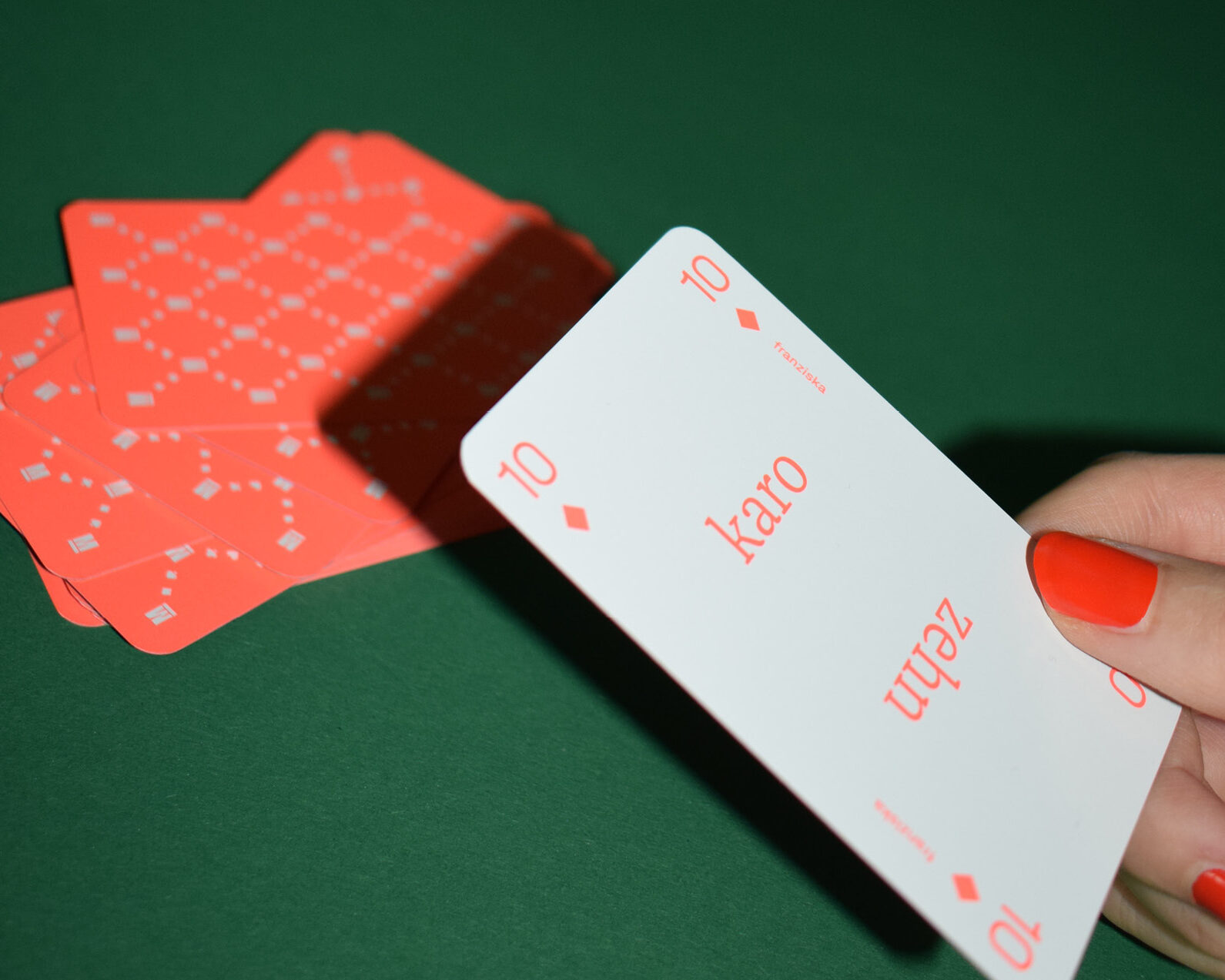
Let’s play!
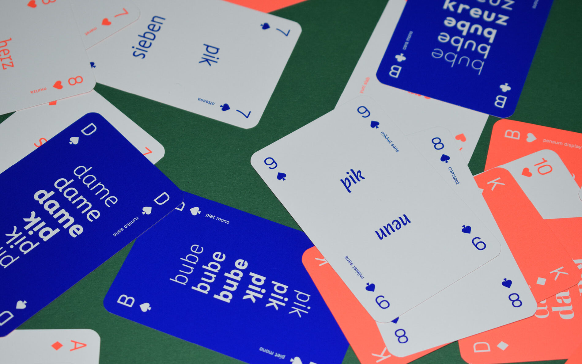
2024 was fantastic: incredible custom jobs, exciting font releases, and our largest team ever. None of this would have been possible without our partners and mates. To celebrate this, Kristina Hörbelt of our team crafted and designed a Card Deck Specimen: 32 cards, 32 fonts. Perfect for all typography enthusiasts. Printed with bright neon colours on multi-layered cardboard. And since people already know the rules, here's the much more important question: which font is on which card?
To lay all cards on the table, the Card Deck Specimen was intended as a Christmas special — yay, another bright idea in a row. But type designers occasionally have a different sense of time than graphic designers. In the end, it didn't matter: a nice printed object works perfectly well as a New Year's greeting too.
Once we dive into a project, we can't help ourselves — we keep at it until it's perfect, no matter what timing or budget says. Luckily, we're our own finance department too. So the foundry's bills are paid by:
Our Foundations: Custom and Retail Fonts
Over the years, we've had countless internal debates about what to focus on publicly. We never quite settled on one direction. But we love both: creating retail fonts for everyone and developing custom fonts for specific customers.
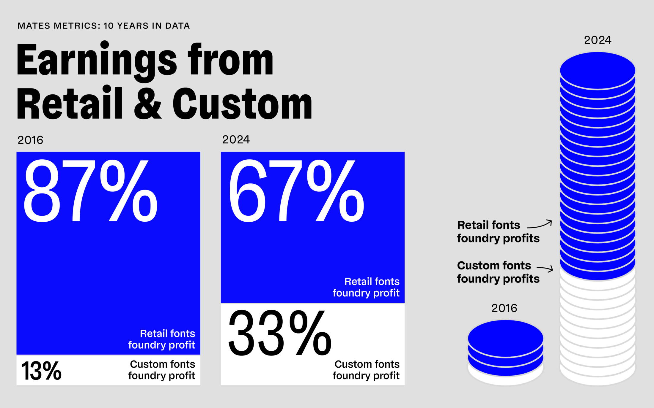
Boxes, coins… same thing, just scaled. Either way, the numbers still look great.
In terms of income, or more precisely profit, custom fonts have grown from 12% ten years ago to a steady, significant part of our business. Today they make up 35% of our annual profit. Nevertheless, the royalties from our font library are the backbone that pays the bills. And the combined "cake" of retail and custom profits? From 2016 to 2024, it's grown by a staggering 1,071%.
Well, back in 2016, there were just two of us, with a small library and barely any recognition. Today we are four type designers plus freelance collaborators, and our retail library has grown almost sixfold.
Forget about earnings — we love everything that goes beyond. Here's another batch of insights:
Fortunate Secrets and Other Surprises
One of our best-kept business secrets: 66% of Lisa, Nils and Jakob aren't great at spelling. 33% don't really enjoy texting and if they do, it's pretty short. We're all about shapes, not words. Which gets tricky when, back in 2019, we planned to launch a German version of our website to serve our strong German customer base.
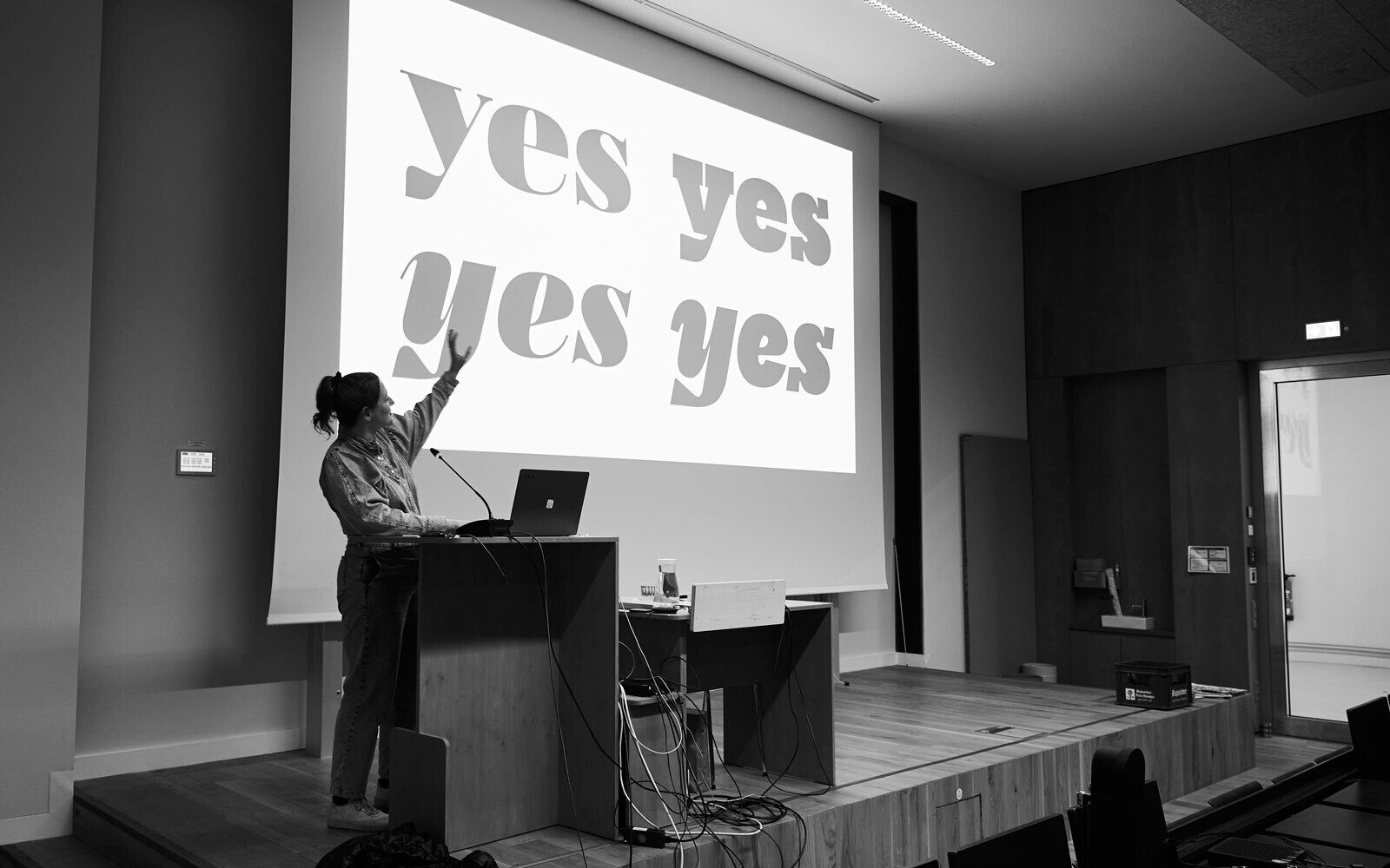
Photography © Jonas Rauen
Running a company takes a lot of work. Luckily, we all have a favourite part of day-to-day business that’s not about type design. Lisa loves making spreadsheets. When she joined in 2018, she built a spreadsheet for everything — mostly to double-check the gut feelings we'd been relying on until then. We are pretty sure we have more spreadsheets lying around than font styles in our library. Jakob, too, has a soft spot for office routines. He finds something oddly satisfying in planning projects and people months in advance.
Kissed by fortune — and backed by hard work — we couldn't be happier celebrating our 10th anniversary:
Anniversary Party and Cheers to 2035
10 years in business — we just had to celebrate! As a studio that works entirely remotely, digital channels make communication easy. But it was really special creating a real space for an event: real people and moments we can feel, not just see on a screen. Natalie booked a place in Hamburg, Laura covered the walls with fonts, and we sent out invitations.
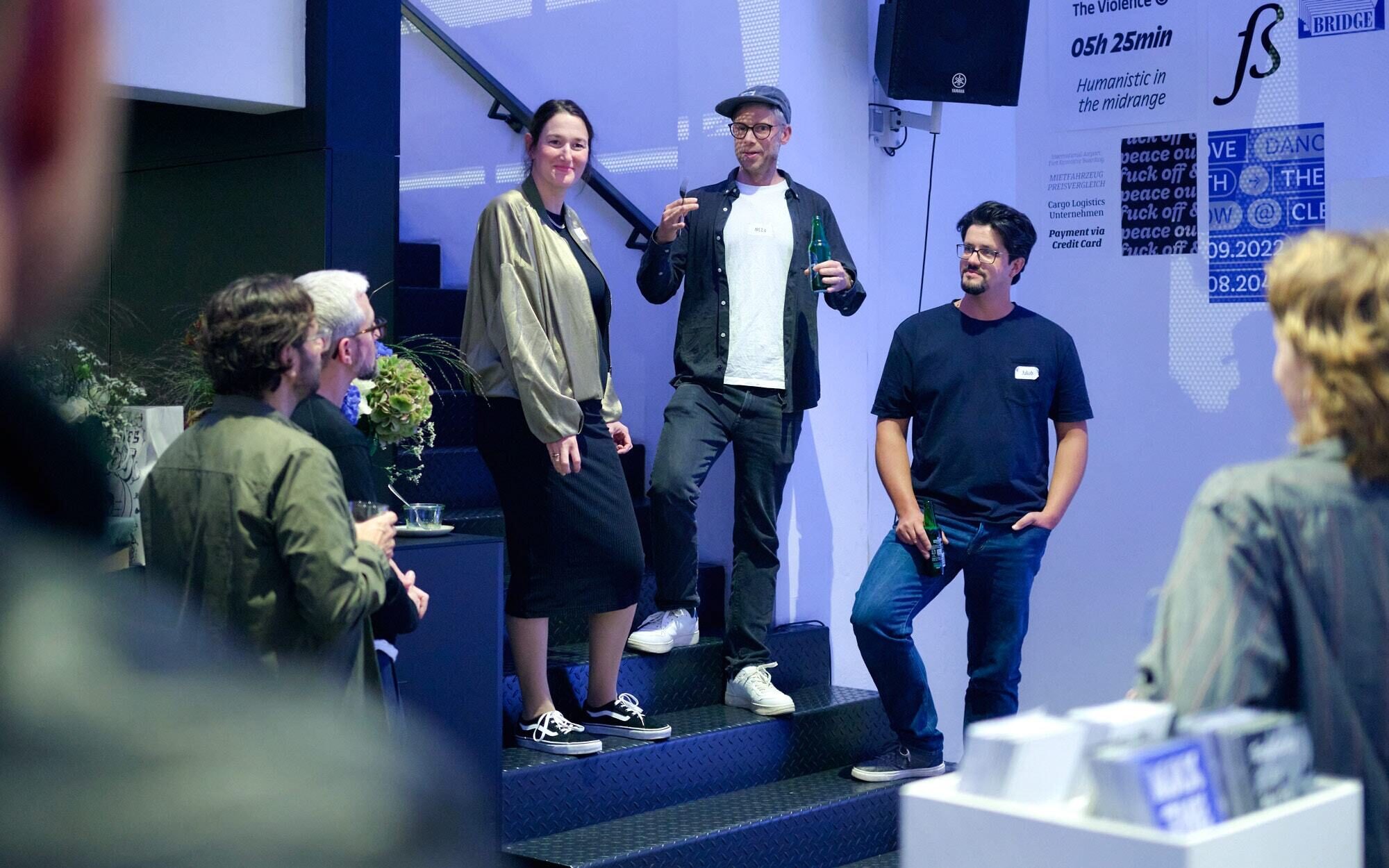
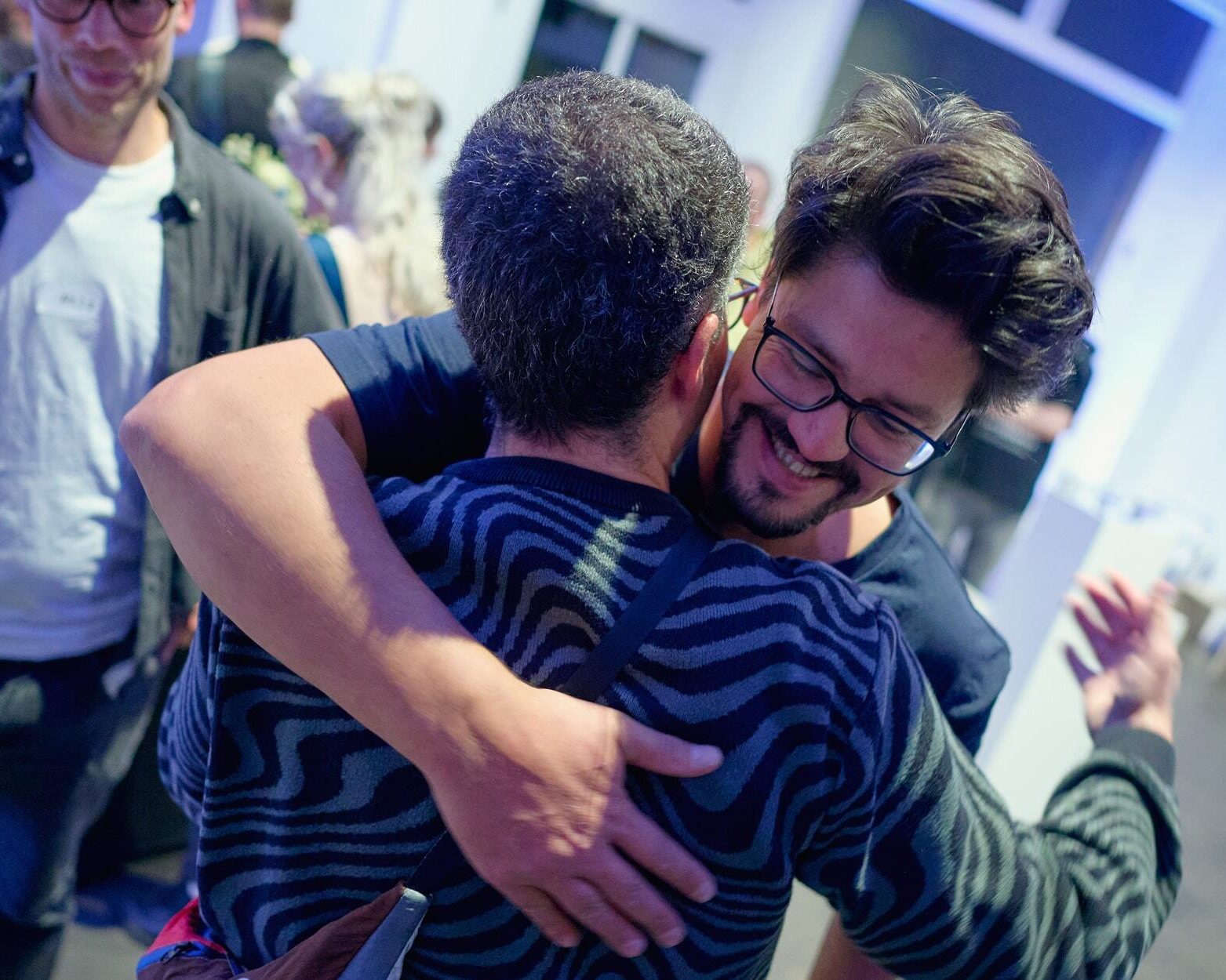
Hugs to Timo Wilke for snapping these (obviously not in the picture).
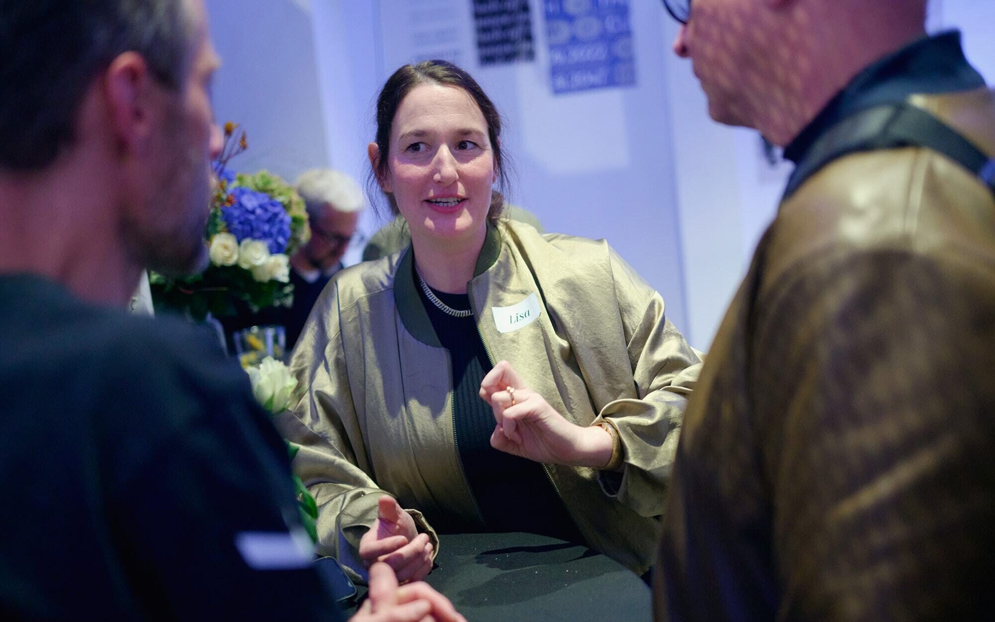
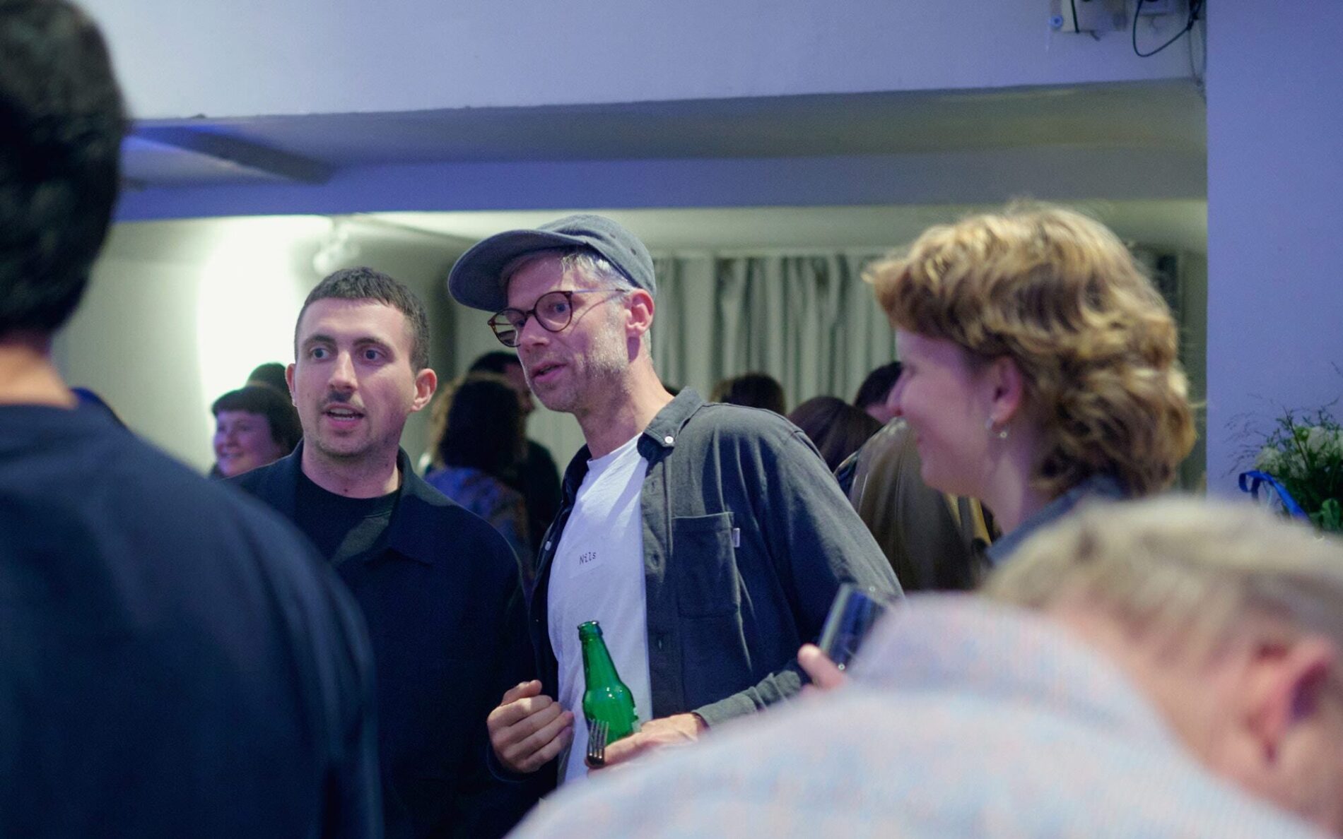
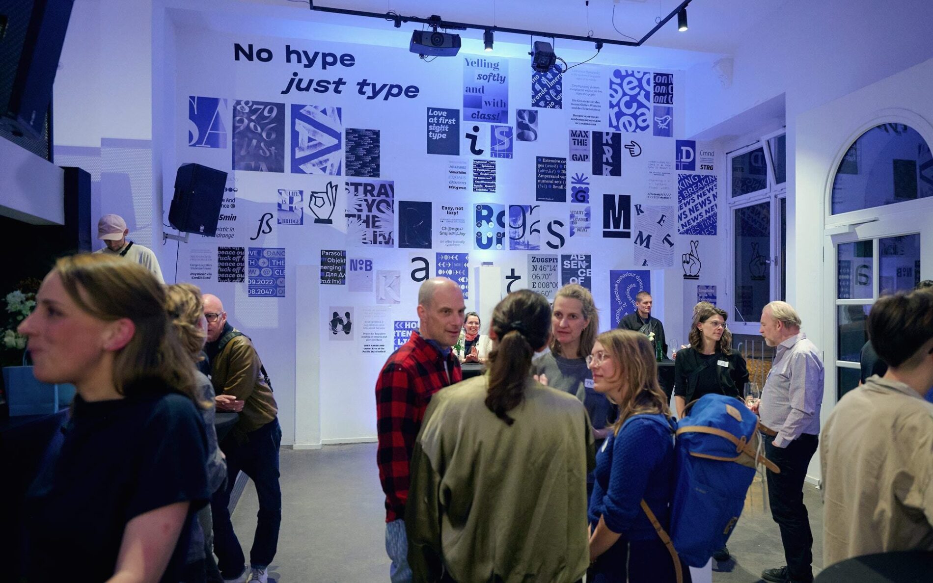
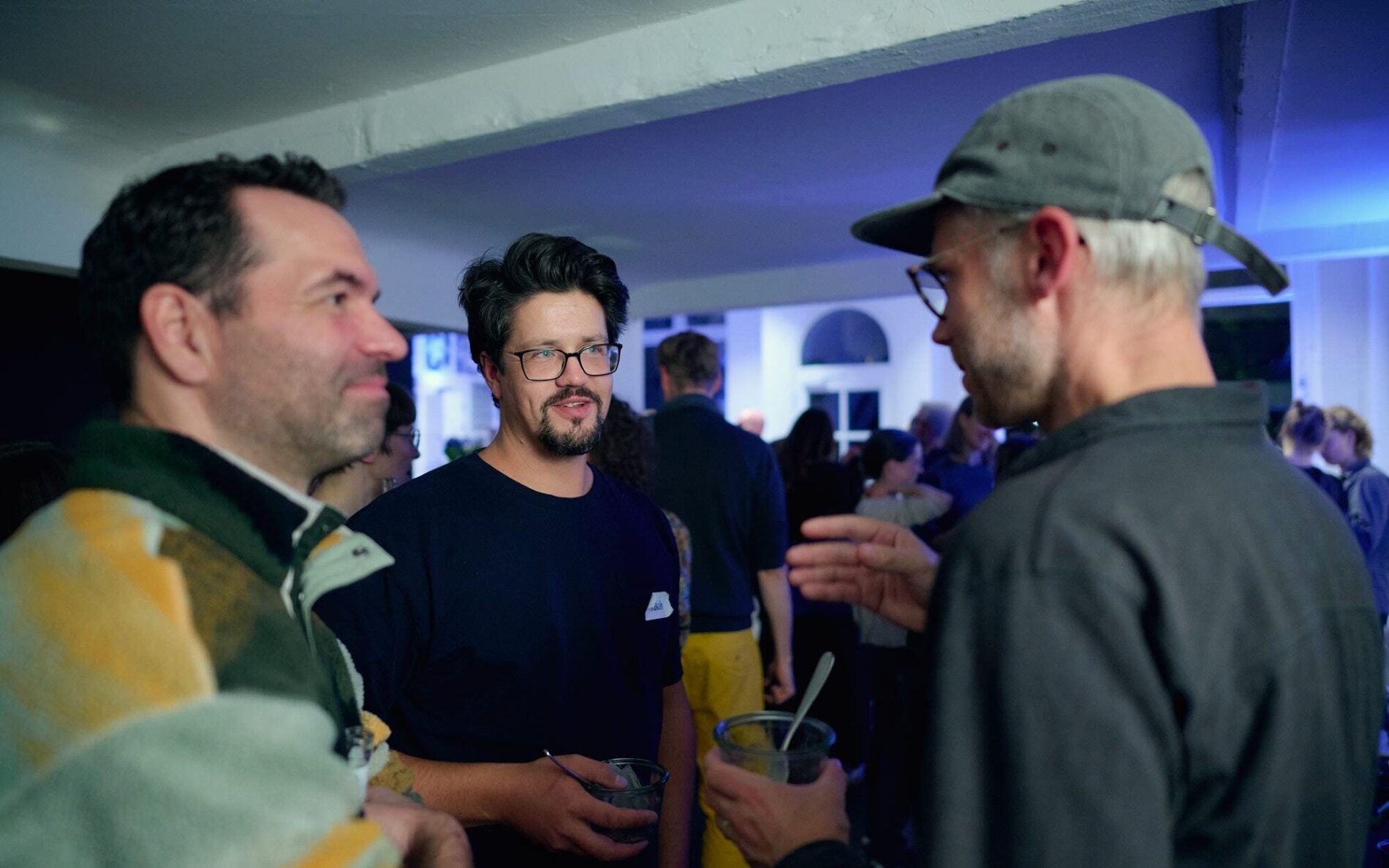
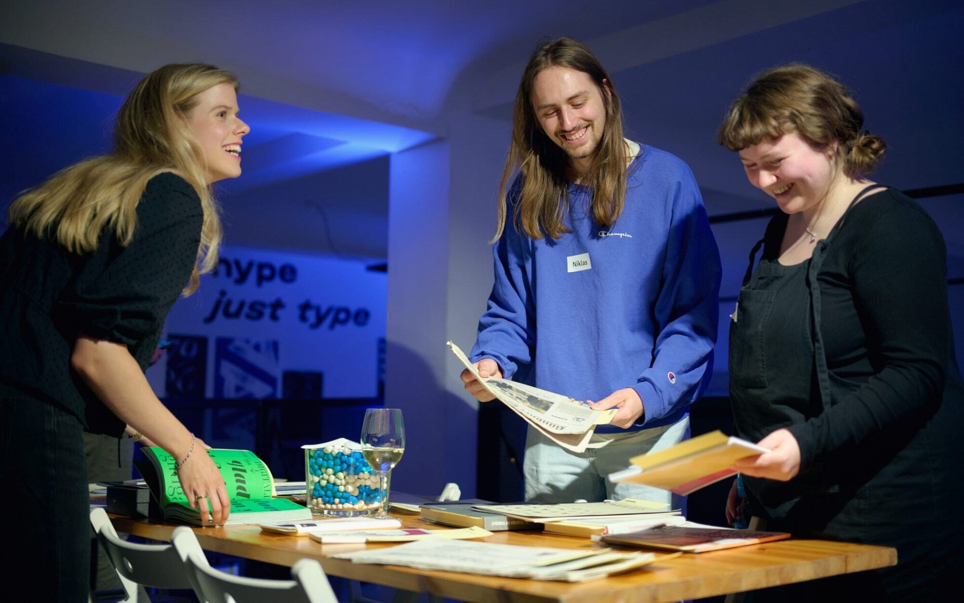
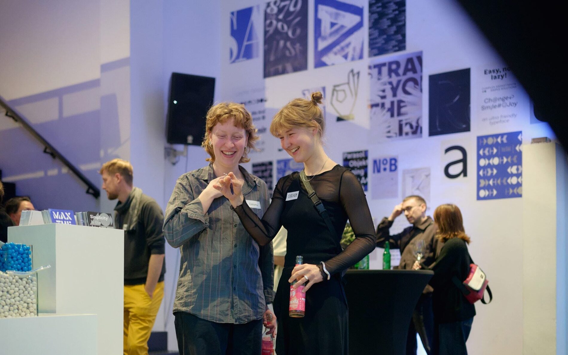
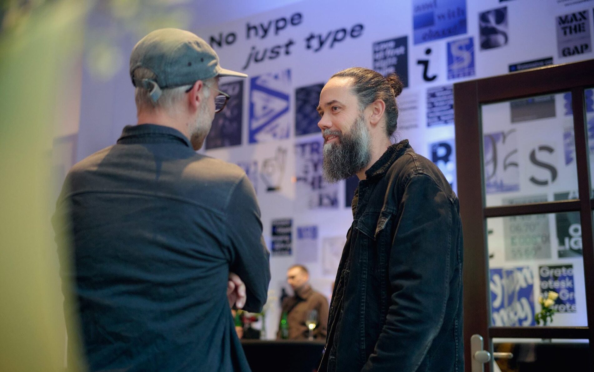
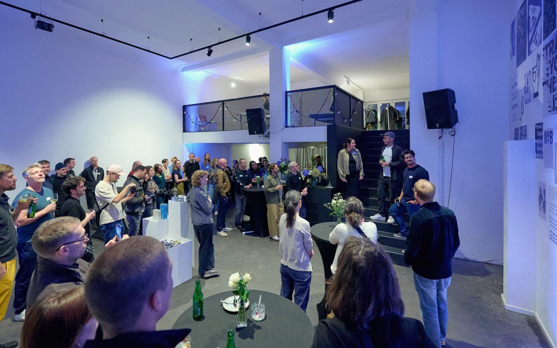
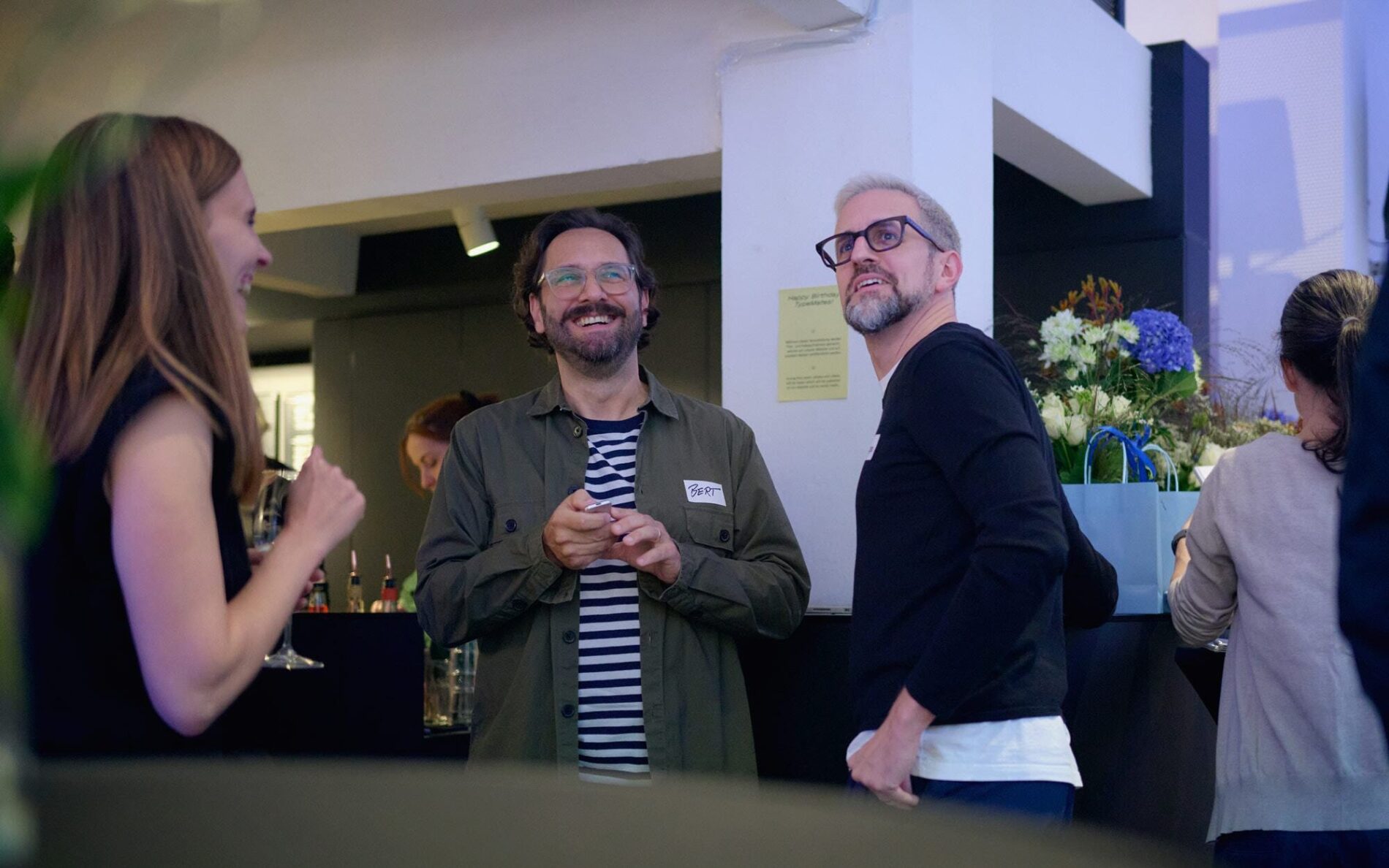
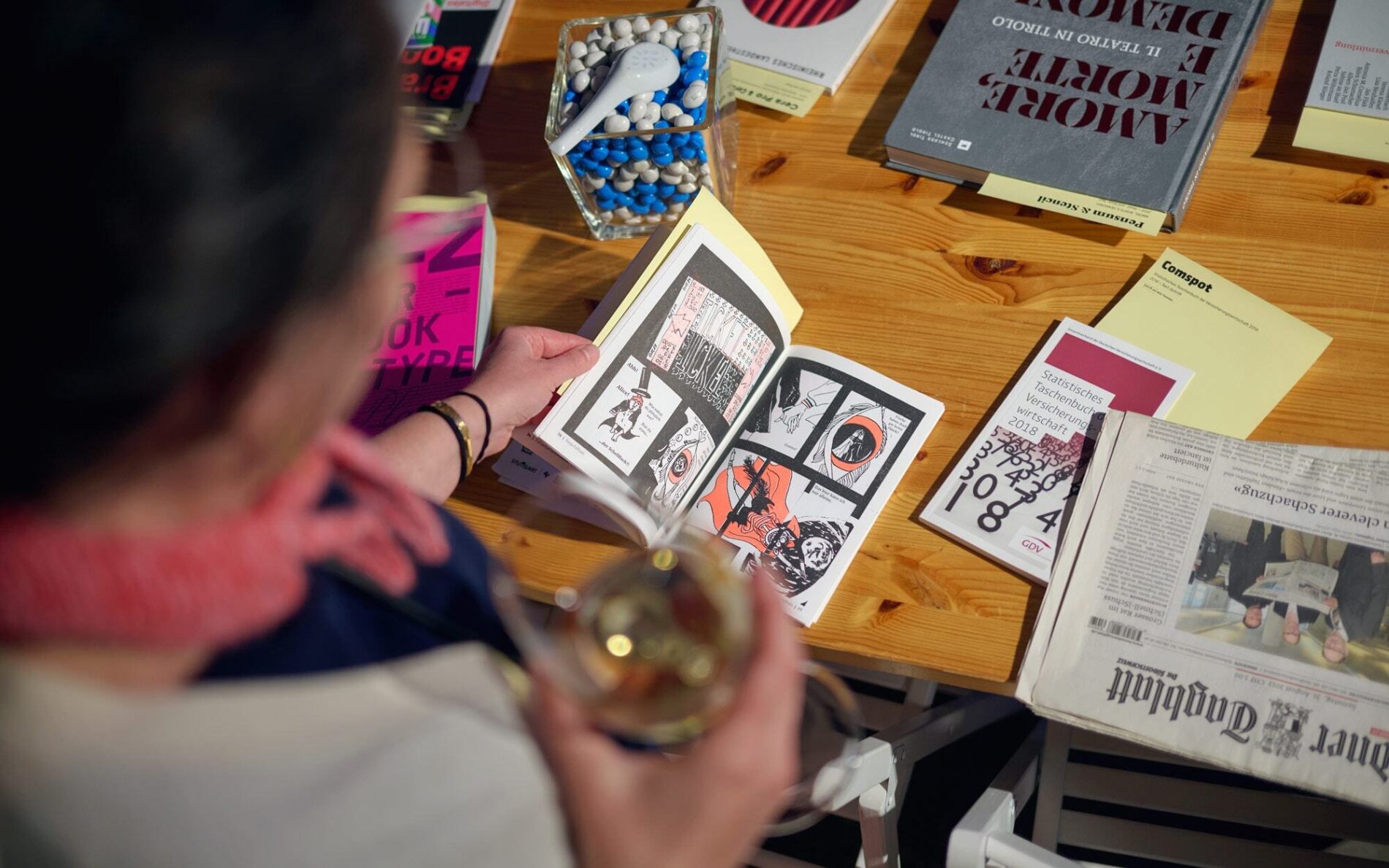
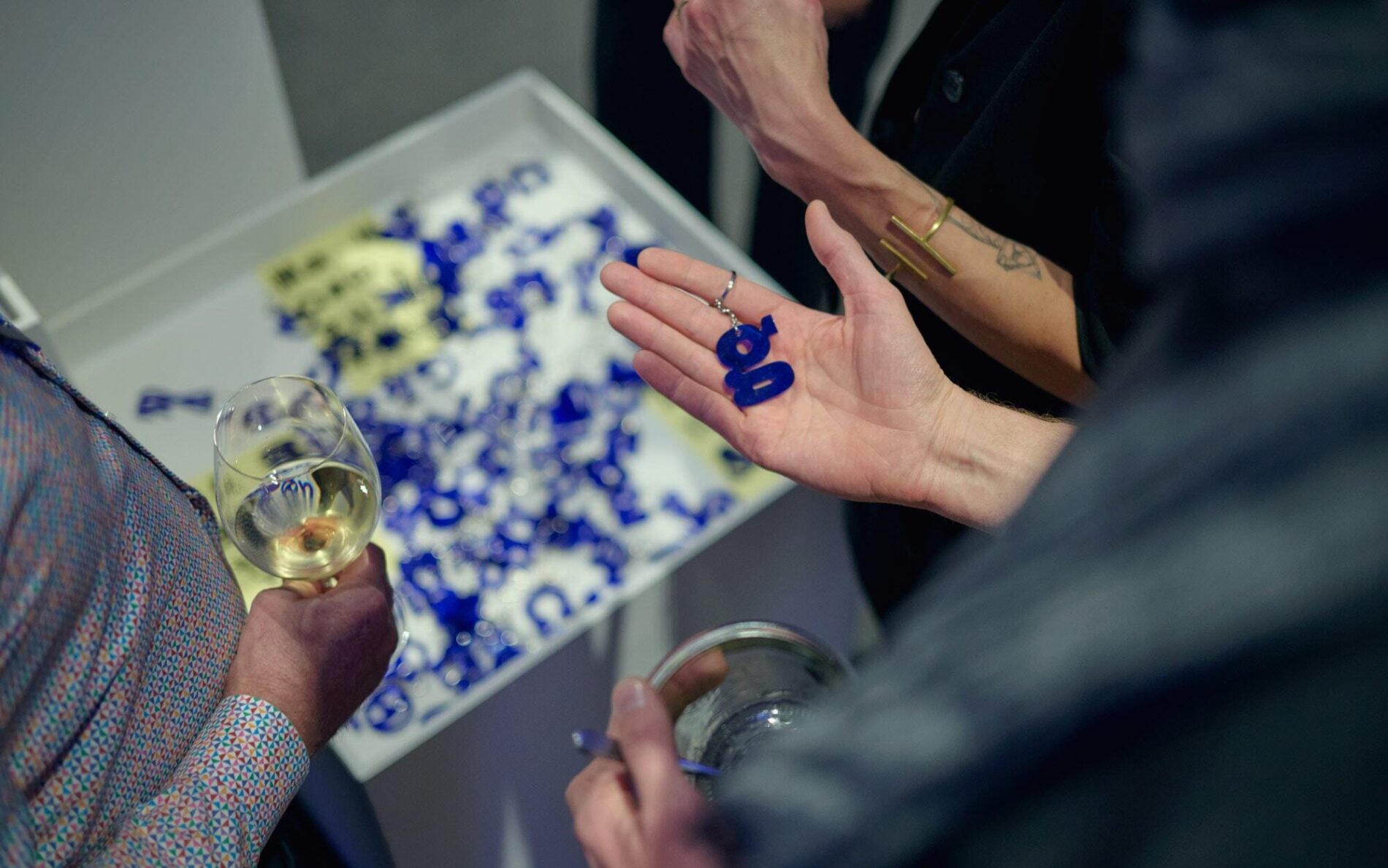
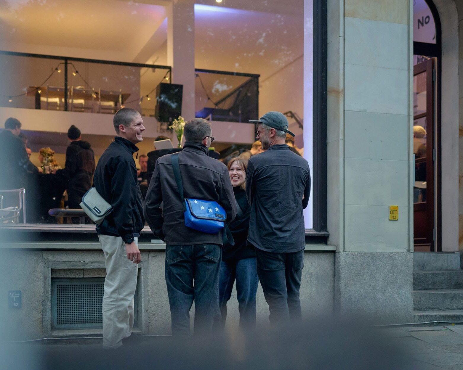
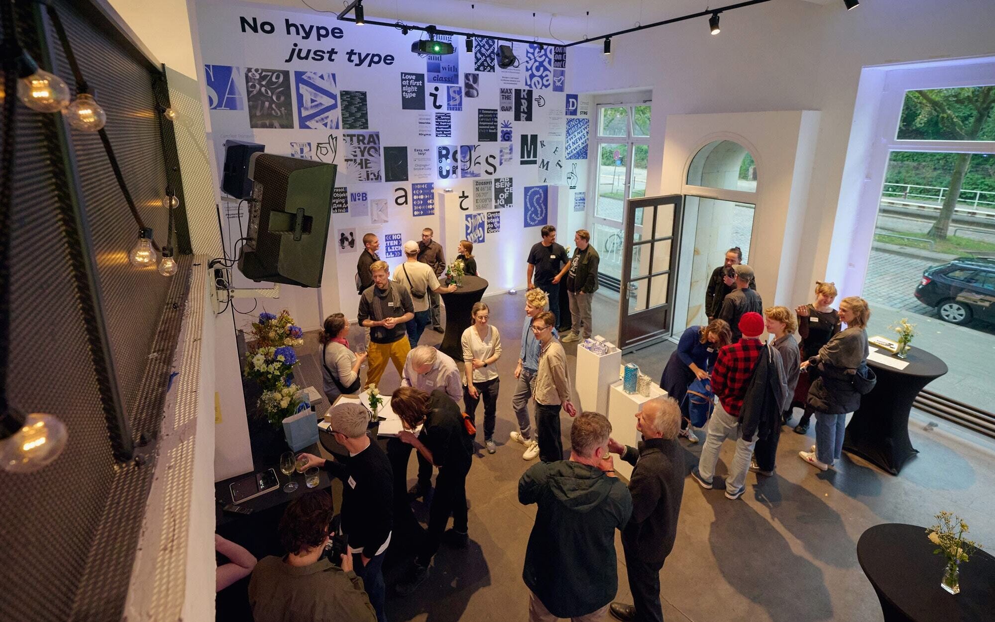
What an evening! We're particularly delighted that so many long-standing TypeMates supporters came: former employees, interns, and connected type designers, along with a teacher three of us shared. Cheers to everyone who joined us — and huge thanks to all who've been with us throughout the journey!
Usually sports and adventure shots,this time a party. Thanks, Johann Kristan.
And now? We're starting team coaching for the three of us. According to Nils, it's like expensive couples therapy. Even if there's no obvious reason yet, it ensures we're relaxed for the next 10 years of running a font foundry, for hiccups and highlights.
We're really looking forward to it!