Nils Thomsen
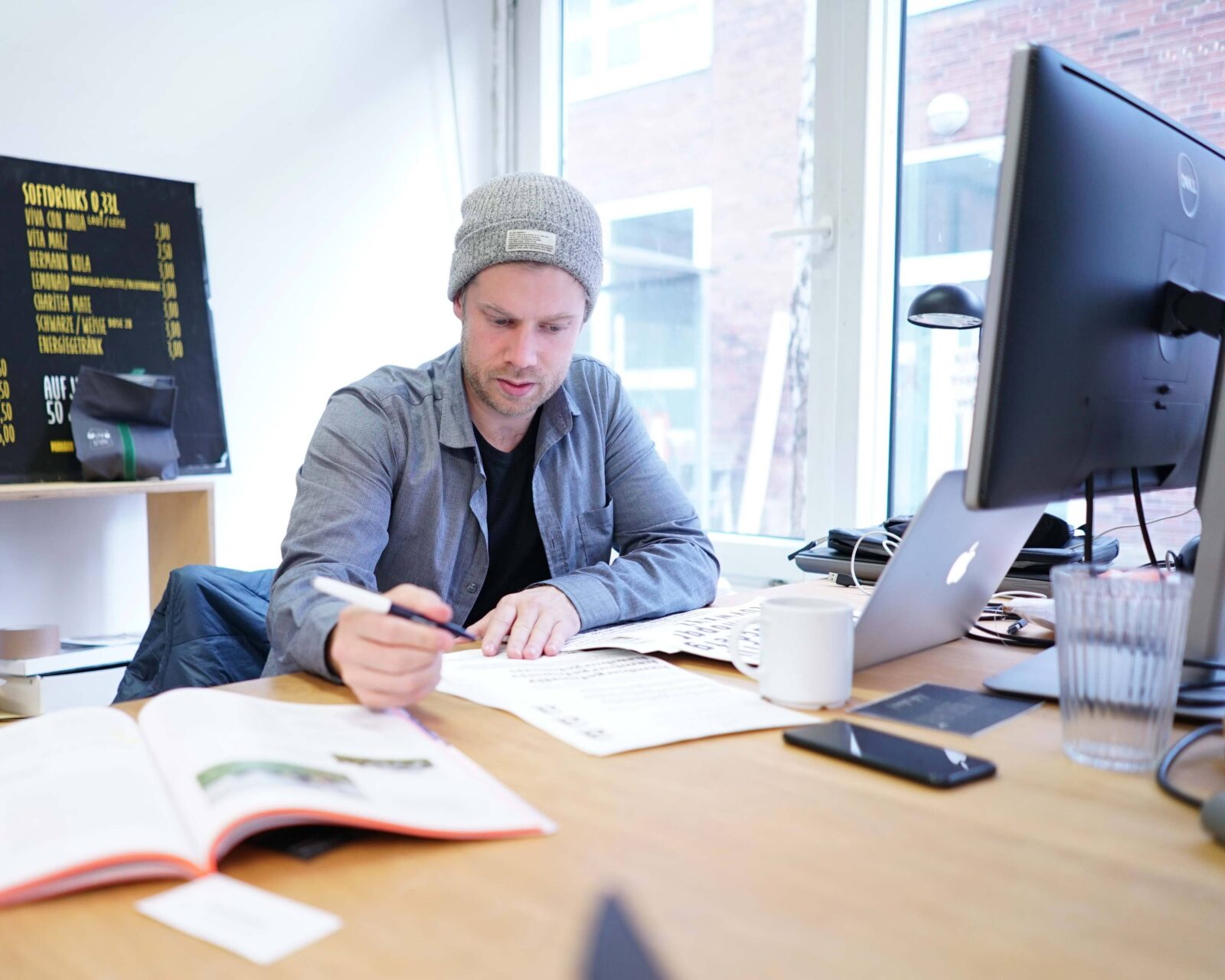
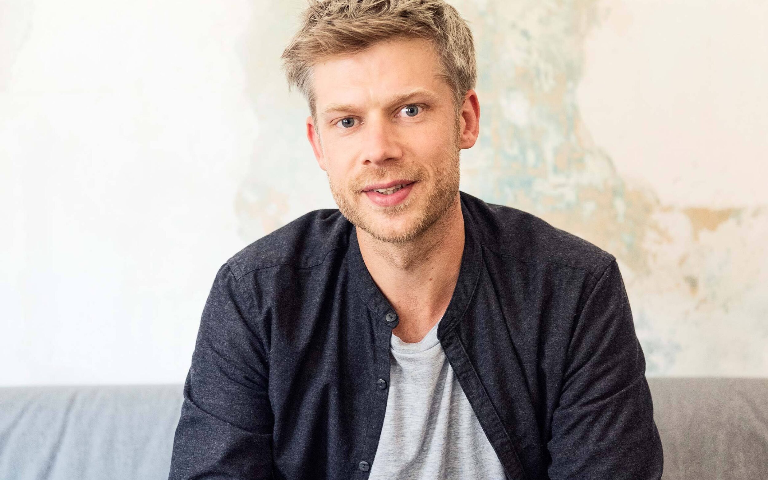
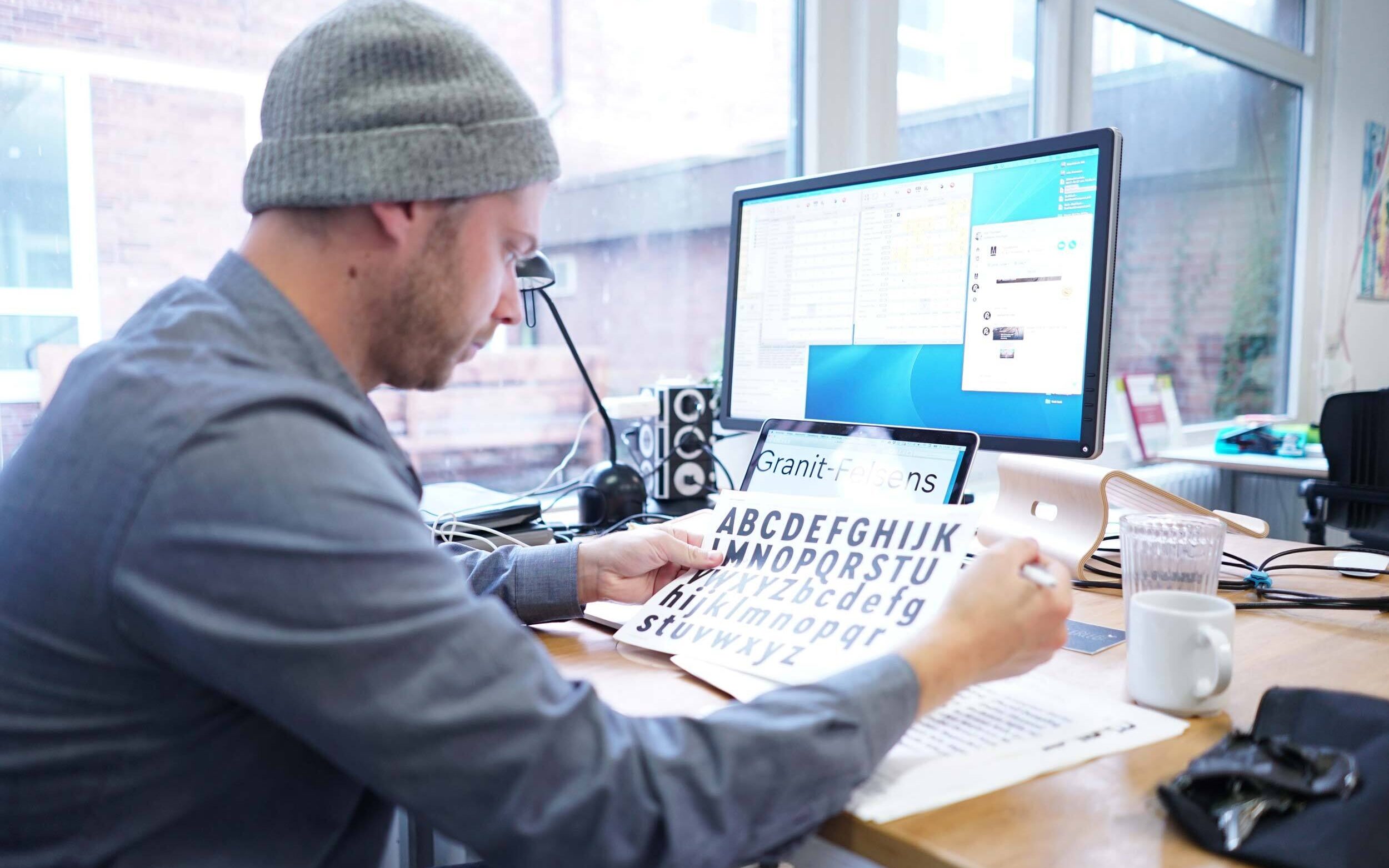
Nils is co-Founder of TypeMates. He is focused on extending the typeface collection and implements letter shapes with ease.


Ever since he was a child, Nils has been captivated by graffiti and this early fascination bloomed into a love of letterforms. Pursuing this interest, Nils completed his studies at Muthesius Academy of Fine Arts and Design in Kiel, and his master’s degree in the postgraduate Type and Media course in The Hague. He worked at Bureau ErlerSkibbeToensmann in Hamburg and contributed to the new corporate typeface of daily German newspaper “Süddeutsche Zeitung”.
Pensum Pro is a typeface for text, text and nothing but text
18
styles by Nils Thomsen
Pensum Sans: a poetic and precise soul mate in the Pensum trilogy, based on the same legible skeleton as the Serif with distinguishing details
18
styles by Nils Thomsen
Pensum Display is the spiky and triangular mate of Pensum Pro, designed to be used for anything big
18
styles by Nils Thomsen
Pensum Stencil breaks letters into individual shapes to create a fusion of brushy elements and spiky details
9
styles by Nils Thomsen
Piet is welding the stiff with the vibrant
16
styles by Nils Thomsen
Comspot, a rounded, typewriter-flavoured font family with a human touch
36
styles by Nils Thomsen
Meret is a straight forward typeface for newspapers and so much more. At home in tight columns and dense leading, it is another monster for text
16
styles by Nils Thomsen
Conto is simple, elegant and spurless for smooth typography
64
styles by Nils Thomsen
Conto Slab surprises with a significant aura for elegant and strong purposes
16
styles by Nils Thomsen
Mikkel: a smooth and goofy Script with an easygoing attitude
10
styles by Nils Thomsen
Halvar: a German engineered type system that extends to extremes
81
styles by TypeMates
Halvar Stencil: an unbreakable industrial typeface
81
styles by Paul Eslage & TypeMates
JABANA WAS BORN IN HAMBURG ST.PAULI WHILE SITTING AT A BAR AND HAVING A BEER SUDDENLY SOME BEAUTIFUL MENU CARD LETTERS APPEAR.
52
styles by Nils Thomsen

