Starting € 50.00
Try Buy
#piet
Piet Sans and MONO: “welding the stiff with the vibrant”
Cycling and public transport are well integrated in Japan. Starting in 1978, Japan expanded bicycle parking supply at railway stations from 598,000 spaces in 1977 to 2,382,000 spaces in 1987. As of 1987, Japanese provisions included 516 multi-story garages for bicycle parking. The first Danish route, C99, opened in 2012 between the Vesterbro rail station in Copenhagen and Albertslund, a western suburb. The route cost 13.4 million Danish kroner and is 17.5 km long, built with few stops and new paths away from traffic.
»Français«

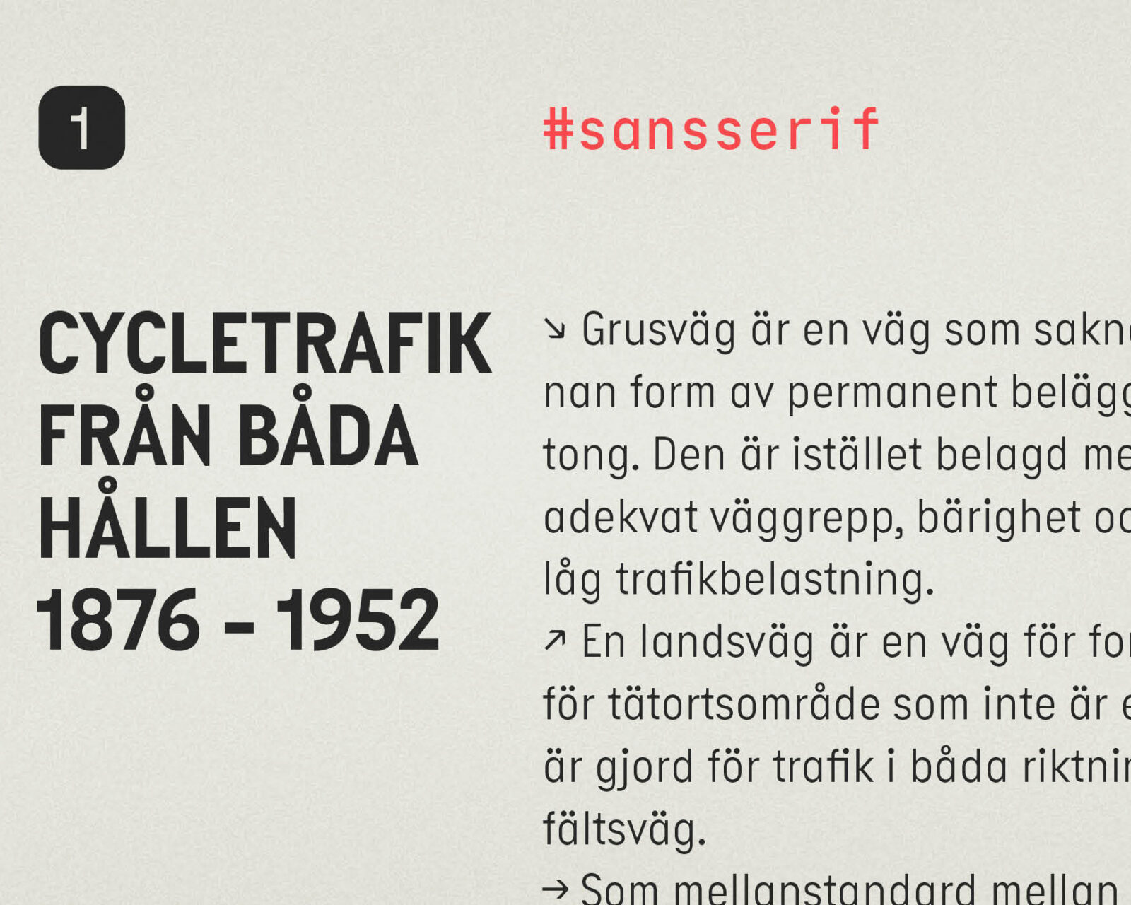
Inspired by Finnish licence plates, Piet is a playful pair of constructed typefaces defined by strange numbers and deep, rounded ink traps. Consisting of Mono and Sans, Piet is bureaucratic at first sight, but with a closer look you’ll find the utilitarian hooked up to the weird, the stiff wired to the wonky, and the italics connected to the battery.

Not pretty, nor refined, Piet is unmistakable. Its shapes are practical and almost unbreakable. With chunky forms and more and less than the expected optical corrections, it is functional, visually unbalanced and narrow. With no cruise control on its ever-present idiosyncrasy, Piet turns its ‘limitations’ into fuel.

Piet is a pair of typefaces. If the Mono feels too fixed, change gear with the sans. Originating from the Mono, it has been (sorta!) fine-tuned with proportional spacing, kerning and some gentler forms for easier reading.

The italics of the Mono and the Sans could hardly be more divergent. Where the italics of the sans are simply slanted, the Mono’s demand prominence. All new shapes — even in x, w and z — and a tender touch is infused into the Mono’s fixed widths. With rotated shapes the caps catch the eye and their adherence to the baseline introduces a raw tension visible in the E, L and Z.

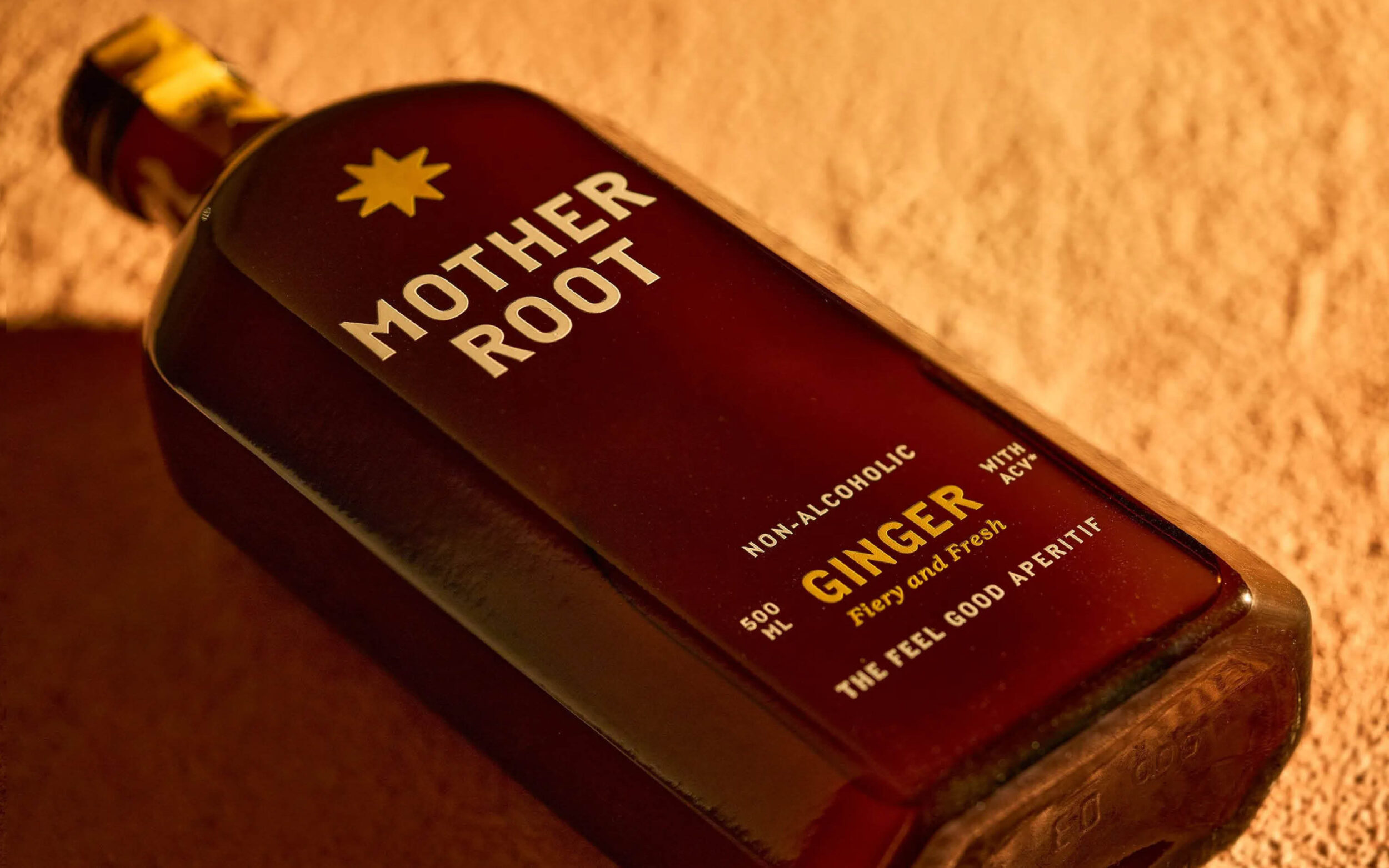
Whether defining a wayfinding system for the Arctic Circle, adding exuberance to the minimalist packaging of natural yoghurt, or ordering markdown documents, Piet is at home with the strange and a getaway car from the average.

Piet Sans and Mono each have four weights and —at times unconventional— matching italics. They provide all the OpenType features needed for ambitious typography: subscripts, fractions, tabular and lining figures, localised shapes and stylistic alternates to accelerate your typographic possibilities.

A look under the hood reveals: Piet Mono’s ss02 has non-stretched letters to intensify its attractive, inharmonious whitespace. By contrast, Piet Sans’s ss02 makes it more mono with mechanical semi serifs. Across Mono and sans, ss03 brings a striking flavour with upright italic shapes. In the toolbox of ss01, you’ll find an alternate a!

Designed by
Nils Thomsen
in 2024
Specs
Formats
Tags
SansRegularMonospaceHeadlinesBody TextInterfaceSignageLatinGeometricIndustrialVariable FontItalicsDuplexAlternates
Related Typefaces
Elma, Comspot

Piet Mono

  • Thin
  • Thin Italic
  • Light
  • Light Italic
  • Regular
  • Regular Italic
  • Bold
  • Bold Italic

Piet Sans

  • Thin
  • Thin Italic
  • Light
  • Light Italic
  • Regular
  • Regular Italic
  • Bold
  • Bold Italic
Character Set
Language Support
Supports more than 200 Languages: Abenaki, Afaan Oromo, Afar, Afrikaans, Albanian, Alsatian, Amis, Anuta, Aragonese, Aranese, Aromanian, Arrernte, Arvanitic, Asturian, Atayal, Aymara, Azerbaijani, Bashkir, Basque, Belarusian, Bemba, Bikol, Bislama, Bosnian, Breton, Cape Verdean Creole, Catalan, Cebuano, Chamorro, Chavacano, Chichewa, Chickasaw, Cimbrian, Cofán, Cornish, Corsican, Creek, Crimean Tatar, Croatian, Czech, Danish, Dawan, Delaware, Dholuo, Drehu, Dutch, English, Esperanto, Estonian, Faroese, Fijian, Filipino, Finnish, Folkspraak, French, Frisian, Friulian, Gagauz , Galician, Ganda, Genoese, German, Gikuyu, Gooniyandi, Greenlandic, Guadeloupean Creole, Gwich’in, Haitian Creole, Hän, Hawaiian, Hiligaynon, Hopi, Hotcąk, Hungarian, Icelandic, Ido, Igbo, Ilocano, Indonesian, Interglossa, Interlingua, Irish, Istro-Romanian, Italian, Jamaican, Javanese, Jèrriais, Kaingang, Kala Lagaw Ya, Kapampangan, Kaqchikel, Karakalpak, Karelian, Kashubian, Kikongo, Kinyarwanda, Kiribati, Kirundi, Klingon, Kurdish, Ladin, Latin, Latino sine Flexione, Latvian, Lithuanian, Lojban, Lombard, Low Saxon, Luxembourgish, Maasai, Makhuwa, Malay, Maltese, Manx, Māori, Marquesan, Megleno-Romanian, Meriam Mir, Mirandese, Mohawk, Moldovan, Montagnais, Montenegrin, Murrinh-Patha, Nagamese Creole, Nahuatl, Ndebele, Neapolitan, Ngiyambaa, Niuean, Noongar, Norwegian, Novial, Occidental, Occitan, Oshiwambo, Ossetian, Palauan, Papiamento, Piedmontese, Polish, Portuguese, Potawatomi, Q’eqchi’, Quechua, Rarotongan, Romanian, Romansh, Rotokas, Sami Inari , Sami Lule, Sami Northern, Sami Southern, Samoan, Sango, Saramaccan, Sardinian, Scottish Gaelic, Serbian, Seri, Seychellois Creole, Shawnee, Shona, Sicilian, Silesian, Slovak, Slovenian, Slovio, Somali, Sorbian (Lower, Upper), Sotho (Northern, Southern), Spanish, Sranan, Sundanese, Swahili, Swazi, Swedish, Tagalog, Tahitian, Tetum, Tok Pisin, Tokelauan, Tongan, Tshiluba, Tsonga, Tswana, Tumbuka, Turkish, Turkmen, Tuvaluan, Tzotzil, Uzbek, Venetian, Vepsian, Volapük, Võro, Wallisian, Walloon, Waray-Waray, Warlpiri, Wayuu, Welsh, Wik-Mungkan, Wiradjuri, Wolof, Xavante, Xhosa, Yapese, Yindjibarndi, Zapotec, Zarma, Zazaki, Zulu, Zuni
OpenType Features
All OpenType Features included: Access All Alternates, Contextual Alternates, Denominator, Fractions, Glyph Composition/Decomposition, Kerning, Ligatures, Lining Figures, Localized Forms, Mark to Mark Positioning, Numerators, Ordinals, Proportional Figures, Scientific Inferiors, Slashed Zero, Stylistic Alternates, Stylistic Set: Alternate a, Stylistic Set: More mono mood, Stylistic Set: Rotalic roundness, Stylistic Set: Tabular width set, Stylistic Set: The lonely one, Subscript, Superscript, Tabular Figures