Mother Root
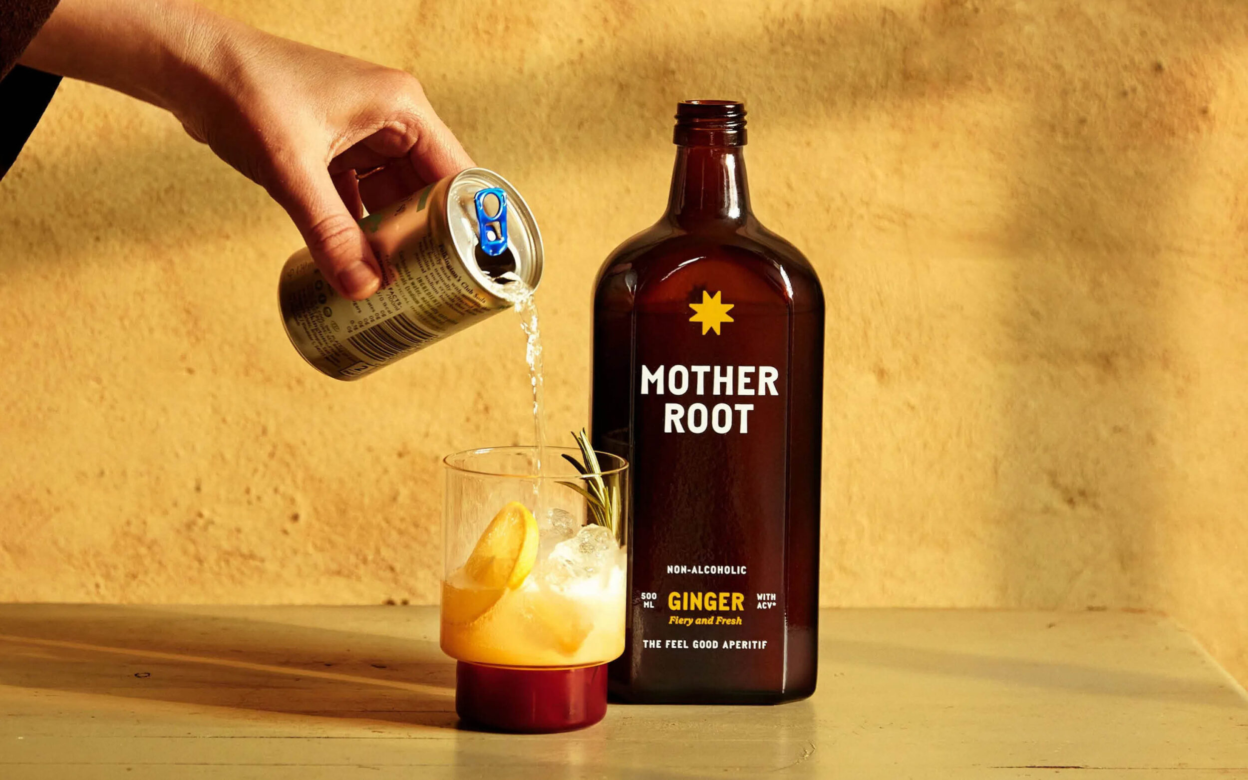
Piet Mono was the perfect choice for the rebranding and packaging design of Mother Root. Fresh, simple and bold, the typeface embodies the values of this natural, alcohol-free aperitif and adds a touch of joy and confidence to the brand.
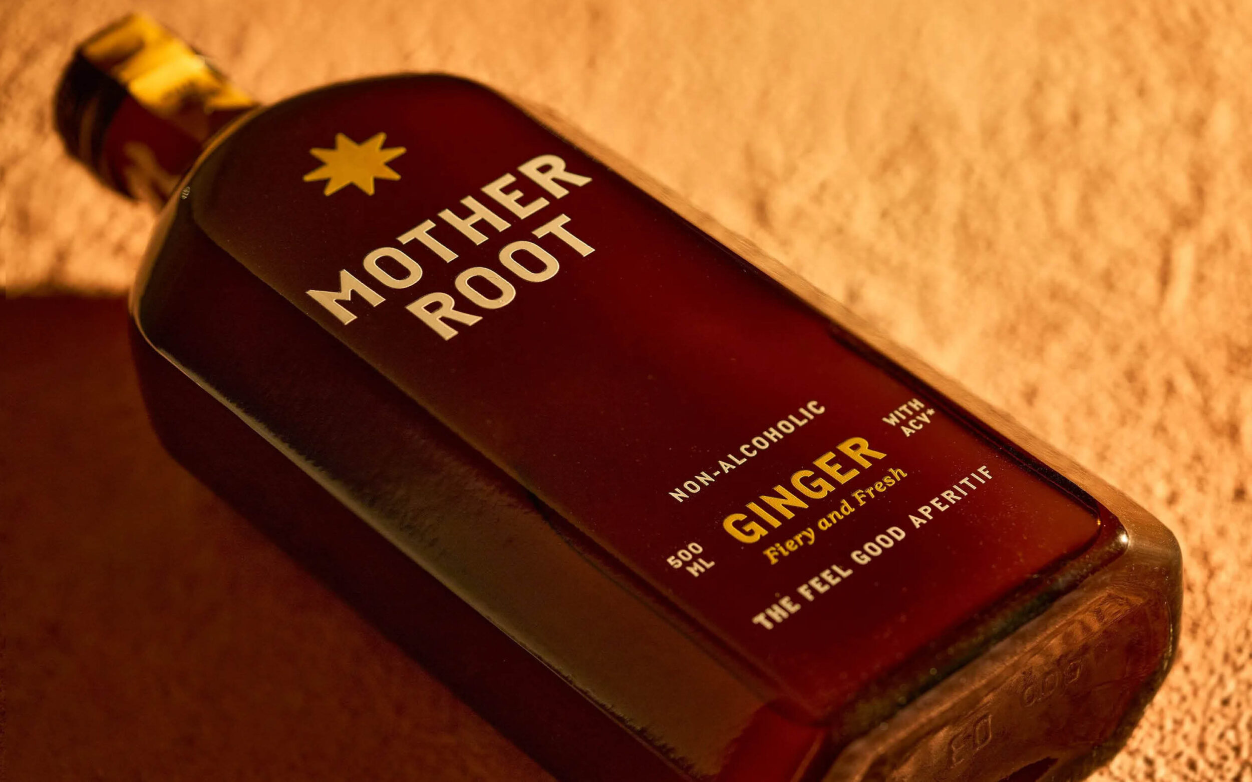
Since its launch in 2015, Mother Root has built a community of flavour-first drinkers. With the 2025 rebrand, POST aimed to present the brand as welcoming, joyful and bold, reflecting changing attitudes towards drinking. They selected Piet Mono as their display font for this purpose.
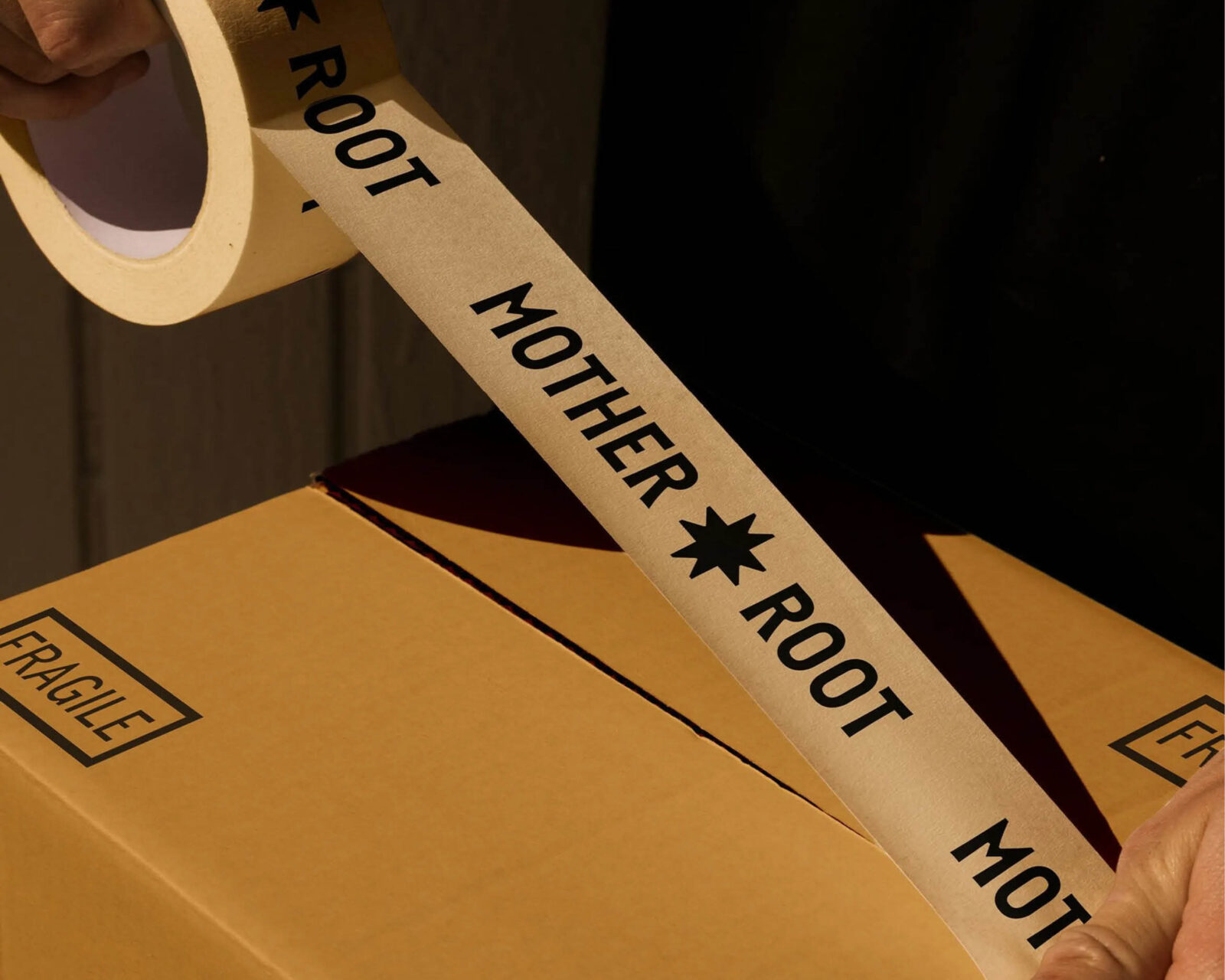
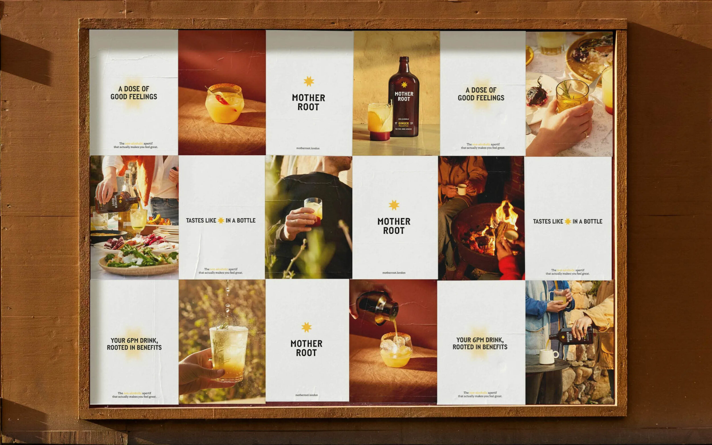
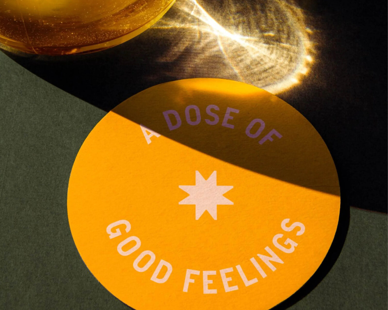
Not only does the typeface match the simplicity of the drink with its four ingredients, but its rounded, almost liquid ink traps also make it a perfect fit for an aperitif. Without serifs, it clearly distinguishes itself from conventional alcoholic aperitifs, maintaining an unmistakable character that is both practical and playful. With its warmth and charm, Piet Mono pairs perfectly with the brand's central motif: the sun.
POST wanted the brand to feel 'bold, not pushy; joyful, not jolly' — a description that equally applies to Piet Mono itself.
Images by the courtesy of POST