Beyond the Typeface Family: 5 Modern Perspectives
What defines a type family today? No longer limited to shared proportions or systematic interpolation, contemporary type design expands the idea of the type family. In particular, large typeface families and variable fonts open up new possibilities, making typefaces more expressive and conceptual.
The Evolution of Type Families
Typeface families and systems have evolved significantly over the centuries. The idea of a large type family has progressed from completely independently designed weights and styles to more related variants, coordinated families and design systems, and finally to superfamilies optimised as variable fonts within a single file. This shift from isolated designs to complex, flexible systems offering many variations has been driven primarily by technological developments and the growing demand for visual consistency.
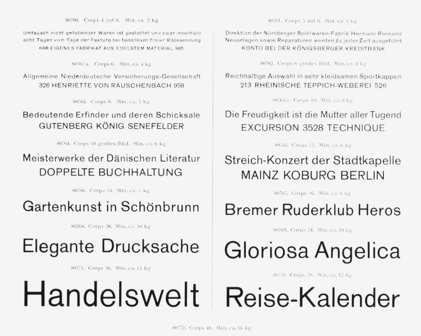
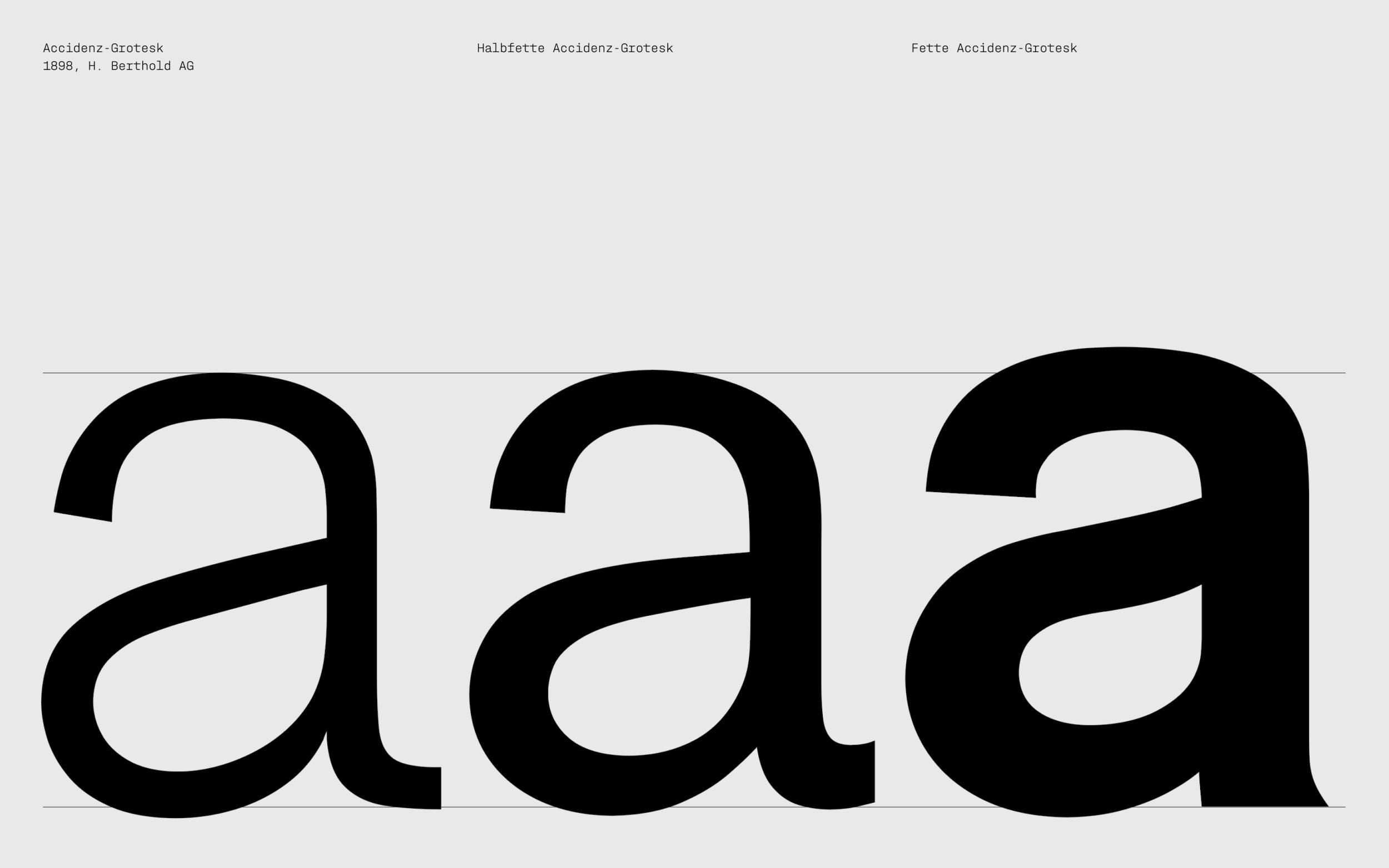
A close comparison of Accidenz-Grotesk, Halbfette Accidenz-Grotesk und Fette Accidenz-Grotesk reveals that the different weights do not match in terms of proportions, stroke endings, counters, stroke angles, the depth of joins, etc.
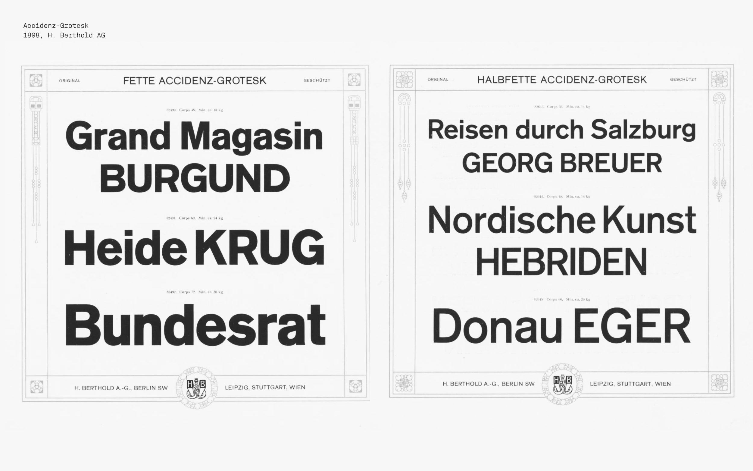
This example of Accidenz-Grotesk, Halbfette Accidenz-Grotesk and Fette Accidenz-Grotesk make clear that early members of typeface families showed significant differences in their design.
Taken from the Accidenz-Grotesk type specimen, H. Berthold AG, circa 1920 (reprint of a brochure from 1912).
Documented in the Stabi’s digitised collection.
From Typeface to Superfamily
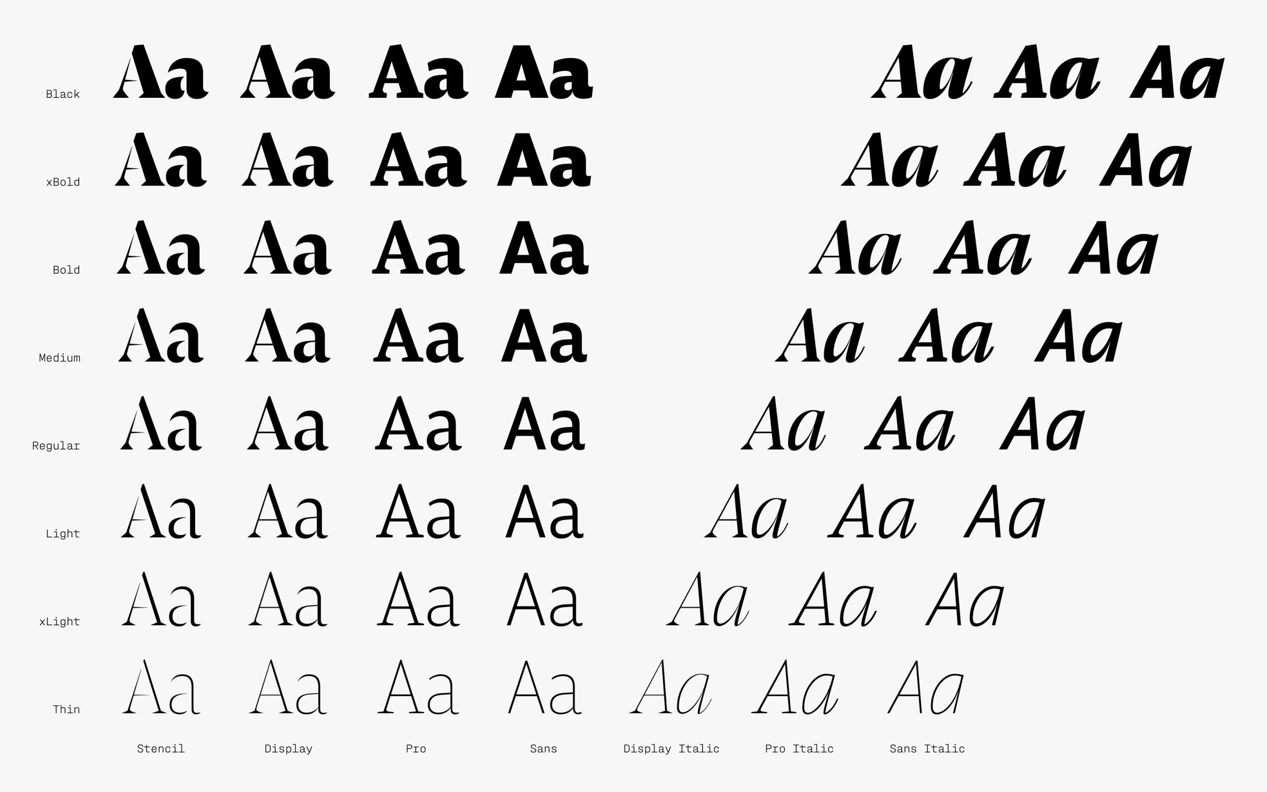
Nowadays, type families are more than just different weights or widths of the same design. Almost anything is doable. Variable font technology makes it possible to include a wide range of weights, widths, and styles in a single file, effectively consolidating entire superfamilies into one dynamic design system. A large contemporary type family can cover diverse typographic needs while ensuring consistency and harmony. Modern typeface families are therefore not merely tools, but design systems for complex visual communication.
Halvar Variable
Pensum Superfamily
Why use large typeface and superfamilies? Because they simplify complexity and offer variety... Classically structured typeface families make type pairing more intuitive, hierarchies become clearer, and visual consistency is maintained across different contexts, from editorial design to branding. Variable fonts and superfamilies additionally offer greater stylistic flexibility, making it possible to switch between functional clarity and expressive character without leaving the type system.
New Perspectives on Typeface Families
Some type families challenge the very idea of what a “family” can be. They deliberately break with established conventions and reinterpret the classic structure of the typeface family: moving away from uniformity as an end in itself, towards systems that foster expression, adaptability and narrative. The following five examples from our TypeMates library explore unconventional structures, unexpected relationships, and new approaches to typeface kinship.
Norbert: Family by Choice
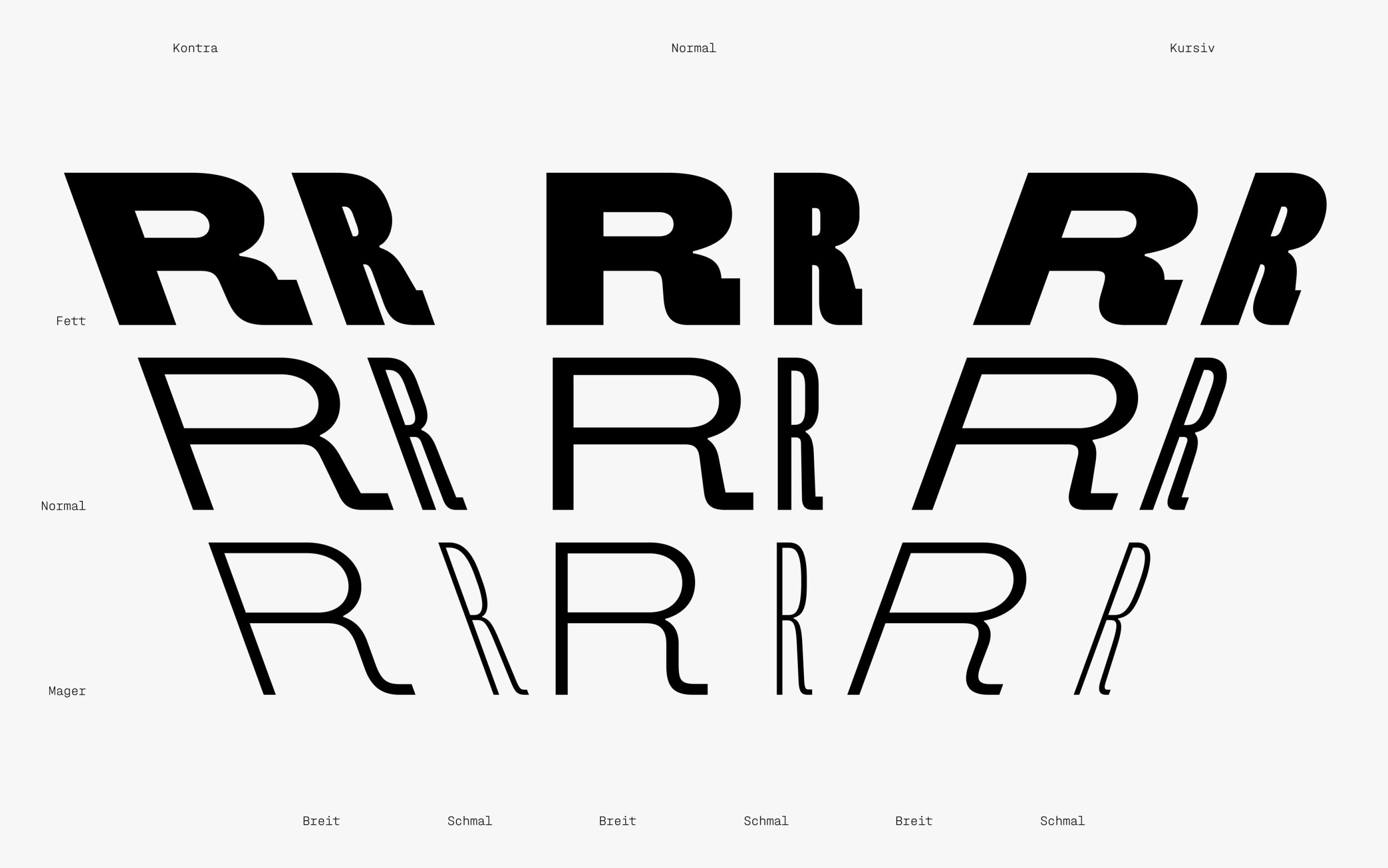
Norbert brings together a set of deliberate extremes, drawing on the diversity of hot metal type, where variation within a family was the norm. Instead of pursuing harmony through uniformity, and the dullness that can follow, each style is drawn individually, yet remains connected to the others. Without interpolation, standard weight progression, or a variable font, Norbert forms a large cohesive family of two widths across three styles: Italic, Backslanted, and Upright. Rather than a conventional type system, it operates more like a group of chosen companions, distinct in character, but united by shared attitudes and values.
Gustine: Siblings with Different Personalities
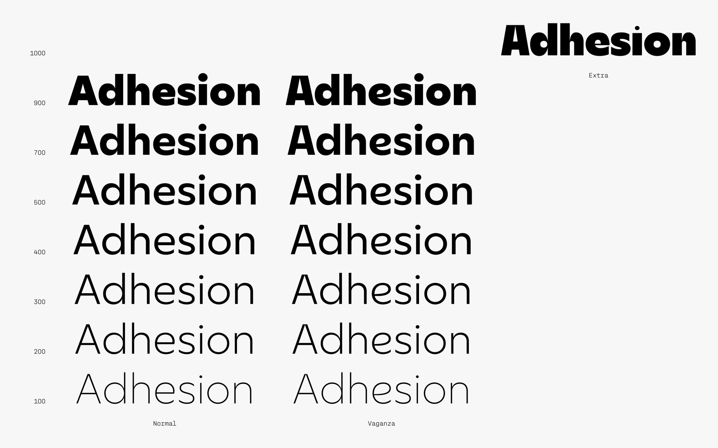
At its core, Gustine is a clear, confident geometric typeface with sharp, dynamic details. As a big family, however, it brings together three distinct siblings. Their styles follow a narrative of birth order: the reserved eldest (Gustine), the adaptable middle child (Gustine Vaganza), and the most expressive youngest (Gustine Extra). While clearly related in form, each style is designed to stand on its own. Instead of relying on italics, Gustine creates contrast through stylistic variation, allowing for hierarchy and emphasis while maintaining a strong sense of family connection.
Edie & Eddy: Expression in Three Voices
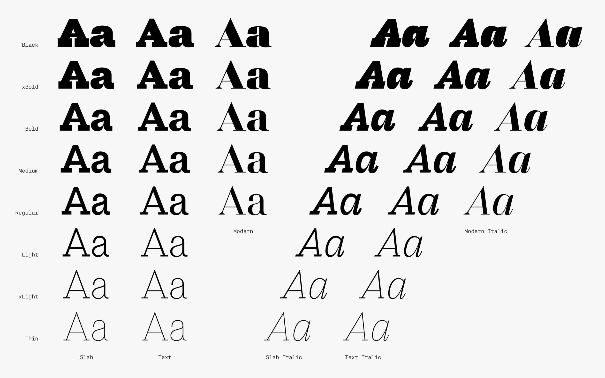
Edie & Eddy is a diverse variable font superfamily stitched together from three distinct voices: Modern, Slab, and Text. Each member has a different character, achieved through the use of contrast. The family allows you to define the tone of your typography. Well-spoken, unmistakable, or empathetic: you can choose the style that fits your message. Positioned across clear design extremes and the space between them, Edie & Eddy takes full advantage of the variable font format, enabling smooth and intuitive transitions between expressions. Designed with flexibility and range in mind, the Edie & Eddy superfamily is in tune with the latest variable font technology.
Gregory: Same Spirit, Different in Detail
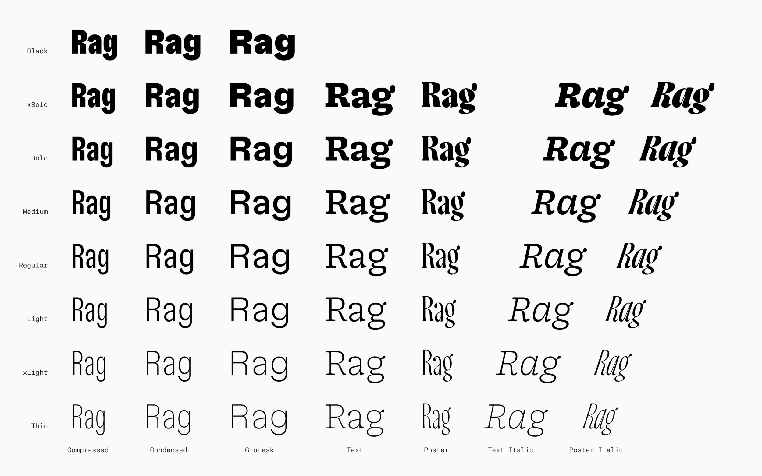
Gregory is a classically structured superfamily, comprising a Serif for text, a Sans for functional use, and a Display for expressive settings. Despite their distinct roles, the three designs are closely connected through a shared appearance, their warm quirks and historical flavour. Gregory Grotesk began with the soft ink trap, a formal detail it shares with its serif counterpart, Gregory Poster. Beyond this common feature, however, the typefaces diverge entirely in their design. Across all family members, top-heavy proportions introduce a deliberate sense of imbalance, giving typography a distinctive presence.
Sombra: Organic Family Growth
Sombra is an organic grotesque typeface that grows in an unconventional way, expanding from Condensed Light to Extended Black, much like the evolving structure of a family over time. The typeface family is a specific and versatile choice for demanding typographic tasks. Rather than offering independent control, Sombra combines both weight and width into seven coordinated styles, each with its own inherited width. By controlled progression and development across two dimensions simultaneously, each weight gains a unique presence, resulting in expressive, human typography.
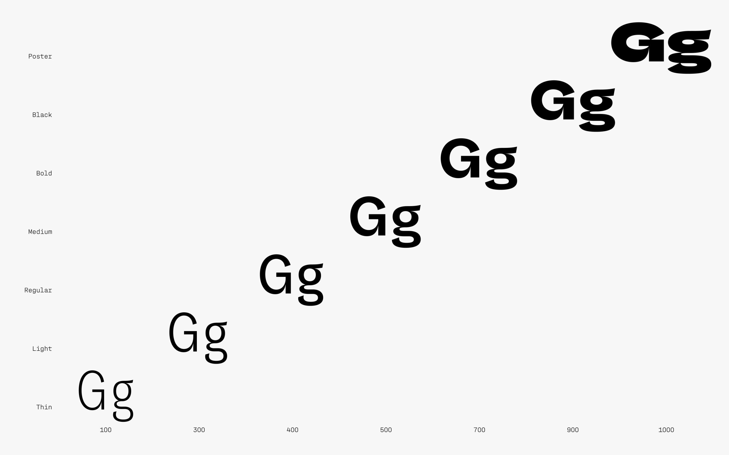
The typeface family is an extremely flexible system.
The experimental approaches to typeface relationships presented here demonstrate that typeface families can be much more than harmoniously developed systems. Variable fonts, and large, flexible typeface families in particular, offer maximum diversity and serve equally as structural tools of expression and narrative media.