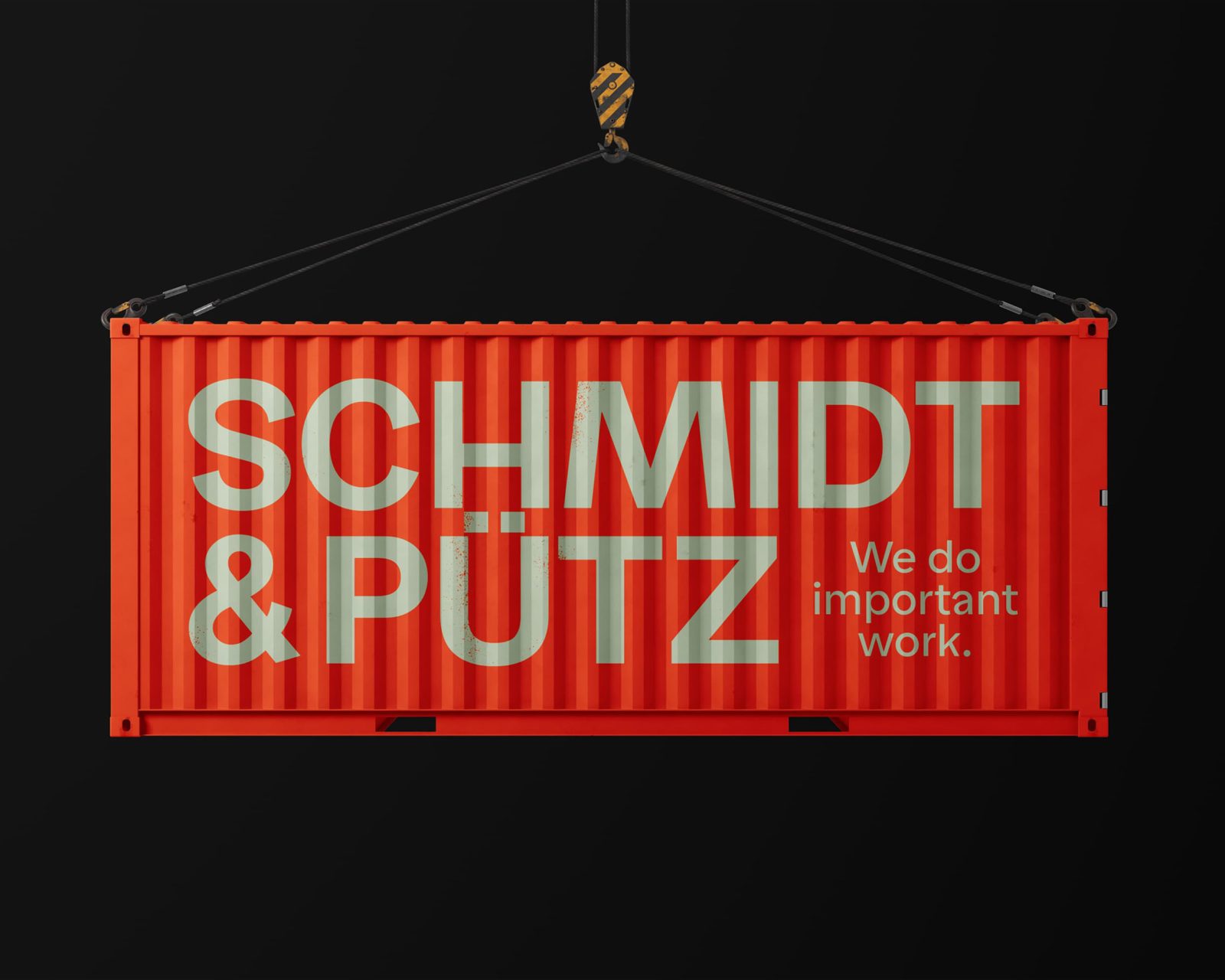
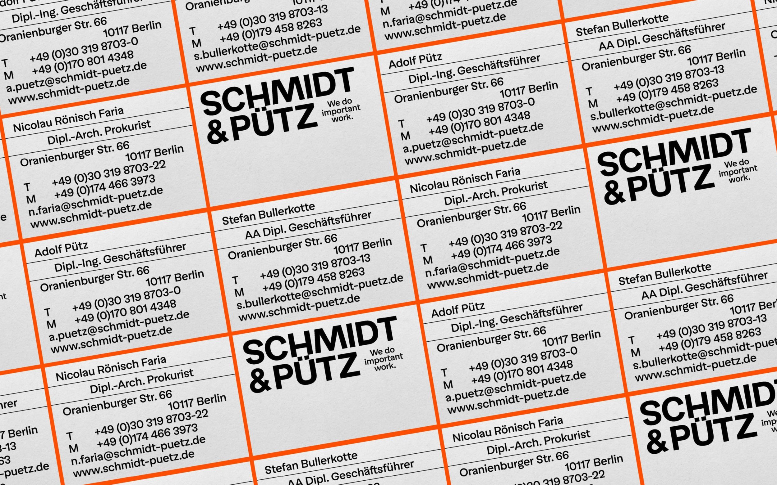
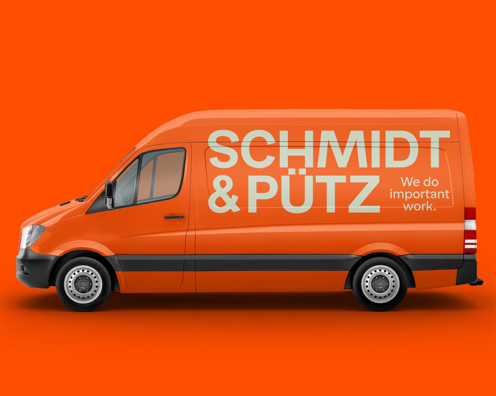
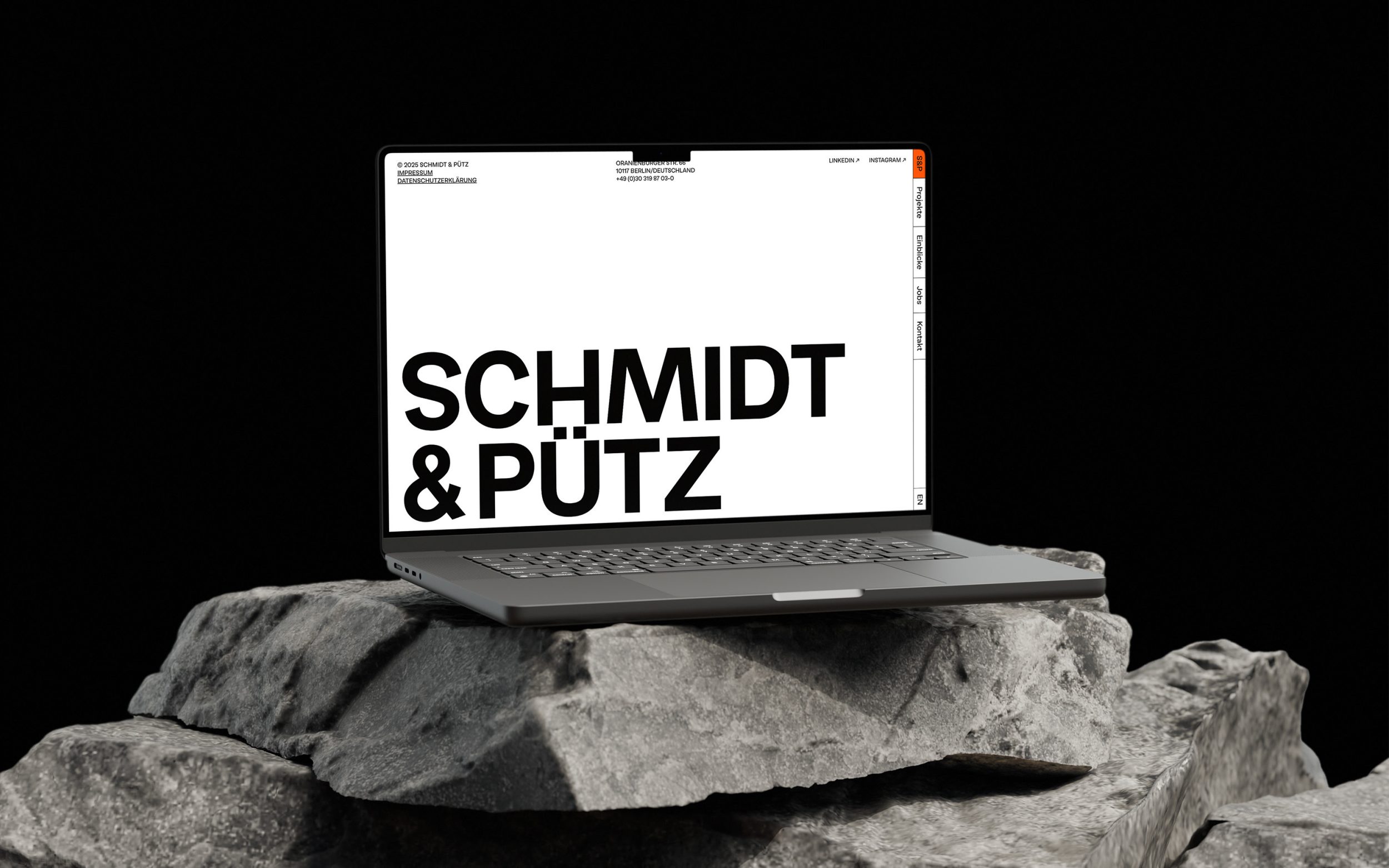
Schmidt & Pütz
Easy Grotesk with its playfully friendly, yet still functional appearance works ideally for the fresh look of the brand and website of Schmidt & Pütz, showcasing their modern and confident approach to high-quality architecture.
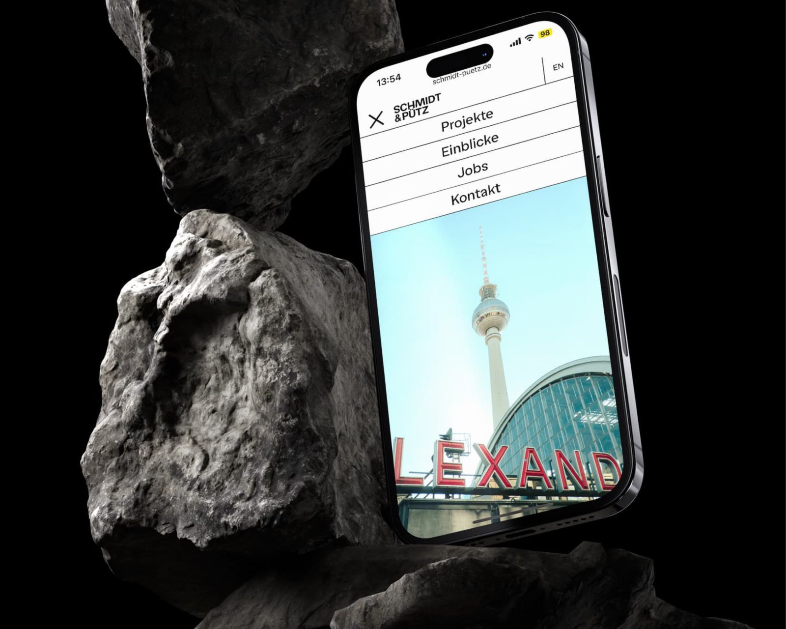
Images by the courtesy of No Pink Studio
Schmidt & Pütz ranks among Germany's most experienced architectural firms, realizing train stations, commercial, cultural, and residential buildings across the country. In close dialogue with clients, they create economically efficient, user-oriented, and architecturally sophisticated buildings. No Pink Studio and David Matos were responsible for the brand concept and design.
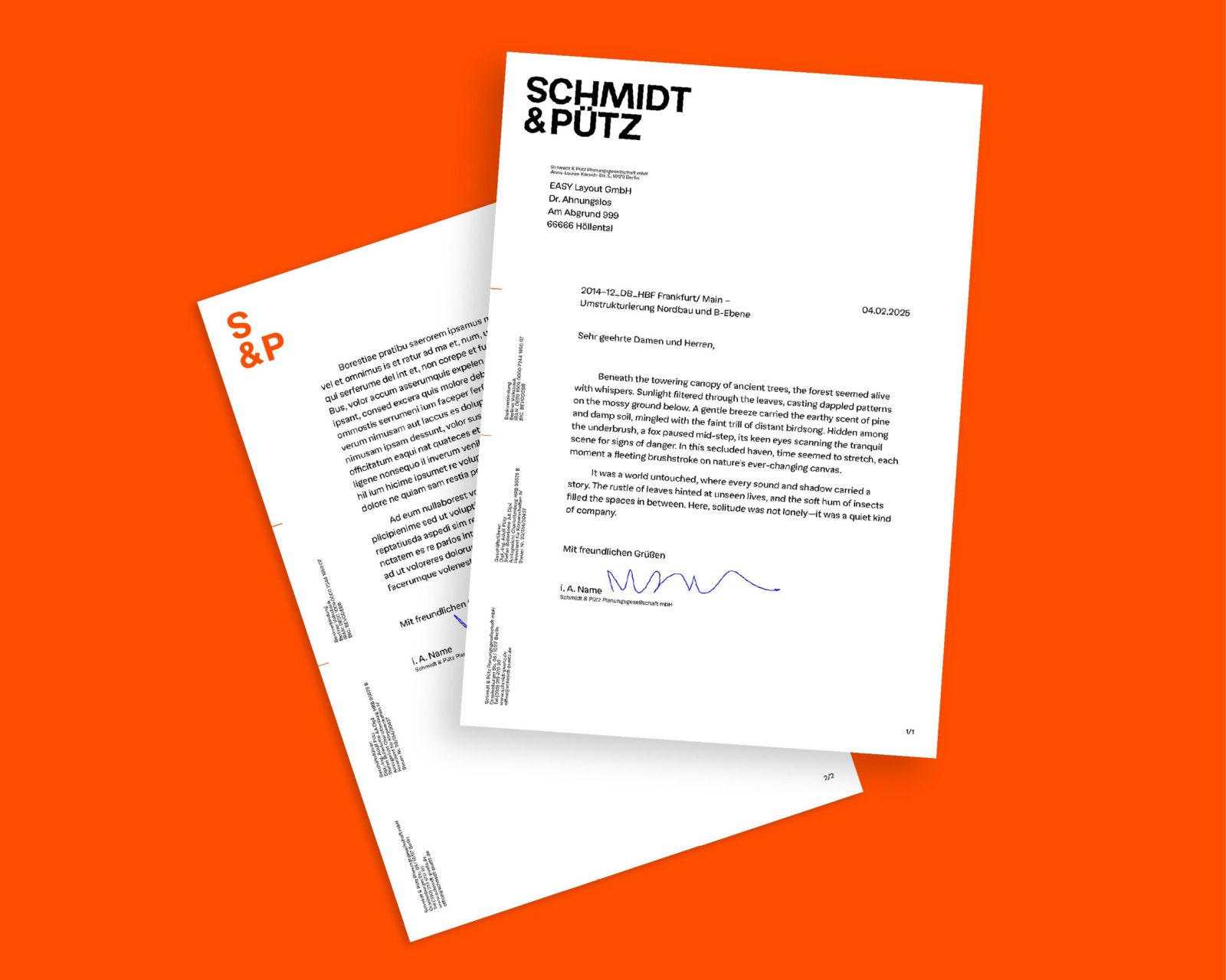
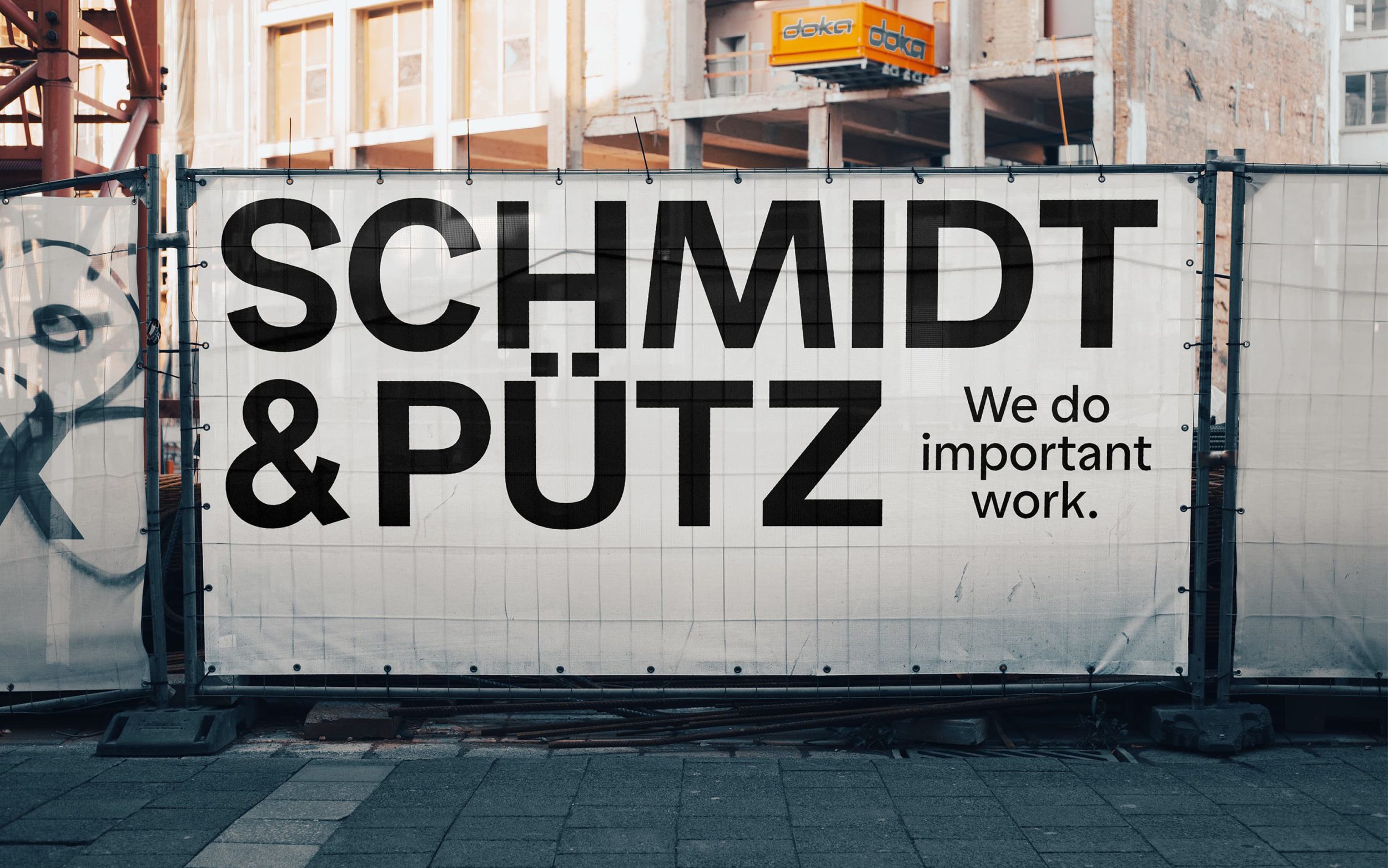
The goal of the design was a strong but quiet visual identity. About their type choice, the Studio writes: “We were looking for a typeface that combines clarity and character without being too dominant. Easy Grotesk felt like a very natural choice in that regard. Precise and structured, yet with a certain softness and openness. It supports the architectural context of the project while simultaneously leaving room for the content.” The confidently clear character of Easy Grotesk ideally underscores Schmidt & Pütz's working method and, through its playful qualities, reflects diversity in competence and a modern mindset. The unmistakably distinctive forms of Easy Grotesk enable its use on the website and in print, and served as the basis for the custom company logo, therefore decisively shaping the brand's language.