A Typographic Collaboration With Teja Smrekar
Based on writing tools, Grato Marker is an authentic, casual companion to Grato Grotesk and Classic. Here’s how Teja Smrekar combined handwritten expression with geometry:
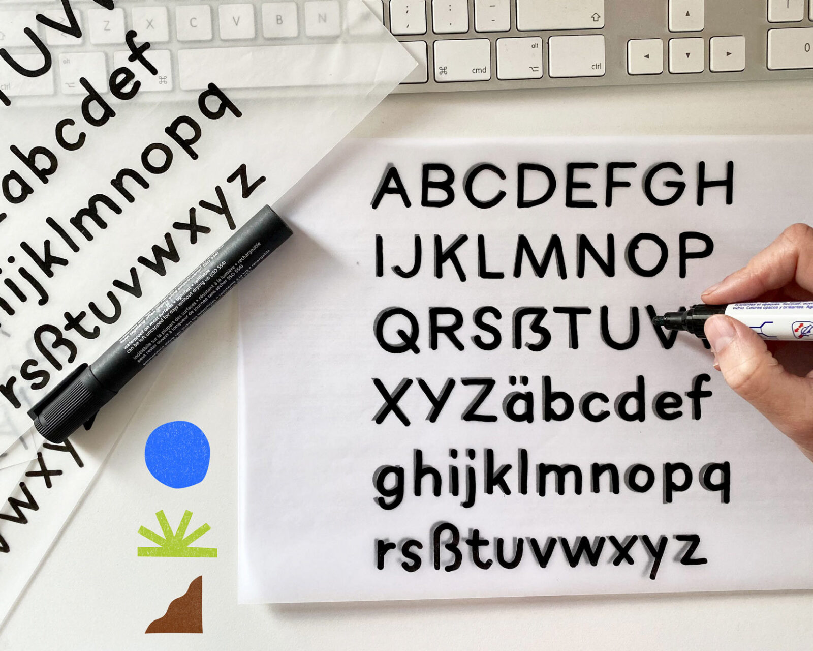
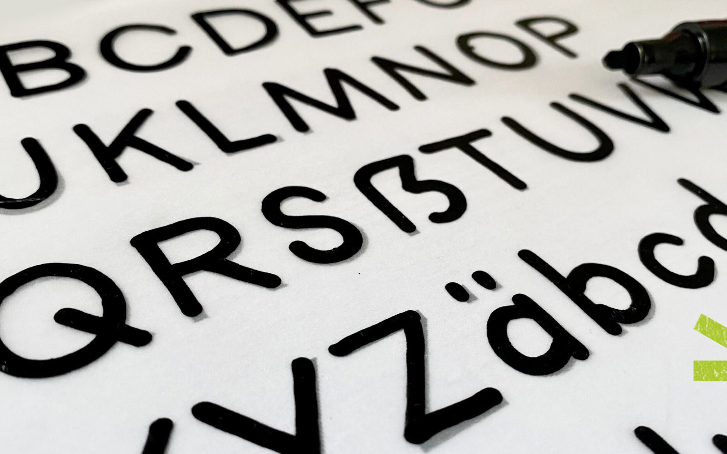
Crafting handmade typefaces is a big passion of mine. When Jakob invited me to collaborate on the Grato Marker project I felt super excited to put my hands to work on it.
In bringing his vision of a hand-made Grato to life, Jakob was the typographic conductor and I was the lead violin in typo orchestra, focussing on craftsmanship and setting the tone for the family.
We kicked off the project with an exploration workshop. Our intention was to find the most suitable writing tool for the task. We considered two methods:
Method 1: Writing Tools Such as Markers and Pens
I started by exploring manual writing tools and their interaction with different sorts of paper. I researched variables such as speed, pressure and the intensity of ink flow.
A couple of questions came up during the process. How “smooth or rough” should the letters be? How much contrast should they have? Should we keep straight lines or make them more wiggly? But those were the easy questions to answer. The challenging part was translating the gestures from one medium to another. In the move from analogue to digital how should we preserve the essence of the form?

Analog handwritten pen, its vectorised output and not satisfying final look and feel.
Method 2: Direct Digital Writing
Exploring direct digital writing I tested two options: writing with pen pressure and without it. It was obvious the version with a pen pressure worked better because it better resembled actual writing.
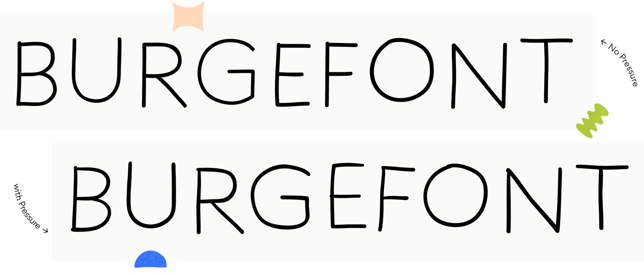
Digital pen without slight modulation in stroke (right) and with more authentic modulation (left).
In the end we decided to choose digital writing with pen pressure as a method for creating the typeface family. It was more convenient and it produced results closer to the look we had in mind.
Interpolation Odyssey
In the beginning, I wrote several variations of a single glyph in Illustrator. After picking the most appropriate one, I placed it in the font editing program.
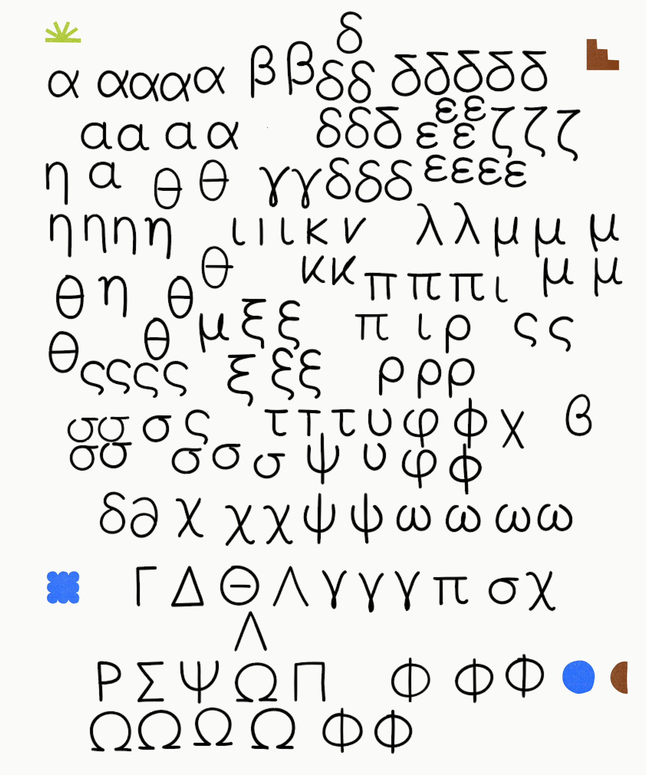
Expanding variants to choose the optimum.
One of the key priorities was to design an interpolatable non-connected hand-drawn typeface. With that in mind I started with the light weight. The Light was less challenging to write than the bold I added later and between the two I interpolated Regular and Medium weight.
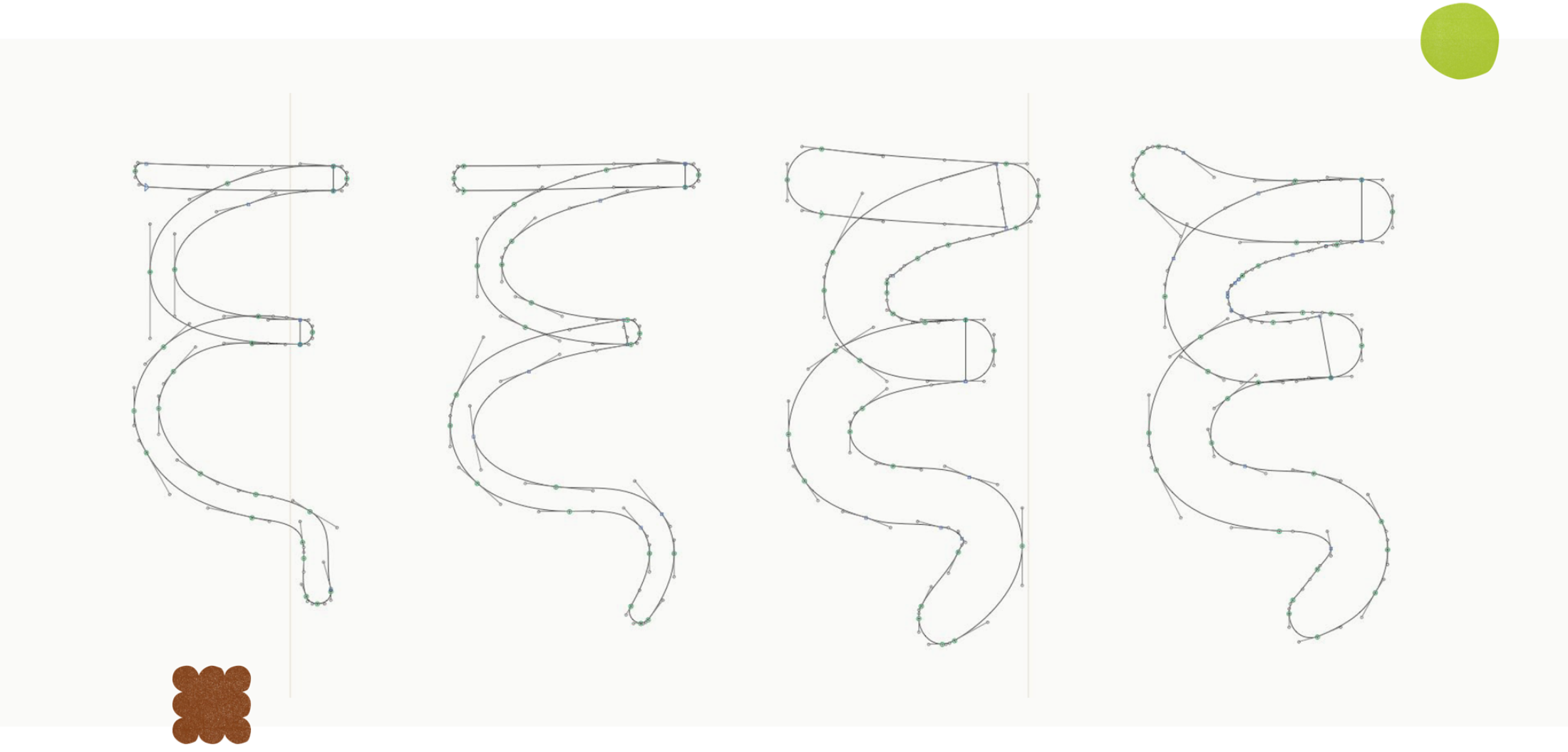
Cleaning up for interpolation.
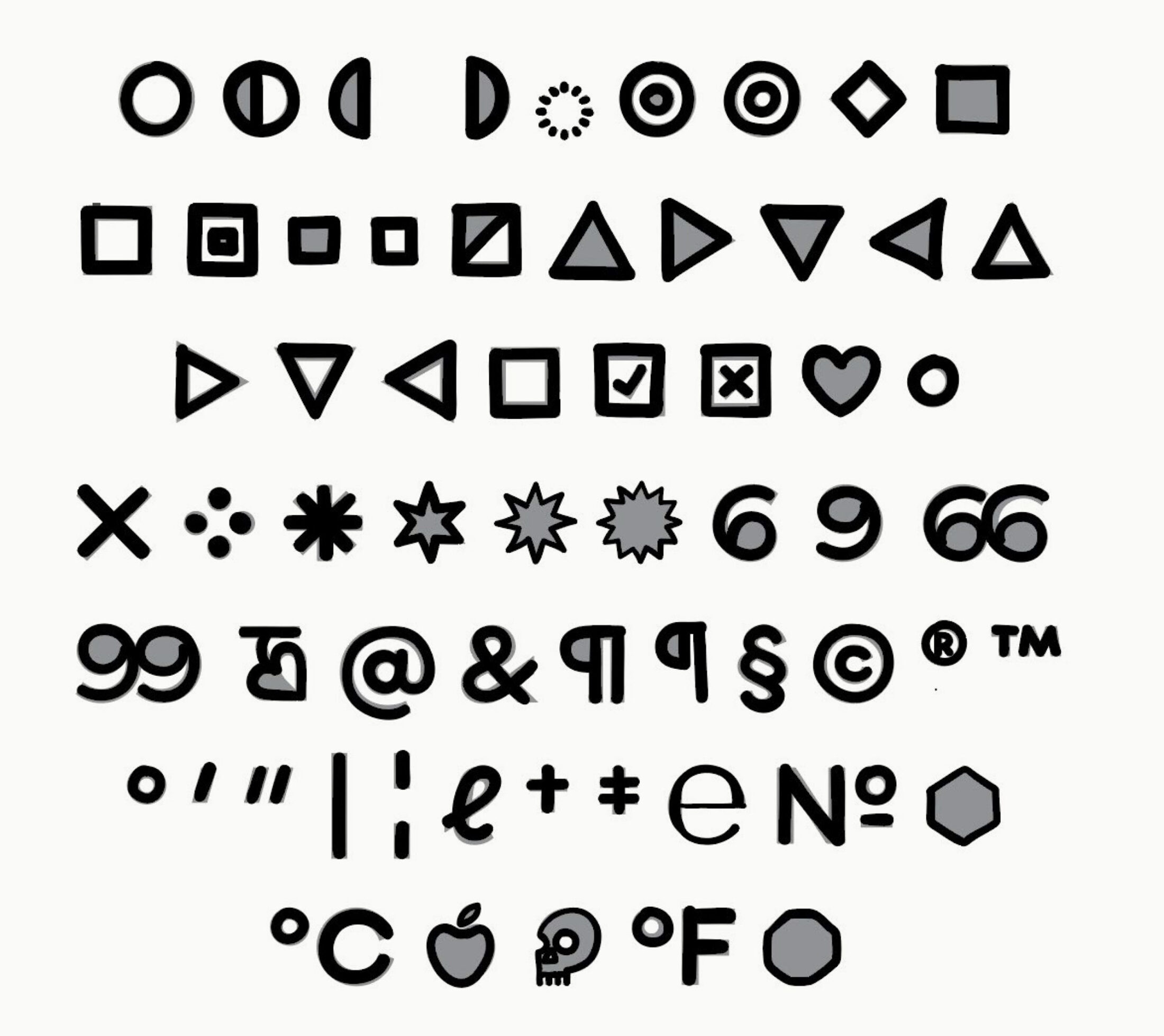
The most laborious part was sorting out the points between the masters. As you know, a typeface isn’t only a-z: there are numerals, symbols etc. Keeping that in mind I had to sort out more than 1,000 glyphs per master. I couldn’t say one glyph was particularly difficult to make compatible. It was the fact that there were so many to sort out. And many many points. Ugh, that was something!
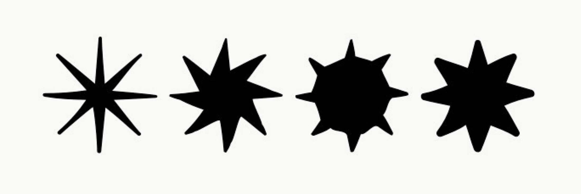
Happy accident while interpolating.
Display Yet Pan-European
As Grato Geometric Suite has an extended pan-European language support, we decided the Marker version should have it as well. It’s not common for display sizes to have an extended glyph set, but Grato Marker works surprisingly well in text sizes too!
For the Cyrillic and Greek parts Irene Vlachou and Ilya Ruderman were a great support. Their comments on the handwriting ductus were the best advice I could get. It helped a lot because we achieved better balance and more meaningful proportions.
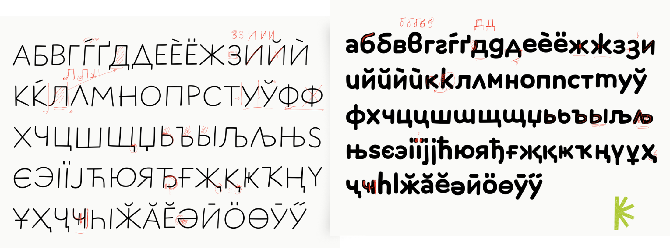
Ilya’s advice on how to tweak the design for better Cyrillics.
Final Thoughts
My favourite letter in the Grato Marker family is the Greek alpha. It has a nice handwritten flow and stability that comes from the geometric influence.
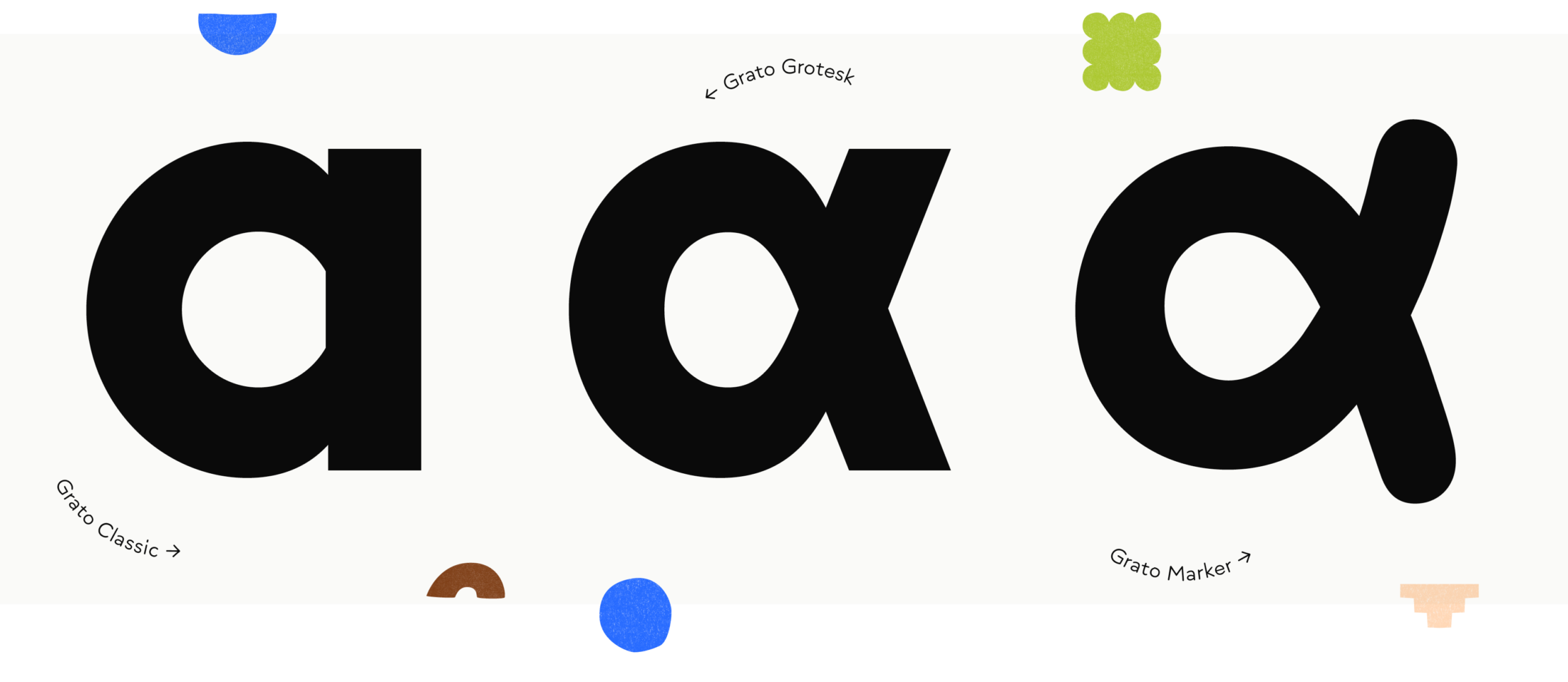
The Greek alpha in Grato Classic, Grato Grotesk and Grato Marker.
One day I would love to walk in a food store and see Grato Marker being used on packaging. I could imagine it on a Greek yoghurt, on a cereal box or in a store catalogue. It could be used in combination with Grato’s Geometric Suite or any other typeface that requires a companion with a hand-made flavour.
Being the first violin in the typo orchestra was a rewarding experience with a steep learning curve. We combined our skills and transformed them into a harmonious and pleasant concert.
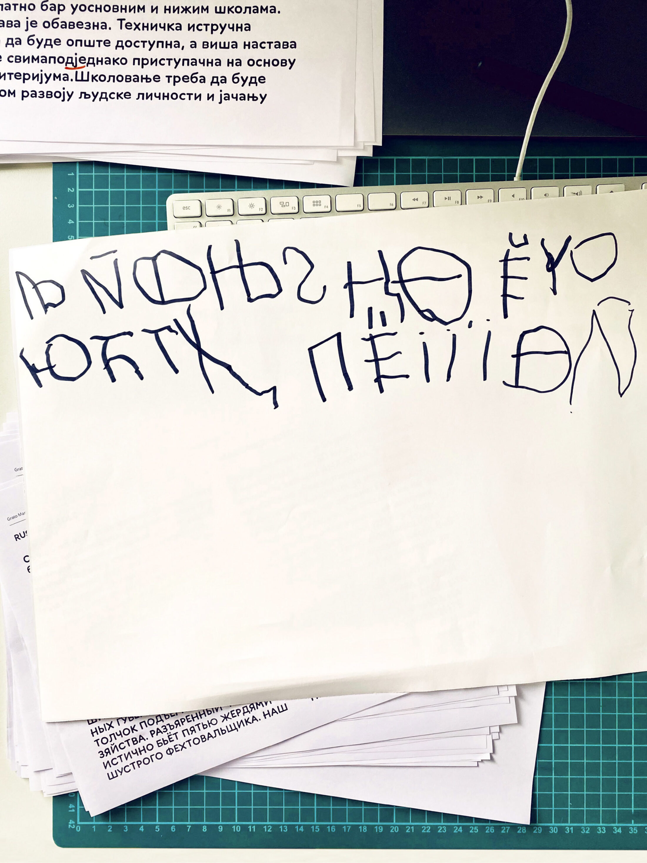
Fortunately it was not Jakob who drew. (to be honest, this Jakob here is a junior school child)