All About Variation
United by graphic simplicity, confident in typographic complexity, Grato and Gratimo are four type families organised into two subfamilies. Along with a sneak peek at a future addition, here’s how they connect and contrast.
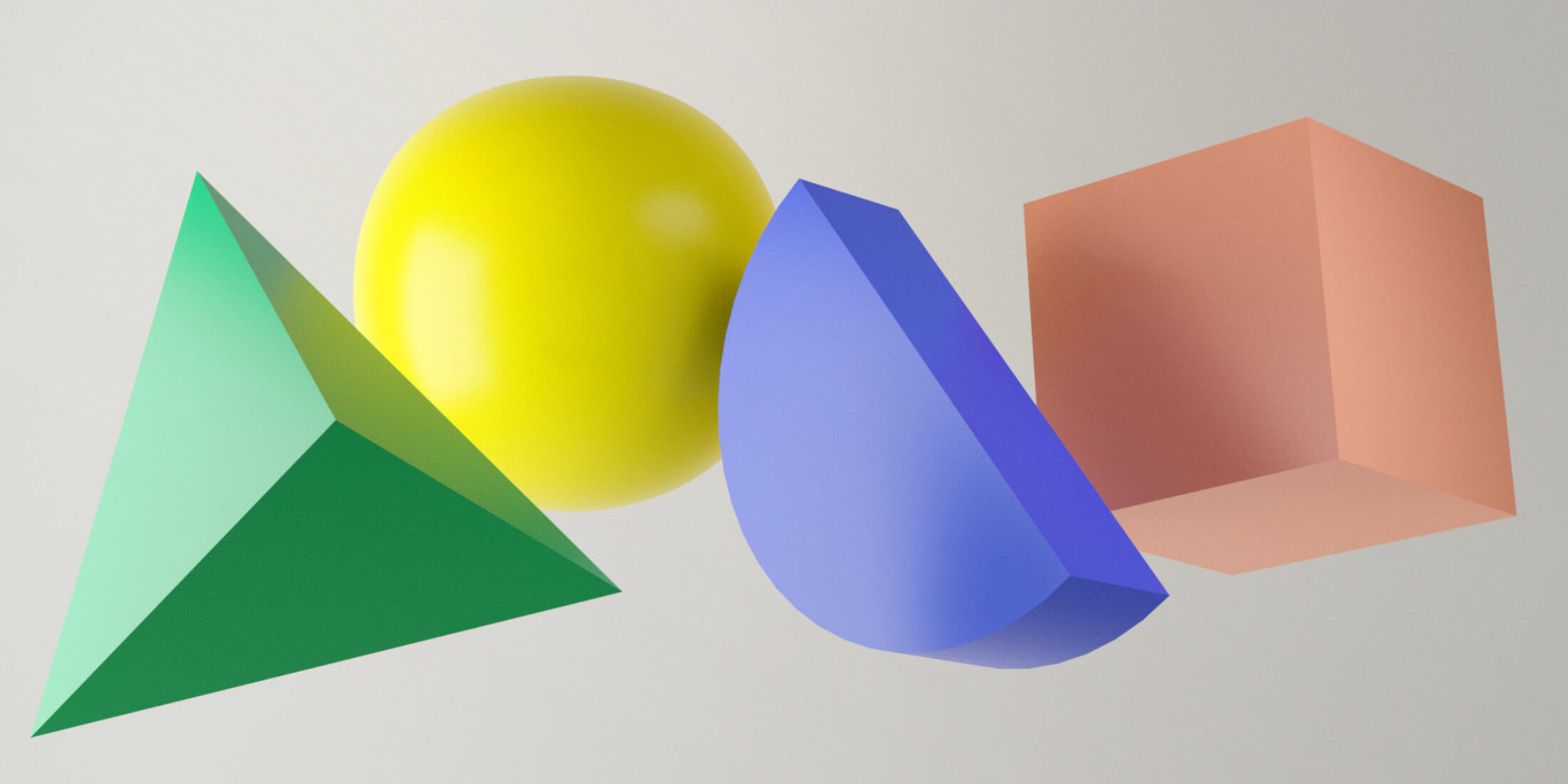
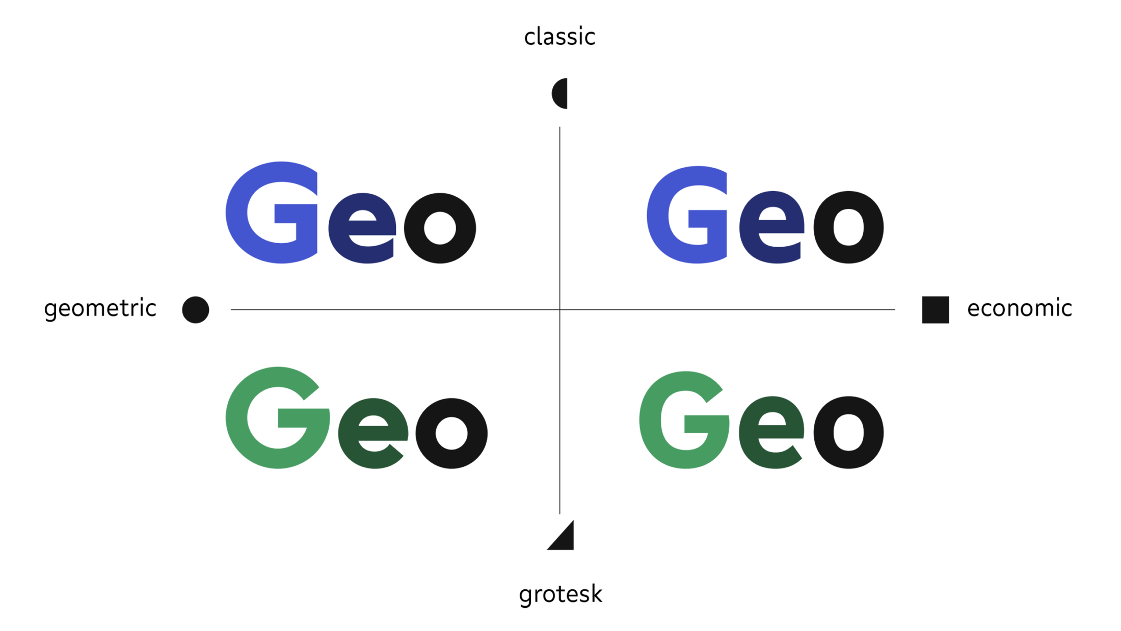
Grato’s geometric core is the starting point for all the families. Varied by two stylistic choices— changes to the cut of terminals and proportions of the uppercase letters— that core makes a Grotesk and a Classic. For more efficient and utilitarian work, they were redrawn for text and interface: Gratimo Grotesk and Gratimo Classic.
Let’s take a close look at the details that bring the typefaces to life and the idea behind the extra legible subfamilies.
Dizygotic Twins
Developed simultaneously, Grotesk and Classic have many glyphs in common, but variations in key letterforms mean they belong to different genres. As a result, the stylistic variants are split into two independent typefaces.
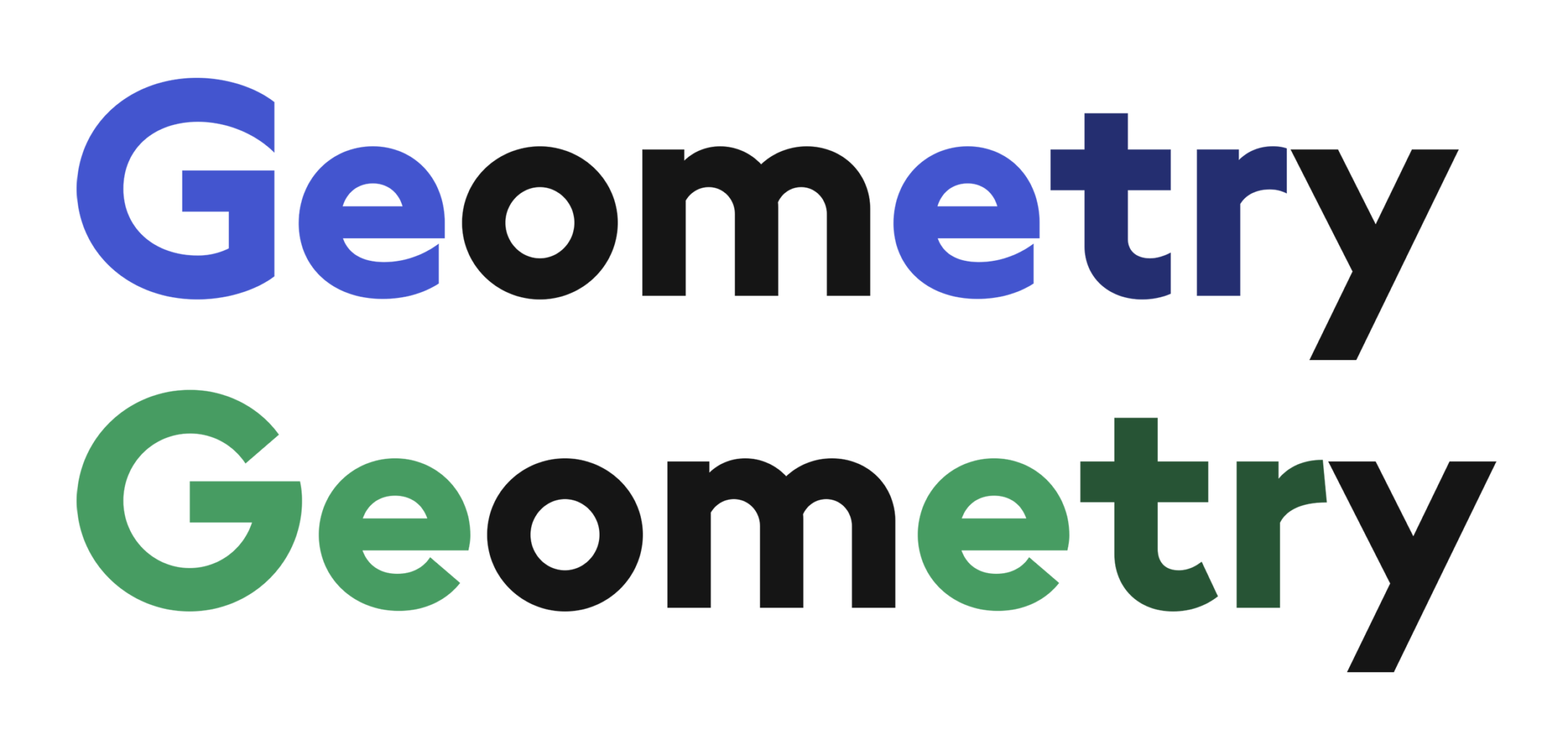
Single letters can change the genre from Classic to Grotesk.
The Classic and Grotesk differ in two main aspects: the cut of terminals and proportions of uppercase letters.
Rhythm and Proportion
Edward Johnston’s London Underground (1916) and Paul Renner’s Futura (1927) base their uppercase letters on classical Roman capital proportions. Their construction falls in line with the proportions of circles, squares and rectangles.
That approach inspired Grato Classic. The variation of wide and narrow capitals gives tension and evokes the elegant serif typefaces of the renaissance.

Grato Classic pursues the classical proportions of early British geometric typefaces like Johnston’s Alphabet.
Decades later, the proportions of sans serif capitals were rationalised on a different, mechanical basis resulting in wide, even letter shapes. As a result, Grato Grotesk is reminiscent of typefaces like rationalised Akzidenz Grotesk (1898) by possibly Ferdinand Theinhardt and neo-grotesque from the 30s.
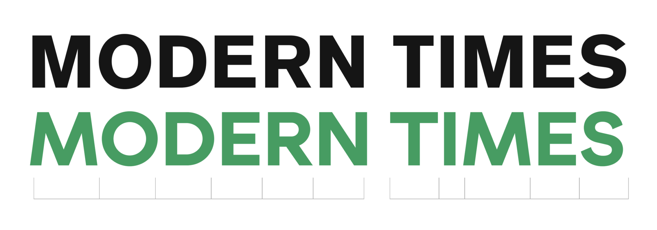
Grato Grotesk pursues the industrial logic of early German typefaces like Akzidenz Grotesk.
Terminals Change a Lot
The scumbag Eric Gill is credited with improving on Edward Johnston’s 1916 type for the London Underground with his typeface Gill Sans (1928). In its uppercase proportions and open apertures, the Classic draws inspiration from early British sans serifs like these. (By the way, those flat terminals make tight typesetting easy.)
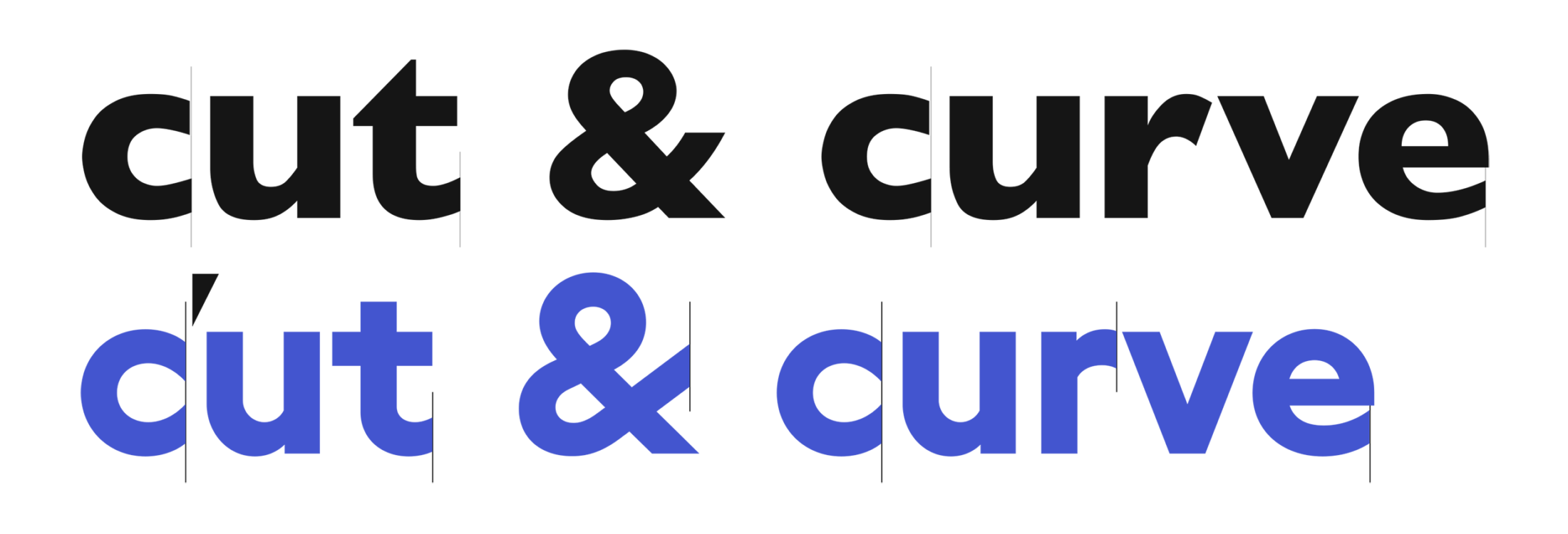
Grato Classic features sharply cut terminals as Gill Sans does.
As with Wilhelm Pischner’s Neuzeit Grotesk (1932) and Arno Drescher’s Super Grotesk (1930–38), curvilinear terminals with angled shears can be found giving a warm, friendly voice to text in Grato Grotesk.
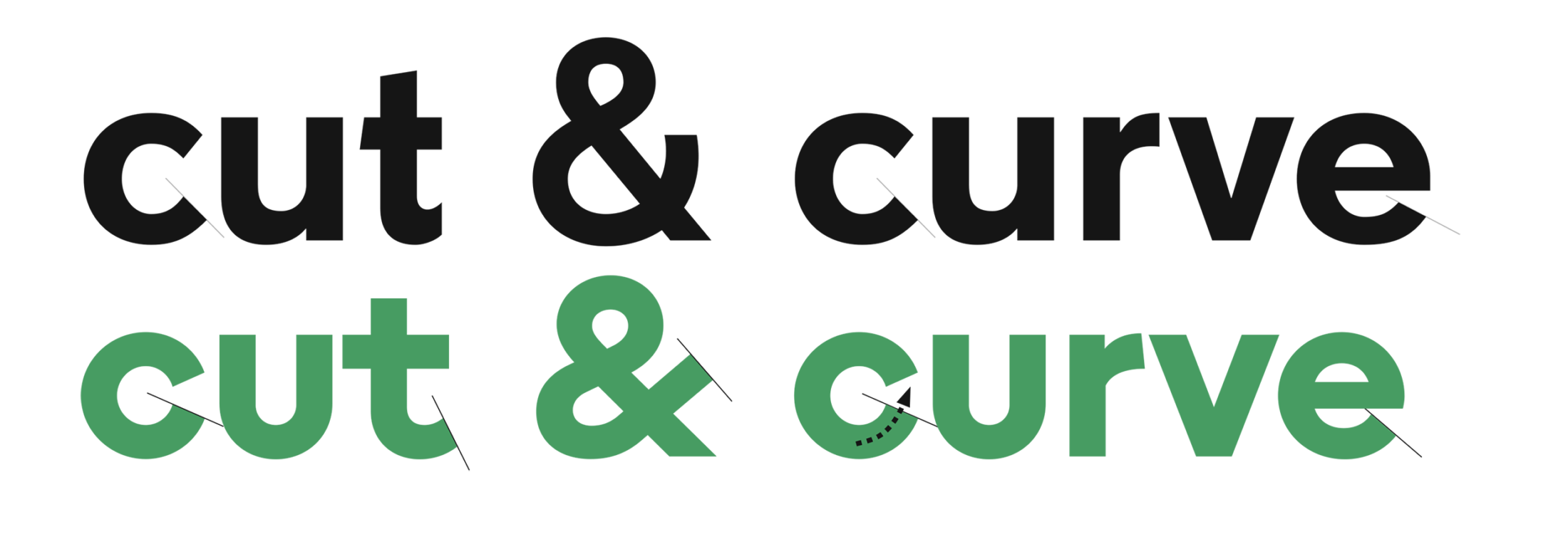
Curvilinear terminals in Grato Grotesk and Super Grotesk.
In a nutshell: the two type families have no real relationship to each other anymore. It’s their development and love of geometry that connects them.
Two More Variants for Readability
Unmistakable geometrics, the benefits Grato Classic and Grotesk bring to branding and display can be drawbacks in other contexts. So, to ensure the best performance in any context, two additional subfamilies are available: Gratimo Classic and Grotesk.

Makes it two families, each with Display and Text subfamilies. Four in total.
Redrawn for reading, fine-tuned and modulated for more rational communication, these optical size variants are improved for extended text and interface typography.
The most obvious change is that the circular o is gone. With a larger x-height, more open spacing and economic forms, the almost geometric letter has become modern, rational.
Increasing the x-height also enlarges the counters, necessary for reading text in small sizes. With the lowercase enlarged, the uppercase is proportionally smaller, making initials less dramatic and allowing the reader to focus on the majority-lowercase text. The more generous spacing helps ensure letters are recognisable and more economic forms ensure that wider spacing doesn’t result in greater line length.
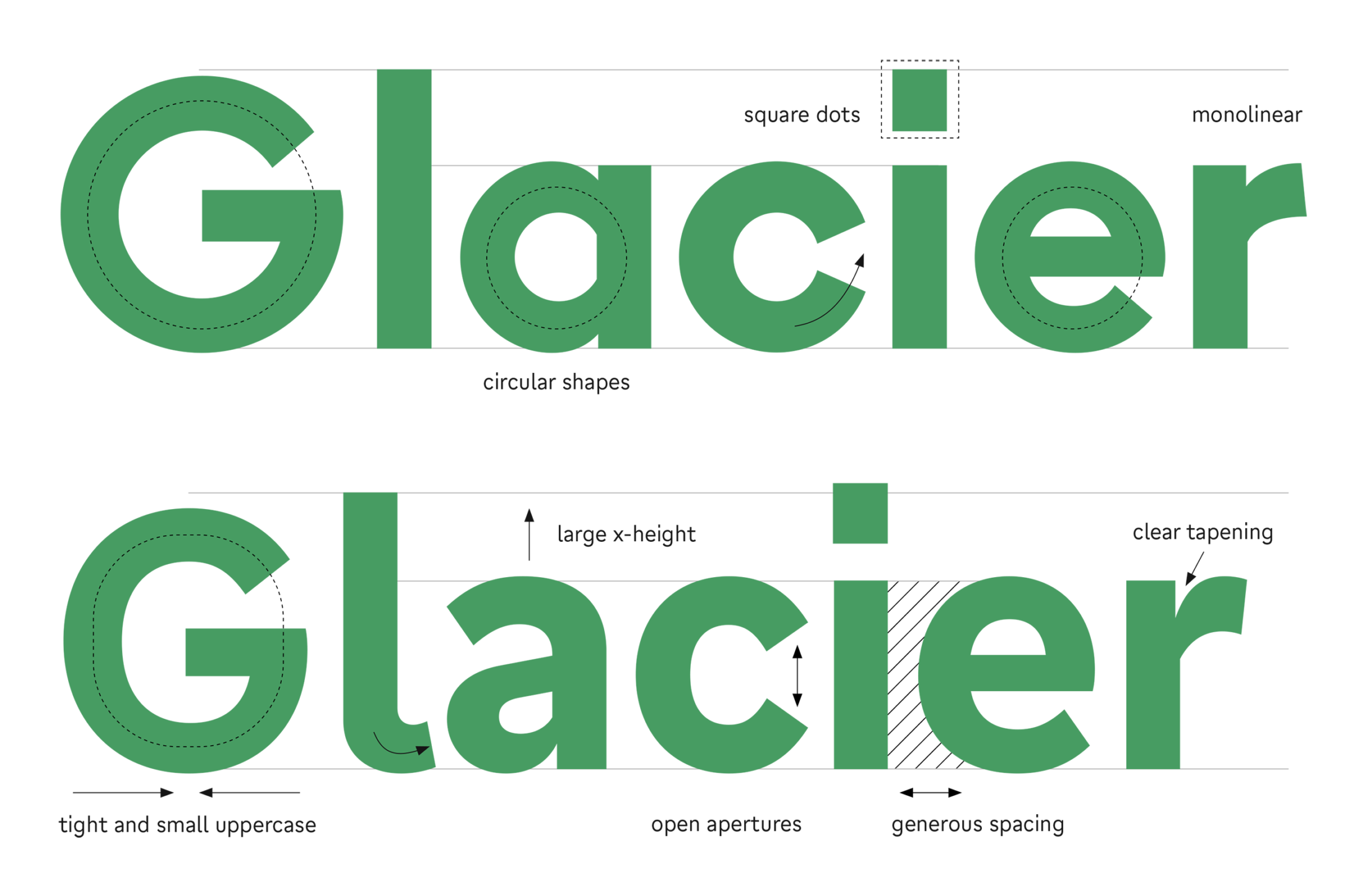
Where Grato revels in pure geometry, Gratimo has a practical focus.
Grato focuses on elemental glyph skeletons and its Stylistic Set#02 goes even further. By contrast, the Gratimo families favour more tailed, easy-to-recognise shapes, with a different look and feel: shifting their classification closer towards the humanist sans category.
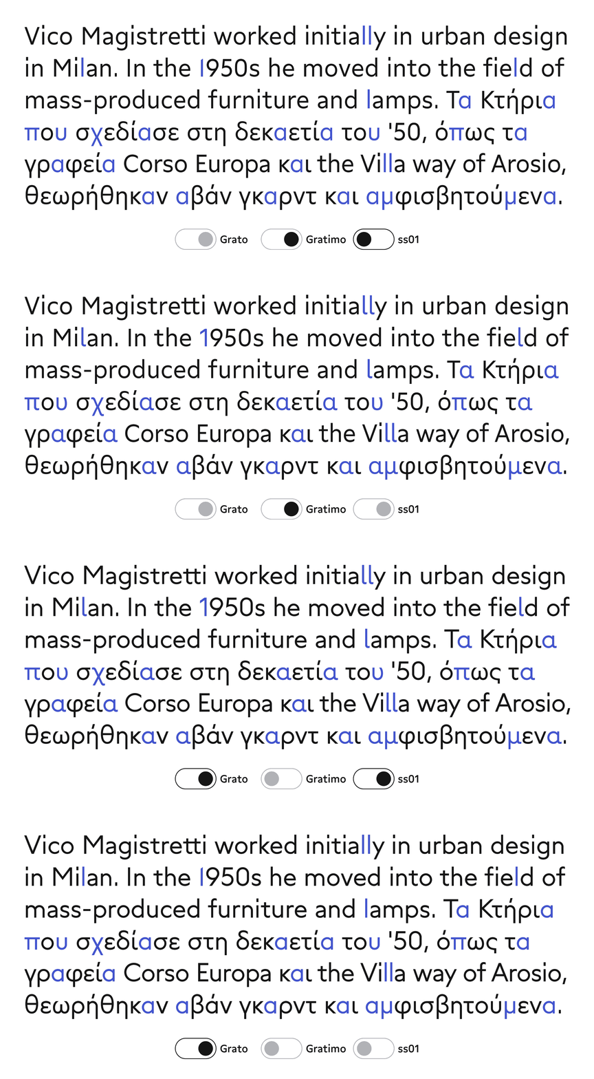
Each family —whether original or text variant— provides all forms to toggle in, but what is default is different (and more appropriate to intended usage).
Further fine-tuning differentiates Gratimo from Grato. To respect conventions the reader’s eye expects, Gratimo has stronger stroke contrast and tapering, better balancing grey value and the texture of text
And its apertures are more open —particularly in the Grotesk— preventing lettershapes from blending to illegibility.
Further, Gratimo’s weight spectrum is more compact, skipping Hairline and Ultra Black, to focus on reading sizes. For typographic variance and greater emphasis, its weights are completed by matching italics.
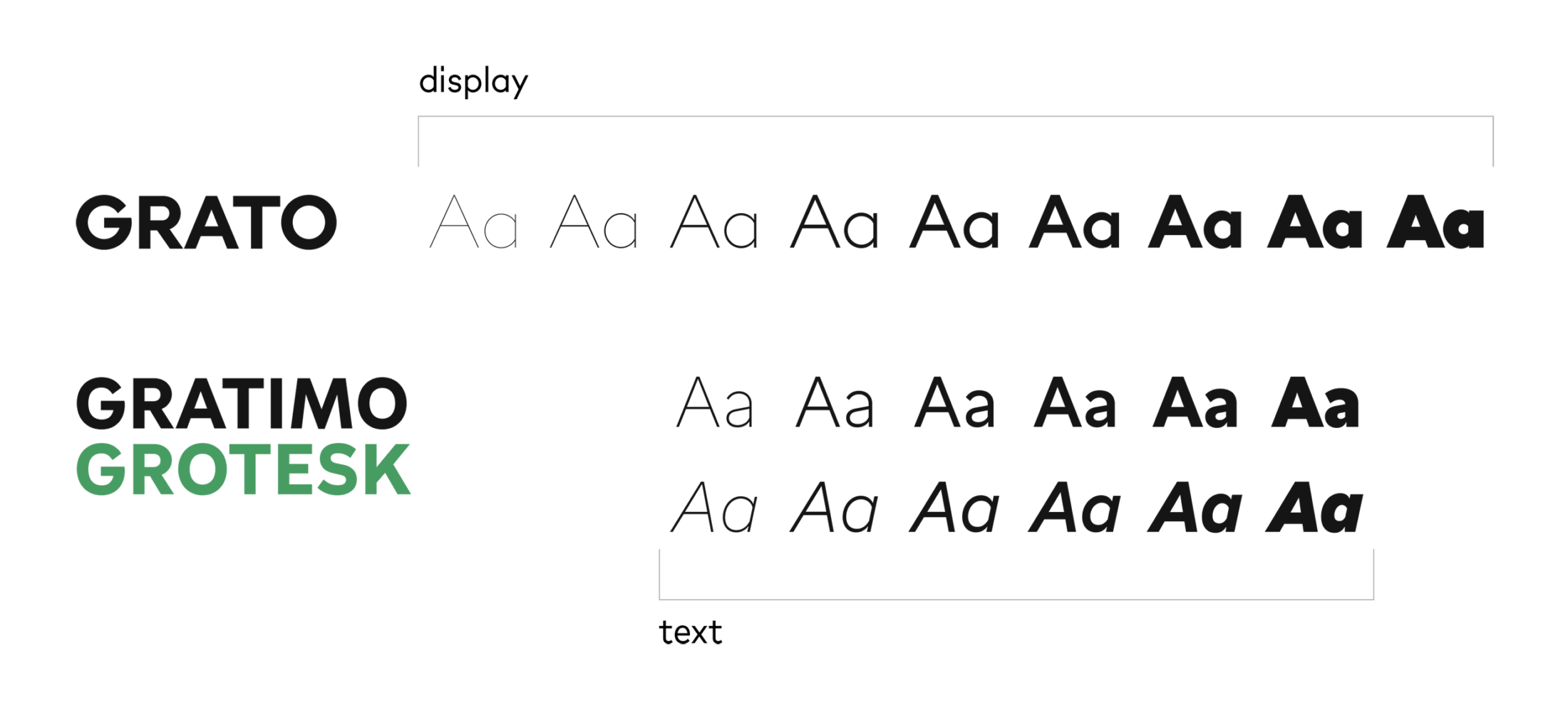
Grato features 9 extreme weights, Gratimo 6 weights for text sizes plus Italics.
To cut a long story short, Gratimo features a whole series of tweaks to adapt the raw build of Grato for a legible and economic texture.
One for All, All for One
No linearly derived optical sizes, the text variants are true stand-alone typefaces. This makes the superfamily more complex and more versatile: Grato Grotesk and Gratimo Grotesk tell the same story, but use different words for different audiences. So, too, Grato Classic and Gratimo Classic: from a different universe, they speak in a slightly different voice for small and large sizes.
And they’re all united in support of languages beyond Latin. The experience of Cera Pro, whose boldly simplified geometric Greek and Cyrillic was readily adopted by native readers and our extensive work with expert consultants means there is no doubt that Grato and Gratimo respect every script they support.
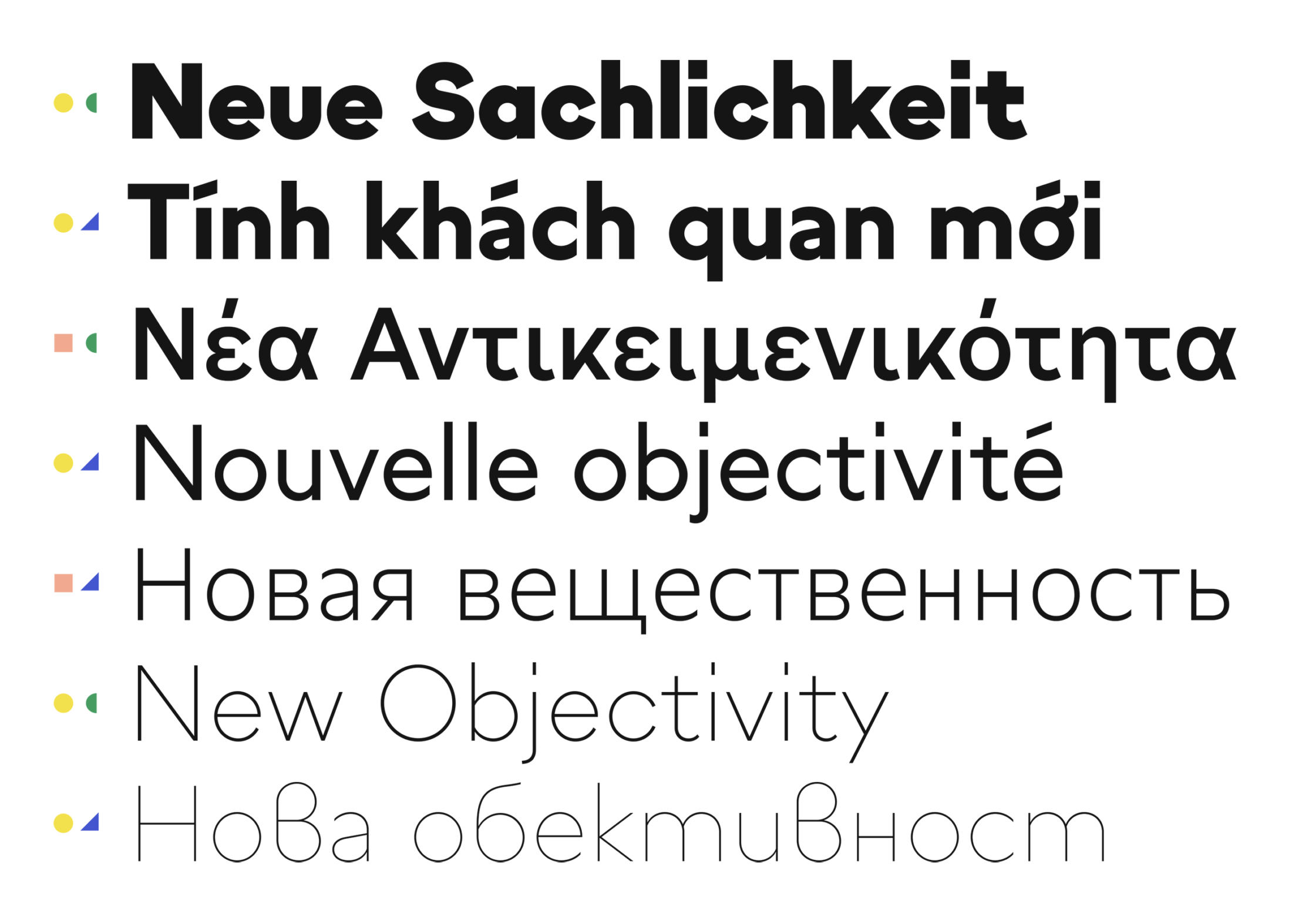
Including Vietnamese, both Grato and Gratimo support more than 270 languages across the Greek, Cyrillic and Latin alphabets.
That’s it, the story of four stylistically connected type families, organised into two subfamilies, and how they connect and contrast. Now give them a free test drive on your Desktop:
More to Come
With the help of Teja Smrekar, another useful addition is in the making: Grato Marker is the expressive, rounded and handwritten variant of Grato Grotesk and Classic!
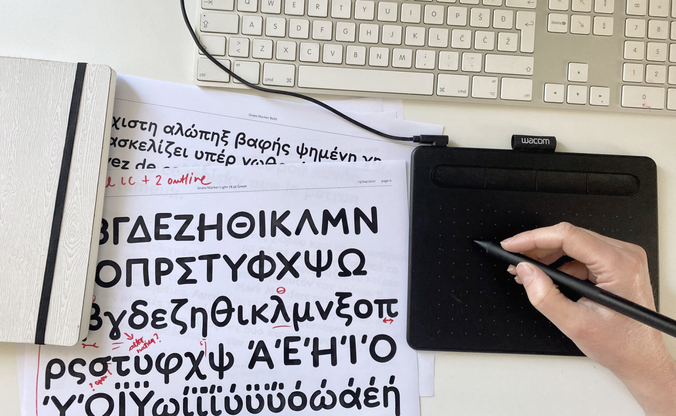
Teja is really into using tools to extend the geometric collection with more expression, personality and typographic hierarchy. With Grato Marker, a powerhouse of clear, readable typography welcomes a new, playful and natural voice.