ICON Papers
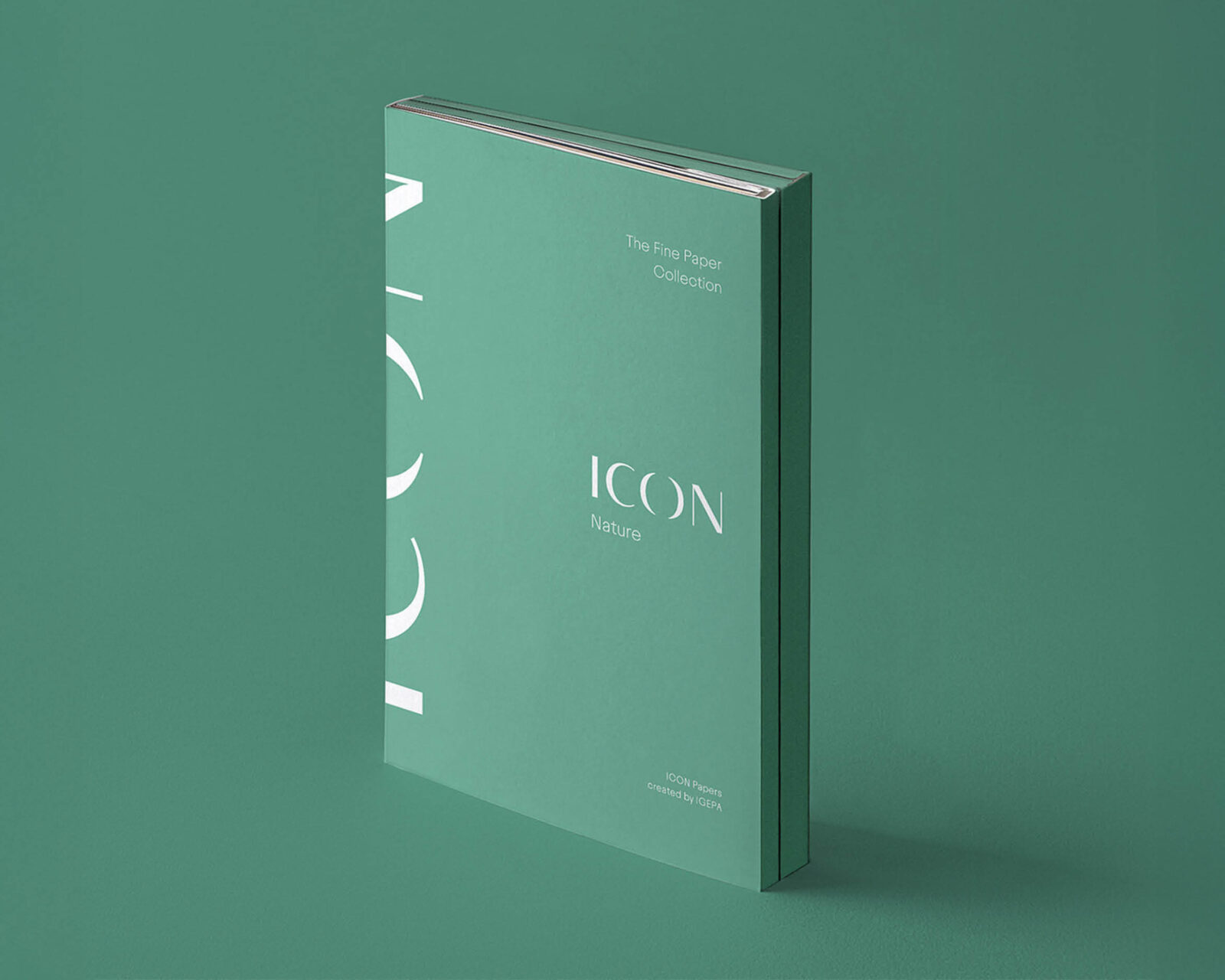
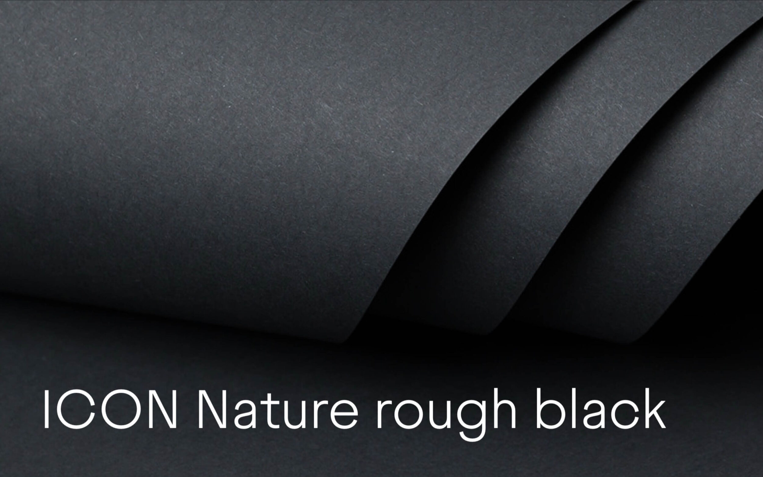
In the branding of the ICON Papers collection, Juneau conveys precisely the versatility and reliability that IGEPA's design and fine papers stand for.
Images by the courtesy by IGEPA
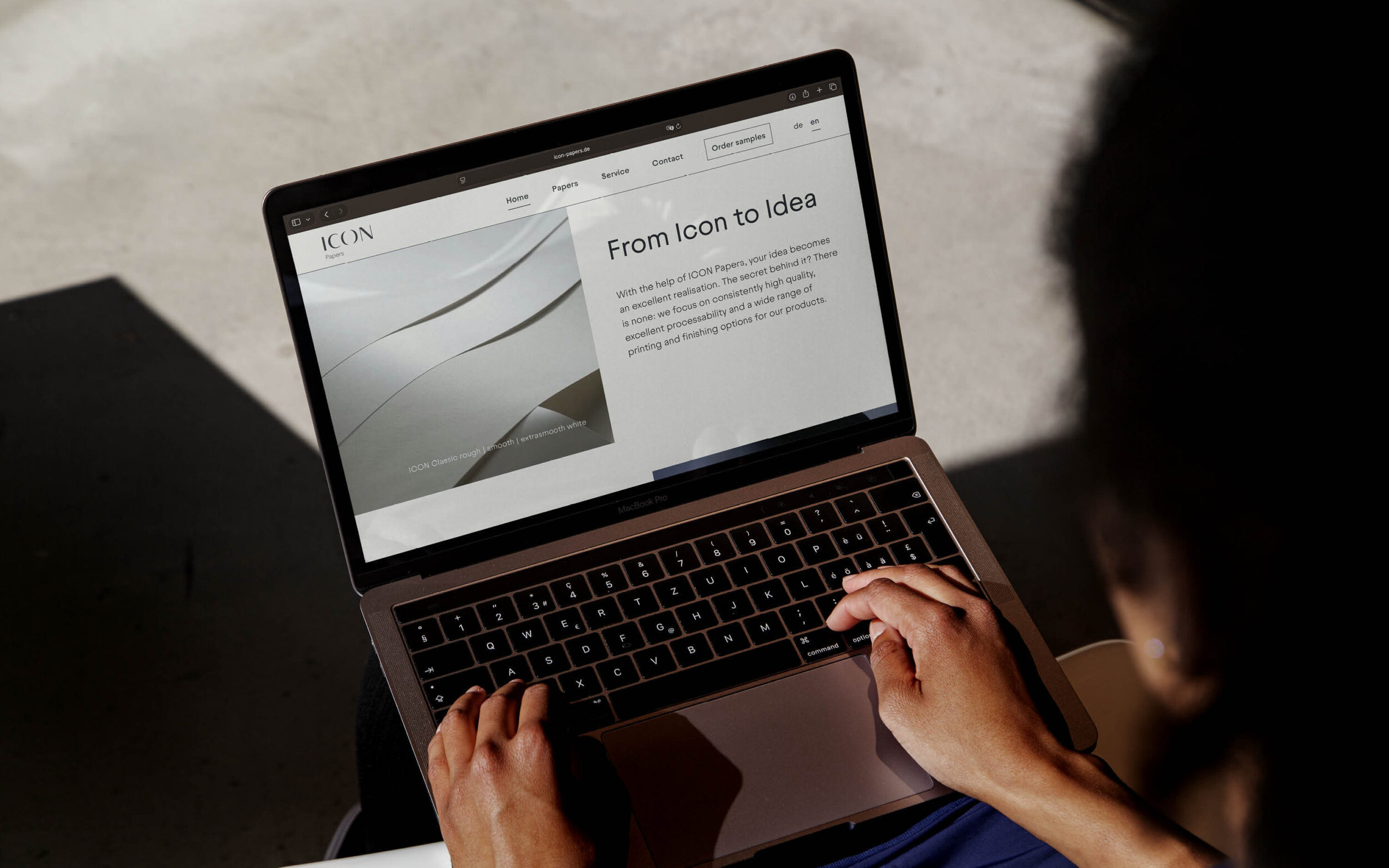
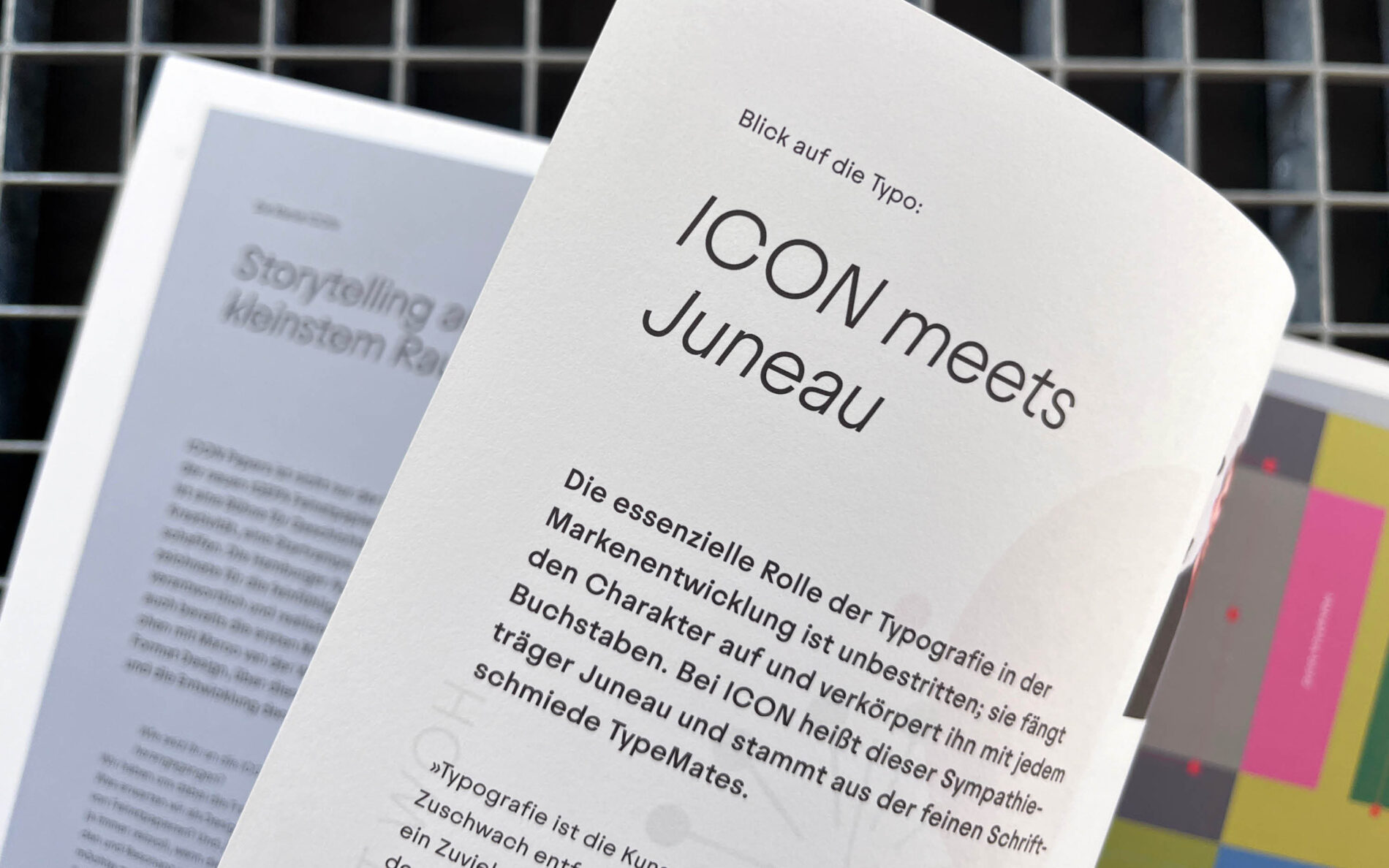
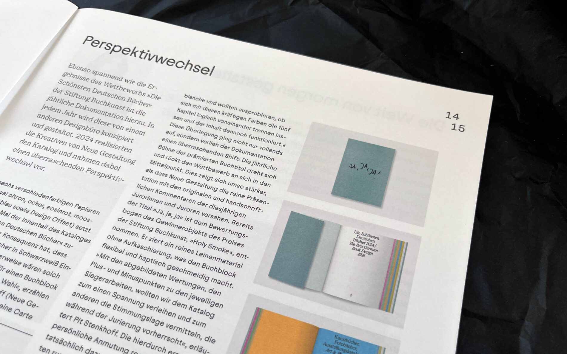
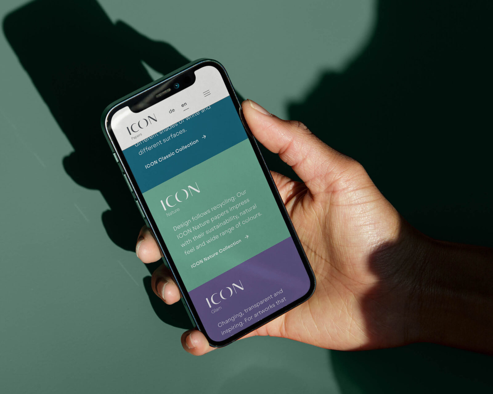
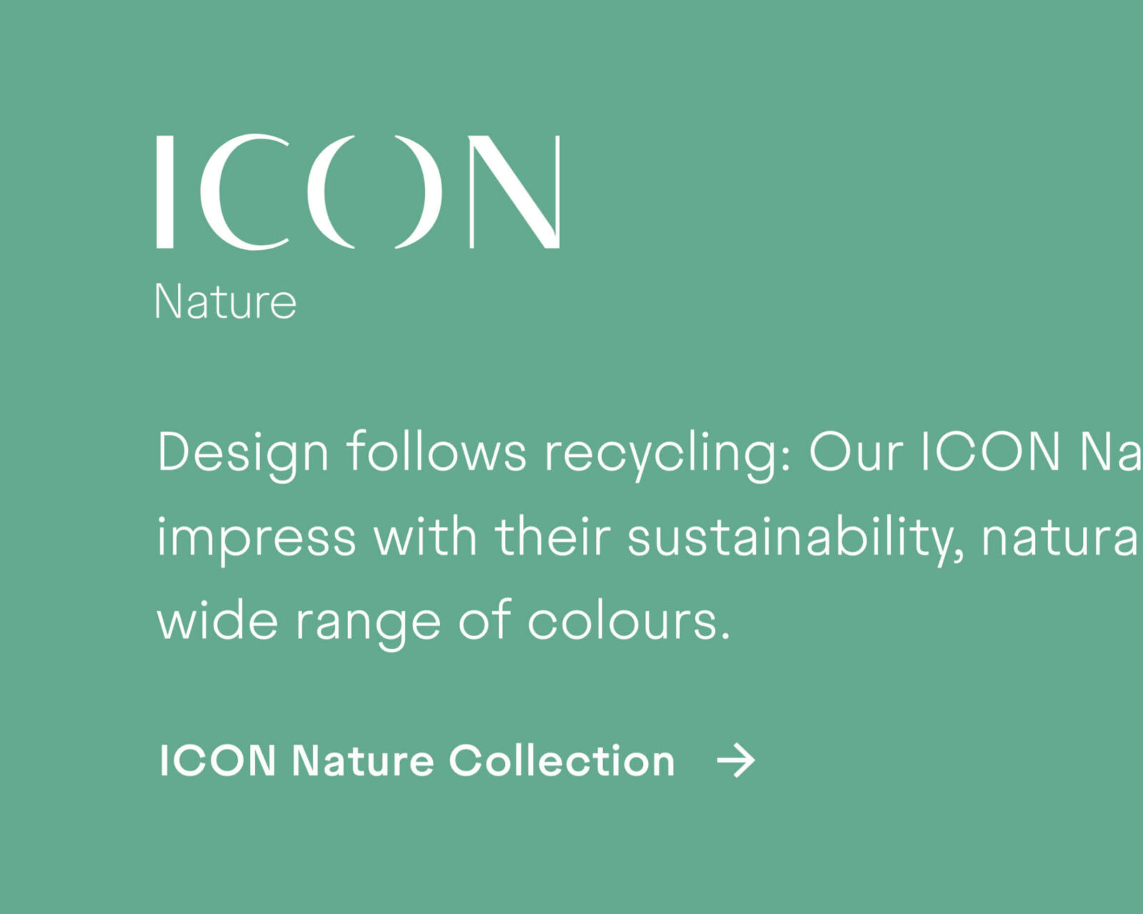
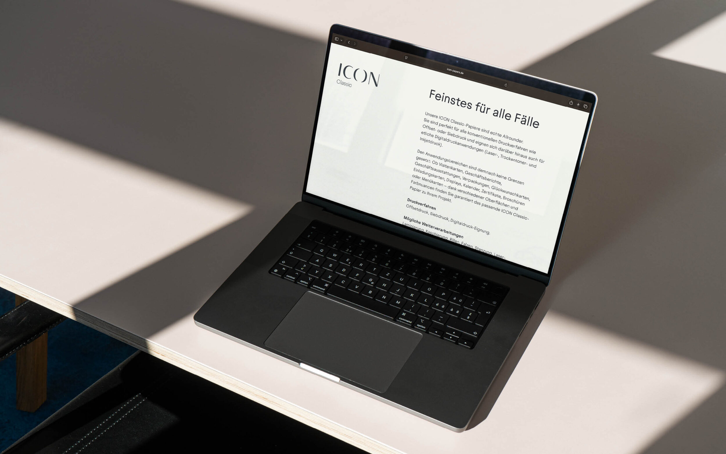
For the branding of ICON Papers created by IGEPA, Format Design chose the Juneau typeface family. It serves as a typographic all-rounder throughout the entire corporate design (with the exception of the wordmark).
The ICON Papers collection brings together a diverse range of design and fine papers that convince through consistently high quality and versatile applicability. Juneau is similarly broad in scope: with 16 weights from thin to black plus italics, opentype features and stylistic sets, it performs confidently in body text as well as display sizes.
Its design unites seemingly contradictory characteristics: it is geometrically constructed while simultaneously inspired by historical metal type grotesques. Through circular forms, economical proportions, and wide-open terminals, it appears both modern and classic, friendly yet serious. This formal ambivalence reinforces the positioning of the ICON Papers collection as reliable all-rounders with high quality and character.
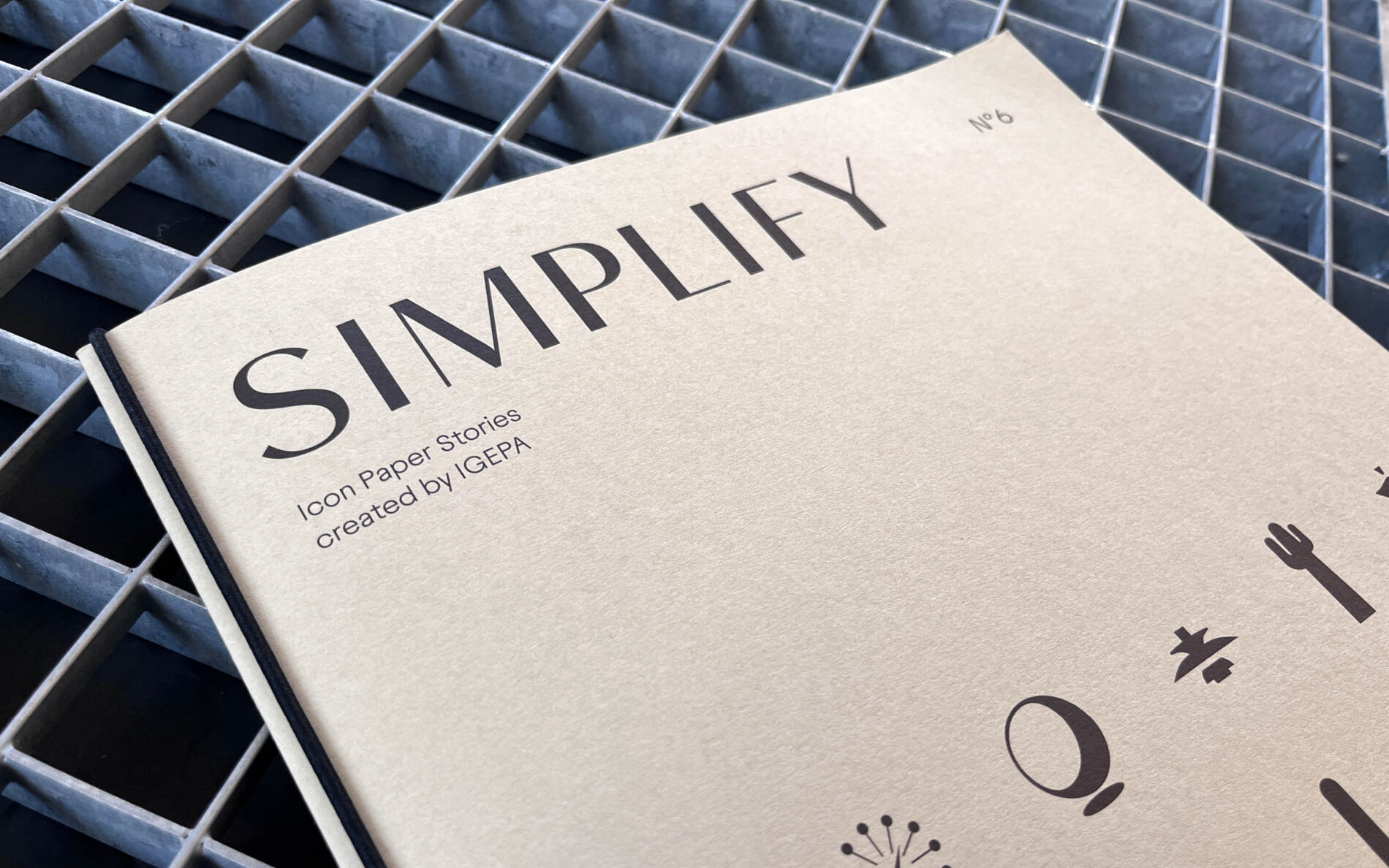
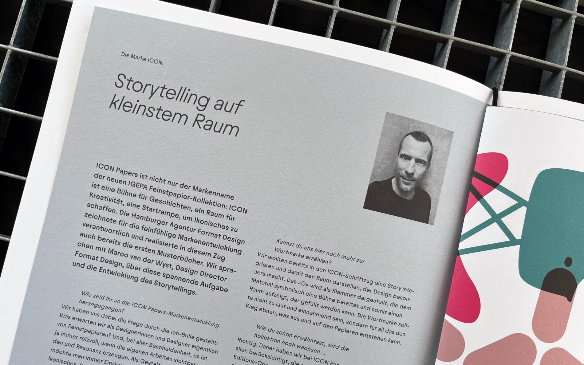
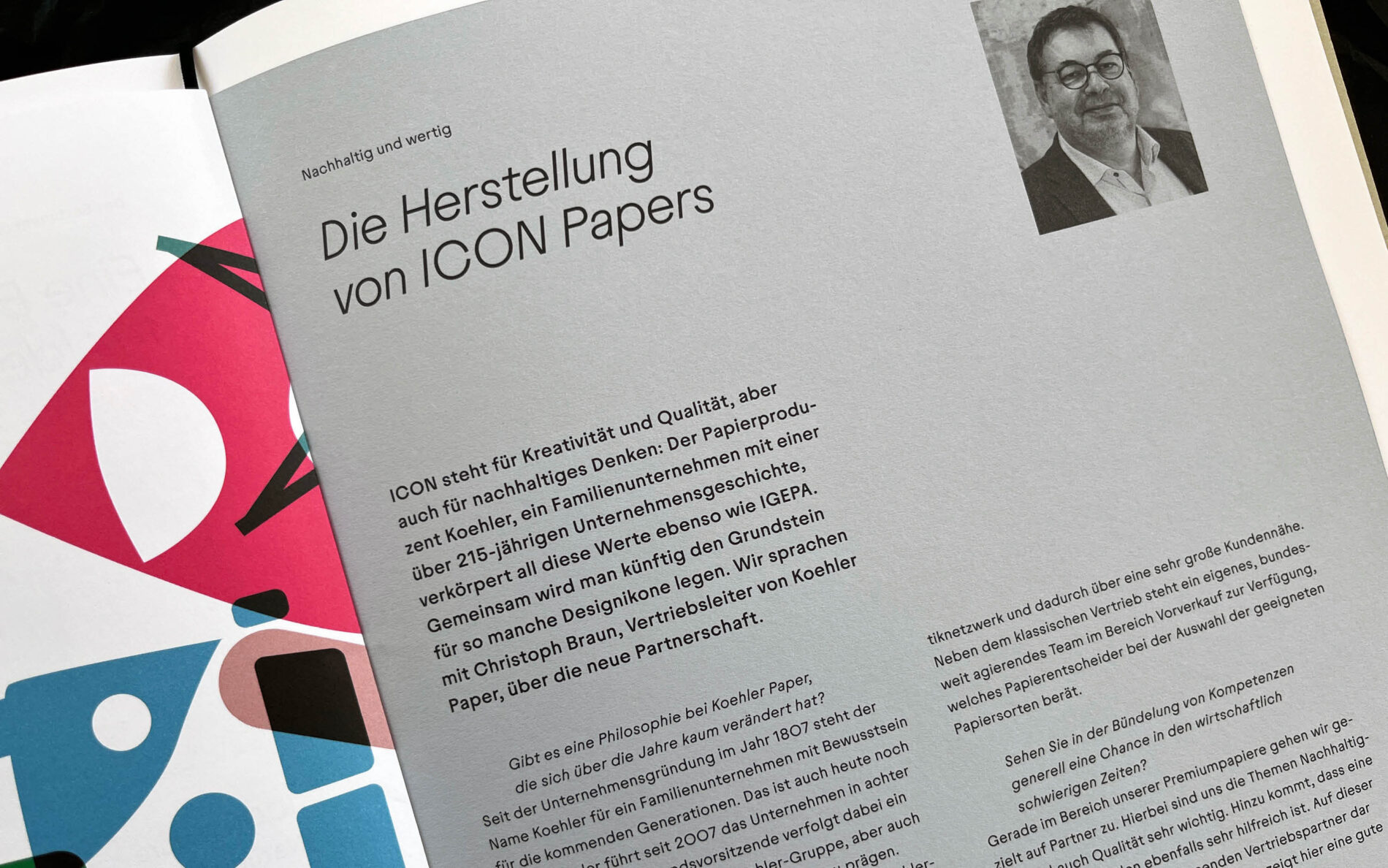
The practical use of these qualities is demonstrated by IGEPA’s customer magazine, Simplify. Showcasing the ICON Papers across a wide range of creative applications, it serves as a source of inspiration for designers and artists. Juneau plays a central role here, too, both in headlines and in body text. Thanks to its balanced sense of ambivalence, it adapts effortlessly to diverse design projects without ever appearing characterless or overly dominant.
