Easybooking
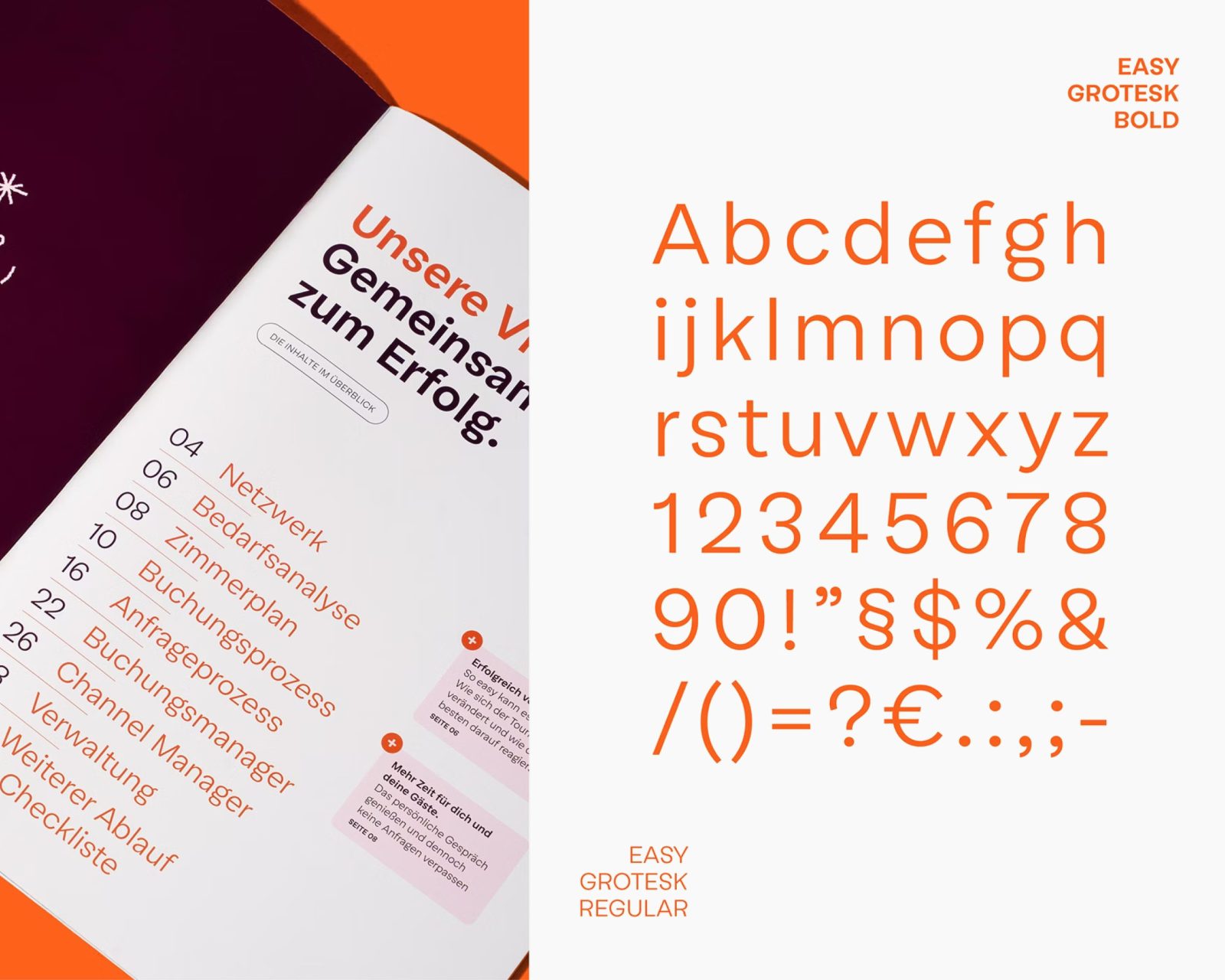
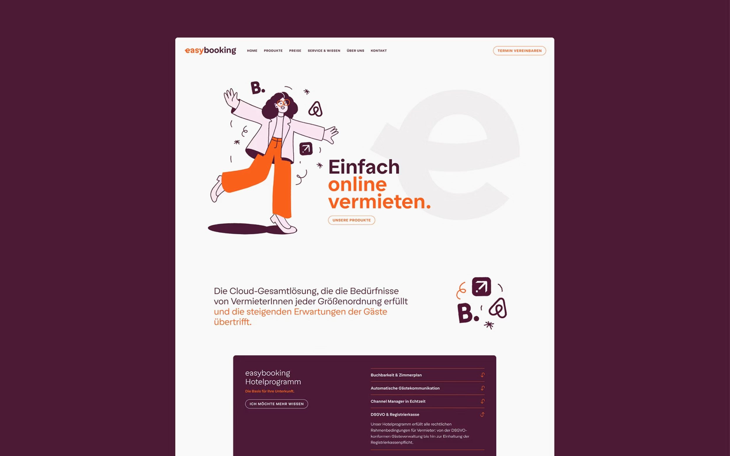
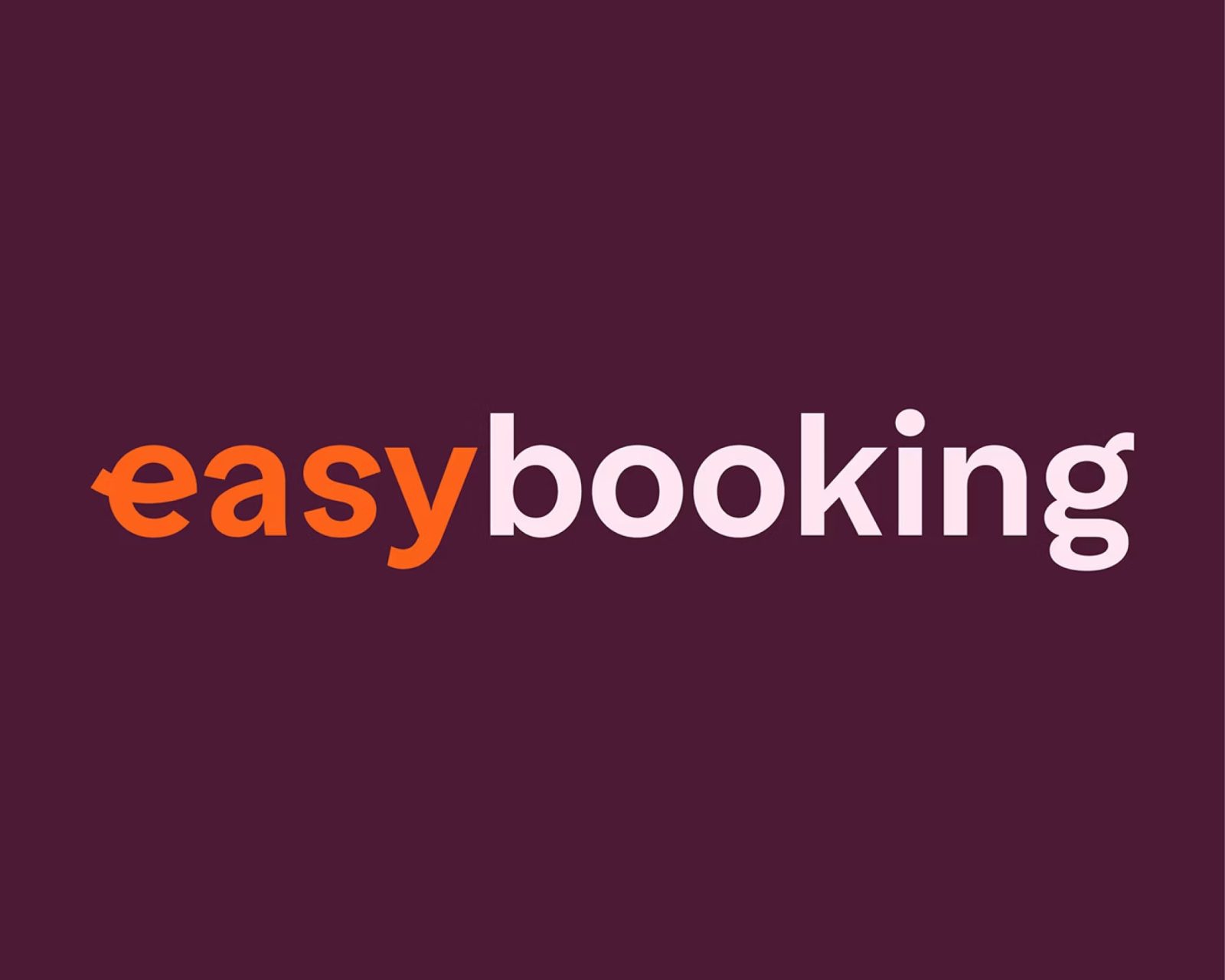
In the branding of the innovative hotel software, Easy Grotesk conveys simplicity, freshness, and quality. With its clear, reduced letterforms, the typeface becomes a visual signature for Easybooking's user-friendly approach.
Images by the courtesy of Northlight
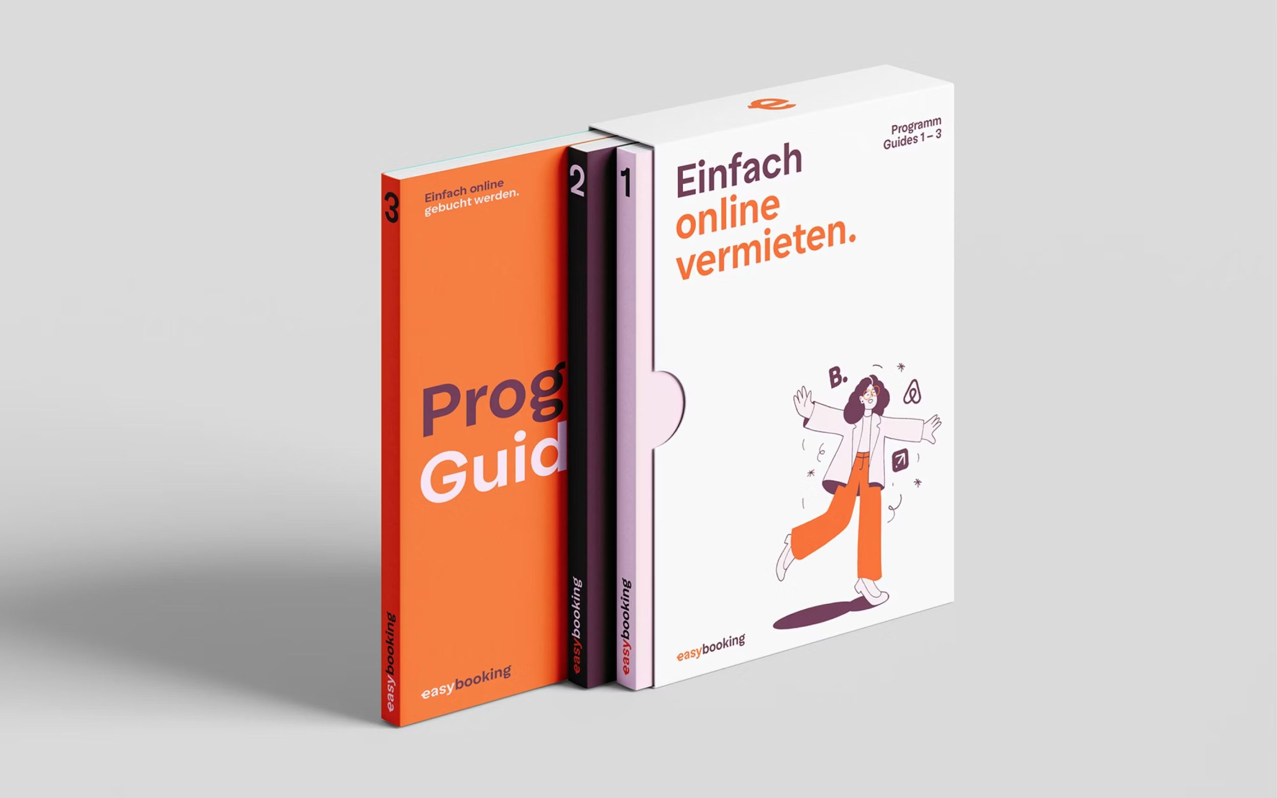
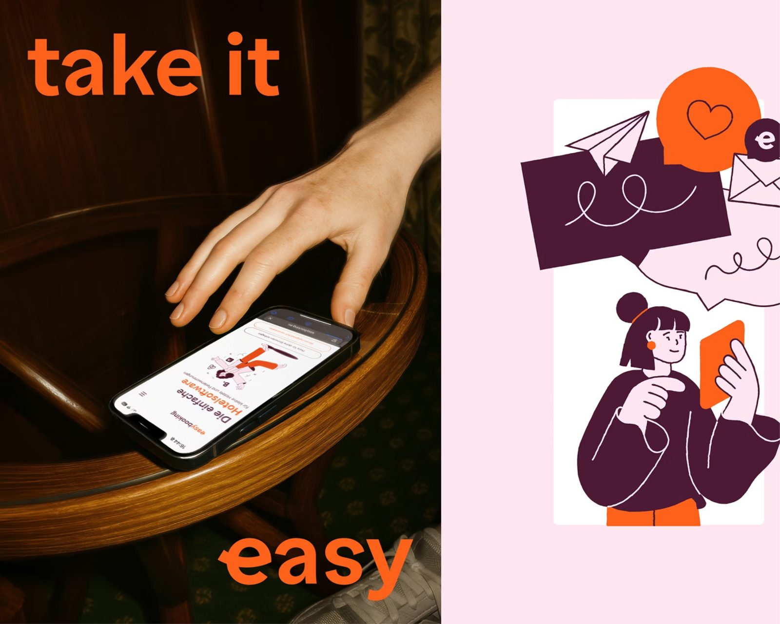
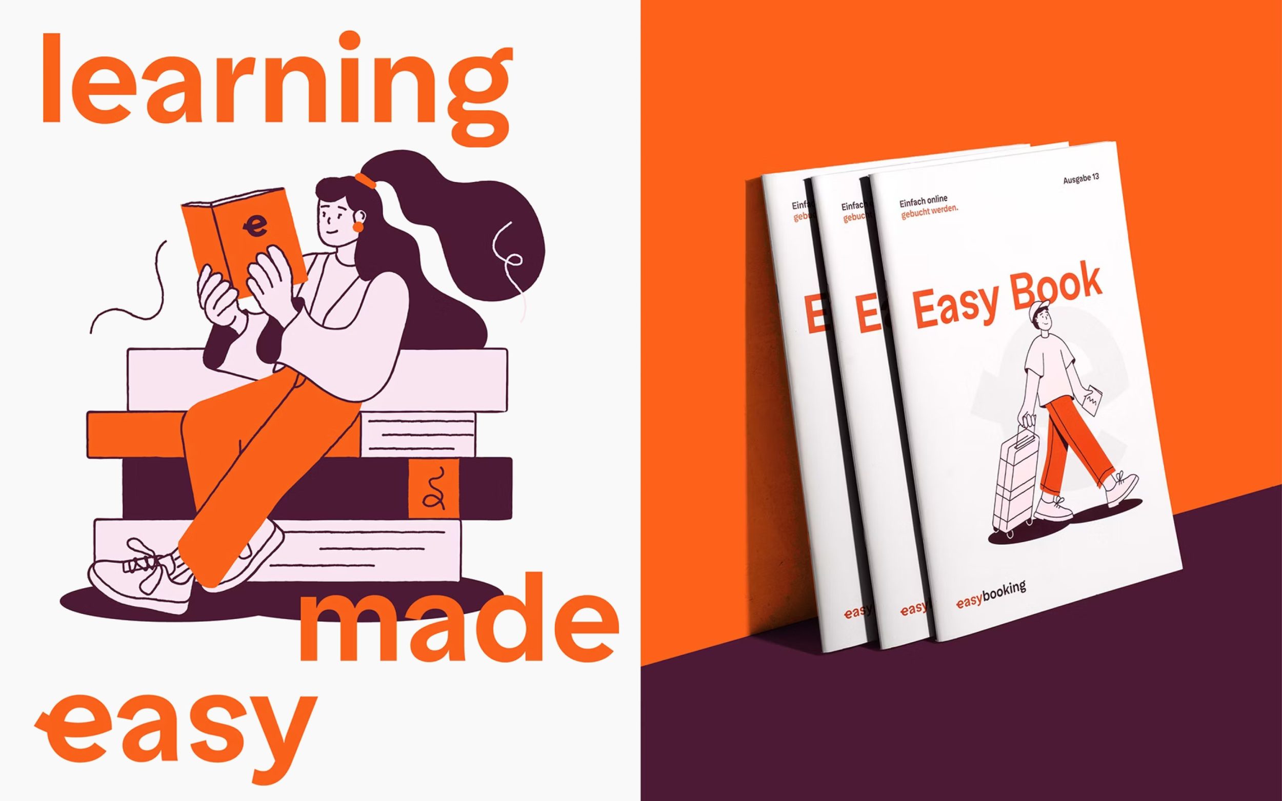
Easybooking is a hotel software that simplifies the organization of small hotels and vacation rentals in an innovative way. With the rebranding, the Innsbruck-based agency Northlight succeeded in translating this focus on simplicity and user-friendliness into a visual language. As the new typeface for the branding, Easy Grotesk was therefore deliberately chosen.
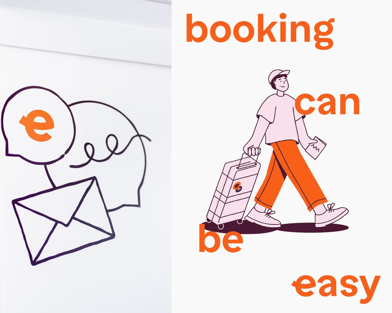
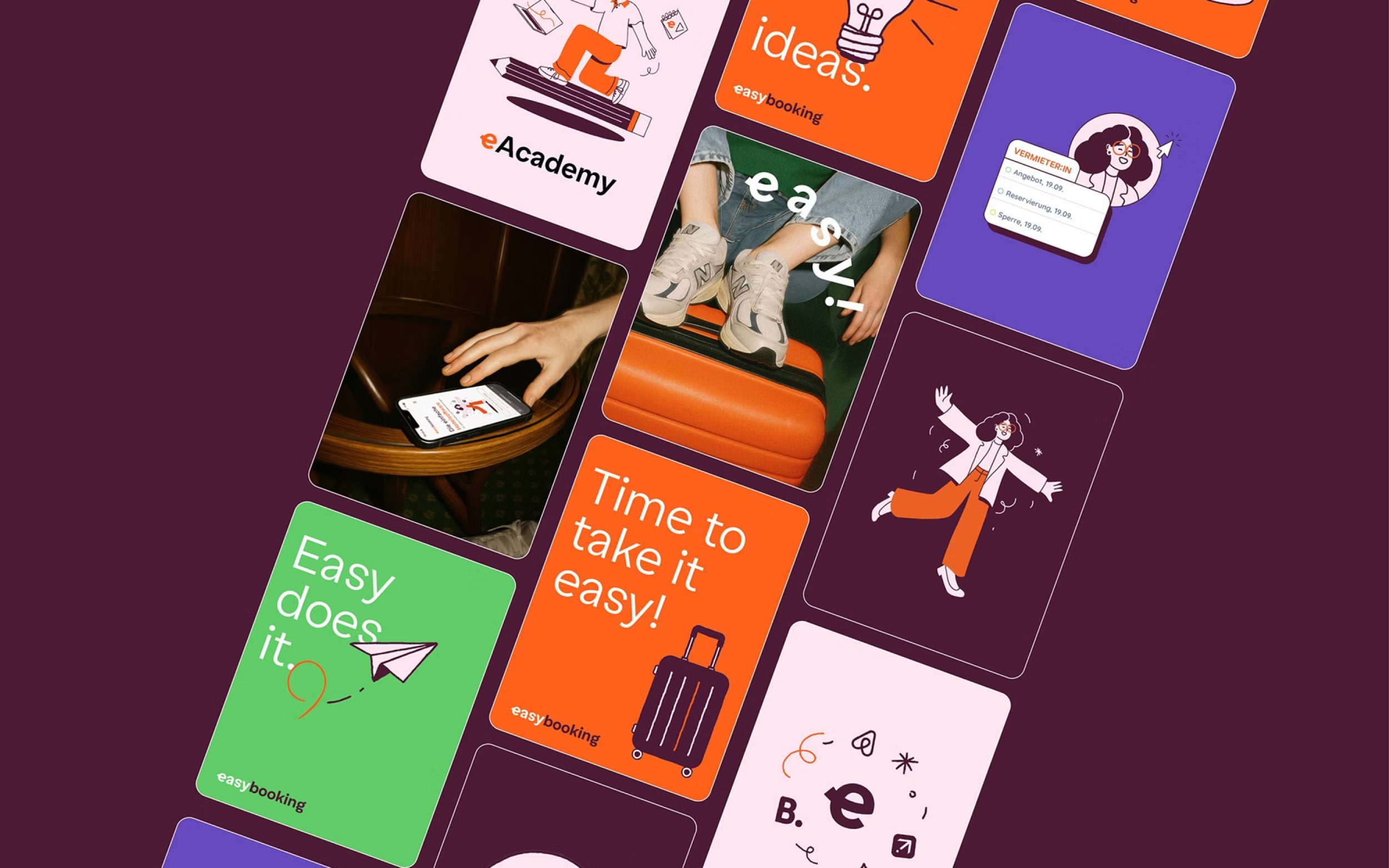
The goal of the rebrand was to make both innovation and technical expertise, as well as versatility and simplicity, more visible. Easy Grotesk was a perfect fit for Easybooking not only because of its name, but also because of the values it communicates. Martin Straif, Creative Director at Northlight, writes (translated from German): “When we started the project, Easy Grotesk immediately came to mind – [...] simple and charming, yet substantial and full of character.” With Easy Grotesk, a fresh and clear rebrand was achieved, making Easybooking more visible.