Aral Script & Sans
ARAL is one of Germany’s best-known petrol station brands. In collaboration with GSVI, the Bochum-based branding agency that has worked with ARAL for 20 years, we examined the industry leader’s typography in detail. We updated the brand’s signature rounded Sans and created a striking marker Script for the campaign.

© Simon Mannweiler Wikimedia Commons, CC BY-SA 4.0
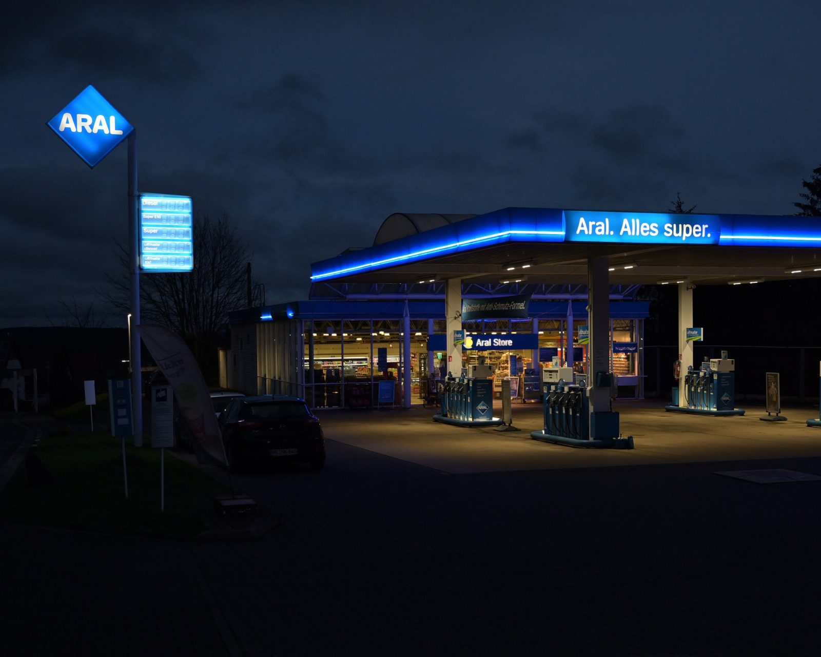
Founded in 1924, ARAL operates around 2.400 petrol stations throughout Germany. This makes it the country’s largest network of petrol stations and one of the sector’s market leaders. Strong marketing is naturally part and parcel of this.
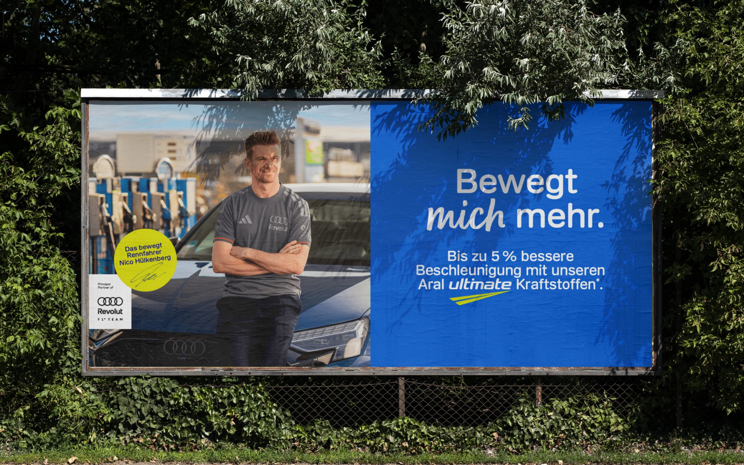
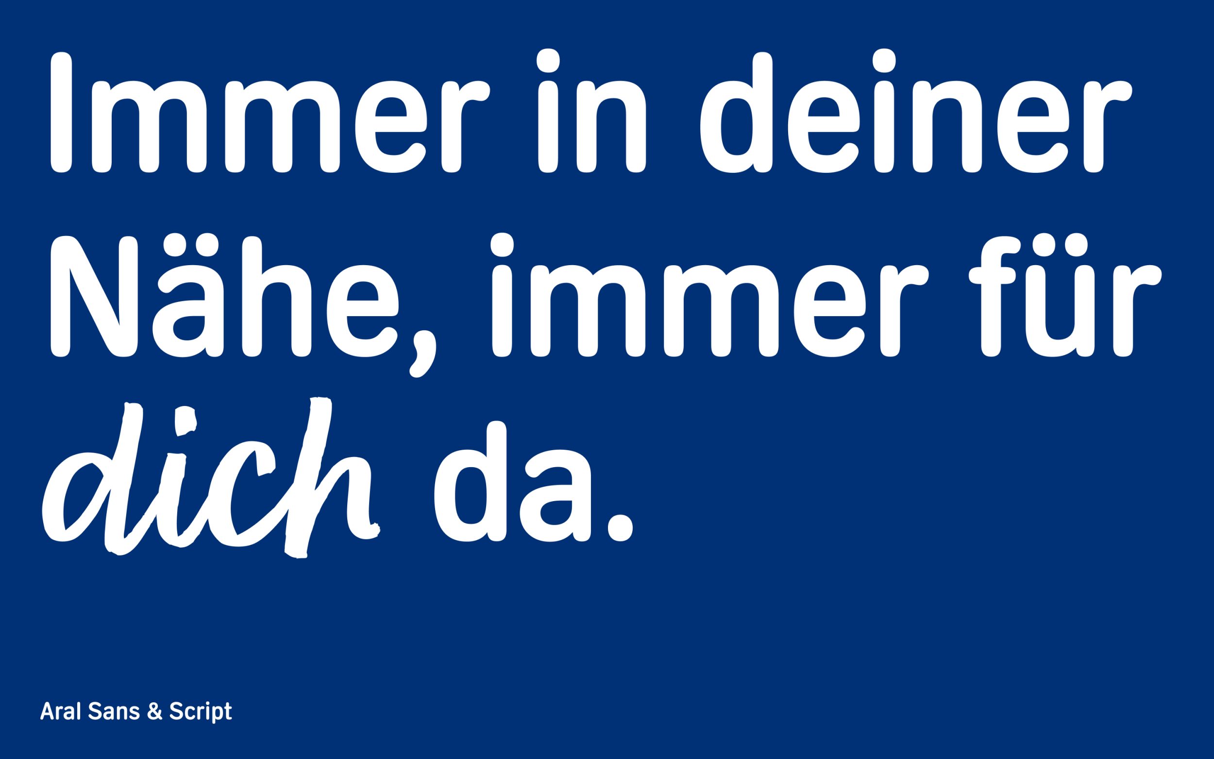
In the campaign, the ARAL Script typeface creates a stylistic contrast to the simple sans serif. As the brief specifically called for an authentic handwritten look, the script became a key element of the visual identity.
The typeface was inspired by the strokes of a broad marker, with slightly irregular contours, visible thick-to-thin contrast, and natural, dynamic linework. Just like in genuine handwriting, no two letters are exactly alike. ARAL Script is designed primarily for eye-catching headlines and attention-grabbing elements on posters and banners. Its proportions have been tailored specifically to complement ARAL Bold Extended, enabling the two typefaces to be combined harmoniously.
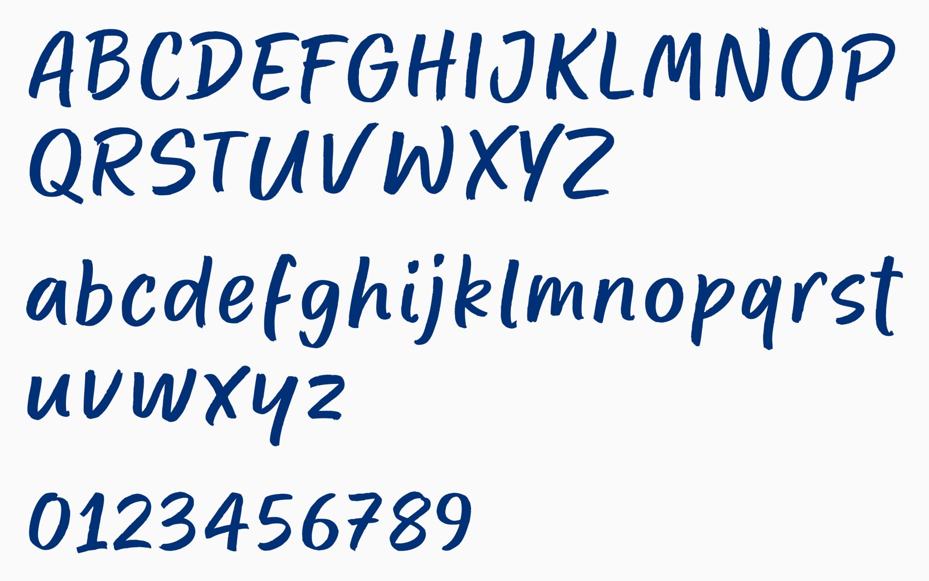
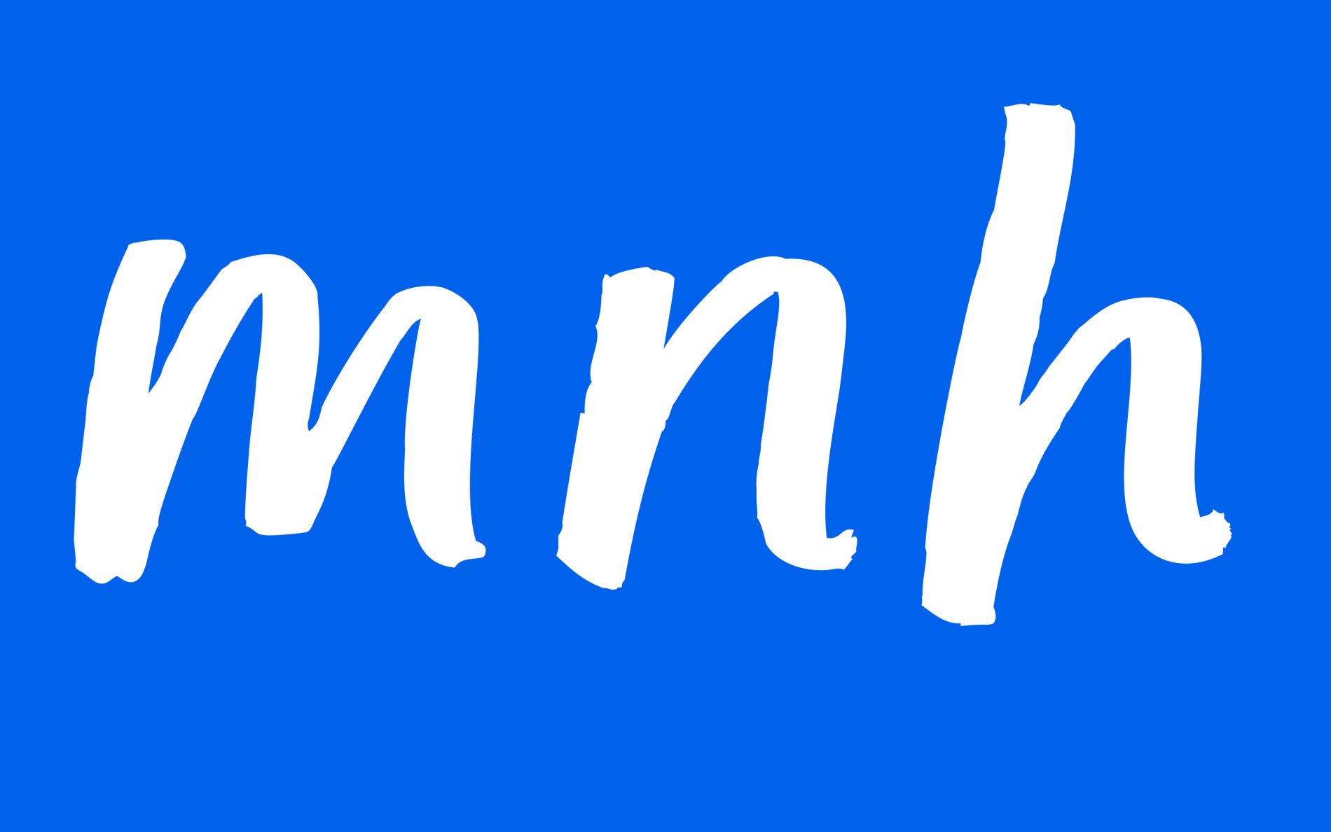
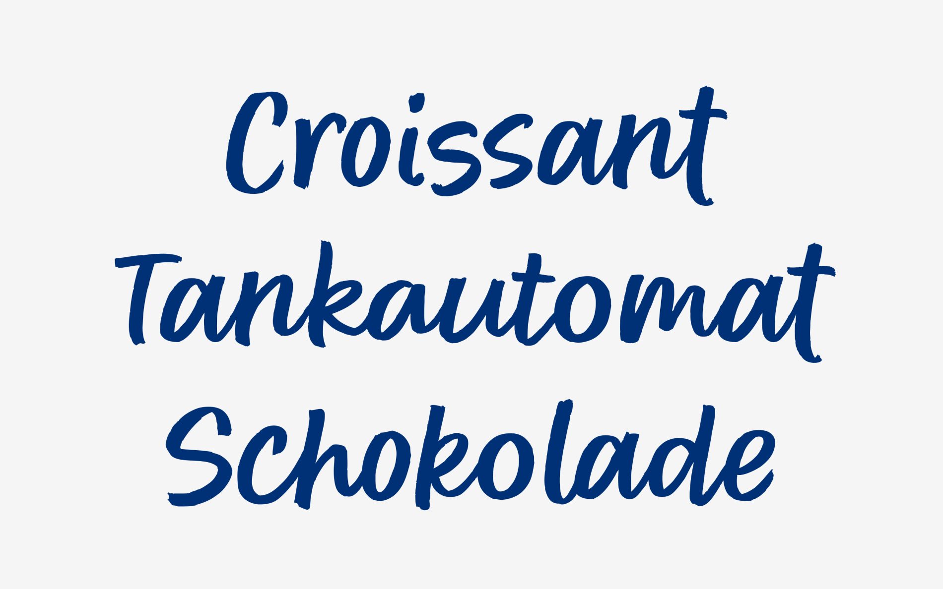
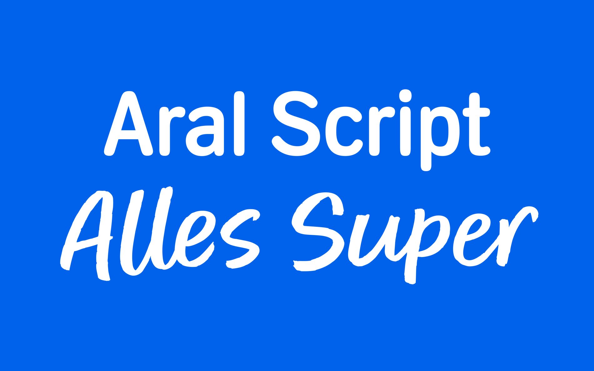
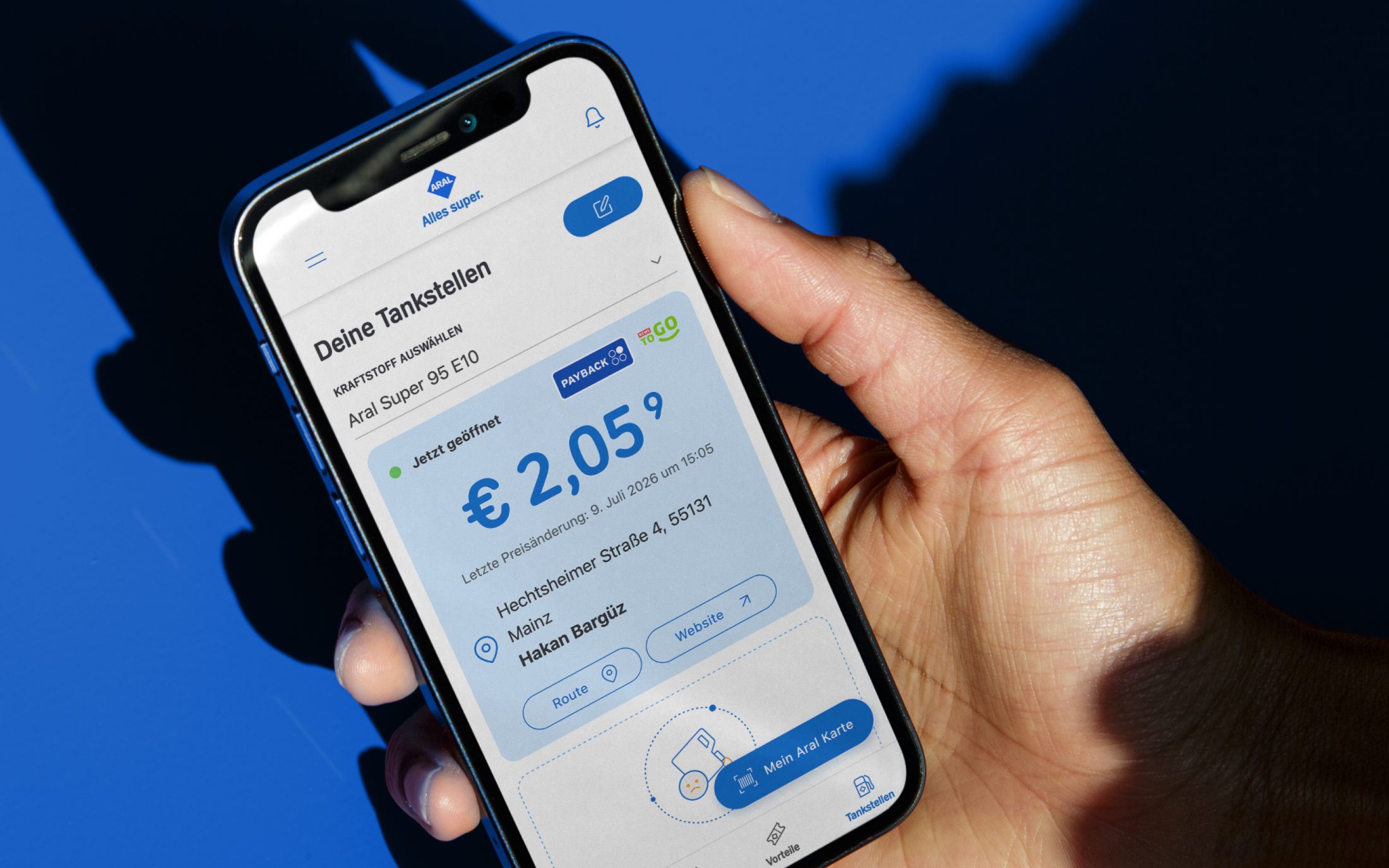
In addition to the ARAL Script, we have also modified the corporate typeface. We revised the Sans carefully, making fundamental changes to some characters and expanding it with an extended version. While revising and optimising the entire typeface, we paid particular attention to the numerals 3, 6, and 9. The design of these numerals focuses on clear legibility to ensure that prices can be recognised at a glance. These adjustments are a small but important step towards accessible communication.
Following the revamp of its corporate typeface and the creation of the ARAL Script, the brand now boasts a typographic system that successfully marries functionality with character.