ADAC Sans, Serif & Slab
Guided by its “We’re here for you” ethos, the ADAC confidently meets the mobility needs of its 22 million members. The new type system, developed in collaboration with us, brings this defining philosophy to life and strengthens the brand identity across all channels and devices.
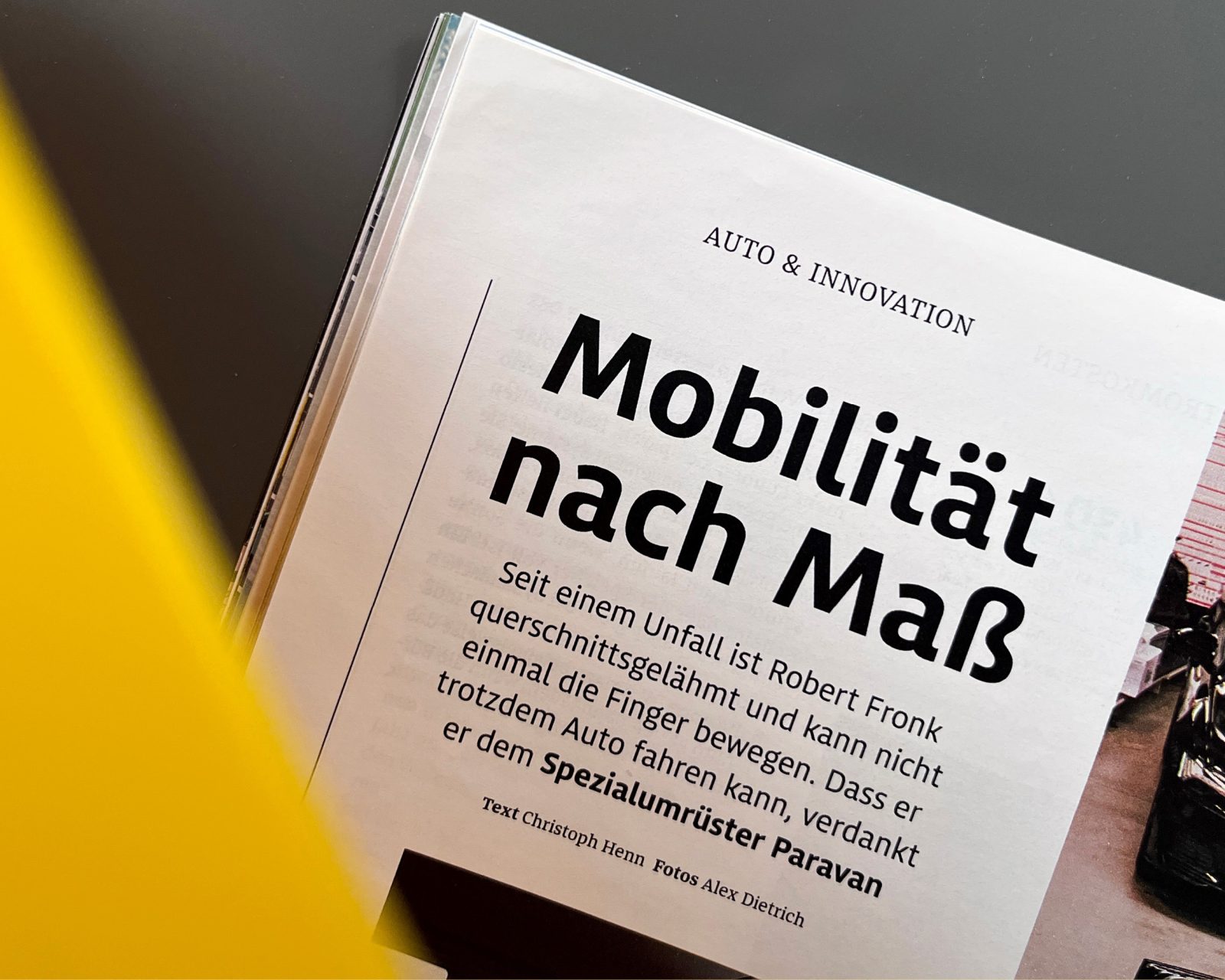
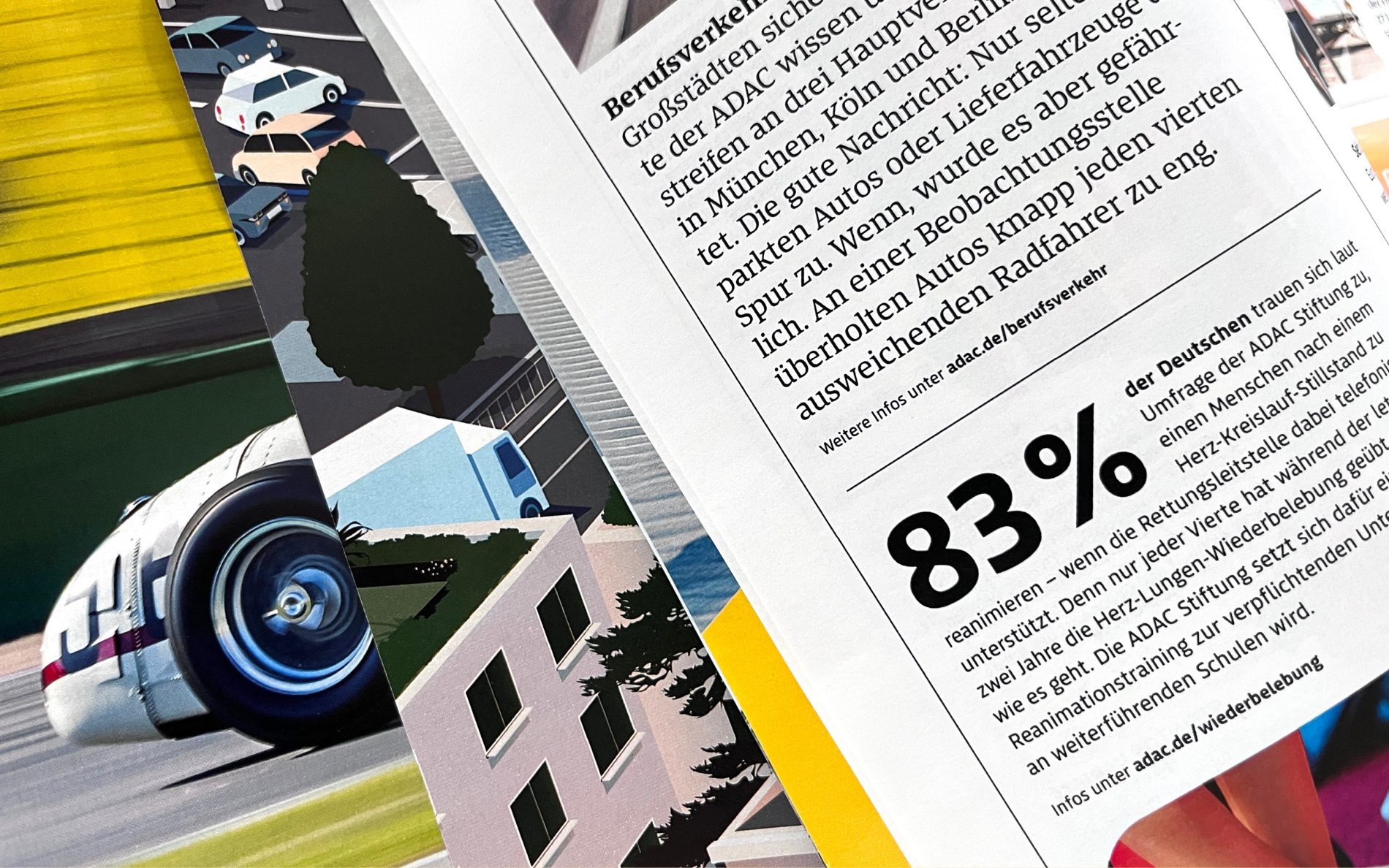
From breakdown assistance and legal advice to car reviews and travel tips, the ADAC supports people in Germany in a wide range of situations. The motoring club’s corporate font system and its application across all touchpoints must meet just as many requirements. Exclusively developed for the brand, the font system transports a distinctive typographical profile that is straightforward, human and open.
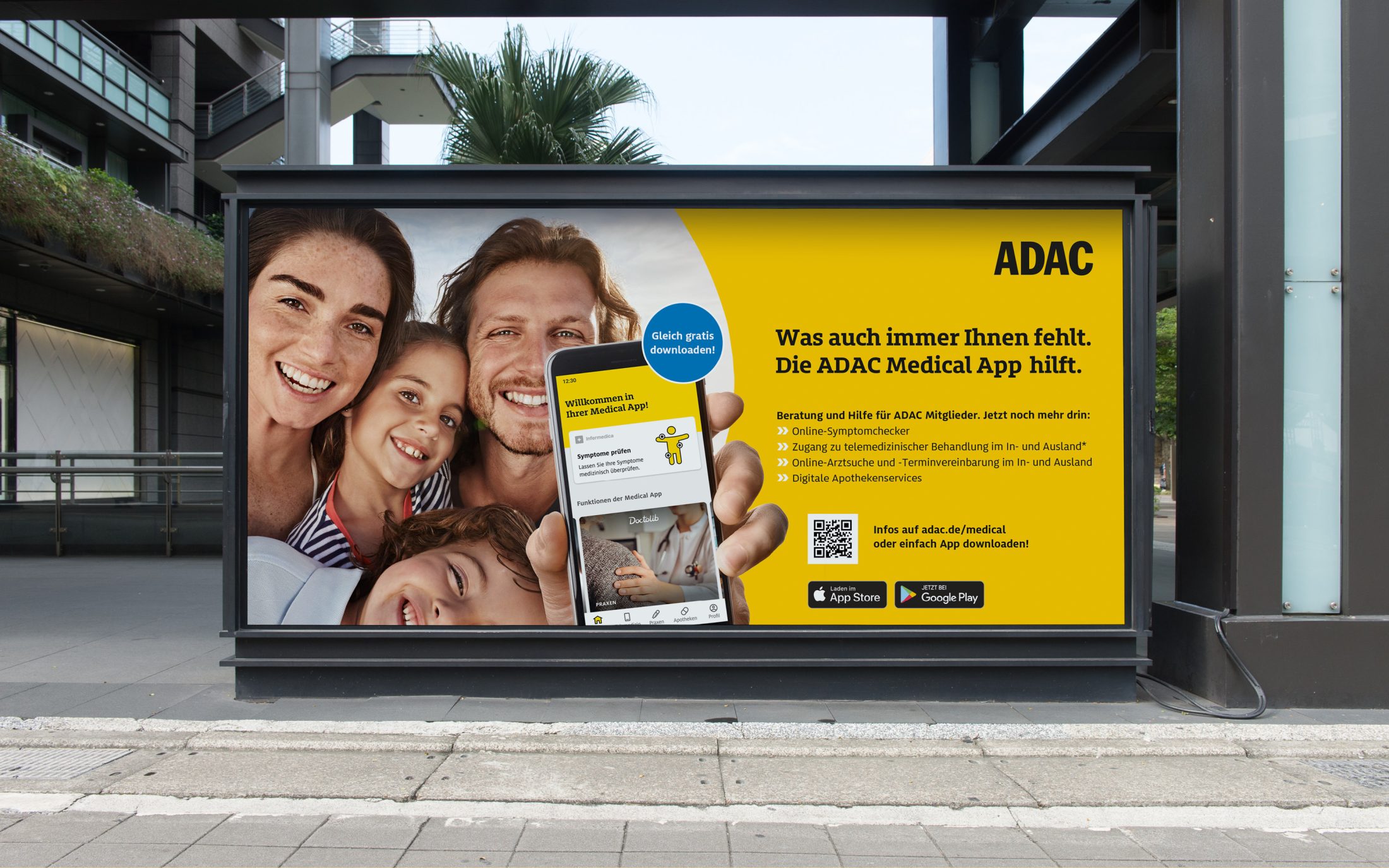
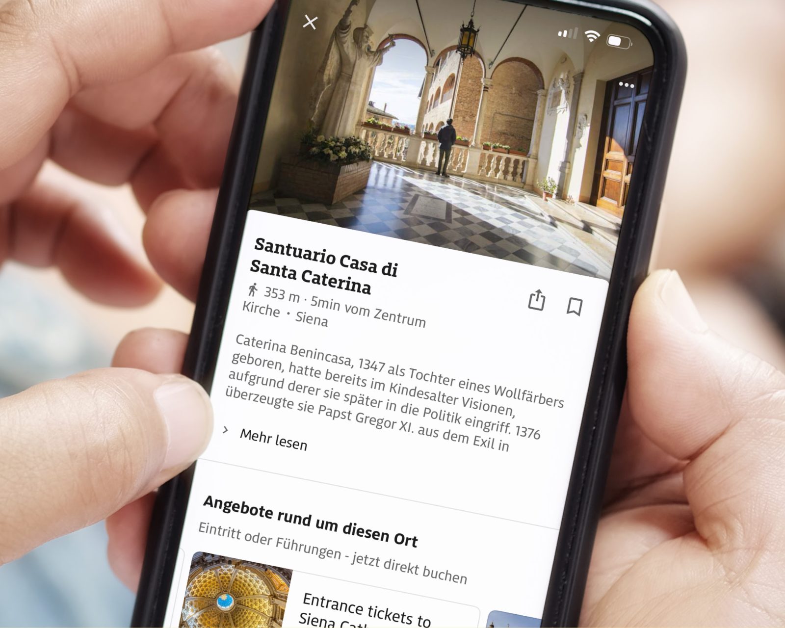
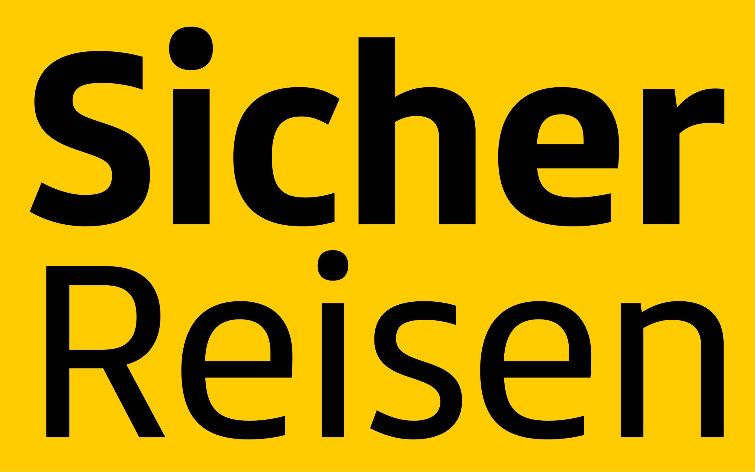
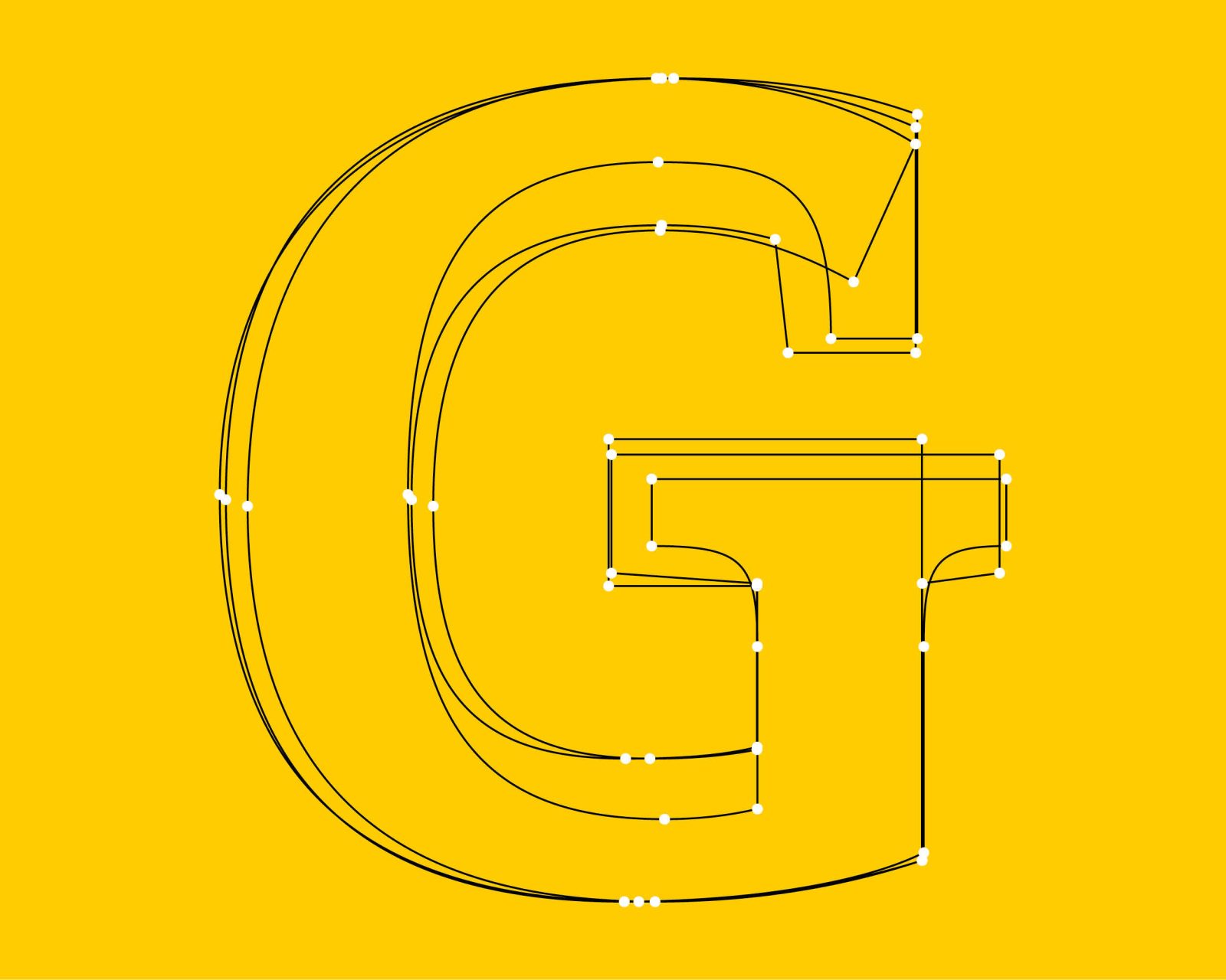
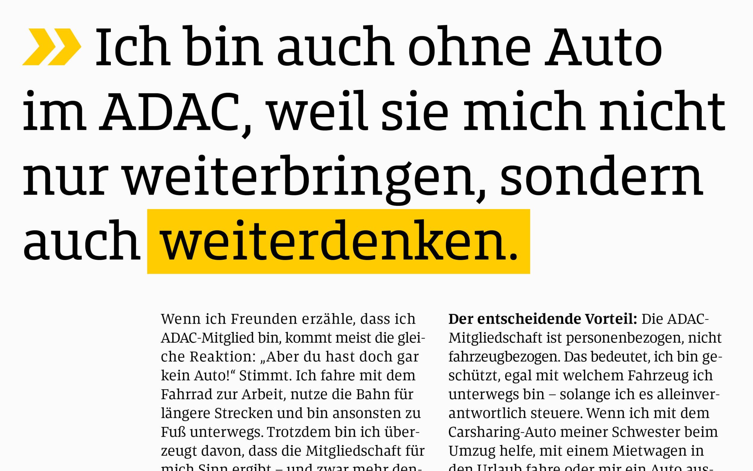
The slightly angular design and dynamic style of the typeface emphasise the brand’s identity. It puts people at the heart of the brand, whilst also conveying its technically innovative character. In this way, it successfully combines tradition and modernity, professionalism and inspiration.
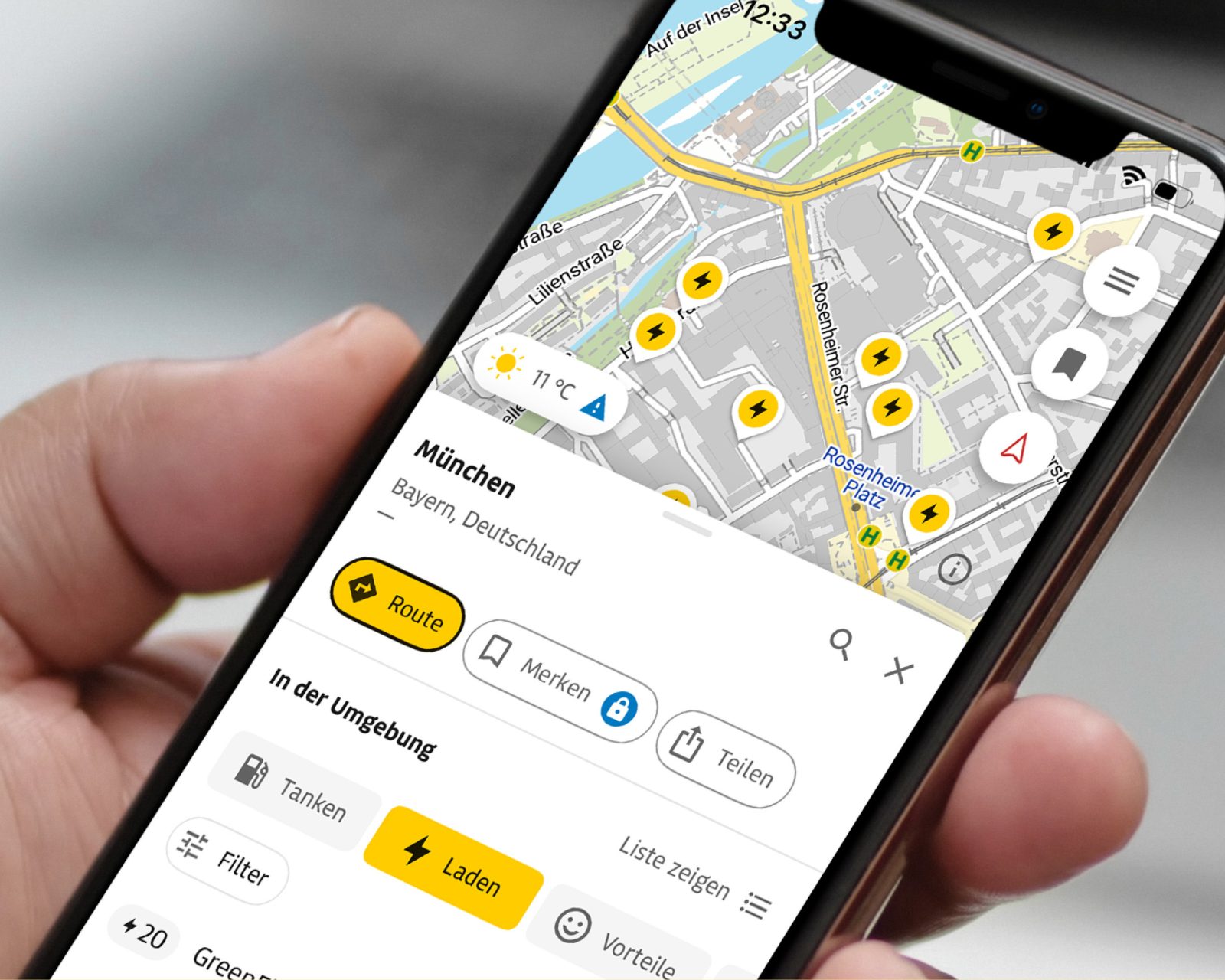
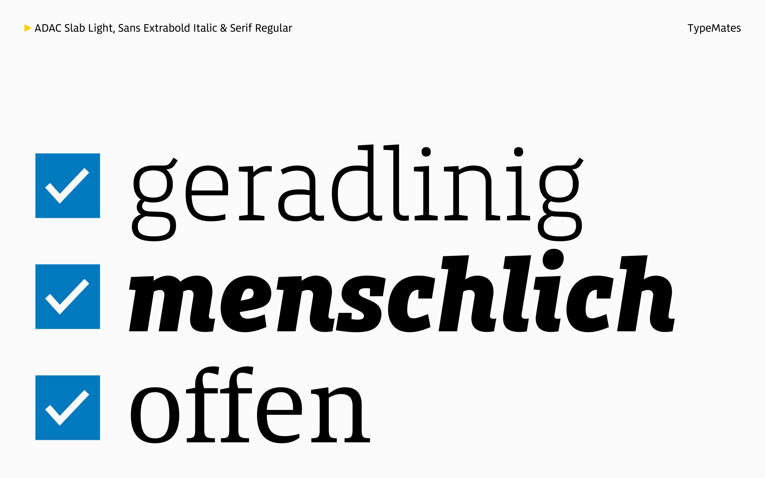
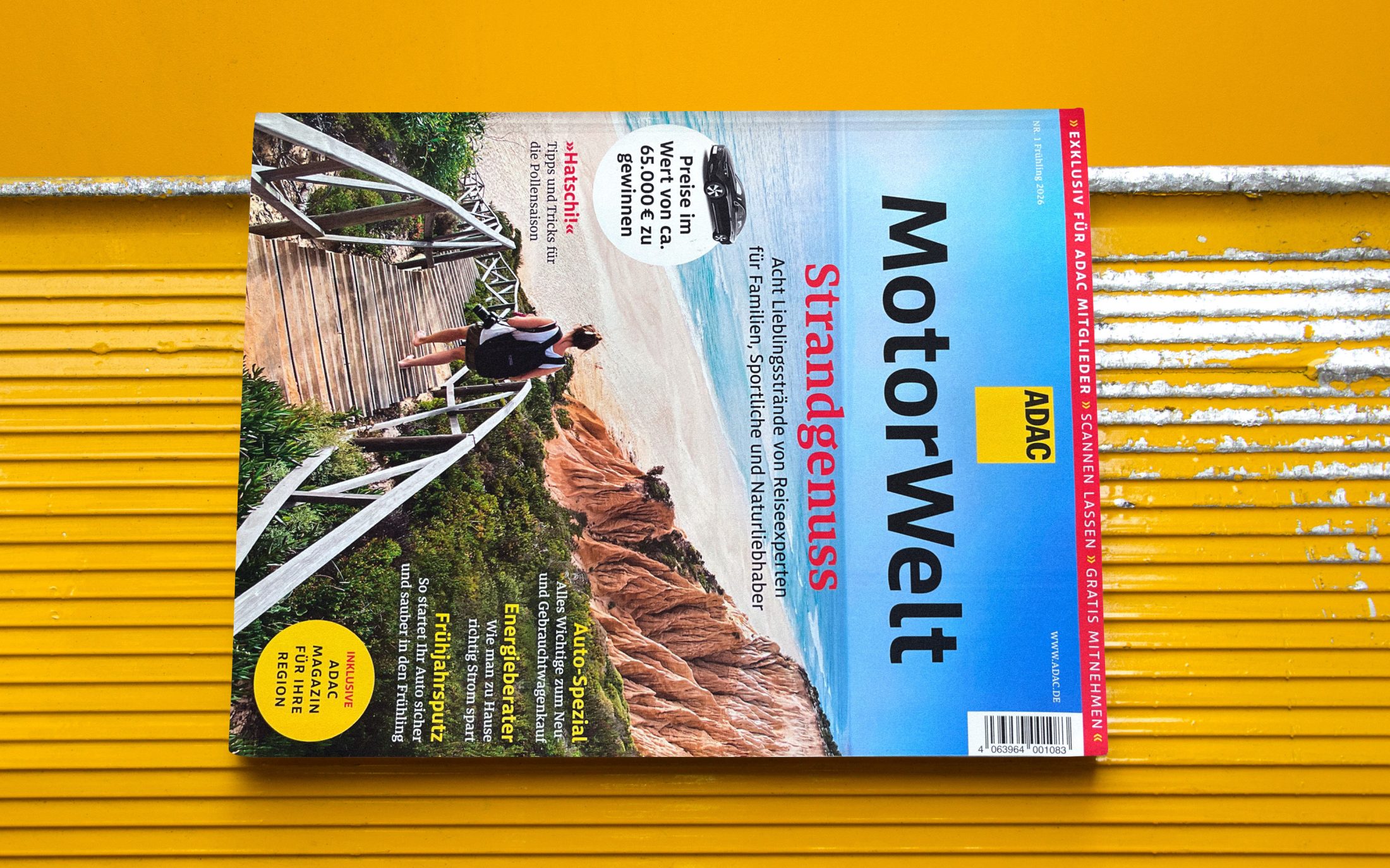
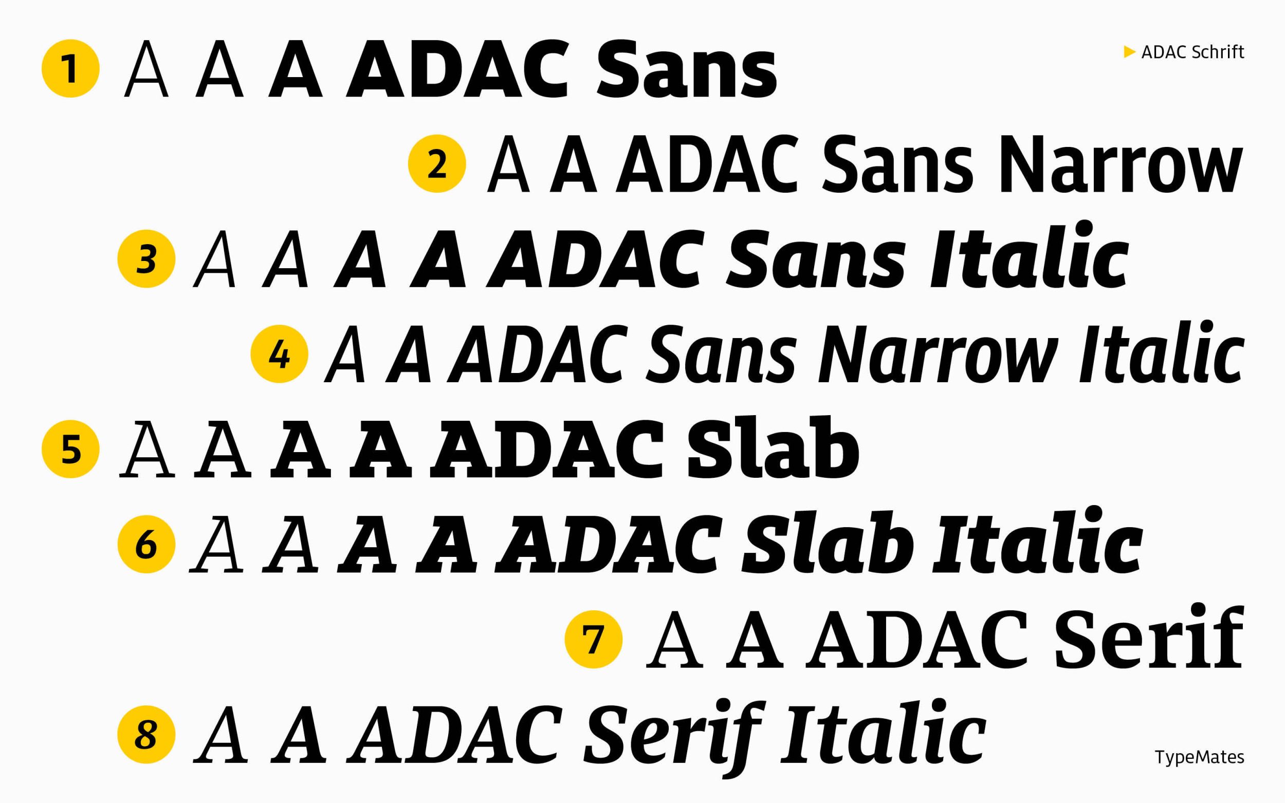
The typeface family is based on a tried-and-tested system and combines a clean Sans, an expressive Slab Serif and a distinctive text version, forming a versatile typographic repertoire. The ADAC’s corporate typeface consistently offers clear and inviting legibility, whether Sans, Slab or Serif. Despite the flexible typographic possibilities offered by the 24 typefaces, the system remains simple and straightforward to use.
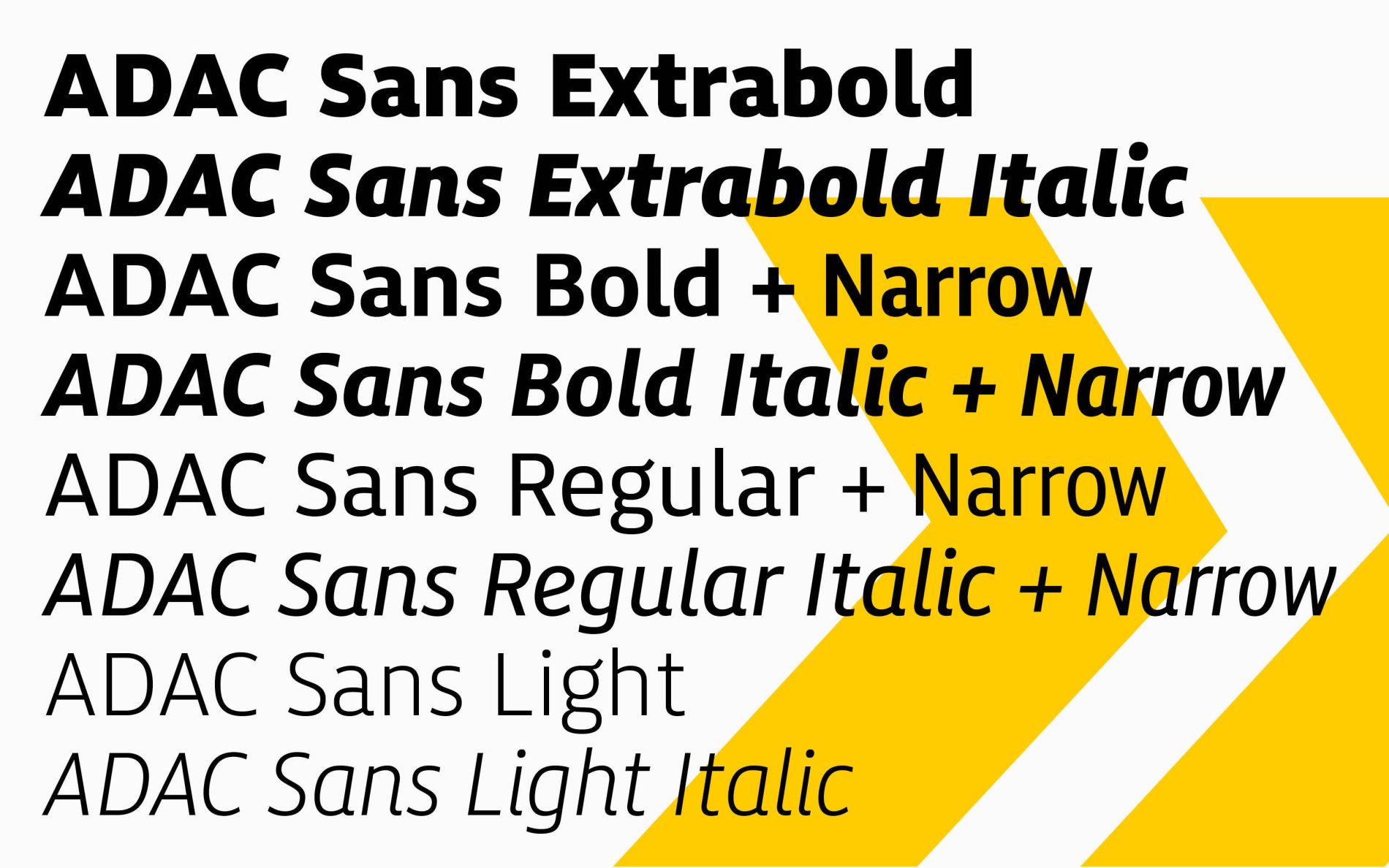
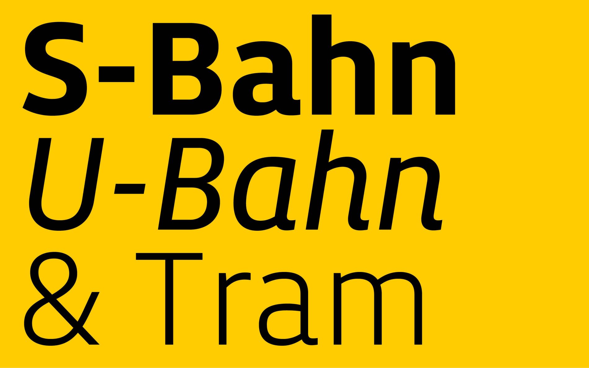
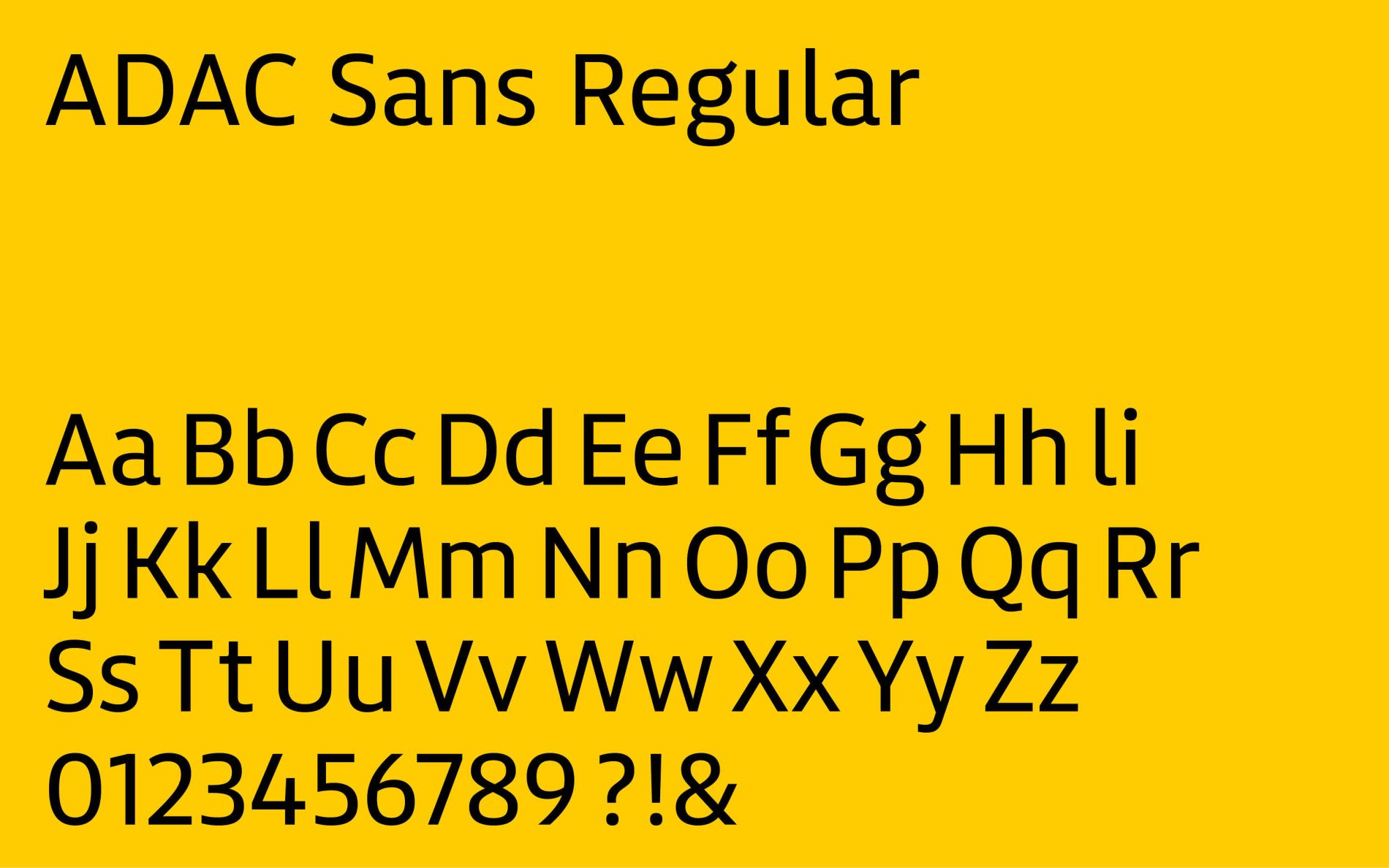
The Sans
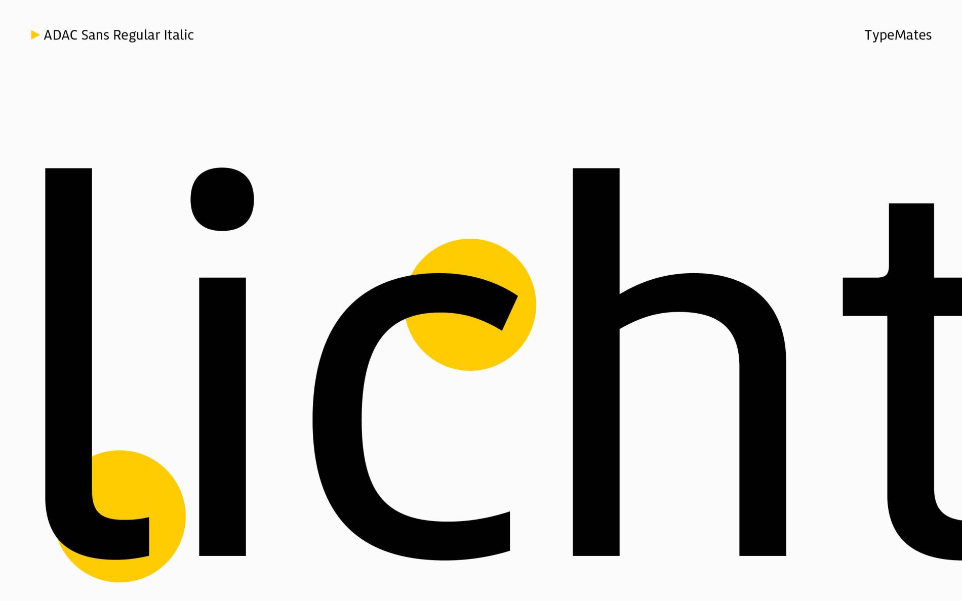
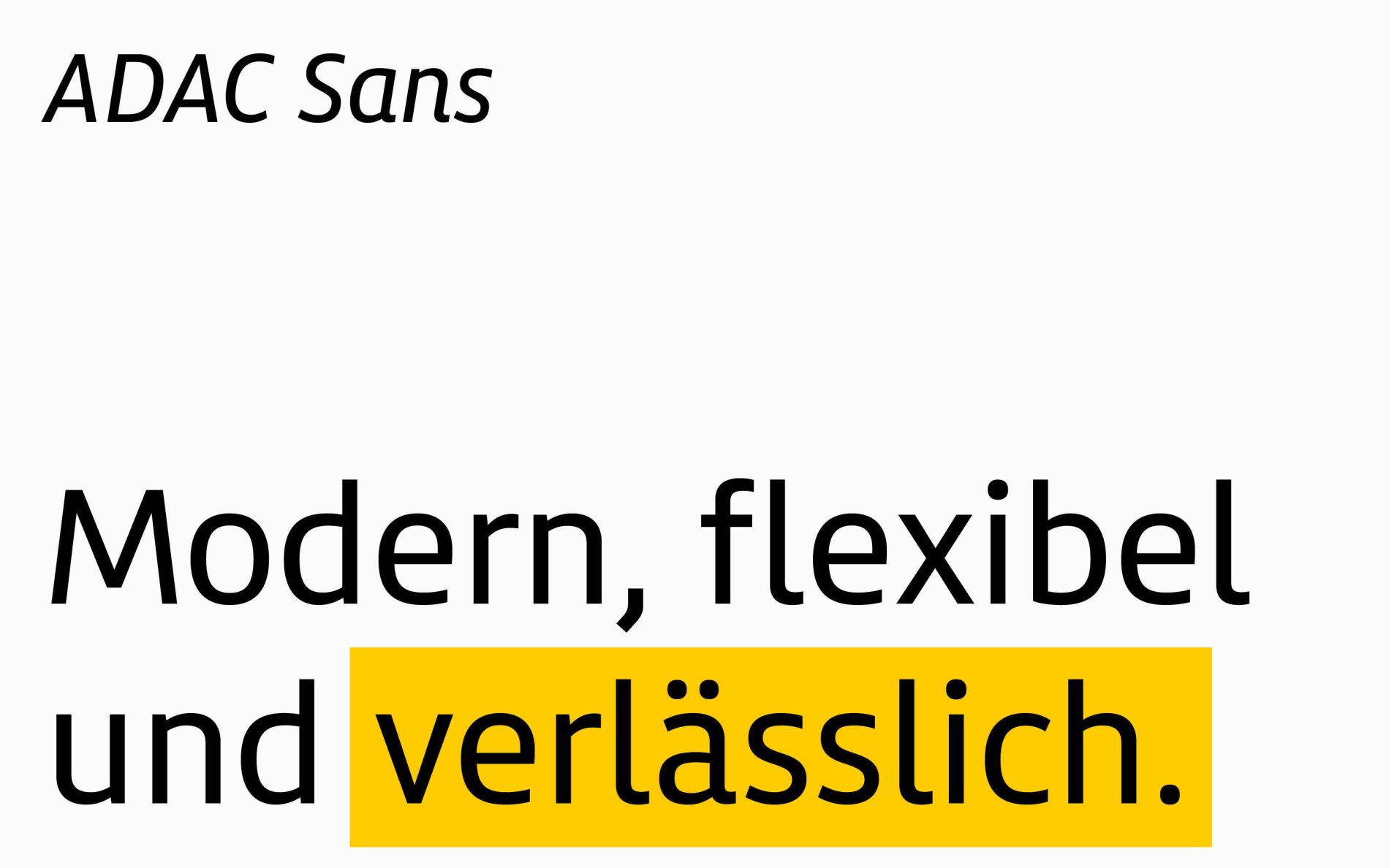
At the heart of the typeface family is the Sans, which was designed for clear communication and interfaces. Its design reflects the simple, accessible architecture of the typeface system. The open, human character of the typeface is particularly evident in details such as the accessible lowercase “l” and the distinctive, memorable “c”.
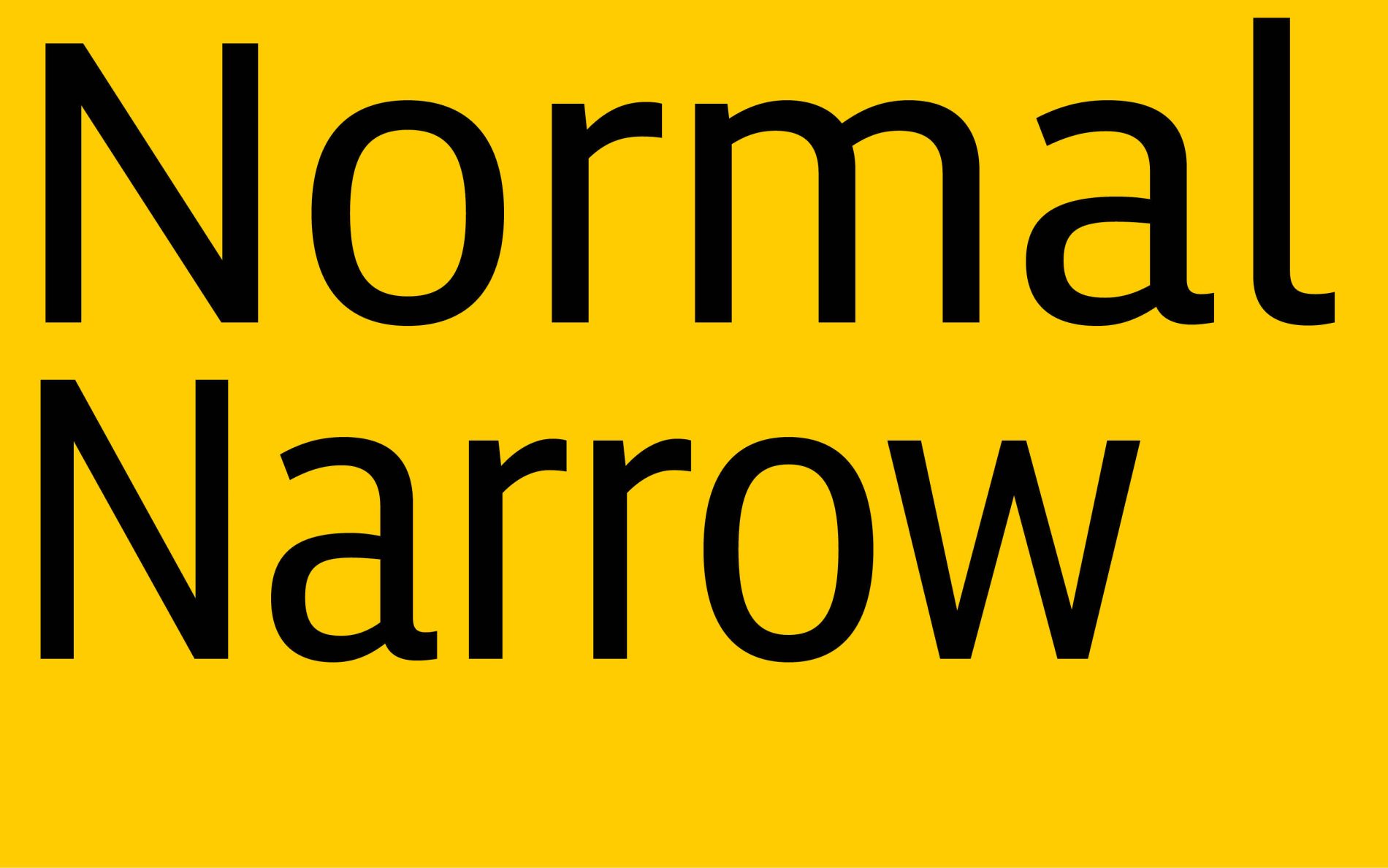
The Sans is expanded by a narrow variant. The four space-saving styles are ideal for setting large amounts of text in confined spaces, such as insurance terms and conditions, membership information and forms. While they convey a similar feel to the corporate typeface, they are intended for uses that do not take centre stage in brand communication.
The Slab
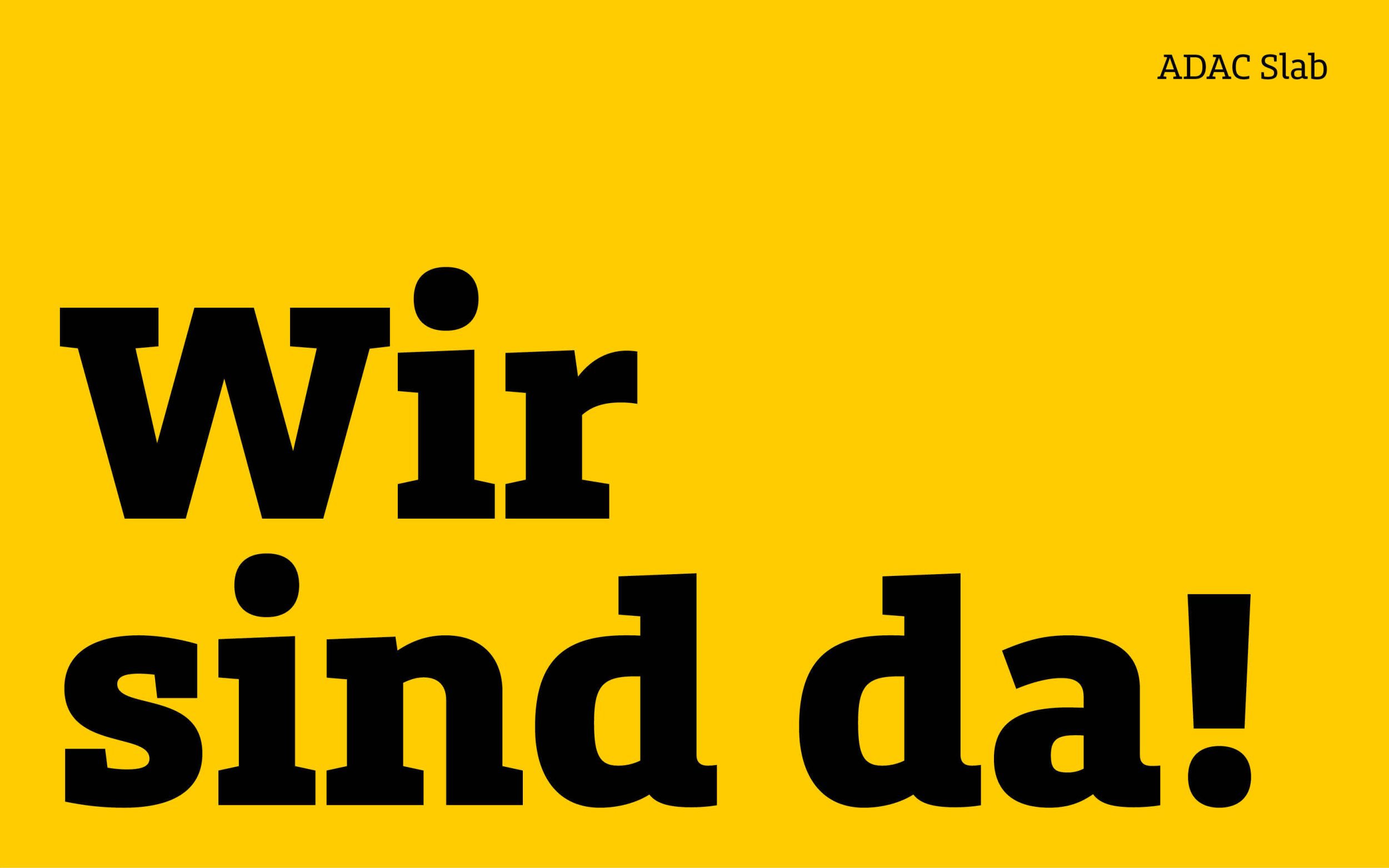
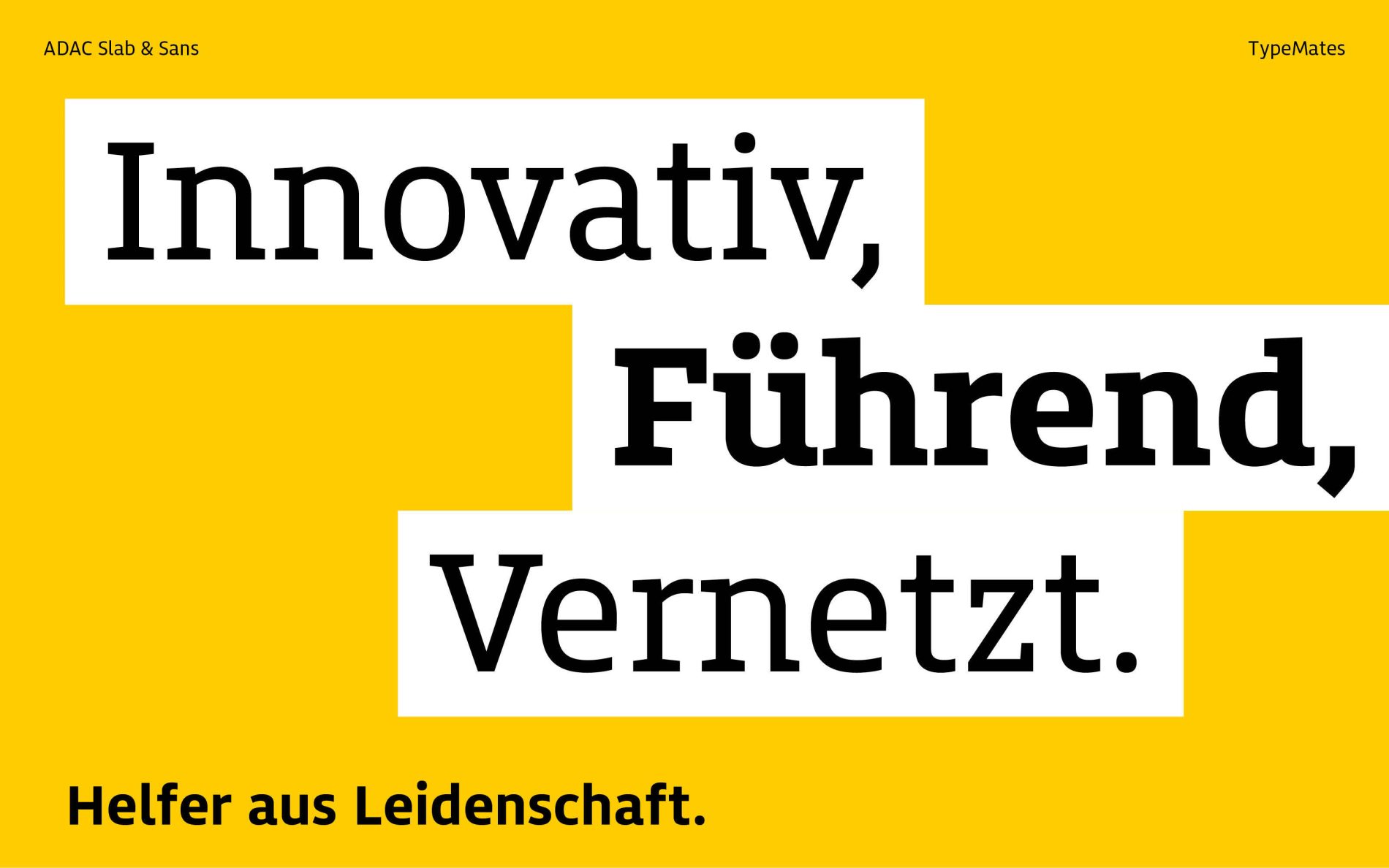
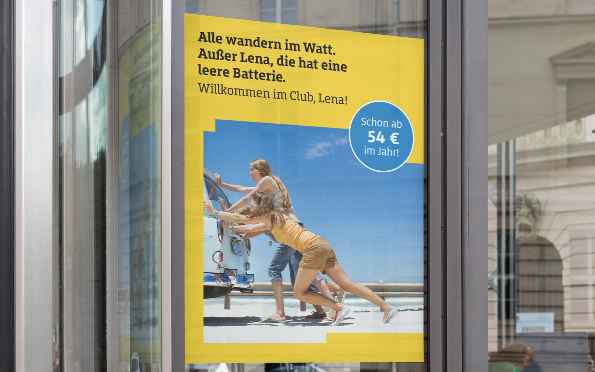
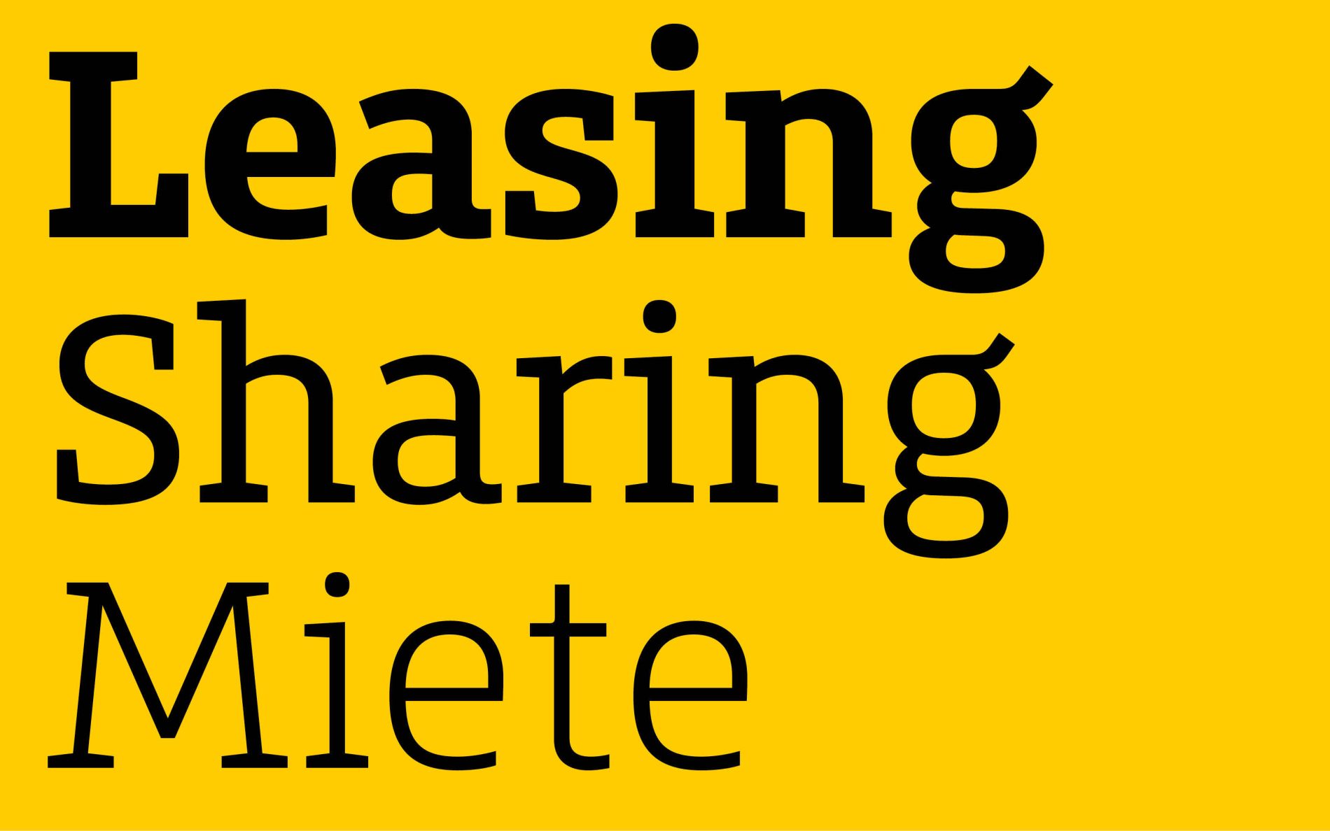
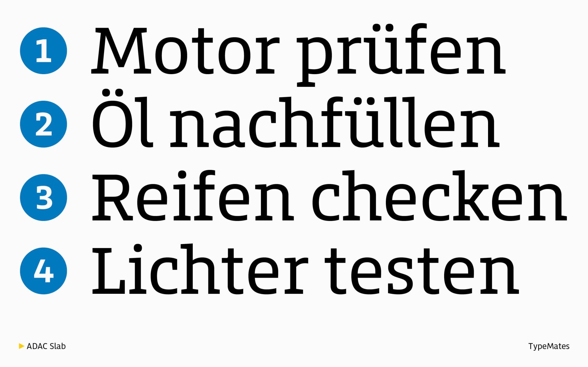
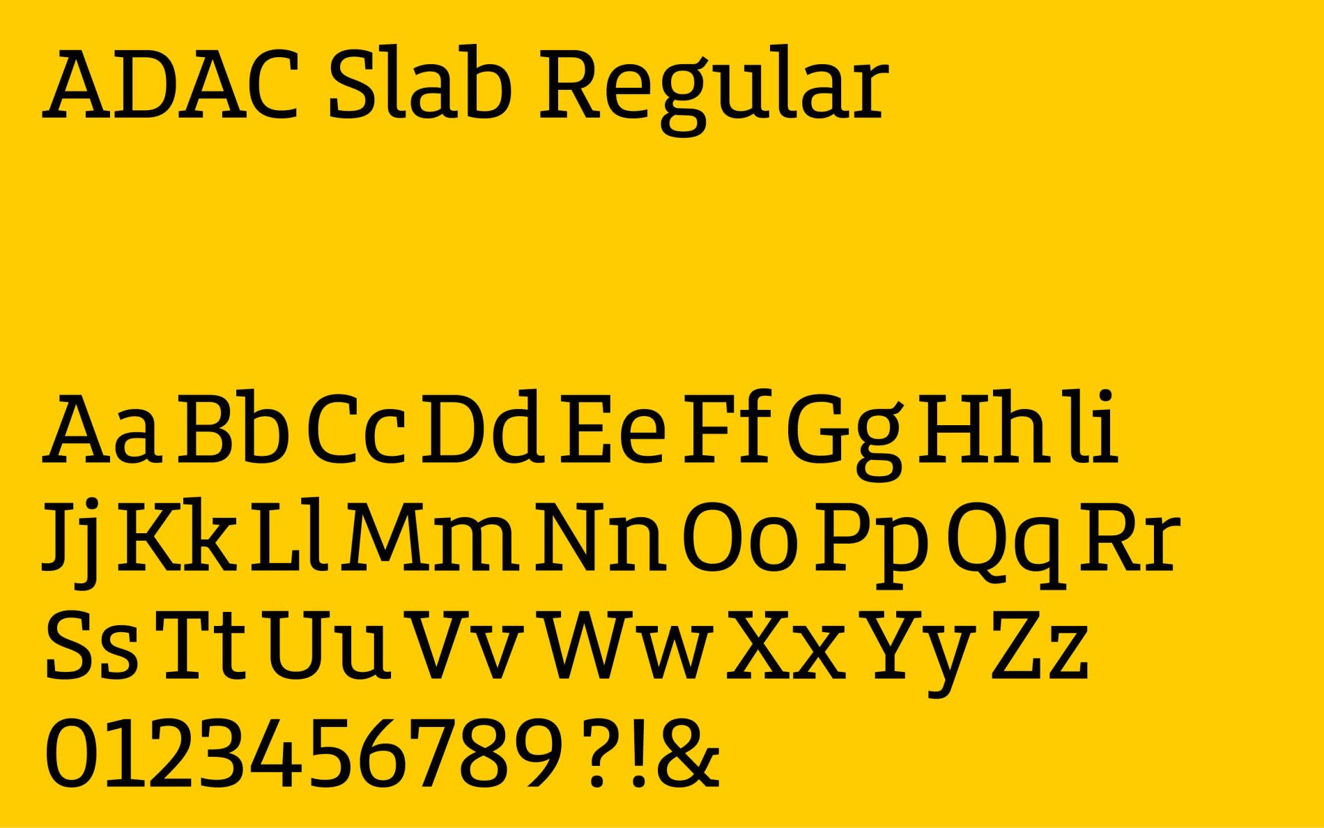
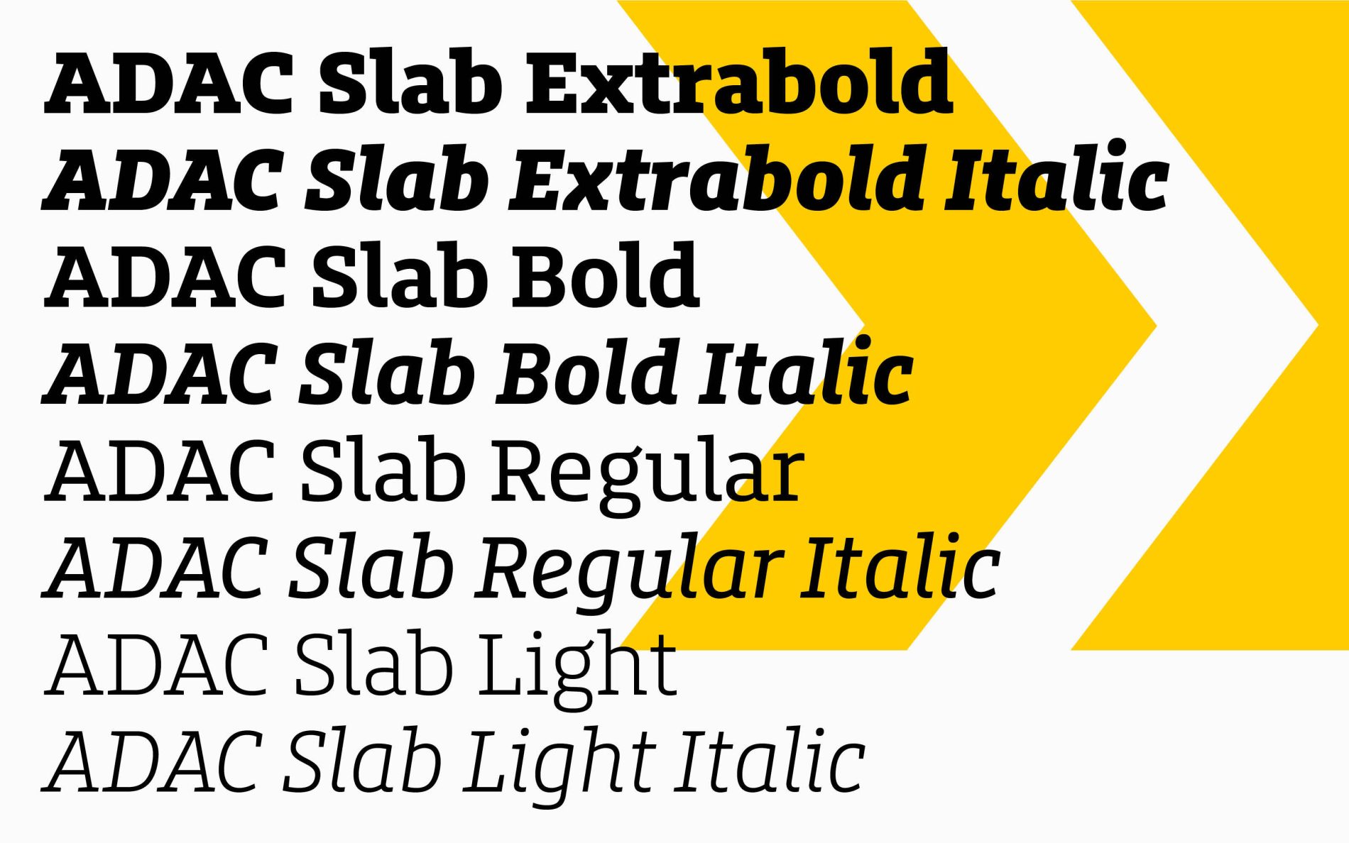
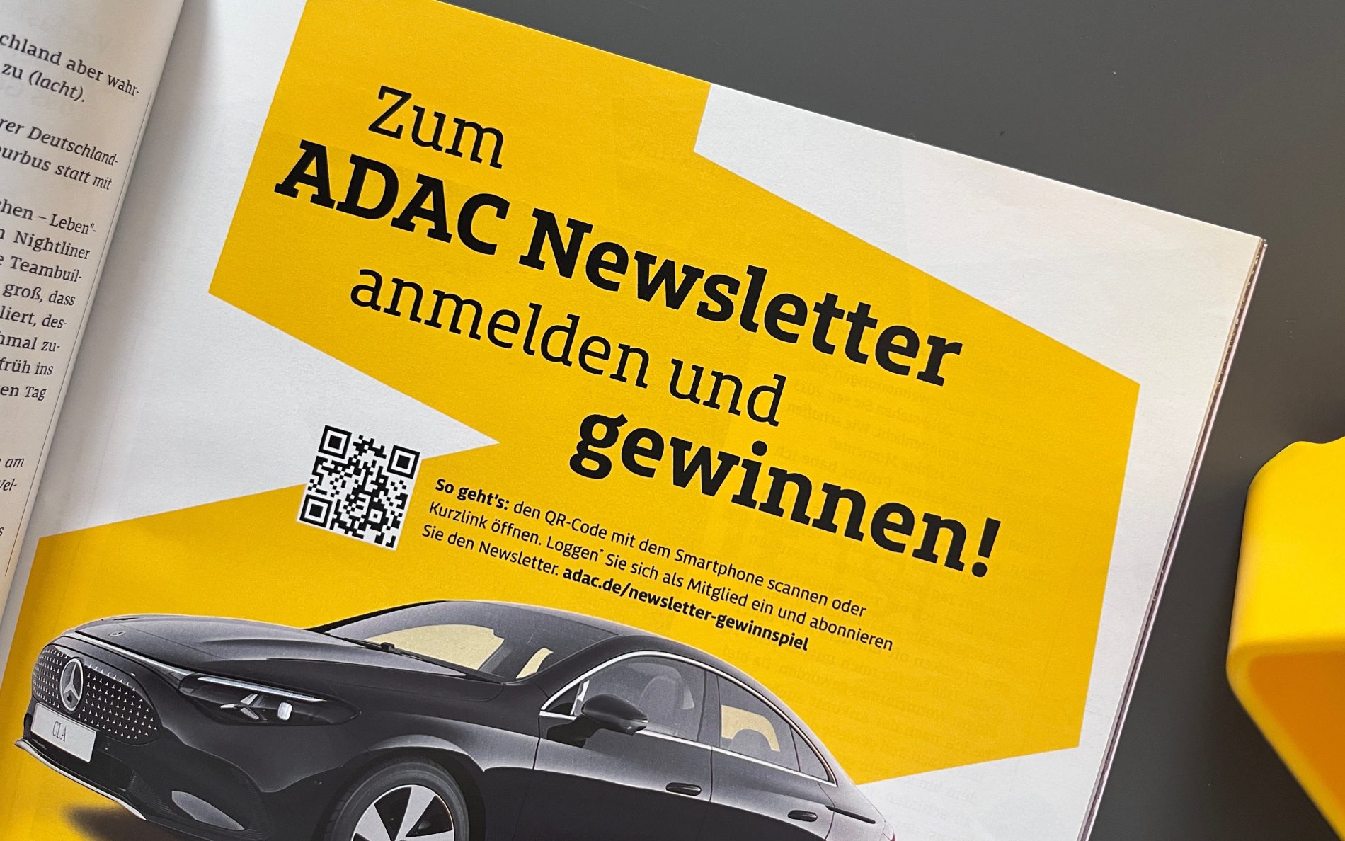
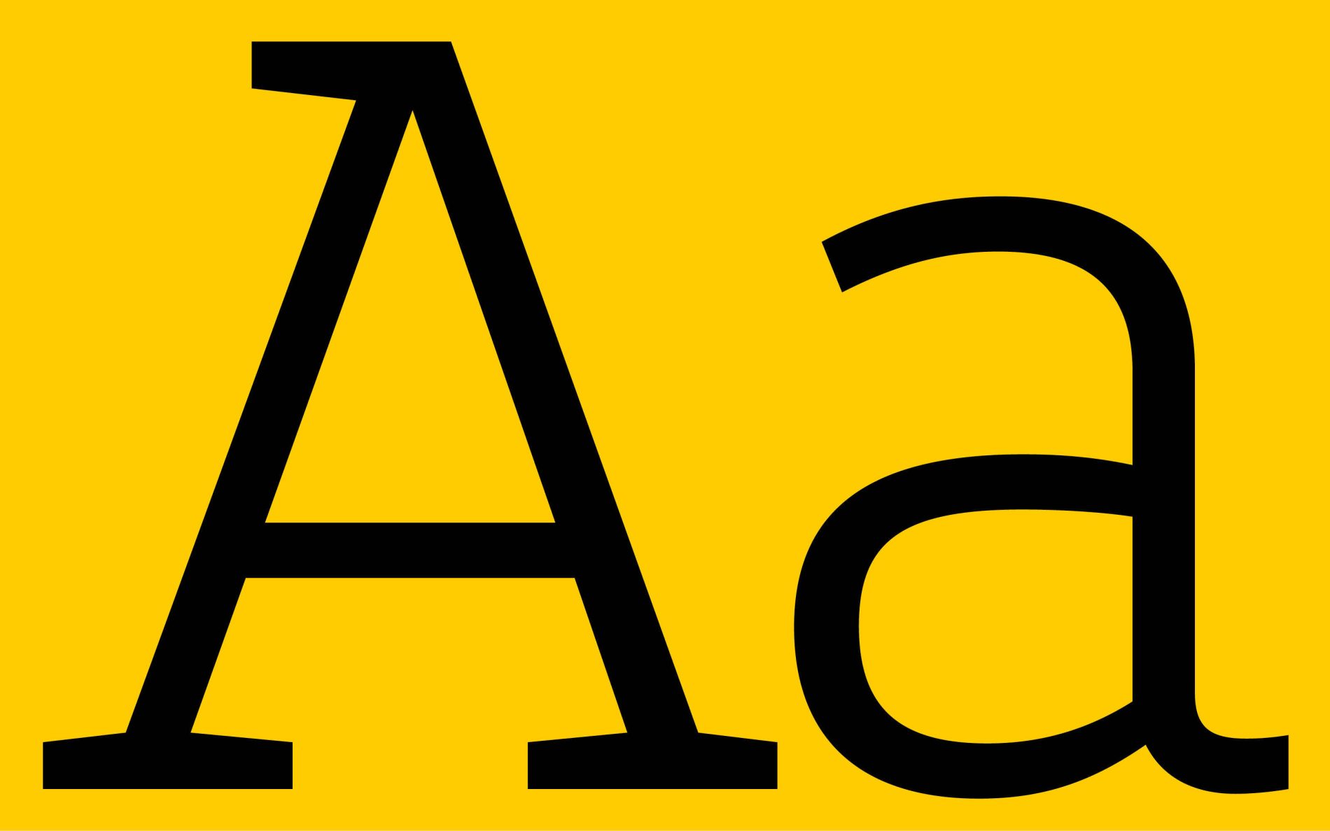
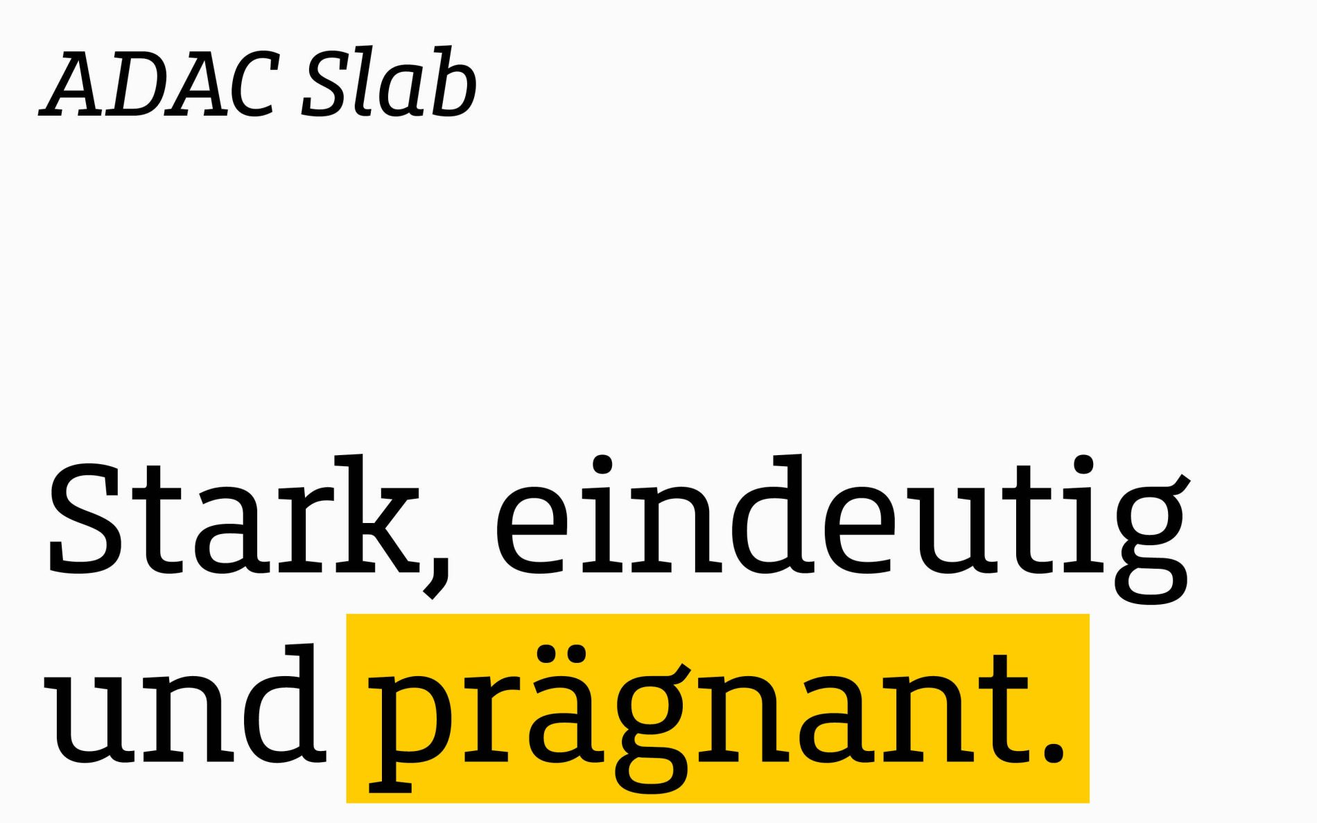
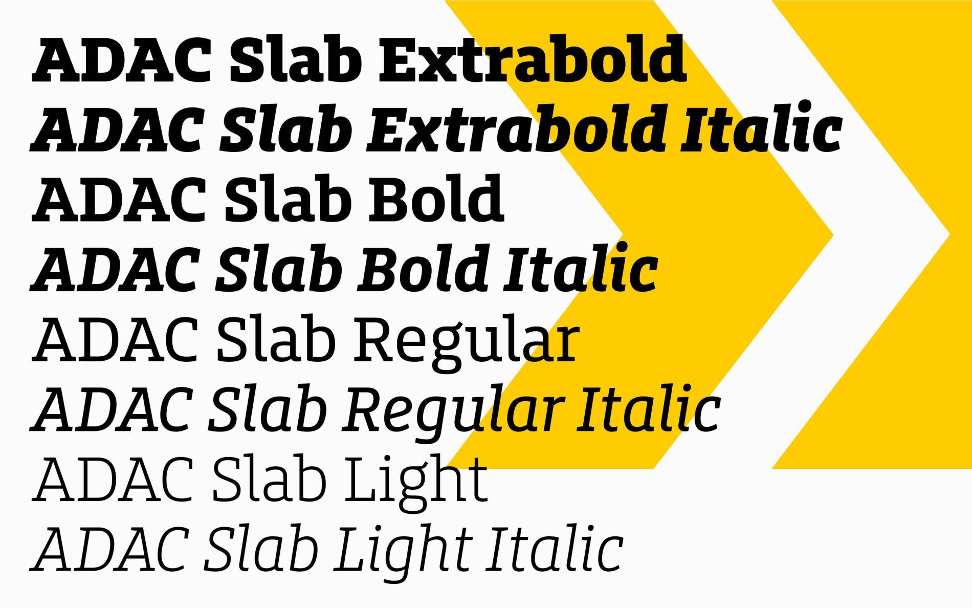
The Slab typeface is designed to create a strong visual impact and high recognition value in headlines. Its pronounced serifs and clear, human-like form particularly emphasise the ADAC’s brand identity.
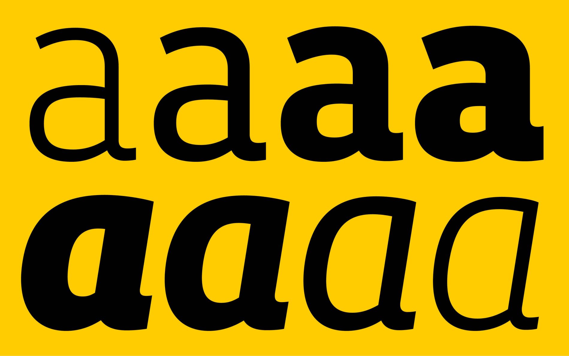
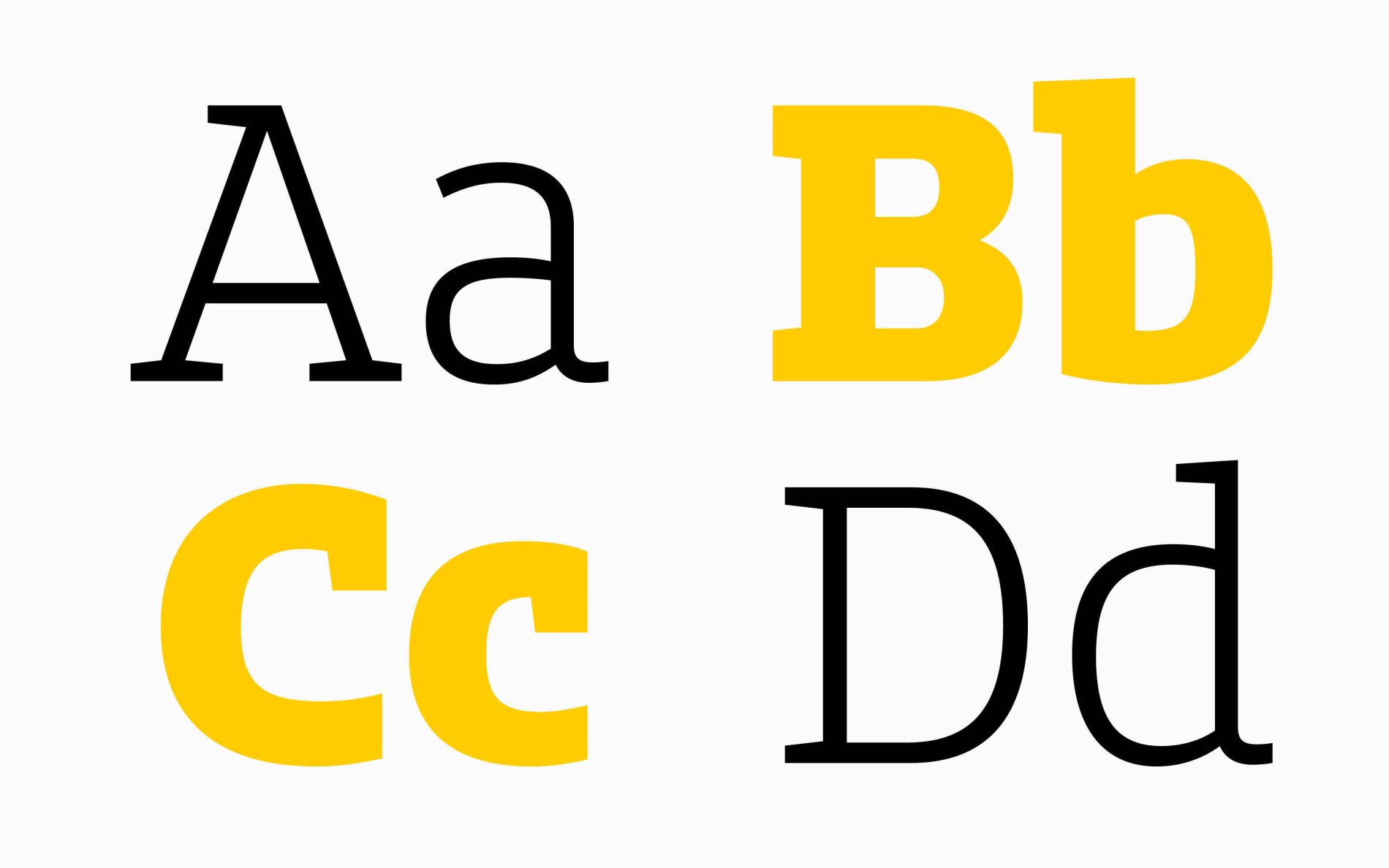
The typeface’s characteristic features stand out clearly: open letterforms ensure good legibility. The lowercase “a” deliberately omits an upper serif, while the “n”, “m” and “x” are partially serifless in their counters. These features create a balanced and clear typeface.
Subtle details, such as the gentle curves in the “u” and the italic style clearly inspired by handwriting, emphasise the brand values of accessibility and humanity.
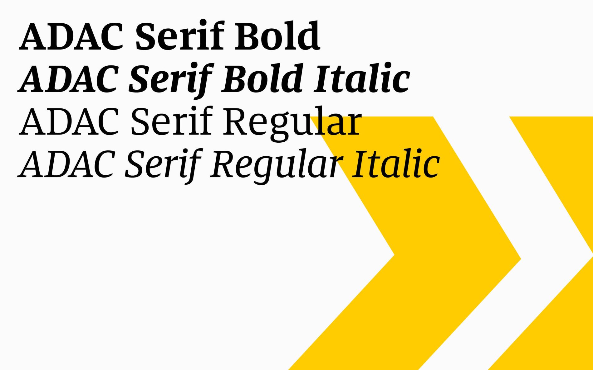
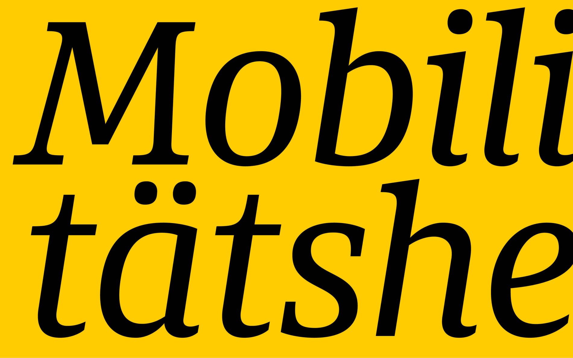

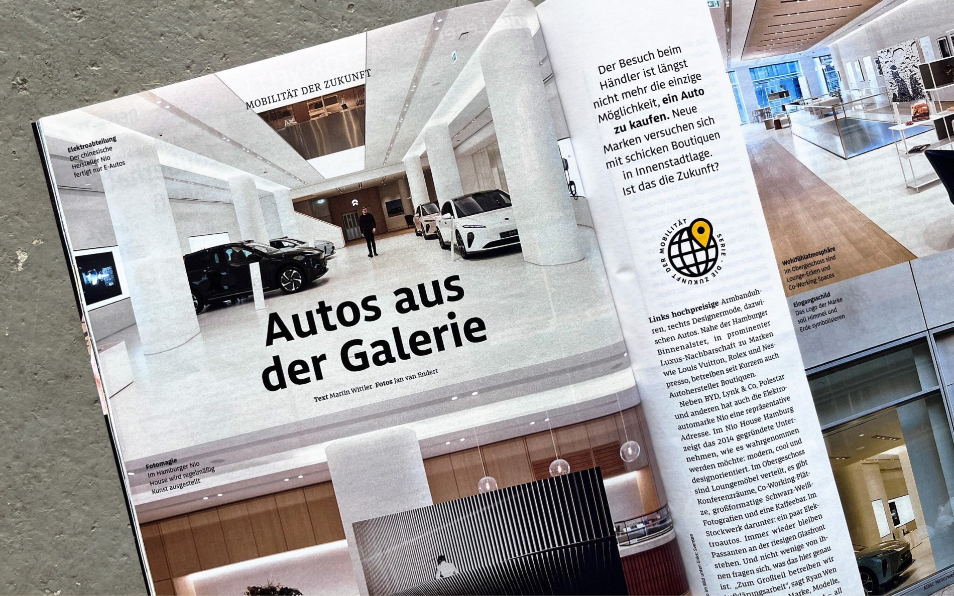
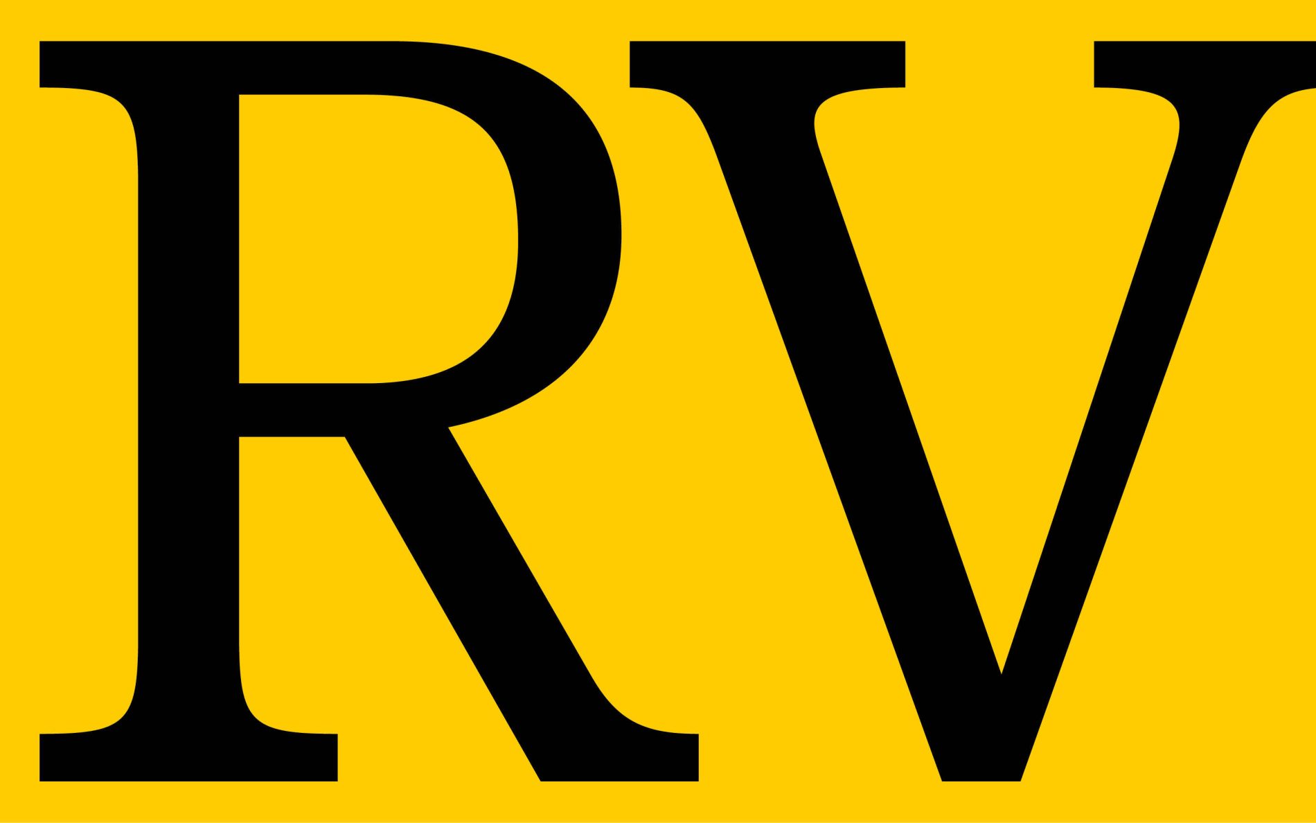
The Serif
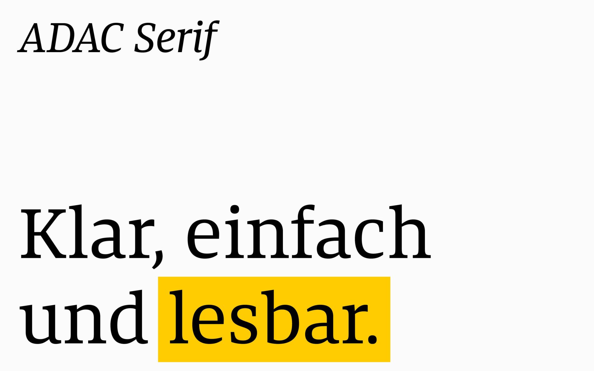
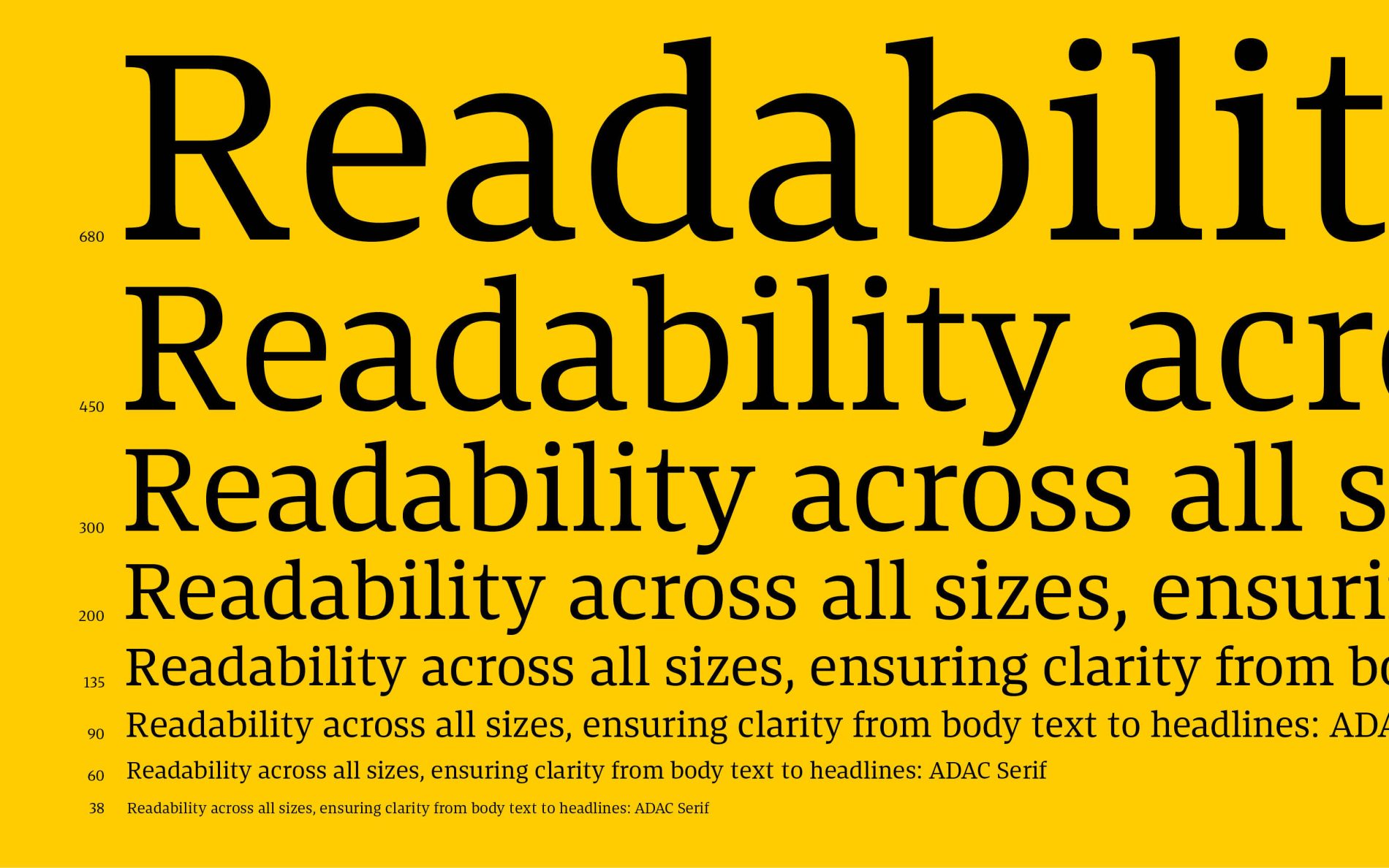
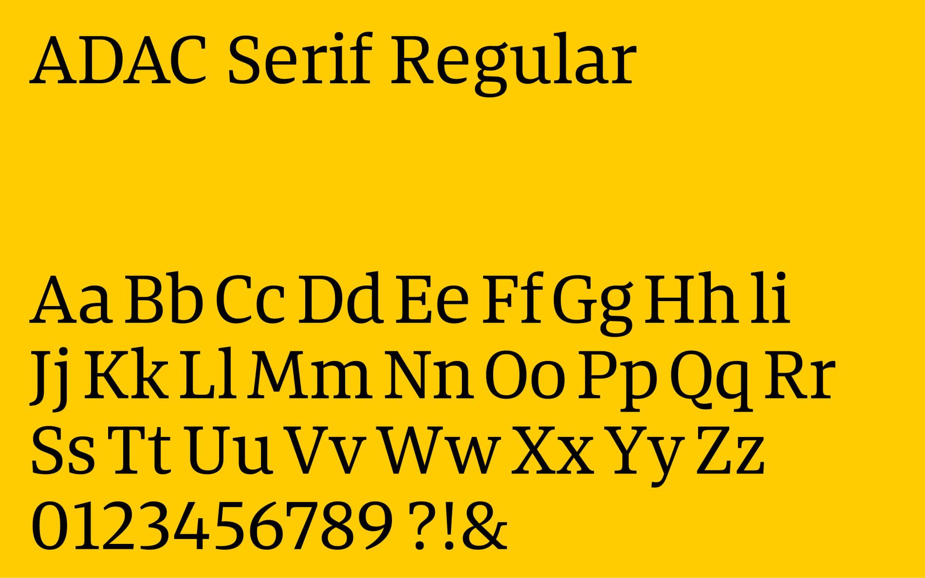
The ADAC Serif is a display typeface designed for use in journals and magazines, both in print and on screen. Rather than being based on an identical design to the Sans and Slab variants, it focuses on rhythm and the natural flow of text. At the same time, the distinctive character of the brand is maintained in the details; for example, the italic “k” echoes the construction of the italics in the Sans and Slab variants.
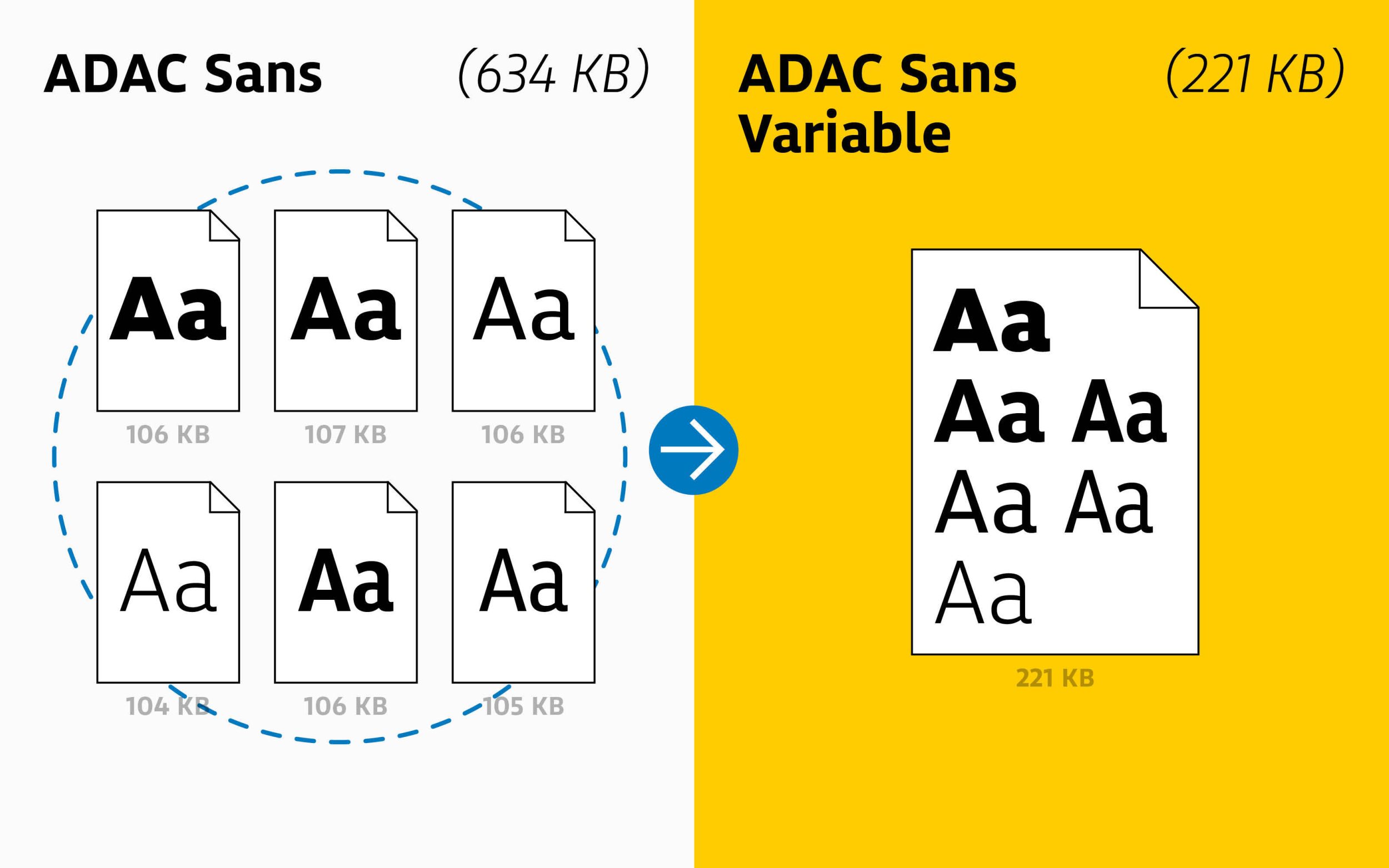
ADAC’s variable fonts are state of the art. When used strategically in web and app applications, they reduce data volumes efficiently.
The ADAC brand angle creates eye-catching lists. It can be applied directly via Unicode and OpenType features.
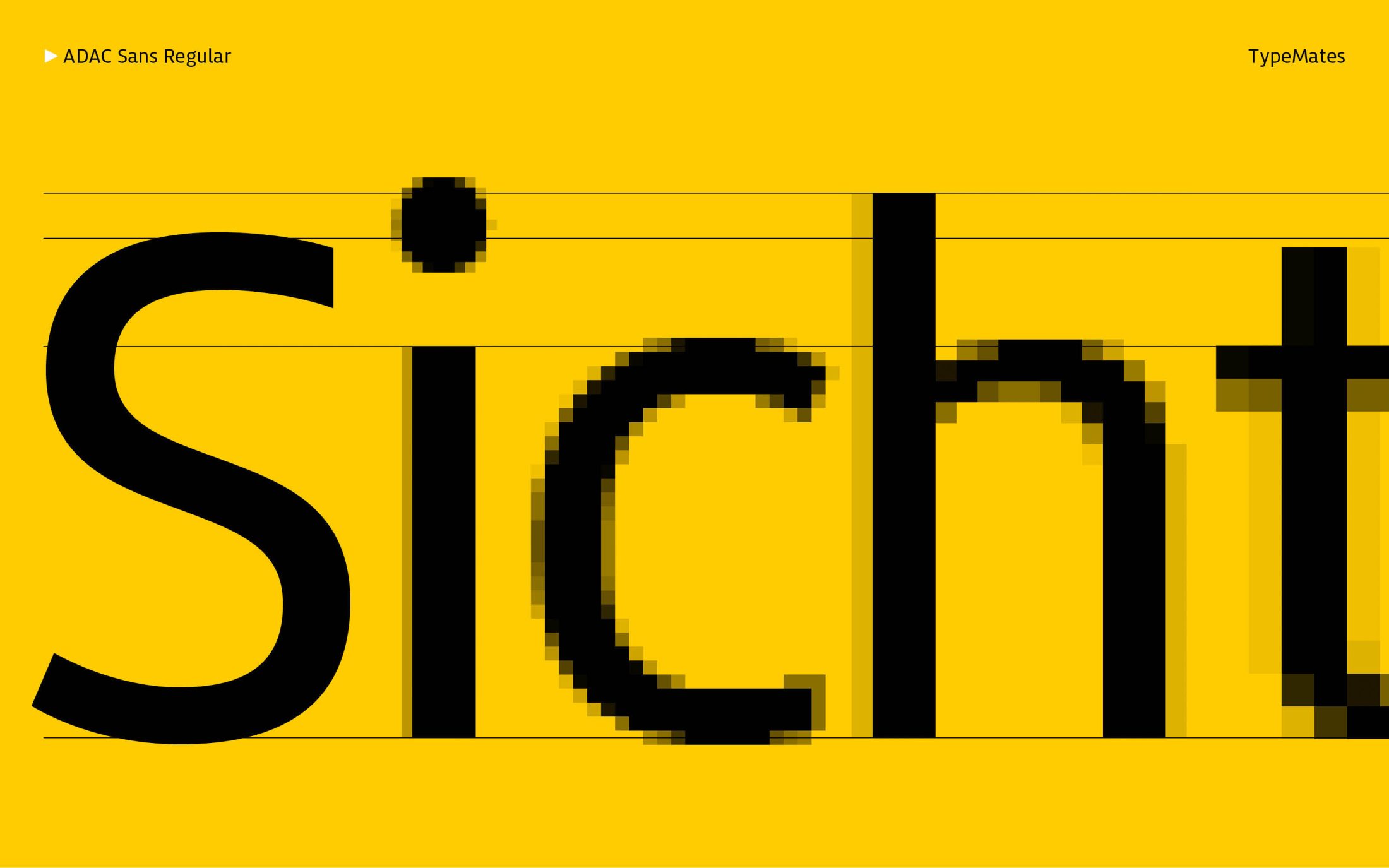
The TrueType fonts and desktop typefaces have been manually optimised for on-screen display. They ensure clear legibility, even on low-resolution touchpoints.
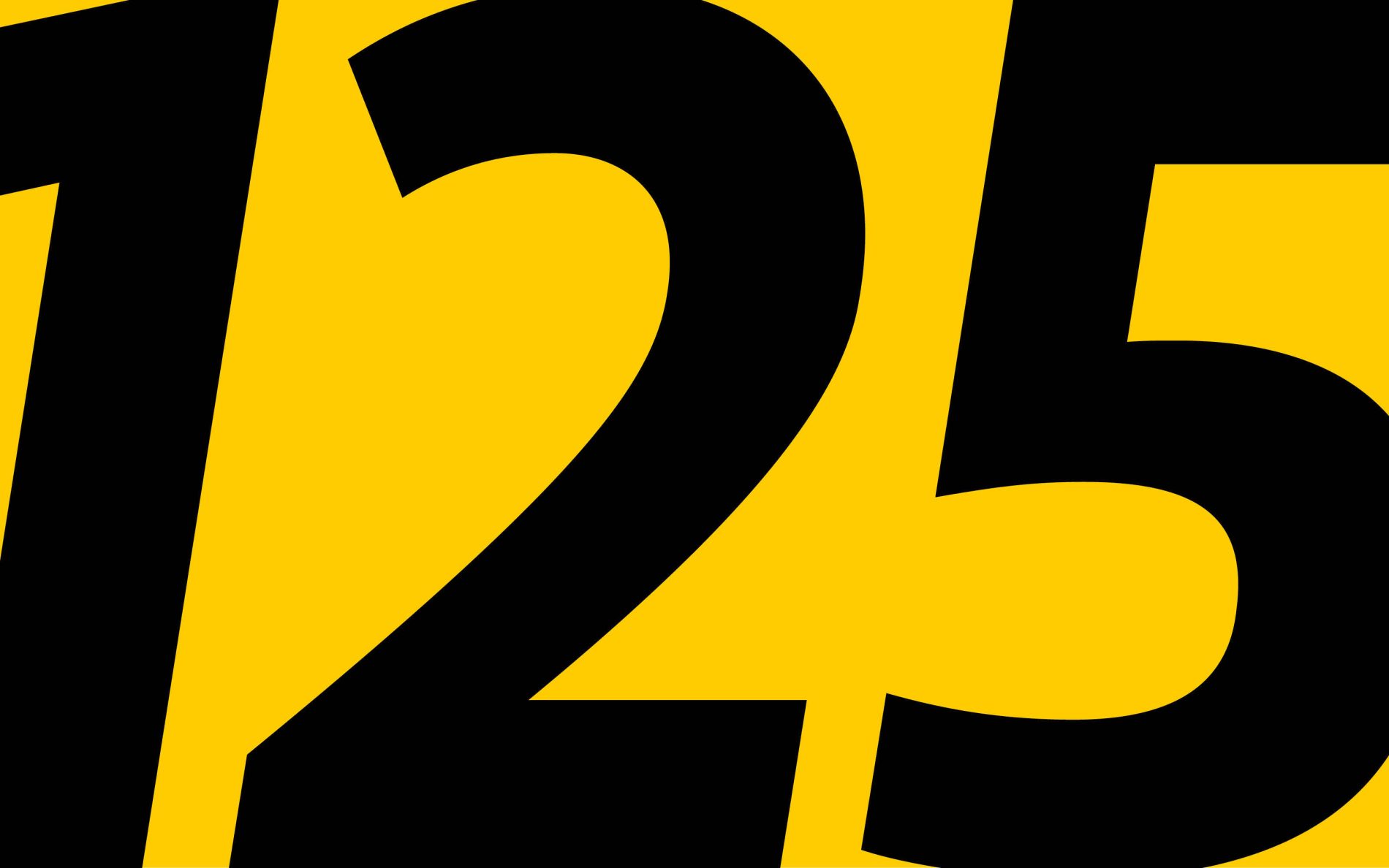
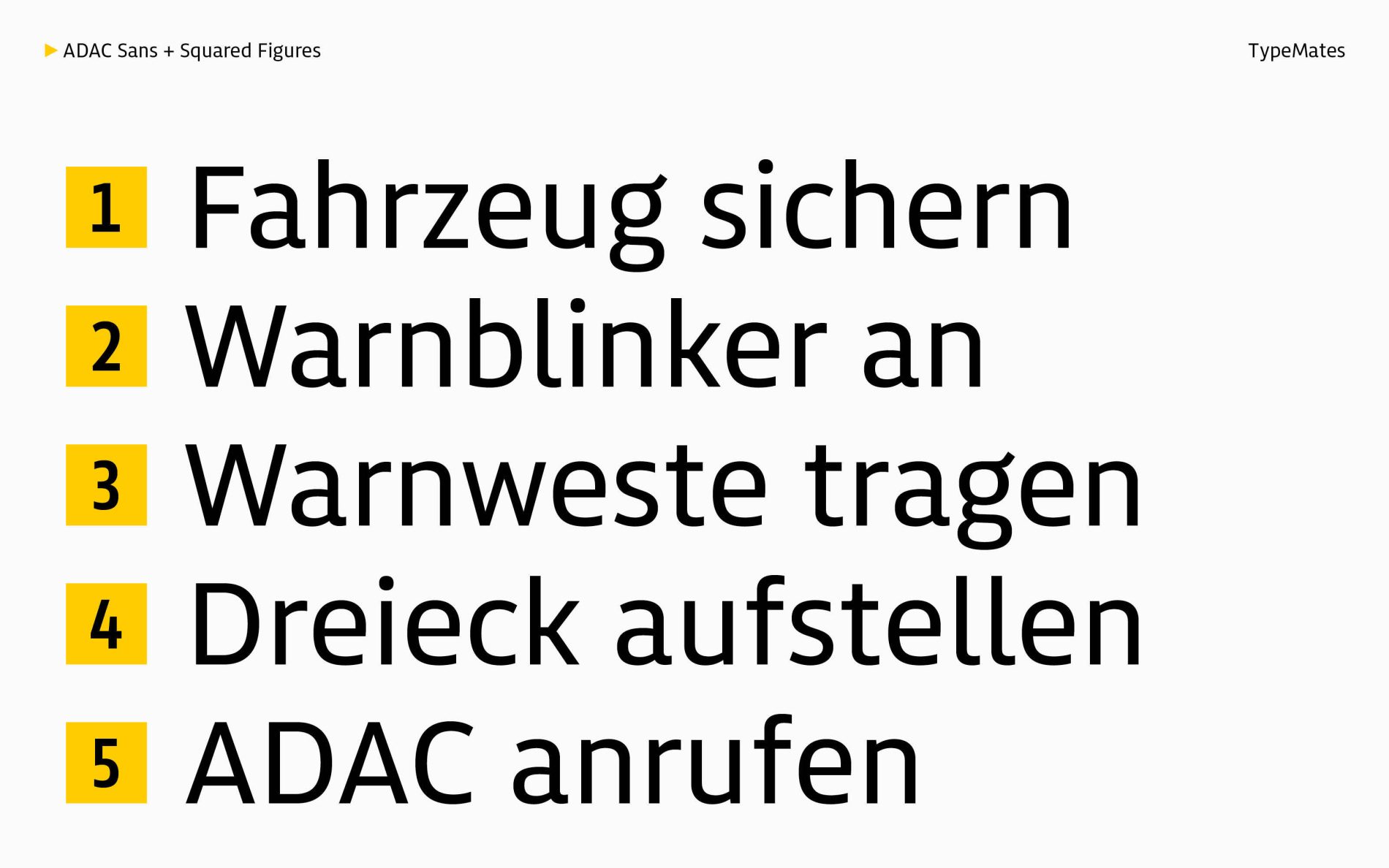
An additional typeface style, “ADAC Squared Numbers”, is used to format single- and double-digit numbers on maps and allows the squares to be coloured individually.
Compact umlauts and a shortened “Q” optimise headlines, particularly within the visual identity of the ADAC Motorsport sub-brand.
Some icons are designed consistently across all font styles and are based on the regular weight of the Sans. Other icons adapt to the style and stroke thickness of the typeface family.
An alternative “g” has been provided for the ADAC Foundation and ADAC Air Rescue to support the consistent continuation of the visual identity.
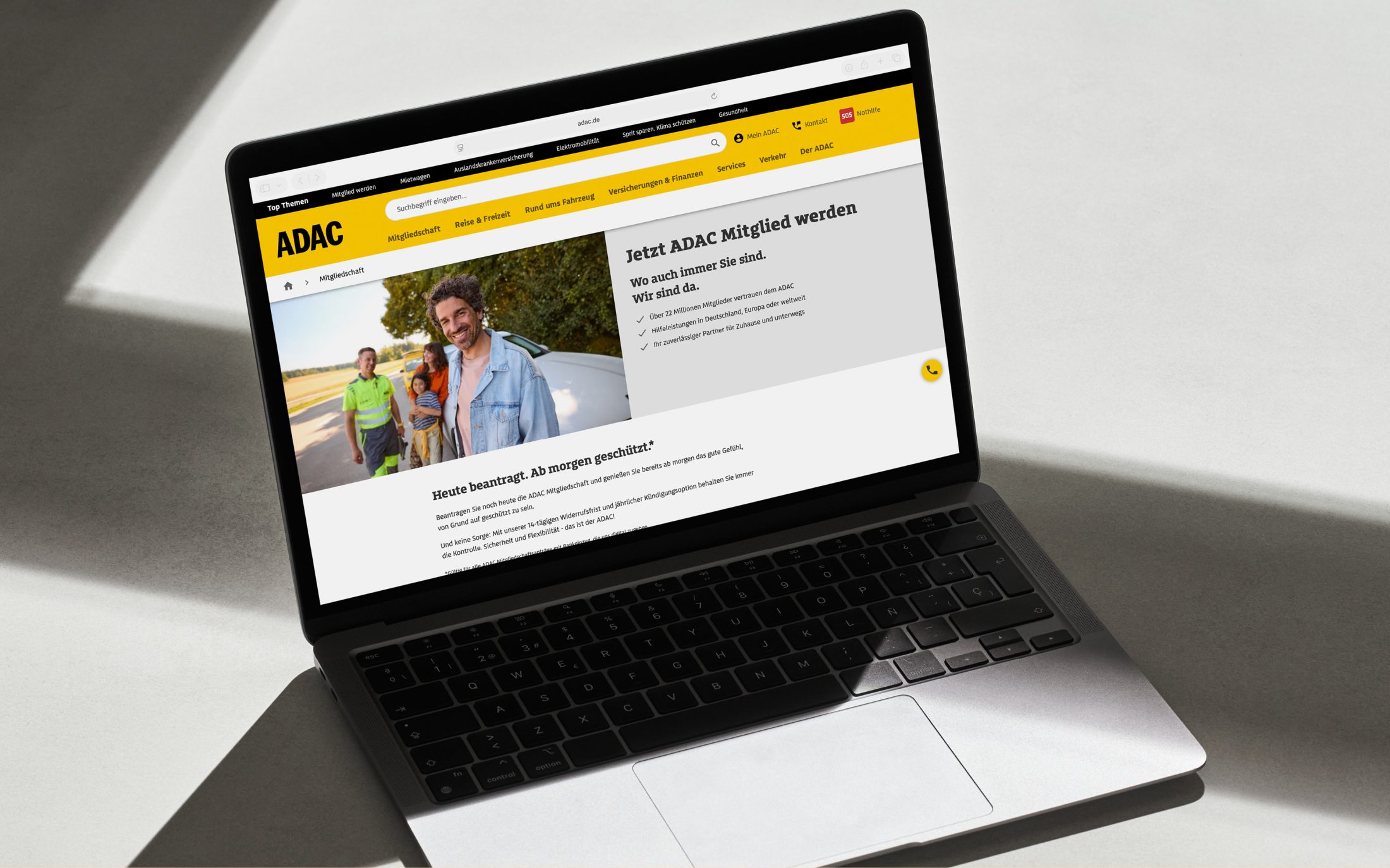
The ADAC Sans, Slab and Serif typefaces are ready for use and form a central design element. Thanks to their bespoke design and unlimited licensing, they can be used without restriction on a permanent basis and across countless media.