Zoom TV
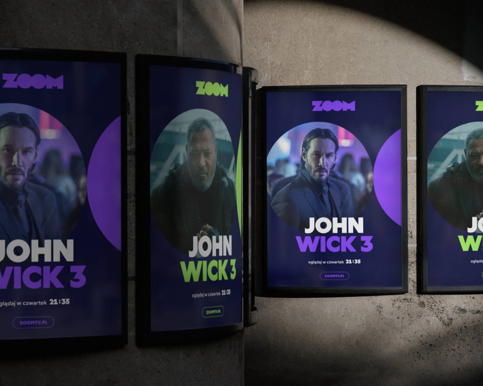
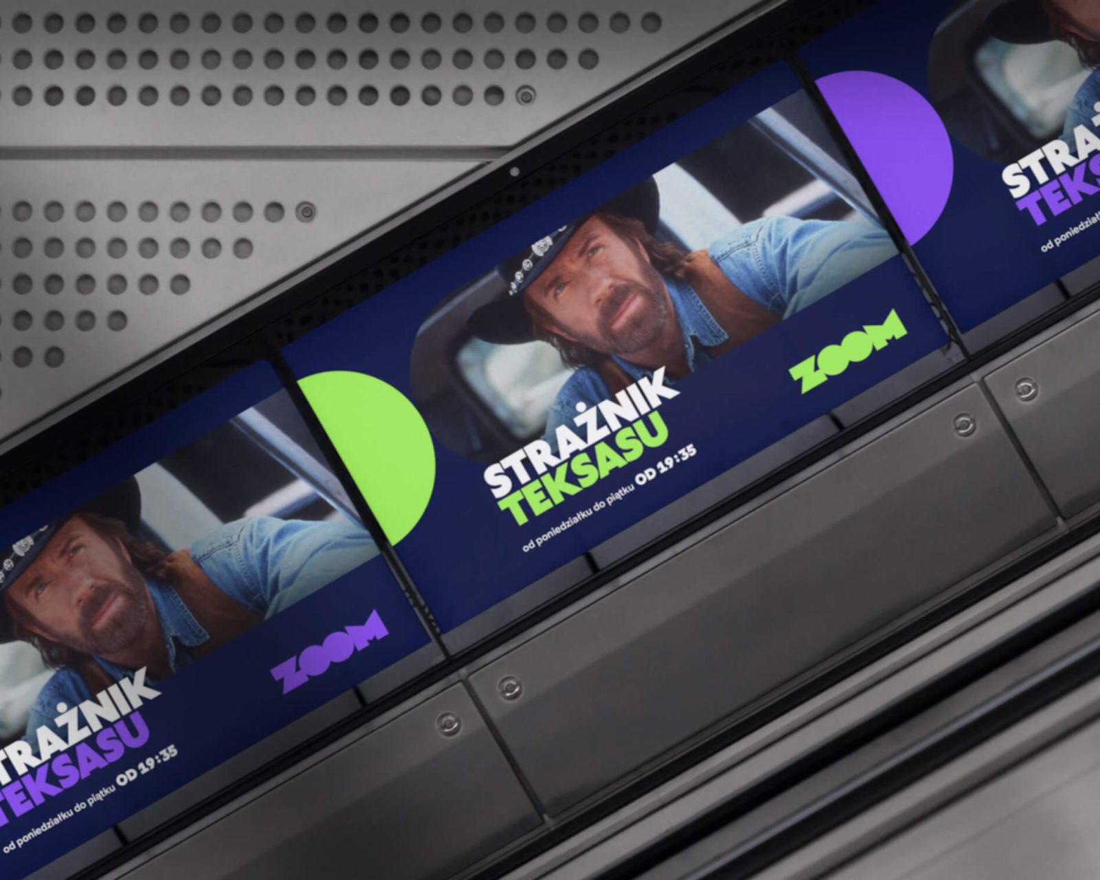
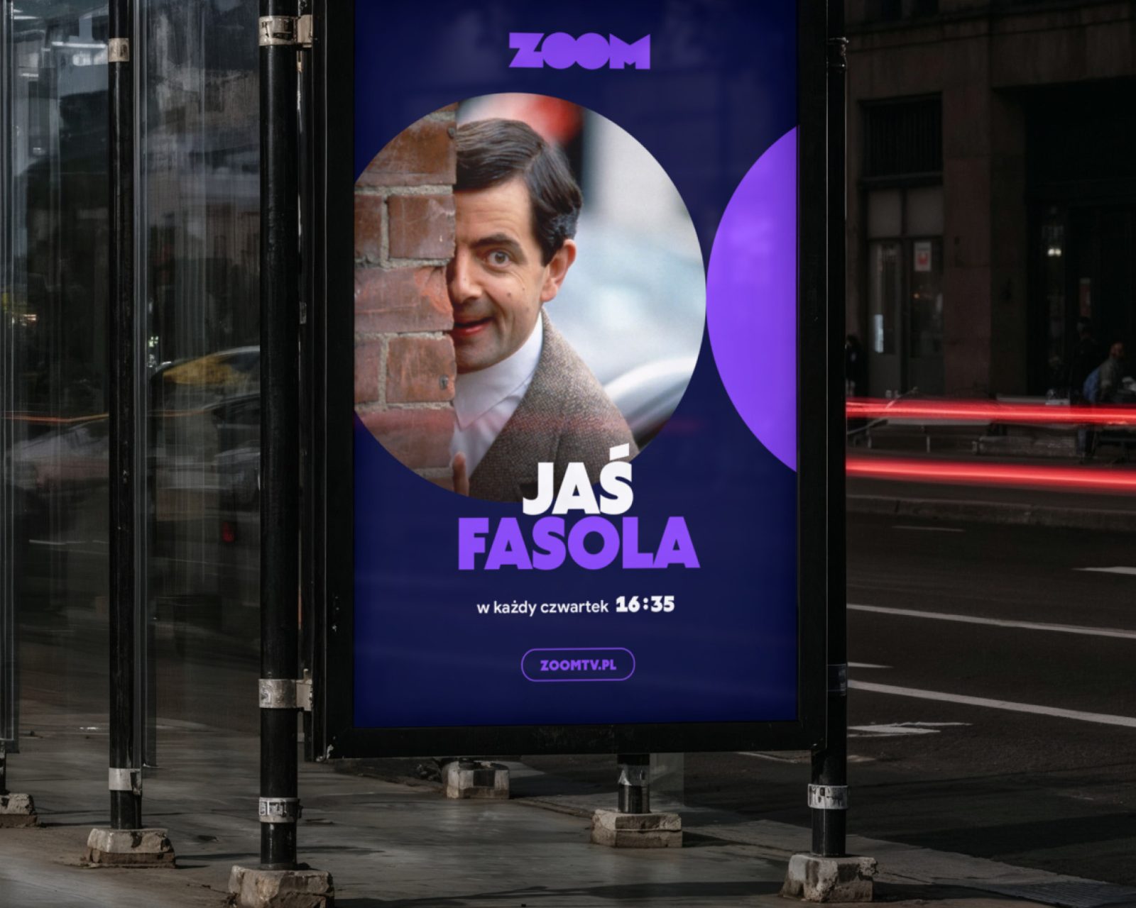
In the rebranding of Polish broadcaster Zoom TV, the Grato Classic typeface conveys simplicity and character without distracting from the television experience itself.
The video stills and images shown are the property of the broadcaster ZOOM and its respective producers/distributors and were used solely to illustrate the implemented visual identity system and on-air design of the channel. All rights to the works shown remain with their respective owners.
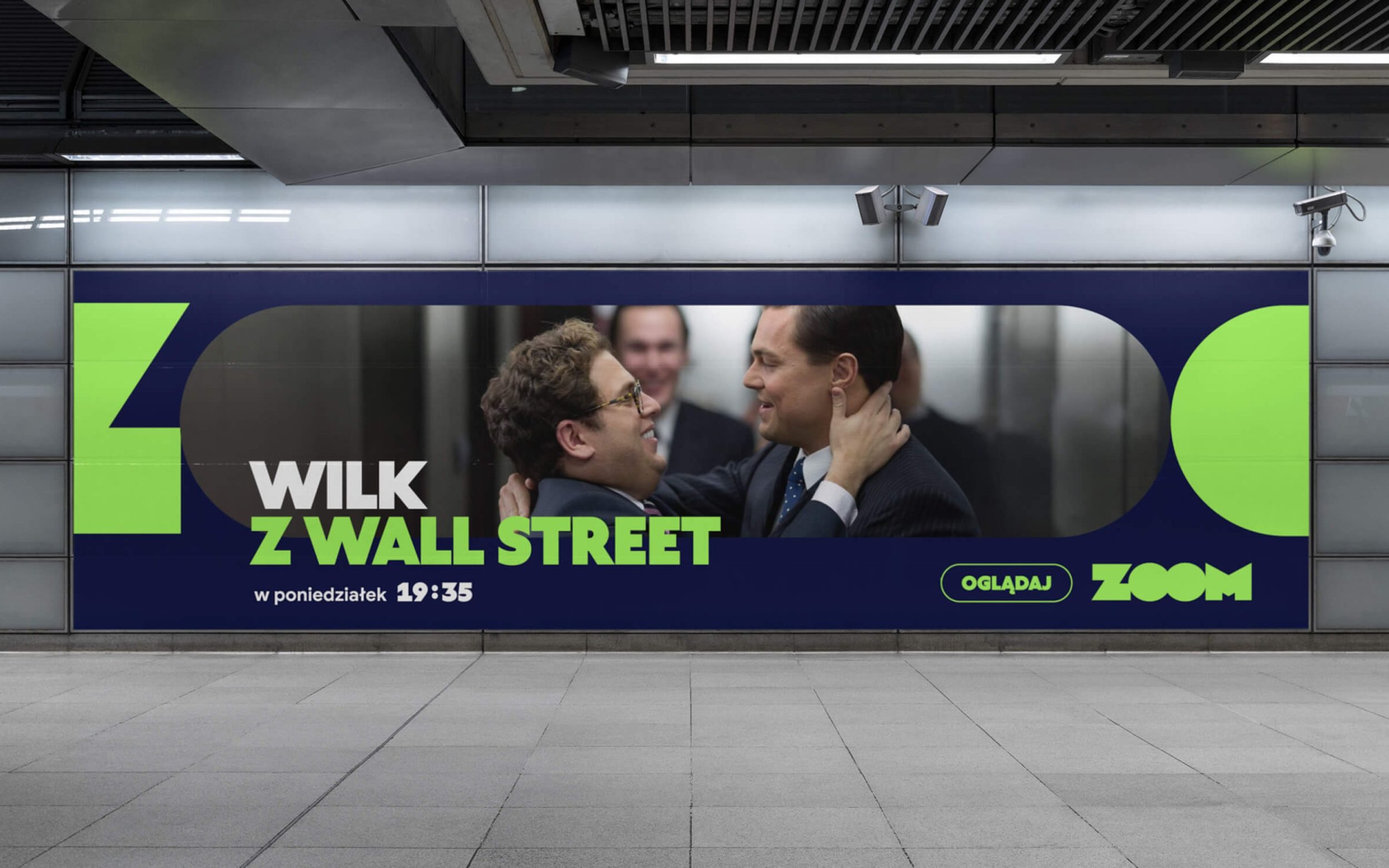
Zoom TV, the Polish broadcaster, needed a rebranding to reposition itself and better appeal to a modern audience. To address this challenge, Wyraz Design developed a dynamic, highly adaptable visual identity centered around motion. Grato Classic plays a key role in this. Mateusz Bieniusa, Senior Designer at Wyraz, explains:
"Grato fits seamlessly into ZOOM's visual identity, combining geometric simplicity with a distinct personality. It has enough character to build brand recognition, while remaining restrained enough not to compete with the channel's main visual focus: the image. Its strong, compact forms work naturally with an identity built around uppercase typography, cropping, and movement. The typeface balances soft, rounded shapes with more defined endings, giving it a dynamic quality that works well within a system where typography shifts in scale and proportion and interacts closely with imagery."