Wolfra Alpenschorle Packaging
New and friendly packaging for Wolfra’s Alpenschorlen, redesigned by Zeichen & Wunder with Cera Pro.
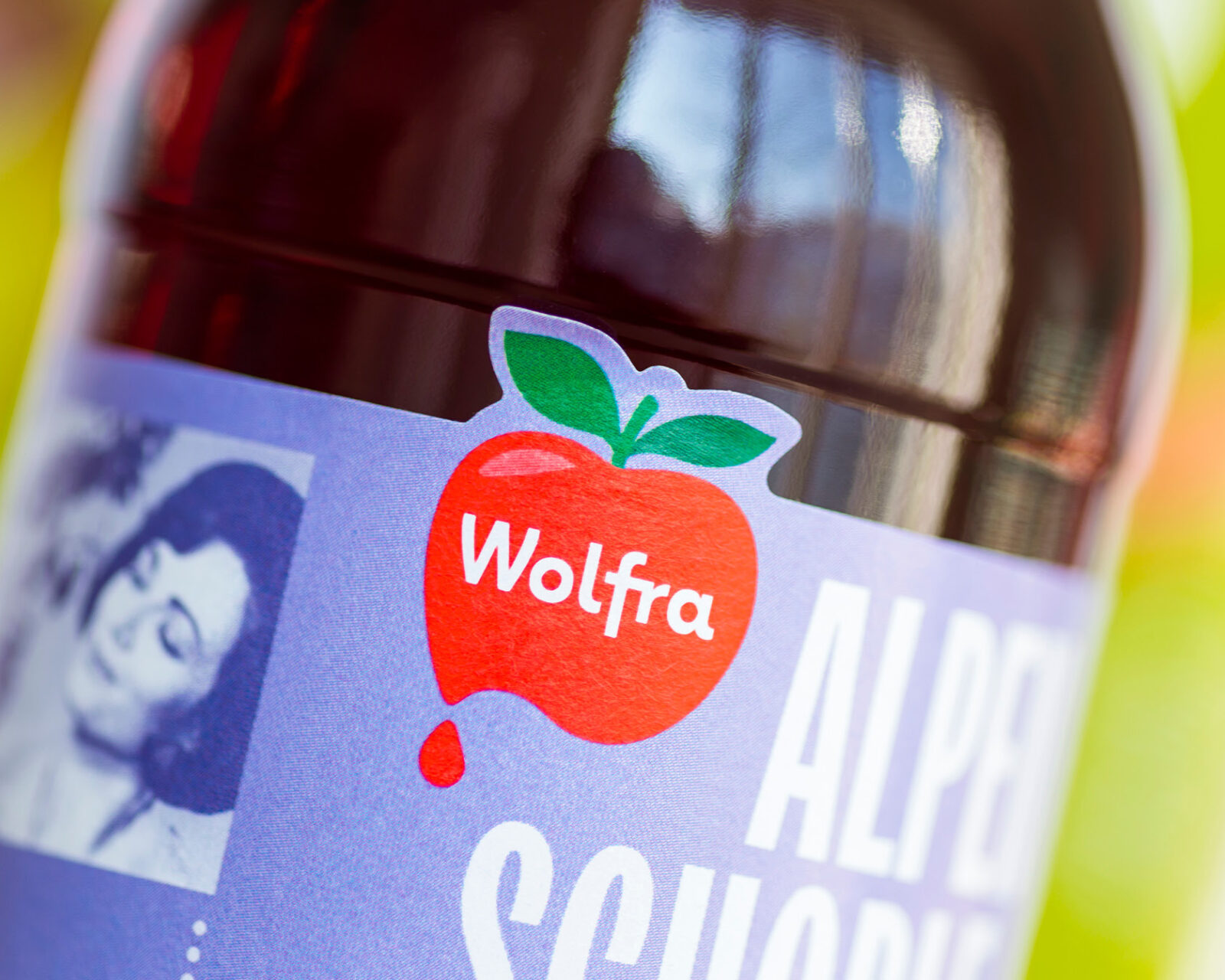
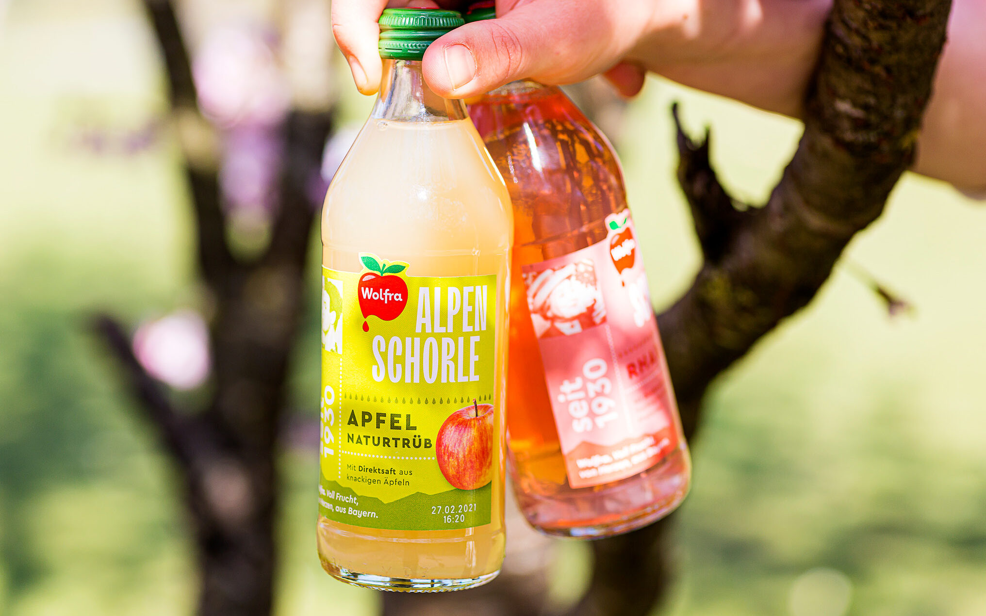
With the new design, Wolfra wants to reach a young, urban target group whilst also appearing to garden connoisseurs with a sense of good design.
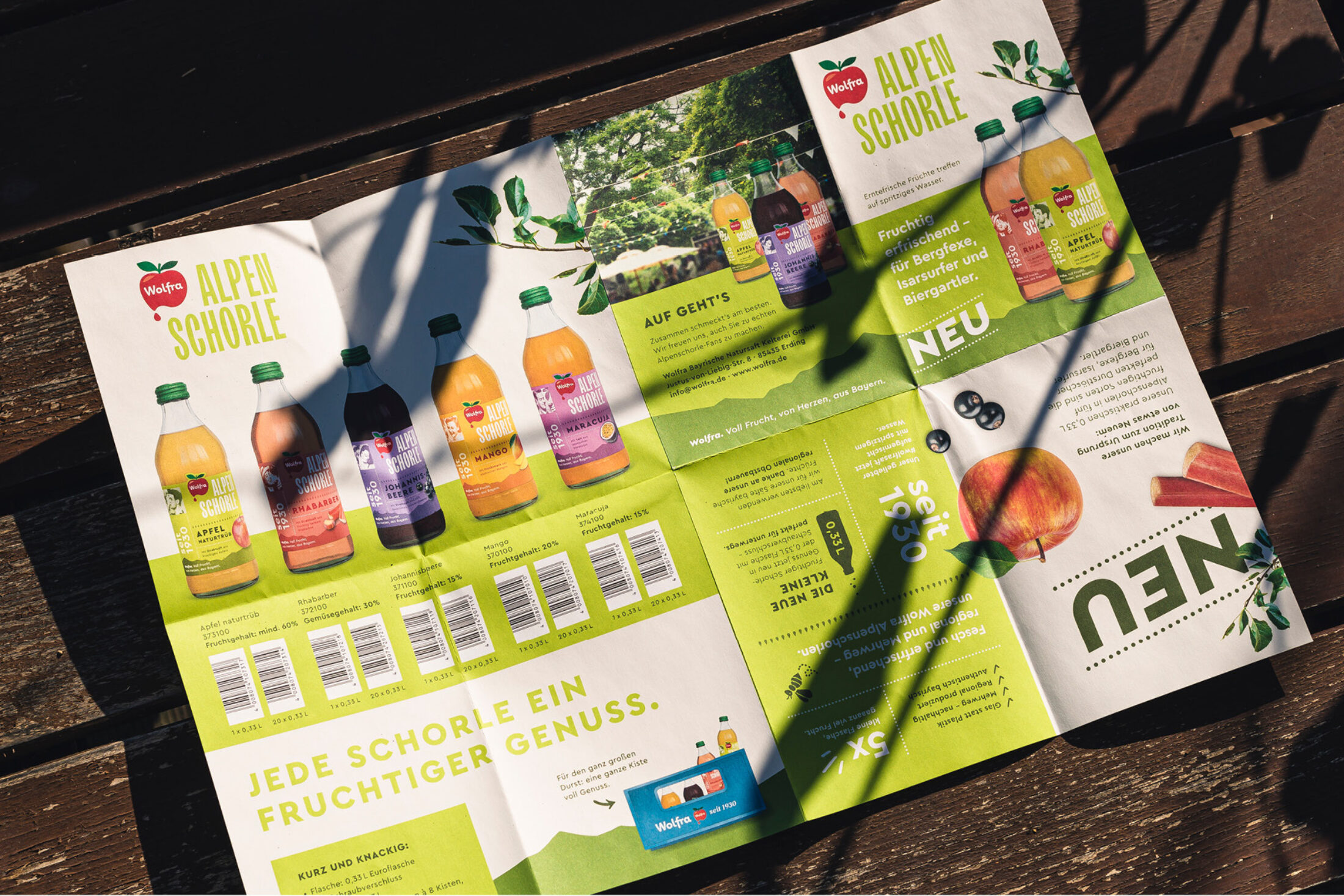
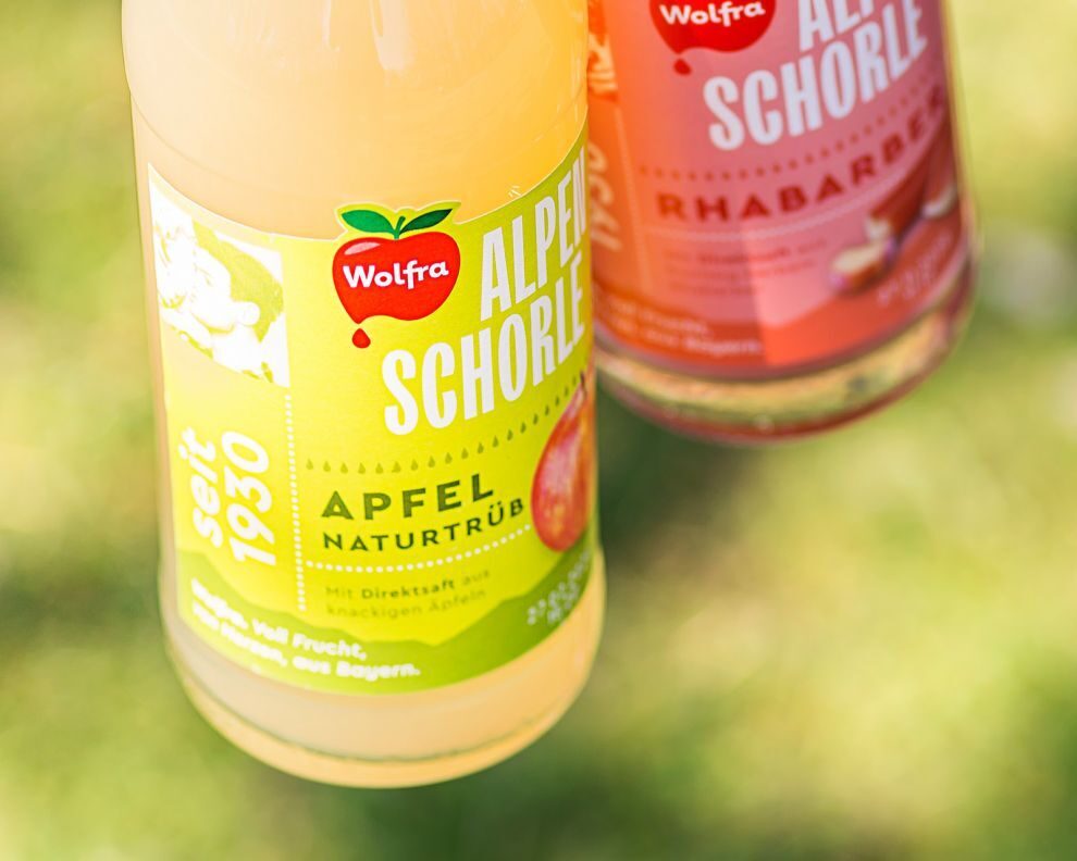
True to the motto “little spritzer, big time!”, the Munich-based agency gave the traditional brand a striking, fresh and at the same time slightly nostalgic redesign. The new word mark is set in TT Trailers and Wolfra’s logo appears to be lettering. Everything else —from labels on the bottle to advertising of the product— is expressed in Cera Pro.

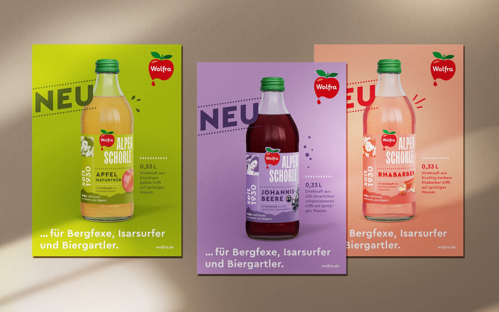
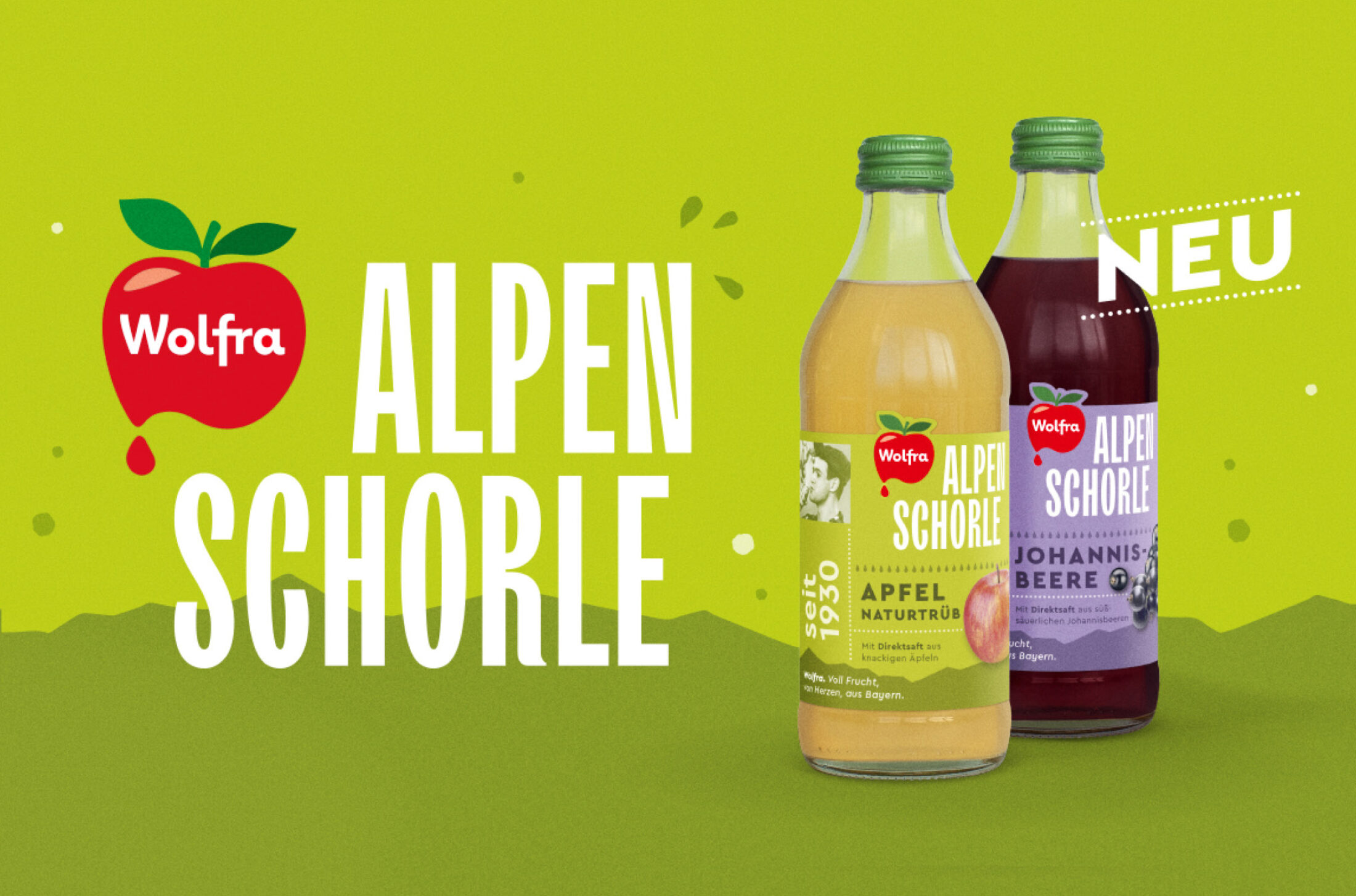
Thanks to Zeichen & Wunder for the images.