Uma Mulher – Uma Poema-Lista
Brazilian designer Valquíria Rabelo is quite addicted to Pensum Pro and finally found a reason to use the text focussed serif with the poem “Uma mulher”.
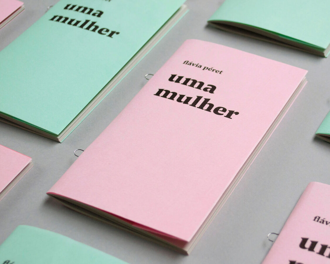
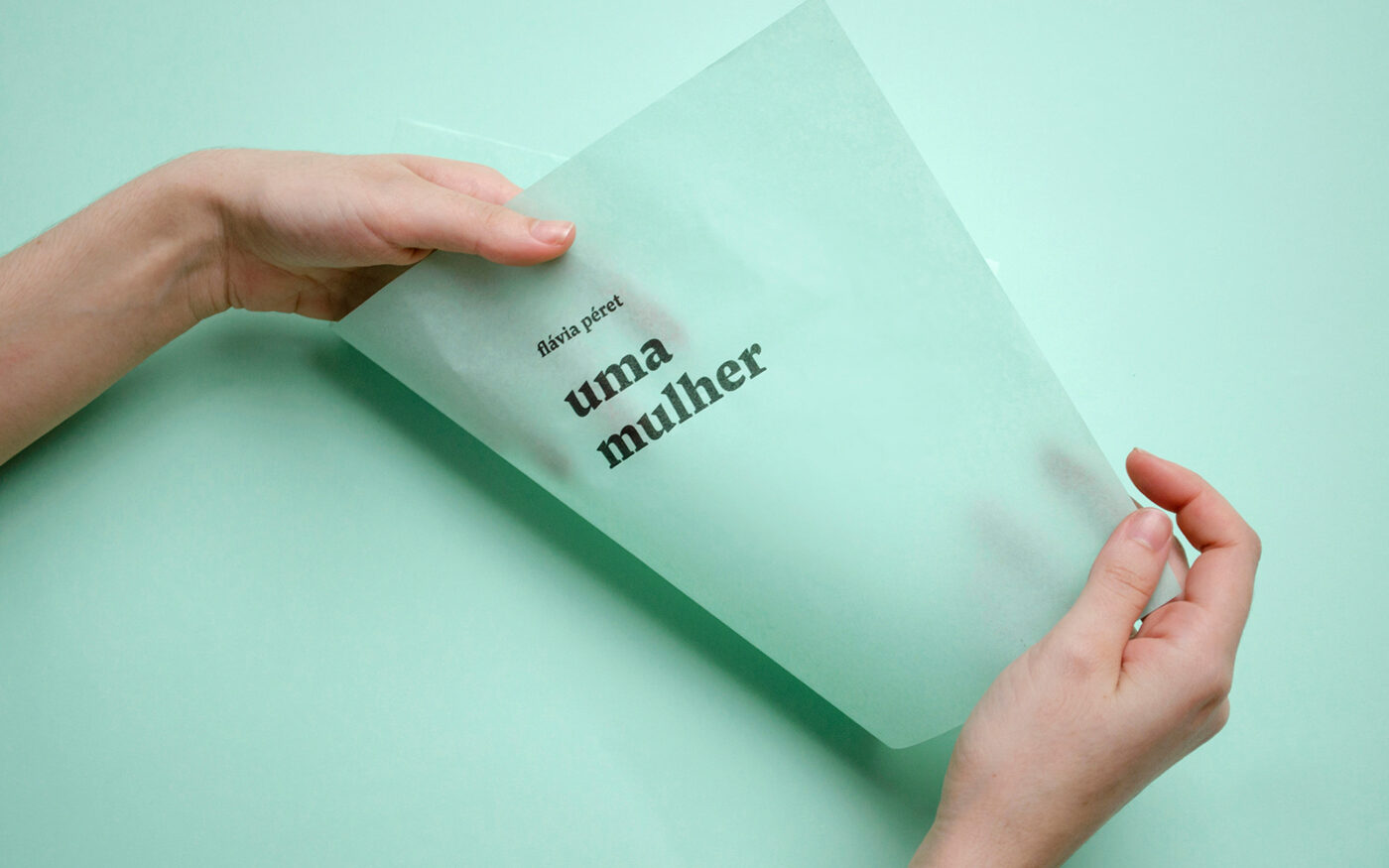
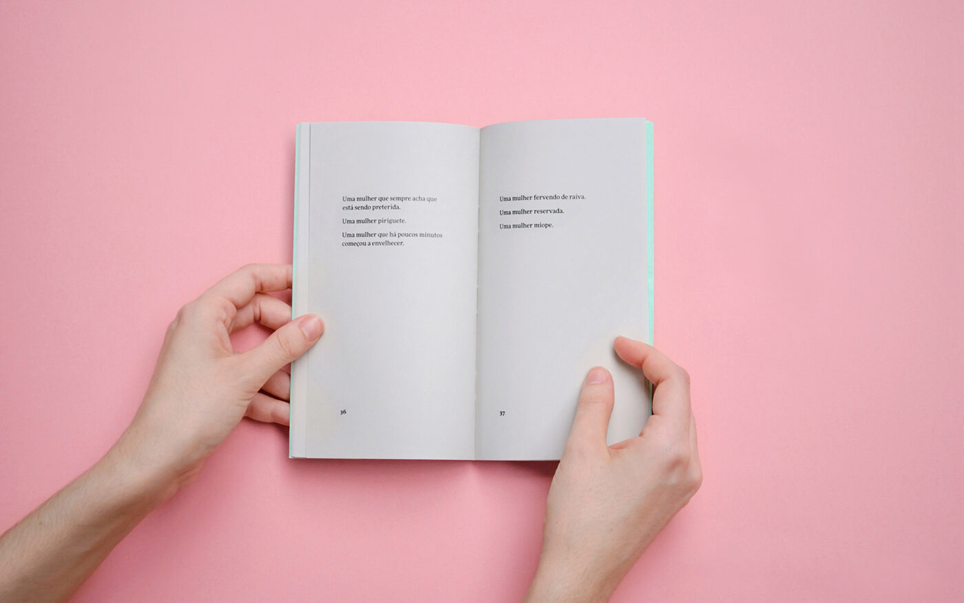
Uma mulher (“A Woman”) is a poem of forty verses, each consisting of three lines with up to sixty characters, all beginning with the words “a woman”. The idea of unity, also contained in the title itself, contrasts with the possibilities of variation: The anaphora gives the text the appearance of a list.
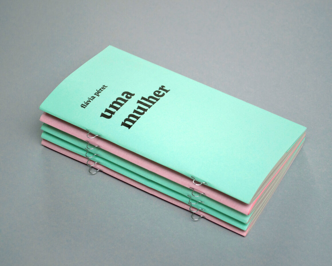
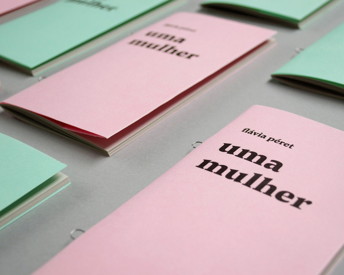
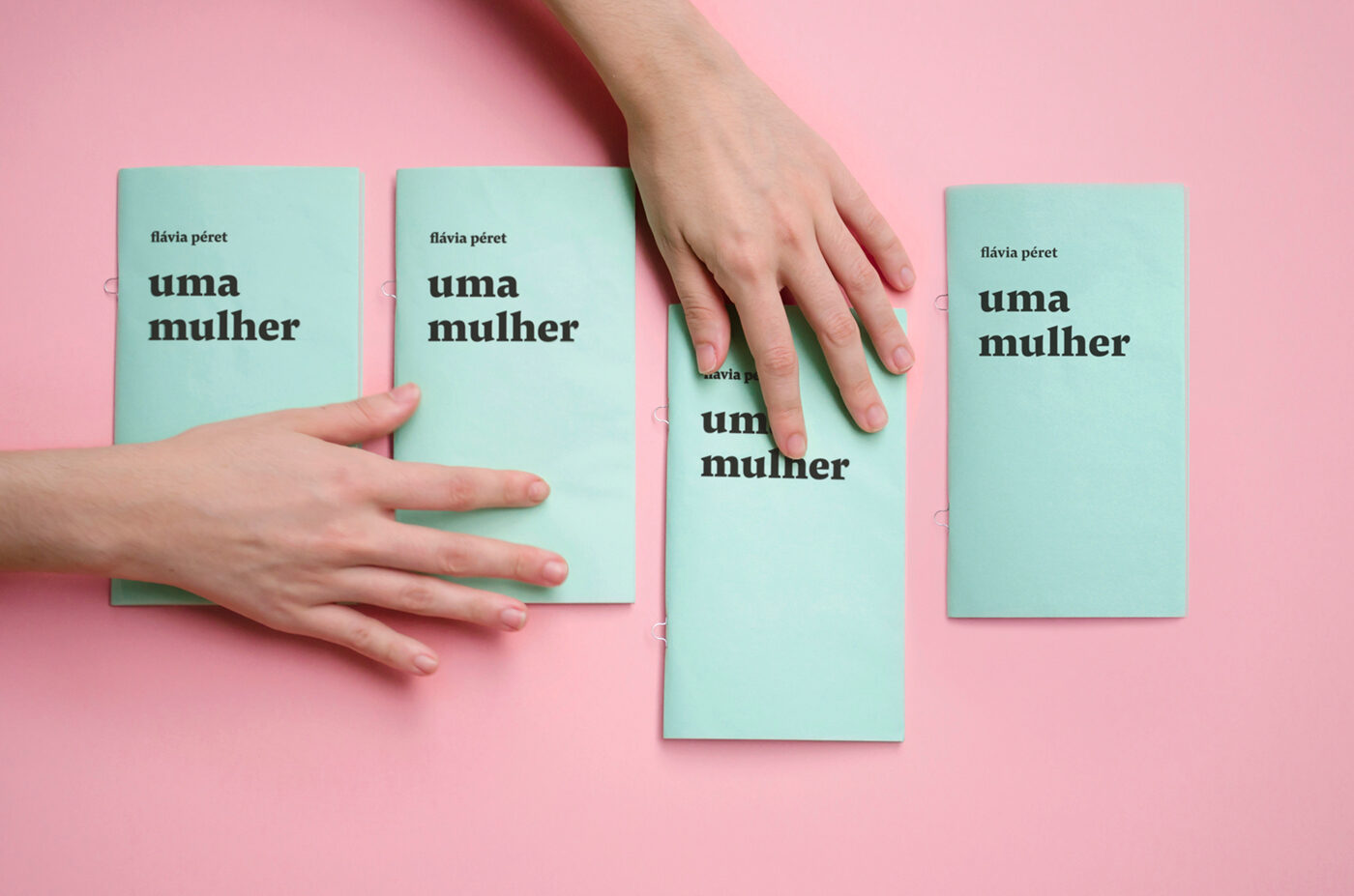
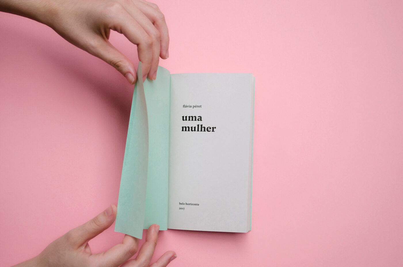
The mechanical gesture of repetition guided the design of the book: loop clamps were used to bind the pages, resulting in an industrial look. The tension between unity and variation was also the reason for producing two covers (green and pink) with the same typographic structure. The covers printed on Flor Post (similar to tissue paper) are translucent and soft. At the same time, the lightweighted paper can be easily peeled off and creates a rough texture that breaks the initial delicacy.
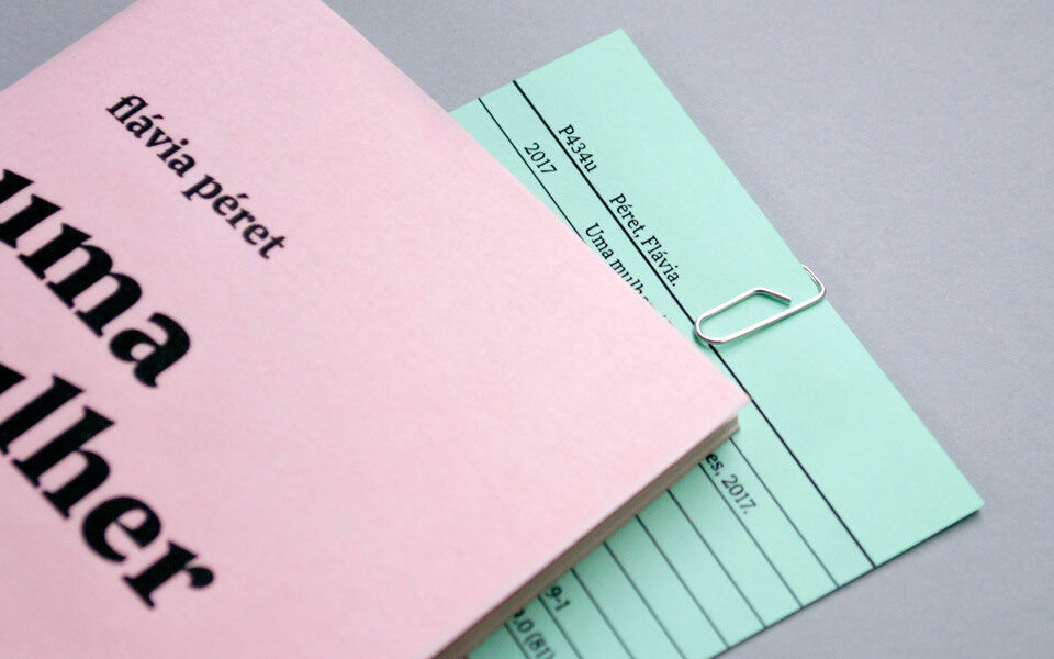
Meta-language is another important aspect of the project. As the poem
describes its own language and compositional process, the book design
itself also points to the graphic universe. For example, the
bibliographic entry was printed separately and then manually attached to
each copy with a paper clip, which closely resembles the look of a real
library card. With all these features, the material properties should
be examined as levels of meaning.
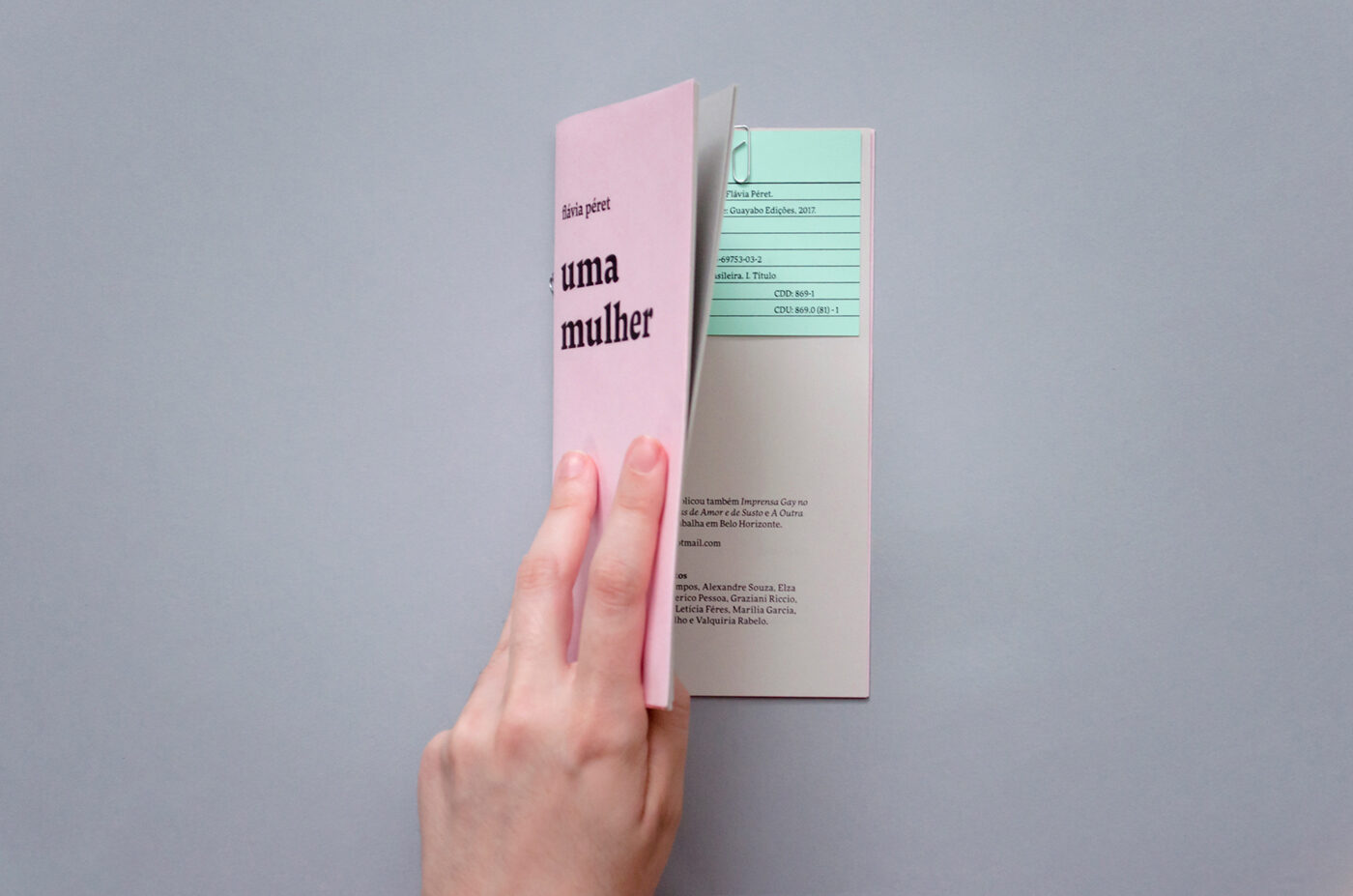
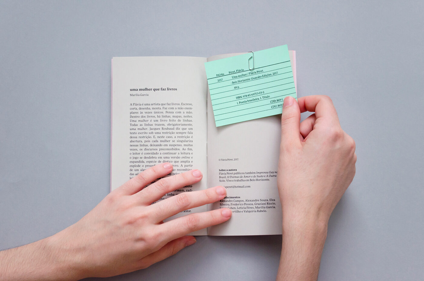
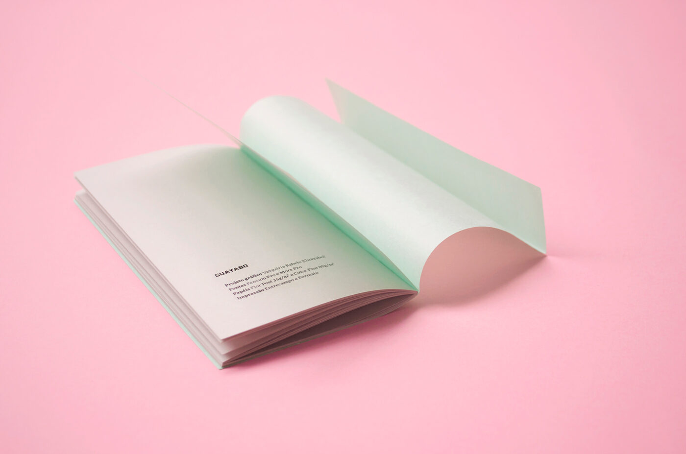
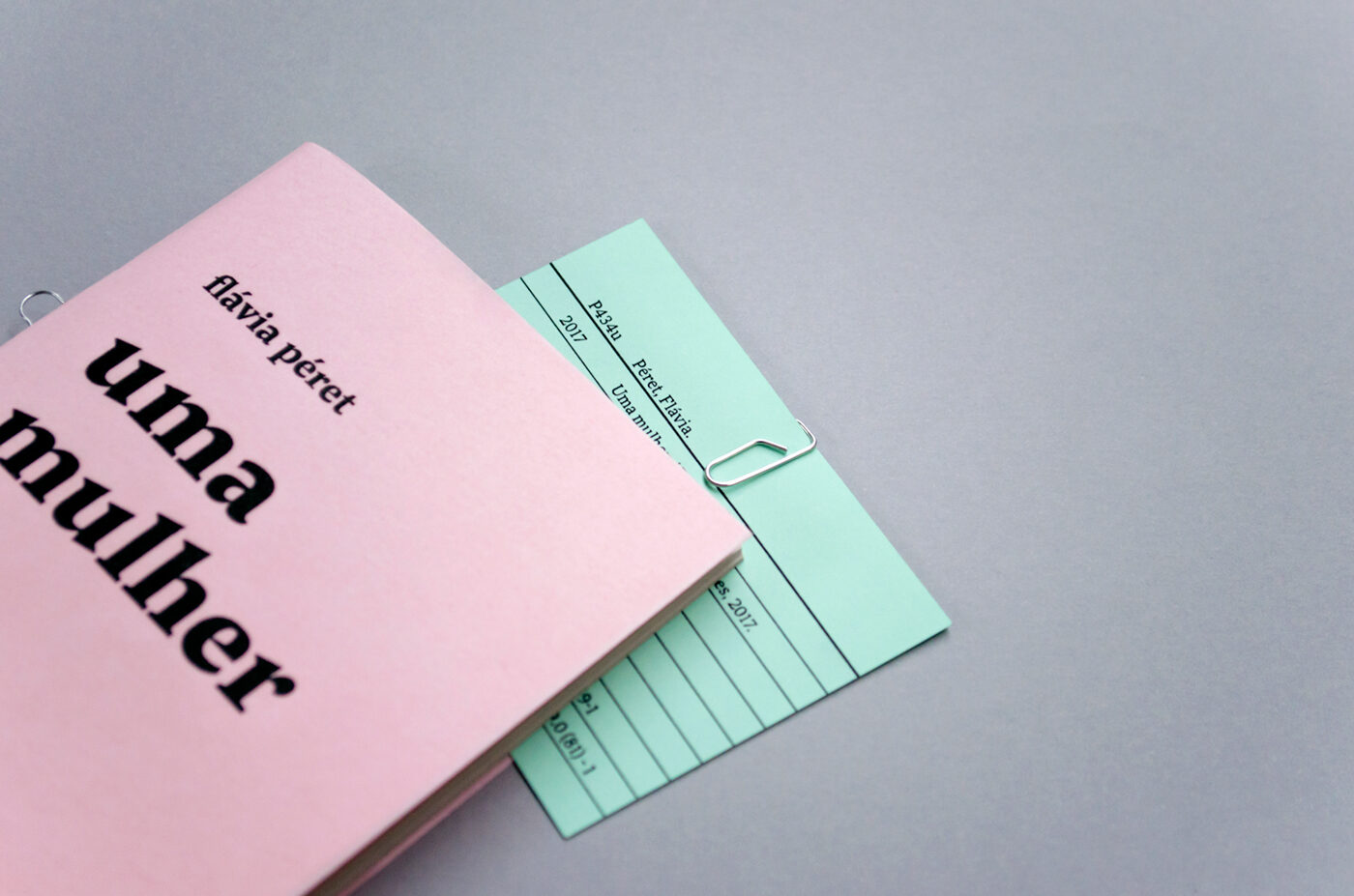
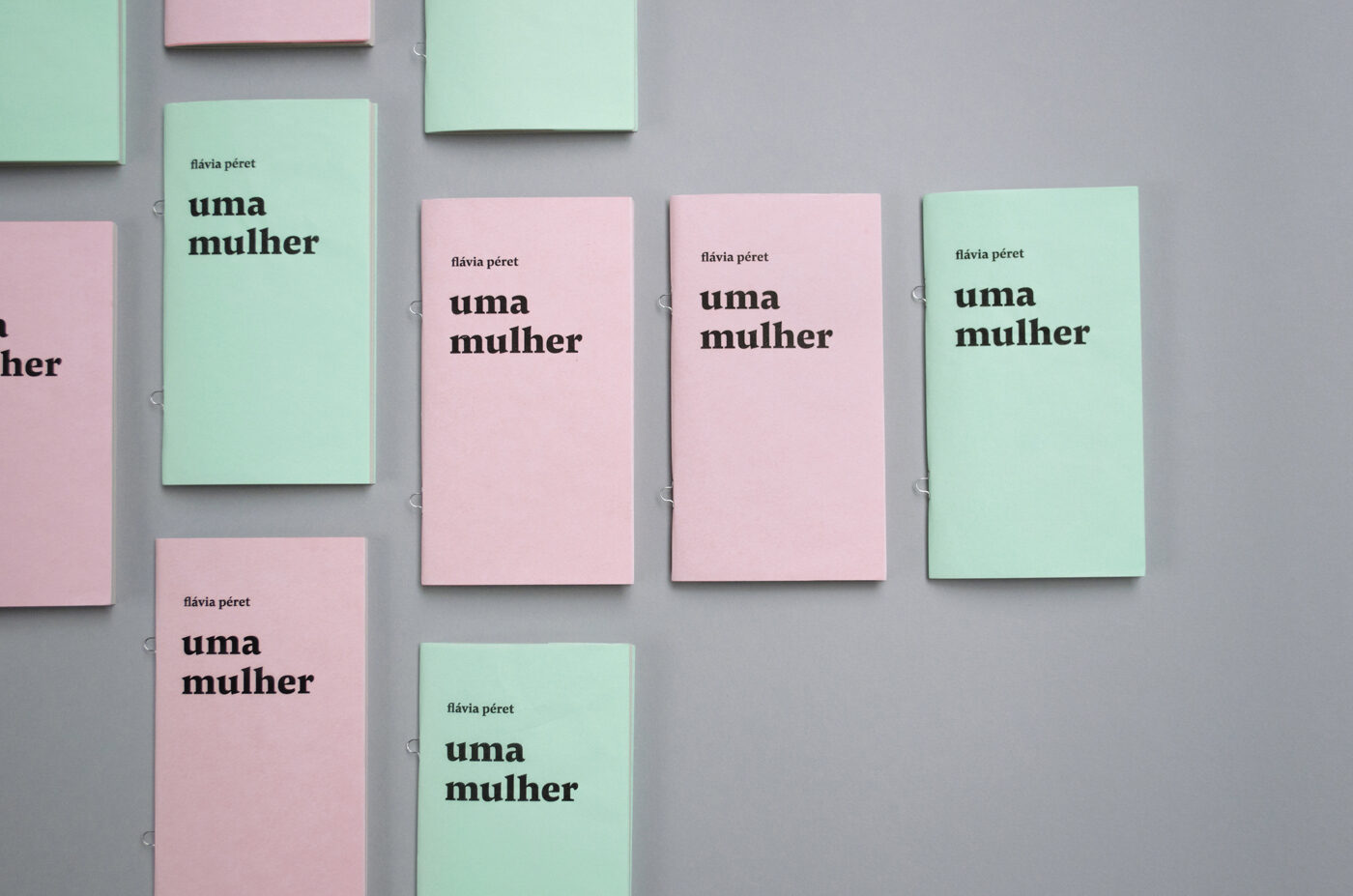
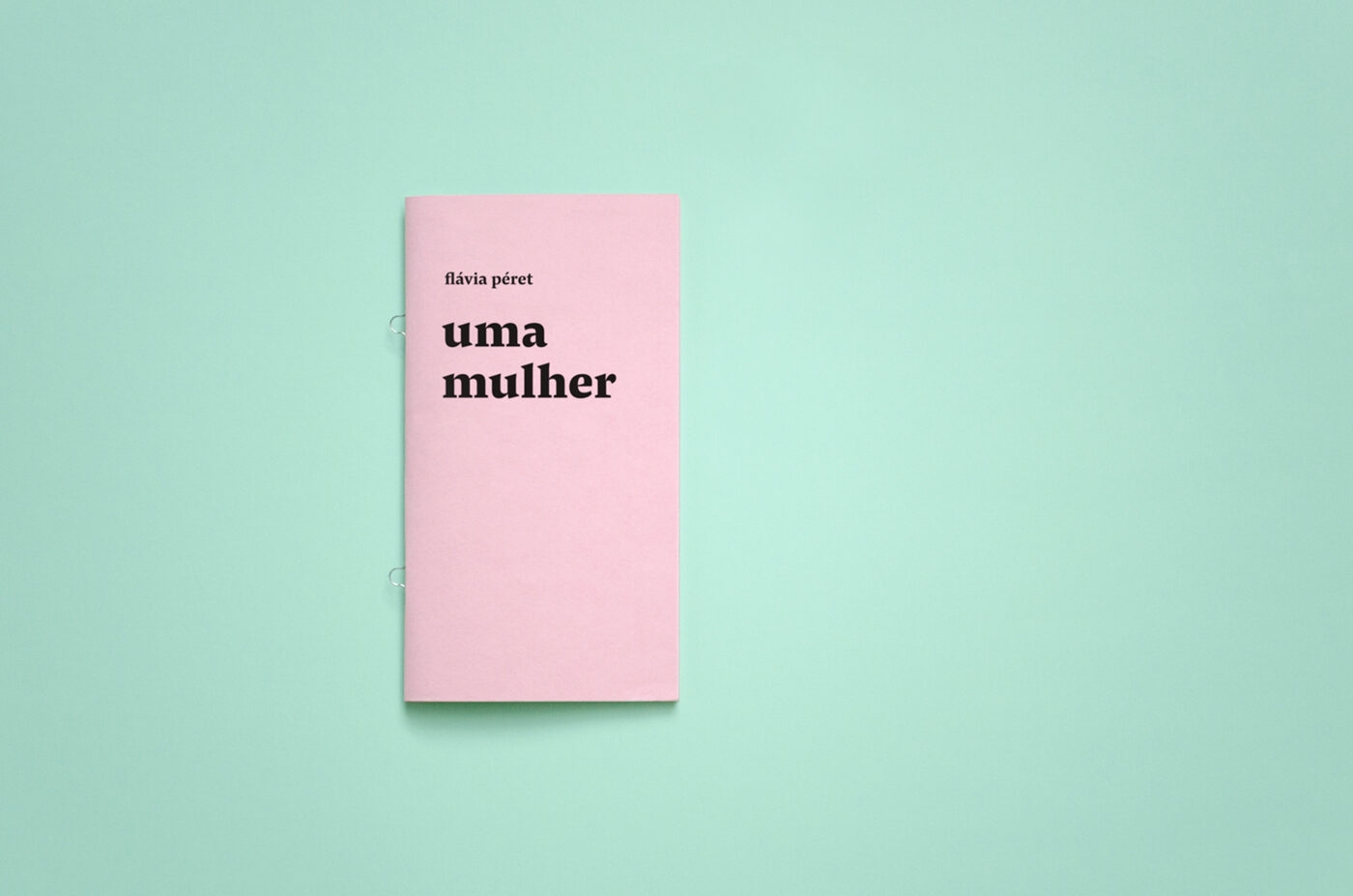
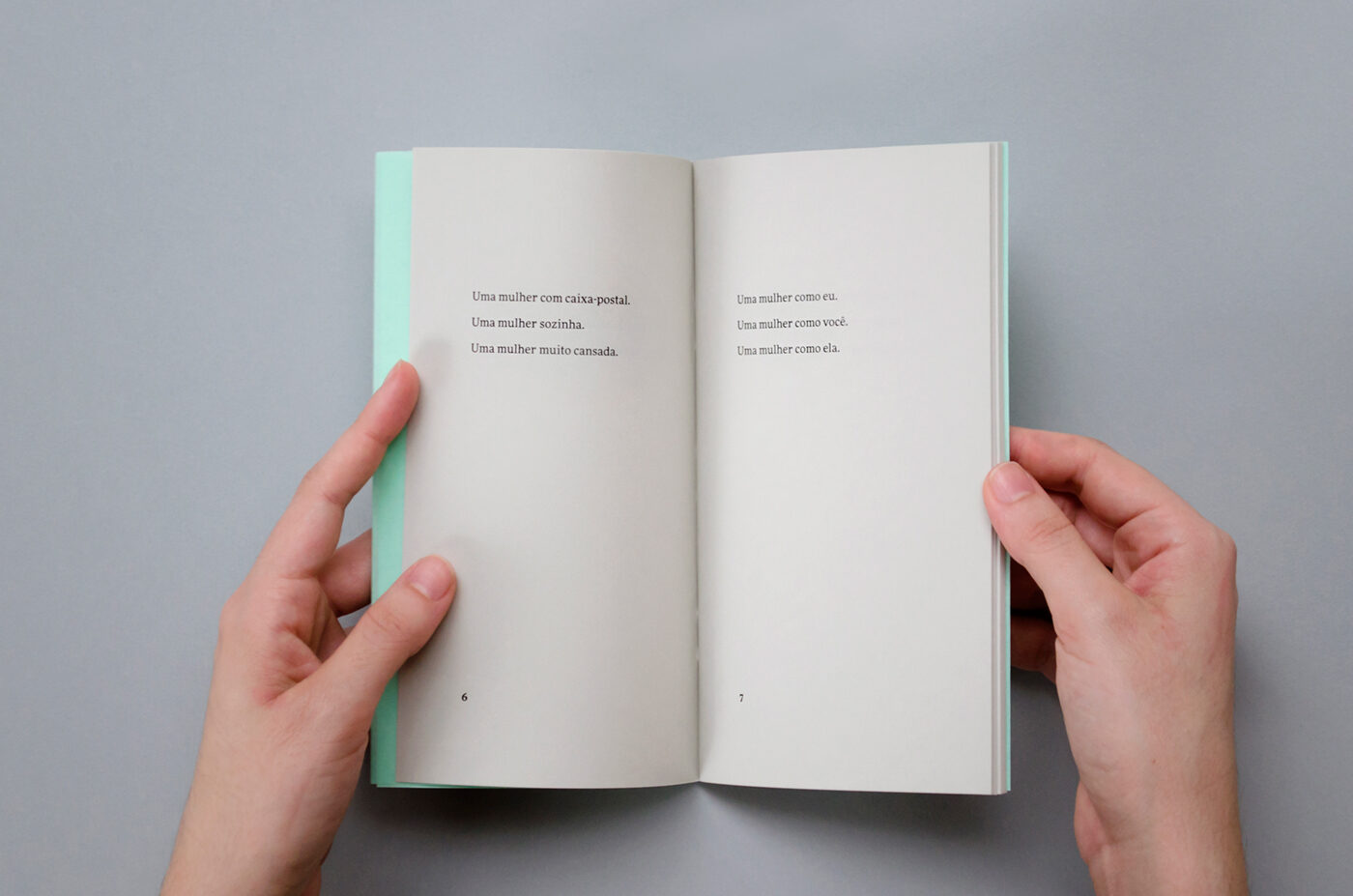
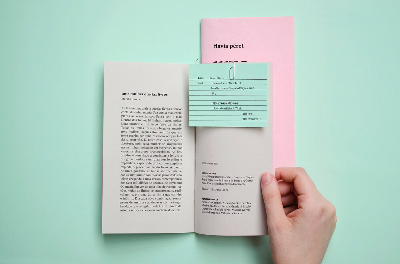
Photography by courtesy of Esther Azevedo, design by Valquíria Rabelo of Estúdio Guayabo