Typotopografie Magazine, Hamburg Edition
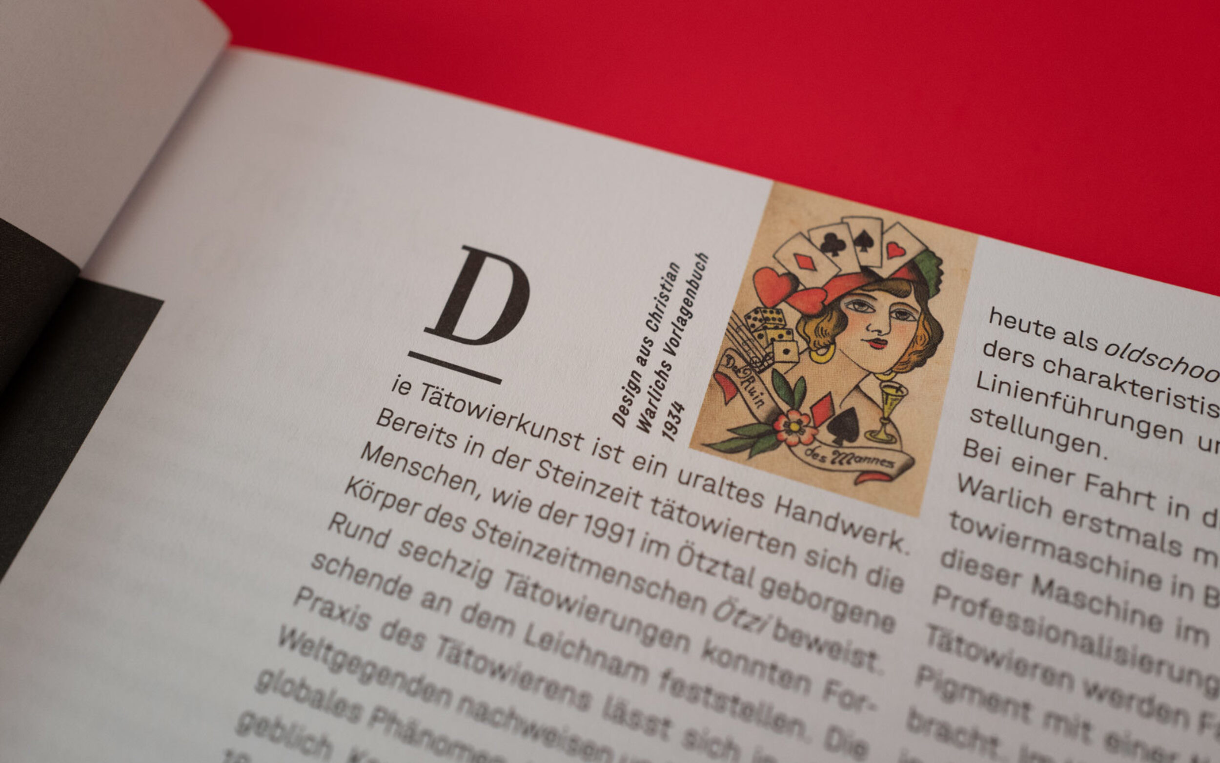
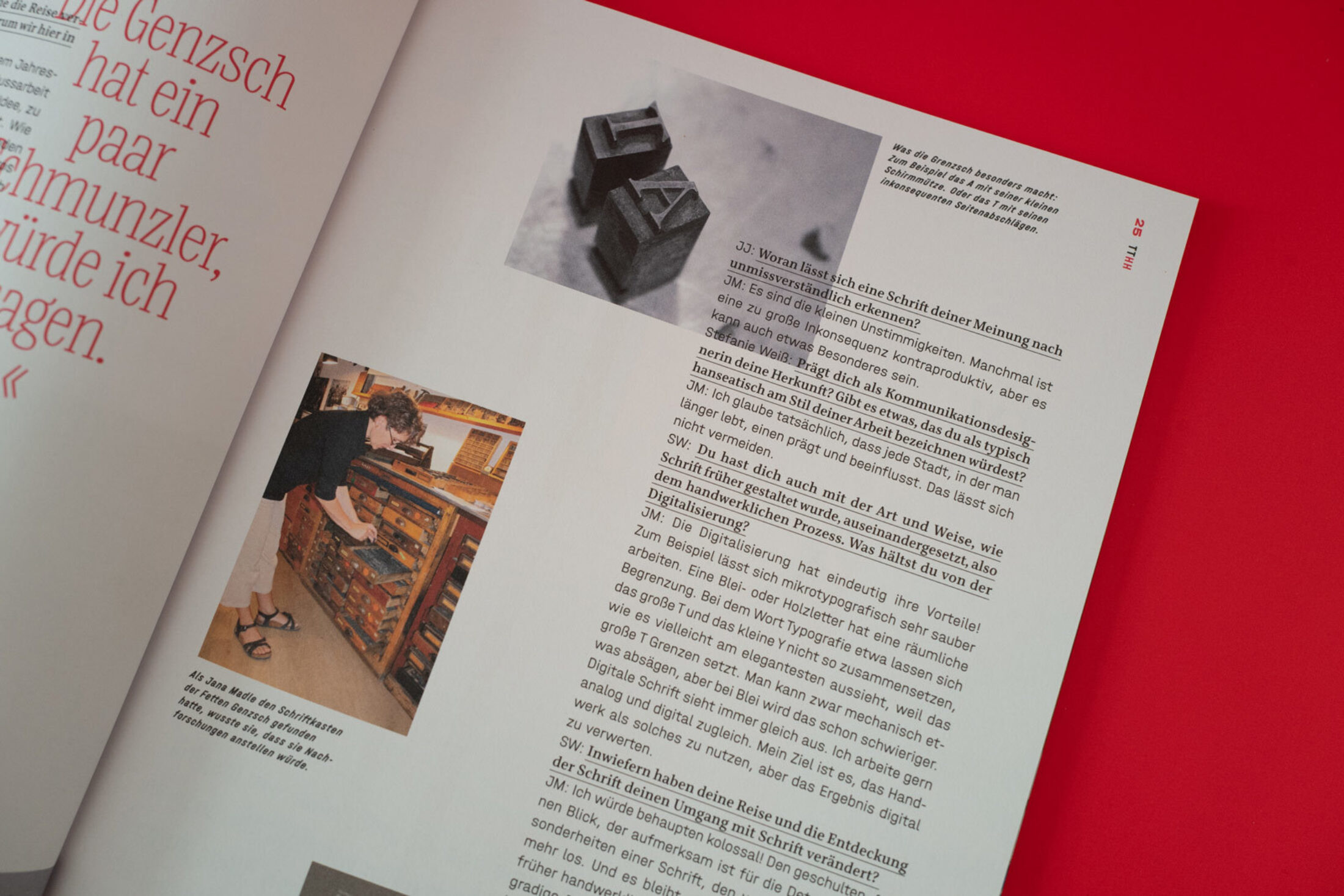
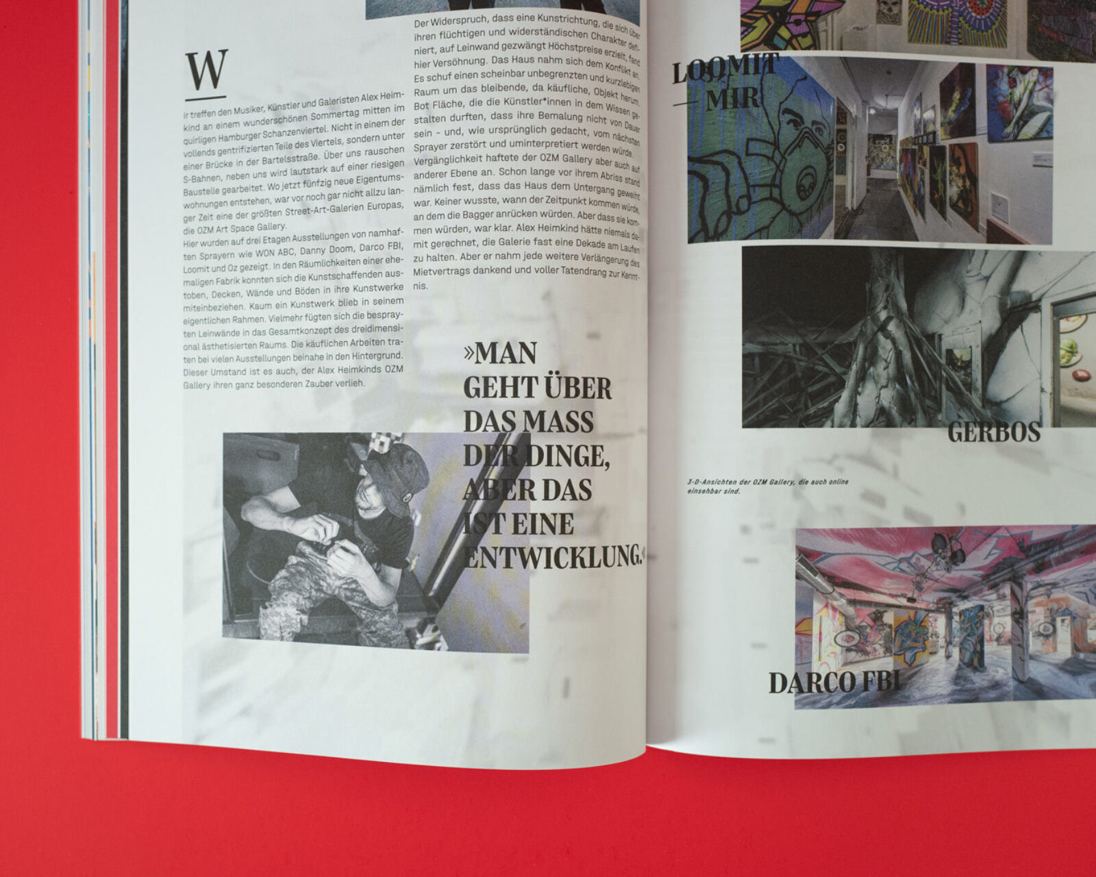
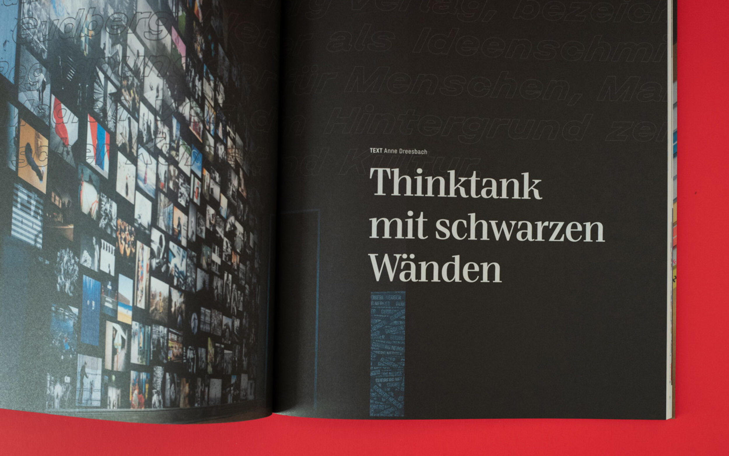
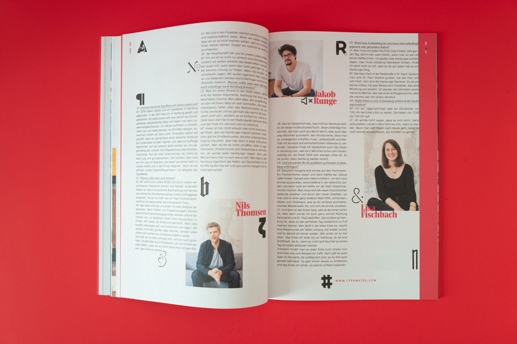
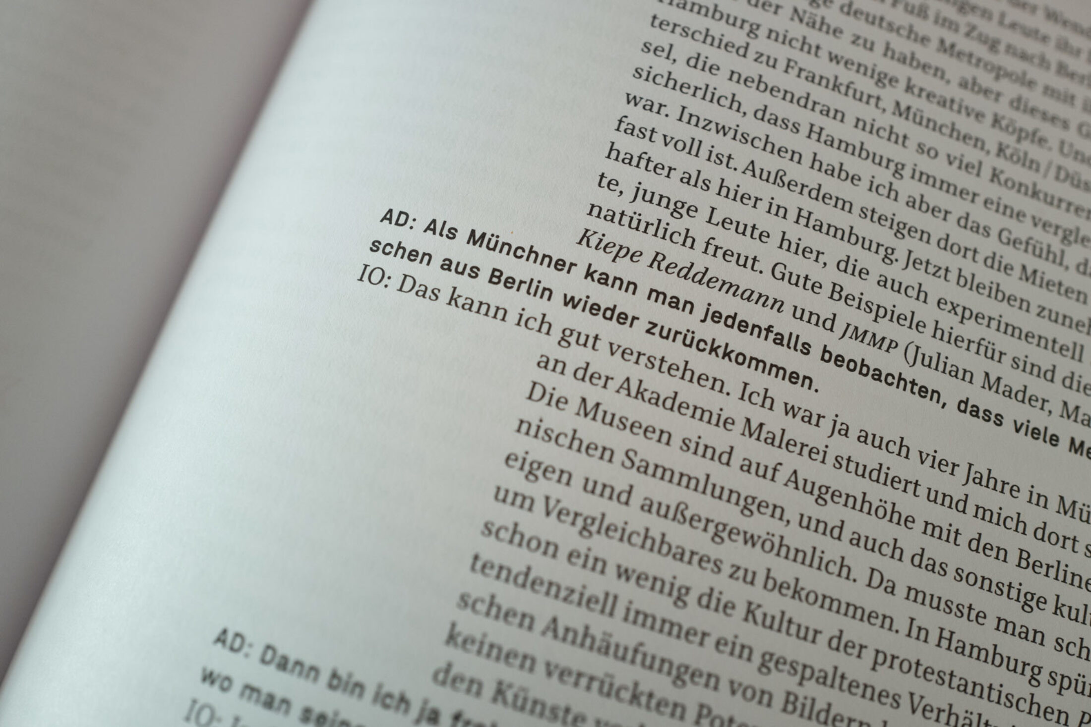
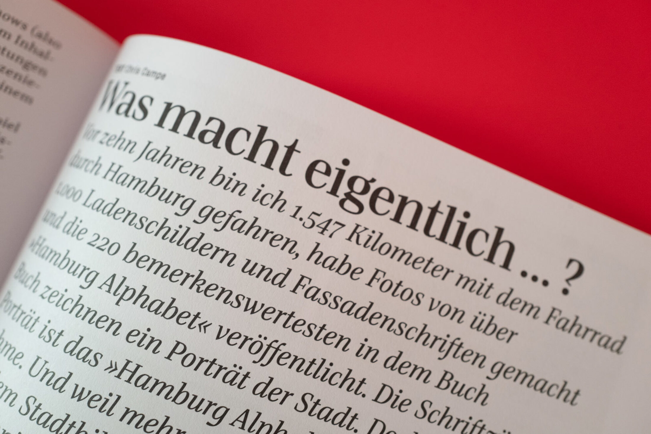
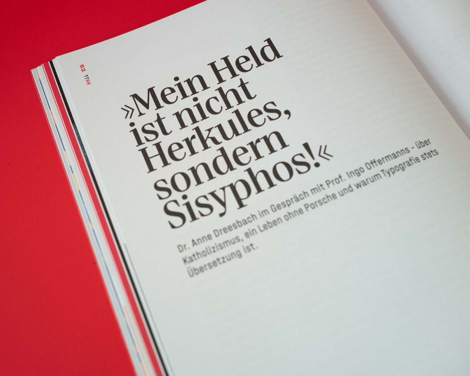
For the anniversary issue of the magazine on design, typography and printing art in urban space, designer Manuel Kreuzer counts on the raw appeal of Halvar in combination with the expressive Bridge Head and Text.
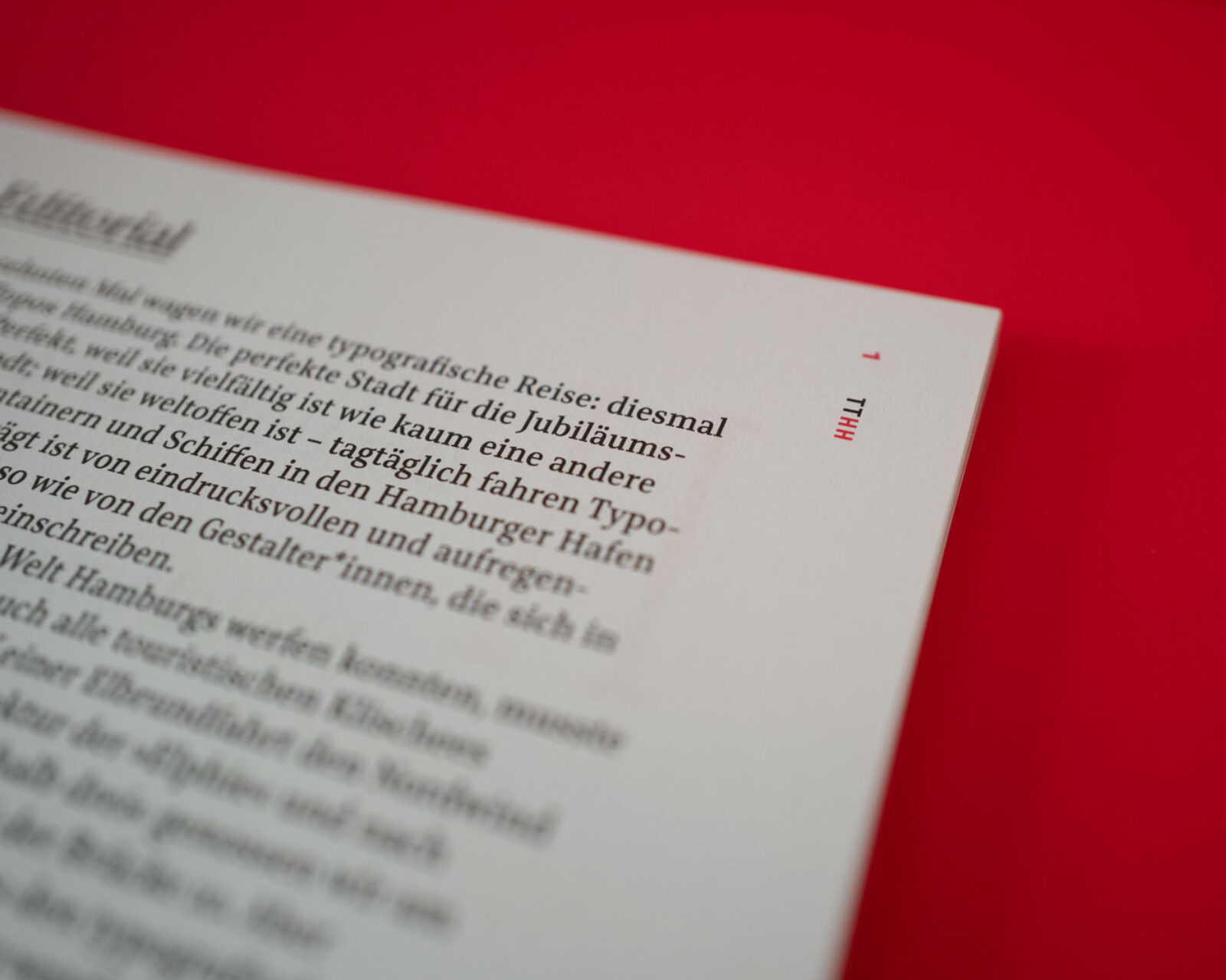
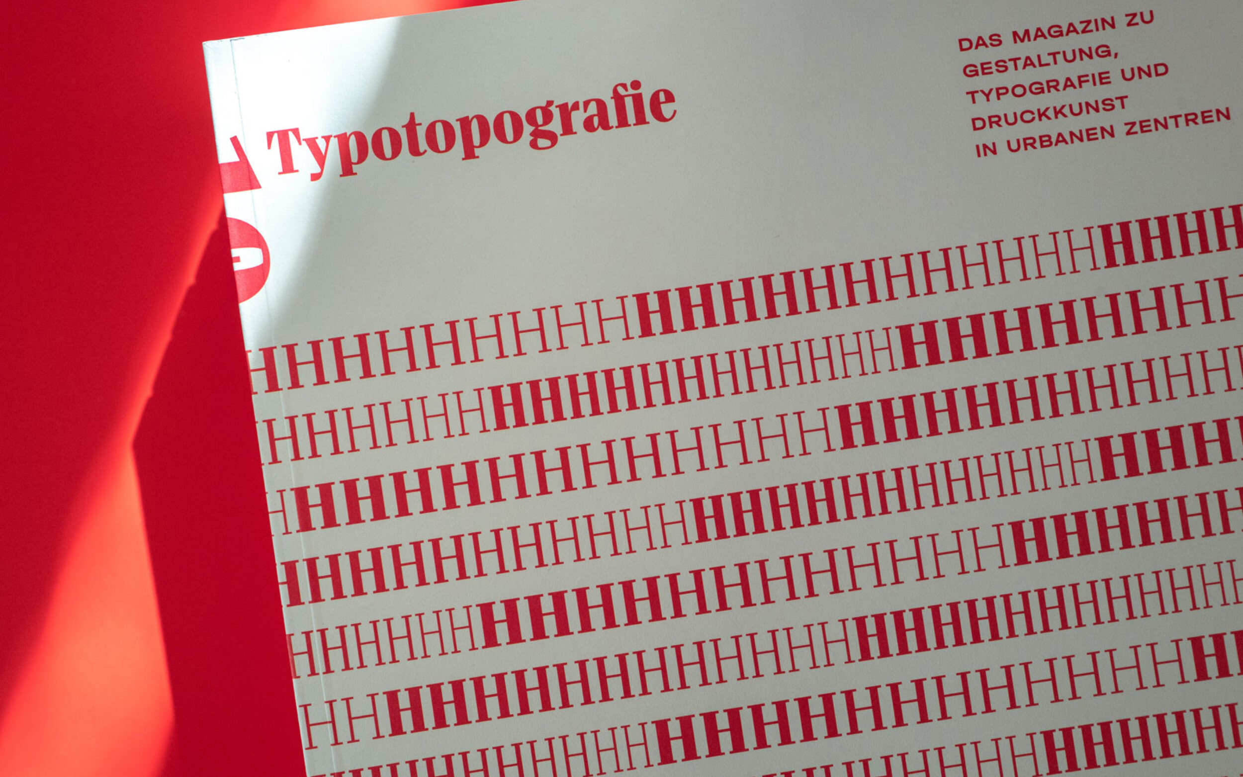
The magazine series of August Dreesbach Verlag invites to (typo)graphic excursions in various cities. It presents special places, personalities, institutions or exhibitions on typography, design and the art of printing in urban spaces. Just in time for the Frankfurt Book Fair 2019, the anniversary edition focuses on the City of Hamburg.
Based on the colours of the city coat of arms, the tenth edition is designed with red as main colour. Editorial designer and typographer Manuel Kreuzer, the designer of the magazine series, gives each magazine of the 80 pages a new visual look and connects the reader with the unique characteristics of the interview partners.
As Lisa and Nils are closely connected to Hamburg, we had the pleasure to be interviewed for the magazine.
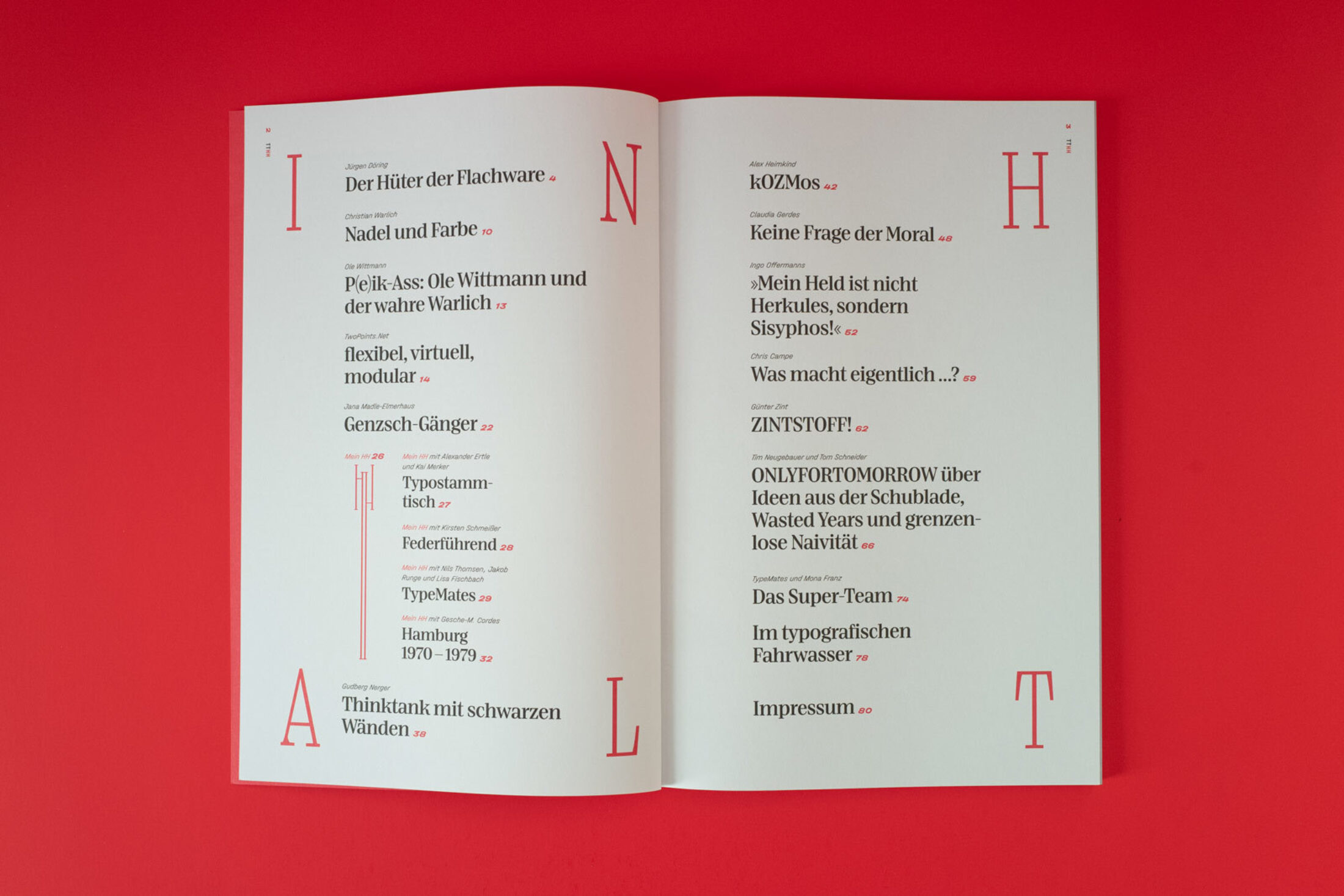
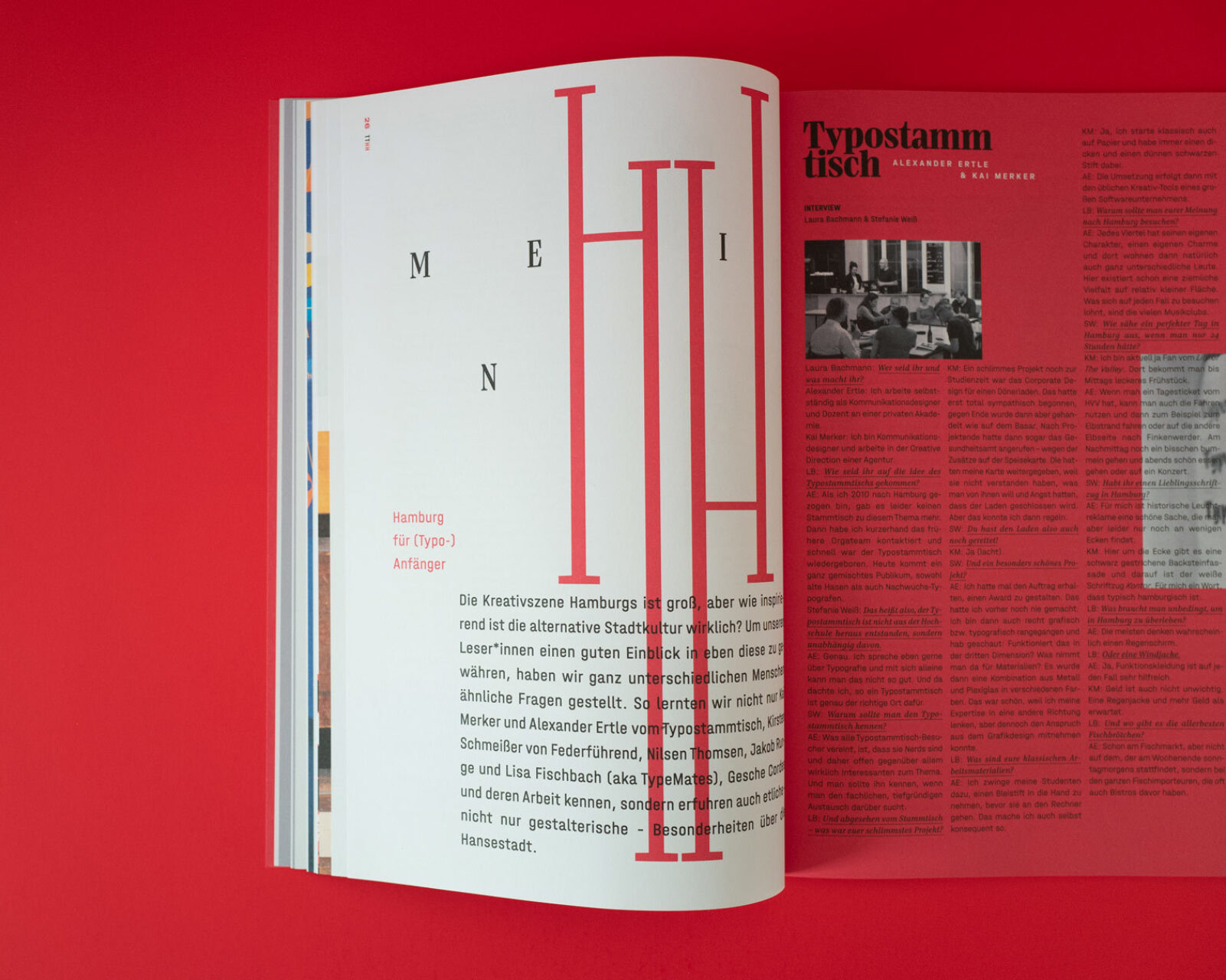
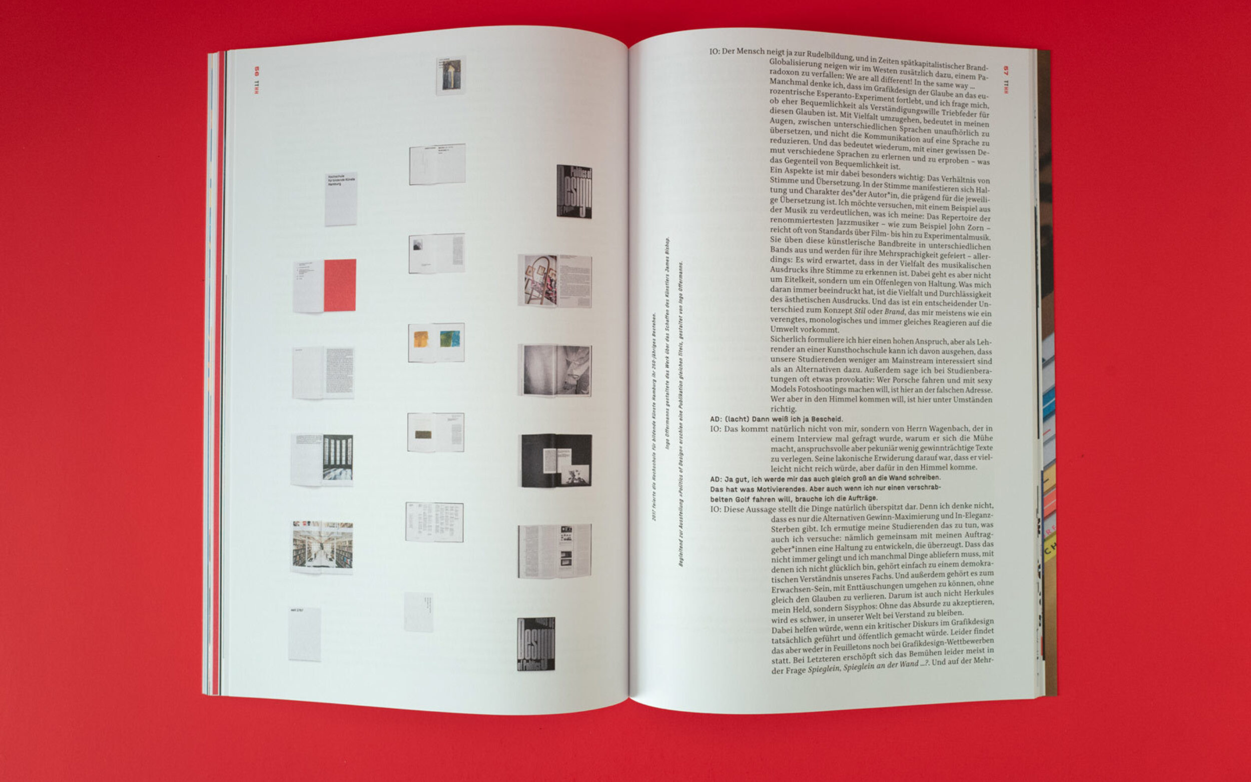
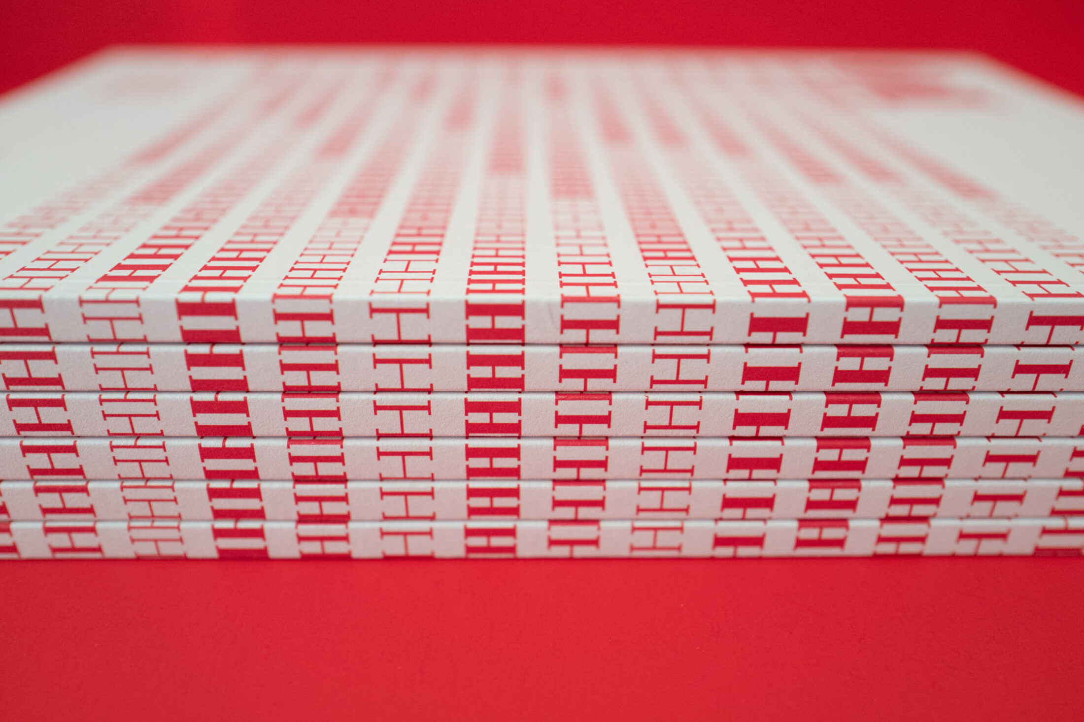
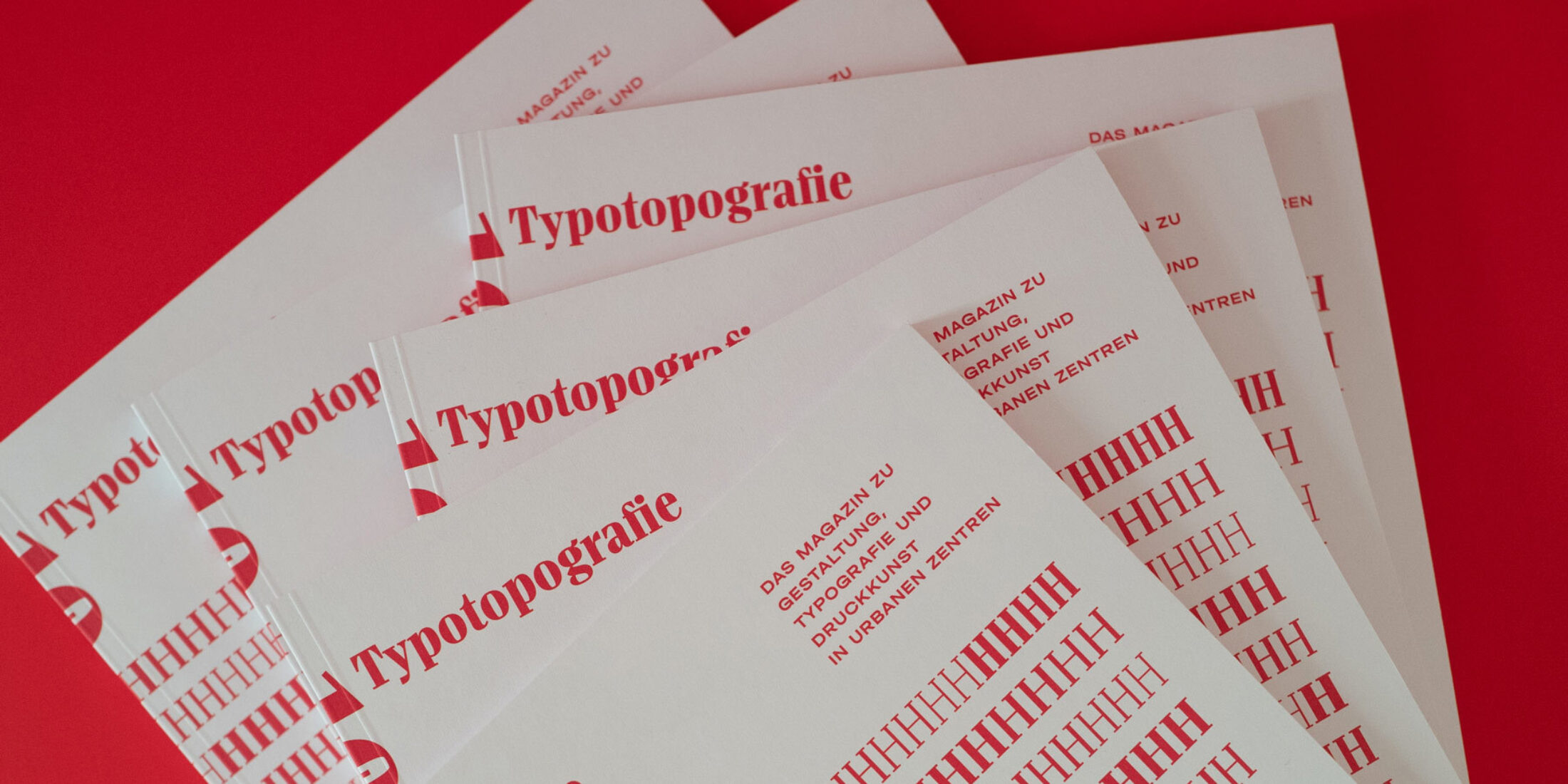
Thanks to Manuel Kreuzer for the photography.