Tim Raue – Rezepte aus der Brasserie
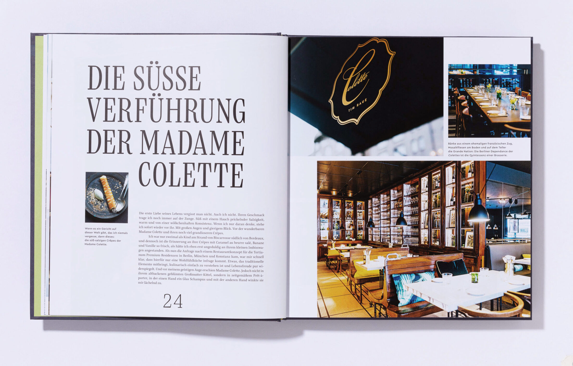
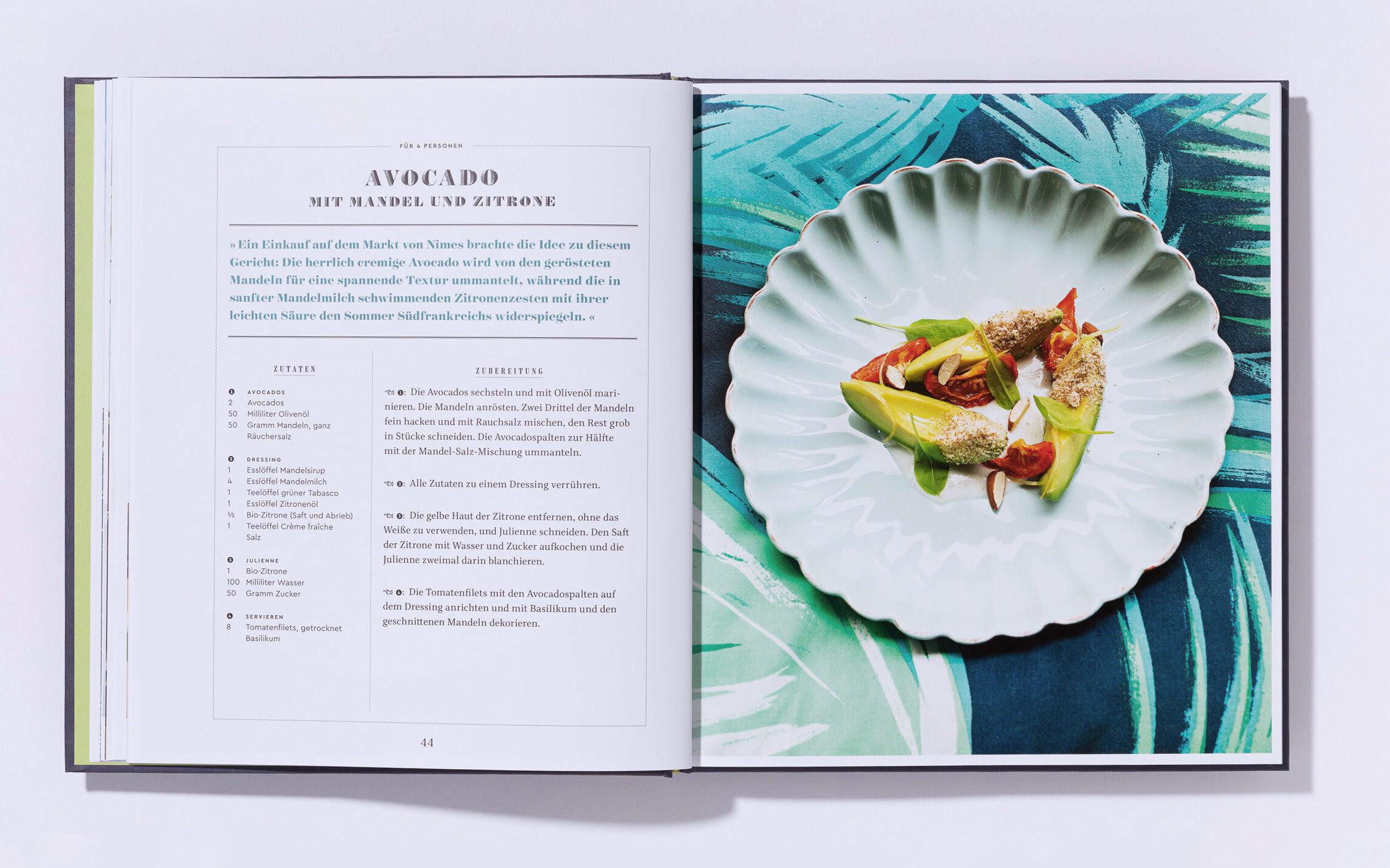
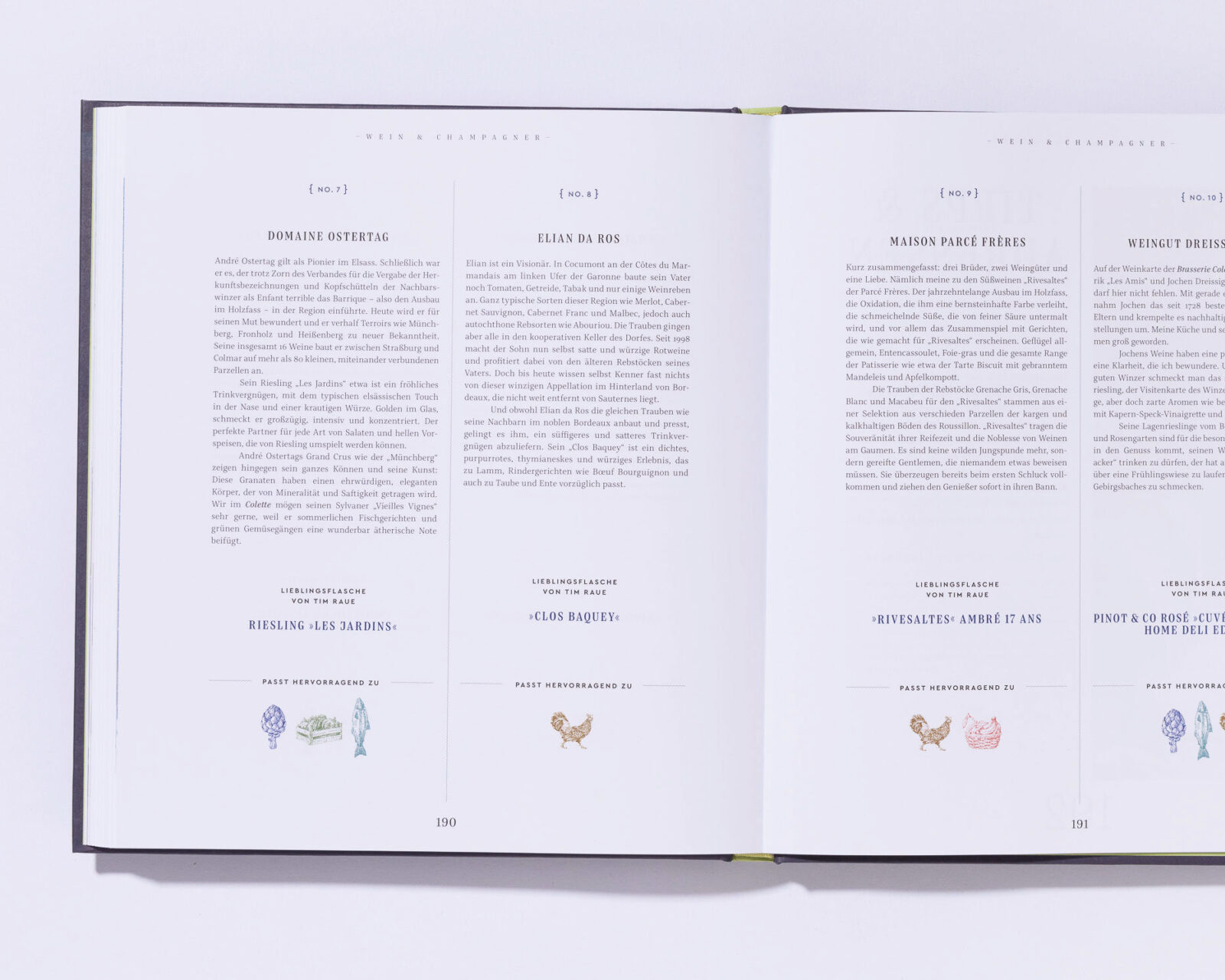
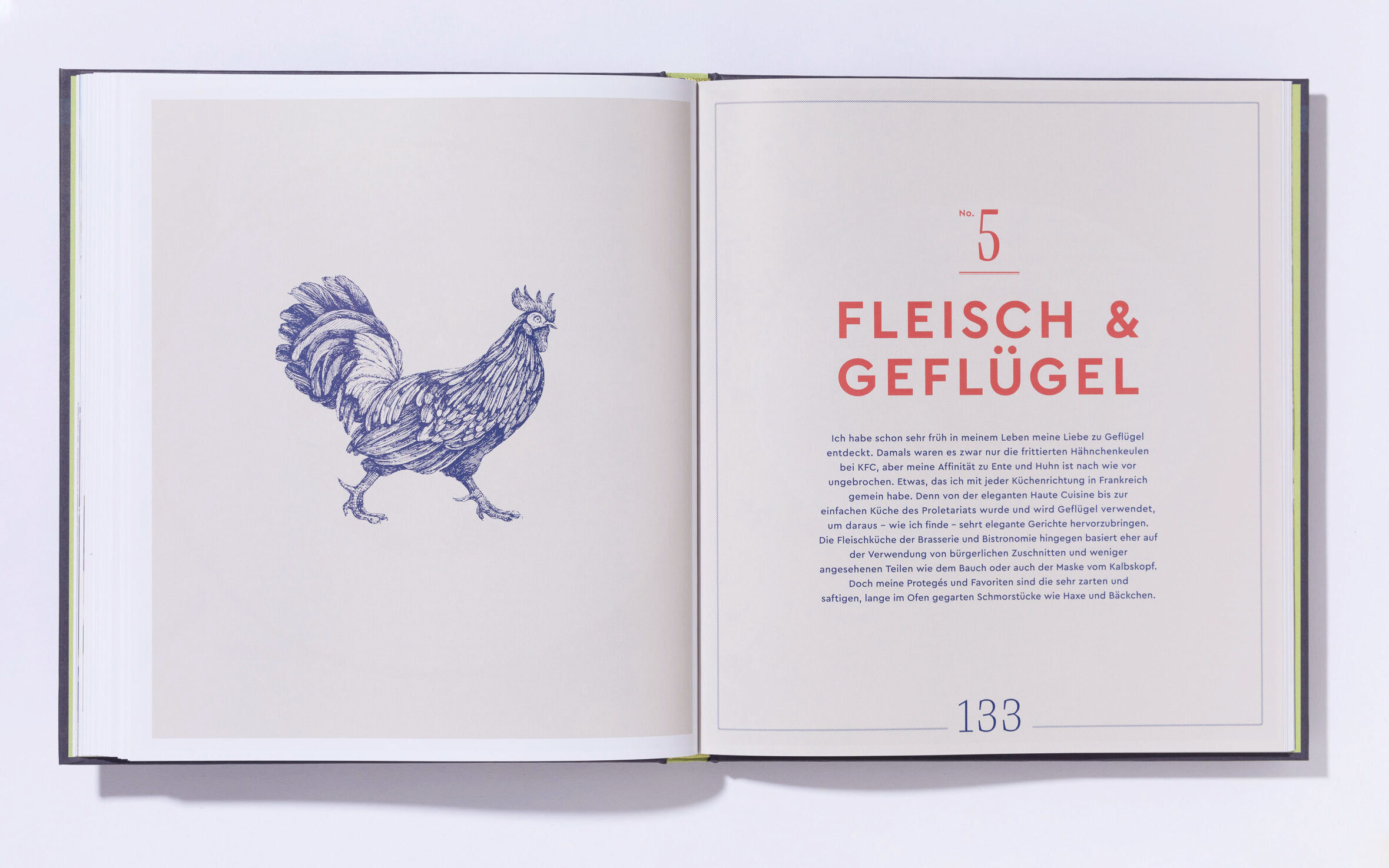
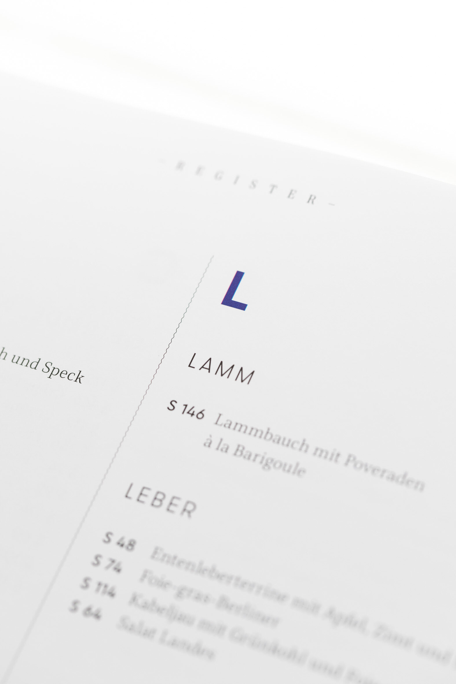
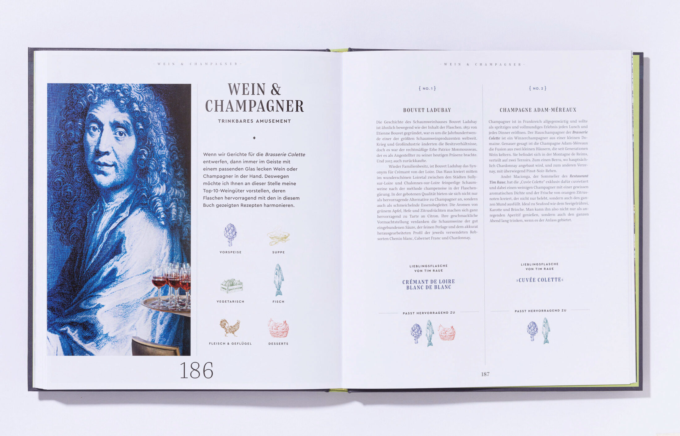
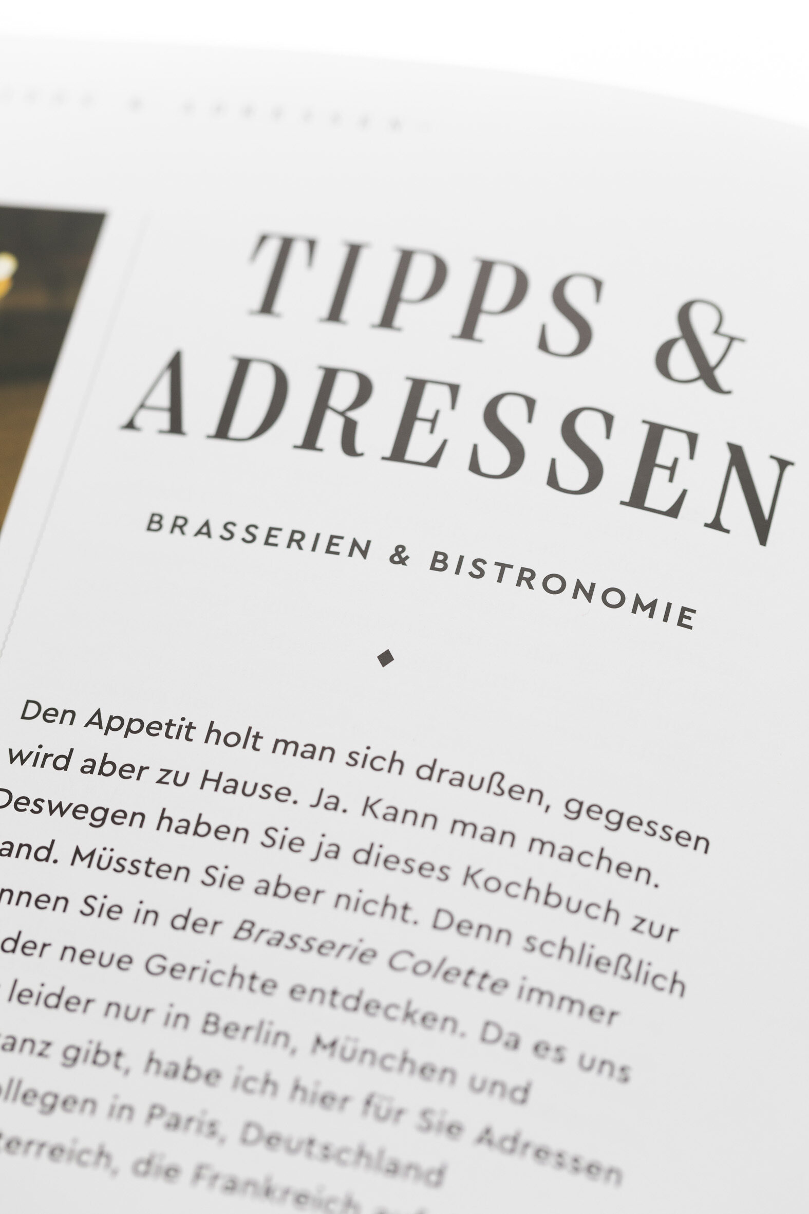
The book by Berlin star chef Tim Raue is dedicated to the classic cuisine of French bistros and brasseries. Designer Heike Czerner combines the striking serifs of Bridge Text and Head with the clarity of Cera Pro.
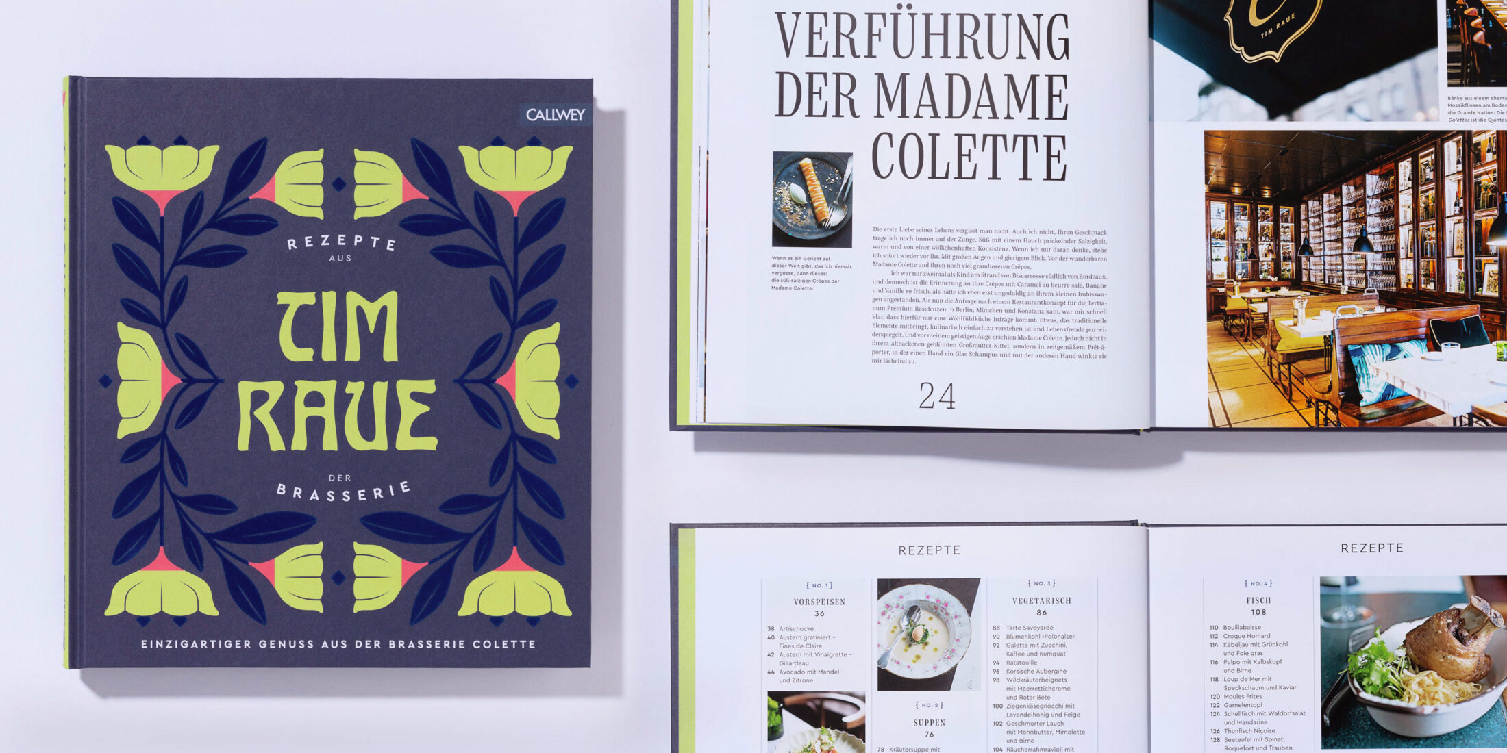
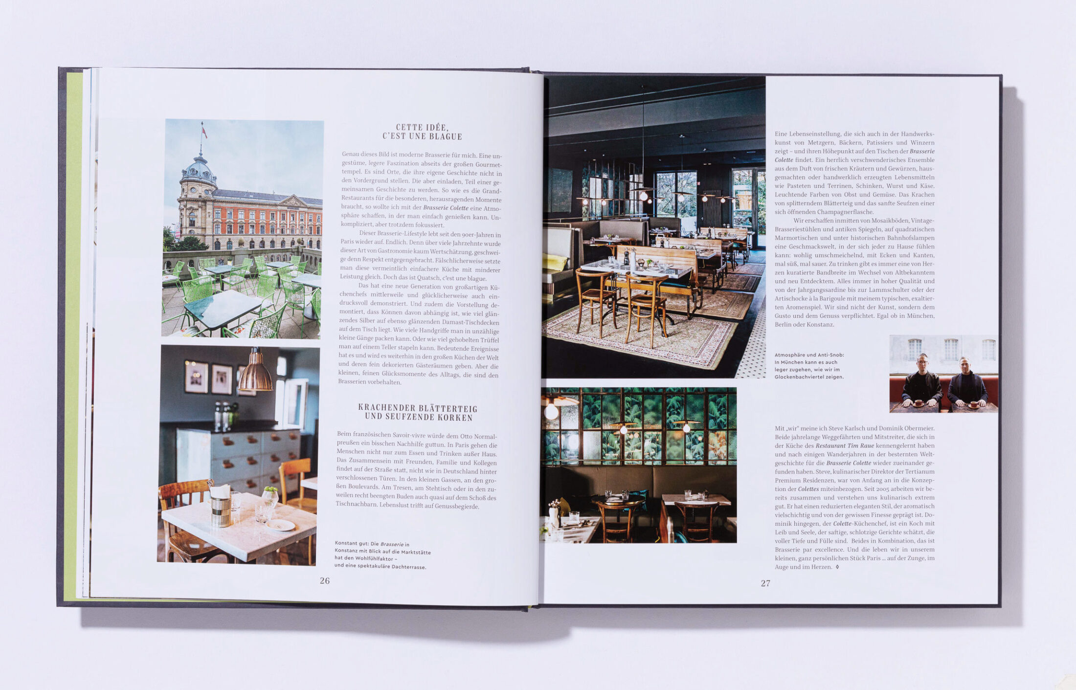
The book “Rezepte aus der Brasserie”, published by Callwey Verlag, is Tim Raue's personal journey across Paris with milestones of his apprenticeship and his favourite restaurants. With his love for the brasserie he uncovers historical and modern elements and eventually looks enthusiastically into the future.
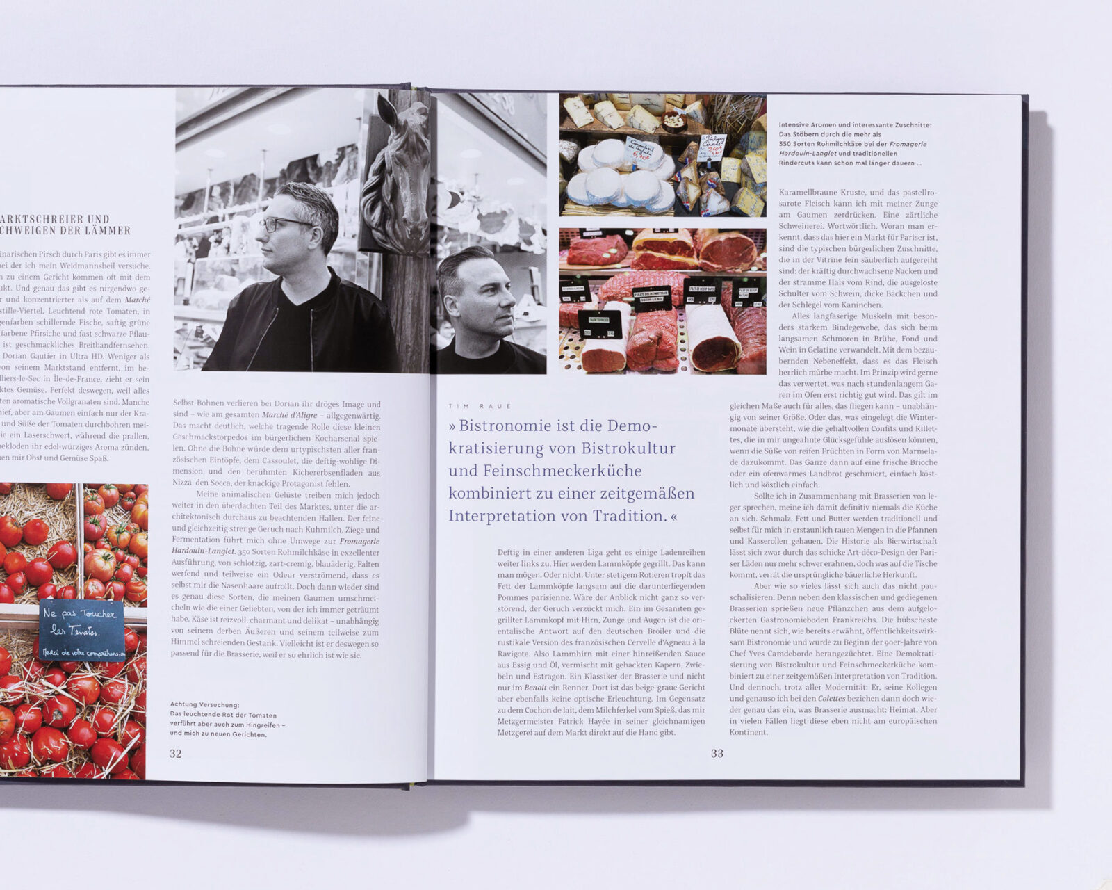
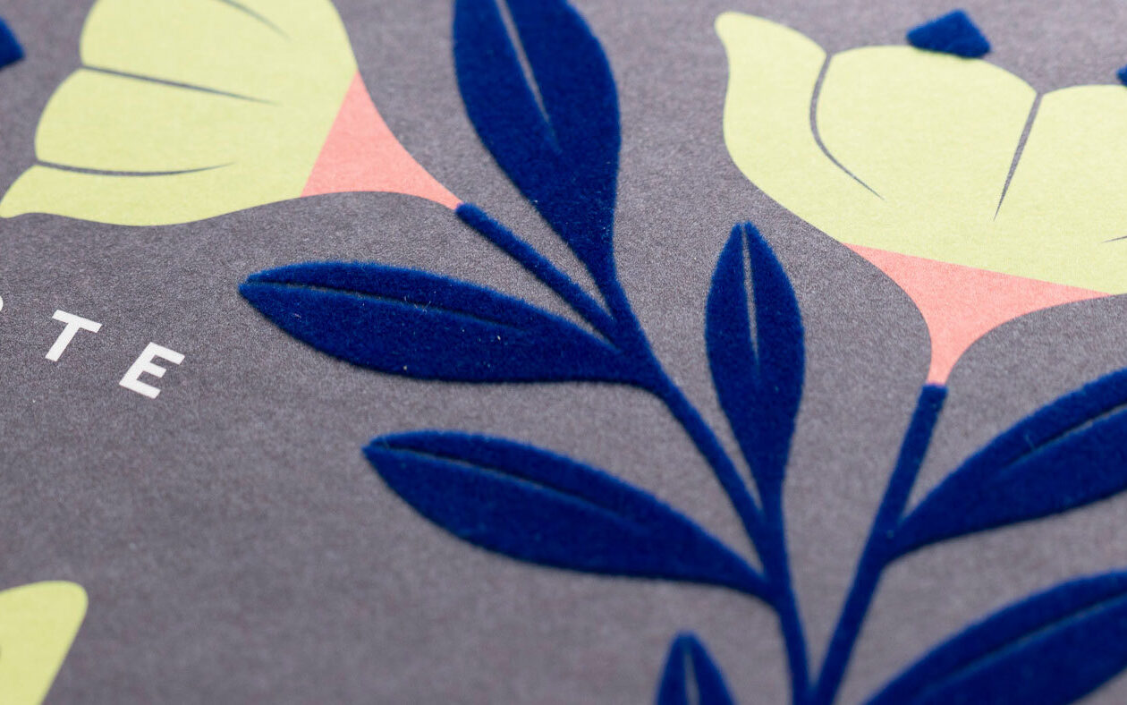
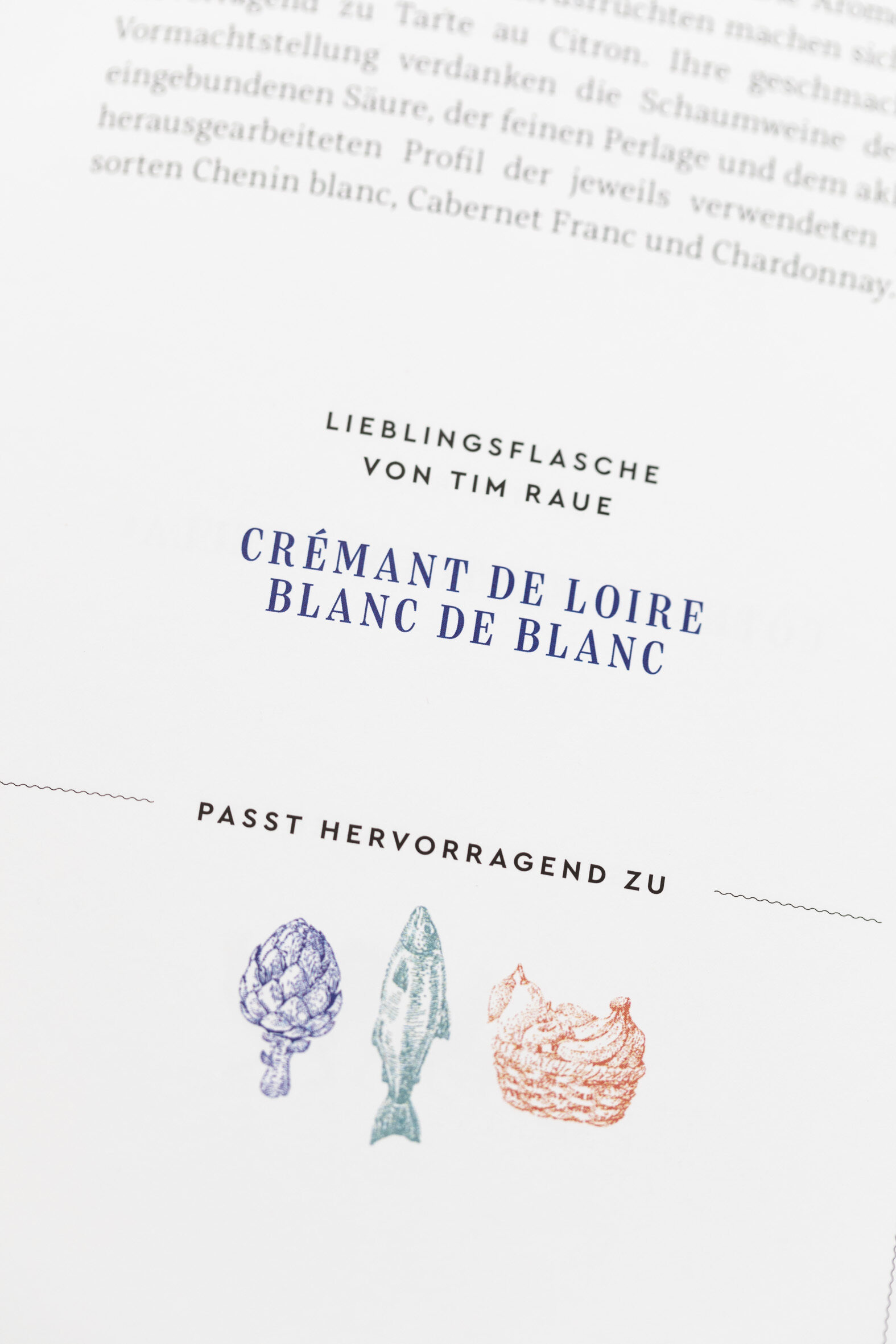
The book is divided into three main sections: The Entrée is an evocative magazine, followed by factual and concrete recipes and concluded with a section of tips and a glossary, ranging from personal to rational. The typefaces are used accordingly: Heike Czerner's combination of Bridge and Cera unifies the atmospheric and factual mood.
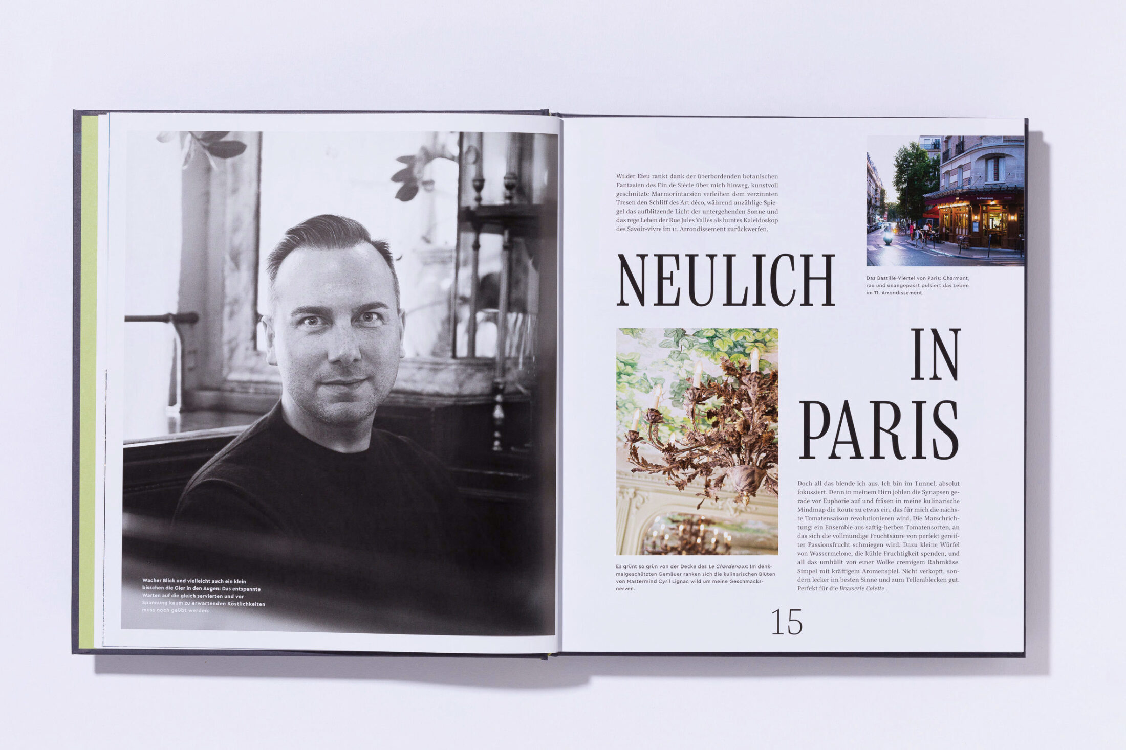
Thanks to Heike Czerner for the fine design and Florian Hammerich for the photographs.
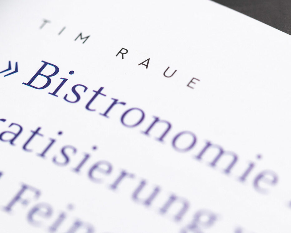
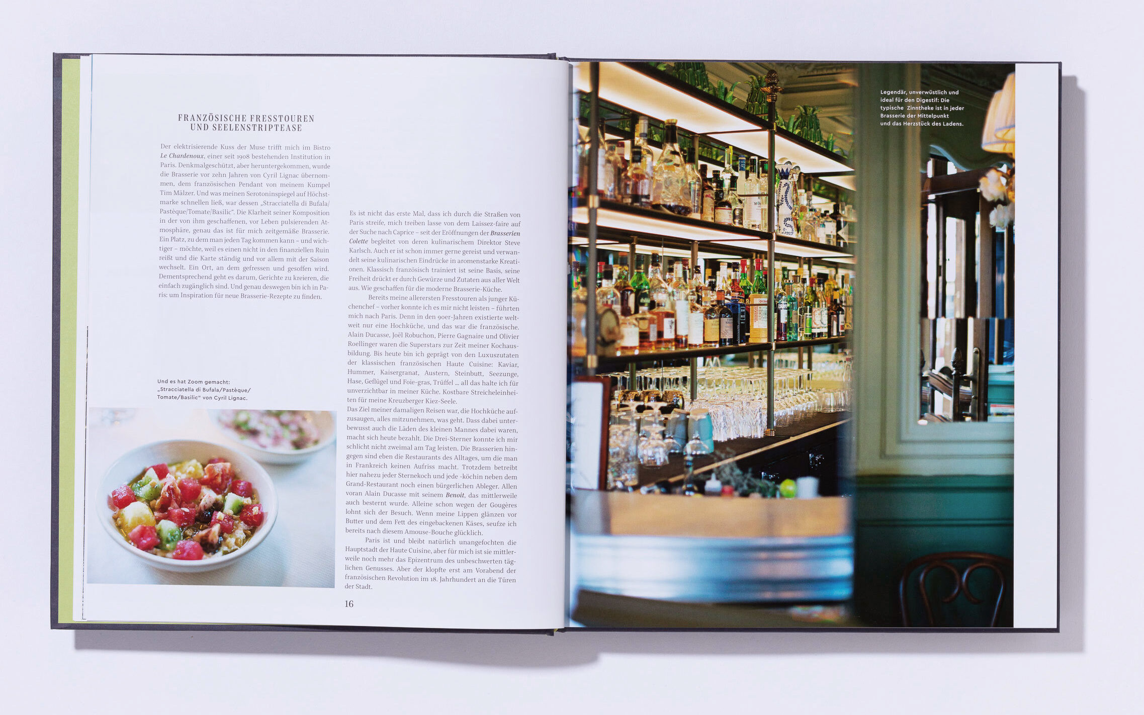
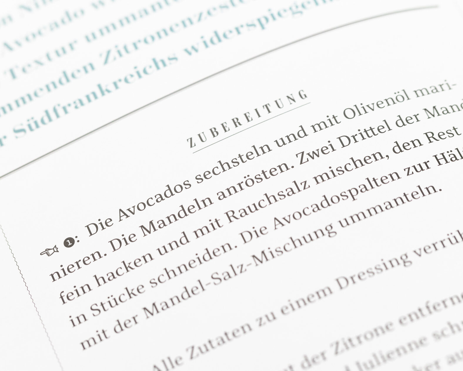
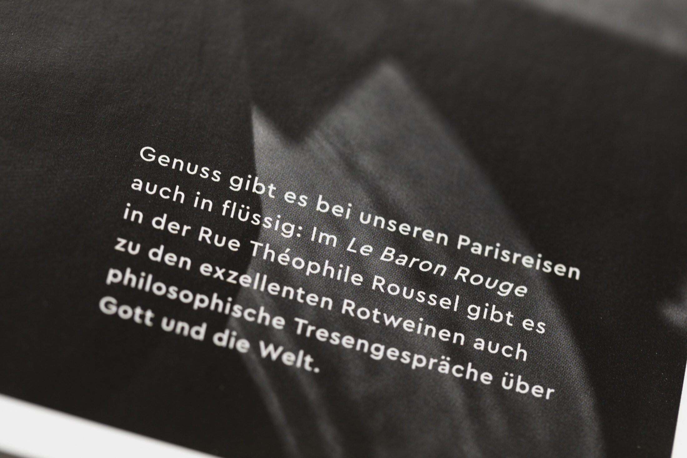
For me, Bridge represented the French typography well: legible in text combined with a charming appeal in large headlines.
— Heike Czerner
