Round and Round We Go
Inspired by the geometric character of Cera Pro, we — Lisa Fischbach and Jakob Runge — were excited to see what it would be like to make a soft version, a Cera Round.
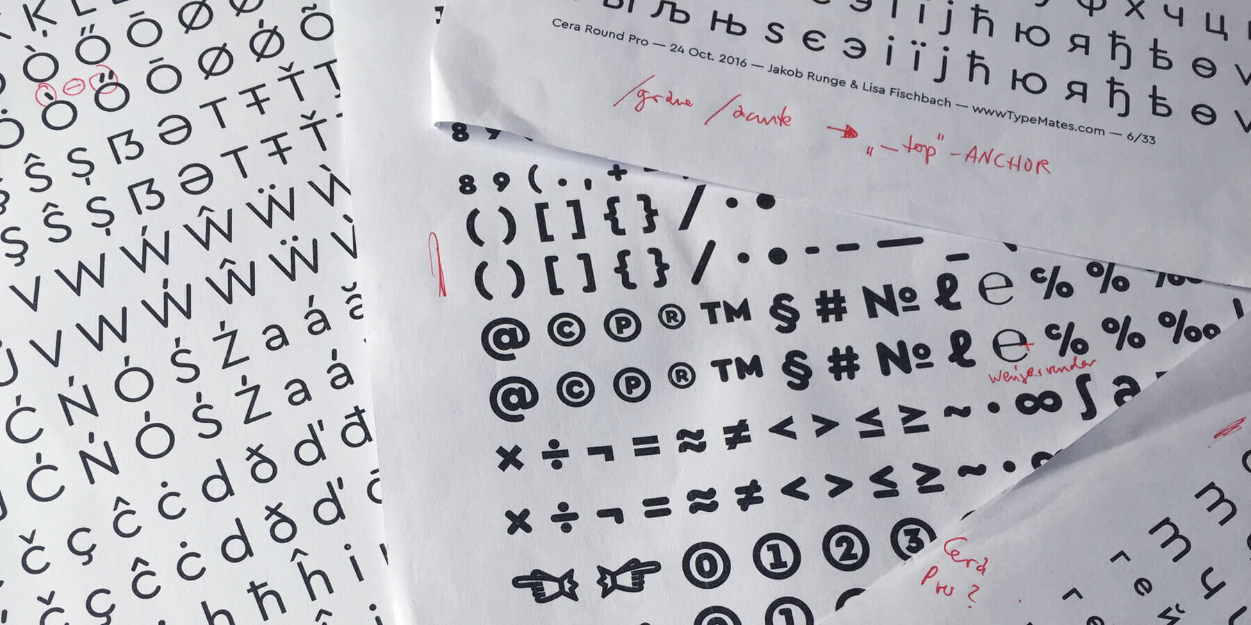
It seems like it should be easy to make a rounded version of Cera. Use a filter named “Round Corners” and job done: beer time! Cheers!
But it wasn’t that simple.
Exploring Different Ways of Round
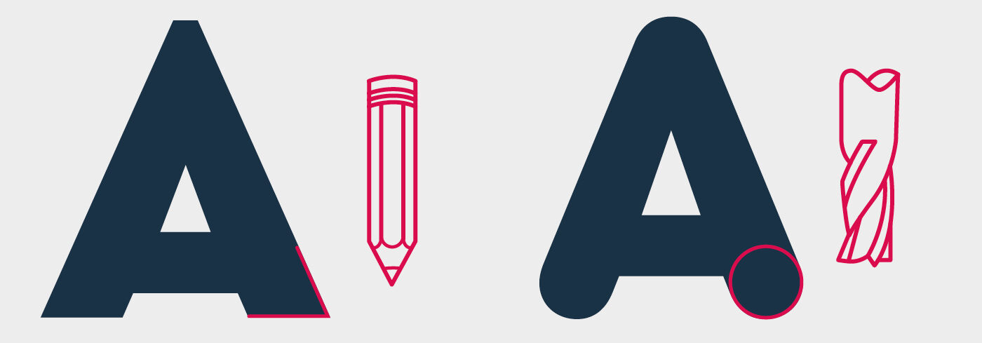
To begin with, the concept of how to round original Cera Pro had to be sketched and tested. What sort of roundness would work best with Cera’s design DNA? We liked industrial lettering and were struck by how it manages to appear both mechanical and friendly — but how to channel that spirit best?
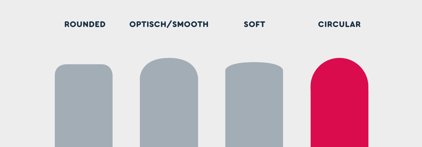
There might be various possibilities in how to harmonise corners and strokes, but we concluded that if we wanted our stroke endings drawn from a circle, geometry had to become the main focus. With this decision, we set off to face the many challenges on the road to creating Cera Round.
Troubleshooting with Overshooting
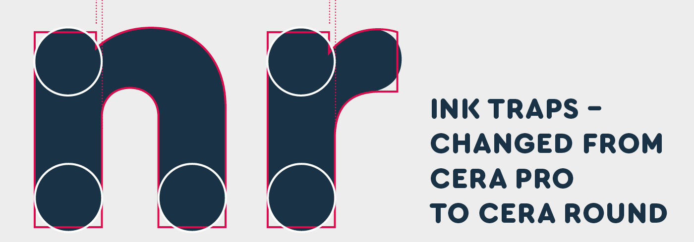
Imagine you have a black square, for example the letter i, and you decide to make each stroke ending half a circle. Doing this, you change the balance between the black of the letter and the white space surrounding it, you are increasing the white. While the stem of the i is mathematically as tall as before, it looks shorter. To make up for this, every stem in Cera Round was carefully assessed and brought into balance with not modifiable letters like the rounded already rounded o.
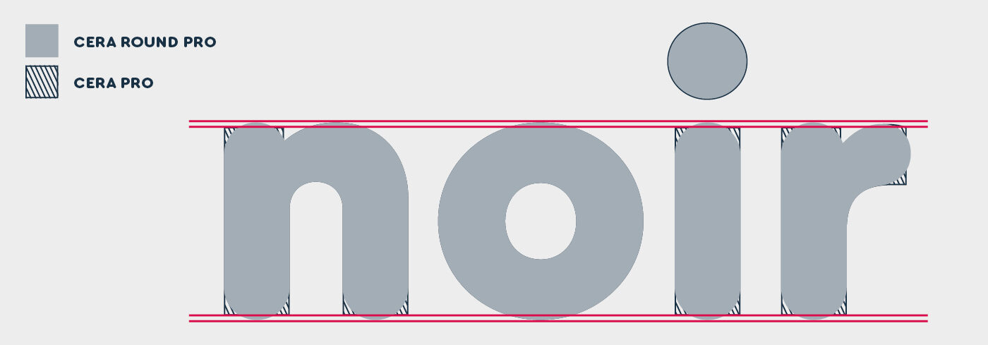
Some stems, like the joins near n, d and r needed special care. The combination of Cera’s original optical corrections and the new rounding could have made them look too small. Once again, the black and white balance was a part of the problem and the solution at the same time: Restoring and rounding off the mathematical origin also means that only after rounding off the upper part of the stem, the necessary white space is created, so that the transition from stem to arch does not become lumpy.
Balancing the Black and White
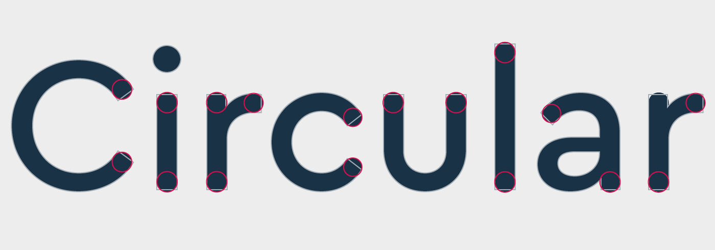
In general, adapting Cera’s light weights to the new style was simple. The difference to the black and white balance was minimal and the counters caused no trouble. The troubles showed up when working on the Black. In the lowercase in particular, we had to be careful in how we adjusted each letter to the new style. As letters were not supposed to narrow too much towards the end of a stroke, parts of some letters, like the top of the lowercase a had to be carefully redesigned before being rounded.
Antagonise the Diagonals
The diagonal strokes were another challenge. The endings between Cera Pro and Cera Round could not have been more different: Cera Pro lets the diagonals end in a tip, stretching their presence on the baseline and x-height, while Cera Round was supposed to just end with a circular terminal. The goal was to have Cera Pro and Cera Round share the same widths for each letter, so that kerning was not affected and the different variations could be exchanged without influencing a layout.
So we changed the angles of the diagonals when needed in order to match the letter better. These letters made us weigh out the level of change needed to strike a balance between designing a close variation of Cera Pro on one hand, and a typeface that works well with its rounded features in itself.
With our imaginary milling cutter in mind, a different approach to joints and baseline for v, w and Greek ν had to be proposed. Overall these letters turned out a bit wider, compensating for the lost tip at the x-height whilst not changing the actual body of the letter.

Different Strokes for Different Folks
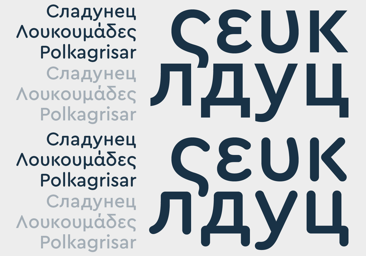
As Cera Pro is pan-European and supports Cyrillic and Greek, there was no question that Cera Round also had to have extensive language support. During this process, it turned out that Cyrillic letters were trickier to round than both Latin or Greek had been.
In comparison to both of those scripts, Cyrillic has more rectangular shapes and some letters have a small outstroke ending that is crucial for character recognition – as in у and л. Getting these to be soft and rounded, while feeling right, was tricky. We did a lot of tweaks on these shapes to ensure the round feeling and keep letters legible and balanced.
Leaving the Path to Stay on Track
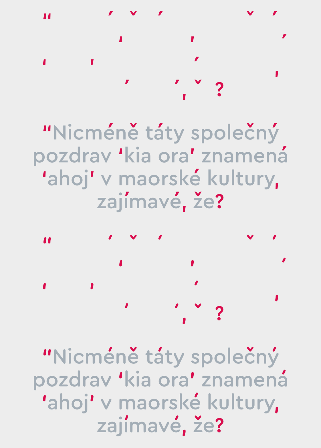
The punctuation marks and the accents for Cera Round became very different from Cera Pro. As Cera Pro’s shapes had a high contrast, we needed to decide whether to make our new stroke endings the same or to narrow them: either by a bit, or a lot. We found that narrowing them slightly and to make them just distinguishable enough, turned out to be the best solution.
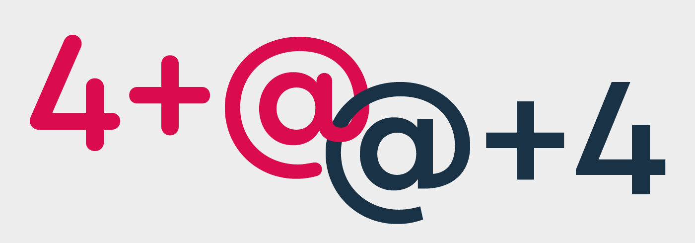
Overall, the typeface was supposed to have a monolinear feeling. In some glyphs, like the 4 or the +, optical adjustments had been made to Cera Pro, making the thickness of the strokes look the same vertically and horizontally. With the new round endings, however, these optical adjustments became visible and distracting. They were so obvious, that they had to be adjusted to be mathematically the same size in order to look right.
Other glyphs had to be changed in their construction. The @ for example got a round connection, in contrast to Cera Pro’s @ with its sharp corner.
Working on the Round version made us rethink the original Cera as well: Bugs and optical adjustments in the existing Cera had to be and were rethought, evaluated and adjusted. Rather than a simple rounding process, Cera Round turned into a whole new series of developments.
Coming Full Circle
To round up: by creating Cera Round, we made something unique, clean, happy and technical at the same time. It is a great addition to Cera Pro and is suitable for big headlines as well as body text. The different weights express the roundness in different ways, making the family itself suitable for multiple uses.
We had fun creating Cera Round and are excited to see it at work in your designs.