Rond om Troge
In the publication on Peter Morger's photographic estate, Weymann Serif provides a typographic voice that combines clarity with character, serving both experimental imagery and poetic text.
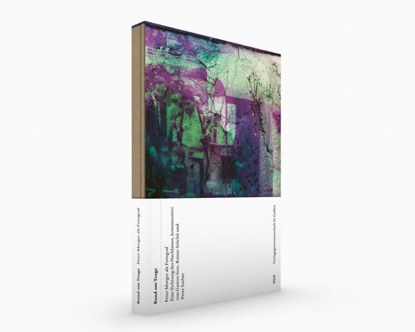
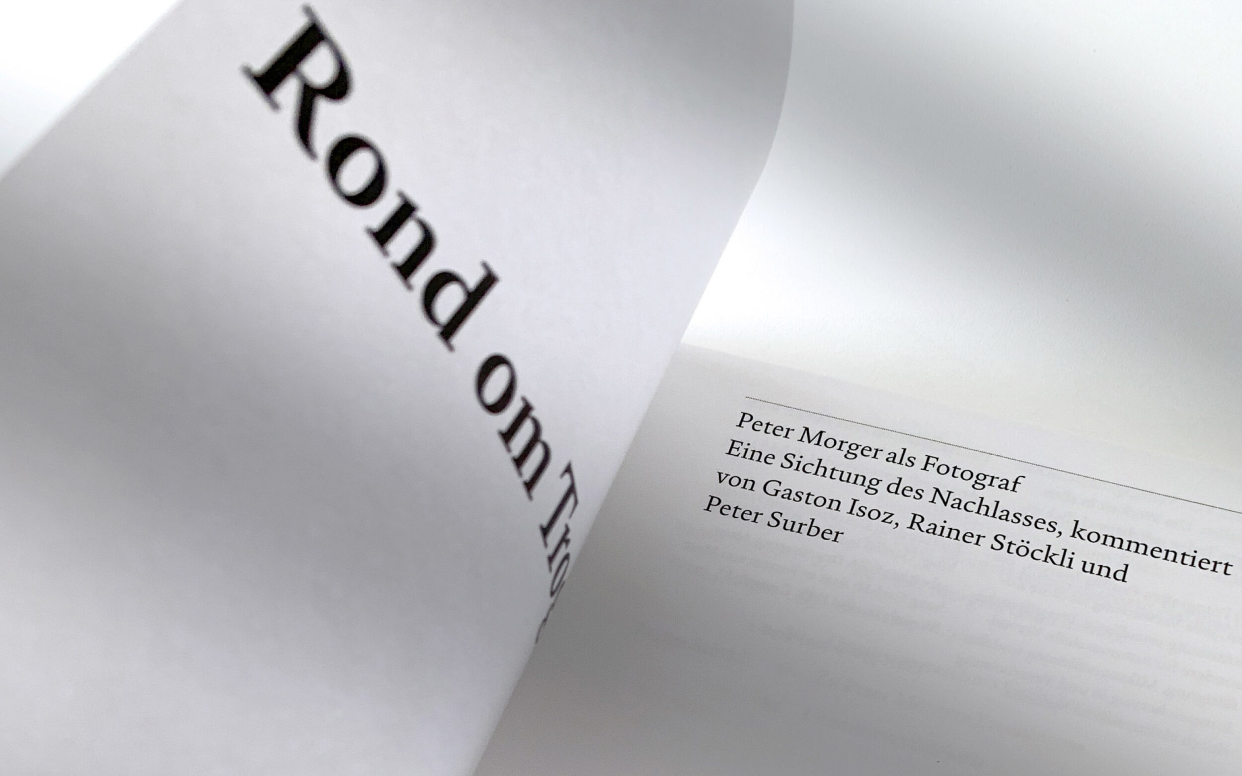
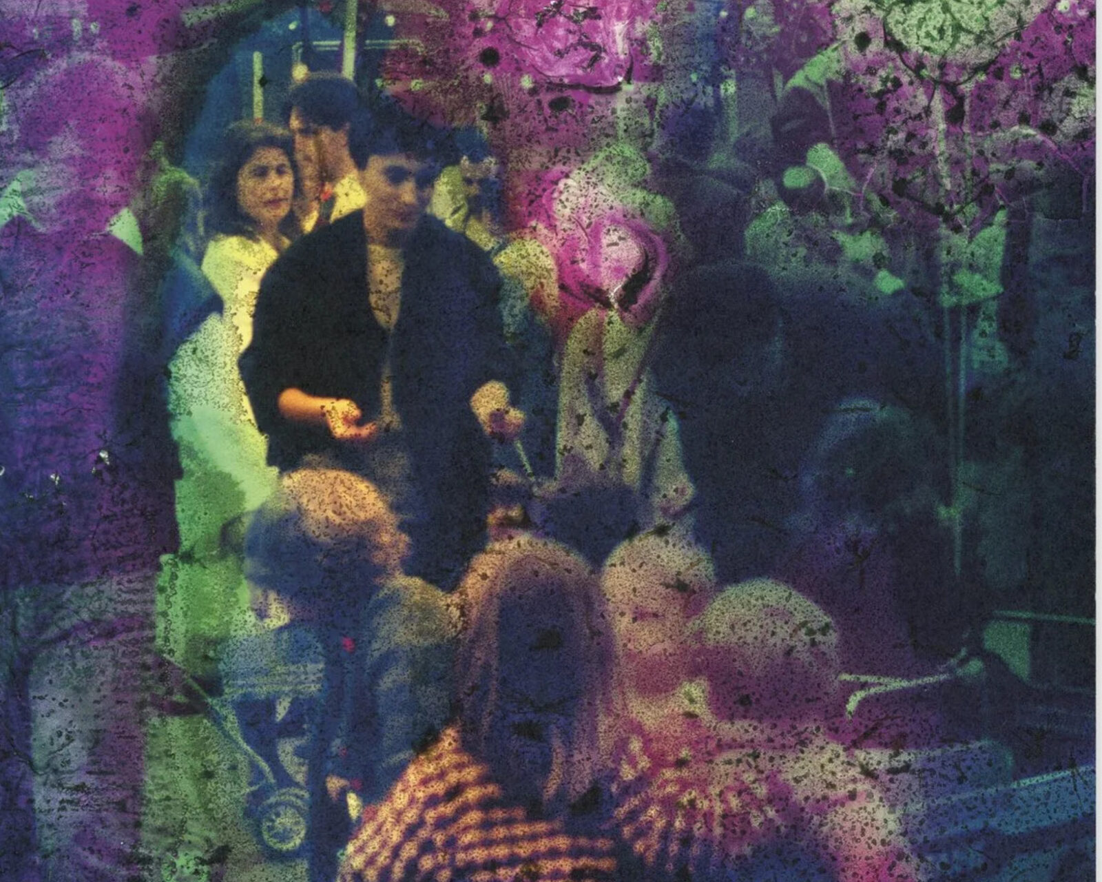
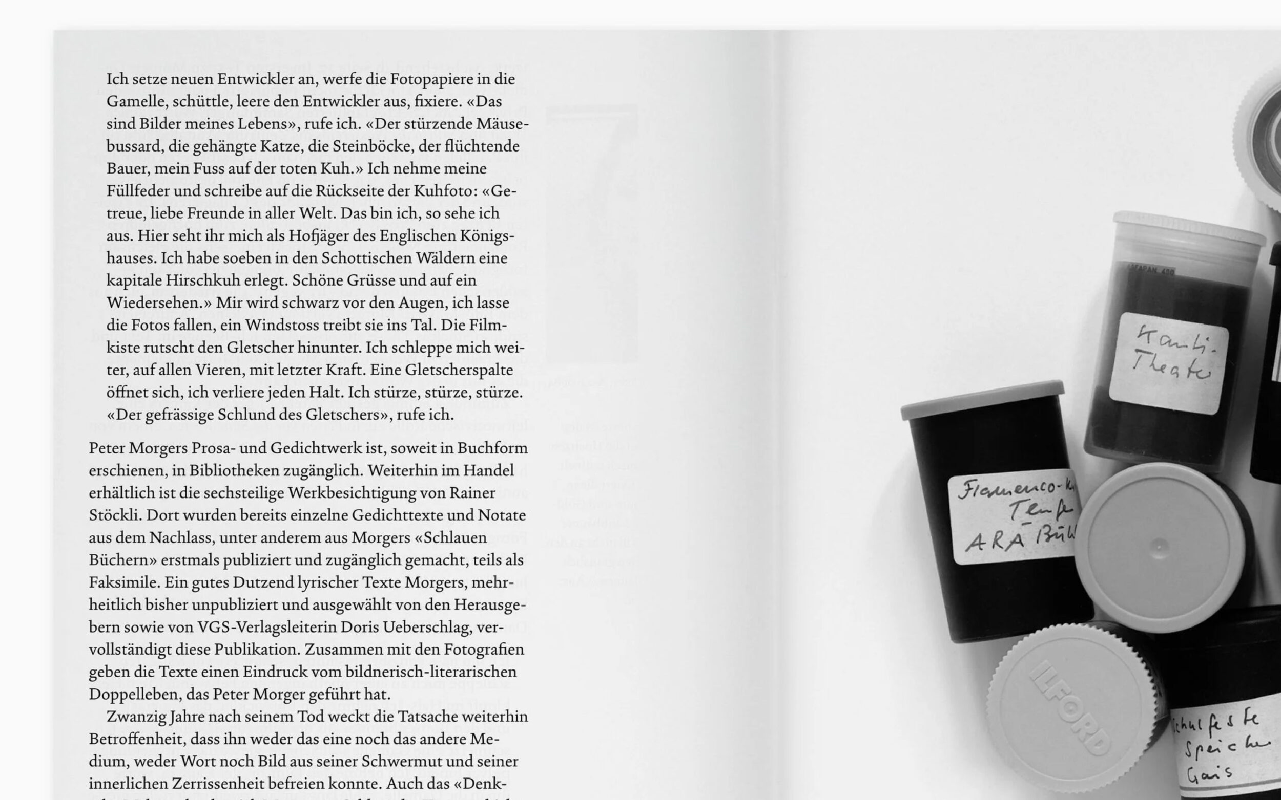
Peter Morger (1955–2002) was a Swiss writer and journalist but his experimental passion for photography remained largely unnoticed. In the book Rond om Troge – Peter Morger als Fotograf (2022), graphic artist and book designer Gaston Isoz presents a selection from Morger's photographic estate to the public for the first time, accompanied by Morger's poems and commentary and contextual texts. Particularly fascinating are the experimental works that Morger described as “trance art”: color slides that he transformed into psychedelic, magical imagery through mechanical and chemical processing.
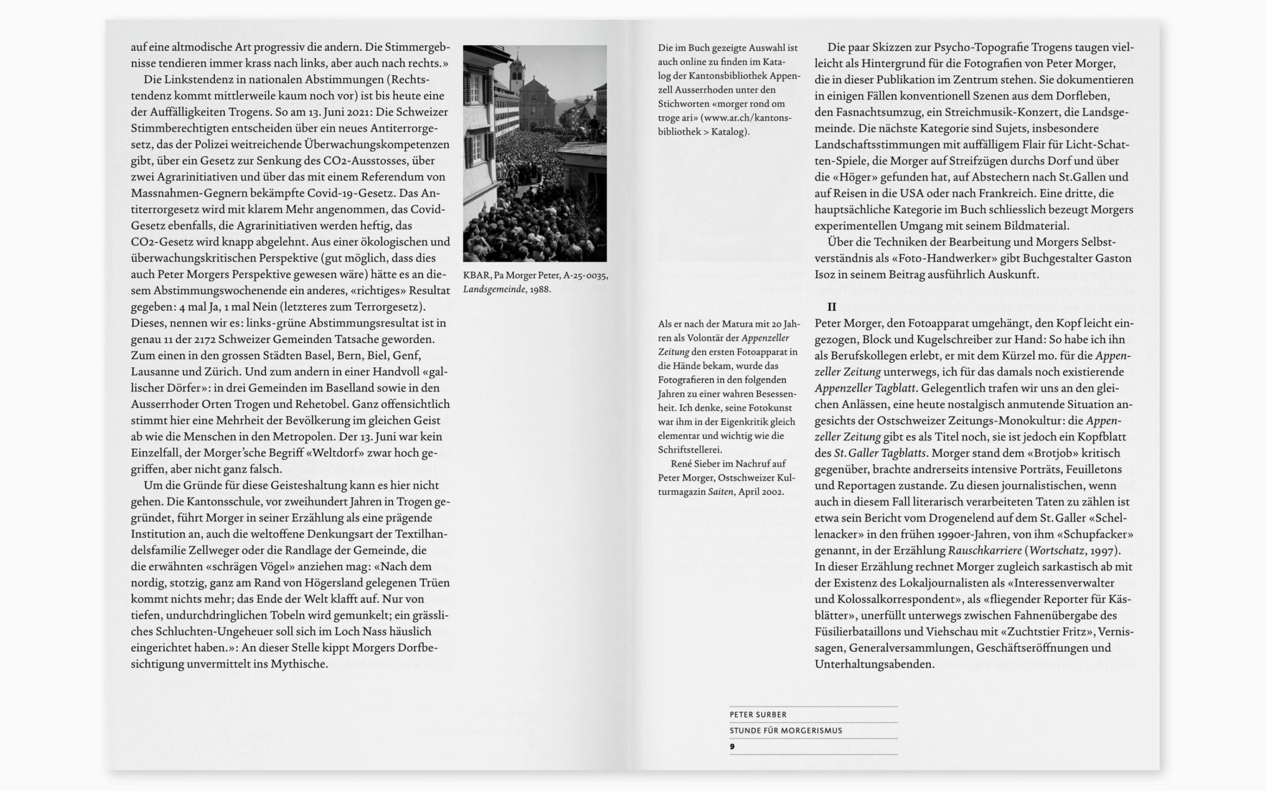
Weymann Serif is used for most of the book's typography. The young serif font by Marc Weymann, who also has ties to Switzerland, seems familiar at first glance because it is based on typographic traditions, but this does not make it any less autonomous. The font is expressive and confident, yet remains discreetly in the background in the book, making Morger's experimental works appear all the more powerful.

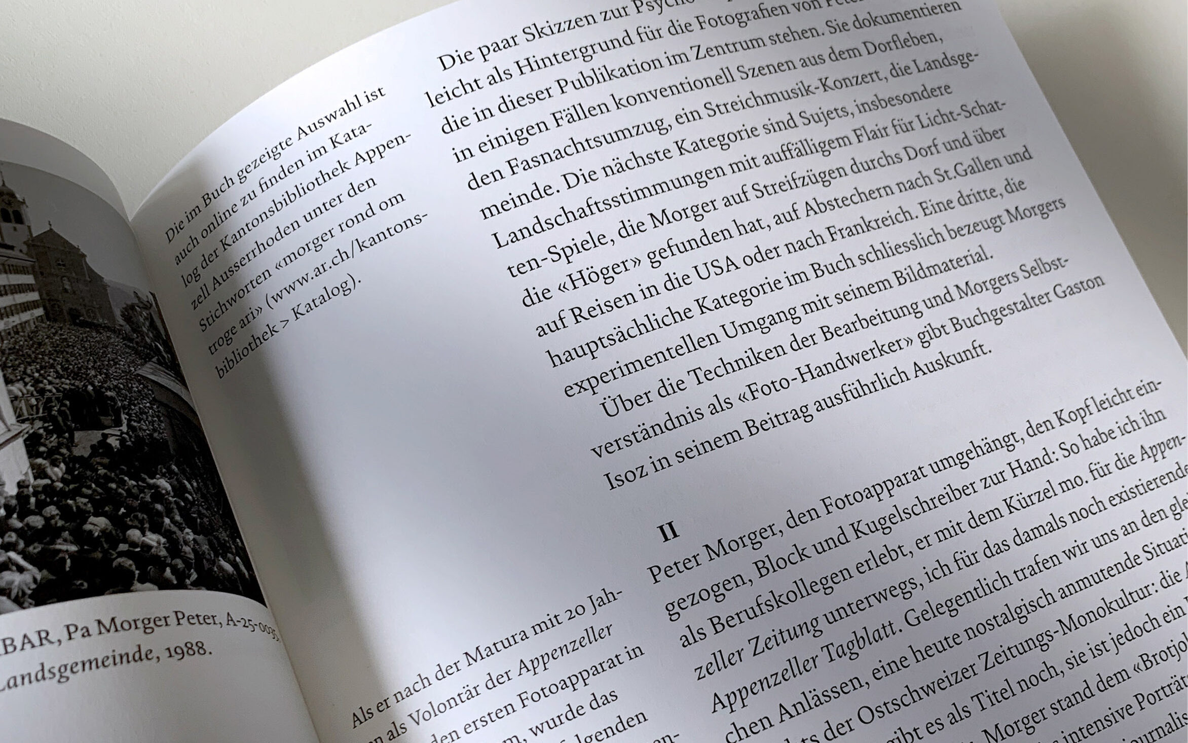
As the book reflects on and re-examines Morgers' work, the typeface is a quiet reflection on the act of writing itself: refined, balanced, and free of frills. These qualities are particularly apparent in Morger's poems: the subtle tensions between curves and sharp edges, as well as the interplay of roundings and serifs, make the typography lively and dynamic without ever seeming overbearing. At the same time, the classic, familiar appearance of the typeface, especially in the bold book style, enhances the readability of the commentary texts.
The book's design shows that typography can be both useful & functional as well as expressive & confident. With Weymann Serif, it finds a voice that does justice to the various facets of Morger's work.

Images by the courtesy of Marc Weymann