OrthOffice
Halvar's dynamic and technical design brings youth and energy to a medical brand while maintaining professional credibility
Images by the courtesy of Holystick Design
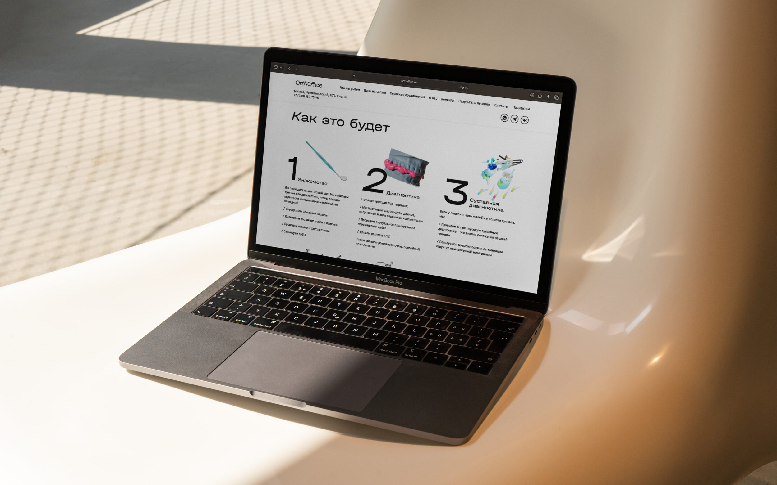
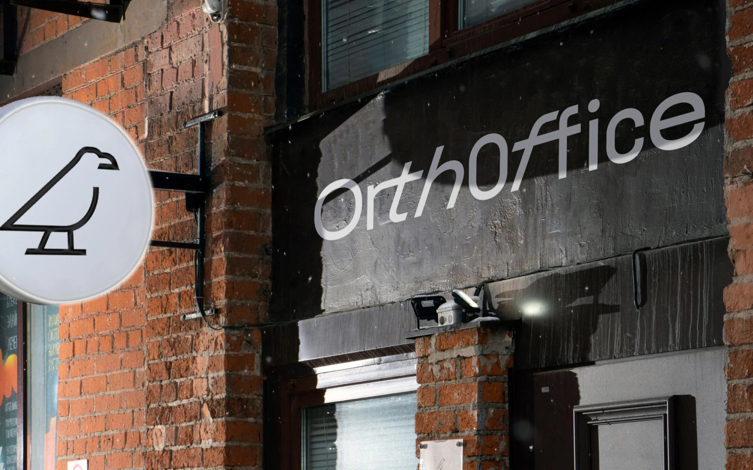
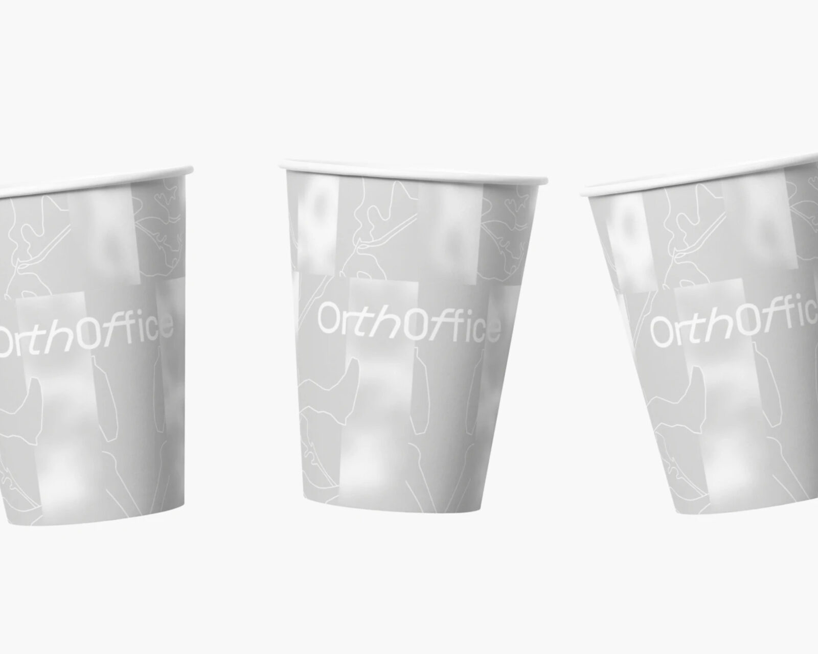
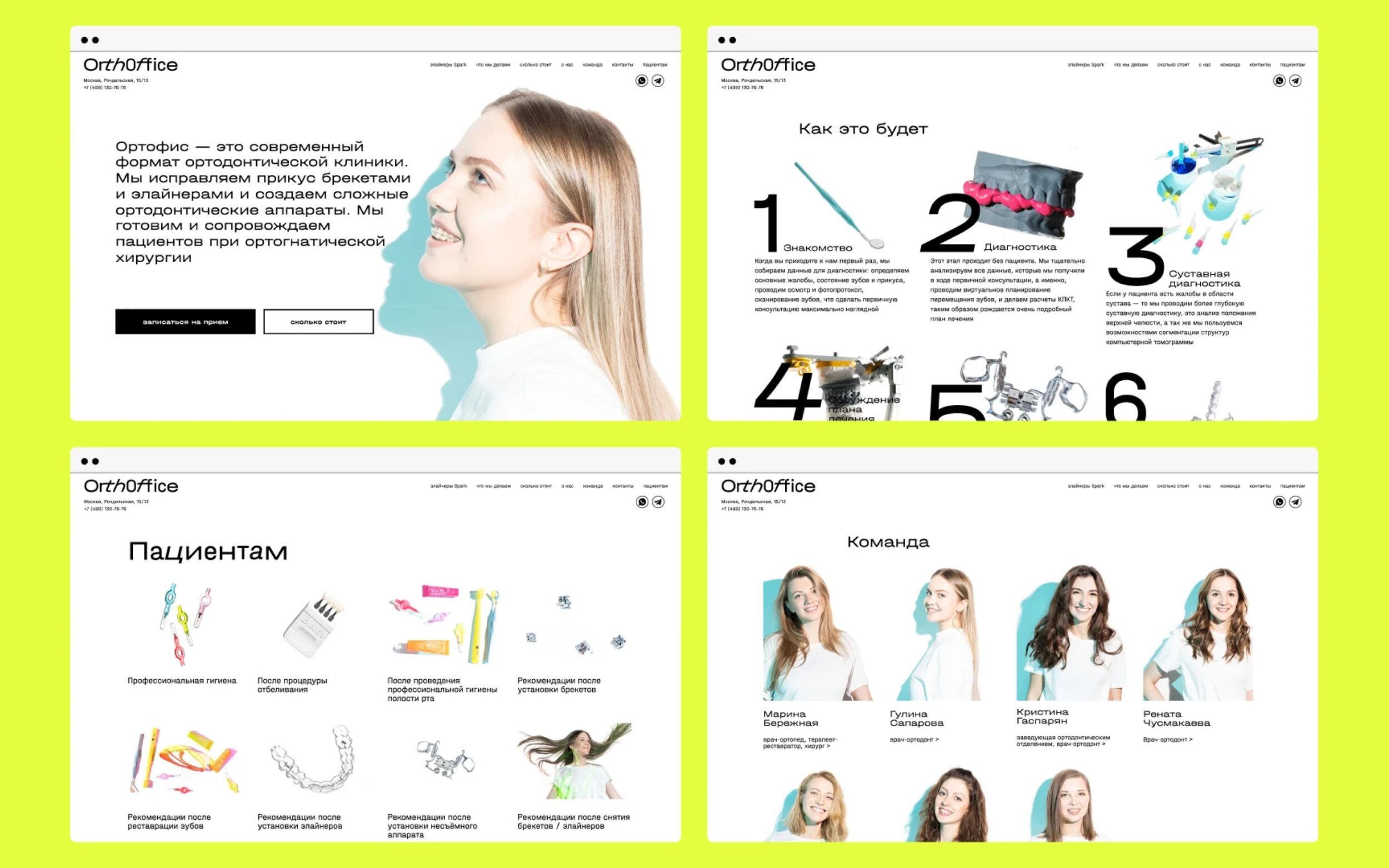
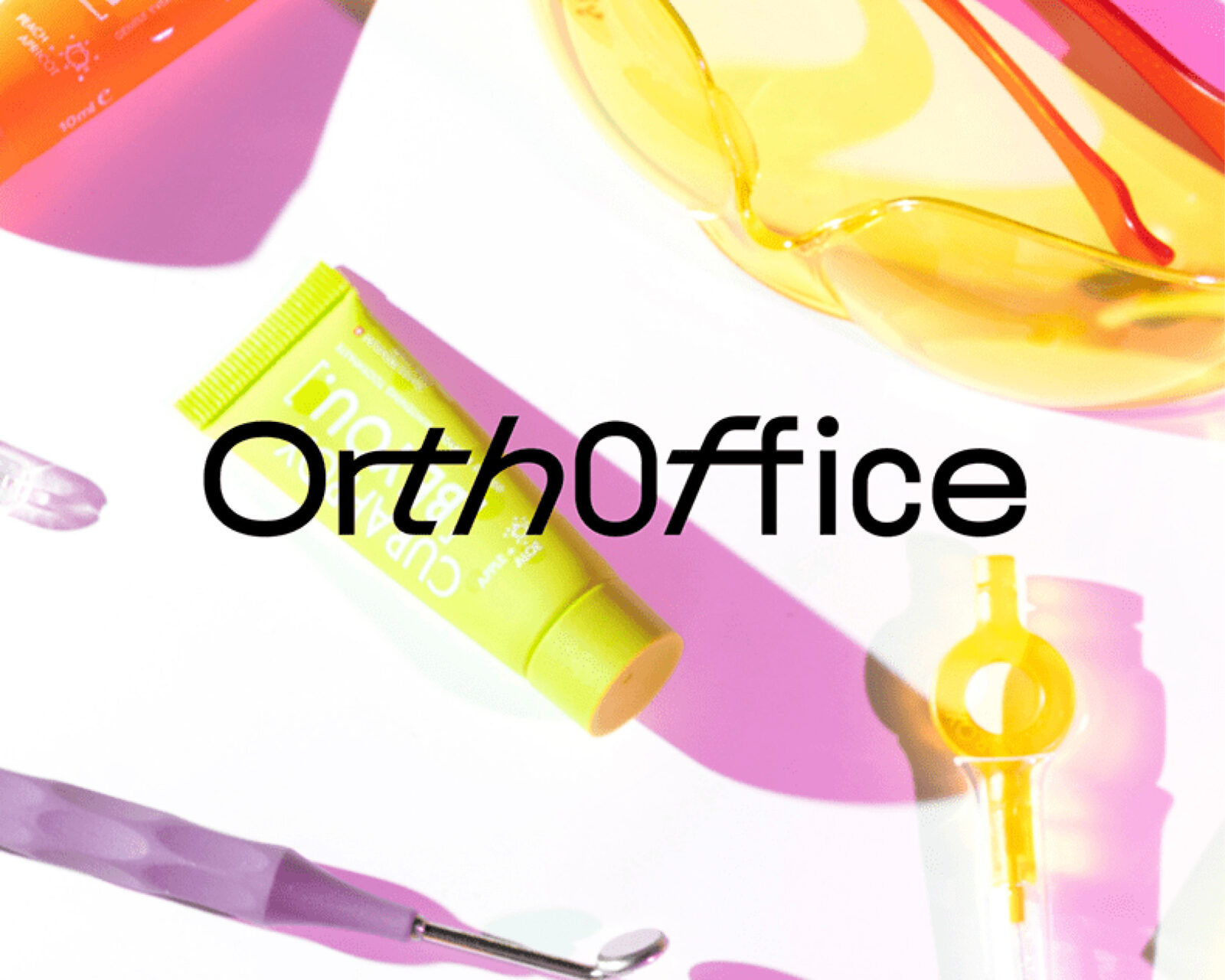
When designing the identity for the Moscow dental clinic Orthoffice, Holystick Studio wanted to create something special. Rather than adopting the classic, conventional aesthetic typically found in medical spaces, they brought a sense of fun and style to the world of dentistry, particularly appealing to their predominantly young clientele.
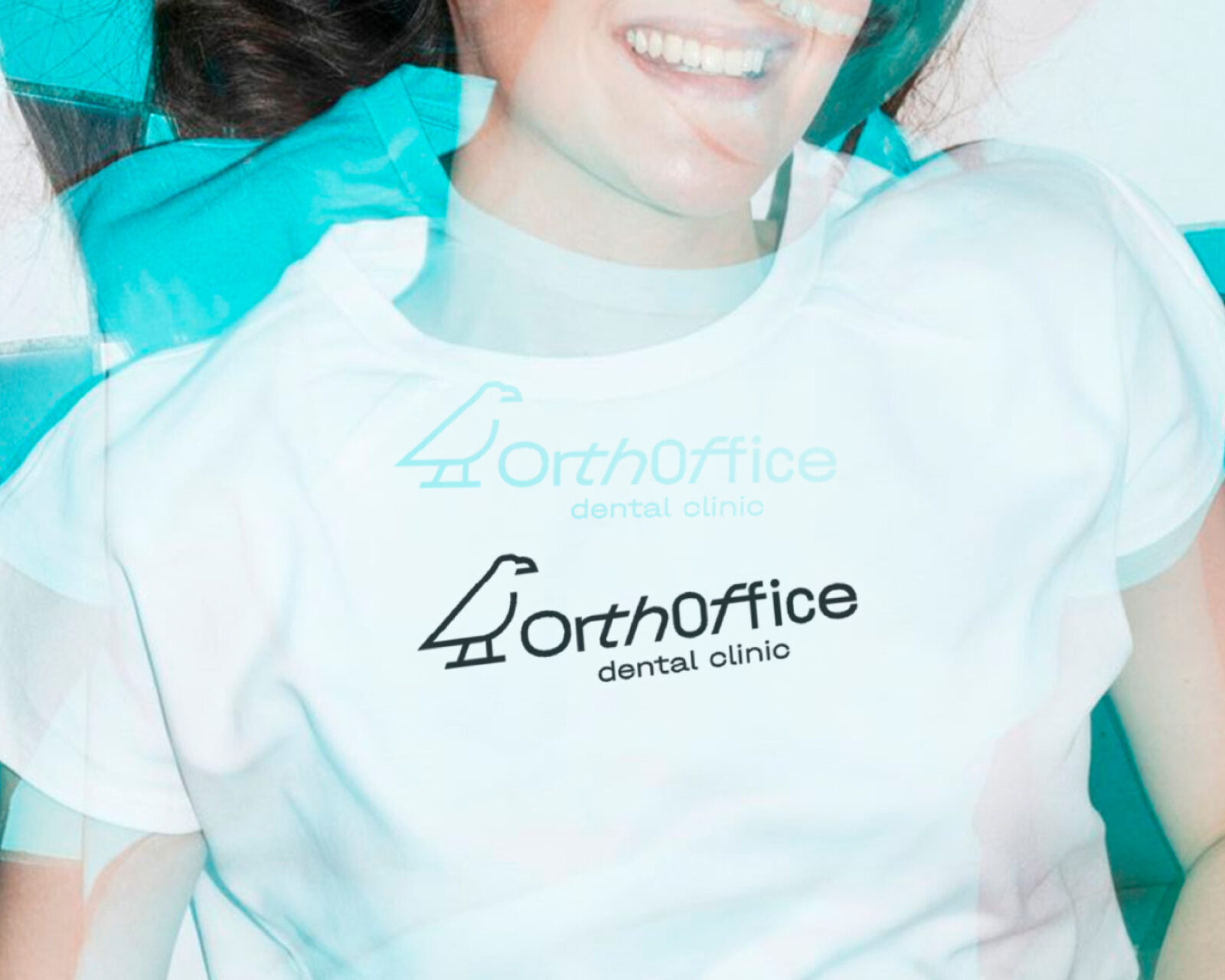

To achieve this, they selected the Halvar typeface for the project. Halvar Breitschrift in particular feels fresh, cool and youthful. Yet, thanks to its technical proportions and constructed forms, it also conveys a sense of professionalism and medical competence. In the logo, Holystick Studio experimented with the SuperSlanted style of Halvar, creating a distinctive wordmark that conveys a sense of dynamic forward motion. The slanted letterforms suggest speed and efficiency — qualities that one would want to associate with a professional dental service.
This typographic choice transforms what could have been a sterile medical brand into something vibrant and memorable, demonstrating that design can be both functional and expressive, even in healthcare.

