Netto is Moving Forward
Netto is a classic. After 15 years at FontFont and having been extensively updated, the distilled typeface and icons are now republished. Discover how this charming and uncomplicated design was carefully refined.
Versions and Visions
Since it was first released, Netto has established itself as a classic. Its republication through TypeMates combines new features with the same charm and functionality.
In 2008, Daniel first released Netto with FontShop*, now Monotype, as FF Netto. Back then, the typeface covered three weights: Light, Regular and Bold. Daniel’s thoughtful and methodical approach to Netto’s design was recognised by the International Society of Typographic Designers who awarded it a Certificate of Excellence in 2009.
For the font nerds amongst you, this first version of Netto was crafted in Illustrator and FontLab. In 2012, that changed. Updating his design, Daniel moved all of Netto’s shapes to a new production programme, Glyphs, redrew pretty much everything and added italics. In 2022, he picked up Netto again.
We are glad that he decided to expand his vision for the font; covering more icons and pictograms; and that he chose to release this new version of Netto with TypeMates.
*FF, FontShop, FontFont are a trademark of Monotype GmbH
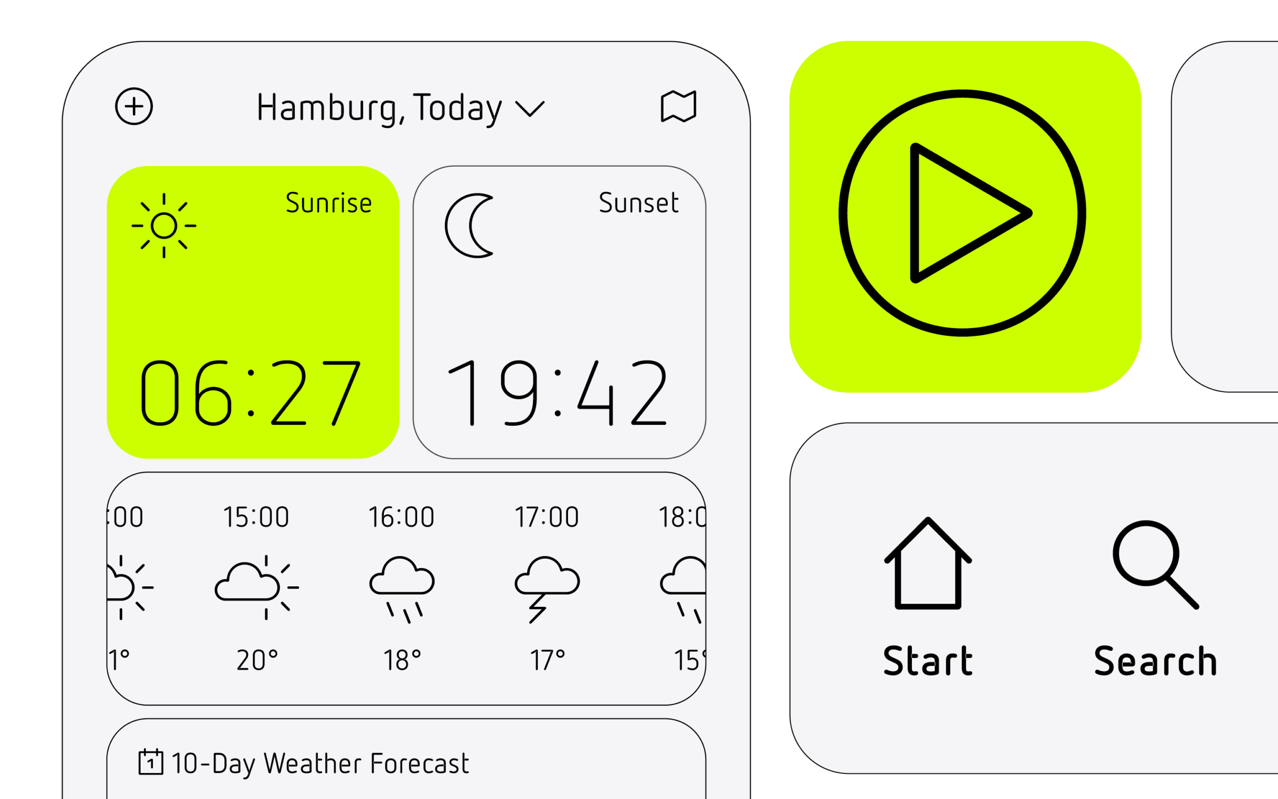
No-Frills Approach
Netto started as a side project to distract Daniel from a monotonous job. Starting with the idea of designing a no-frills typeface, he developed a font free from historical ballast. By reducing the letterforms to their essential shapes, he carved out the design’s geometric construction. Plagued by the question of why Isonorm-fonts always looked kind of clumsy and strange, Daniel was inspired to develop his own shapes.
By studying the letters and identifying the parts he could optimise, he came up with a few solutions for each one. Looking at all the variants, Daniel “simply” chose those that felt right, and then moved on to the next letter. Looking back, Daniel says, it was a pretty straightforward process.
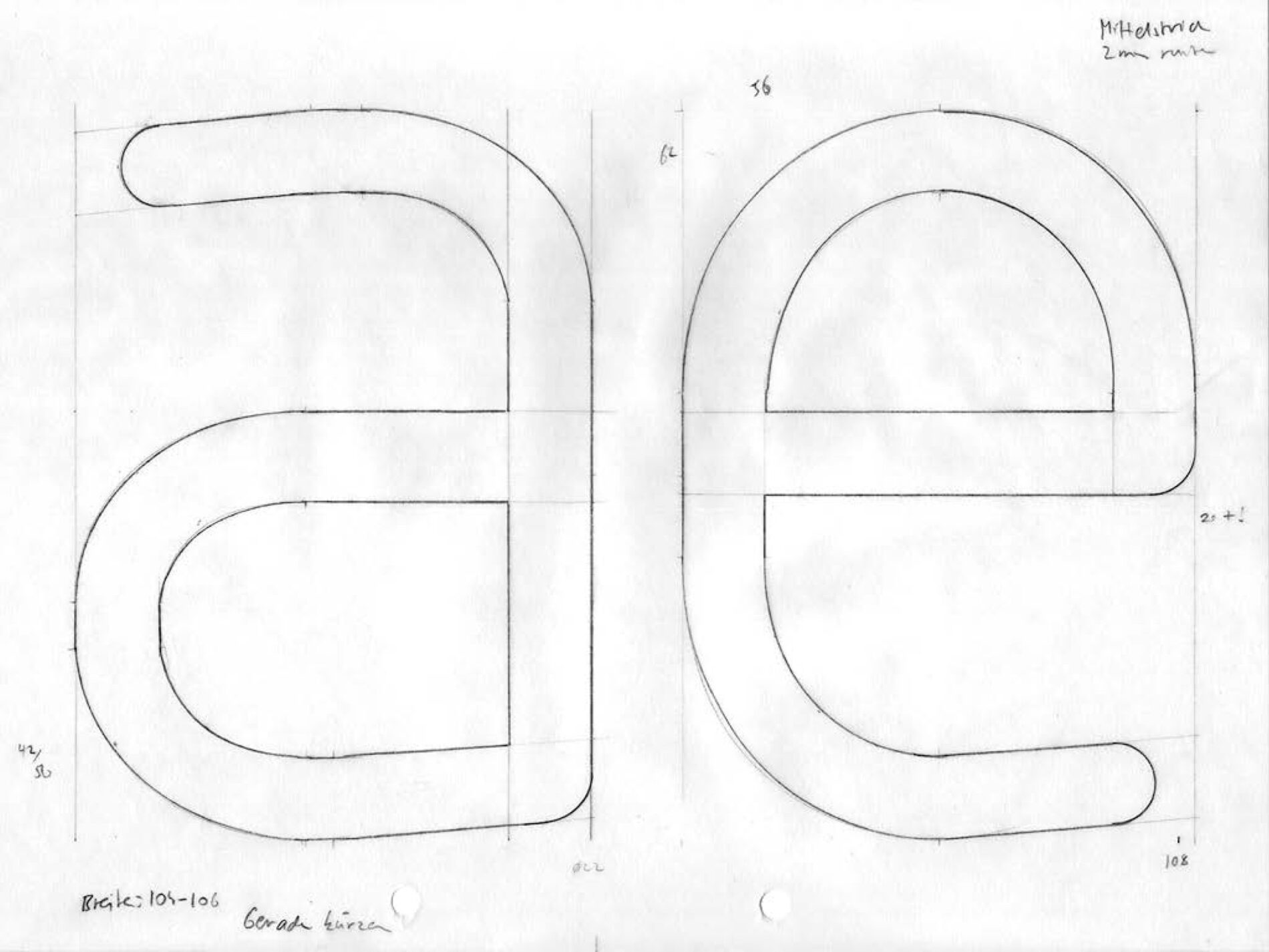
Daniel drew inspiration from the ISONORM
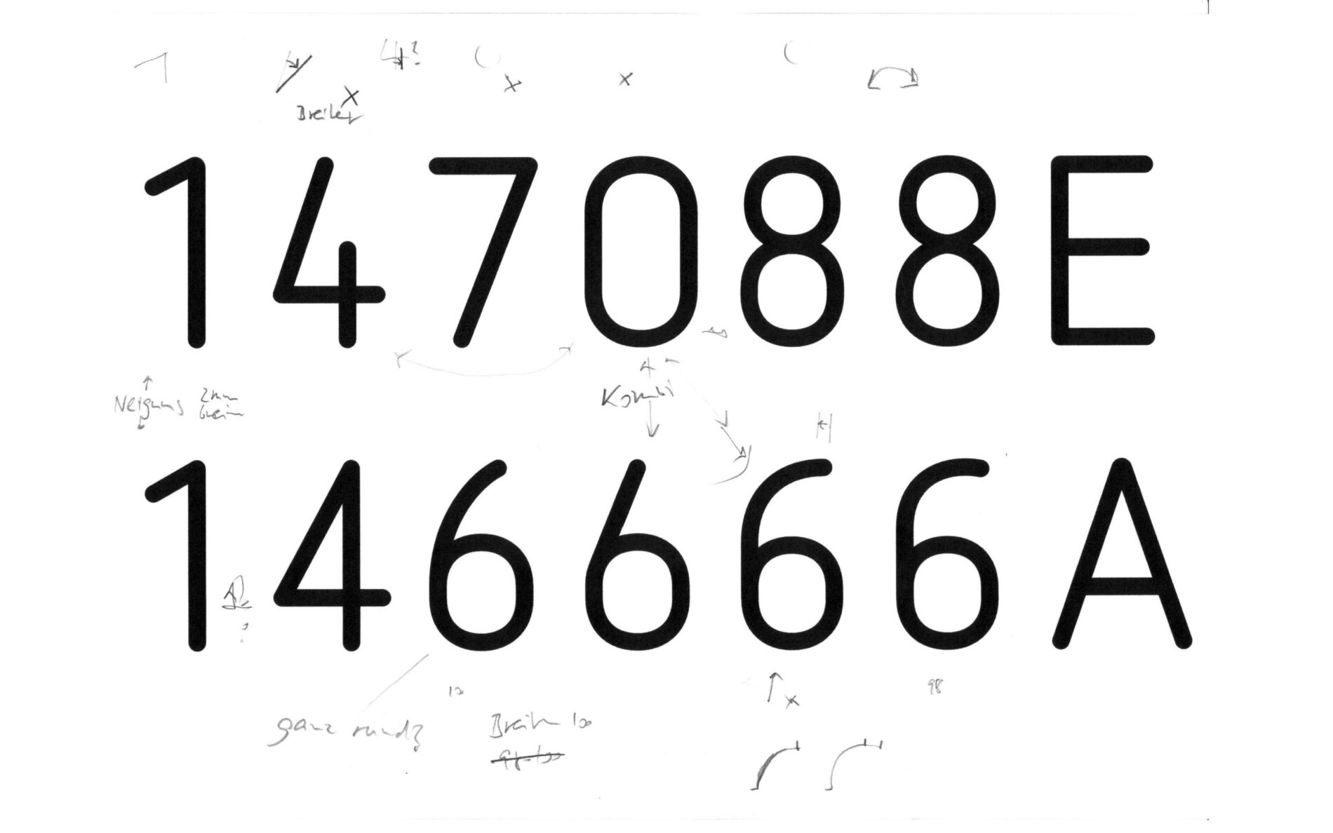
Spending time to find the right form
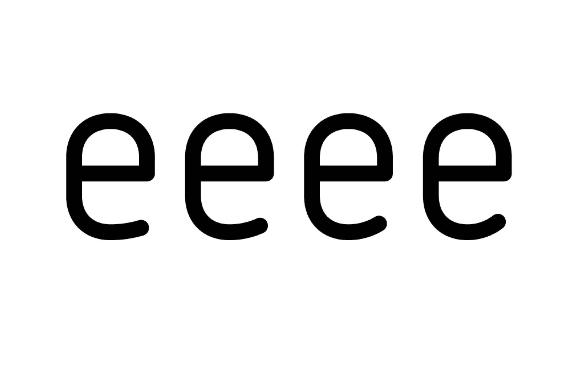
and finding the right aperture.
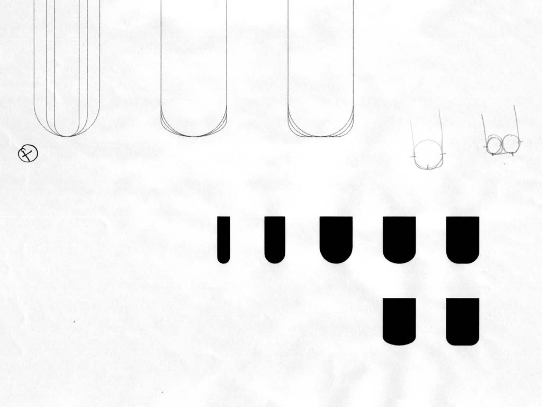
No-frills is easier said than done. Fiddling with the rounding to get it just right!
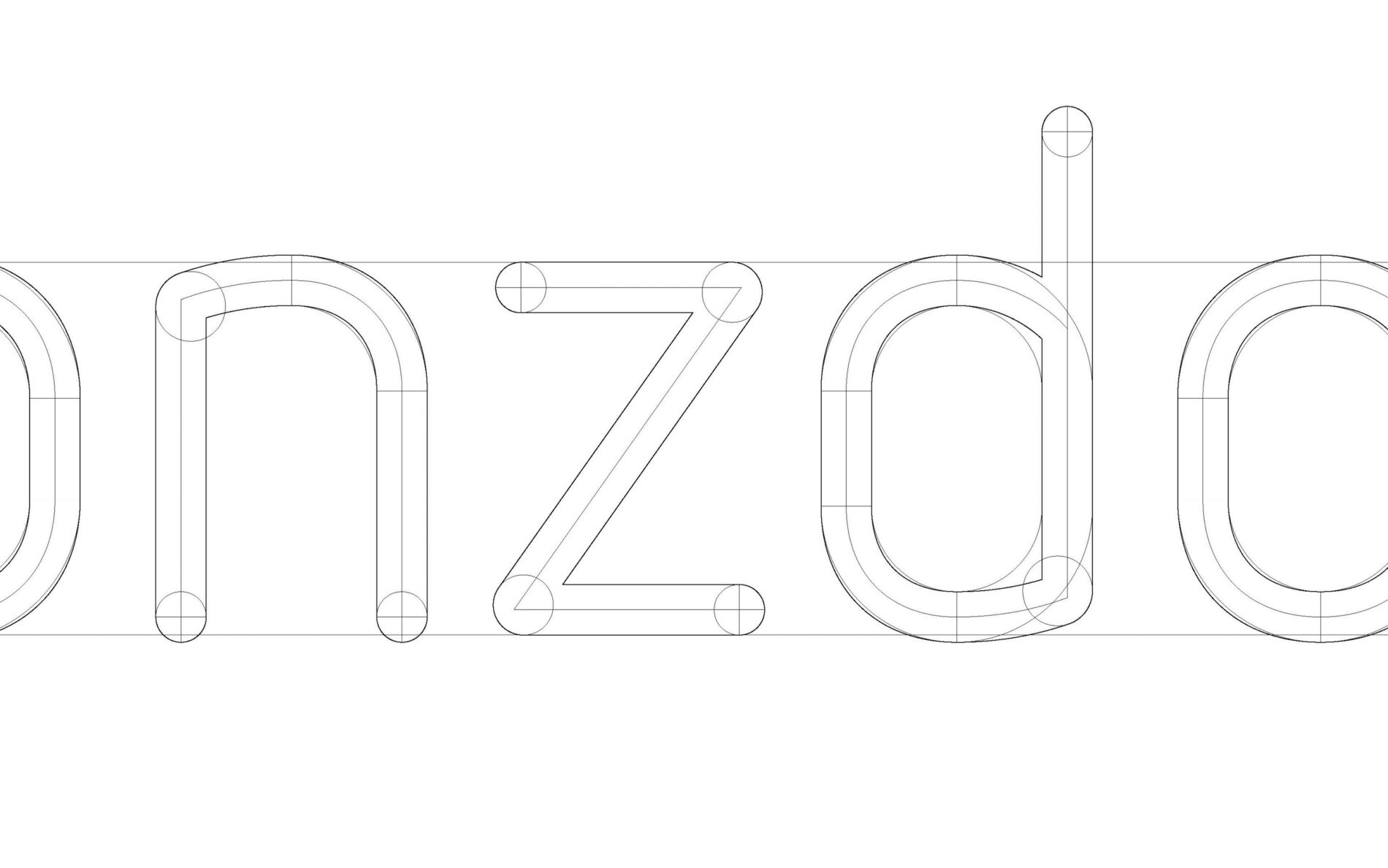
Engineering the basis for the whole font. You can see the structured approach of the parts that add up to become the characters.
Carefully adjusting the stroke just enough to optimize for legibility—as with all mathematical things in type design, in the end optics win. This optical adjustment is also a feature of all icons and arrows.
Developing his eye as a first-time designer of letter shapes, Daniel got some great tips from Andreas Frohloff that were crucial to Netto. For example, strokes are always modulated by contrast, even or especially when the shapes are supposed to look monoline and equal in weight and capitals are usually a tad fatter in stroke width than the lowercase. Frohloff also suggested the addition of the more legible l with the hook and commented that a single-storey a in the Italic might be too easily confused with an o in this design.
Despite the constructed and the non-decorative approach taken with Netto’s letterforms, traces of the handwritten are conveyed by the steeper curves in d, p, and u and give the typeface a certain charm. For Daniel, f and t became key to determining Netto’s character. The most tricky letterform to figure out was &, but due to the adjustments needed to ensure the right grayscale, all the letters in the black weight presented their challenges.
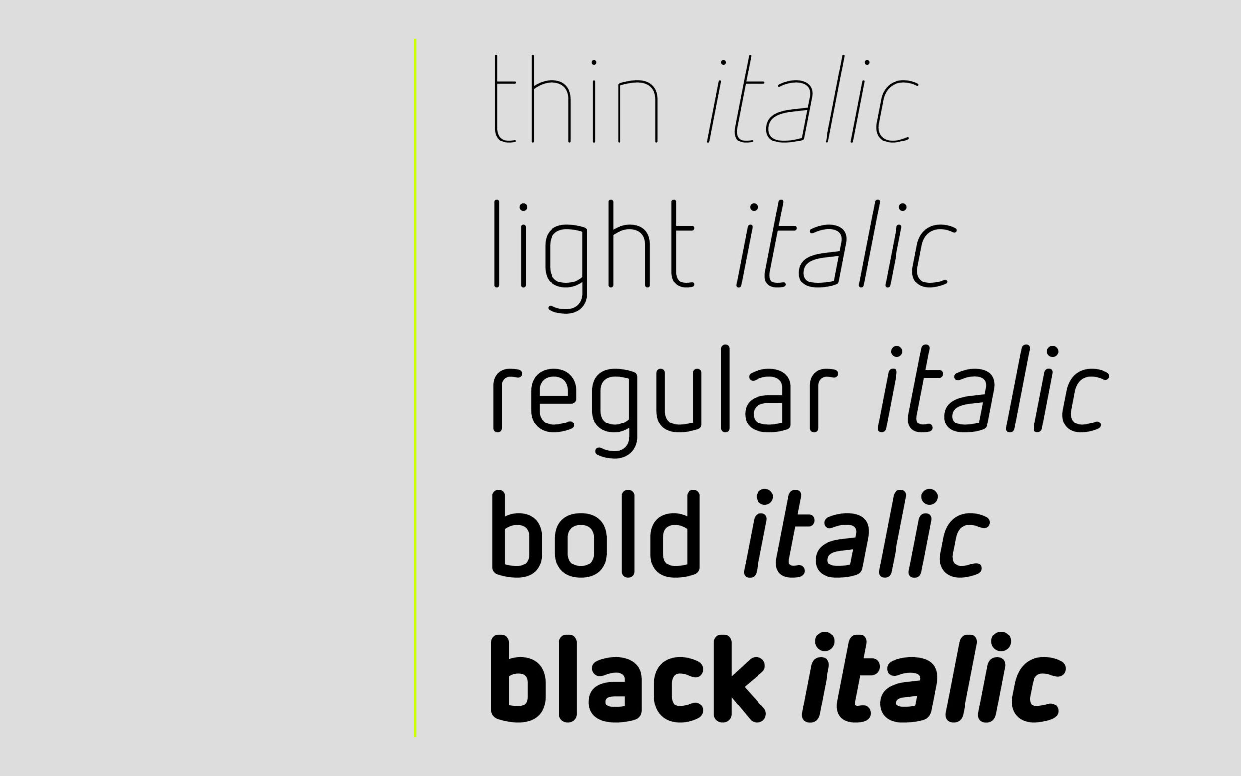
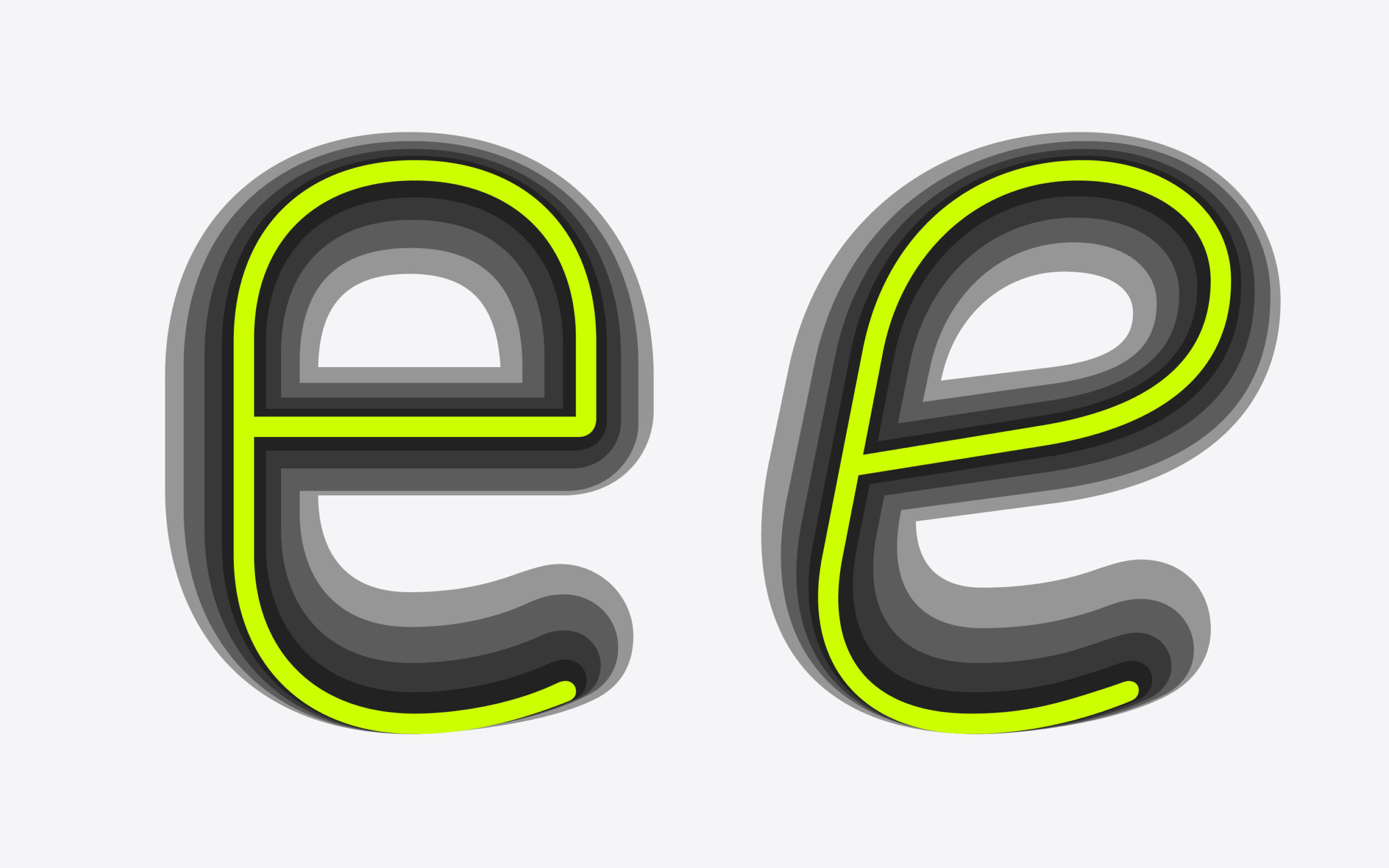
Netto’s weight spectrum was expanded, Thin to Black, and each weight supplemented by matching Italics. In line with Netto’s character, the Italics are clean and logical, reminiscent of a slanted style, and stay true to the upright shapes even as the e becomes a bit more rounded.
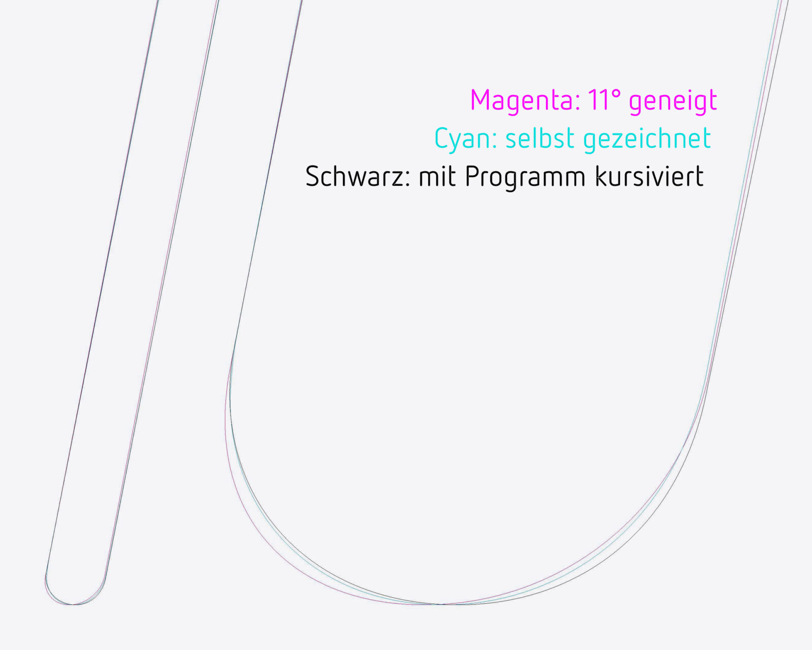
Along with ensuring they felt logical and natural beside the Upright, the Italics presented a new challenge for Daniel’s design process: finding the right degree of curvature. As Netto was his first typeface design, exploring all the ways that curves could be adapted in a slanted were part of reaching the Italic’s final form. “Trust what you see” became the motto. Even though it was not “logical”, a squarer curve in the black looks right and so it was used.
Diving Deep into Icons
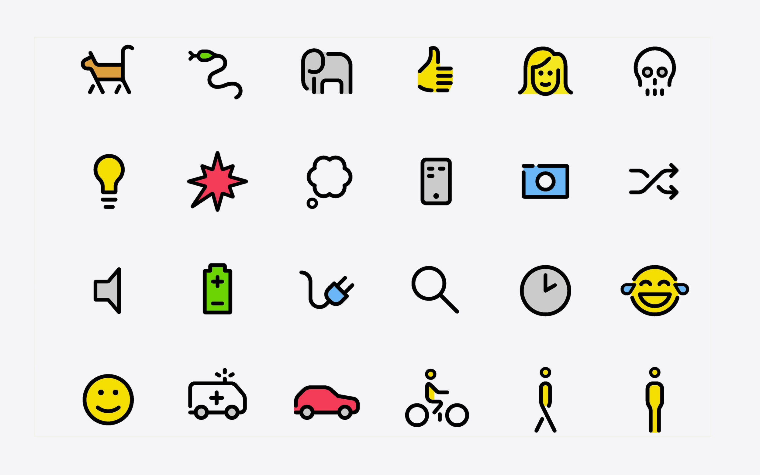
When he needed icons for a job, Daniel used Netto’s letterforms as a starting point. This became the base for Netto’s expansive icon collection which covers a vast number of purposes and areas, from interface and information design to wayfinding, plants and animals to transport.
A few parameters were important to Daniel while creating the icons and extending Netto’s character set beyond letter shapes.
Level of Abstraction
Similar to the letters of the alphabet, the icons are designed as a series and to be formally coherent. Common characteristics like a uniform metric, recurring stroke widths and proportions are helpful. In principle, Daniel realised Netto’s icons should be designed as clearly and simply as possible. Thus, individual icons with too many illustrative details had to be revised to fit with the overall layout.
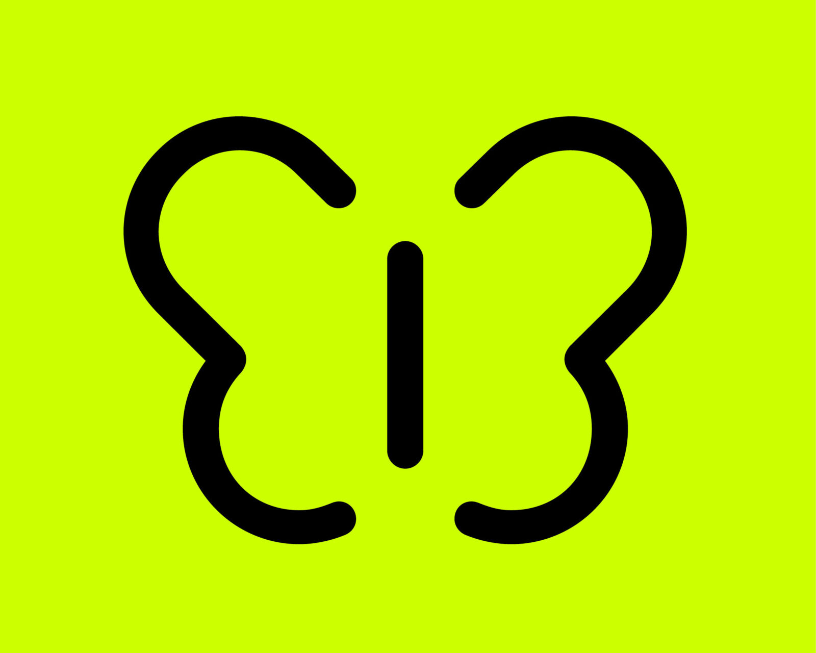
Finding the right form for each icon was sometimes very easy, as though the picture for them was already in Daniel's mind. Sometimes it took a few more variations to see which would be suitable. One of the more challenging was the butterfly, and, oddly, most machinery like cars, motorcycles and scooters.
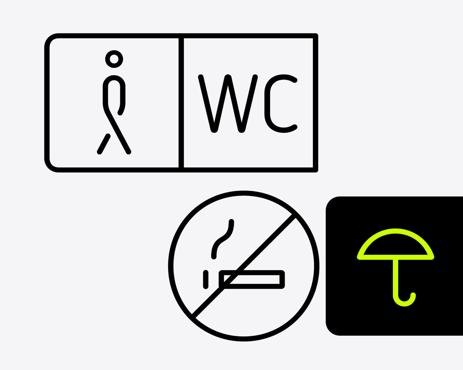
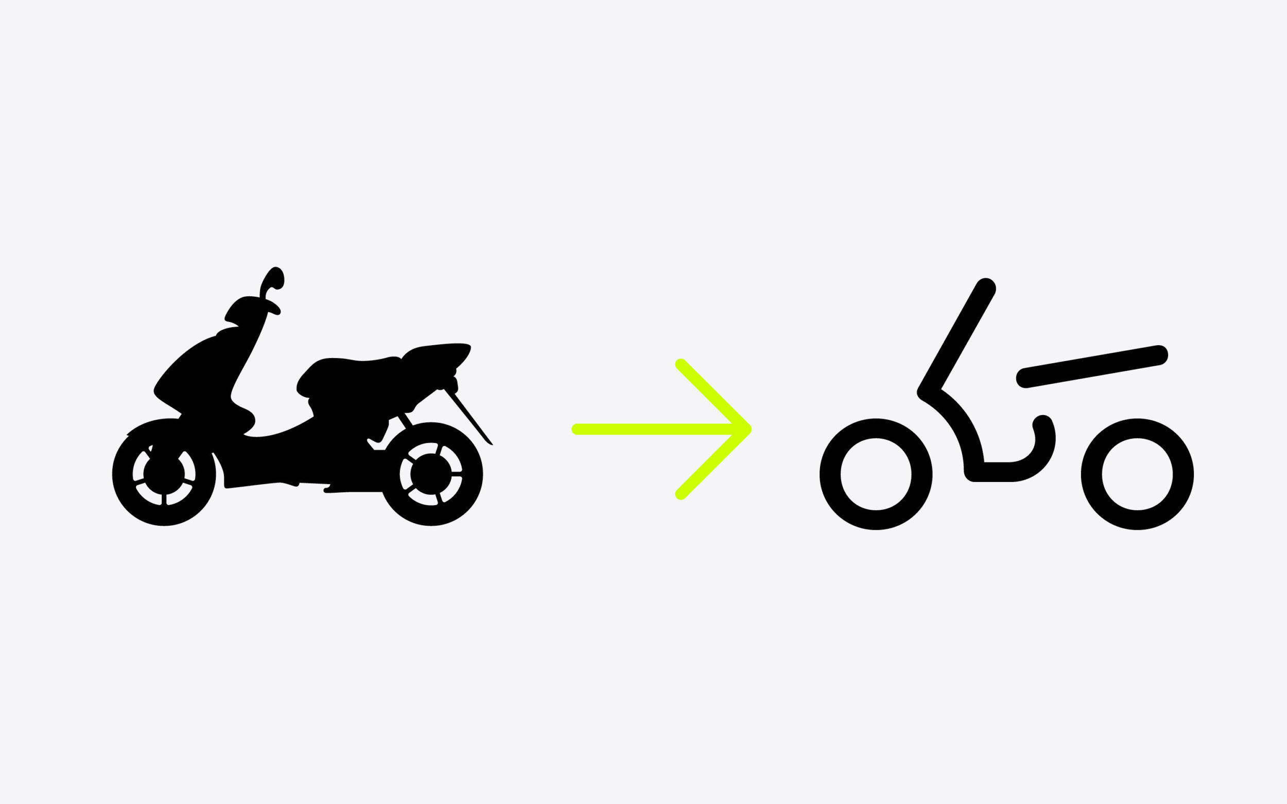
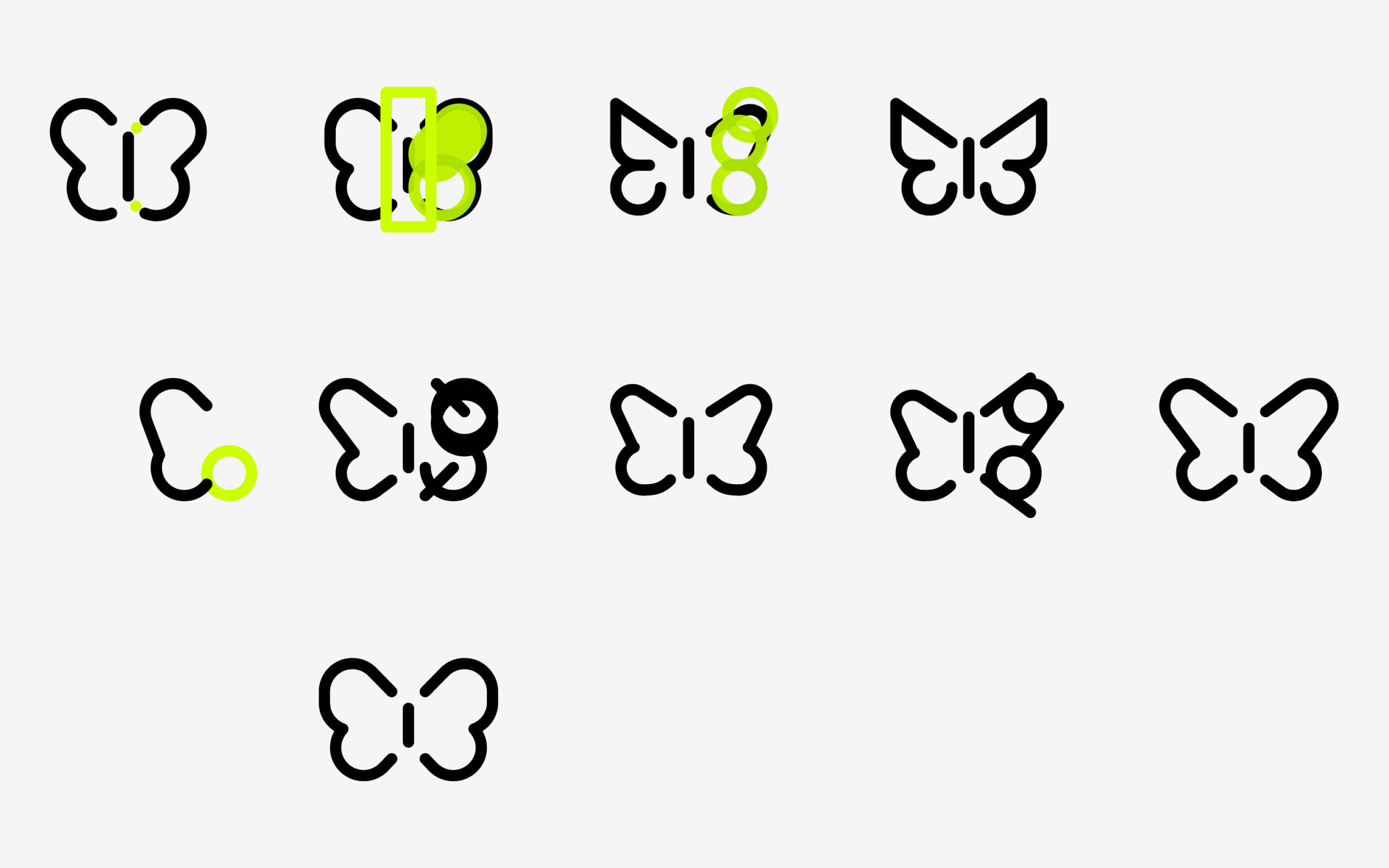
Getting the right degree of abstraction: icons are perceived more immediately and directly than written words. However, they are often less clear.
Size of the Visuals
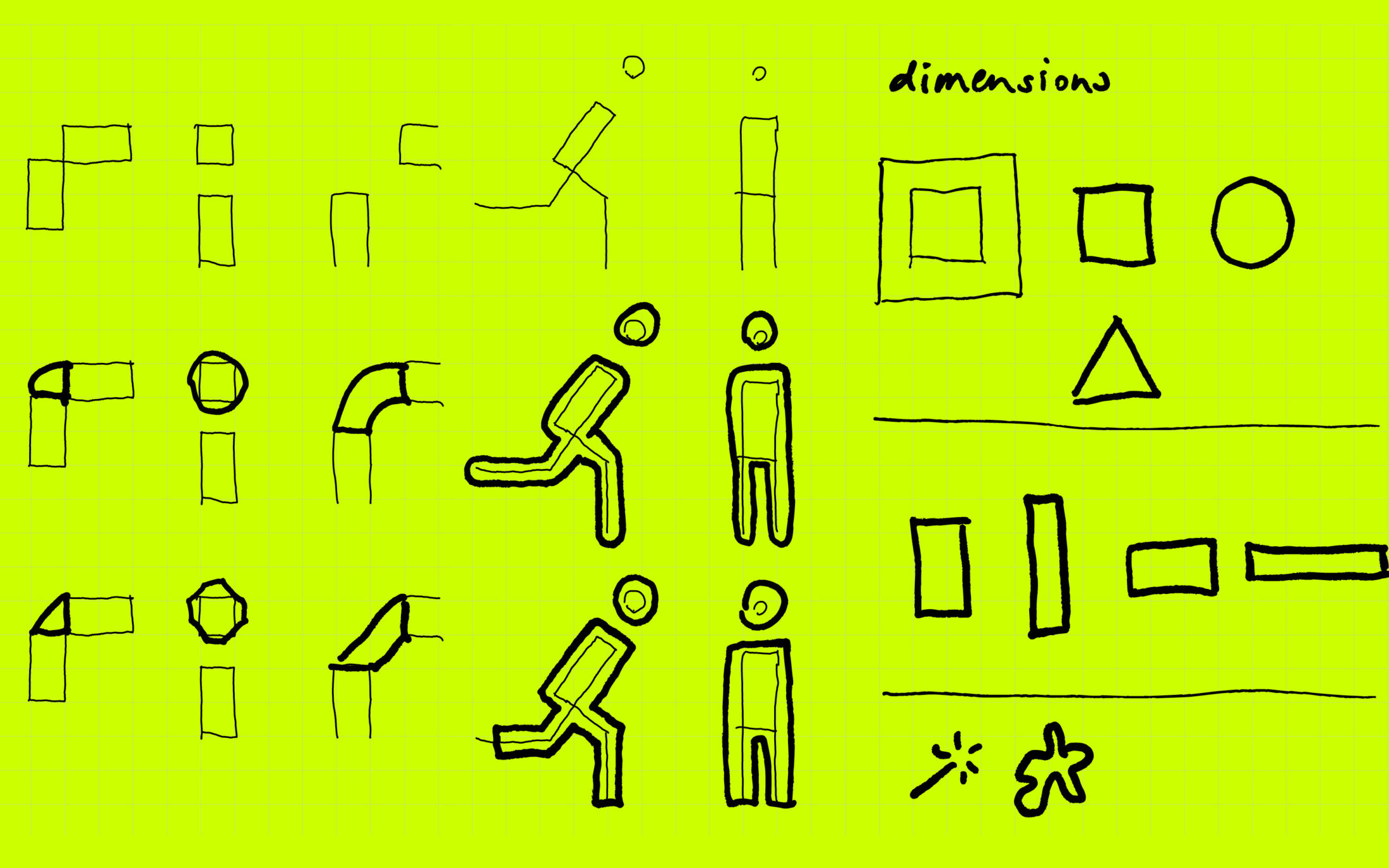
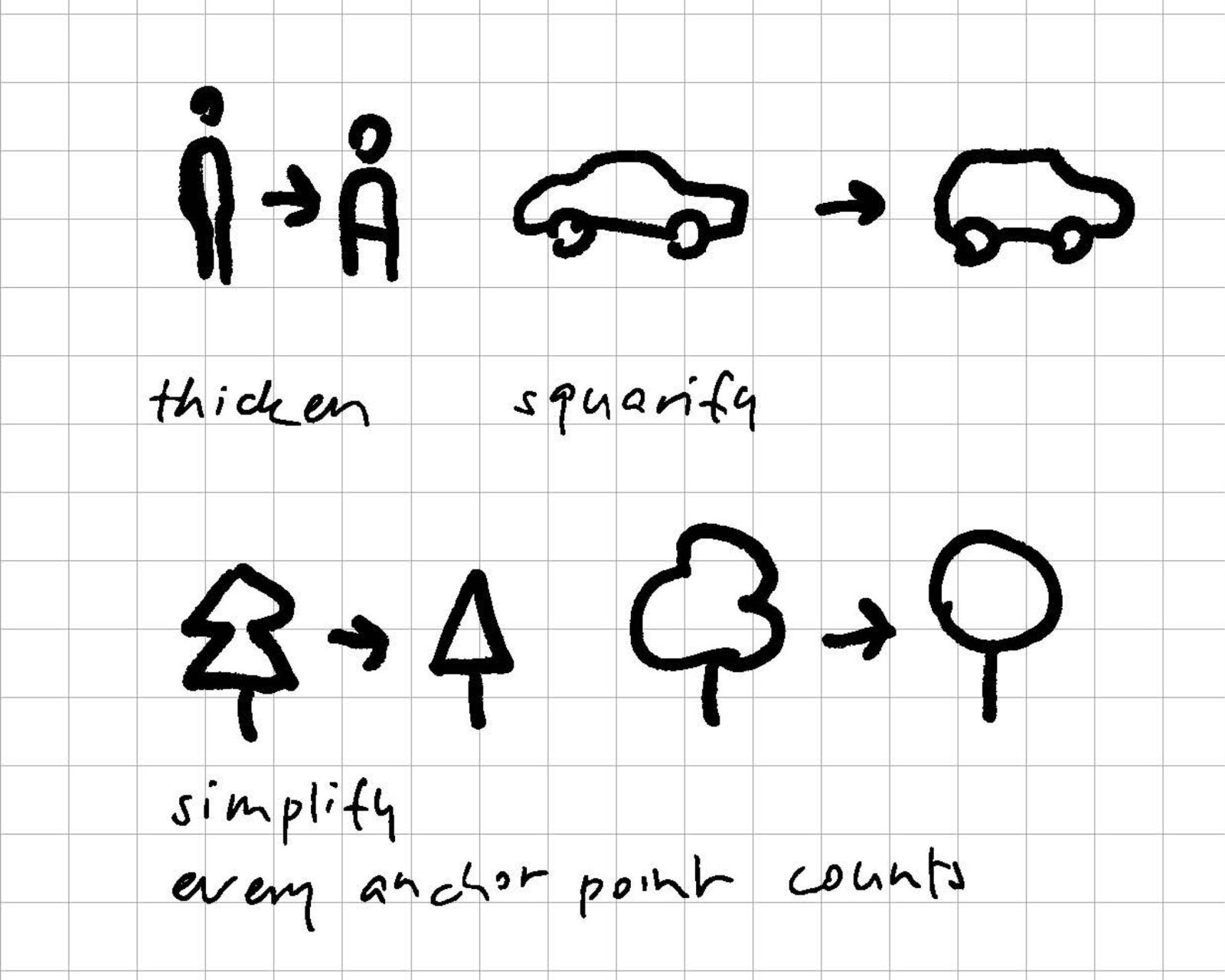
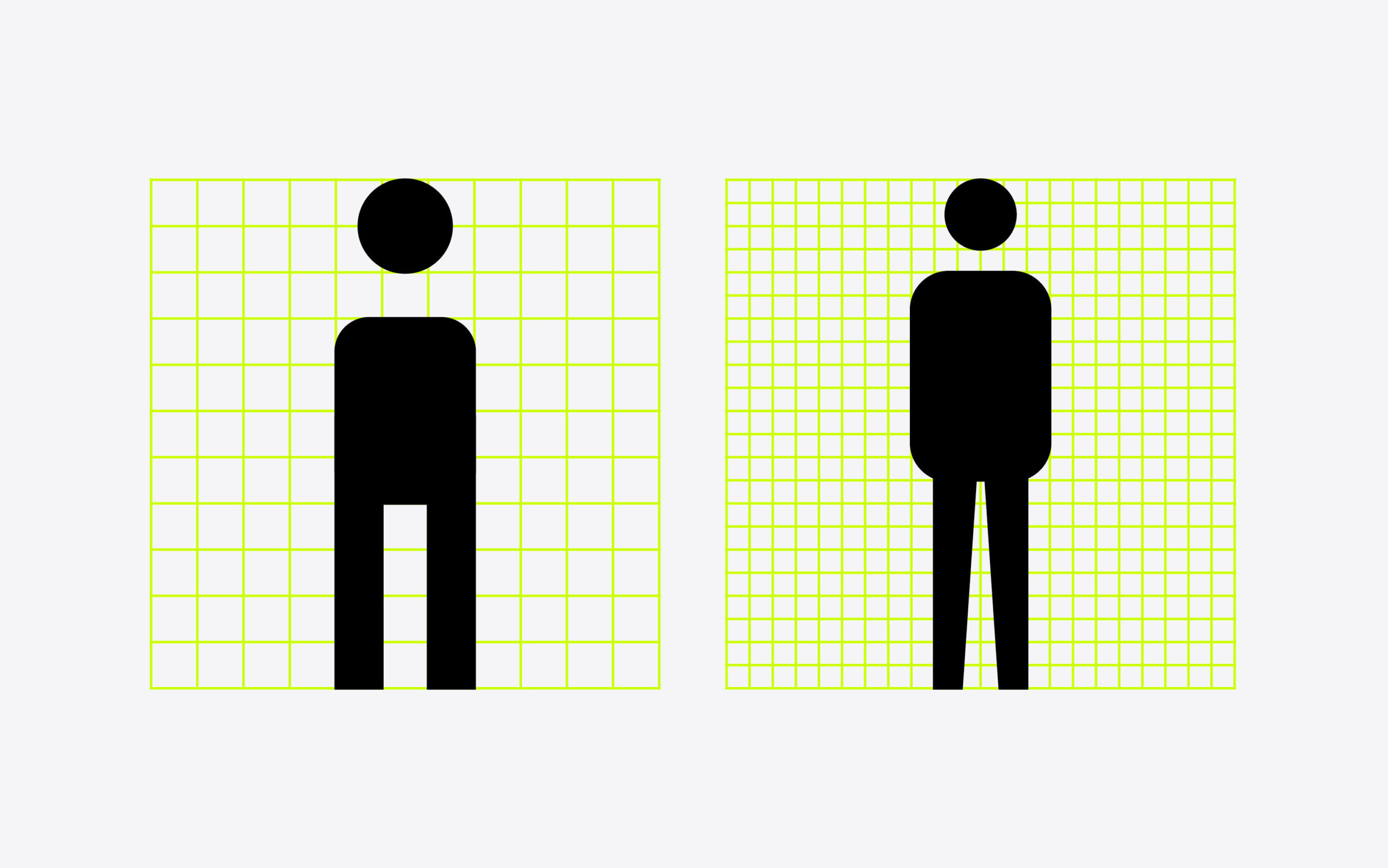
Daniel’s sketches for a square version of the icons highlight the problem of visual size in iconography. The size of icons within a series should be visually coordinated: if only their height matches other icons, landscape icons will appear significantly larger than their narrow, portrait-style companions. As a result, squares were used as reference objects, making sure all icons seem the same size. Even though the square was a useful tool, it was equally important for Daniel not to let it dominate the designs. Squareified icons risked looking infantine and unsuitable for Netto.
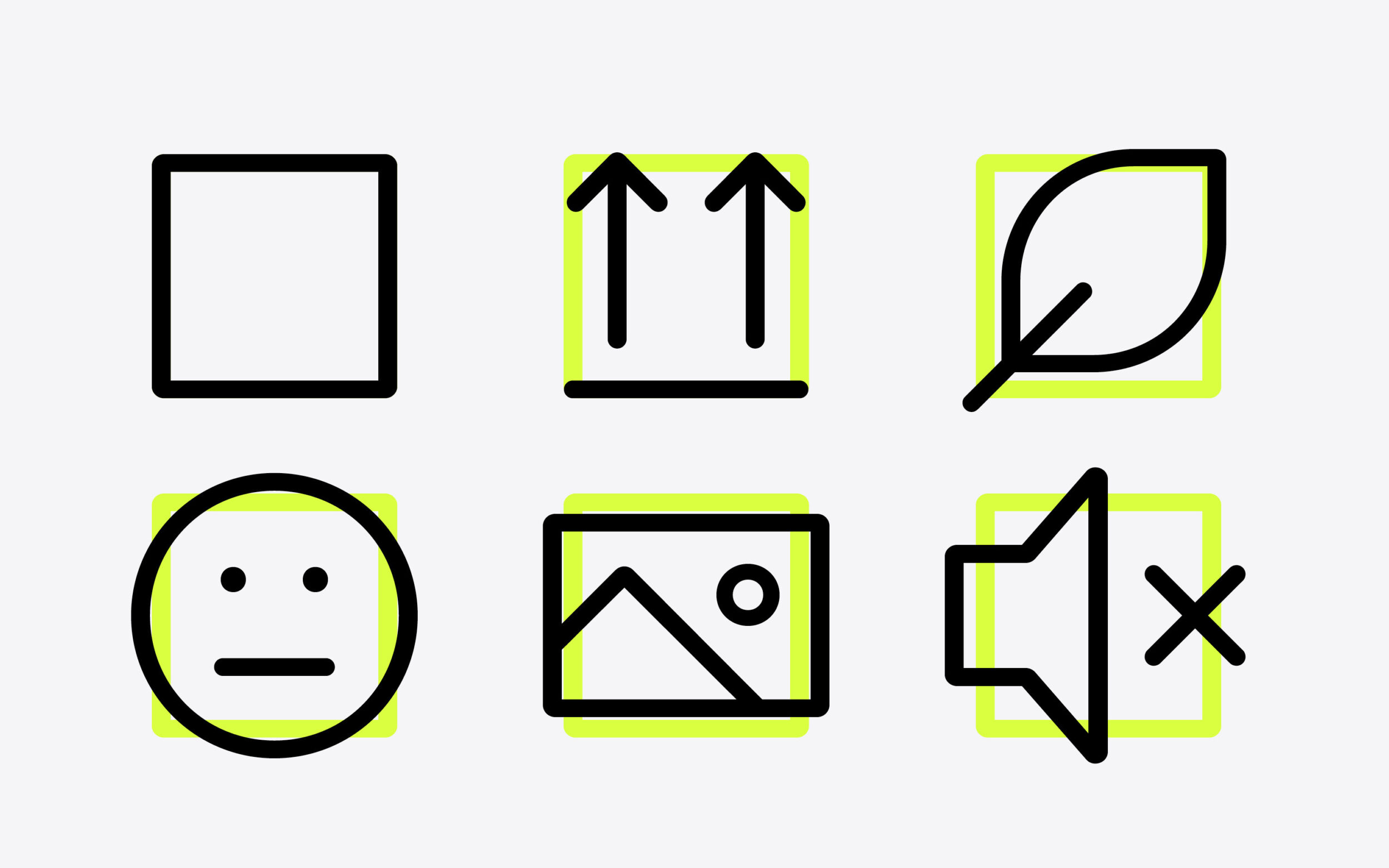
Using the square as a unifying measure, rather than just the height, helps ensure icons are the optically correct size when combined.
The Grid
Although in most cases icons do not have to be designed with pixel precision, a grid helps ensure icons are designed effectively and uniformly. It also saves the designer from making unnecessary decisions by reducing the number of possible alternatives, speeding up the process. With Netto, the challenge was to define a grid in such a way that it was neither too coarse, nor too fine for the task at hand.
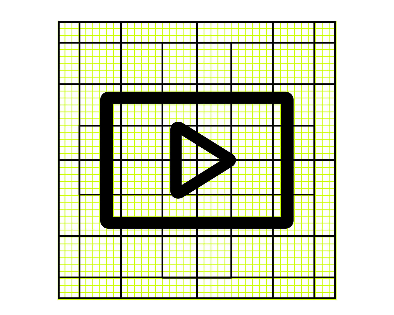
Details
Daniel developed rules for the distances between strokes, the line width over different weights, and instructions for curvature. For example: when angles are sharper than 90°, the curvature was reduced. The larger or flatter the angle, the stronger the rounding of the corner had to become. However, the degree of rounding has to be checked and adjusted in each case. That last sentence is key. In the end, each of Netto’s icons and letters needed to be checked and adjusted to work individually and in harmony with the rest.
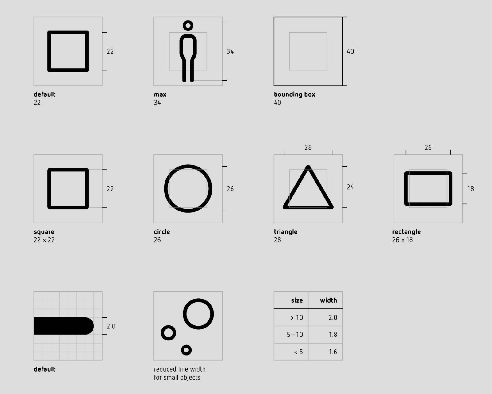
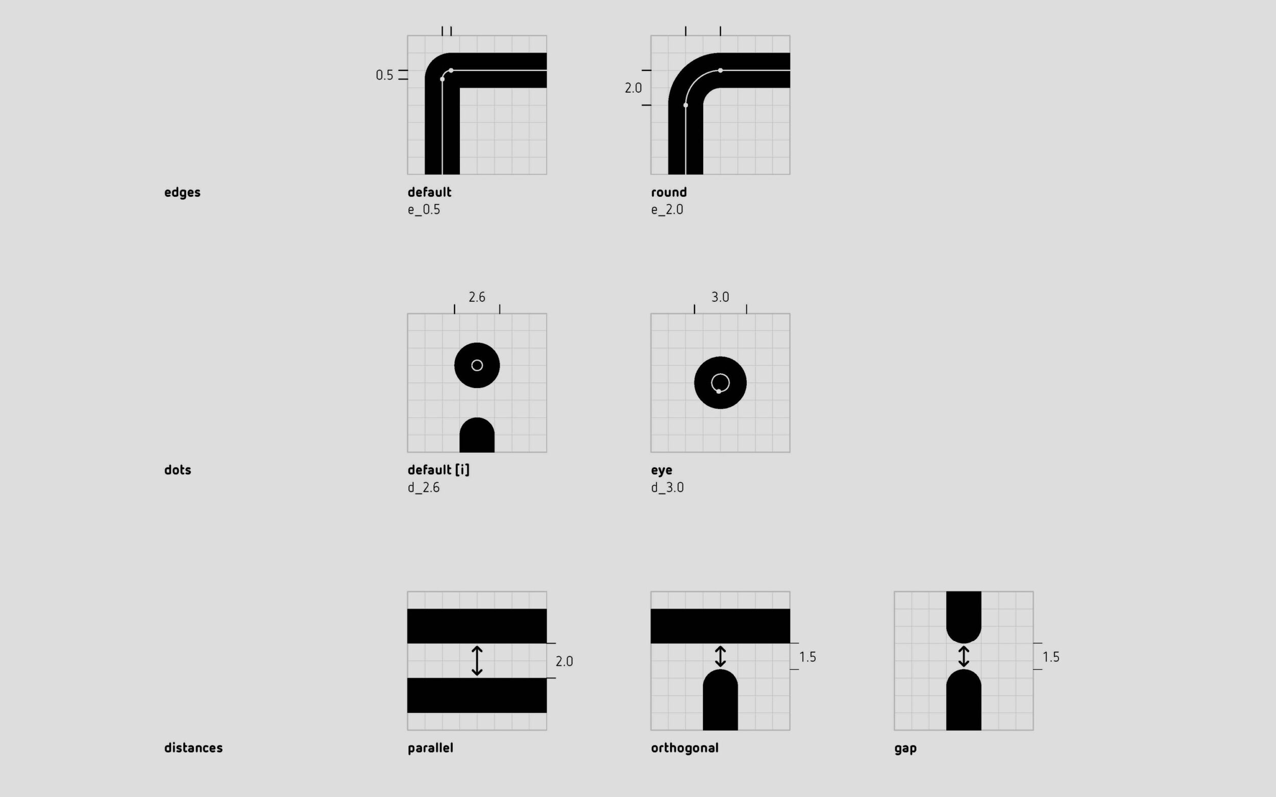
Getting specific in the curvatures of the forms.
While creating the icon set, Daniel already knew these parameters to some extent—he even created a manual to help him—but for every third icon a new design problem occurred, one that had never happened before and required an individual solution. His manual thus became a starting point, before he went with his gut and made decisions as he drew. After realising that this approach was designed to give him a sense of security, Daniel learned a lesson with each new glyph: less head and more heart.
Each of Netto’s pictograms is produced and tested in a variable font format. The result is perfect for designers that love clear systems and a treat for those who like to get out a ruler and carefully make sure each distance and stroke thickness is exactly as it should be. (Exactly as it should be, but not without a dash of personality and individual solution).
Making a Super-Icon-Variable Font
Along with finding the right form for the icons, how they are applied is part of their design process as well. To organise icon groups and make them seem more homogenous, frames or area elements can be used. Their interaction with typography is also coordinated: the size and positioning of icons is connected to the baseline, the height of the capitals and the size of the font. As the icons, like the letters, are assigned Unicode positions, Daniel naturally tested them to work well together.
As a result, the icons can be applied to any media and the pictograms are guaranteed to look good in text—great for UI design.
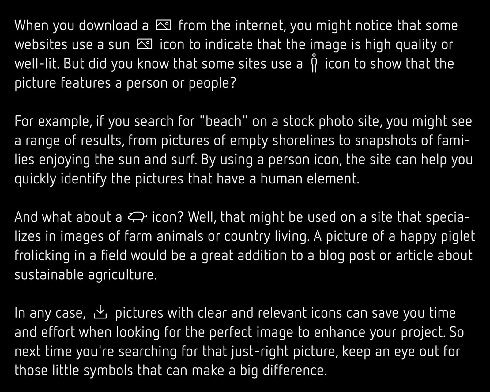
Due to the balancing of letters and pictograms, the icons are harmonious in text
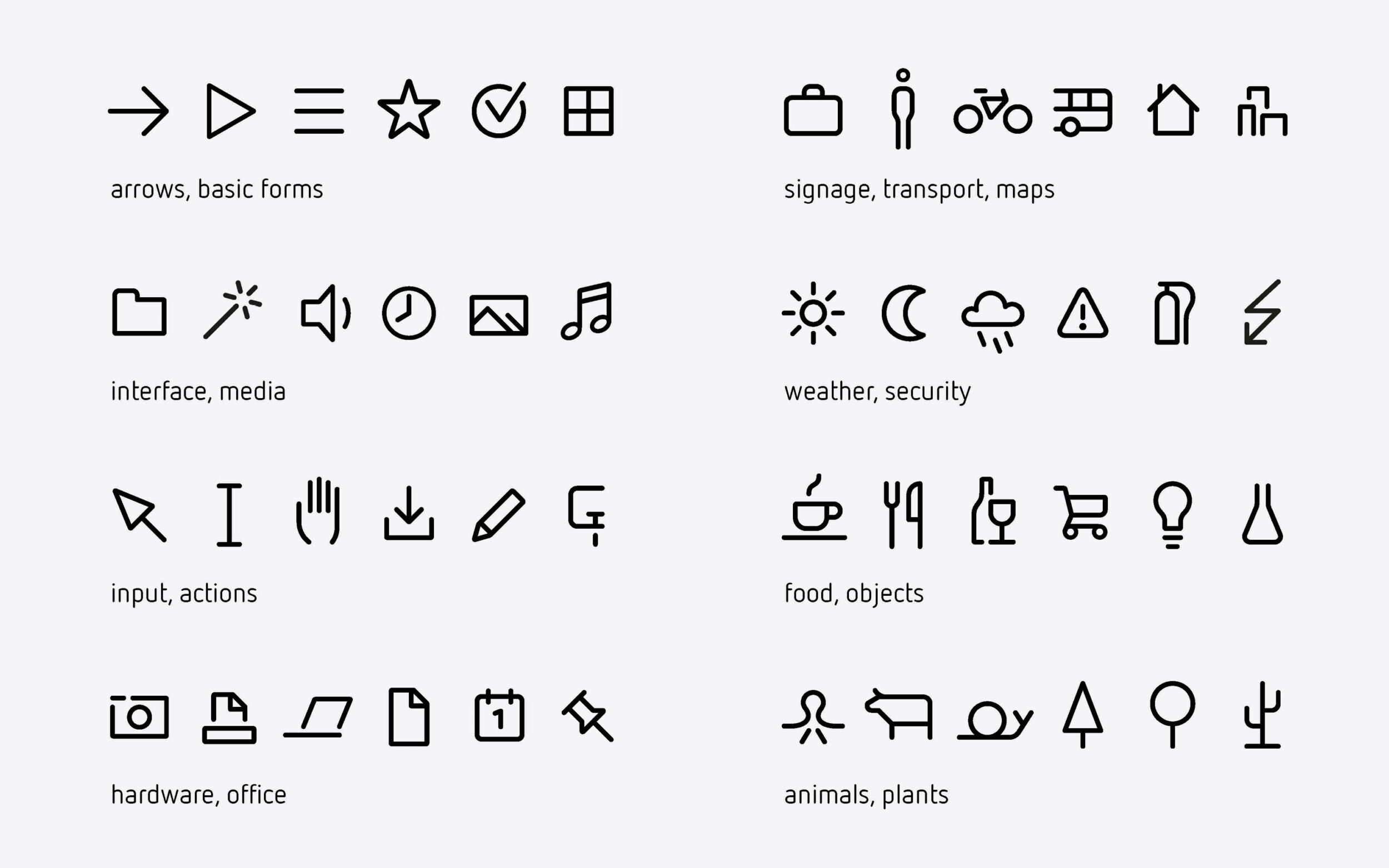
The icons are organised into topics, making it easier to find and select.
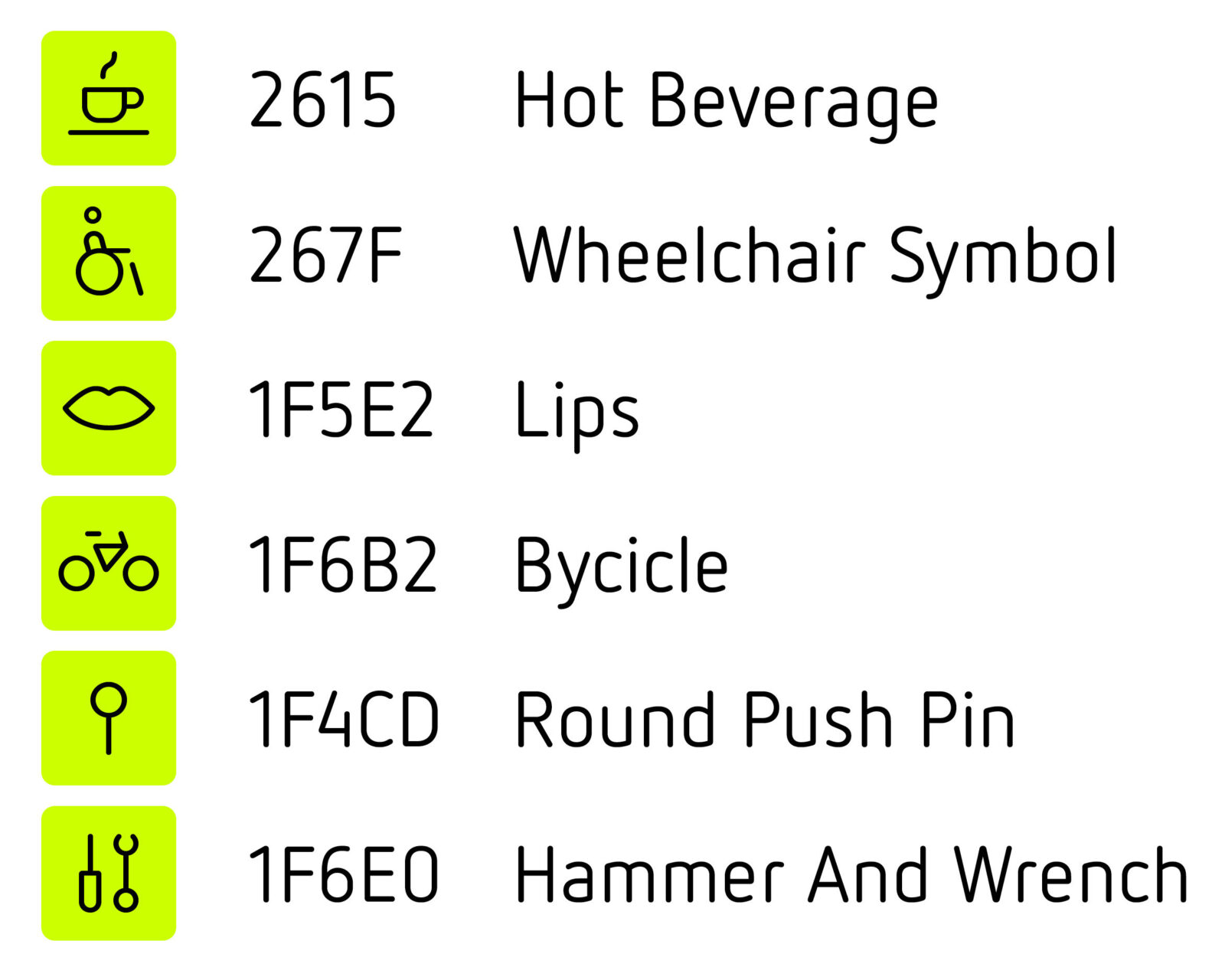
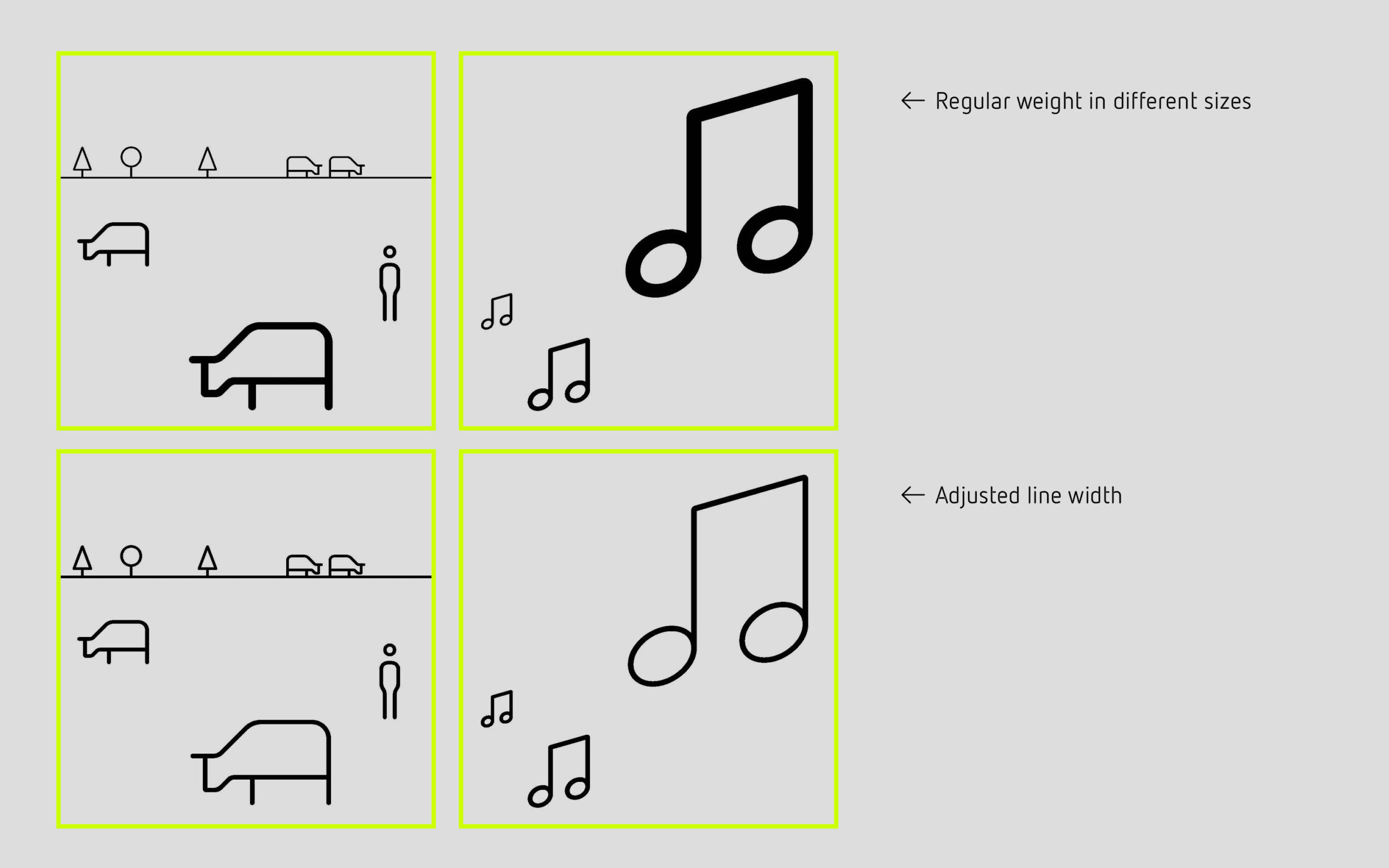
The icons’ harmonisation is taken to another level through the variable font format. All characters can be fine-tuned to the same stroke width, no matter the size they’re being used in. In this way, the variable icon font can become a nice tool for illustration.
This project is motivated by the vision of text and visual representations becoming more unified and easier to use together. Icons and emojis are usually designed to stand out from text, and probably mostly want to, but the dream of having a coherent visual language in letters and pictograms drove Daniel to expand Netto again and again.
In all this, one can see Daniel’s dedication and the fun he’s had with the shapes of his classic design: rethinking, expanding and taking them, always, a step further. But the question remains: when and where to stop? Daniel says he’s willing to someday add icons that are missing or might become more significant in the future. He’s open to suggestions—we wonder if he’s thought that through!
Daniel is also playing around with the idea of a colour font. This came from teaching in HfG Schwäbisch Gmünd and an experiment where he asked his students to create 36 different icons and emojis, ranging from easy forms like arrows and hearts to a cyclist, on their representative Unicode slots. Naturally, he tried applying this assignment to Netto. Not all of his results became part of the newly released icon font—Daniels' rule of thumb was: “If it’s not working well in the Black, I should not add it.”
