Mediapart
For Mediapart’s independent investigative journalism, Pensum Pro and Pensum Display provide clarity, character, and editorial strength.
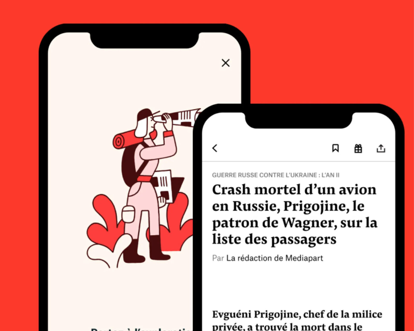
Graphics by courtesy of CMJNRVB Studio
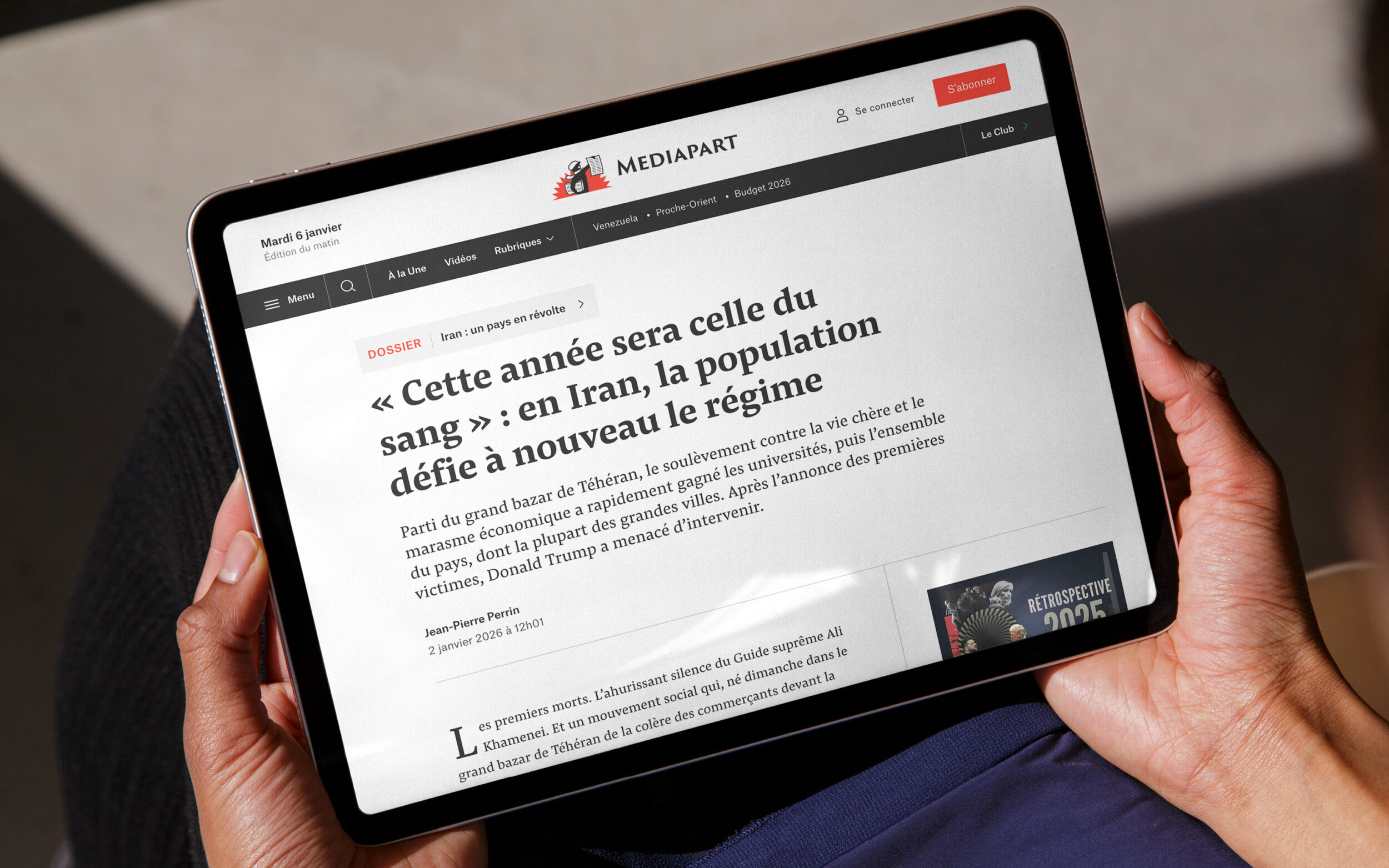
Mediapart is a French investigative online newspaper known for exposing numerous political and economic scandals. Its financing model is unique: Mediapart is financed exclusively through subscriptions, allowing it to report independently and free of advertising.
The design studio CMJNRVB was responsible for the redesign. For the editorial design, a font was sought that would make long articles easy to read while also having a strong visual presence in headlines. Pensum Pro and Pensum Display meet these requirements particularly well. Both fonts are part of the Pensum Collection. Together, they form a versatile font package that enables a consistent yet varied typographic appearance.
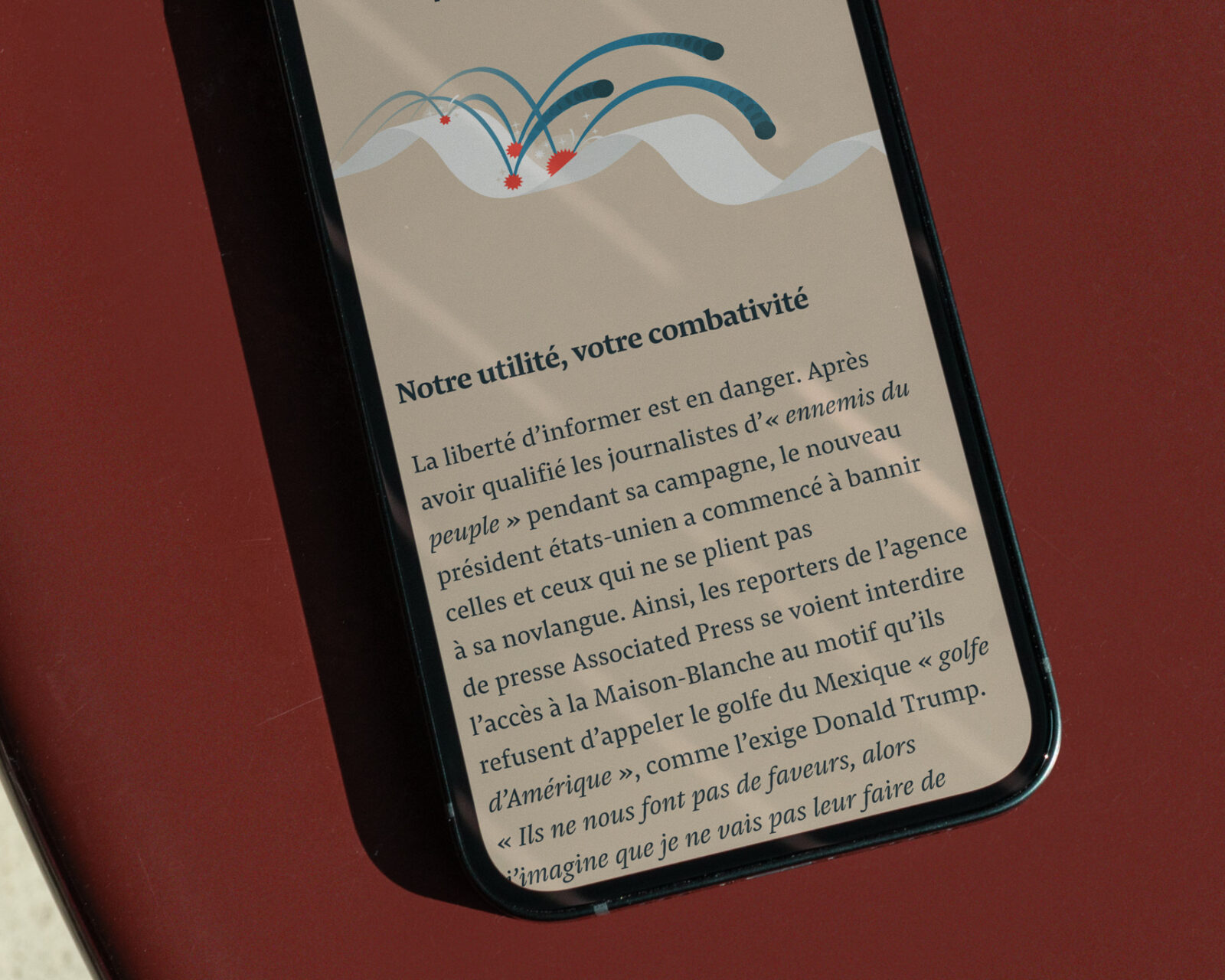
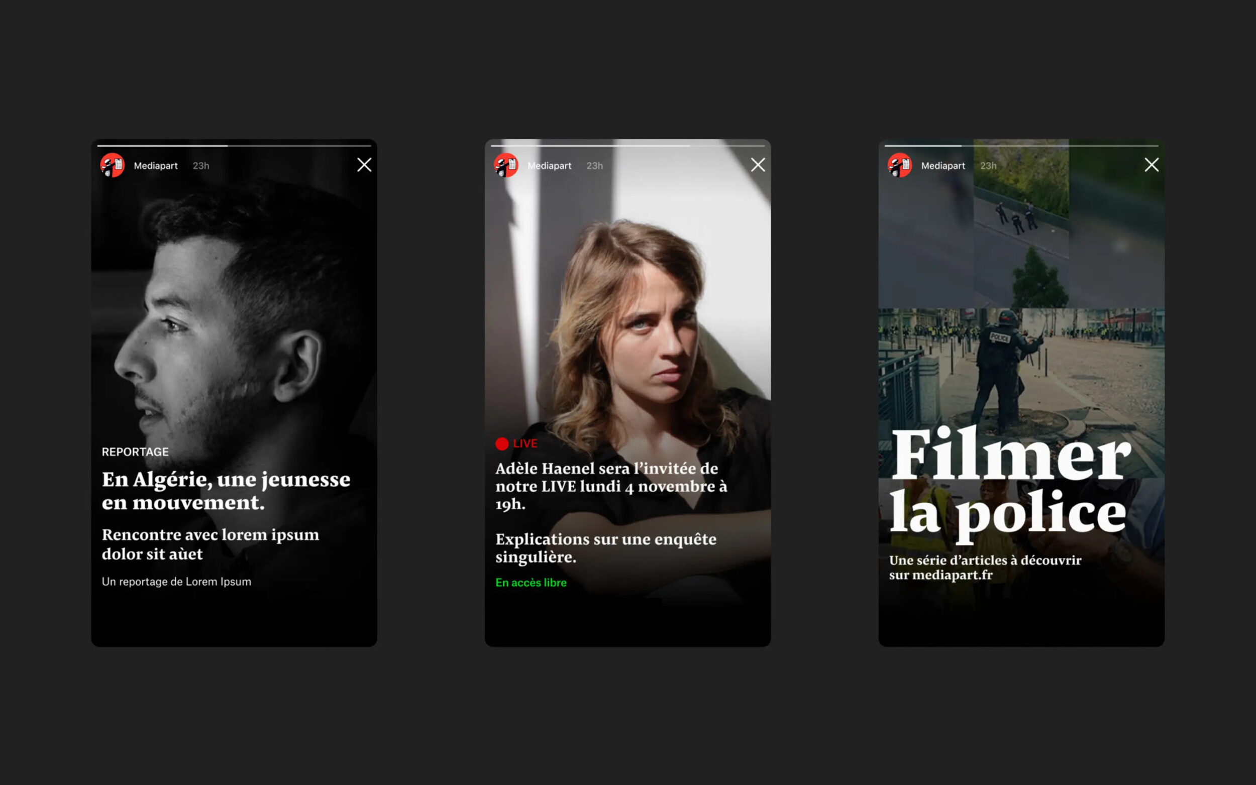
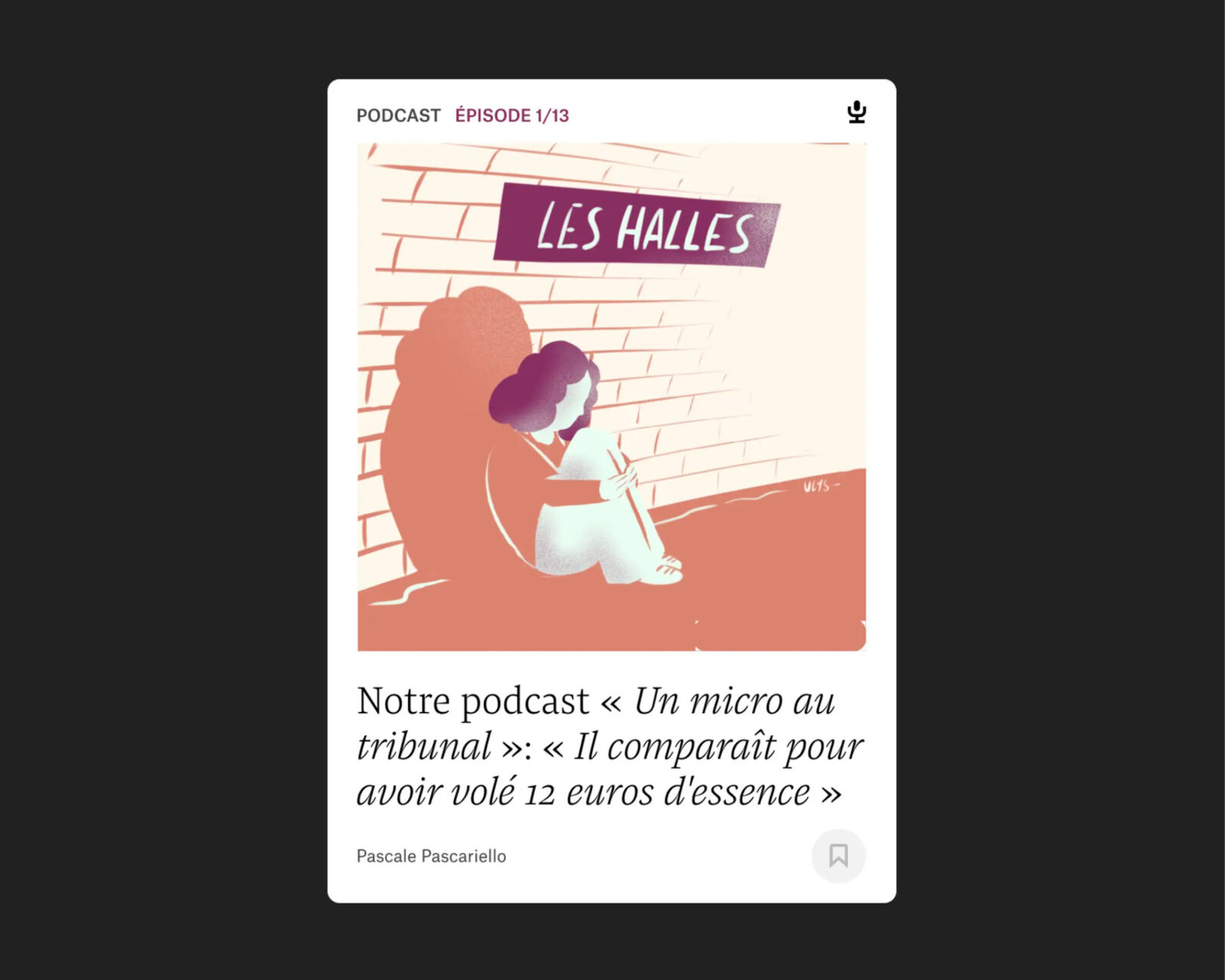
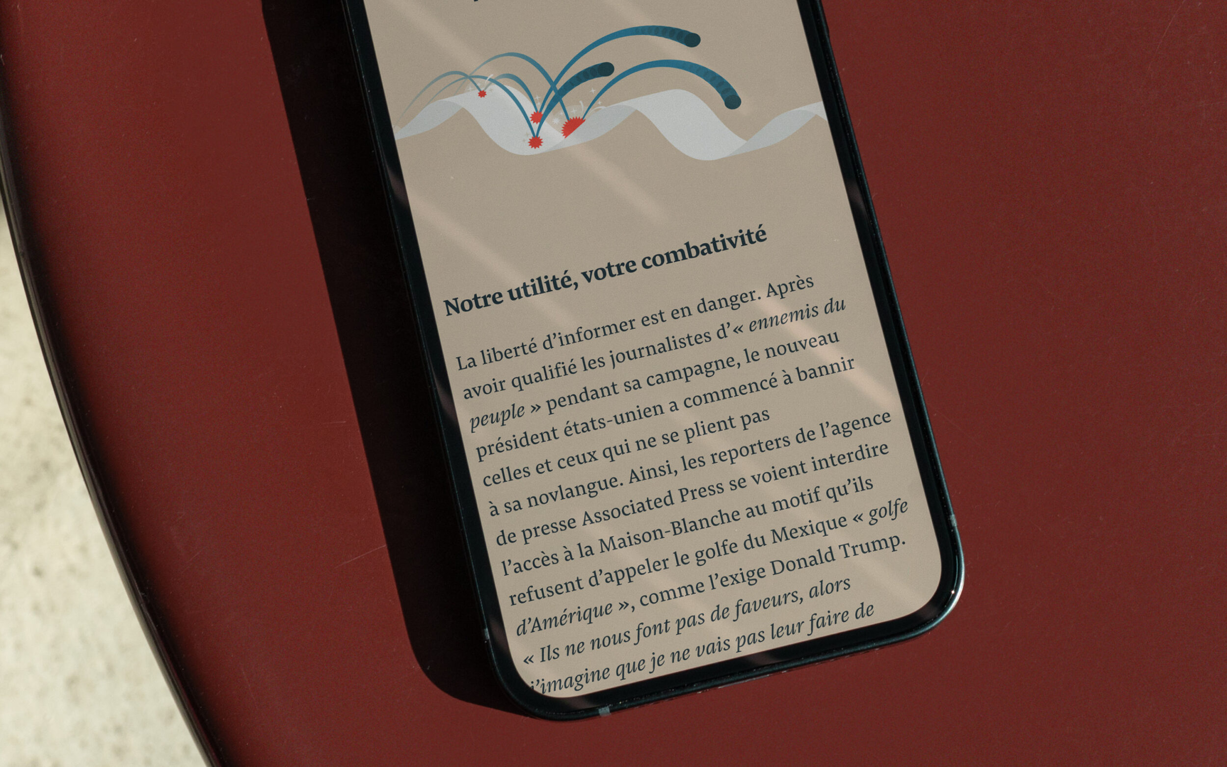
Pensum Pro impresses with its balanced proportions, high legibility in continuous text, and clear yet distinctive design. It is optimized for long texts and has already proven itself in various editorial designs. Its italic variant adds extra dynamism and sets specific accents.
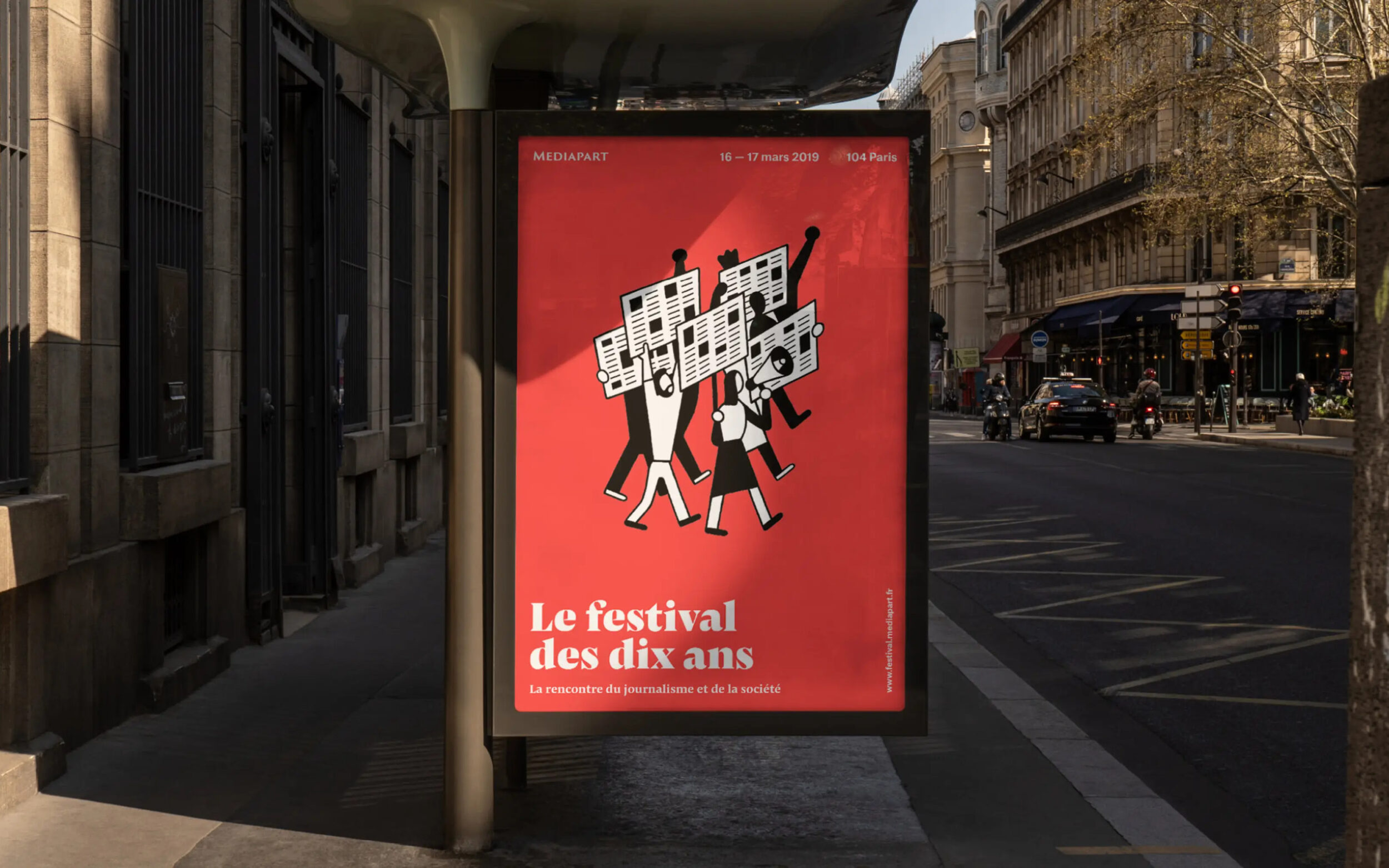
Pensum Display is based on Pensum Pro, but with strong contrasts and sharp, triangular shapes, it has a powerful presence that is particularly suitable for headlines and posters.
Together, Pensum Pro and Pensum Display create a precise, characterful typeface that combines clarity, seriousness, and warmth, qualities that typographically underline Mediapart's independent journalistic standards.

