Making Of Franziska
After 10 years at FontFont, tried and tested Franziska is now home. This is the process and details behind the design, which originated as Jakob’s master’s thesis at the Muthesius Academy of Fine Arts under the supervision of Albert-Jan Pool and André Heers. There is also a re-introduction to the dedicated microsite that was awarded by the Type Directors Club (TDC).
Idea
Loud Restraint
Franziska is a typeface suited for long text: discreet, functional and modern, but with real personality. To give you lots of flexibility in your design and production, she provides not only good legibility in body text, but interesting characteristics in larger point sizes. It’s a design that elegantly closes the gap between the artistic formulation of the individual glyphs and the rational functionality of the overall type design.
Dynamic Statics
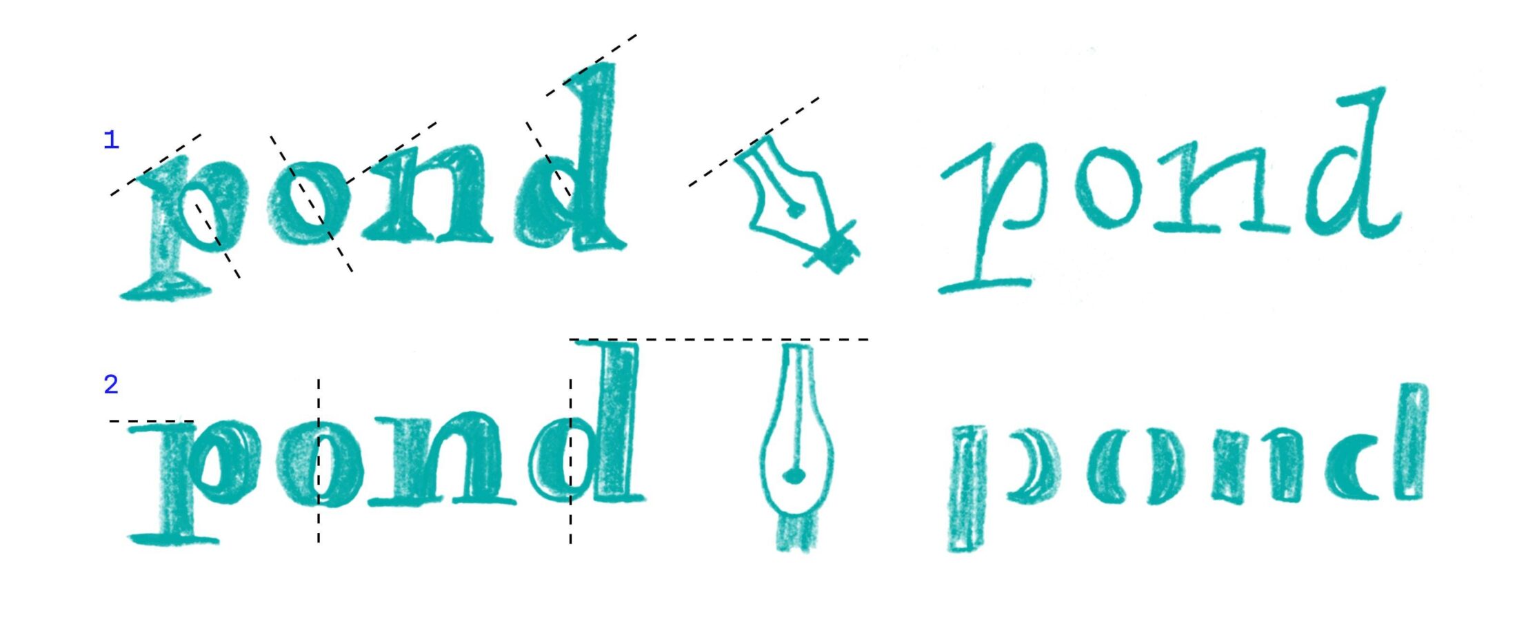
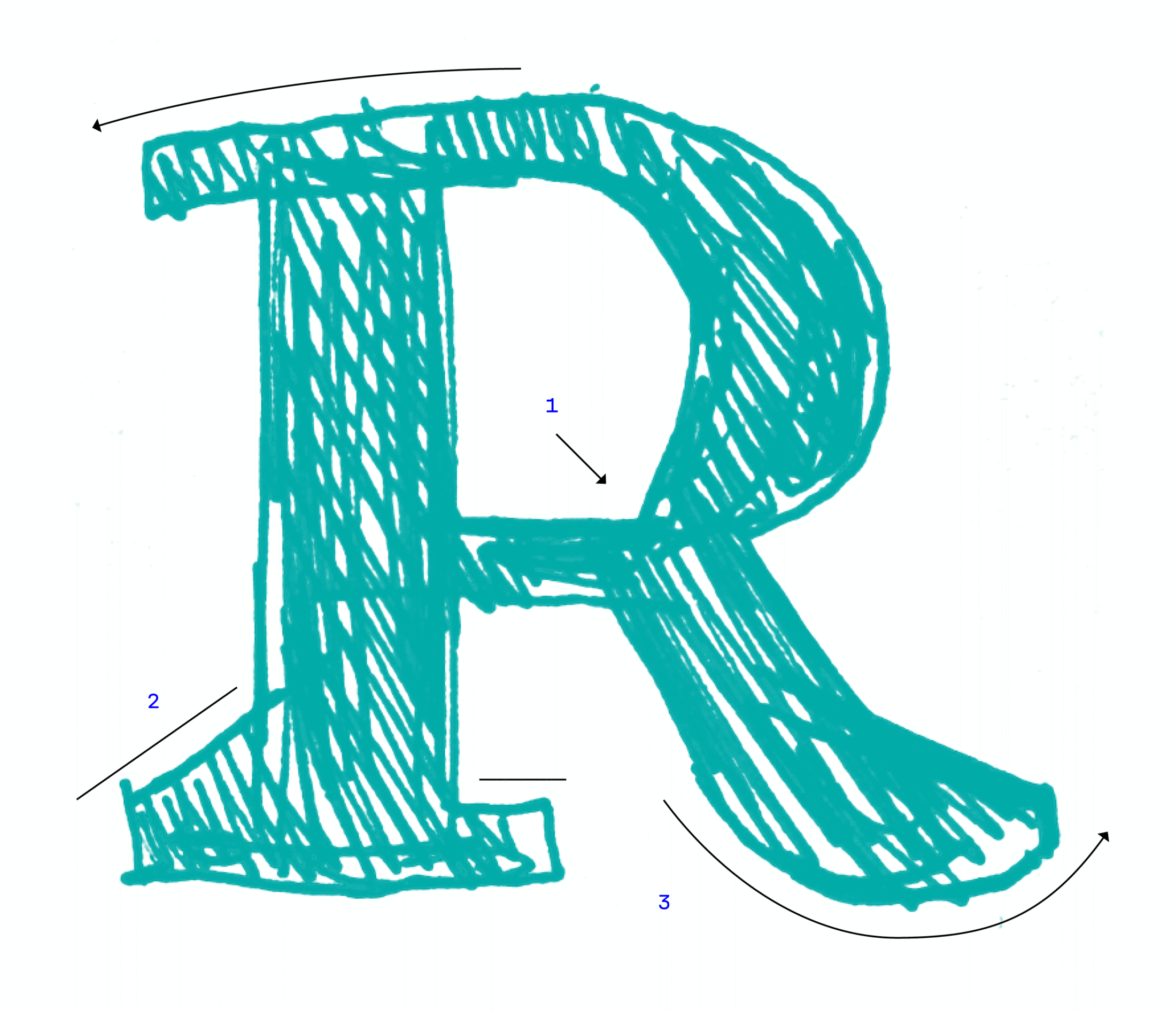
Once you’ve decided to design a text face, serifs are always quick to appear on the scene. Although sans serif typefaces can be just as legible, roman types have the clear advantage: they create stronger word images and guide the reader’s eye with their serifs. But this particular combination, which merges the dynamic physiology of a renaissance-style ❶ broad nib with the static garb of a classical-era ❷ pointed nib, makes the design both lively and easily distinguishable without breaking any established conventions.
Monolinear Contrast
For a roman typeface ❷, Franziska should have an unusually low stroke contrast … and in any given use-case, it should always remain a robust slab serif ❸ … yet it should draw on the well-known contrasts of the legible roman style … while remaining static as classical romans ❶ and slab serifs ❸ …

Paper 2.0
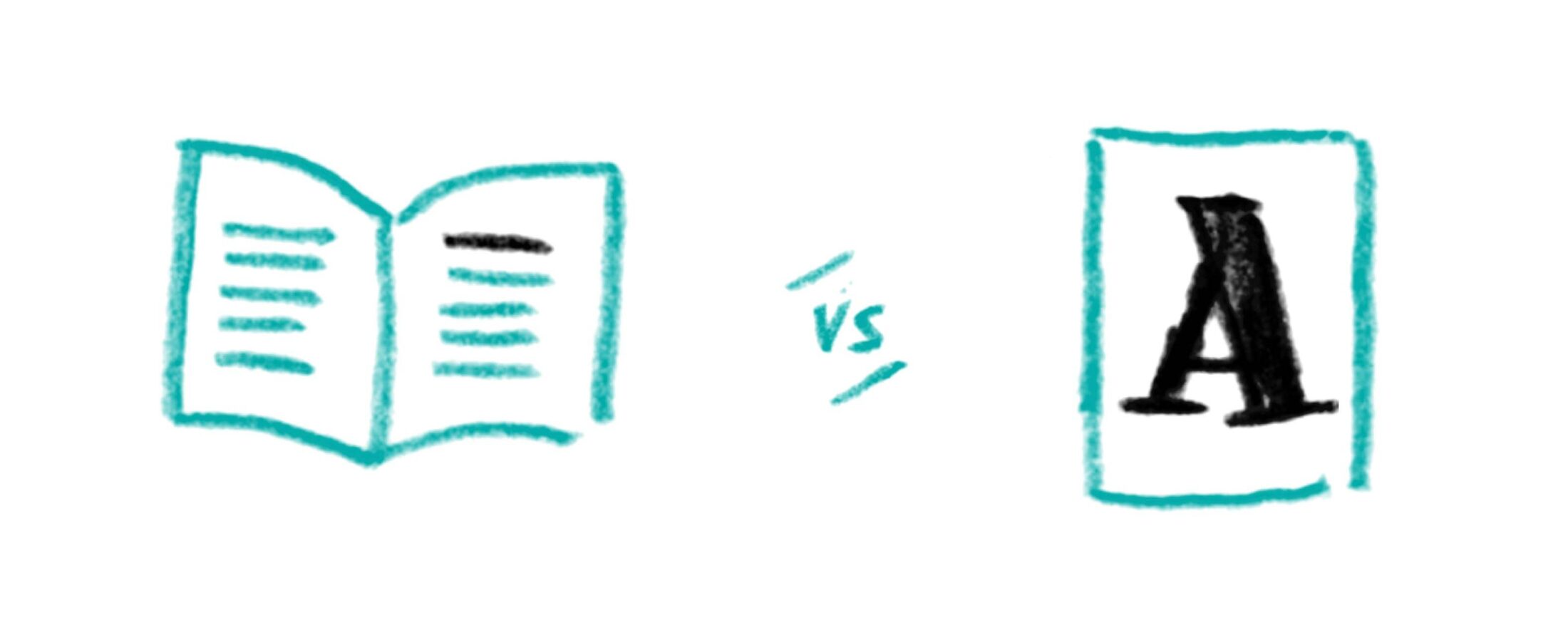
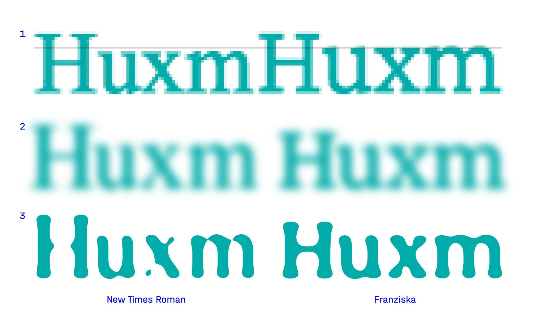
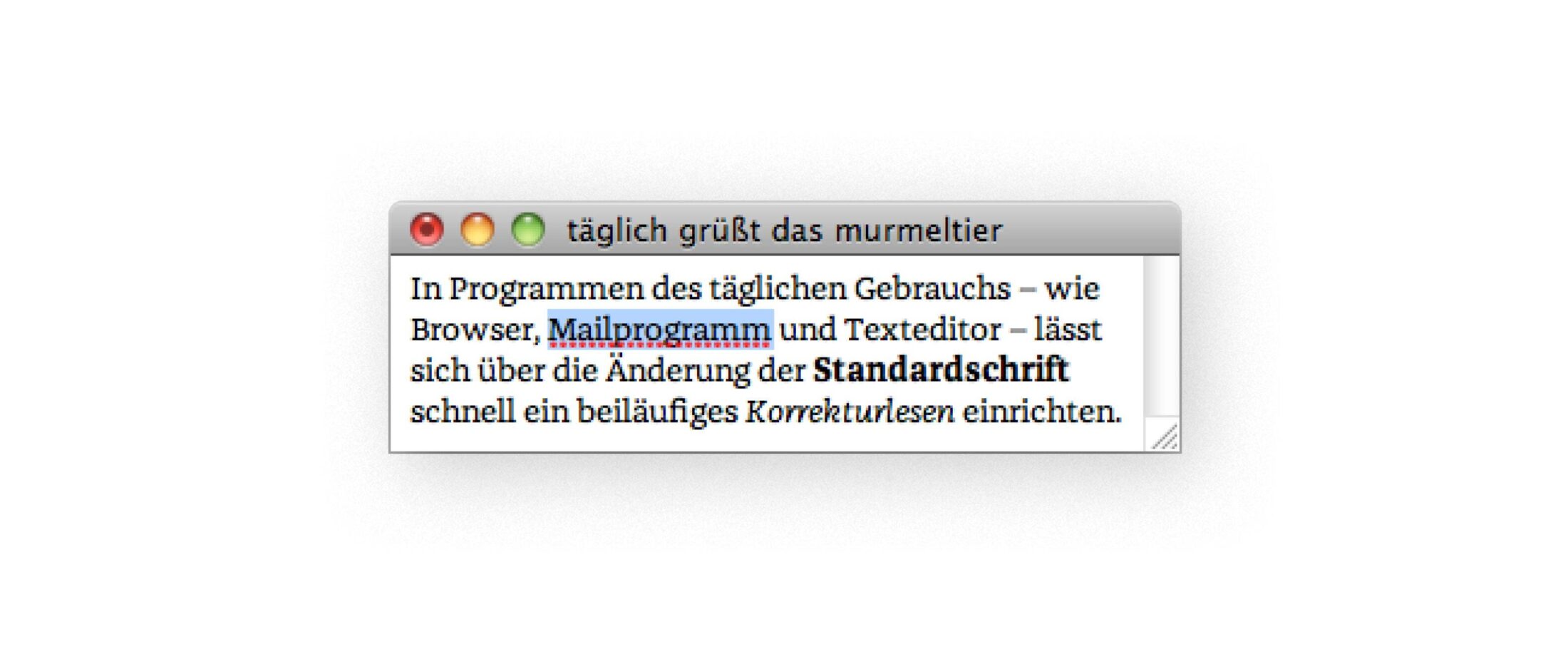
In addition to its traditional use in print, a typeface must look good on screen. The finer the details, the harder it is to optimize the type in small point sizes on low-resolution media. This is where Franziska benefits from its classical-era features — a vertical axis causes fewer problems than a slanted one. The large x-height ❶ also helps keep the type recognizable, even when displayed with very few pixels. No matter whether you’re reading the newspaper without your eyeglasses or playing with an app after guzzling five cans of beer, a certain robustness ensures that Franziska remains discernible even on a bad display ❷ or when it’s blurred ❸.
Sketches
Digital Craftsmanship
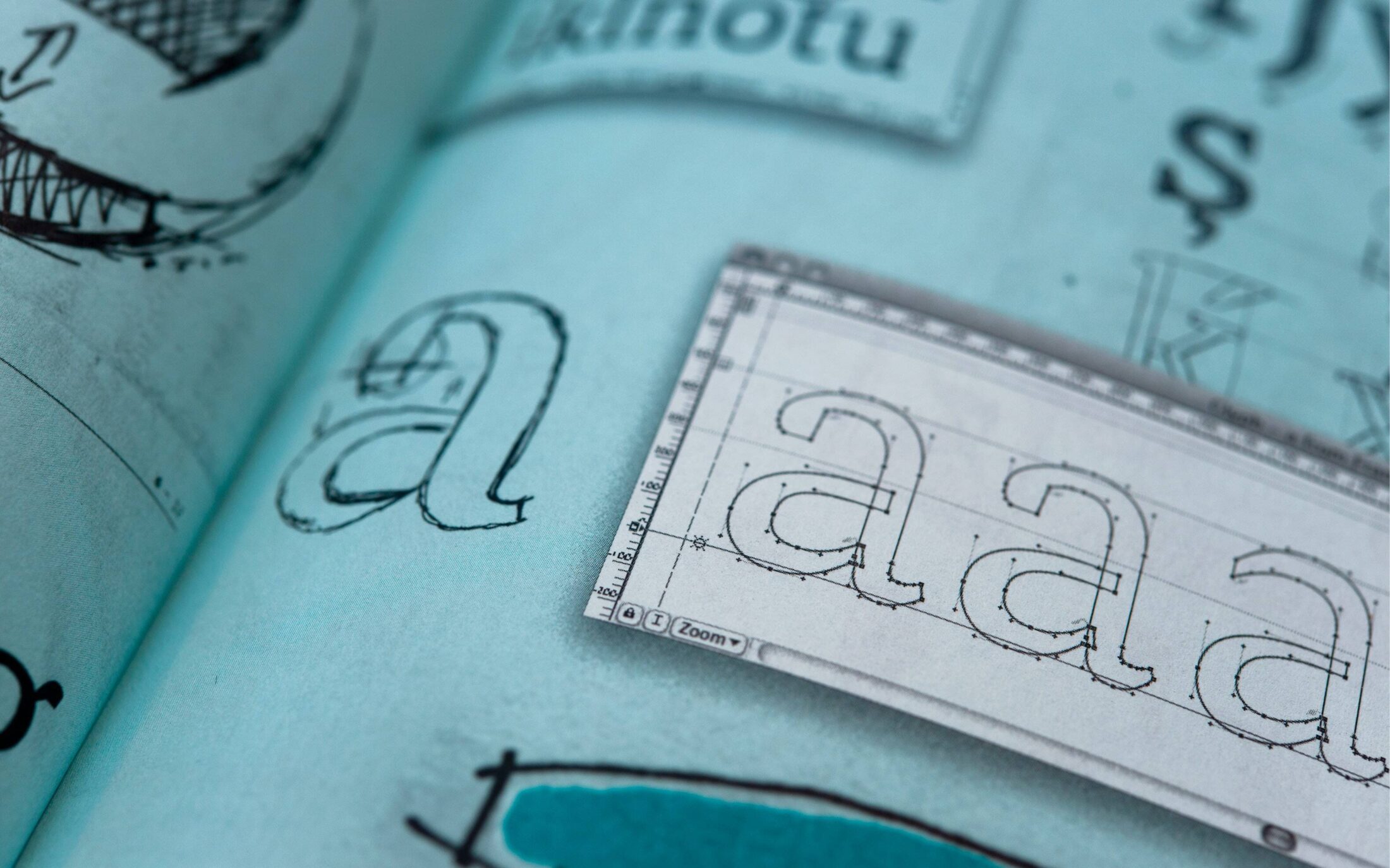
No matter whether it’s a detailed digitization template or just a rough draft, an analog sketch of the type helps you quickly visualize your ideas and appraise the shapes. Every calligraphic doodle or precision drawing can lead to the creation of a digital glyph.
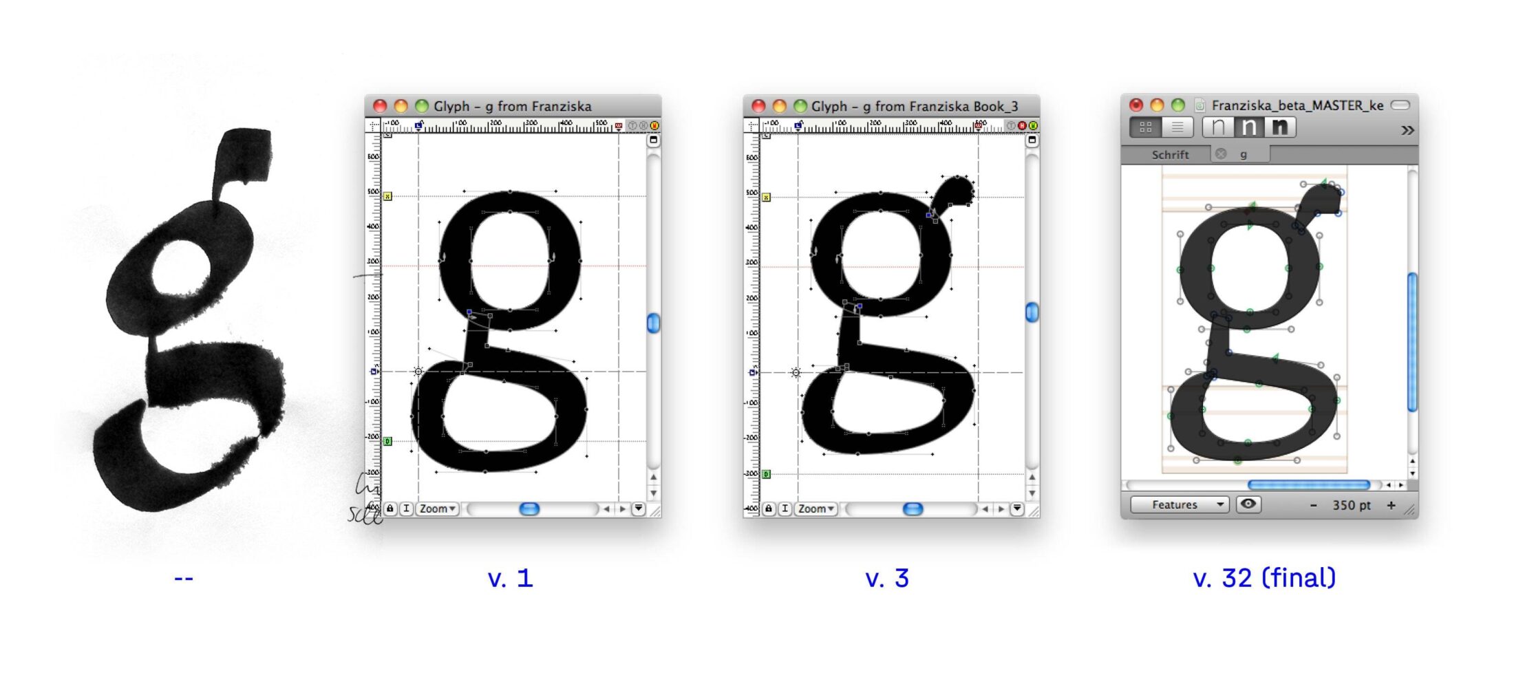
In the best-case scenario, the analog sketch can deliver inspiration for contours that might never have occurred otherwise. The rather awkward use of the broad nib created distinctive letter shapes that could still be integrated into a functional text font, after some digital fine-tuning.
Prominent Details
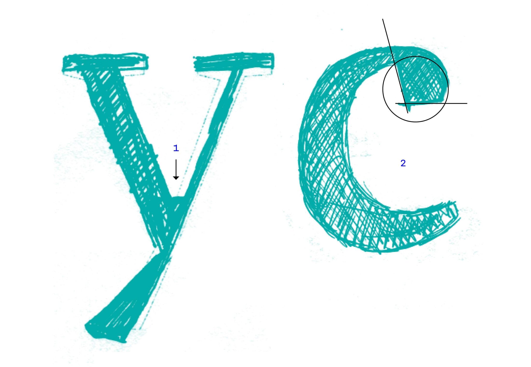
Despite all conventions of legibility, corners and edges always bestow character: as slightly exaggerated ink-traps ❶ and drafting details, they stand out in display sizes and can even promote the functionality in 12pt. The round drop terminals were sharply cut off ❷, to further emphasize the distinctive personality of the type.
Rhythmic Blocks
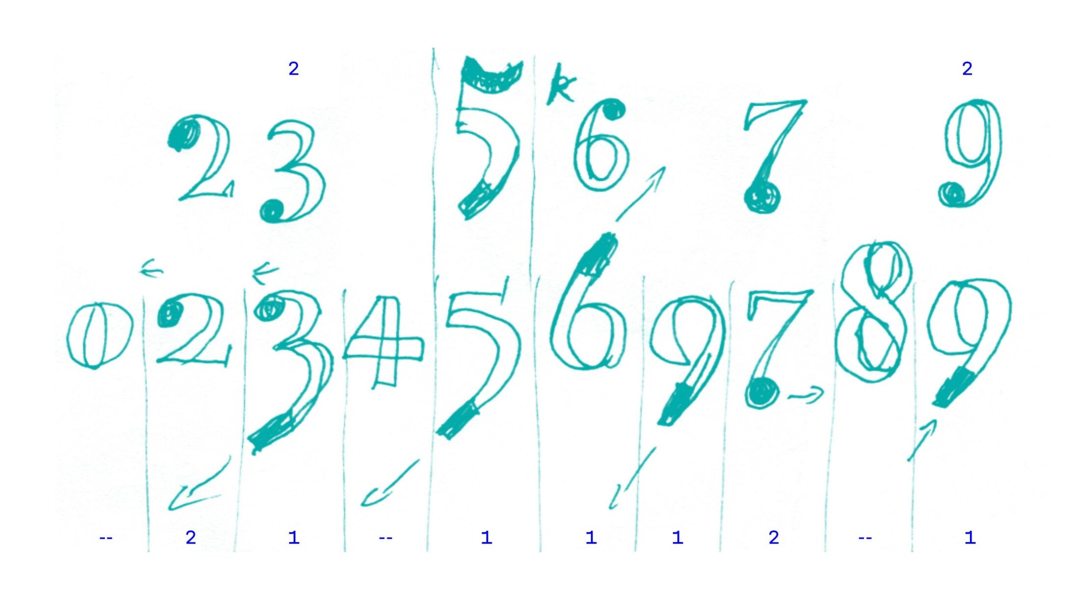
Hybrid figures combine the characteristics of text figures and lining figures. On top of this, some of the glyphs took after Renaissance roman ❶, while others sided with classicism ❷ — thus, the numerals are not only hybrid in function, but, unlike the grouping of the letter shapes, they illustrate the combination of two diverse style categories at the same time.
Asymmetrical Serifs
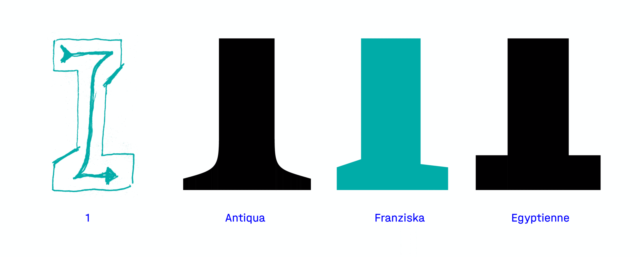
To keep the digital typeface lively in spite of its angular construction, the serifs have a light asymmetry ❶, derived from the logic of the hand-drawn letterforms. Alongside this kind of contrast, the shapes of the serifs refer to a hybrid of roman and slab serif: while bracketed serifs are a hallmark of renaissance-style roman, many Egyptian slabs tend to have straight serifs. But Franziska features unbracketed serifs that angle into the stems.
Vivid Uppercase
To make the uppercase letter shapes closer to the design of the lowercase, the very geometric capitals also feature distinctive details ❶, asymmetrical serifs ❷ and soft features ❸. In addition to this, they are kept rather small in comparison to the ascenders and the large x-height, so they meld into the text face more smoothly than other types.
Variants
Final Start
The only way to assess which of the early idea sketches will pan out is to scrutinize them first in vectors, then in plain black and white. Very early in the process of its creation, Franziska began as just a few glyphs in FontLab. This made it possible to generate initial text specimens that provided an impression of the overall type design that could be appraised. These digital vectors were of course optimized at every turn, and printed again and again until the final typeface evolved bit by bit. During this process, the ascenders were also lengthened to improve differentiation in the x-height.

Visual Precision
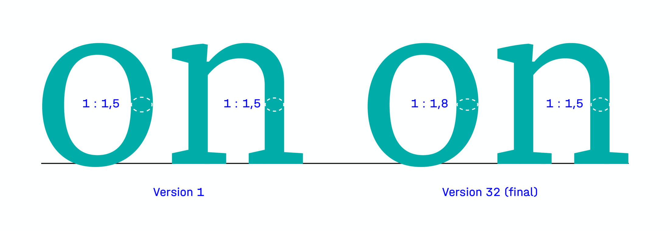
Initially, Franziska began with strong tendency towards Egyptian slab, but this diminished during the course of its development, and was replaced by higher contrast. In particular, the horizontal stroke contrast between round ‘o’ and angular forms ‘n’ was visually adjusted, giving the entire typeface a pleasant grayscale. The serifs also grew thicker and longer, in order to be recognizable as such in tiny point sizes.
Edgy Softness
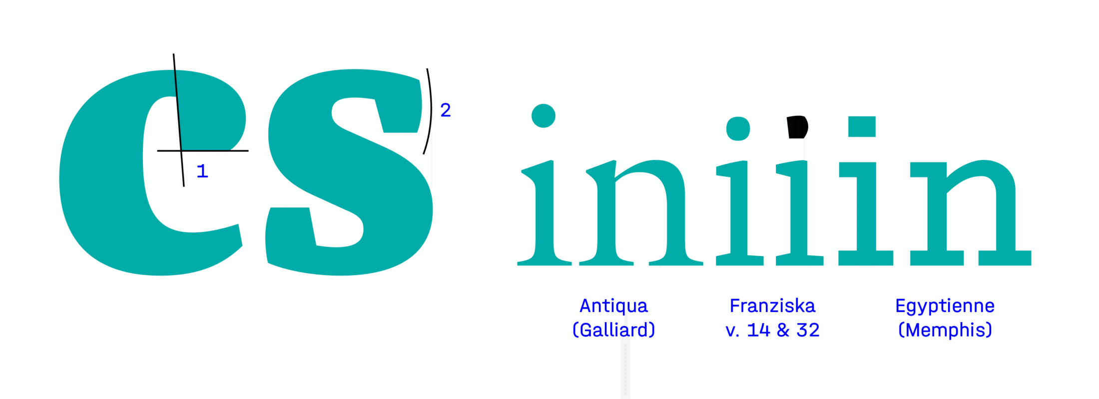
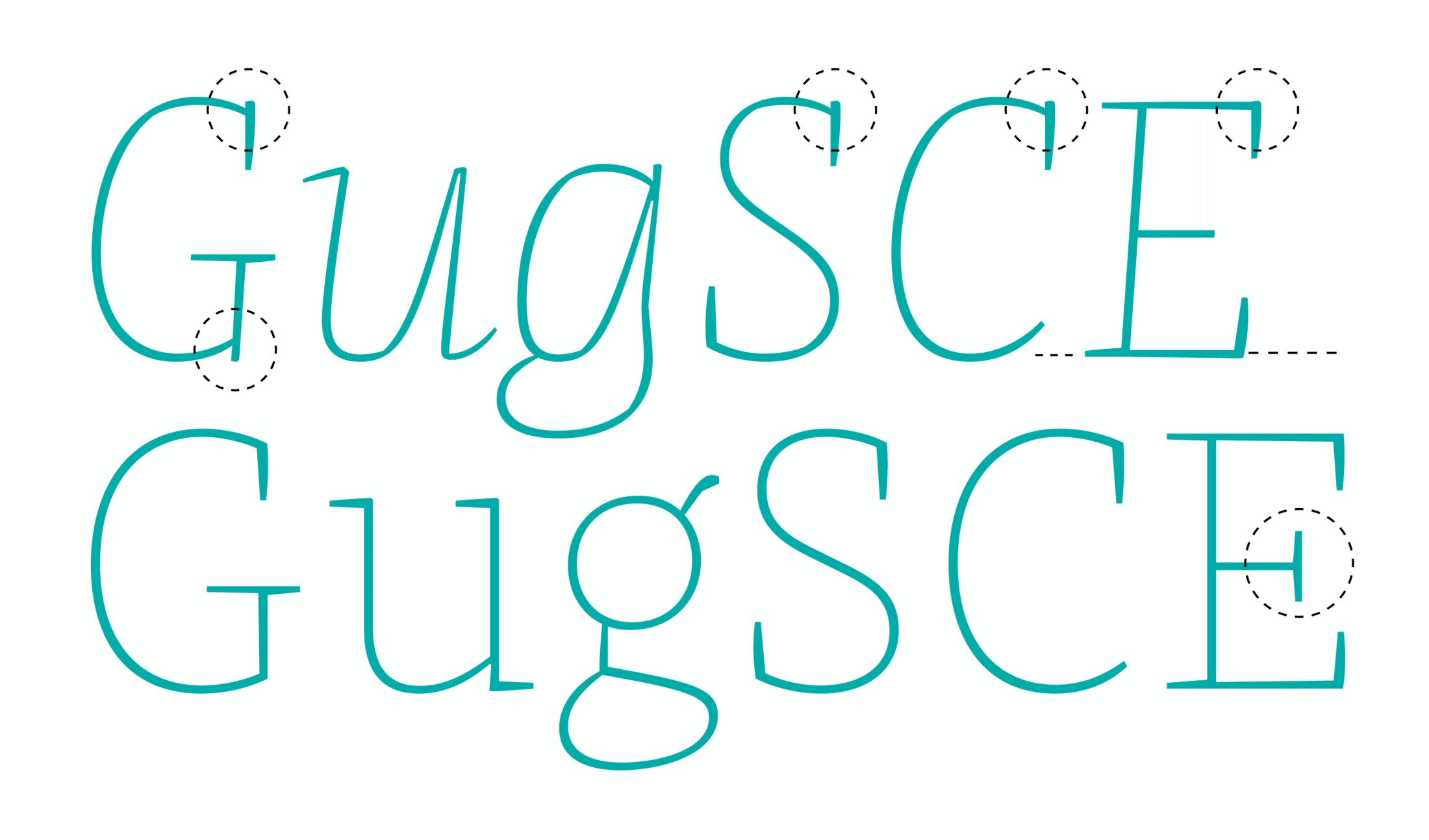
Quite in contrast to the overall effect of the design, the individual letter shapes have an exaggerated, edgy expression which still looks soft and performs as originally intended: the drop terminals, which were initially round, were sharply truncated ❶ in order to display them more clearly. Besides this, the vertical serifs ❷ and diagonals of the type are gently curved to create a formal hybrid of “soft but edgy” or “edgy but soft”.
Another inconspicuous detail that’s very unusual for roman fonts is the square dot on the ’i’, which clearly refers to a linear Egyptian slab, as opposed to the overall tendency towards contrast normally found in a roman.
Iconographic Symbols
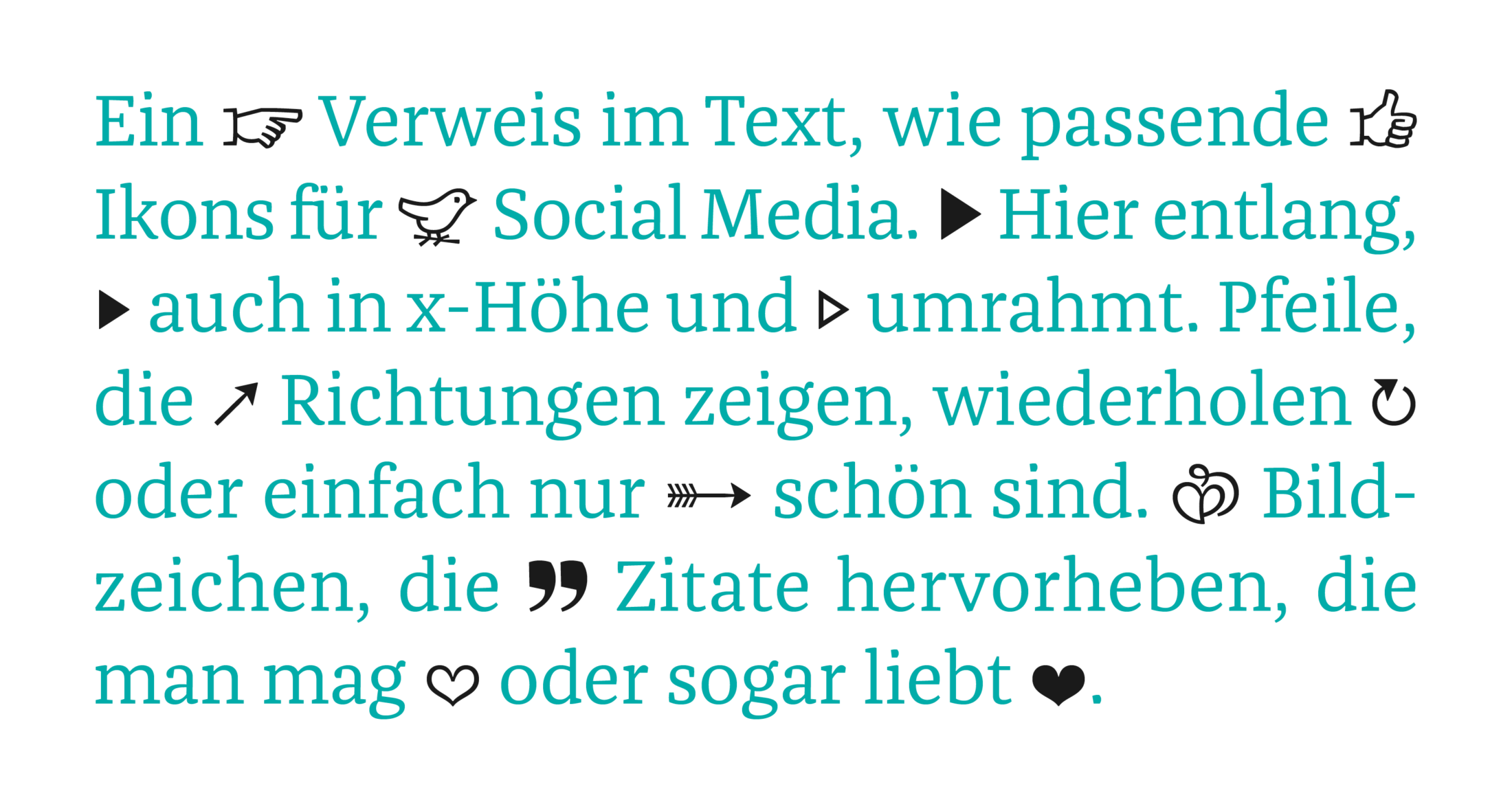
Though Jakob’s focus was squarely on the development of a harmonious typeface, Franziska’s icons provide a useful addition, like icing on the cake, consisting of glyphs that could each take up to an entire day to design.
Macro, Micro, Type
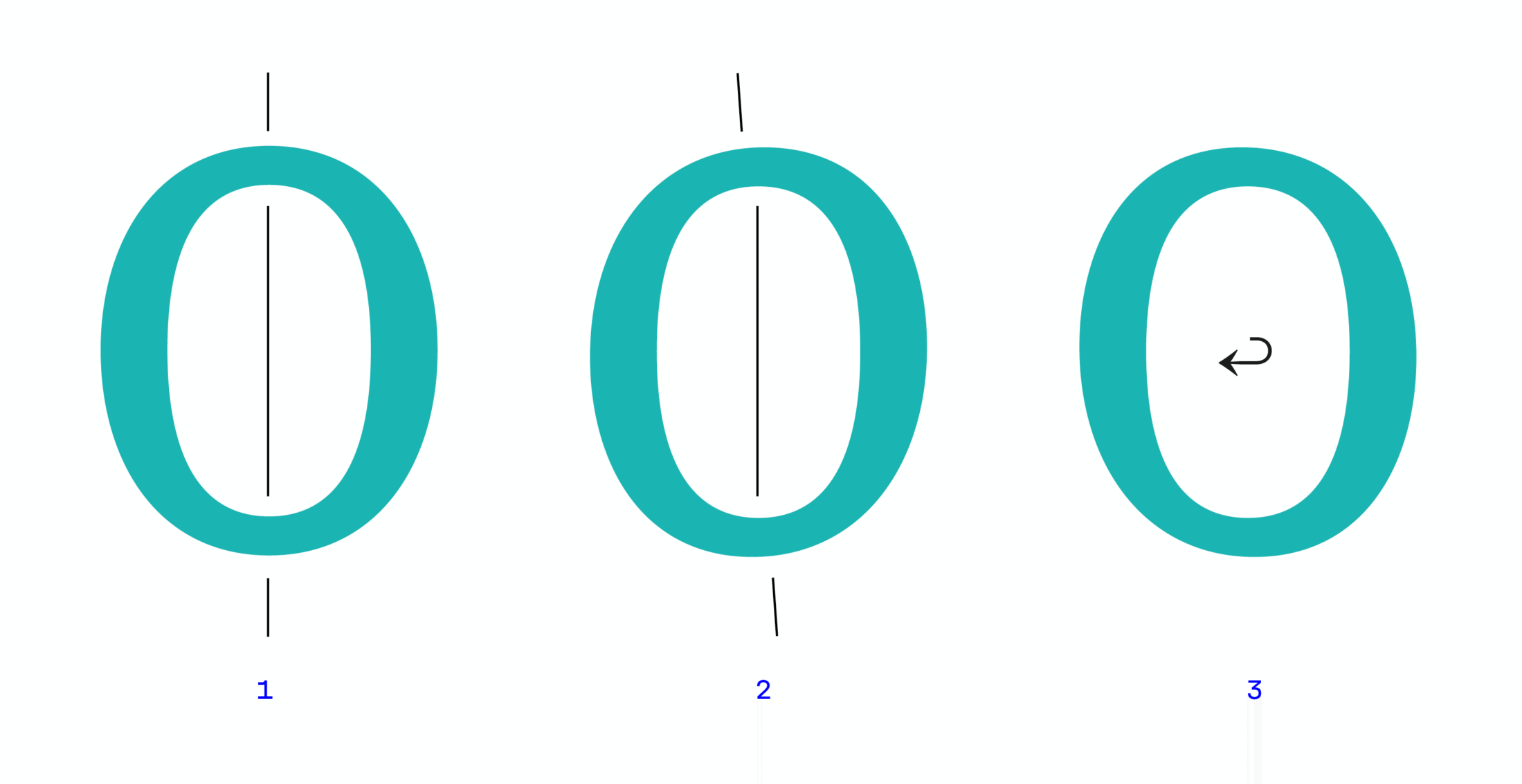
Many revisions of the typeface took tiny steps: an ‘o’ with a purely static axis can seem slightly unnatural and lifeless ❶, but by tilting the outer contour instead of the inner space, it can stay static but gain dynamics ❷. This is a detail that hardly anyone might see or even actively read, but if you mirror the image ❸, this barely perceptible detail becomes apparent.
On Offset
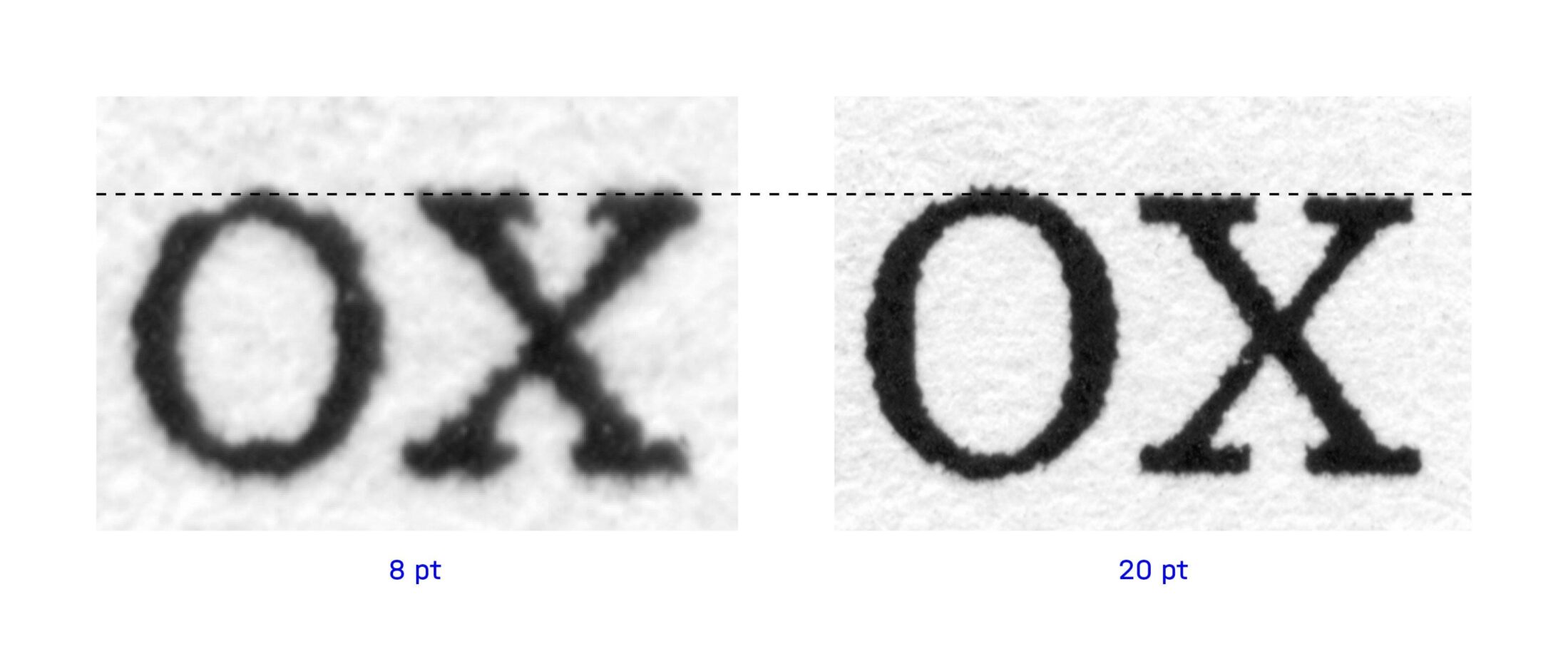
All variants of Franziska were printed out at regular intervals to test the functionality of the experimental curves. However, a 1200 dpi laser printer rasterizes type in different quality at different sizes, changing curves into staircases, leaving room for interpretation of the shapes. How, then, can you decide if the visual overhang of the ‘o’ is good compared to the ‘x’, when both characters appear different in small body text and display size? A pragmatist simply prints it out at 20pt, looks at it from twice the reading distance and then judges the body text (a hot tip from Albert-Jan Pool). But you might as well use a printing plate and immerse yourself in the world of magnifying glasses and line testers.
Å to Ž
It’s easy to extend the basic Latin character set to cover Western, Central, Southeast and Northern Europe by using components like (a + ` = à). Glyphs has made the workflow much easier. It’s no longer necessary to manually position diacritics on the letters: now magnetic anchor points automatically merge both glyphs into one character — as long as the size and proportions of all diacritical characters match ❷.
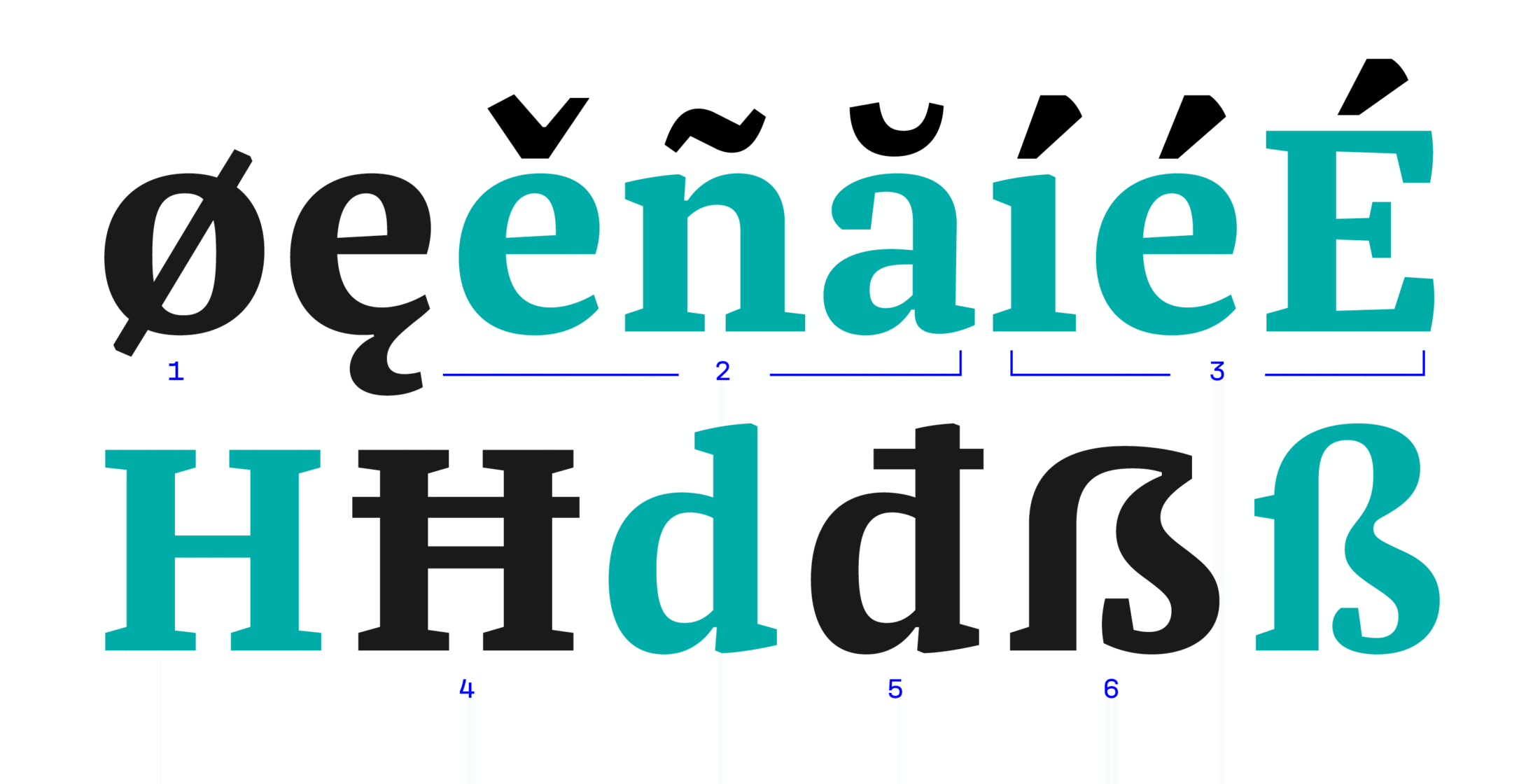
Still, every single glyph was tested to optimize the white space ❶,❹, the angles ❸ of the accents to the letter shapes ‘i’ or to optimize the overlying space (upper and lower case), and to prevent clashing with existing forms, such as the serifs ❹. Beyond this, some language-specific glyphs require completely new letter shapes ❺.
Italics
Autonomous Harmony
Franziska’s italics represent a separate paradigm completely independent of the roman model. They combine a basic calligraphic construction with angular elements and its incline tends towards an upright italic. Despite their independent natures, the roman and italics complement each other to form a harmonious type combination, and at the same time, they allow for a very wide range of design applications.
Upright Italic
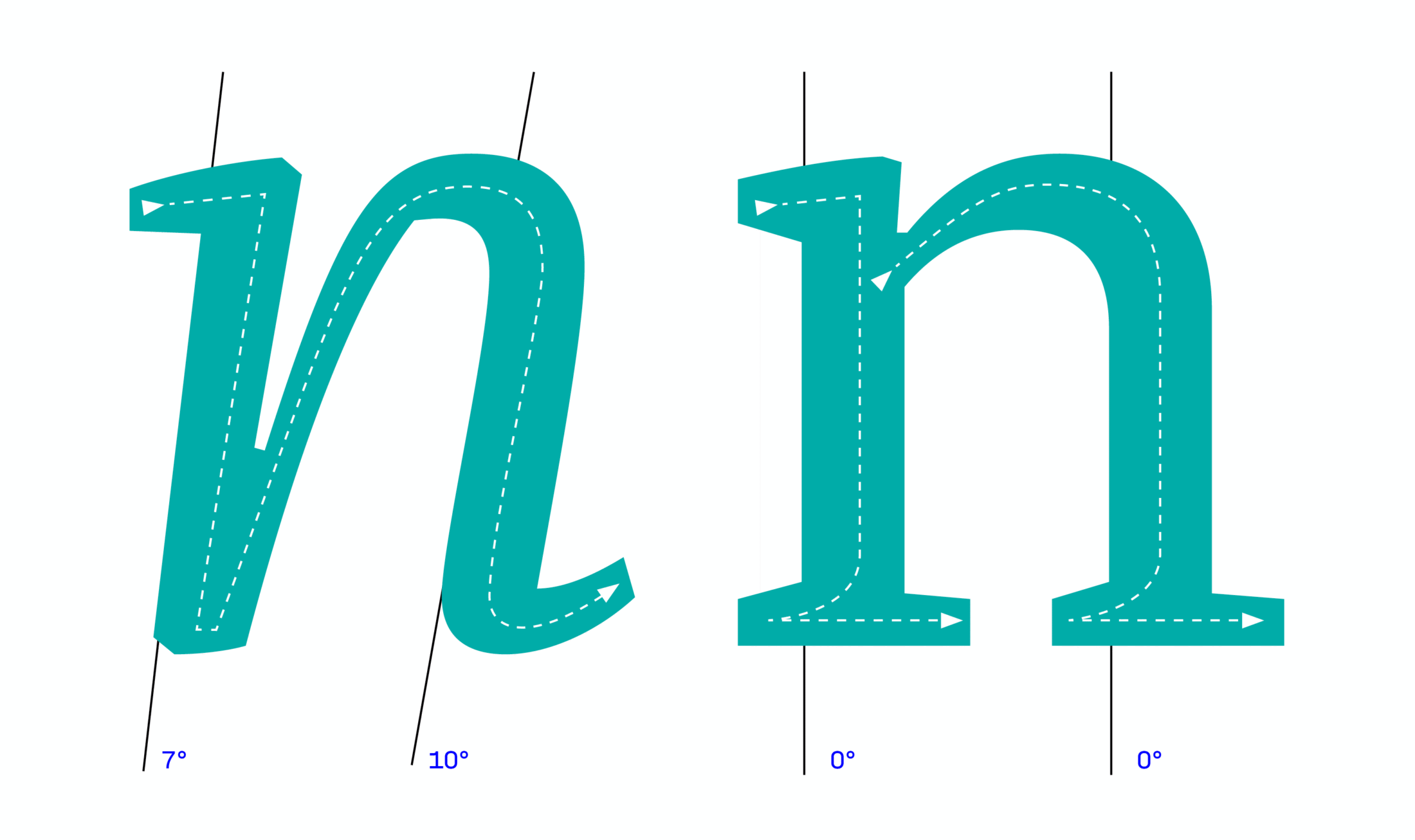
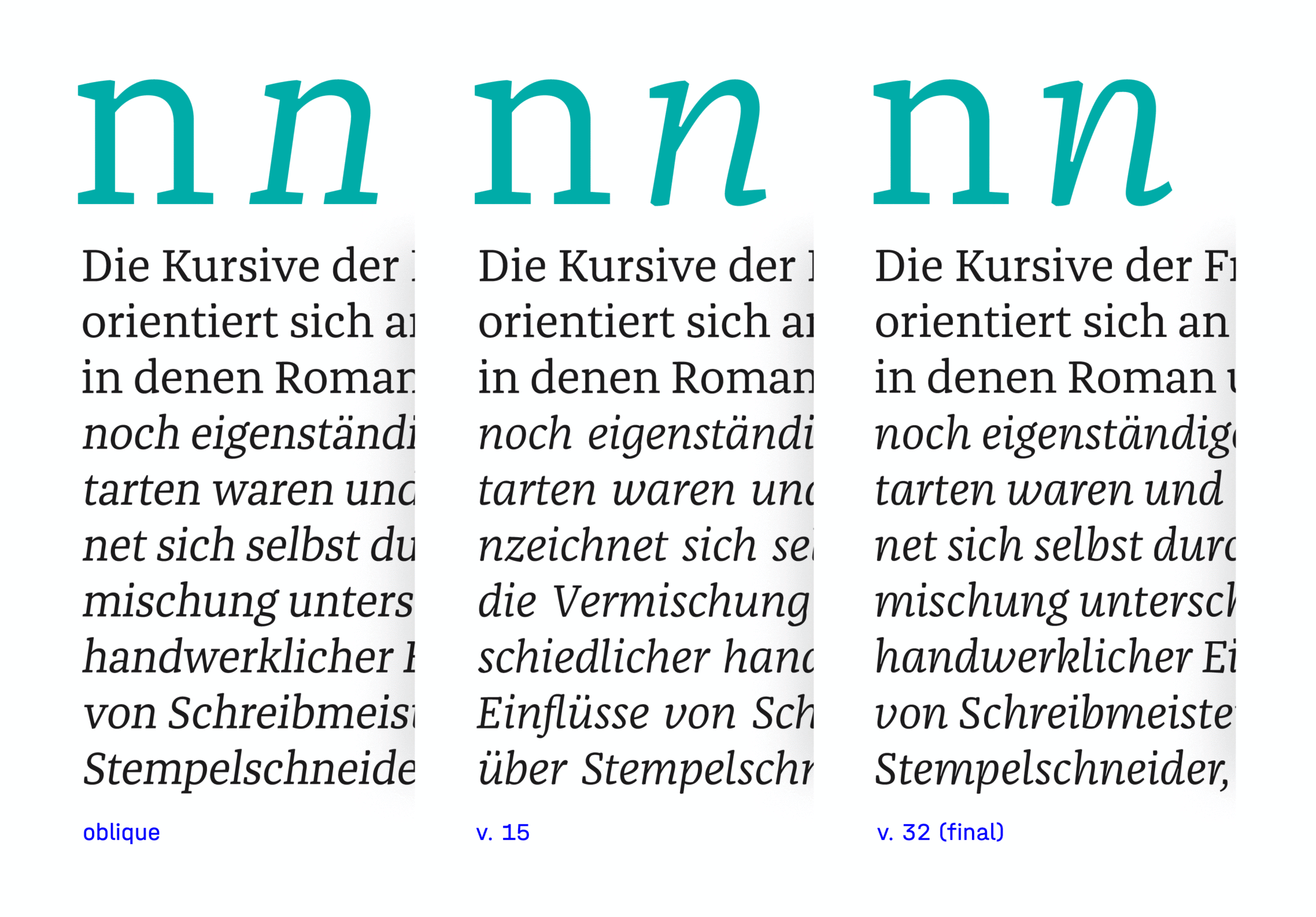
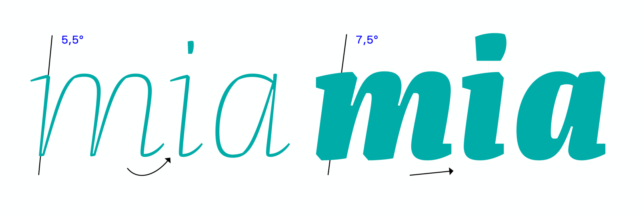
The development of the italics began at an 8° angle and with a minimized grayscale and character width. Then they were gradually endowed with an italic construction. Finally the italics settled into a more upright basic angle of 6°. While the hairline slants at only 5°, the black has an angle of 7° to make the slant visible even in the bold weights.
Same but Different
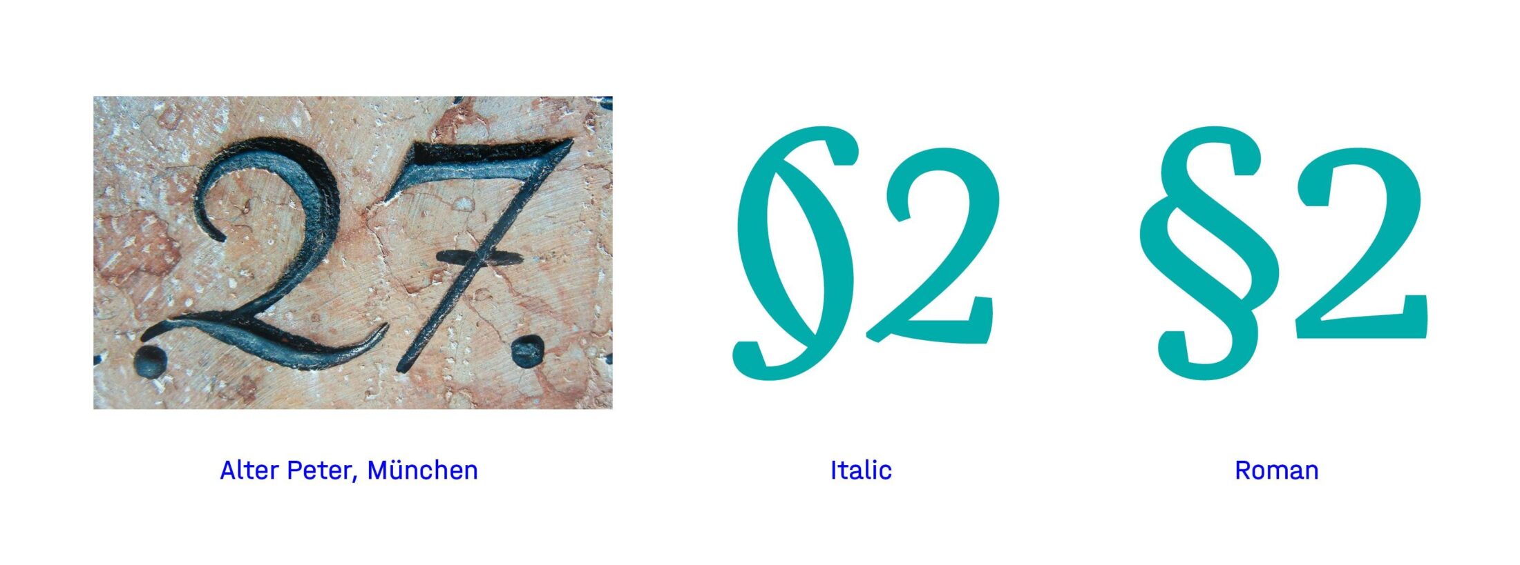
in keeping with the idea that the italic is a typeface of its own — a partner to the roman, not subordinate to it — all glyphs were re-modeled, including the numerals and special characters. This was facilitated by unexpected inspiration on the one hand, and by existing alternate glyph drawings (§) on the other.
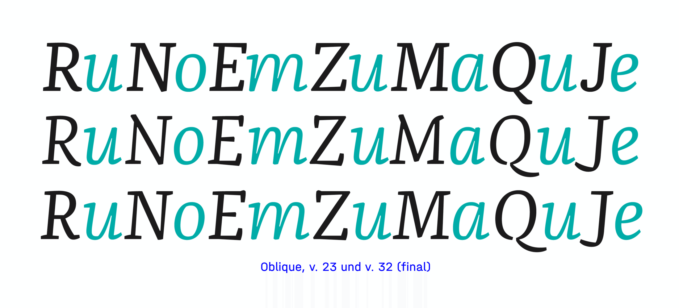
The uppercase letters were already drawn with a tendency towards the dynamics of the lowercase letters. In the italic version, the uppercase letters take this a step further. They are not merely slanted spinoffs of the uprights; they themselves contain hand-drawn features of their own. Though they first looked more strongly like initials, this characteristic was reduced a bit to make the design more calm and fitting to the roman, despite its already lively lowercase letters.
Since italics are used to accentuate parts of a body text, they naturally push the boundaries of the »how much vividness can you handle« question. Thus, they offer more options for use in headlines and package design where their playful forms and edgy details can articulate themselves more.
Weights
Exponential Interpolation
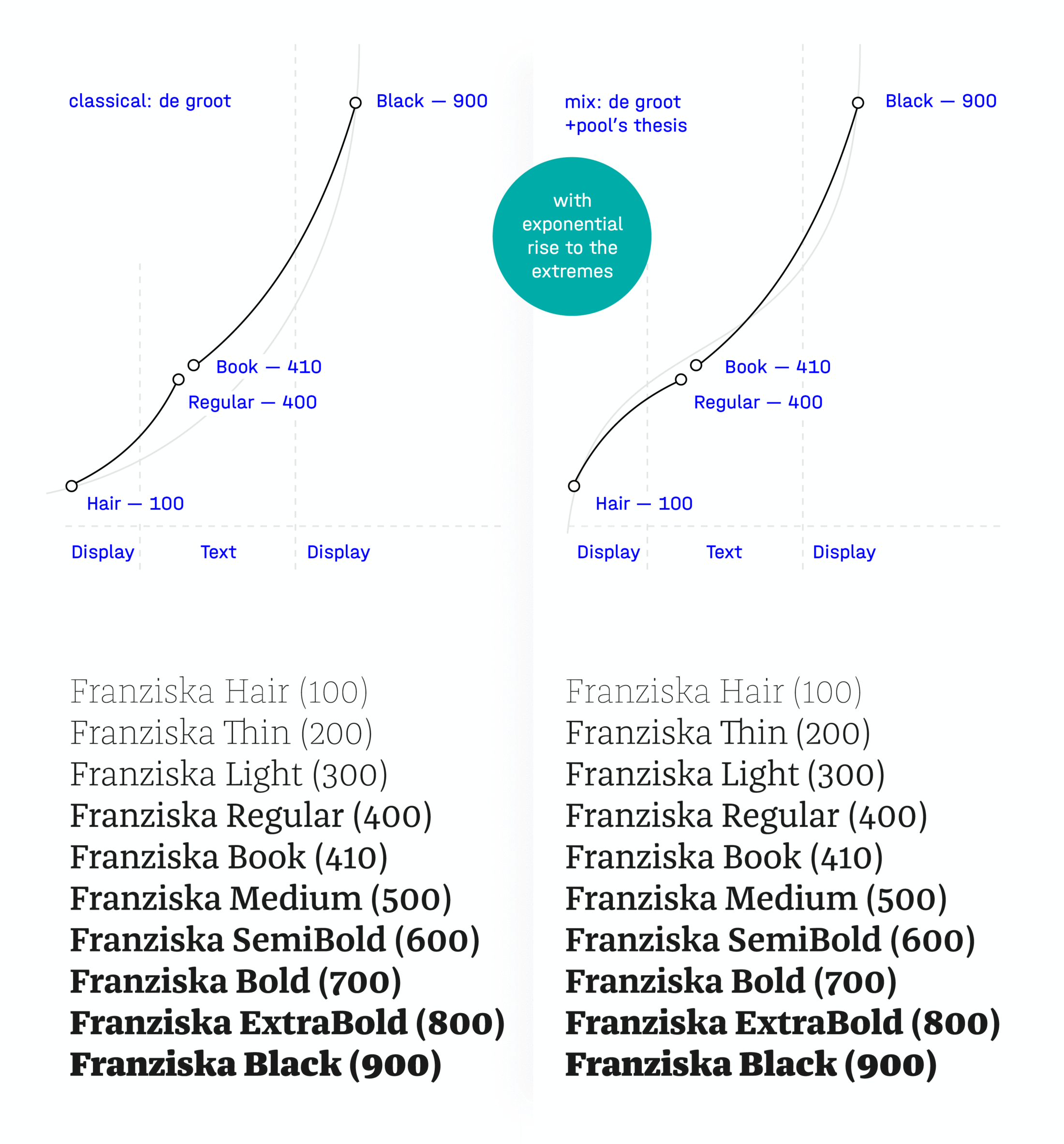
Contrary to Luc(as) de Groot’s interpolation theory, which postulates that the formula [B=√(A÷C)] always guarantees a correct increase of contrast, hairline and black weights are often worlds apart. This is because the pure average value of a thin weight and an ideal bold weight is not always ideal for a body text. If you want to design the often-used medium weights perfectly, one method is to draw a third version and then interpolate it in two steps. There was an interim theory that contrast should not only increase towards the bold pole, but should go towards both extremes (hair and black), in order to calculate the exponential increase (black) and decrease (hair). This theory was unfortunately disproven, because the medium weights could barely be distinguished from each other. Ultimately, Franziska was calculated with three extremes in two curves according to the classic interpolation theory.
Superpolated Instances
Once a glyph has been designed, converted into vectors and then complemented by further variants (such as hairline or black), you can merrily begin interpolating the intermediate weights. In the Superpolator application, you can perform test interpolations and extrapolations, though for the sake of simplicity, the final interpolation comes from Glyphs.
Duality of Singles
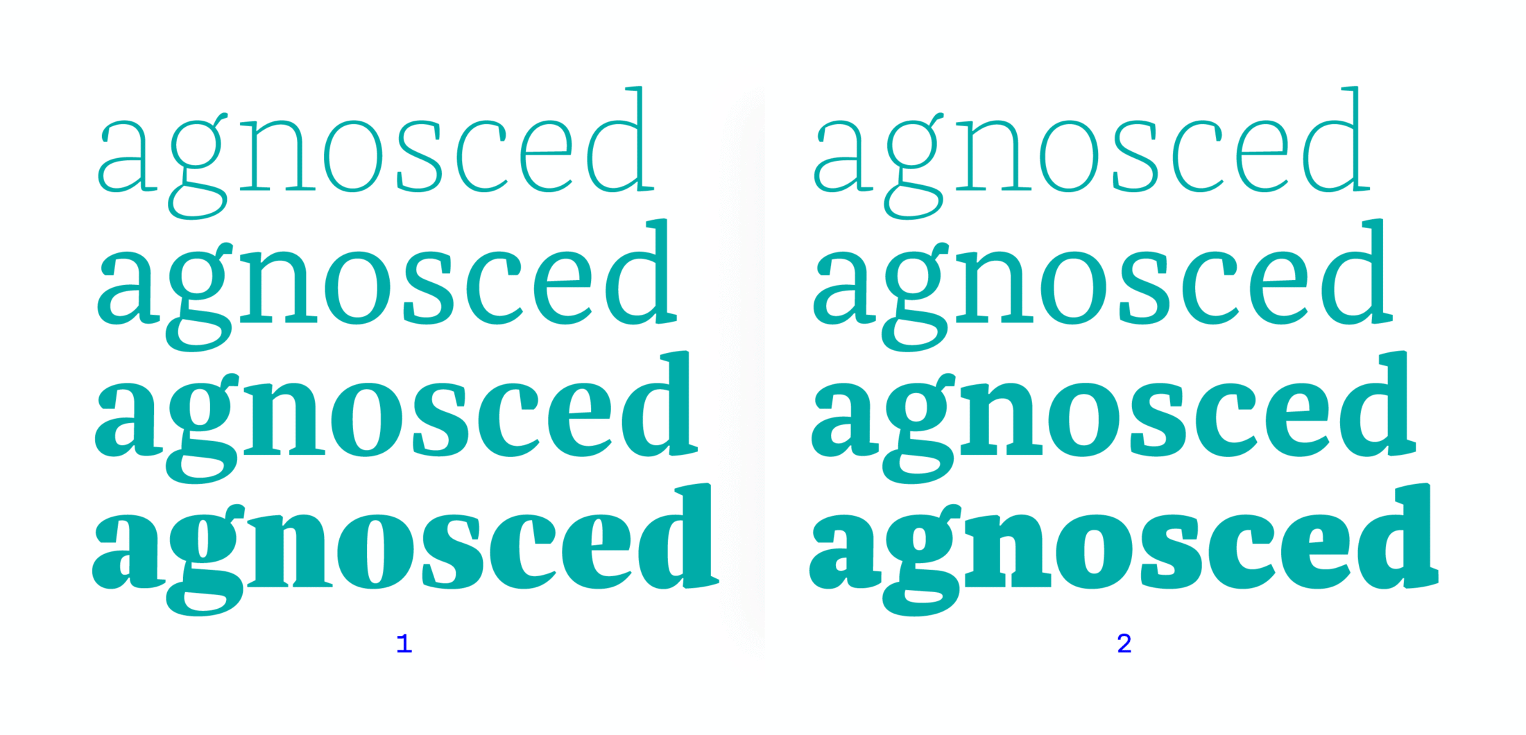
To enable different effects already present in the family, the thinnest of Franziska’s weights tend towards monolinear Egyptian, while the thicker ones are more like high-contrast romans. One early draft envisioned a much clearer distinction between slab serif and roman. Starting with the Light weight as a slab serif, the idea was to split the typeface into two directions: one black weight with block-shaped Egyptian character ❷ and another black weight with a high, almost classical contrast ❶. Finally, this idea of splitting the typeface was abandoned because the hybrid concept of different classifications already was apparent in the linear family.
Egocentric Team-Players
Since the extremes of a family provide great effects, the thinnest and thickest weights of Franziska not only belong different genres, but they also are intended as display versions of the medium text weights — since extreme weights are rarely used for body text anyway. In the italic version, each weight was adapted to match their roman counterparts: the thinnest italic is playful and lively, while the other weights become progressively calmer and more compact as their thickness increases.
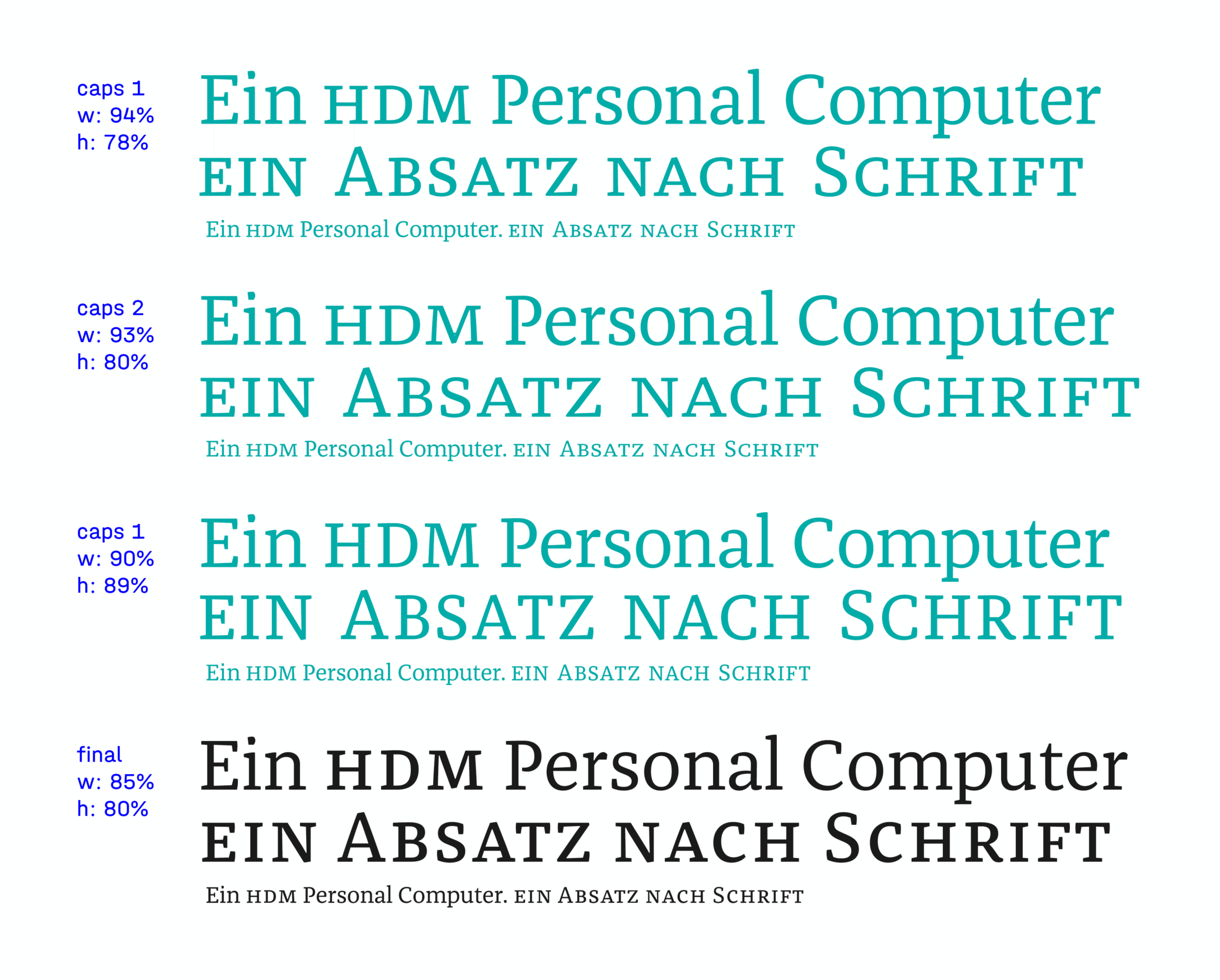
Small but Capital
The small caps straddle the gap between the large x-heights of the lowercase and the differentiation to the capitals.
OpenType
Incidental “Silver Bullets”
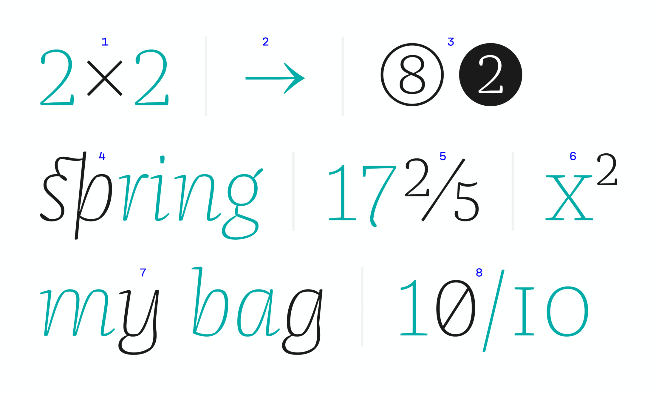
The decision to create hybrid numerals made it necessary to adhere to the maxim ‘less is more’ in designing Franziska. Still, the type contains plenty of OpenType features. The purpose is not to offer confusing options, but to enable more stylish typography. Some features are automatic self-corrections that run in the background ❶,❷ and others provide access to stylistic alternates ❸, ❼, ❽ such as emphasized italic, discretionary ligatures ❹, numerators and denominators ❺ or superior and inferior figures ❻.
Global Localization
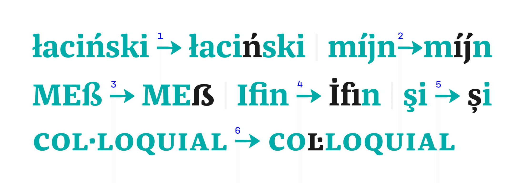
The OpenType code locl enables you to skillfully handle the nuances of European languages, no matter whether you’re using a Polish kreska ❶, a Dutch ‘j’ with an acute ❷, an automated German capital eszett ❸, a Turkish dotted capital ‘I’ ❹, separated fi-ligatures, Romanian und Moldavian alternatives to the comma-accent ❺ or a Catalonian accent marks ❻.
Capital Specialties
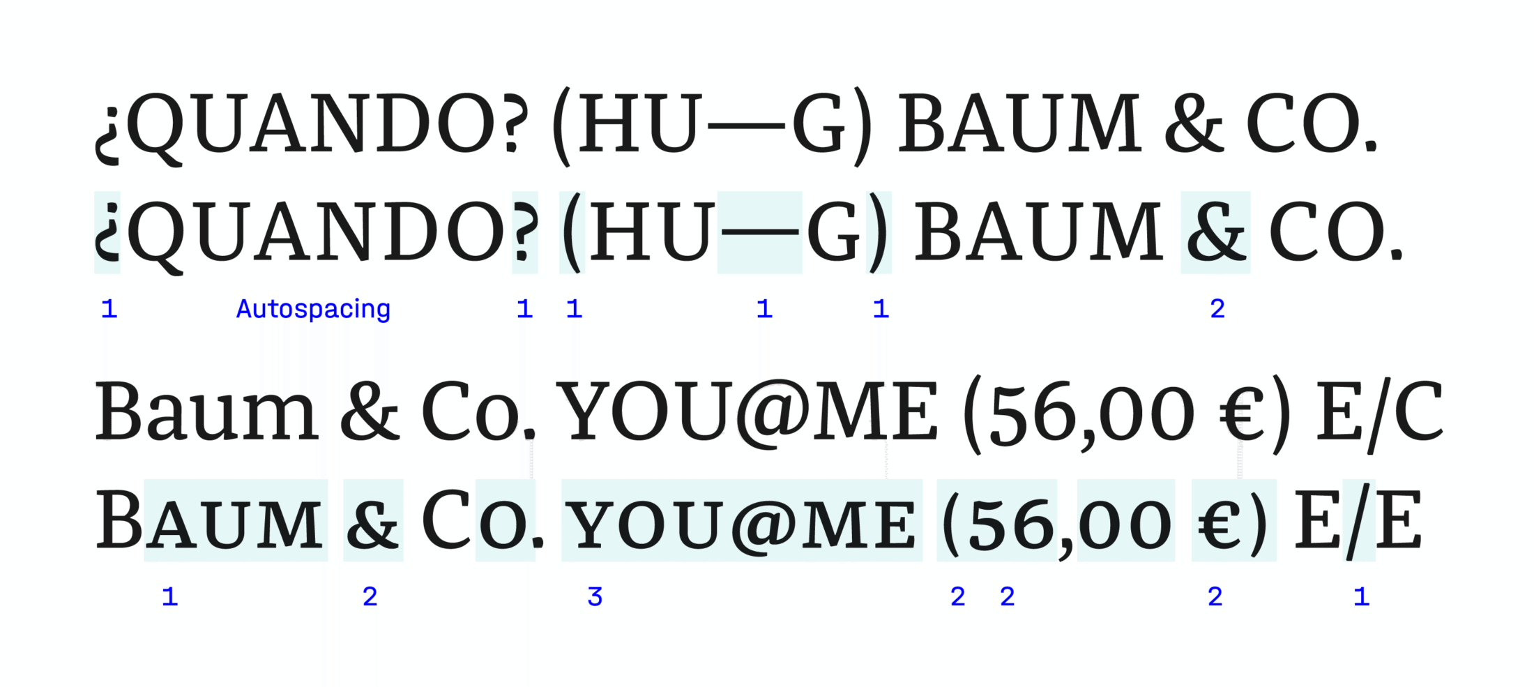
Franziska’s OpenType features not only allow you to quickly activate the all-caps and small caps settings, they also optimize the typography. When the text looks chunky because it’s set in all-caps or small caps and has no distinguishing descenders, the punctuation marks are raised proportionally ❶ to compensate. To optimize further, Franziska’s all-caps setting is gently tracked to compensate for its tighter spacing with the lowercase. It also includes alternate characters ❷ that can automatically interchange to better fit the desired style. Finally, there’s a »Capitals to Small Caps« option that allows you to use in wider, warmer caps for setting uppercase ❸.
Spacing
Compact Expanse
As Franziska is a text font, it follows Frutiger’s style of spacing in the middle weights: leaving a lot of space between characters in order to create clean, even read, even in small sizes. The extreme styles — Hair and Black — are more narrowly spaced than might be expected from their internal shapes because they are headline fonts.
Variable Rules
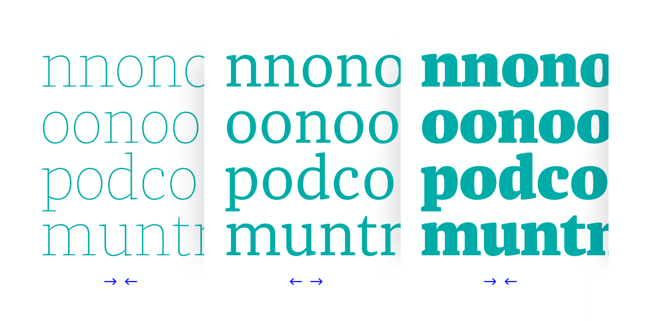
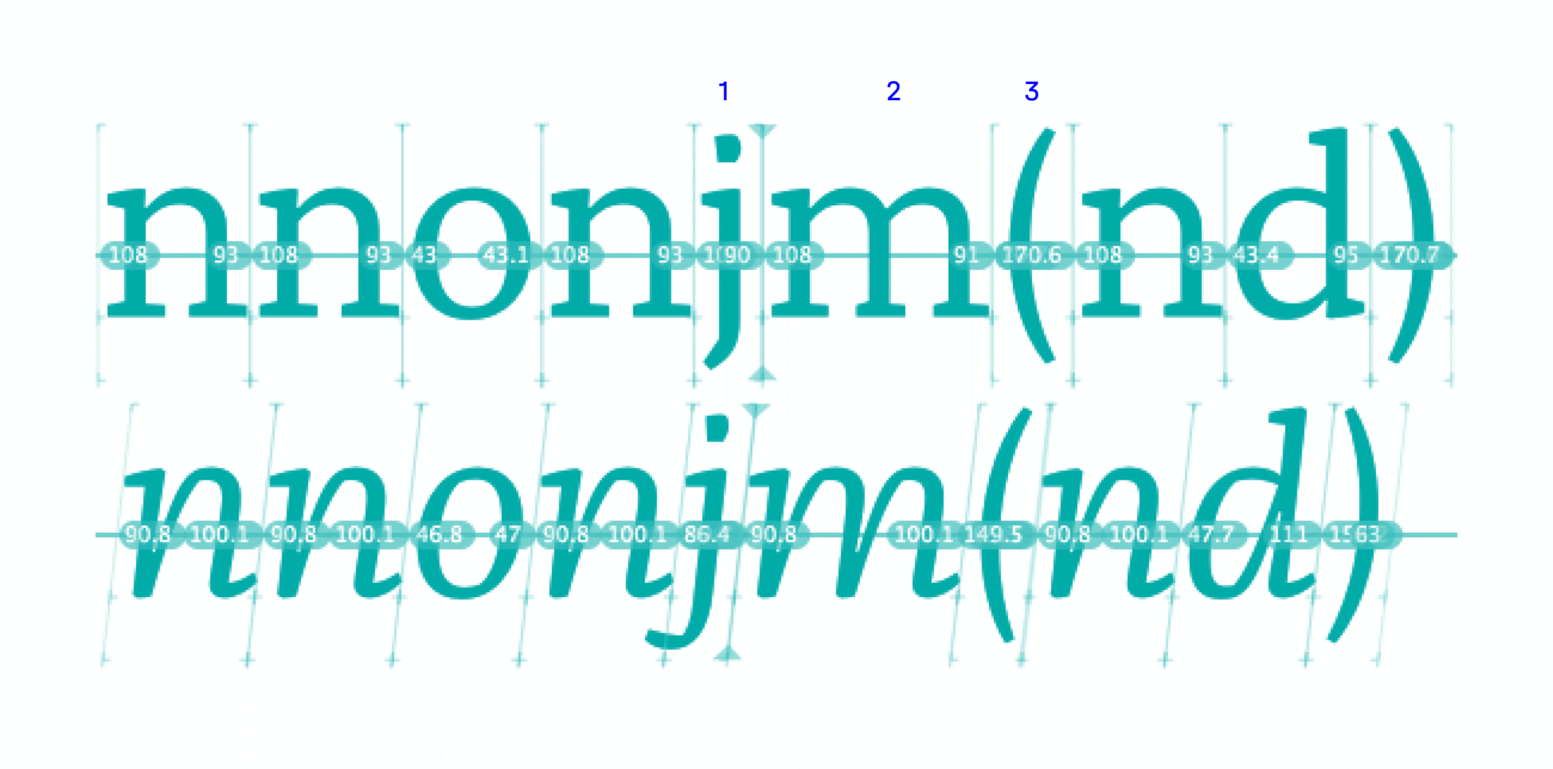
For the most part, Franziska’s spacing is based on variables — because once you’ve found the values for the ‘n’, there’s no question about the left and right side-bearings of the ‘m’ ❷. Good spacing does not render the kerning obsolete, but it does make it become lessonly marginally necessary ❶. Programs like MS Word and some browsers even ignore existing kerning, which is why good spacing is essential. In some cases, the spacing can also support the meaning of the text visually: brackets can bind whole sentences and don’t just stick to the first letters ❸.
Kerning
Quick Detours
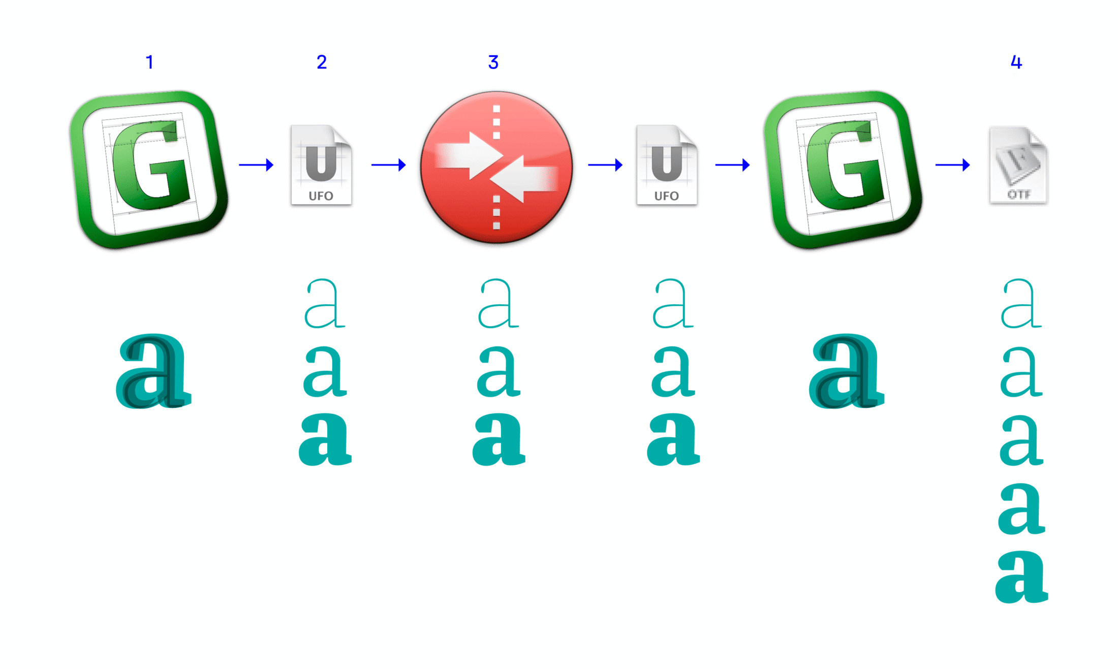
By the time you get to kerning, you can consider yourself lucky that type design has a lot to do with defining proportions through units per em quad. Letters drawn in the Glyphs application ❶ are broken down into initial instances of the weights and exported to the open UFO format ❷. MetricsMachine each weight with kerning pairs ❸, before the data is exported and reimported back to Glyphs. Thus, the final weights can be calculated from here ❹ — including the interpolation of kerning values.
Time-Saving Classes
Both Glyphs and MetricsMachine create groups of letter classes, making the number of kerning pairs manageable: if glyphs all have the same basic shapes ❶, the kerning values can be copied across the board. In other cases, the glyphs get grouped only by the similarity of their left and right side bearings ❷. Franziska has about 938 glyphs, of which 260 are sorted in classes and 28,600 cases are manually kerned, and this results in over 42,000 kerning values. Kerning by classes doesn’t always make sense: the values for a Nordic ‘ů’ combined with a ‘ý’ may be useful for the transliteration of cyrillic languages, but it is helpful to optimize all possible combinations of Franziska to ensure a rhythmic text flow.

Individual Flatrate
Who even likes sweating it out over kerning pair tables? The MetricsMachine software offers relief here: once the capitals and small caps are sorted into sensible groups, then the logic of tedious caps-to-caps ❶ kerning can be transferred to the small caps. It’s even possible to integrate the relevant punctuation ❷ into this value transfer. Still, about 100,000 kerning cases were moved manually for this entire family.
Calculating Design
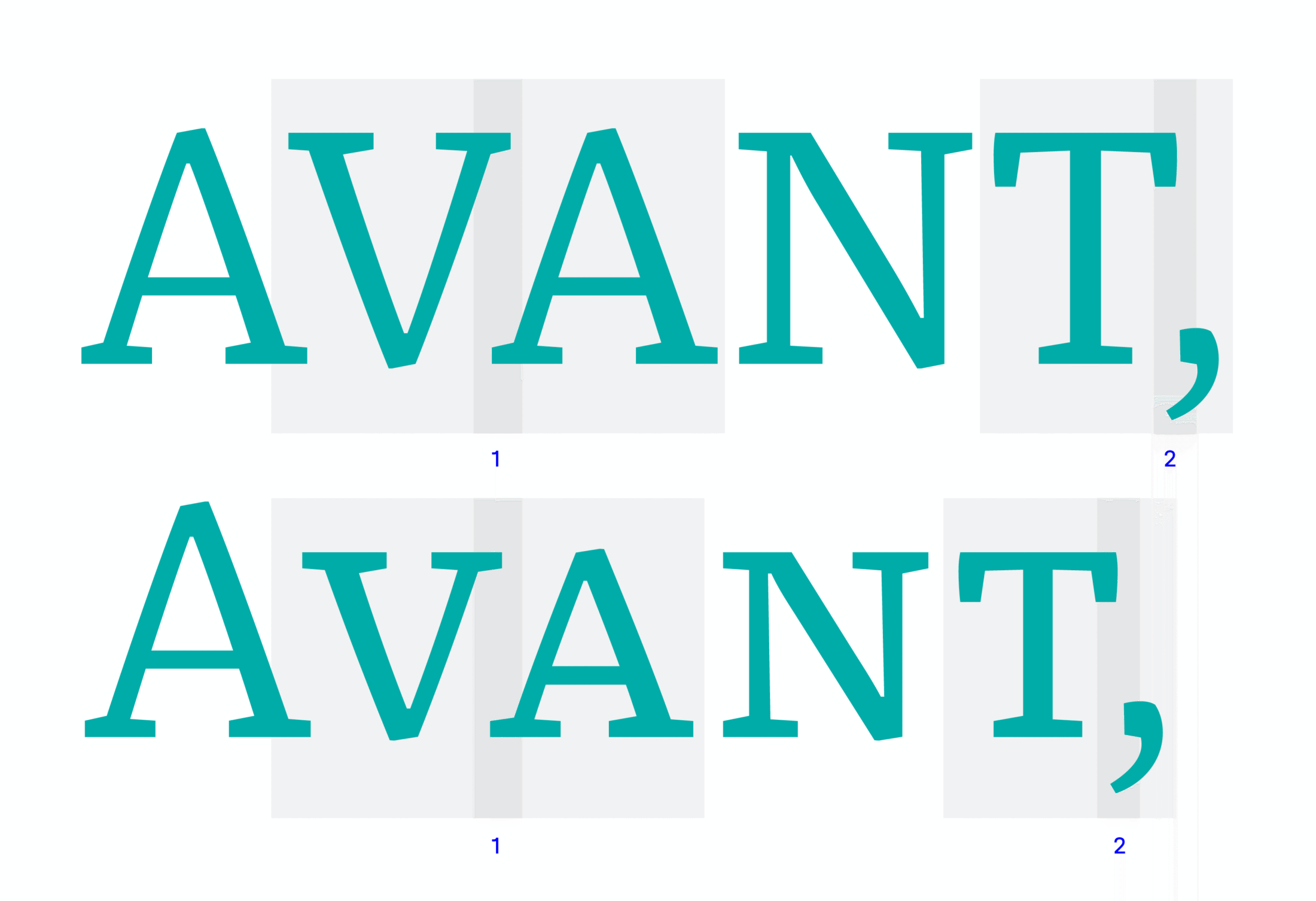
Though the act of kerning seems like mindlessly grinding out possible combinations and numeric values, it is in fact also design: it determines the white space, which contributes as much to the appearance of the type as the letter shapes themselves. Apart from obvious gaps ❶, the fine ❷ and practical kerning ❹ values are defined, among other things. Even word spaces ❸ were kerned as well to create harmonious white spaces in every context.

FF Franziska
Final Start Recap
Franziska has changed primarily in its scope of fonts and its micro-typographic details. The FontFont Team’s philosophy was that the designer makes all design decisions and they are technical support. Thus the majority of finished concepts and formal ideas were thoroughly checked, but not altered unless Jakob agreed Only the somewhat stubborn version of the paragraph symbol ❶ was neglected as a stylistic alternate because of readability concerns.
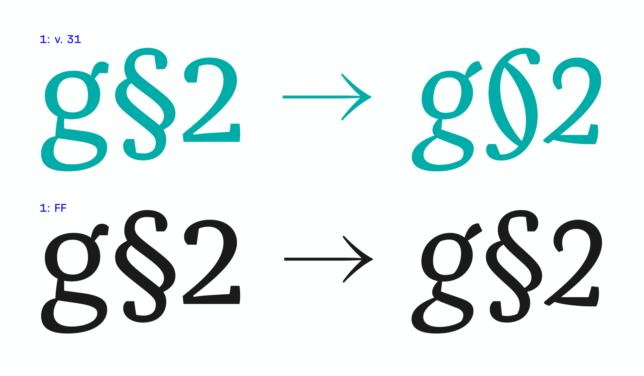
In these single proofs of the original Franziska, FontFont added Unicode slots ❷, missing tabular figures and matching currency signs ❸. Sometimes they simply identified wrong accents on unfamiliar glyphs ❹ or noticed when mathematical characters in tabular width were not drawn for an italic weight.
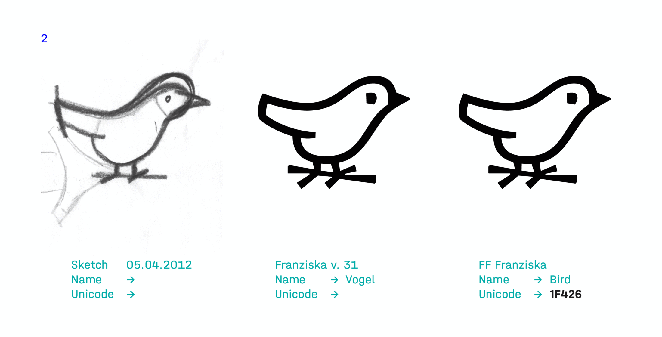
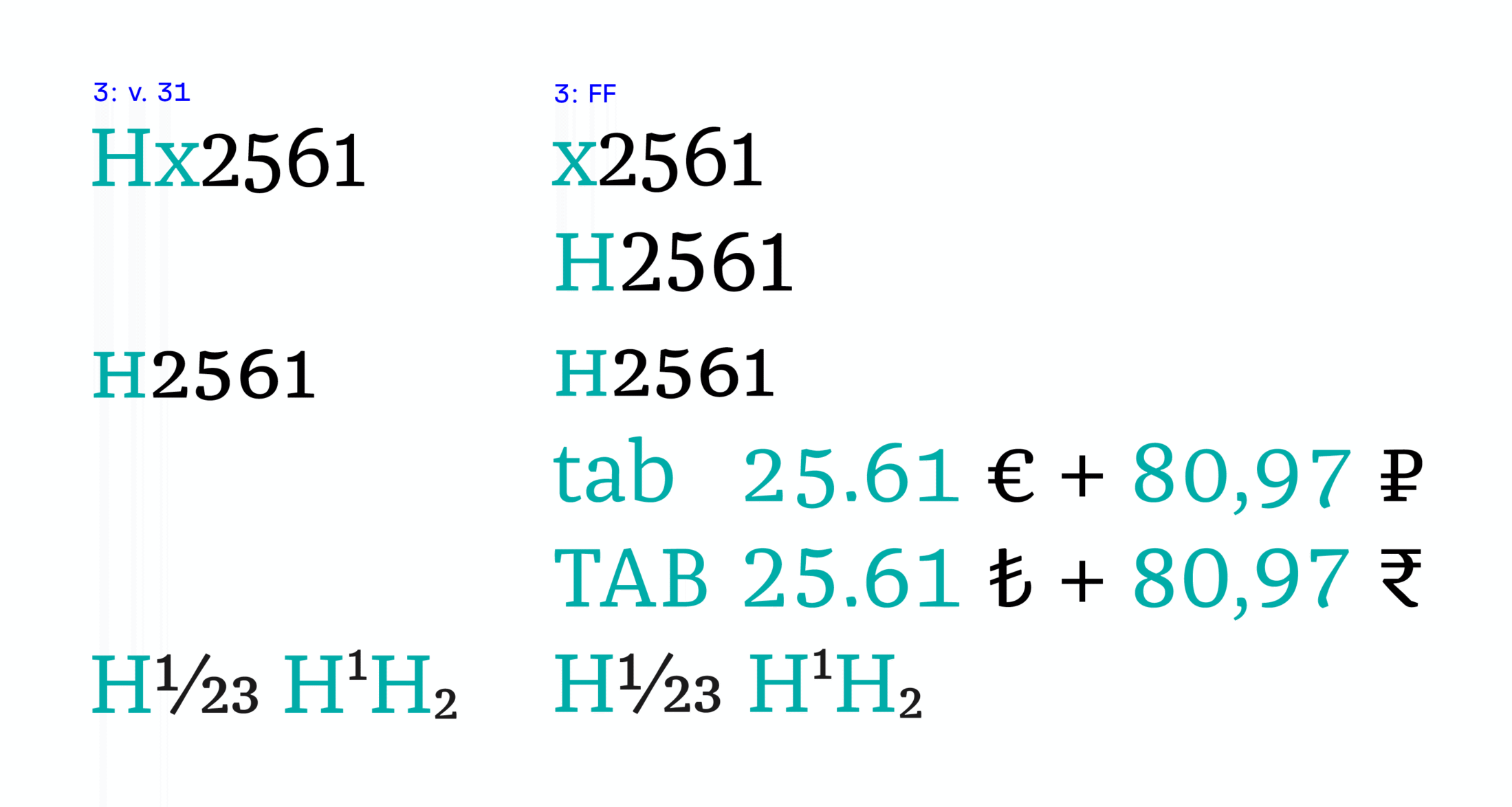
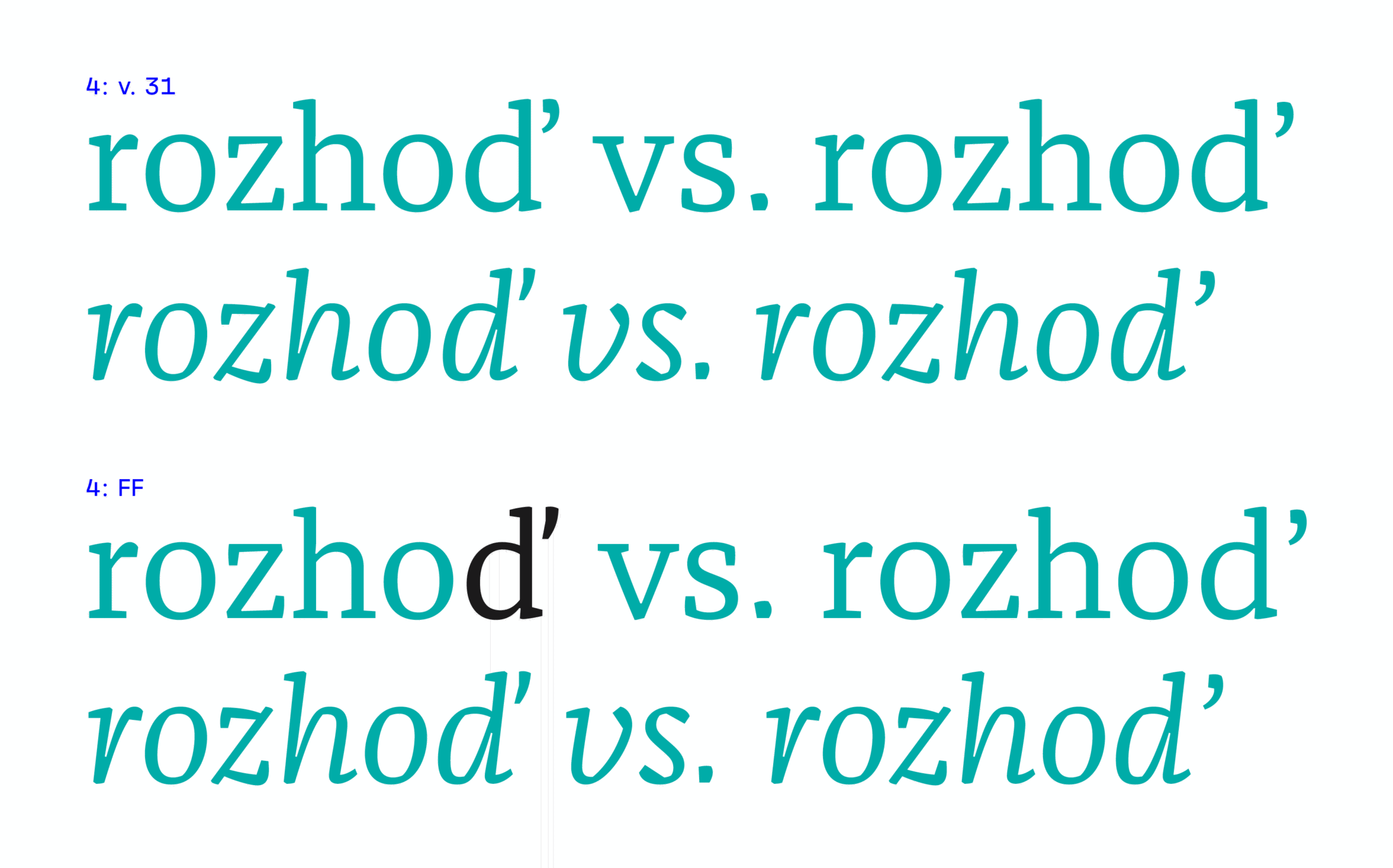
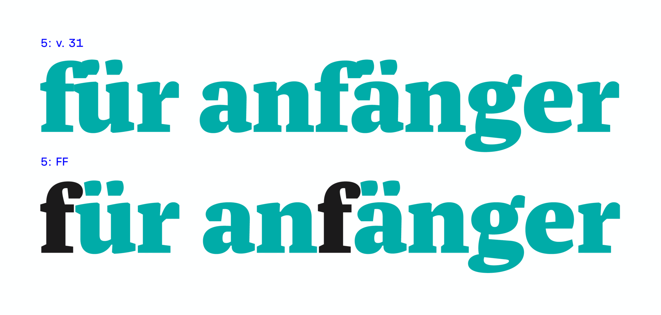
FontFont also collaborated with Jakob Runge to find a solution for the characters ‘f’ and ‘ä, ö, ü’, which clashed in the black weight ❺, an issue that some early adopters had already addressed to the designer. FontFont performed final testing and detected all unsolved kerning problems. They placed extremely high demands on themselves the spacing and kerning for most of the weights was completely reworked in just three weeks.
Home at TypeMates
Franziska was one of Jakob’s first typefaces to be taken seriously with its recognition as a FontFont, it was an essential stepping stone to becoming a professional full-time type designer. A big shout out to Andreas Frohloff, Ivo Gabrowitsch, Christoph Koeberlin, Ugla Marekowa, Alexander Roth, Jürgen Siebert and Erik Spiekermann—the team at what was FontShop—for all the support they gave along the way!
Now, after 10 years, Jakob’s own Foundry has evolved. Franziska is home and published at TypeMates. There were only a few updates needed for Franziska to meet today’s demands: Antonia Cornelius reworked the fonts to match the TypeMates’ production standard and enabled the Variable Fonts, while keeping the font data familiar to the already tried and tested FontFont version.
… by the way, just in case the yellow press is asking: Franziska is dedicated to the real life Franziska. Before Jakob got enthusiastic about serifs, he met her. 🖤