Fello by Bold Scandinavia
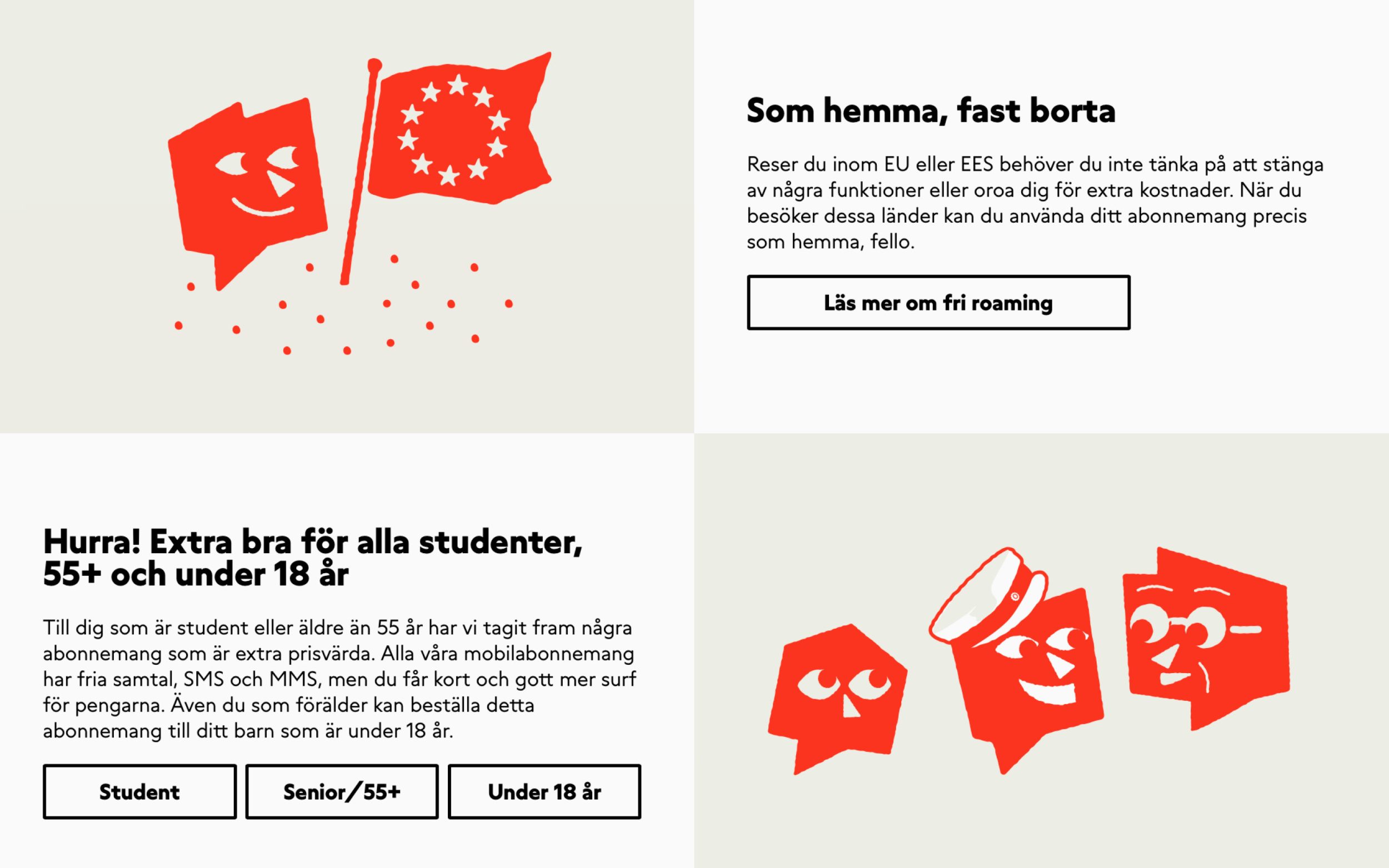
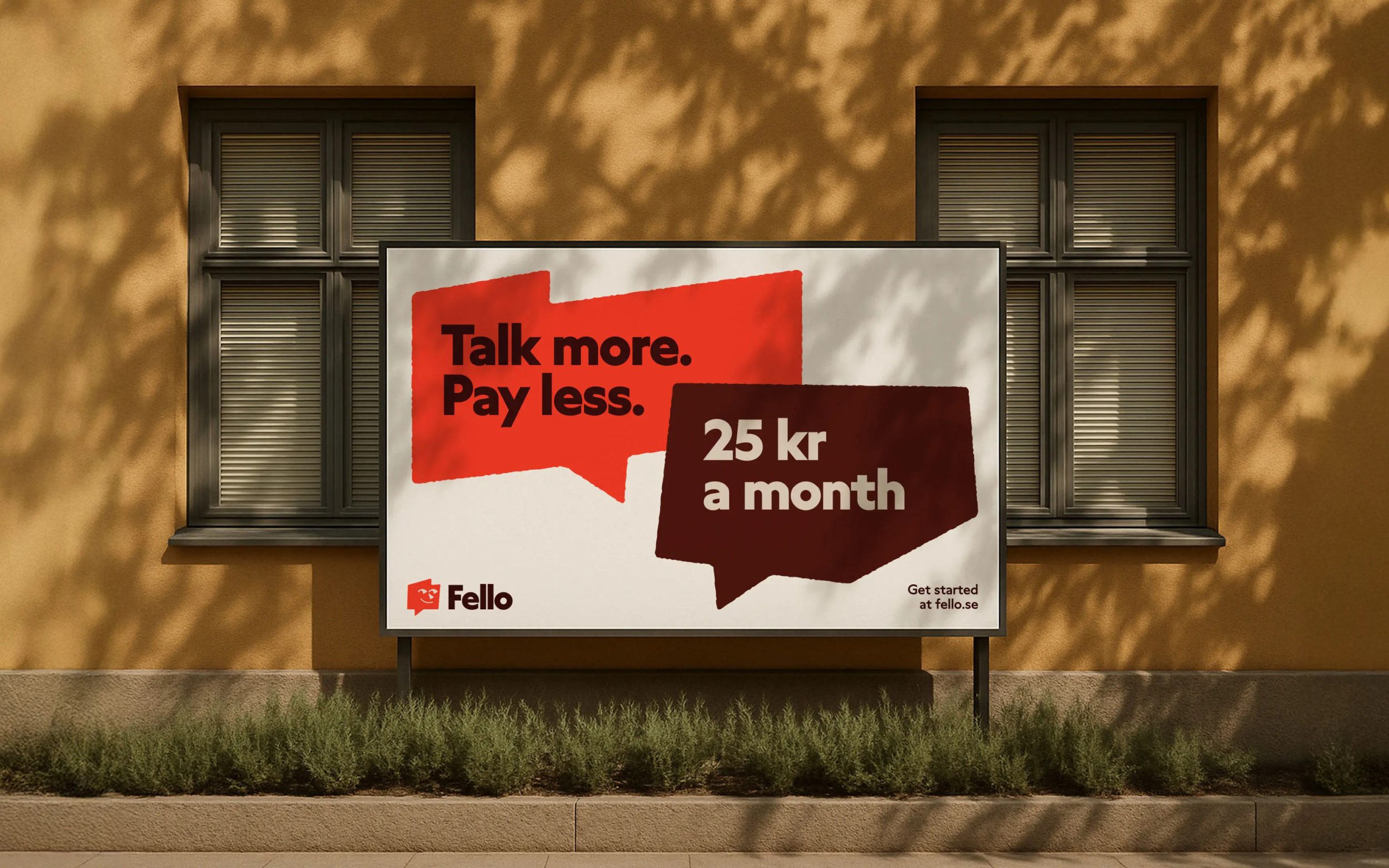
Grato Classic's playful yet versatile character brings typographic consistency and conversational warmth to Fello's customer-focused mobile brand.
Images by courtesy of Bold Scandinavia
Fello is a Swedish mobile phone provider that focuses on simplicity, honesty, and customer care. When Bold Scandinavia was commissioned with the rebranding, the focus was on refreshing the brand identity. The goal was to increase recognition and make Fello's positive qualities more tangible.
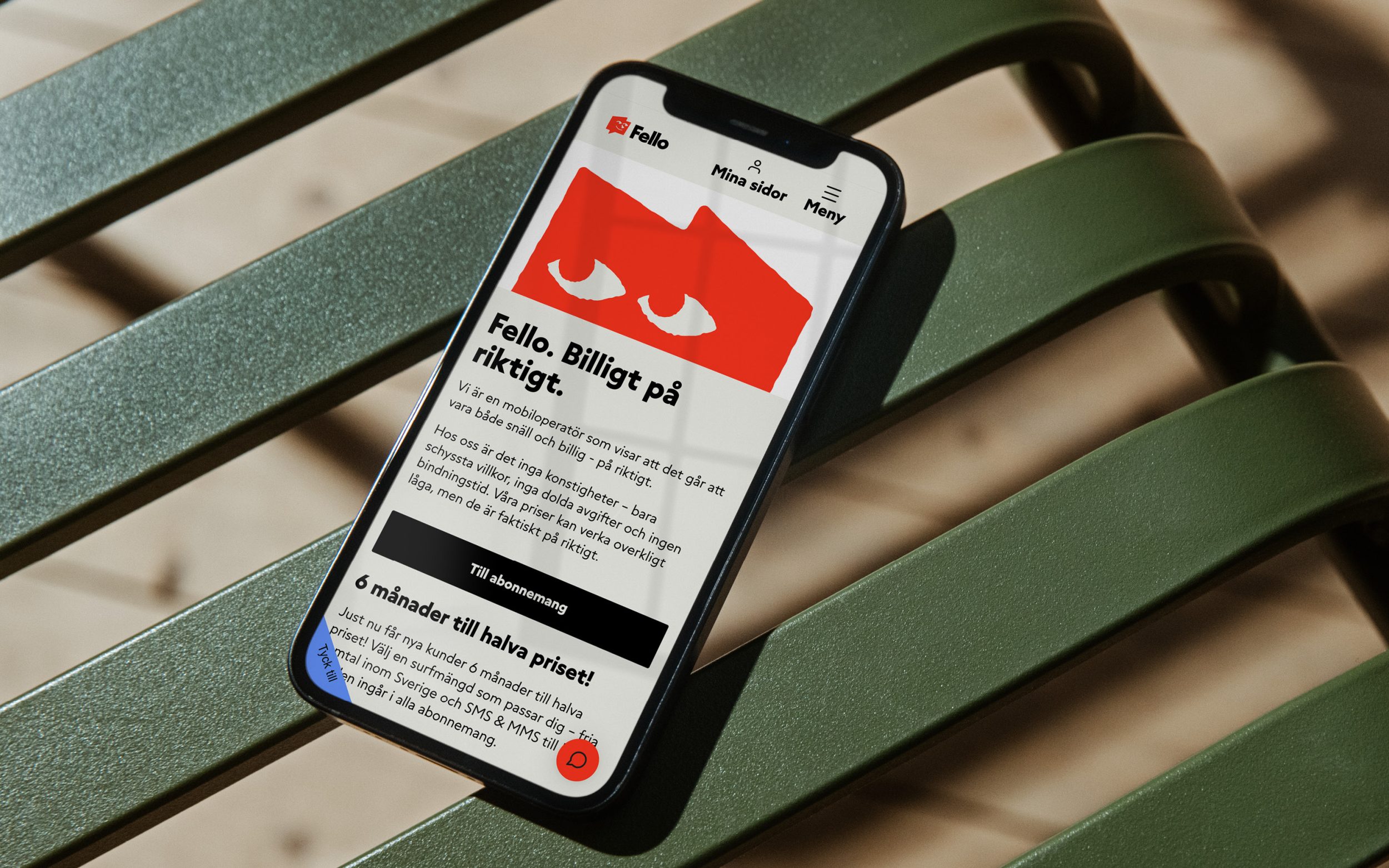
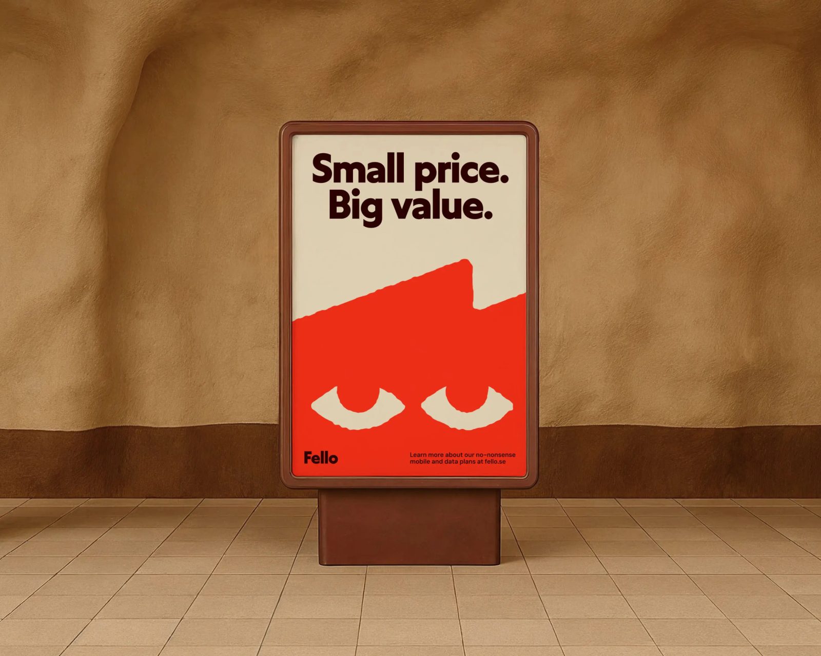
The result is a flexible but consistent design system that relies entirely on Grato Classic for its typography. Bold Scandinavia's creative director Michael Mason explains the choice as follows: “Grato Classic had the perfect balance of character and simplicity that we were looking to strike with Fello’s rebrand. It’s distinct enough to work nicely as a headline — but hardworking enough to be leveraged across type styles. We saw its playful, conversational, tonality rhyming particularly well with the tone of voice we were looking to land with the Fello mascot, so to us it felt like a perfect fit for the new brand.”
Grato Classic thus becomes the typographic foundation of a brand that not only promises simplicity, but also makes it visible with its font.