Cera Pro for Saurer

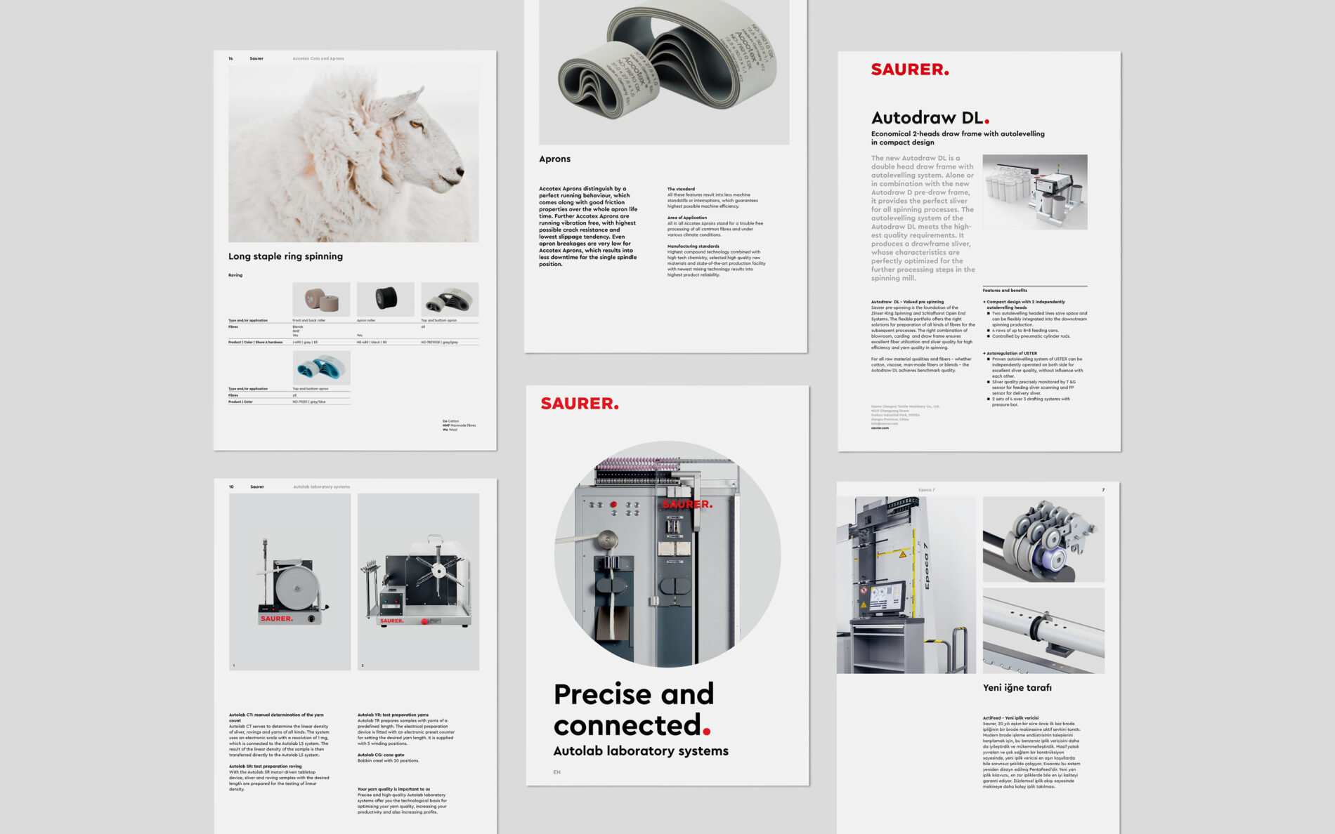
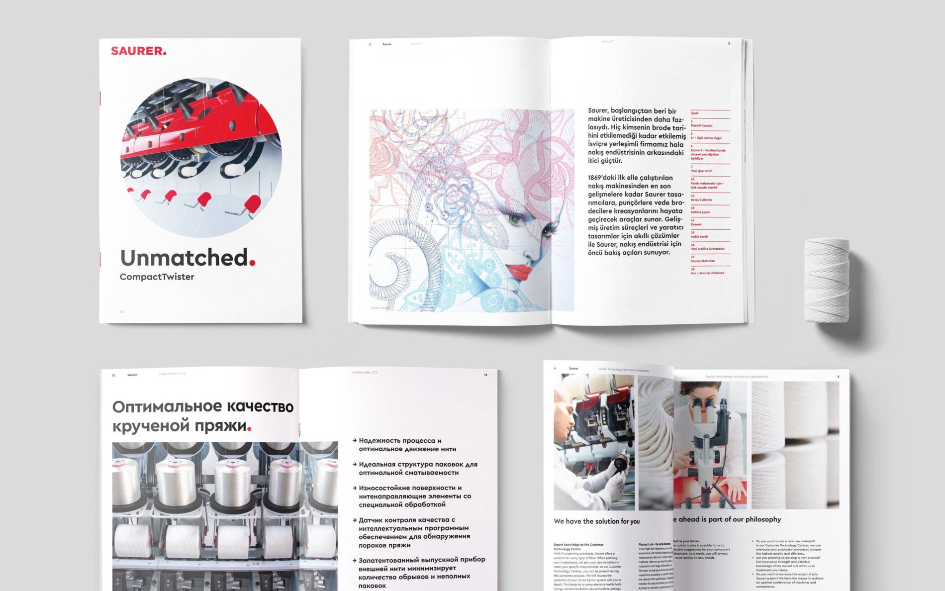
A leading technology company that focuses on innovations in the processing of fibre and yarn, Saurer is an icon of Swiss industry. MetaDesign Zurich created their new brand identity.
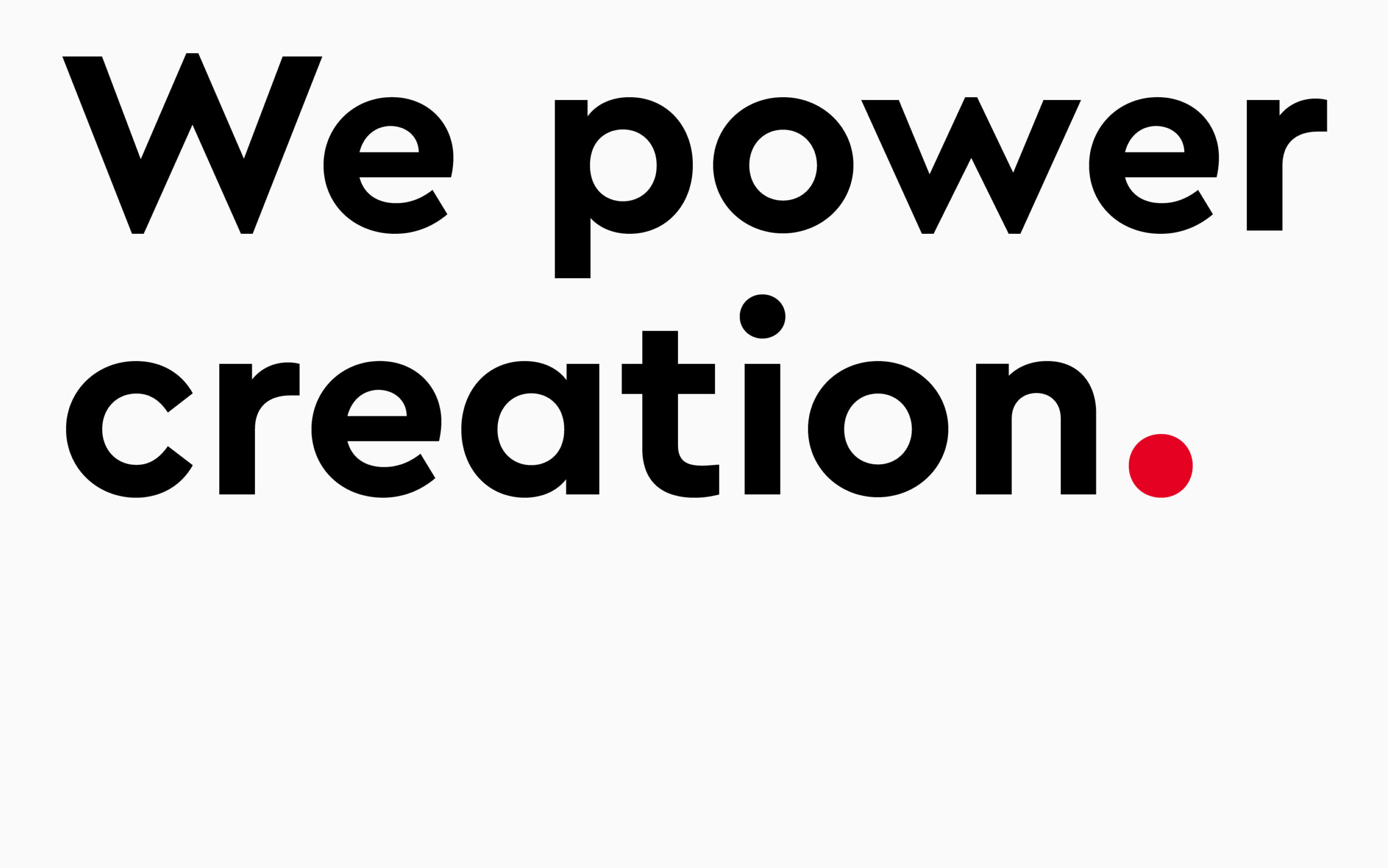
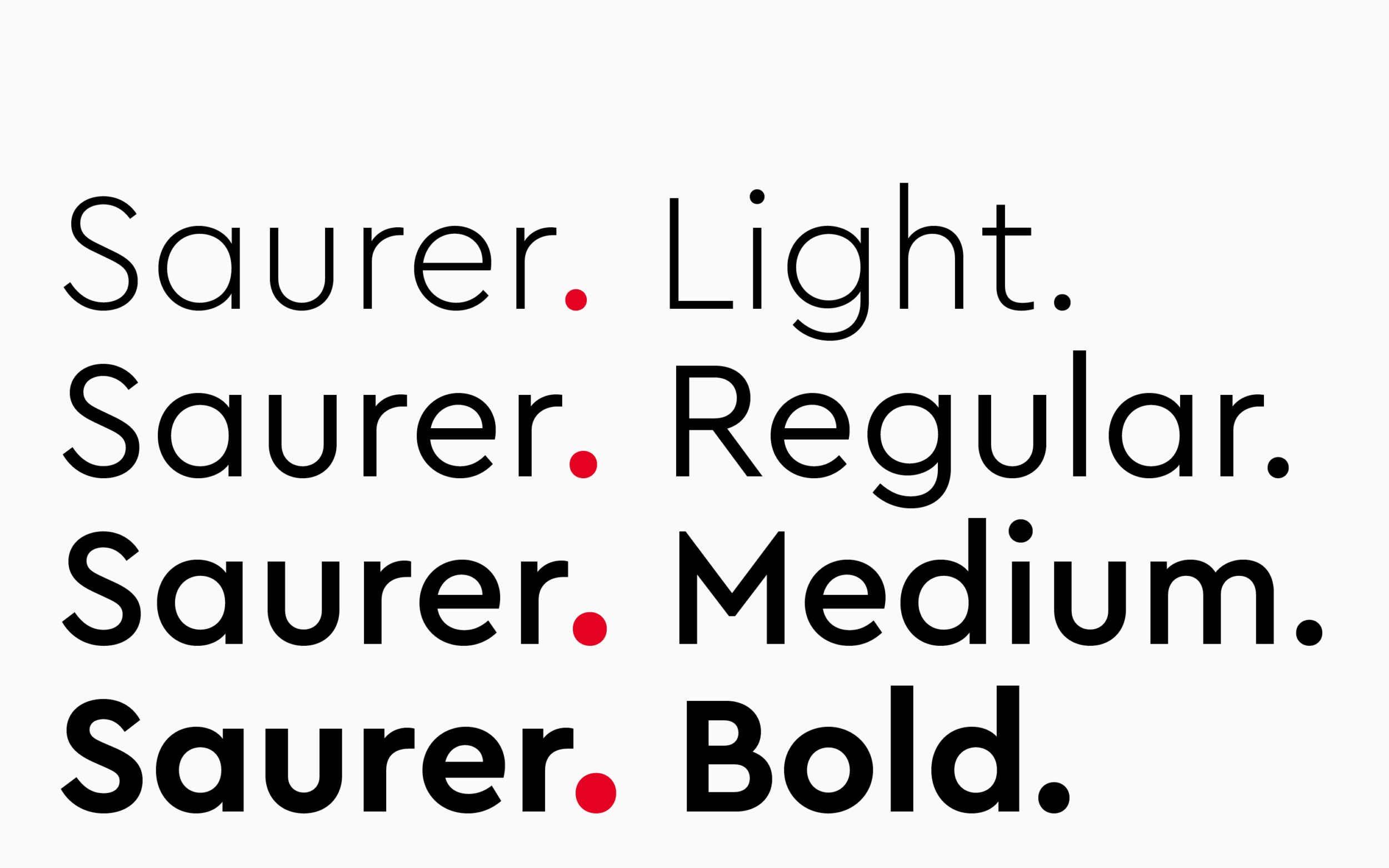
To open a window to storytelling and enable bold, communicative statements, the designers at MetaDesign put the punctuation of Saurer’s logo’s centre stage in the new brand identity.

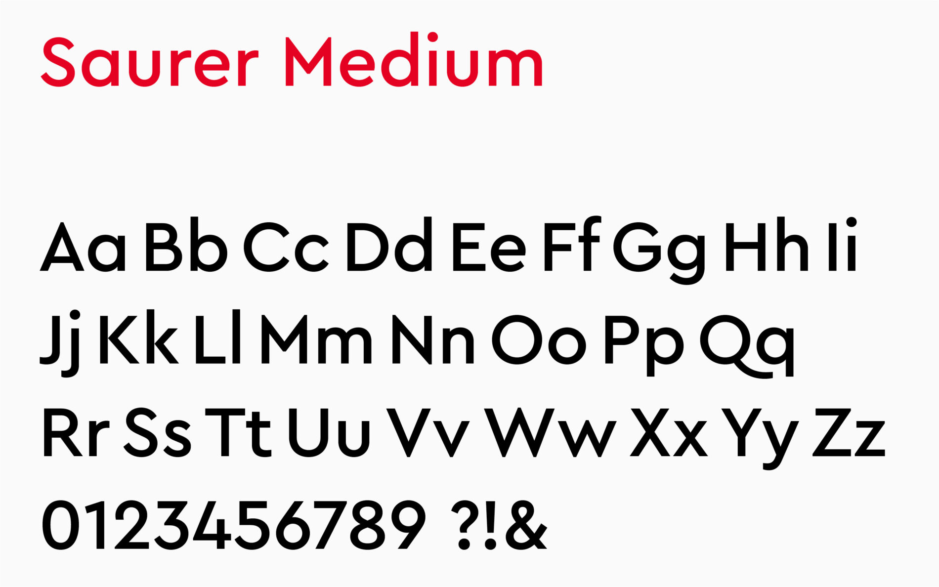
Their typeface of choice was Cera Pro.

Type Mates Metadesign Cera Pro Font Modification Saurer Technology Company 02
Type Mates Metadesign Cera Pro Font Modification Saurer Technology Company 04

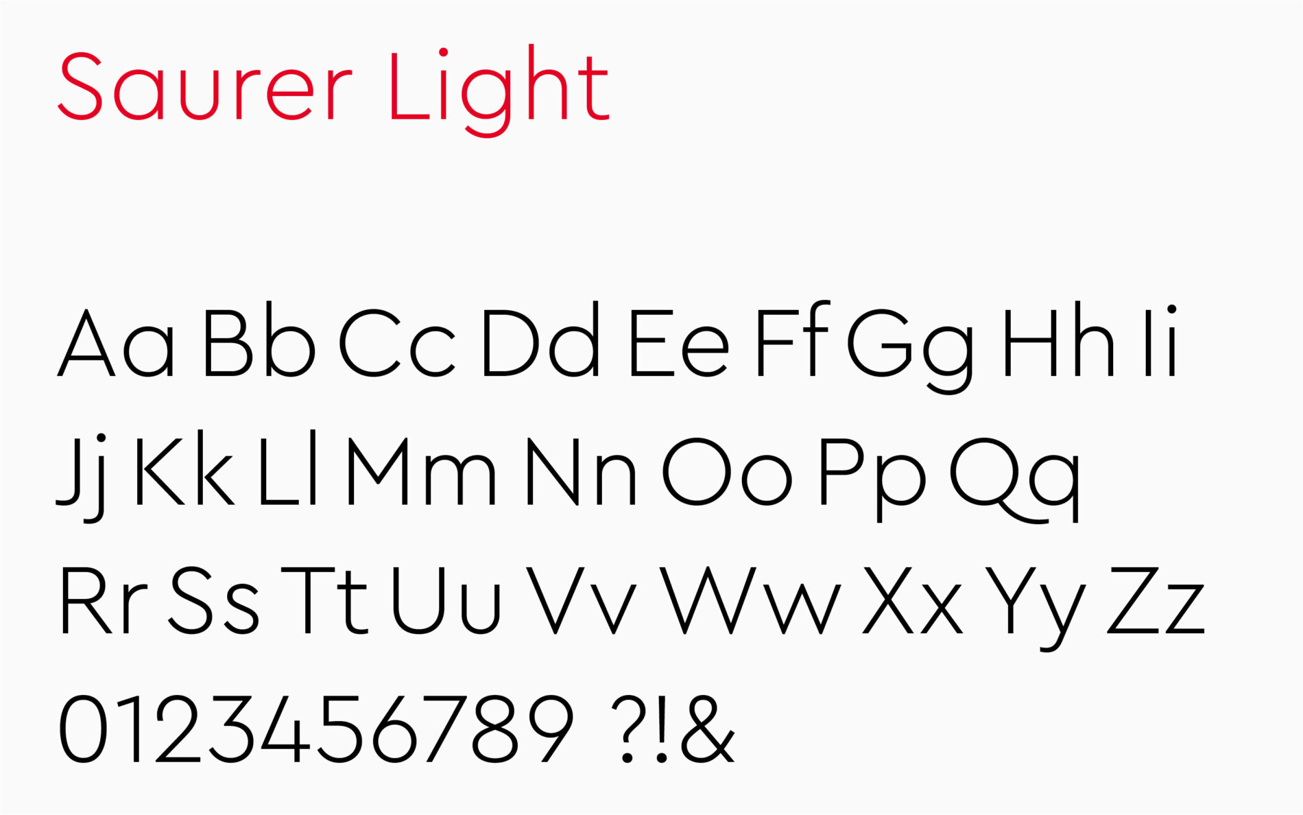
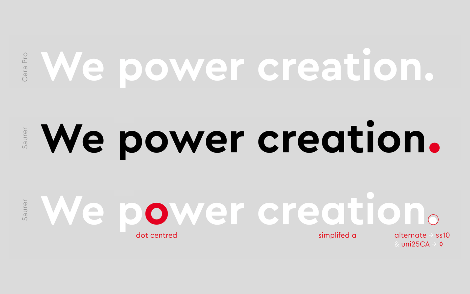
We created a more rounded texture by making Cera Pro’s alternate letters the defaults. A large full stop, accessible through shortcuts and unicode, gives Saurer’s communications extra emphasis.

Type Mates Metadesign Cera Pro Font Modification Saurer Technology Company 03

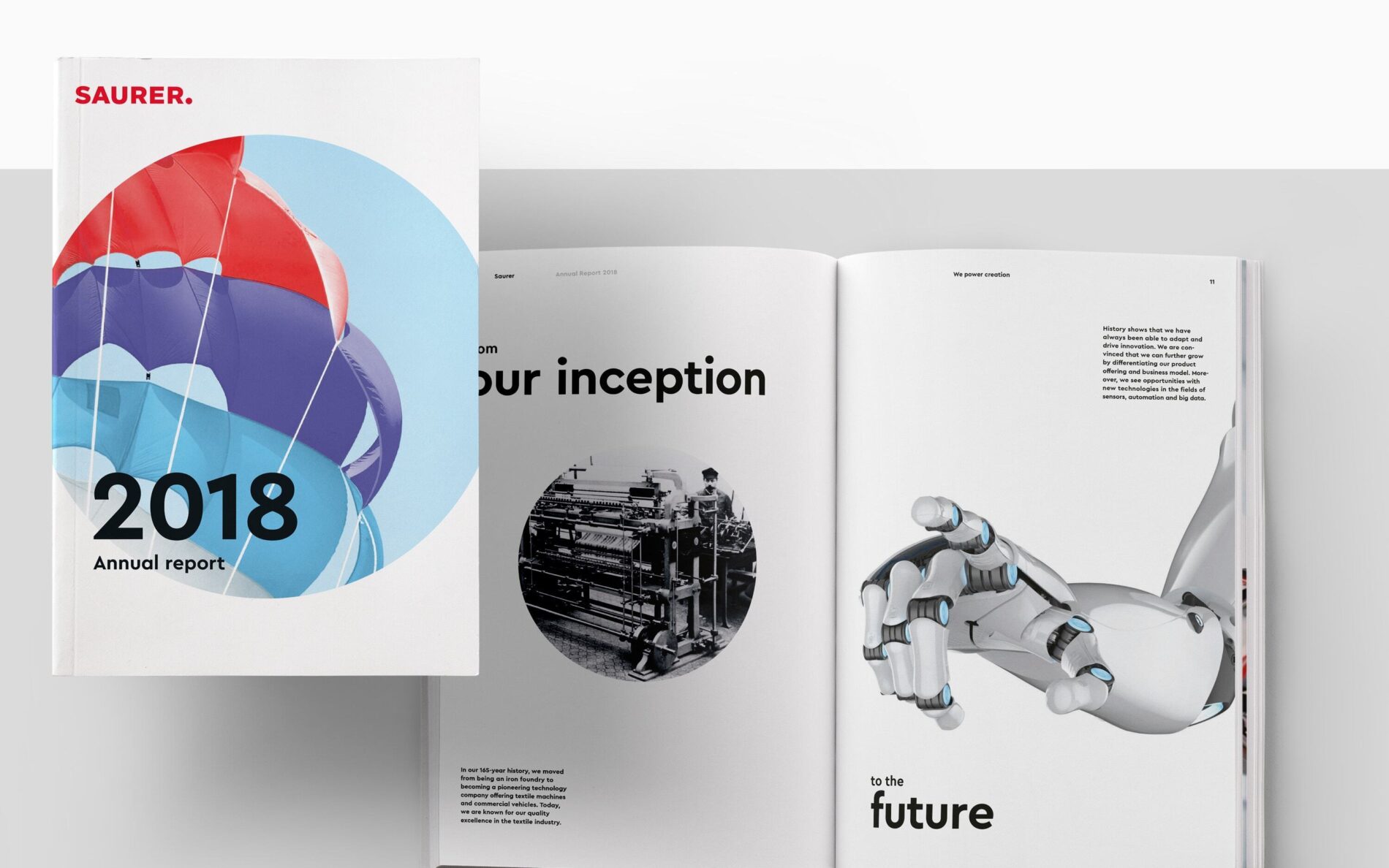
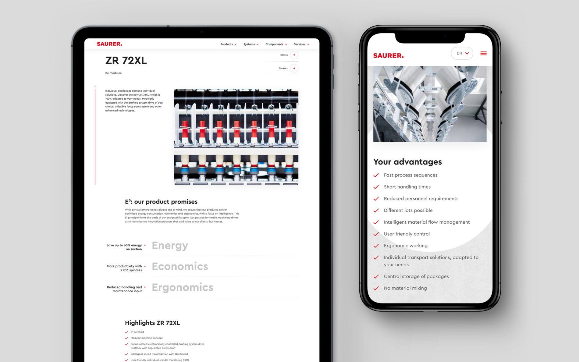
The result is a clear and powerful design that brings the brand to life across every single touchpoint — from print media to spatial experiences to digital.
Type Mates Metadesign Cera Pro Font Modification Saurer Technology Company 06
Type Mates Metadesign Cera Pro Font Modification Saurer Technology Company 07
Type Mates Metadesign Cera Pro Font Modification Saurer Technology Company 08
Type Mates Metadesign Cera Pro Font Modification Saurer Technology Company 09
Type Mates Metadesign Cera Pro Font Modification Saurer Technology Company 10
Type Mates Metadesign Cera Pro Font Modification Saurer Technology Company 11
Type Mates Metadesign Cera Pro Font Modification Saurer Technology Company 12

Further reading