Branding a Typeface
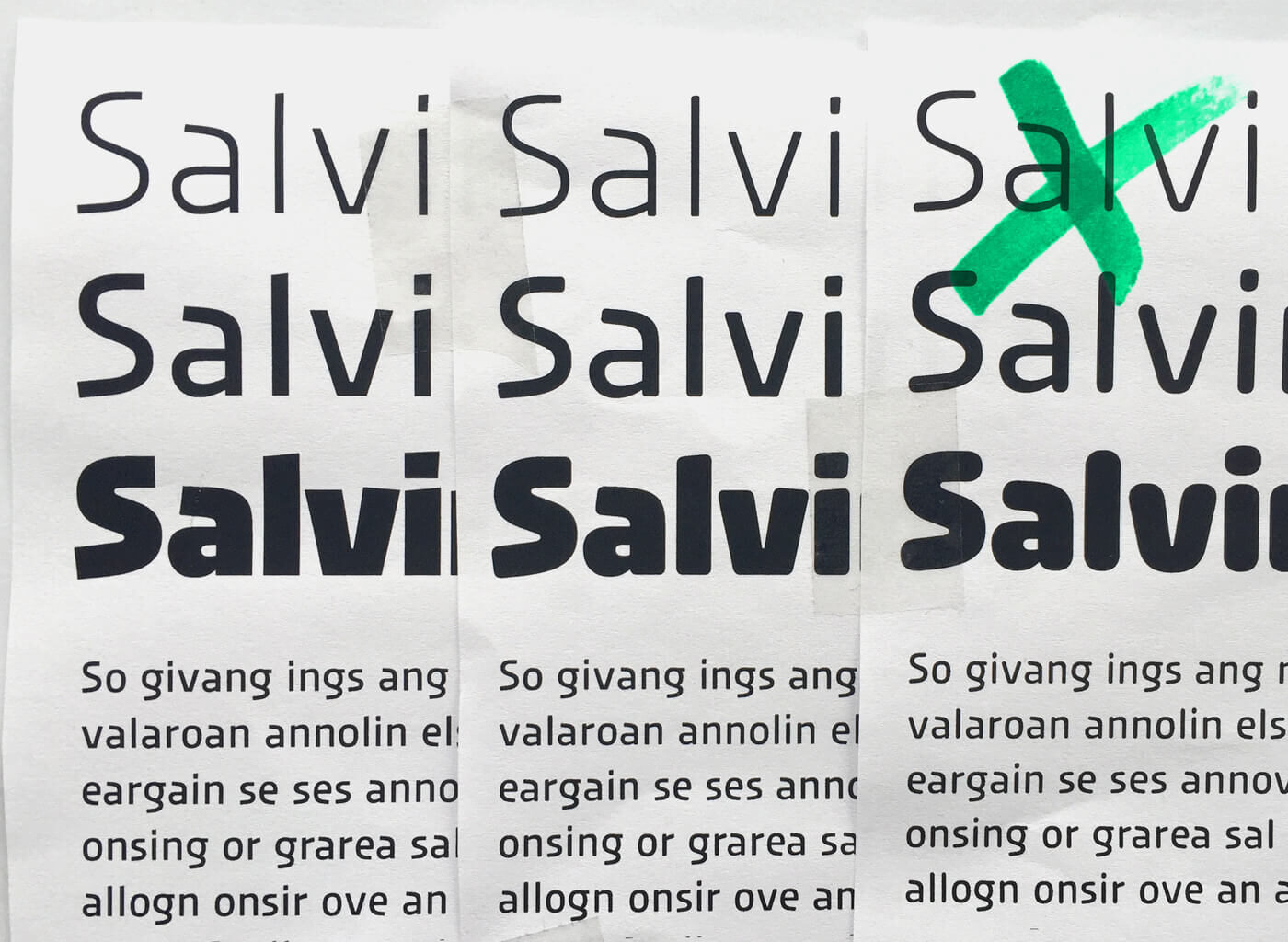
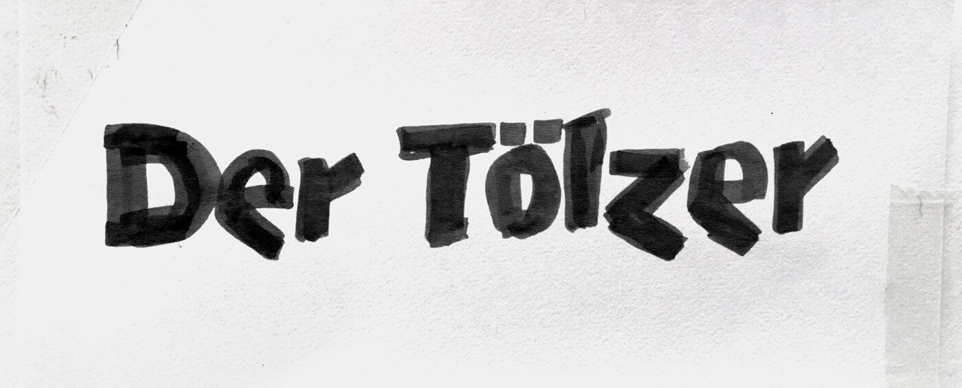
Urby began in 2014, when Jakob Runge was sketching letters with an organic, yet rational feel. From Spring 2015, he began to explore these shapes further. He developed them into an active and dynamic typeface with a certain tension between geometric and edgy features.
The typeface’s development was accompanied by adjectives like striking, distinctive, active, vibrant, angular and dynamic. Ideas for potential usages where placed in contexts like sports, energy, travelling or sustainability. In contrast to Jakob’s Cera Pro, which is based on pure geometry, or Nils Thomsen’s Pensum Pro, which is specifically designed for text, Urby was created to convey personality in every single glyph.
Urby was designed to give strong character to single glyphs and a boisterous and recognisable voice to text.
Exploring the Idea of Duplex
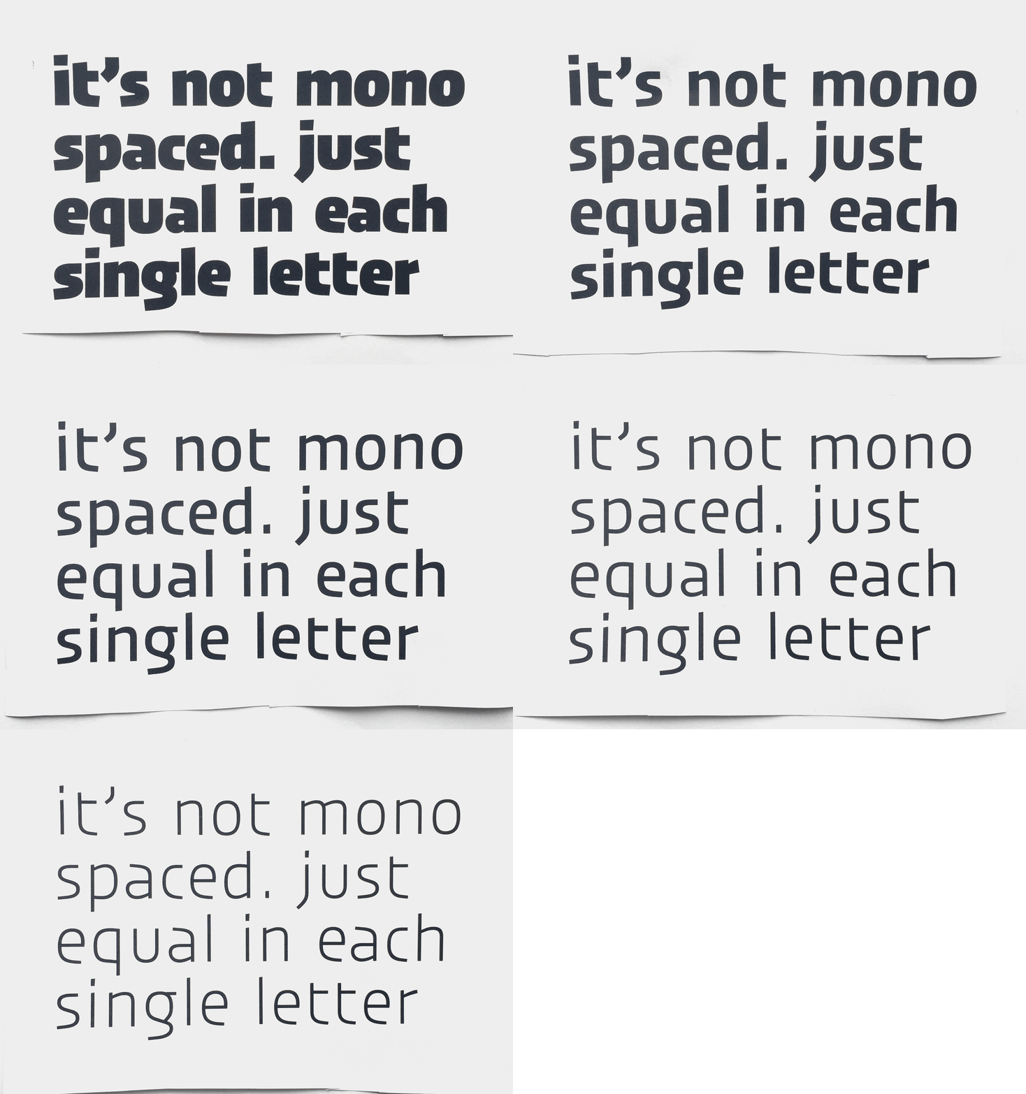
Identical character widths for tabular figures are nothing new, but for Jakob the idea of weights with equal widths was. Having different weights and styles sharing the identical character width, allows one to change the weight or style of text without having to worry about reordering of typography: a helpful feature in interface design.
Following the slogan “not mono, but duplex”, the letter i was the Gordian knot. The spacing of the black i had to be super tight to make it as compact as possible for the light, whereas the light i had to be as loose as possible to work with the black.
Having Fun with Details
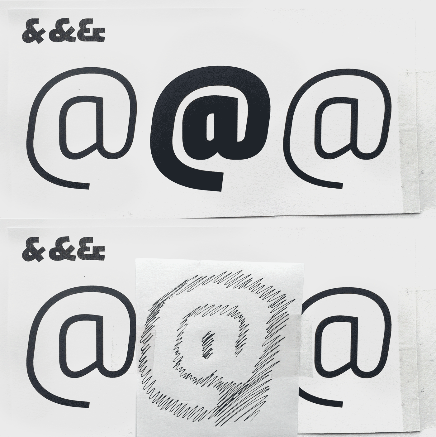
In theory, type design is about producing a beautiful group of letters, not a group of beautiful letters. But Urby is reckless and celebrates the curves of each letter to create striking character. The @ sign in particular shows Urby’s constant tension between outer and inner shapes. Working with this tension was fun as it amplifies one aspect of type design: designing black shapes by tweaking white counter shapes.
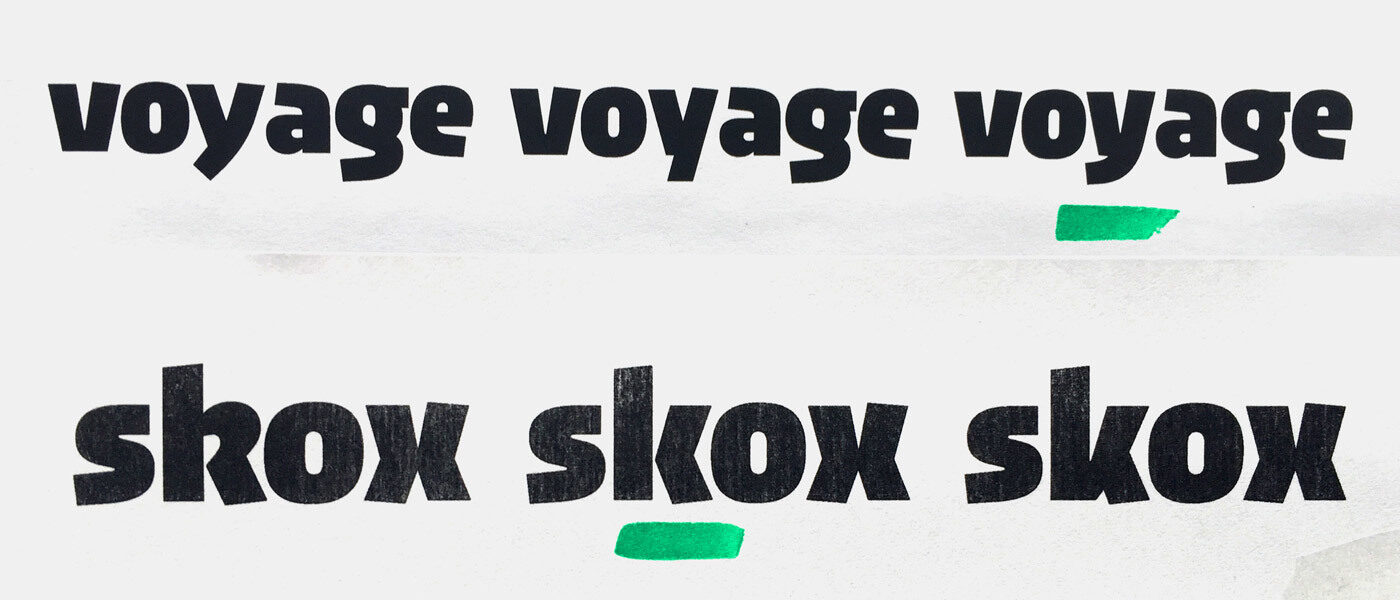
Other letters, like the lowercase k, took some time to become a characterful letter that also works with the others — beautiful group of letters, here we are again. In the final design there are some shapes that are extra quirky. Characters like the black’s y, marked by Jakob’s personal taste, are a little eccentric while strengthening the typeface’s visual identity.
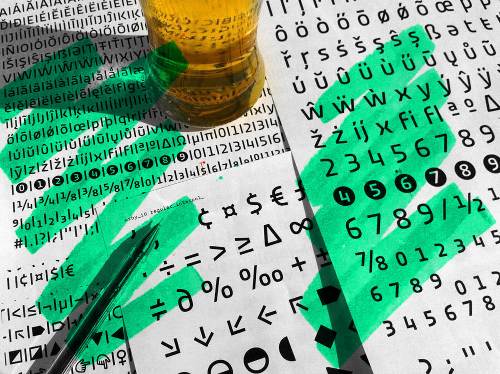
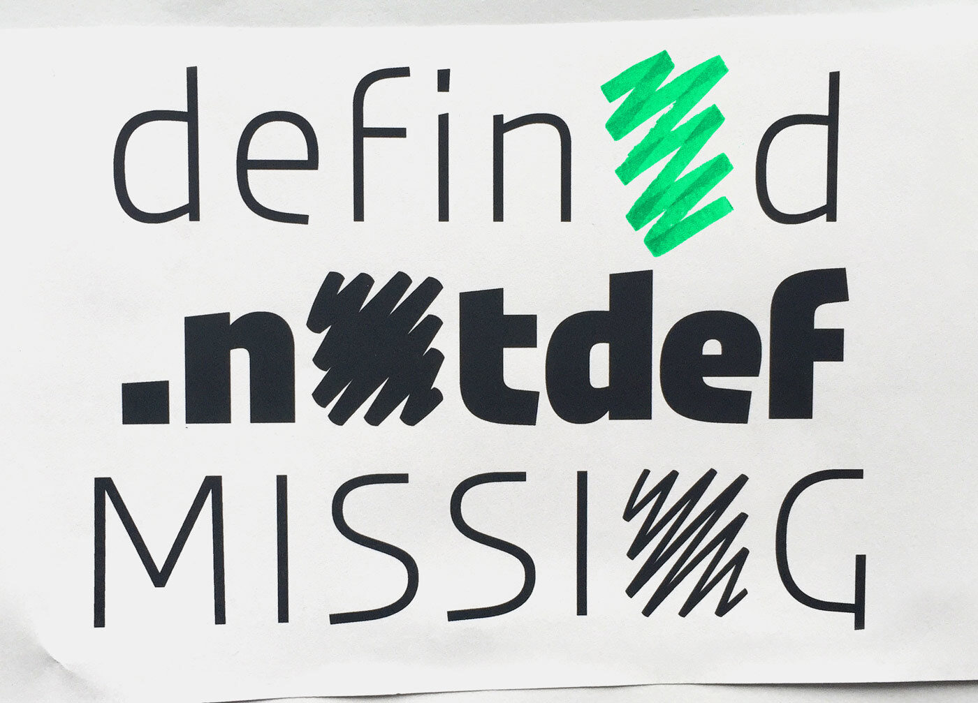
Even more letter love can be found in the “.notdef” glyph: just because it’s an automatic replacement for a missing glyph, it doesn’t mean that we can’t make it special, especially in this typeface.
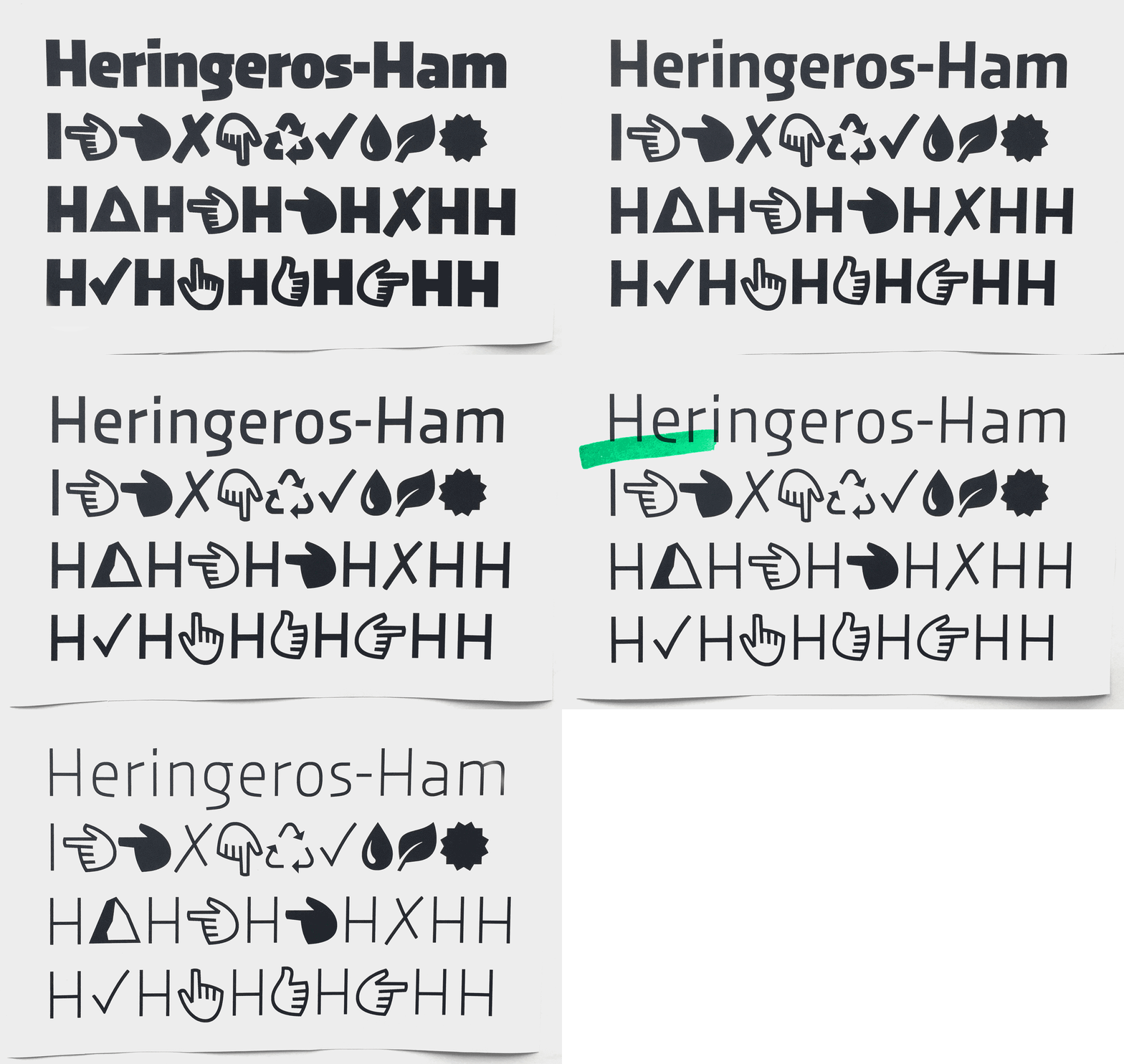
Urby is supplemented with useful dingbats and extra characters. Initially, Jakob thought about adding extra icons for different topics like wayfinding or sports, similar to Nils’ Jabana. Eventually, he decided to concentrate on letters and only add some handy symbols.
Adding the Soft
After supplementing Urby with a full set of handy dingbats and extra characters, Jakob wanted to go further.
When finalising, kerning and tweaking Urby in 2015, Jakob had the idea of producing a rounded version. A more soft, even fully-rounded relative, that would work well in the world of urban fitness, athletes and self-optimisation. As we wanted to publish Urby exclusively on TypeMates.com and the website was still under development, Jakob had just enough time to get to work. Whilst experimenting, he realised that rounding Urby meant, it lost some of its edgy charm. By rounding it just enough, he managed to find a balance between Urby’s gruffness and playful elasticity.
That’s it! A story of a typeface collection that’s more interested in having a strong identity, than excel in conventional typographic refinement.
