Ábrahám Borműhely '22 Wines
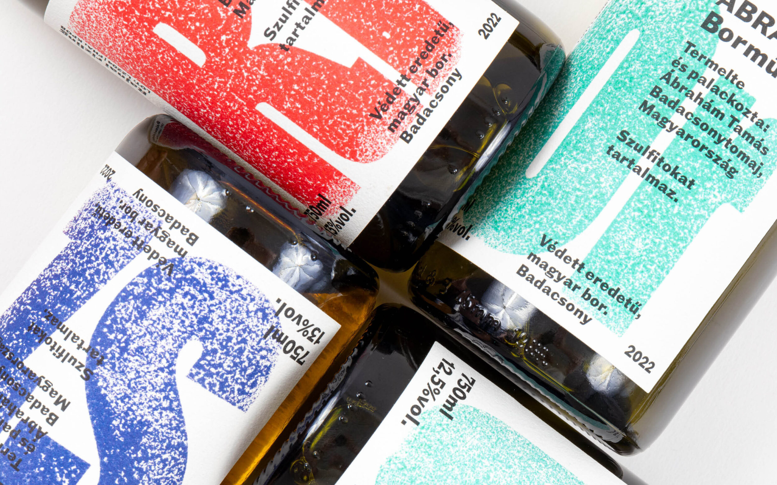
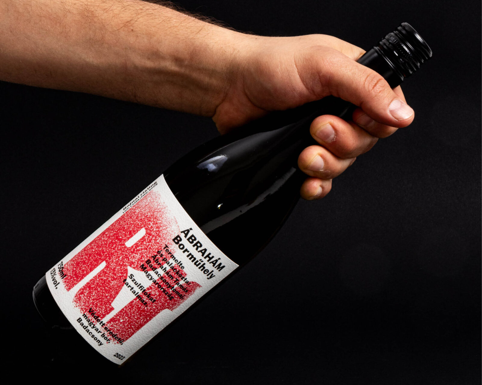
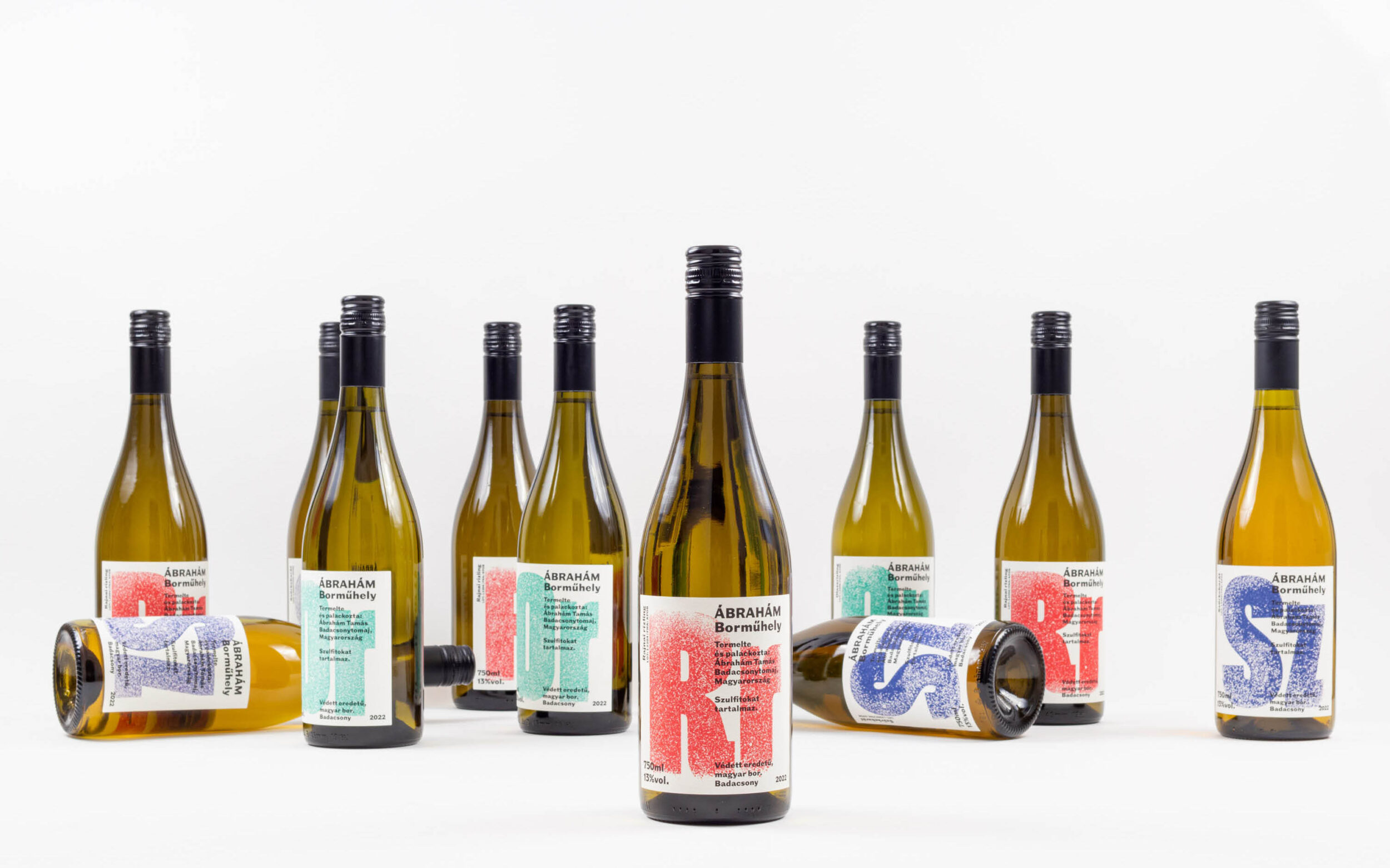
When designing labels for a small Hungarian winery, Ákos Polgárdi (Submachine) used Norbert Schmal, a font inspired by early hot metal type, as the defining visual element. The labels were created using analogue printing techniques.
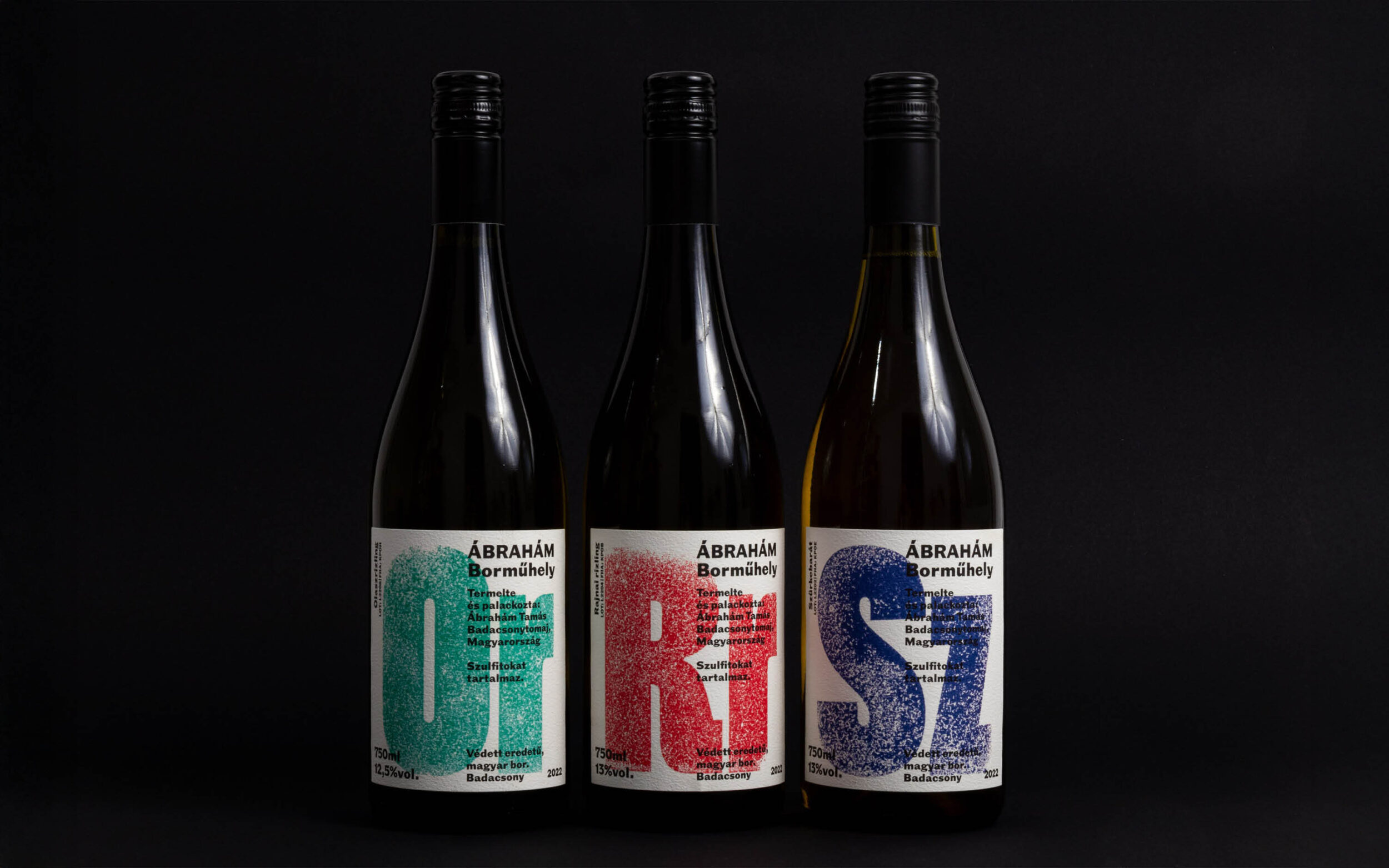
Norbert Schmal Fett is a sans serif typeface designed by Philipp Neumeyer. Drawing inspiration from early hot metal type families, it features bold, condensed forms that combine craftsmanship and precision with analogue vitality, resulting in a very distinctive aesthetic.
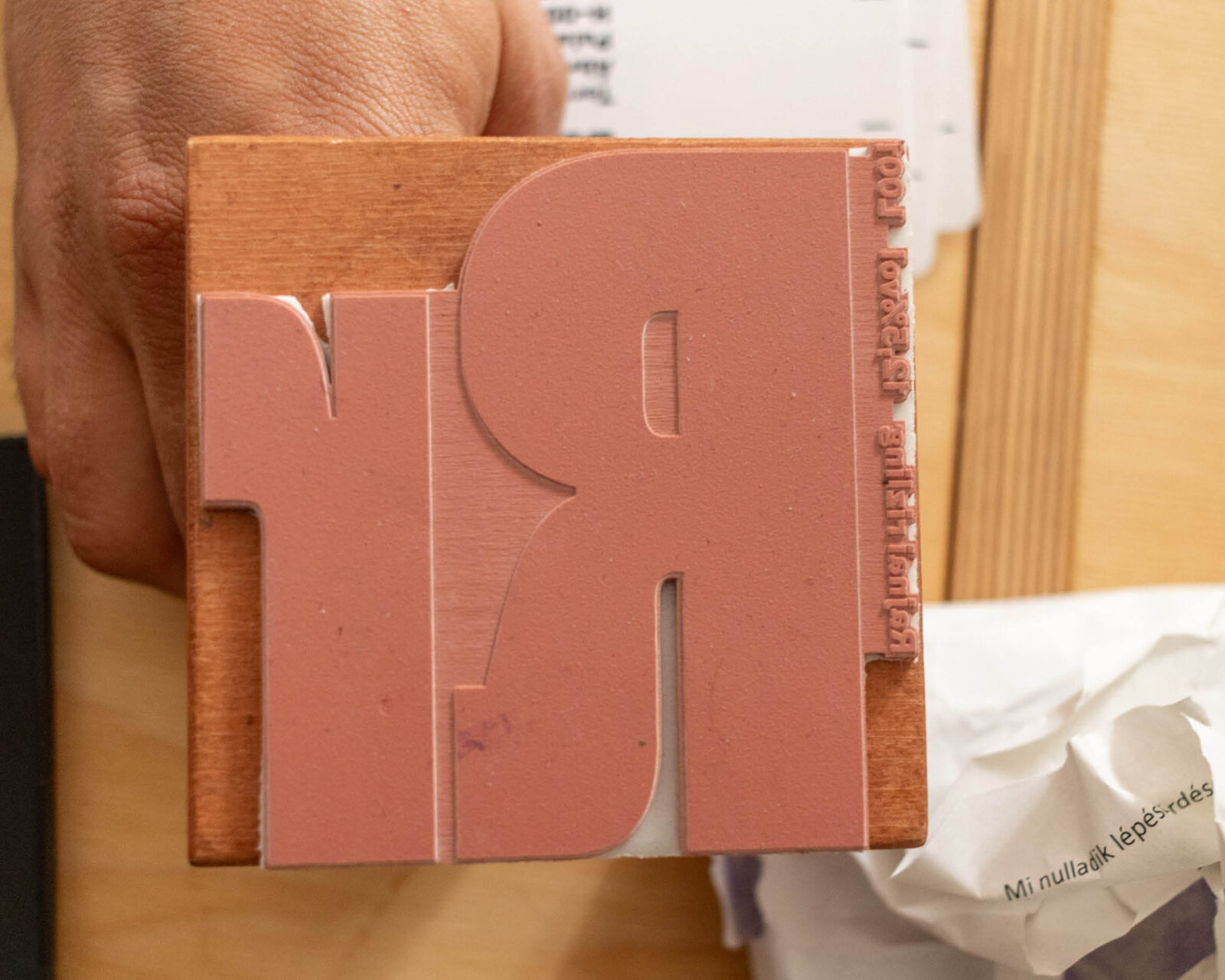
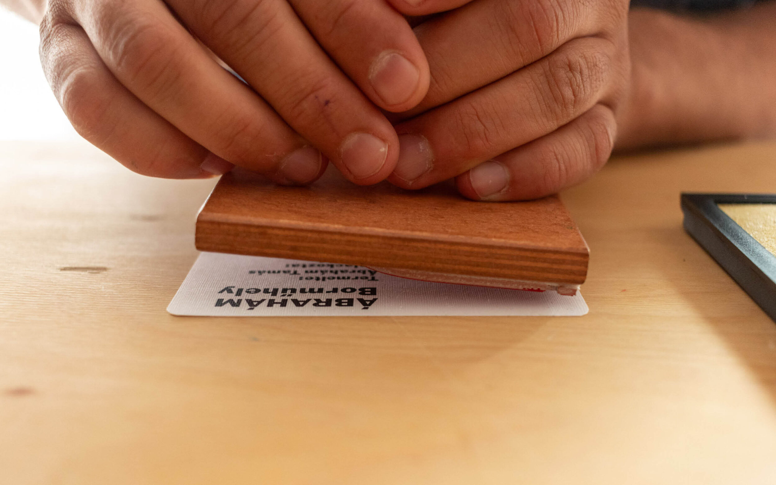
Through analogue printing techniques, these letterforms acquire a visible, tactile texture on the labels. The typography transforms into a graphic element that defines the image and establishes a strong visual identity for the winery.
This approach mirrors the character of the wines perfectly: they are authentic, handcrafted and full of personality.
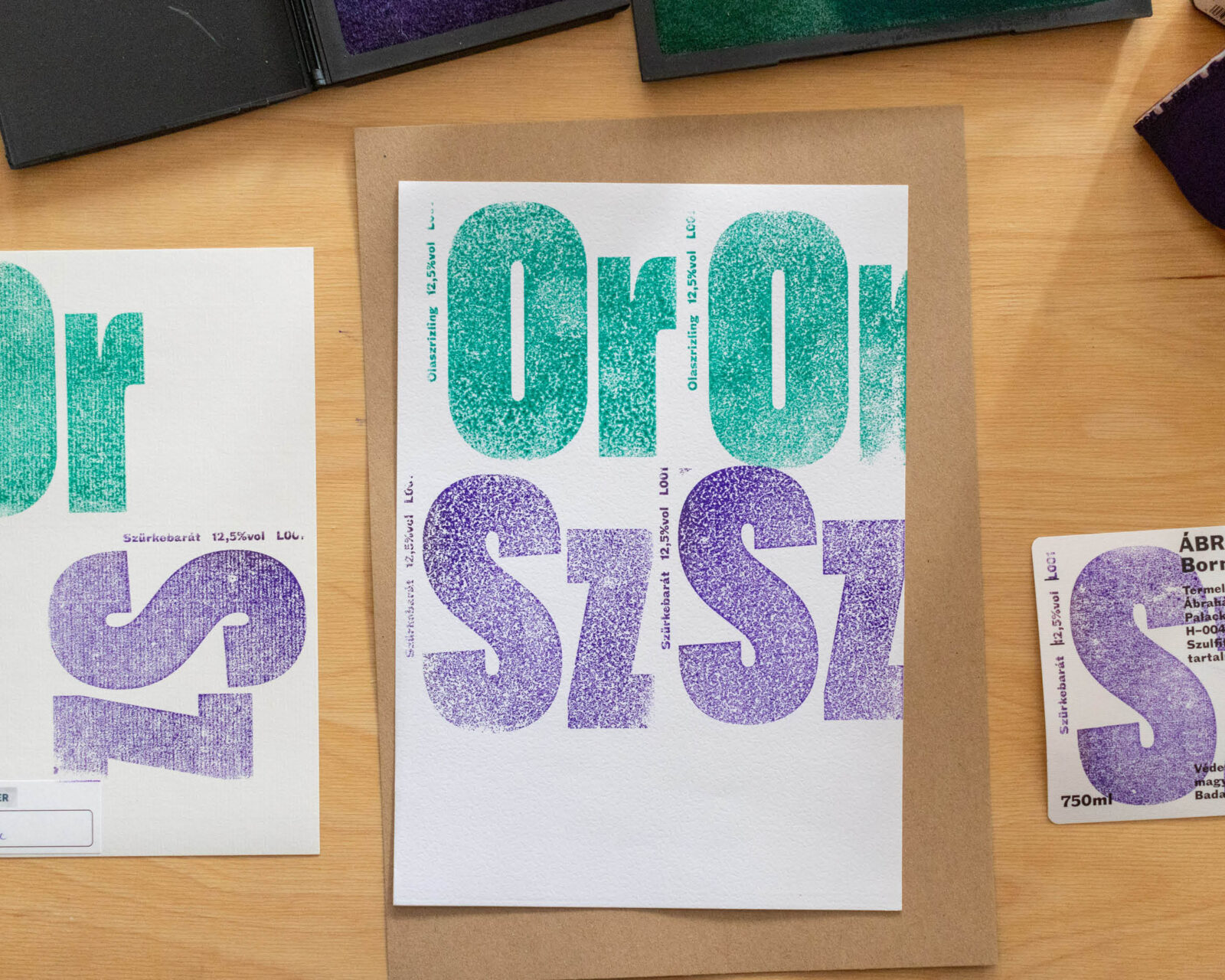
Thanks to Submachine for the images.