Tomaticon Catalogue
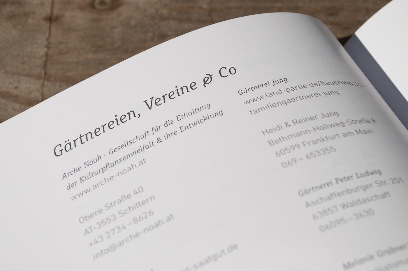
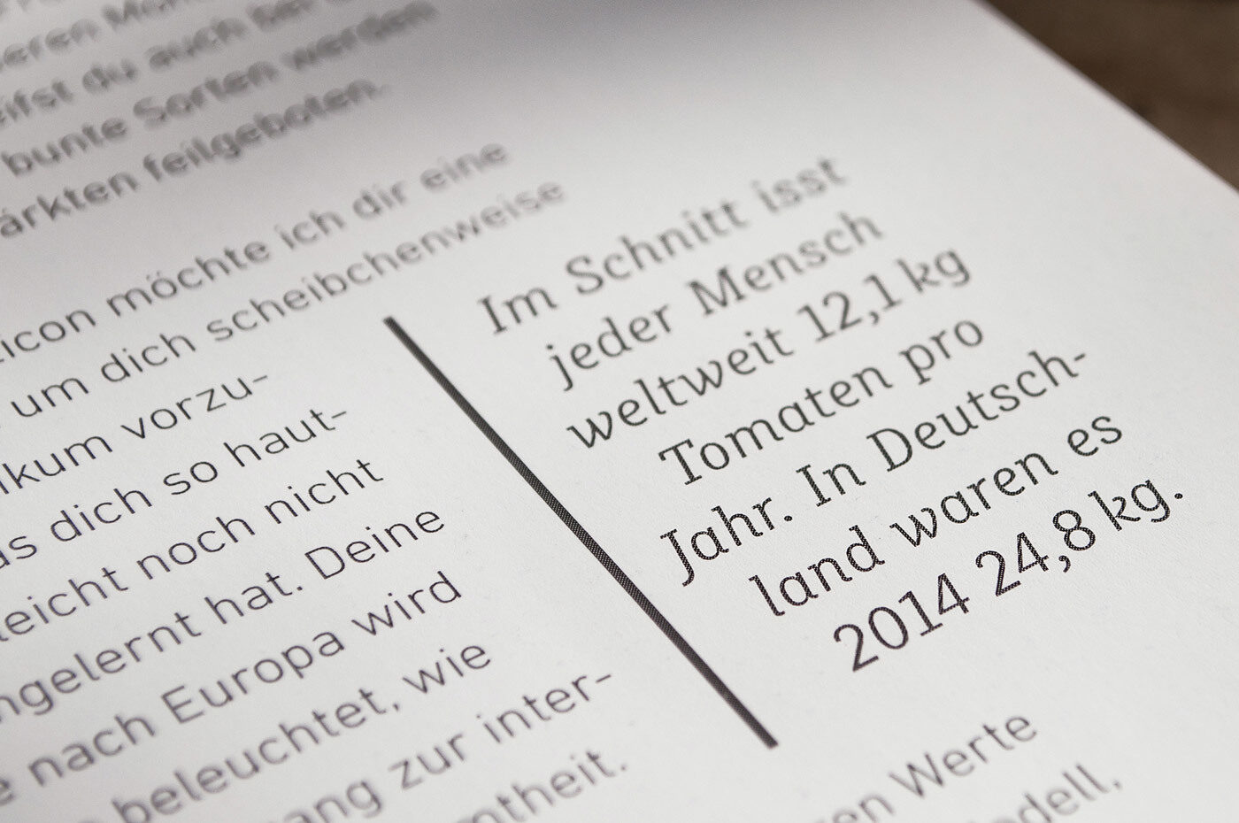
A compendium on the tomato’s biodiversity uses the lively cursive of Muriza in combination with its original inspiration, the DIN font.
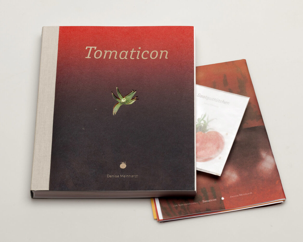

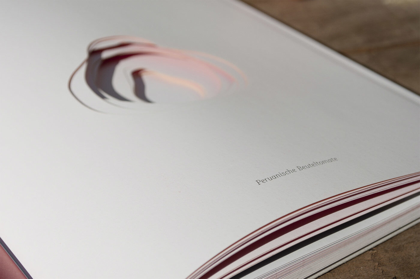
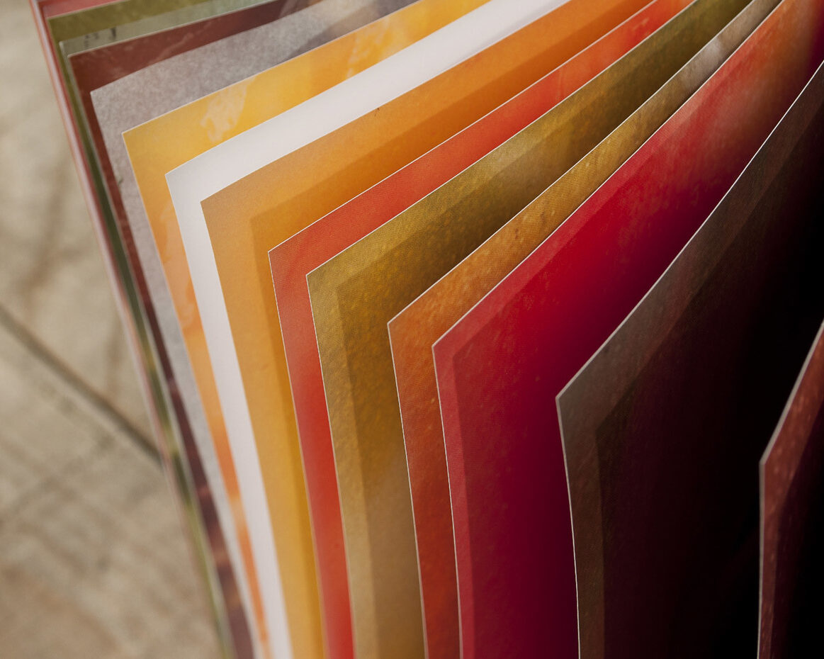
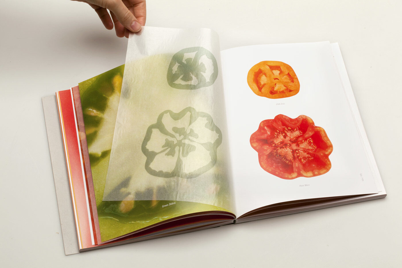
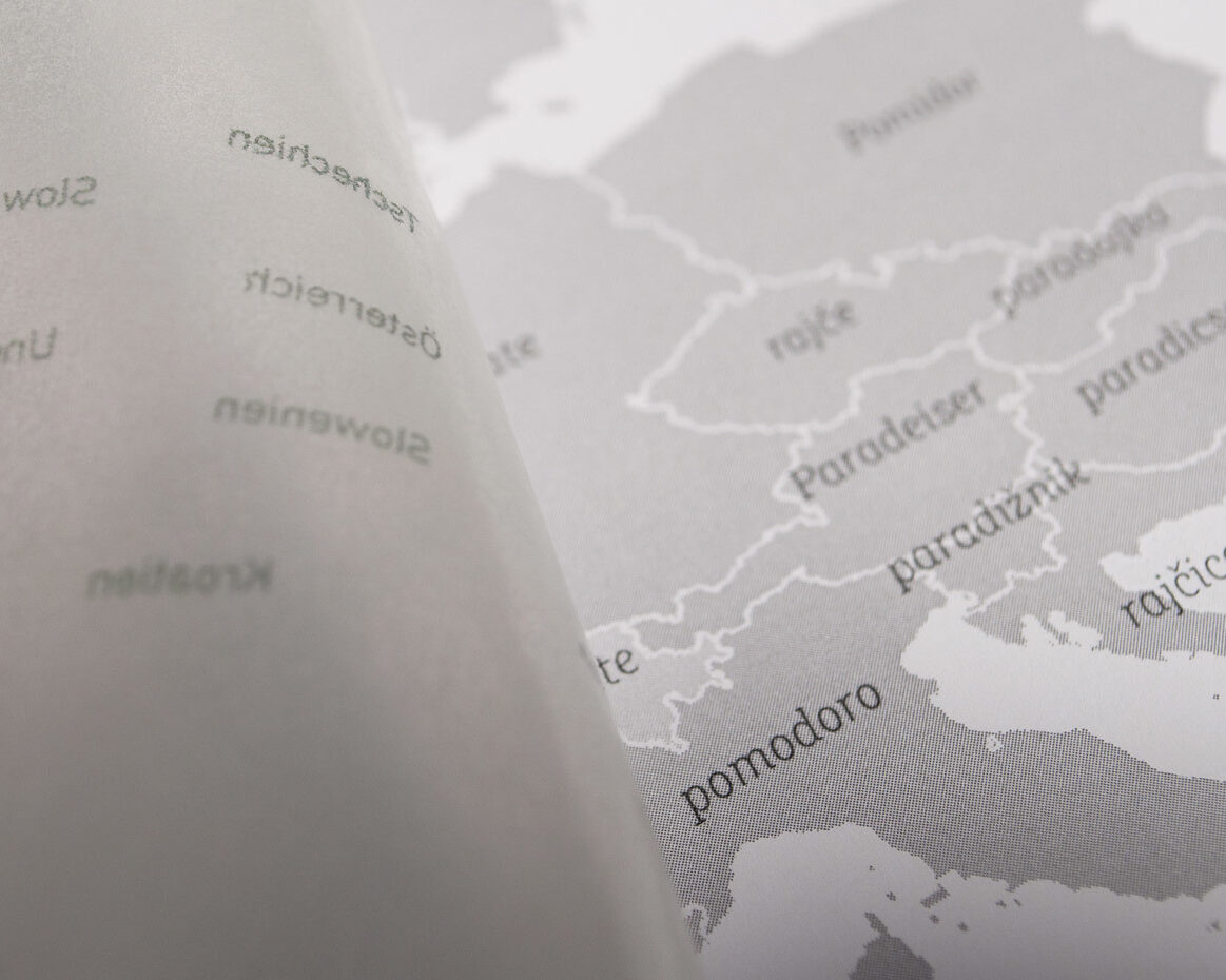
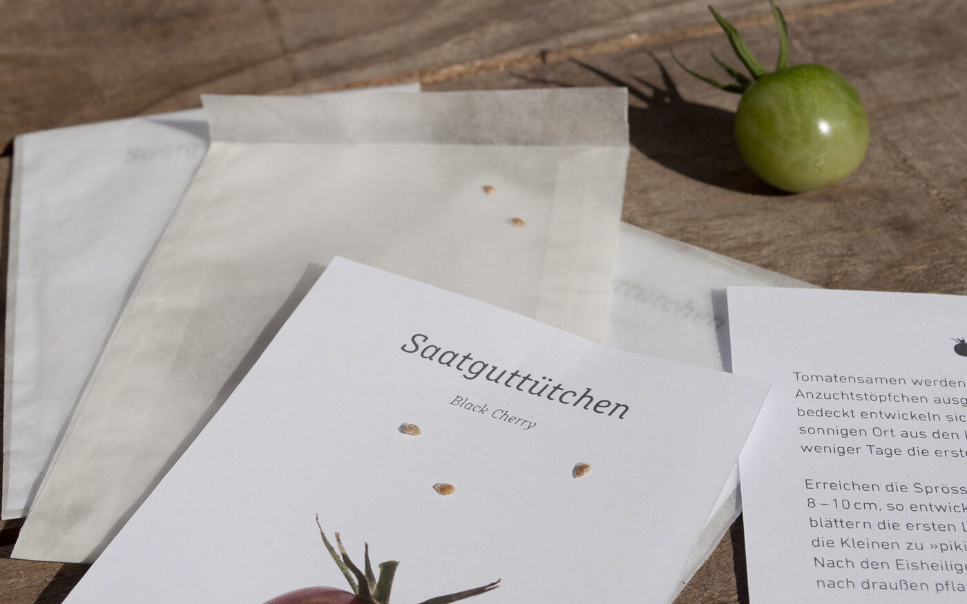
Denise Meinhardt's diploma thesis at the Darmstadt University of Applied Sciences dissolves the common cliché of a round, red vegetable and takes a look at the tomato’s biodiversity. The catalogue itself also comes with a sustainable spirit: it’s printed on wood-free FSC paper with food-certified ink. Further, the envelope can be composted and contains enough seed to grow a new tomato.
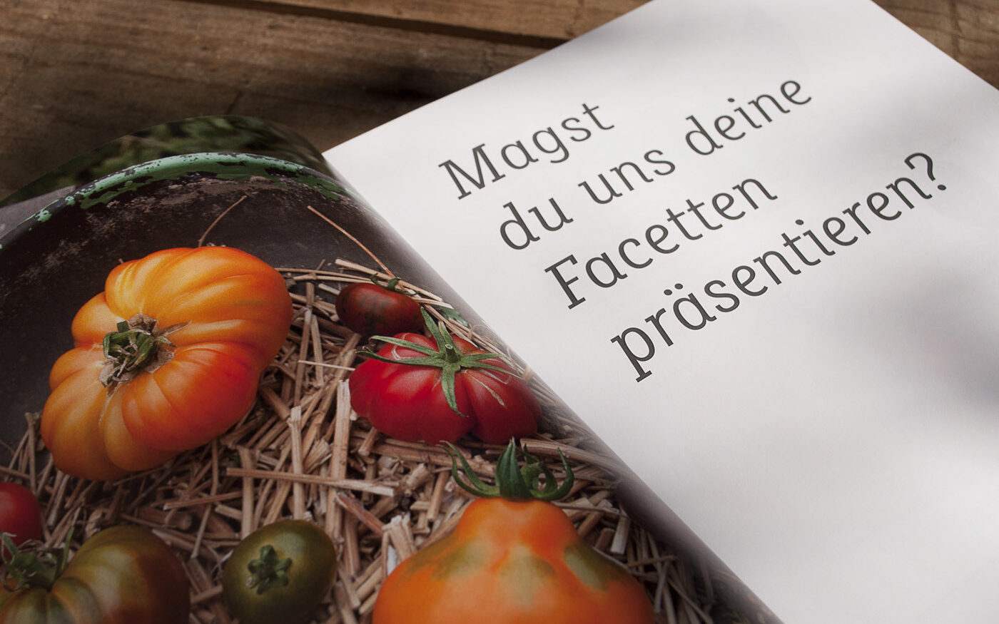
In the typographic canon, both the engineered DIN and the slab Muriza are based on a geometric idea and underline the informative part of the Tomaticon. Both fonts provide calmness and clarity through their monolinear stokes. The slab serif Muriza contrasts the static DIN with energetic italics and is used in titles, headlines and interview questions.
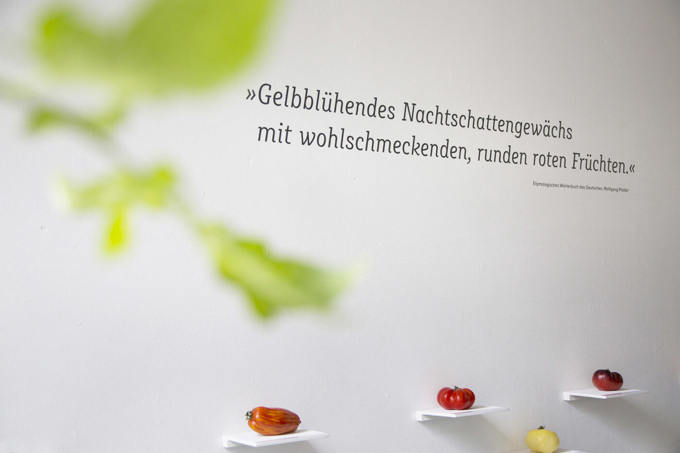
Image by Sandra Schildwächter.
I'm especially attracted to lower case k. For me, the Italics reflect the organic growth of the tomato.
— Denise Meinhardt
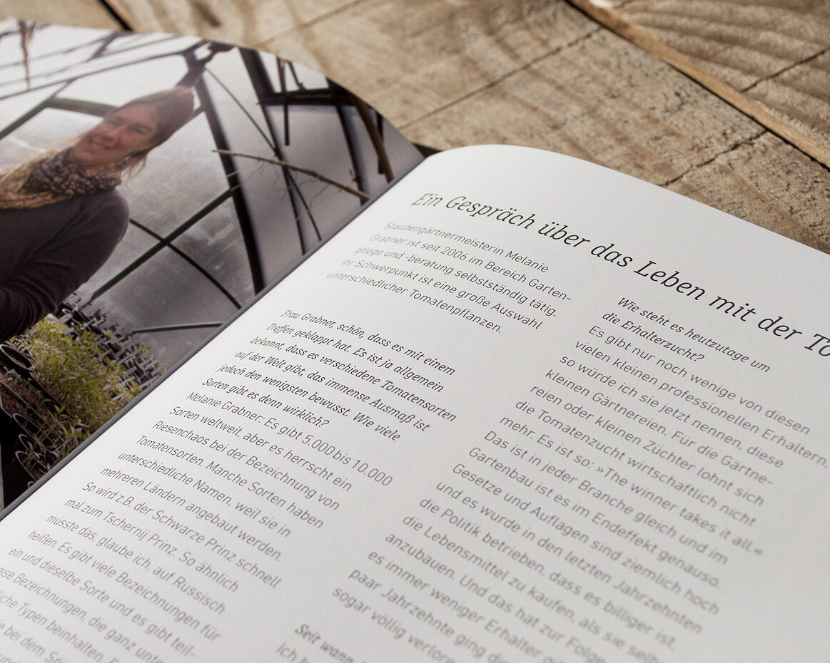
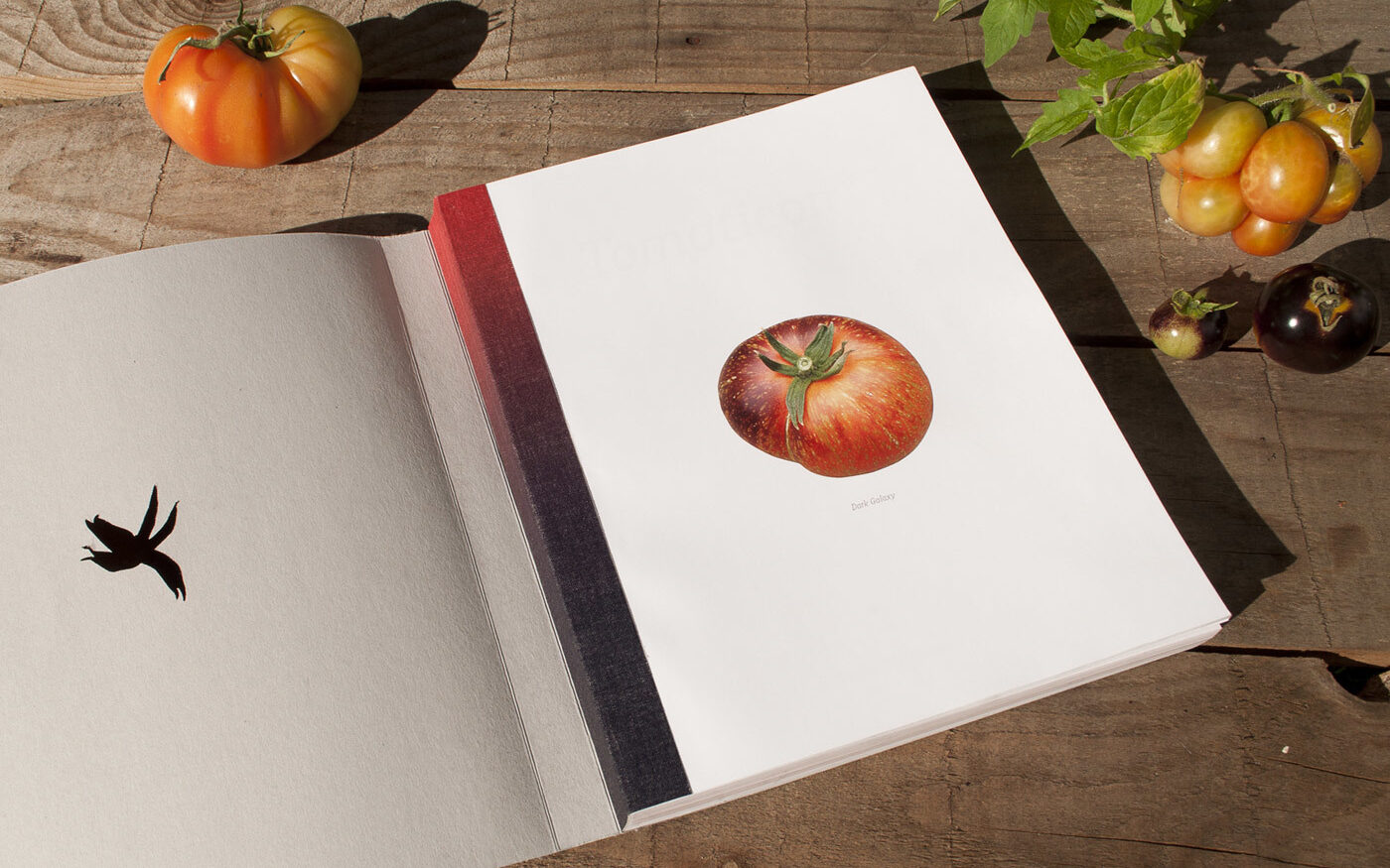
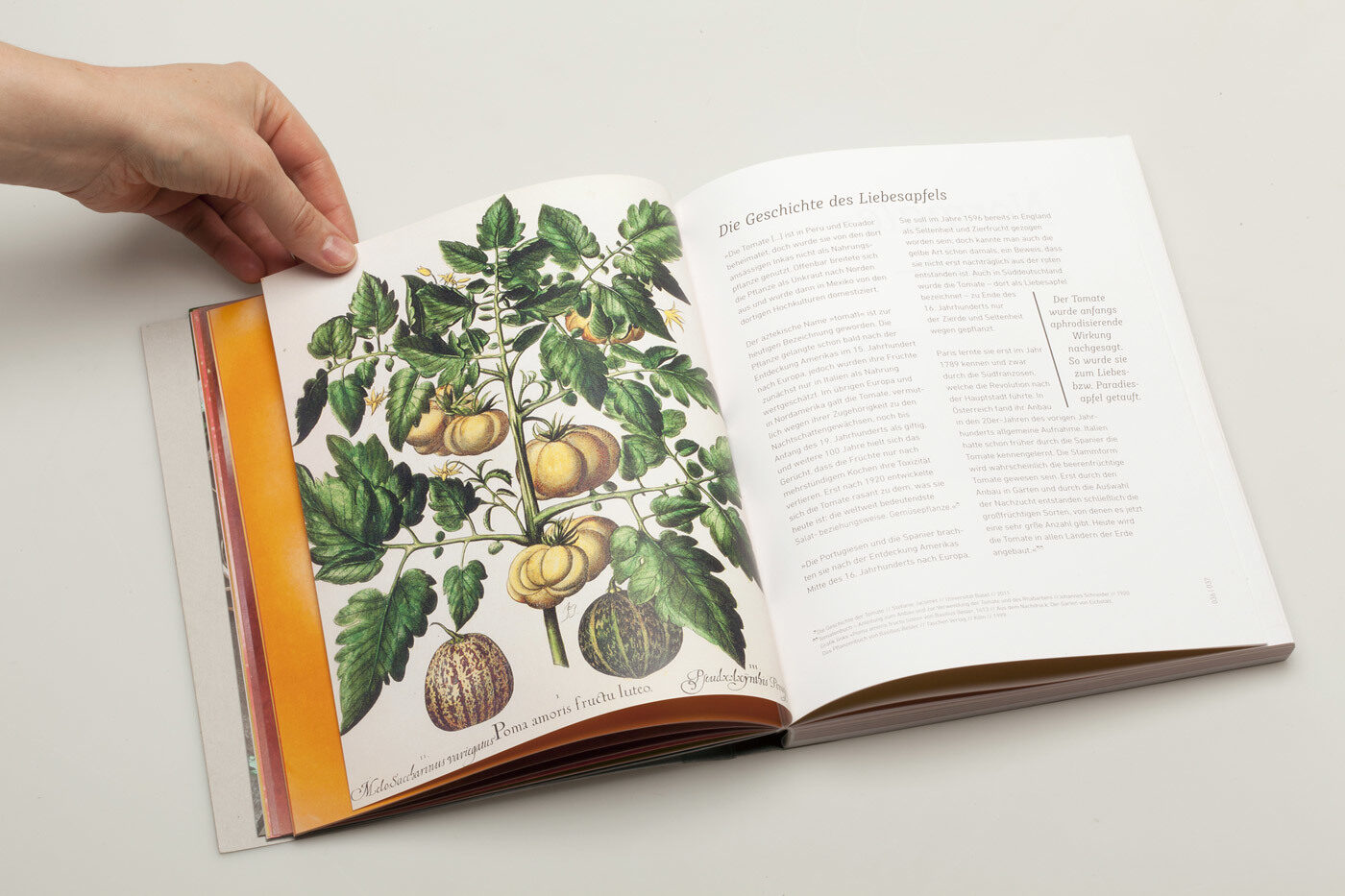
All images by courtesy of Denise Meinhardt.
Header Image by Sandra Schildwächter.
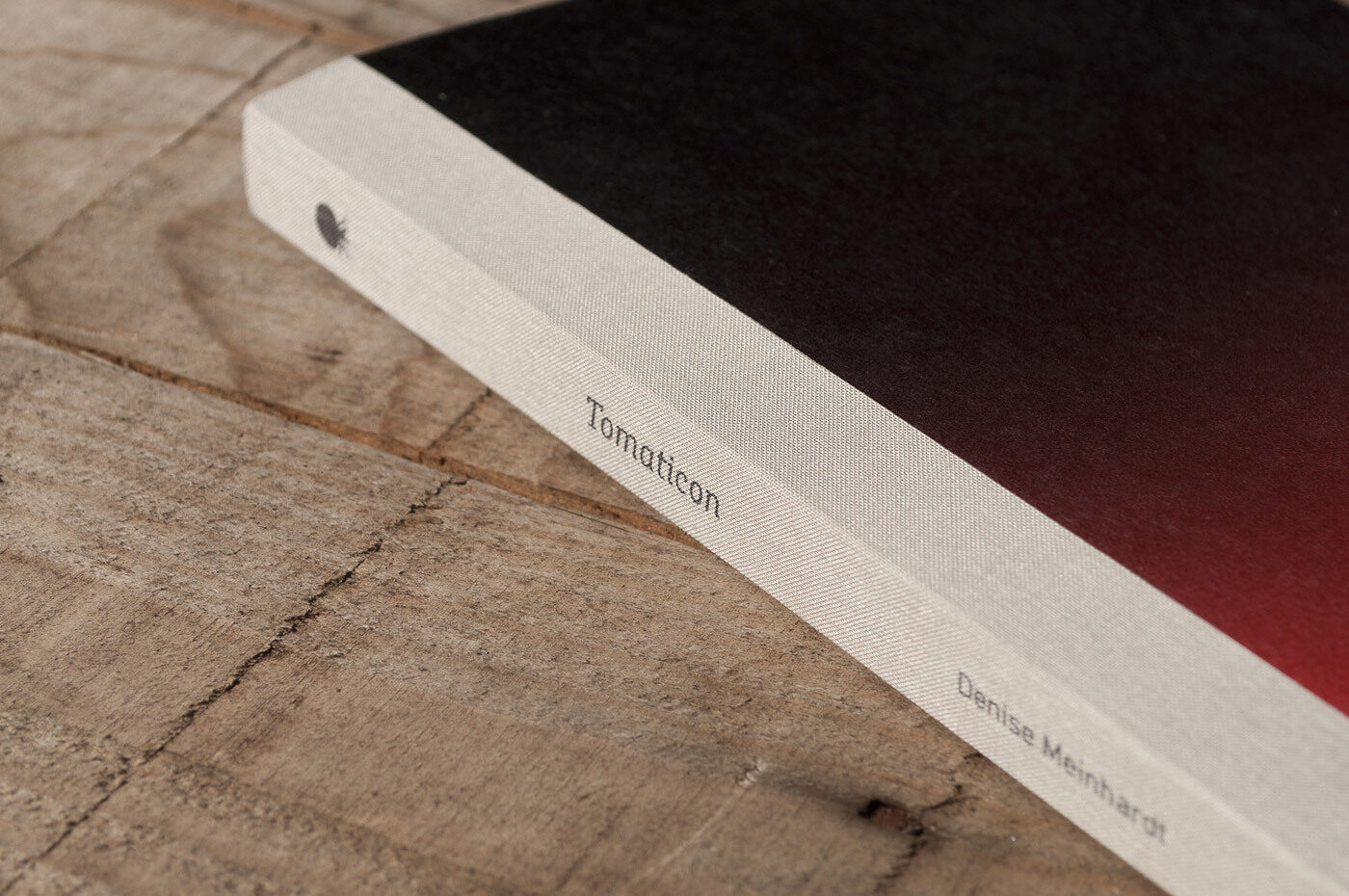
All images by courtesy of Denise Meinhardt.