The Future of Typography: Magazine Series
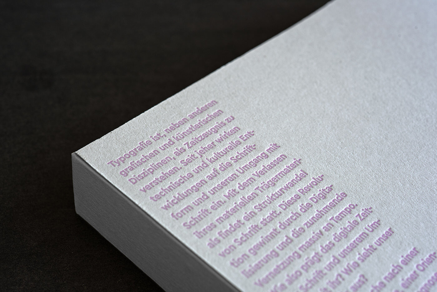
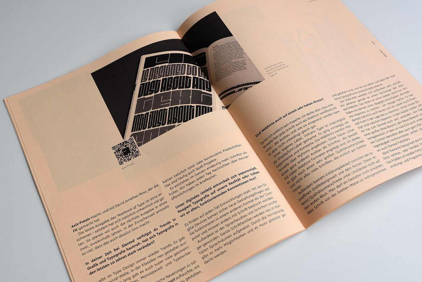
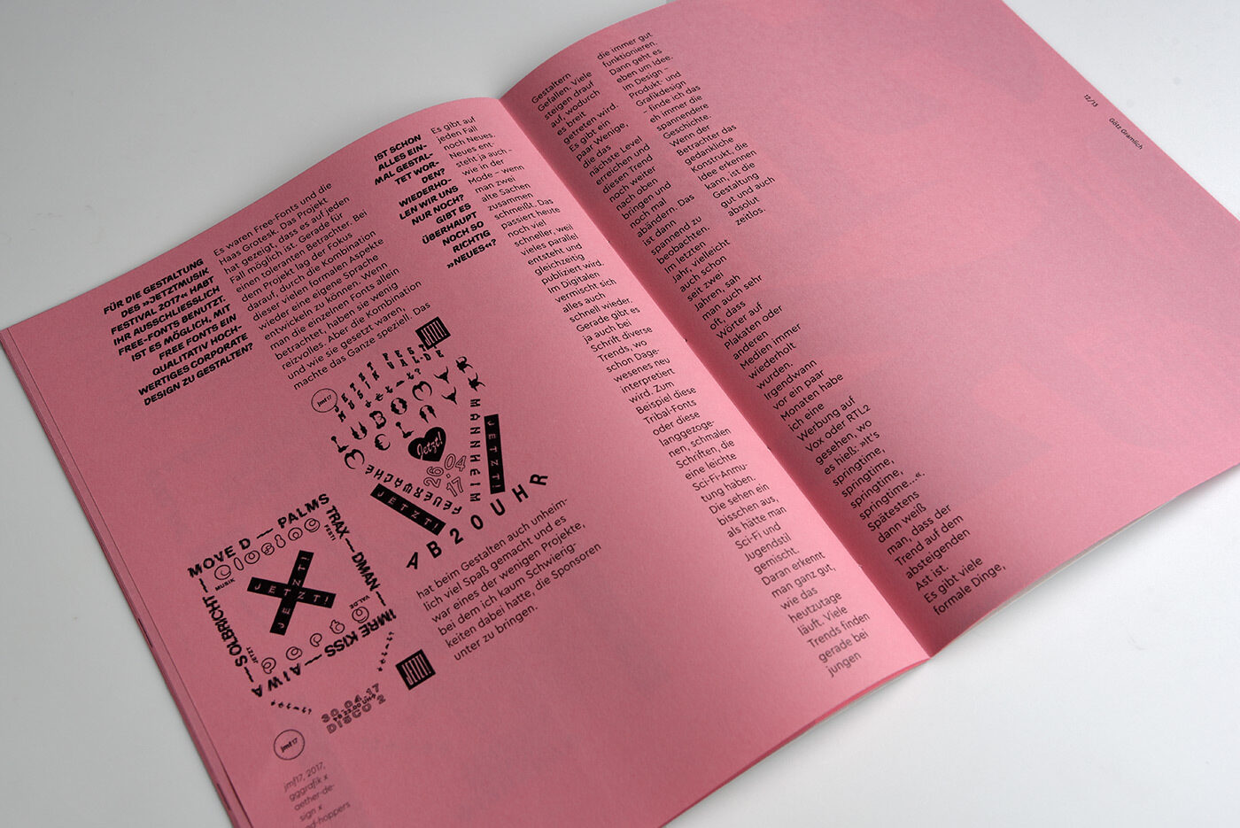
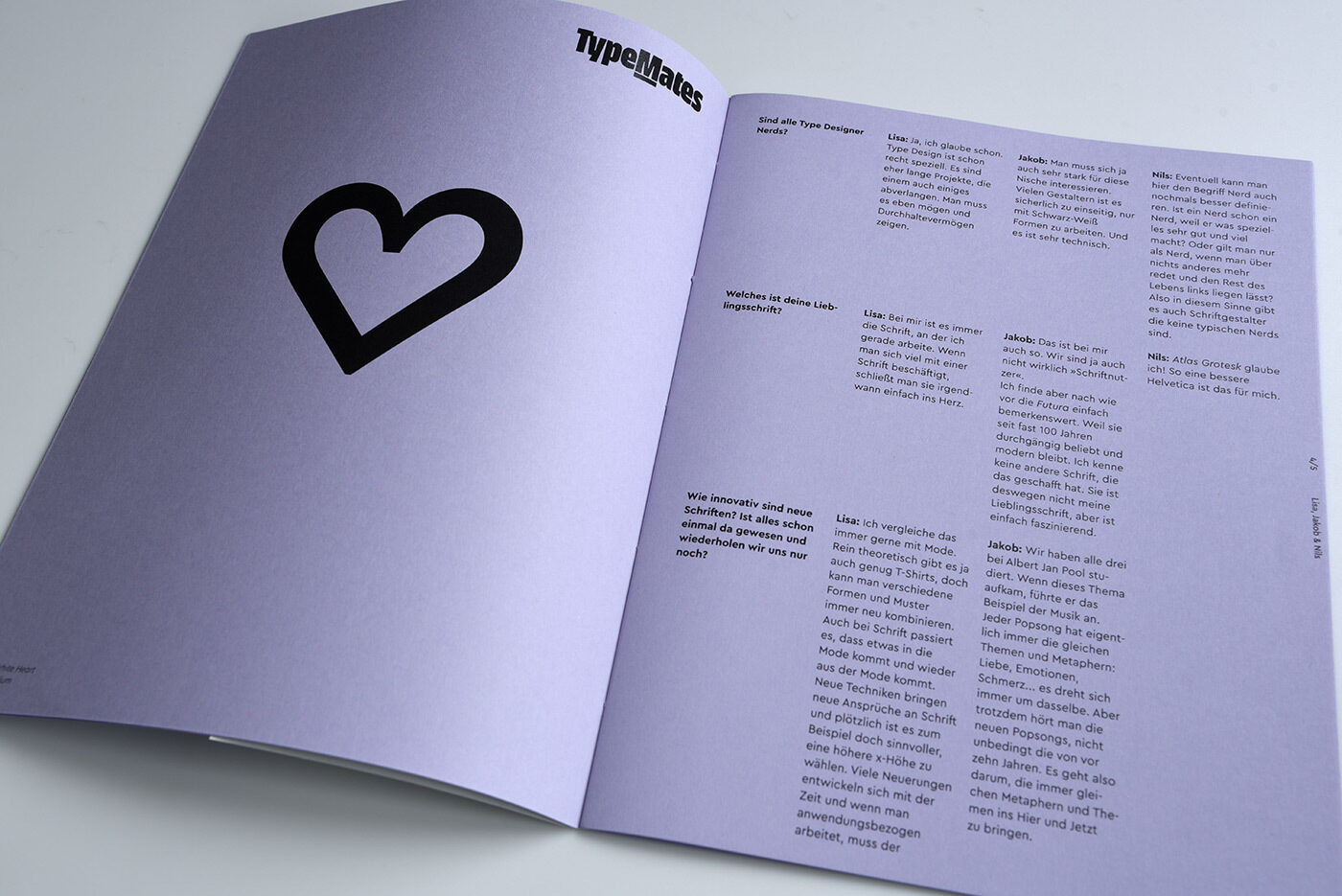
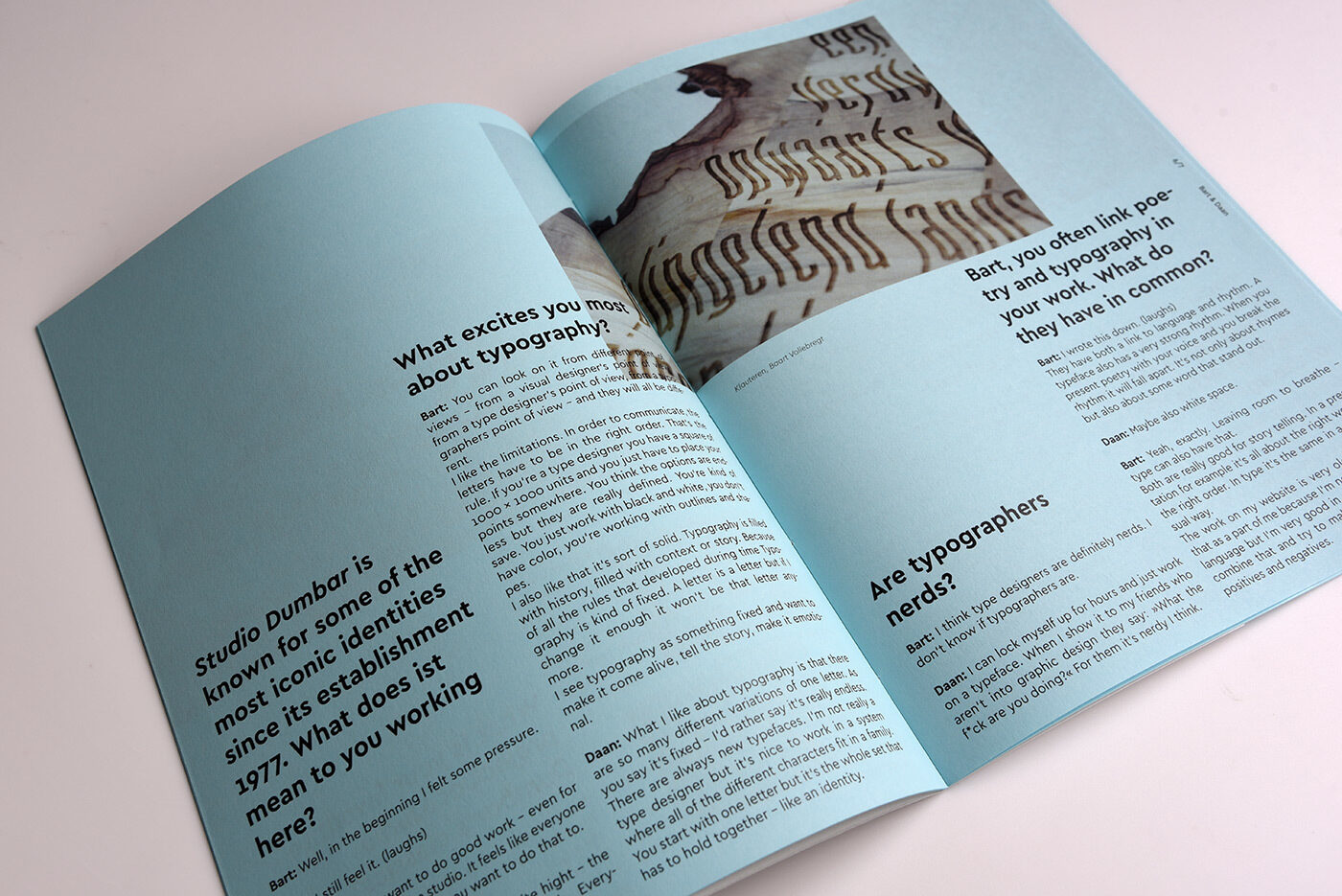
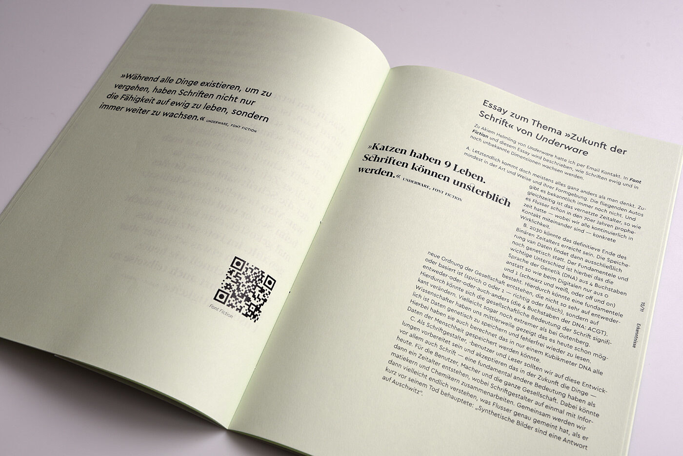
A more space saving Cera Pro serves for a layout with narrow columns in Josephine Becker’s magazine series on how typography has changed as a result of digitalisation. Width variations of the Cera Universe are used here, even before Adobe InDesign was supporting Variable Fonts.
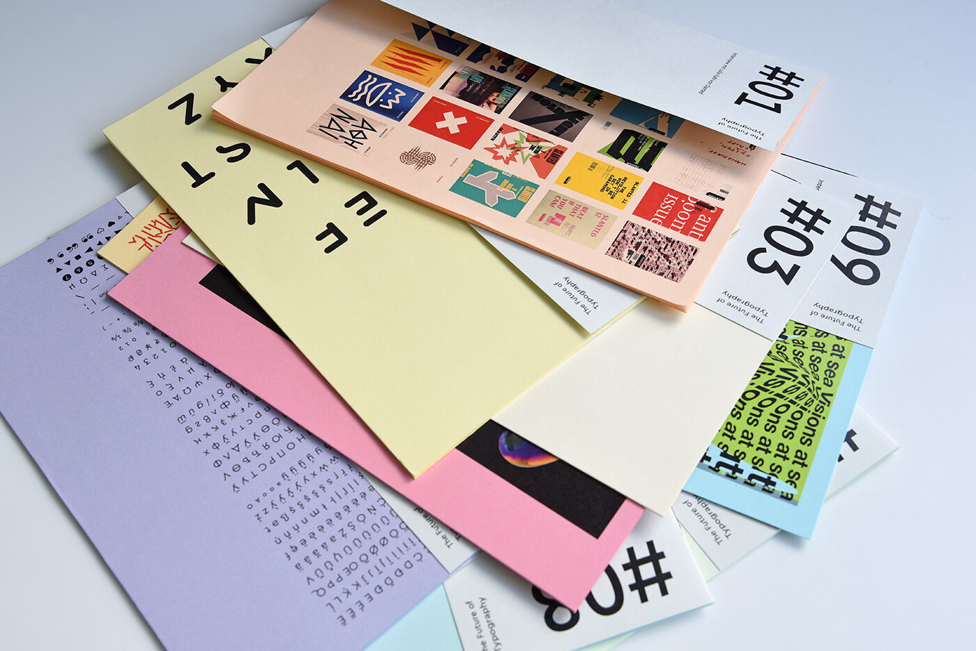
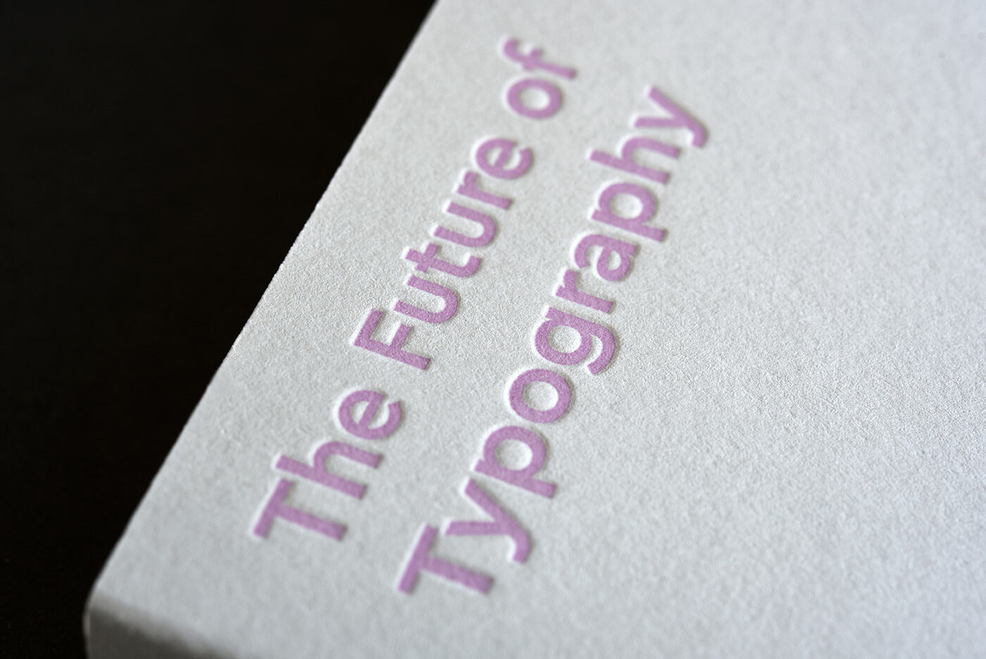
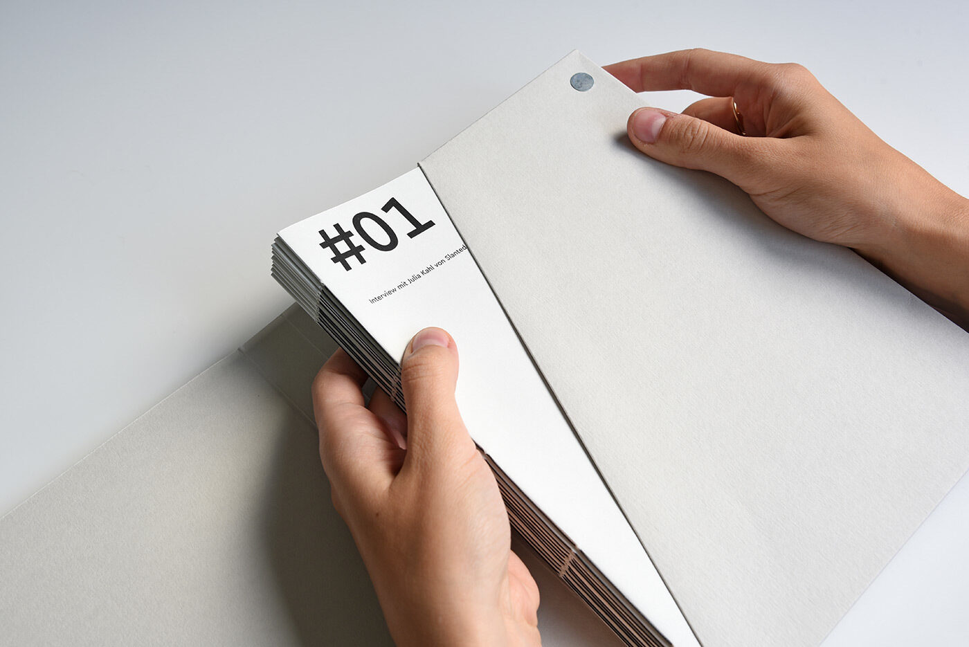
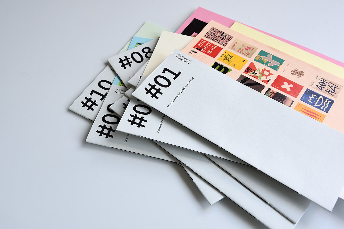
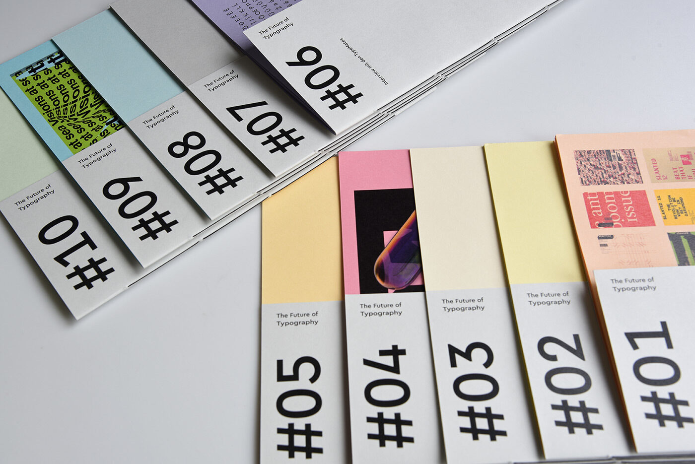
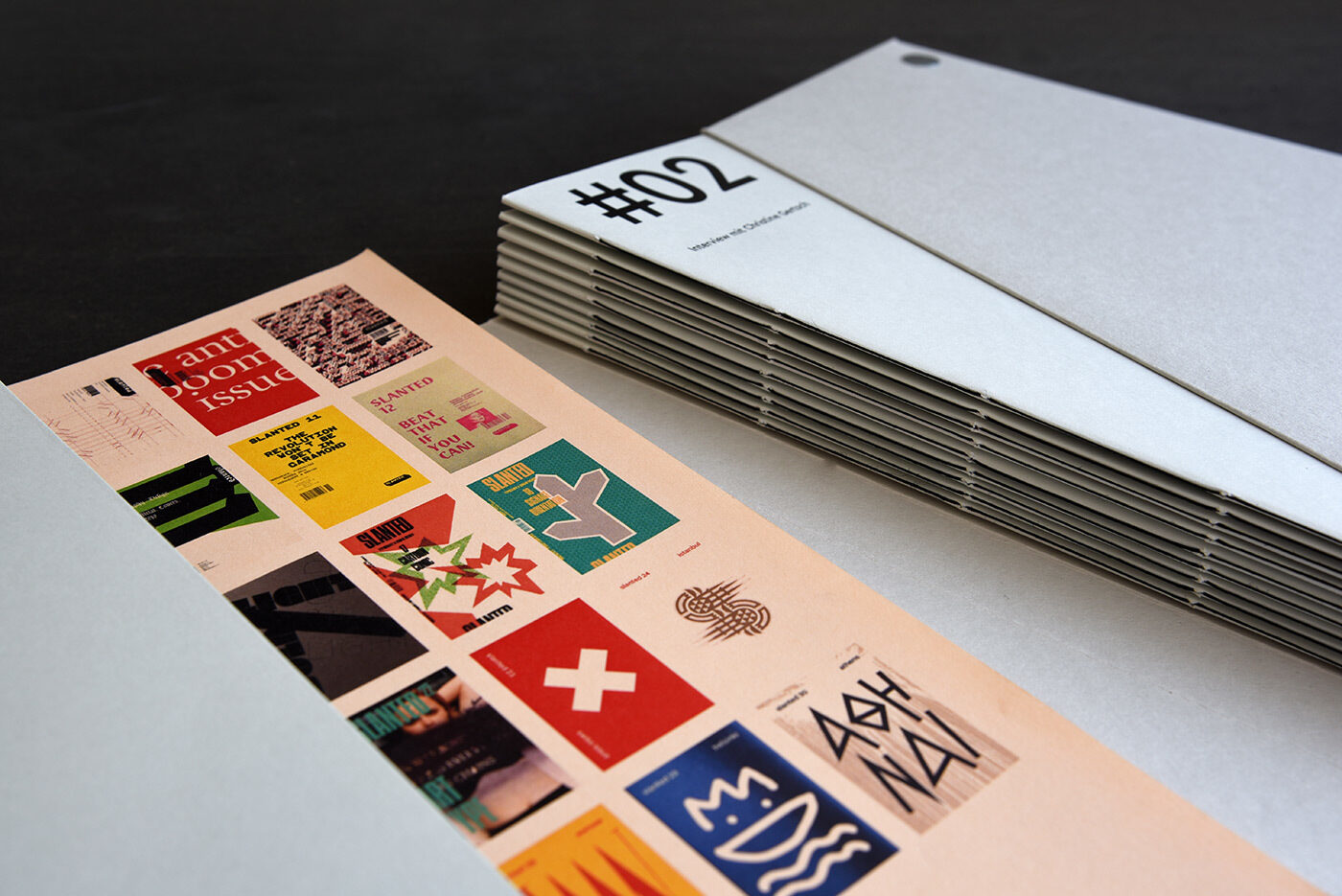
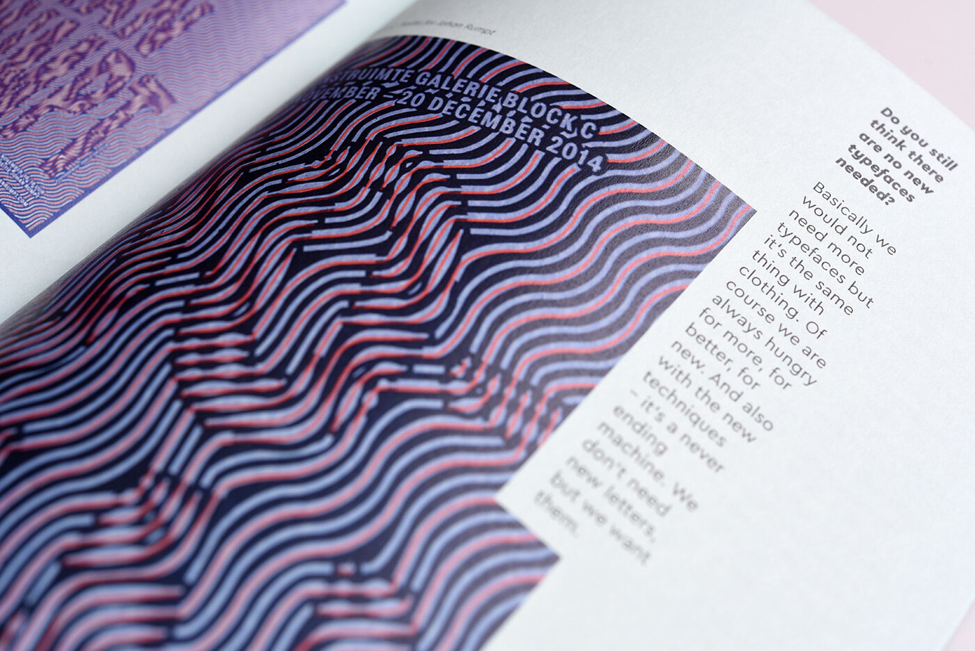
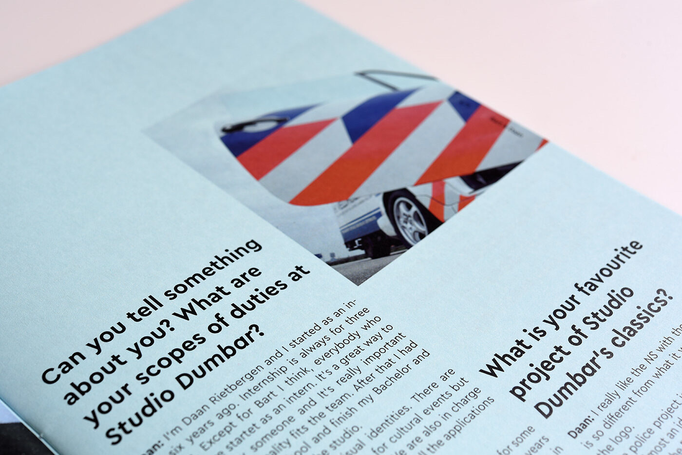
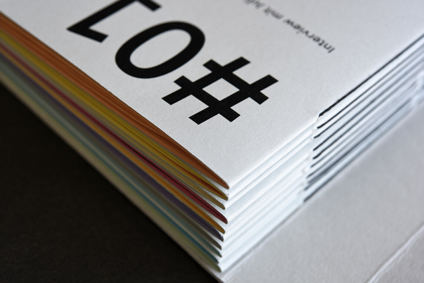
“The Future of Typography” is a magazine series that presents nine interviews with designers and draws a conclusion in the tenth issue. In her bachelor thesis in Communication Design at Folkwang University of Arts, Essen (Germany), designer Josephine Becker researched how our handling of typography and writing has changed as a result of digitalisation. Her interview partners include Niklaus Troxler, Julia Kahl from Slanted, Grilli Type, Studio Dumbar, Hansje van Halem and Götz Gramlich.
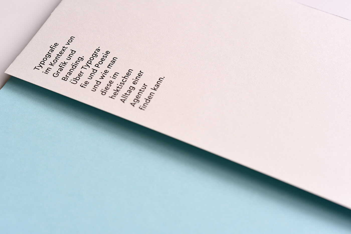
The main typeface is Cera Pro in a customised version. Being Interview partners as well, we interpolated Cera to create a weight named “Ticken Schmaler” (“A nudge more condensed”), situated between Cera with its circular o, and the more compact Cera Condensed. The outcome is a space saving typeface for Josephine’s layout, that has narrow columns and benefits of Ceras width variations long before the concept of Variable Fonts.
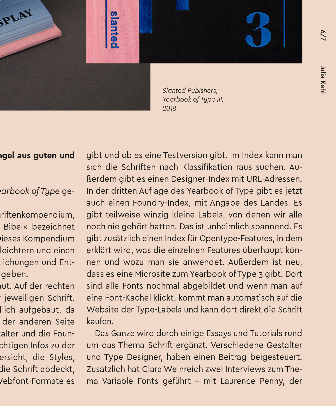
Whilst the regular Cera has a 100% circular o, and Cera Condensed has an o that is only 70% circular, this custom version of Cera has a width of 95% compared to the regular Cera.


All images by courtesy of Josephine Becker.