Display: Different Size, Different Design!
Seeing our Pensum Display release, you might be curious to see what the differences are between Pensum Display and our text workhorse Pensum Pro. Pensum Pro is a professional tool for body text across print and screen, Pensum Display is ready to take on the challenges of big text sizes. Let’s take a look.
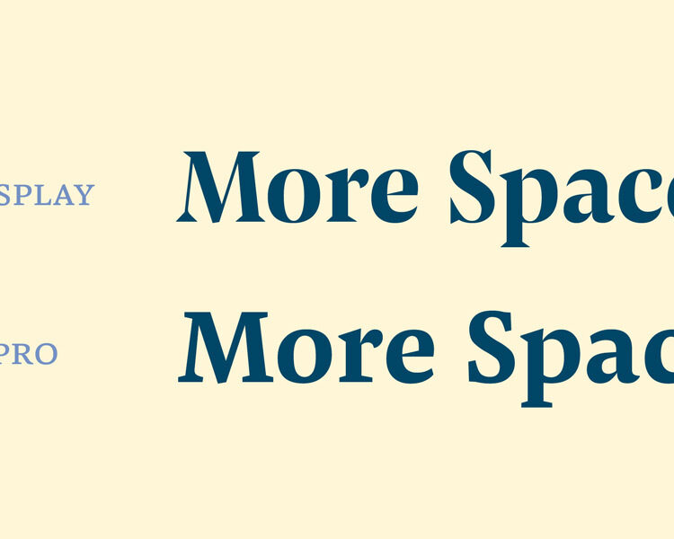
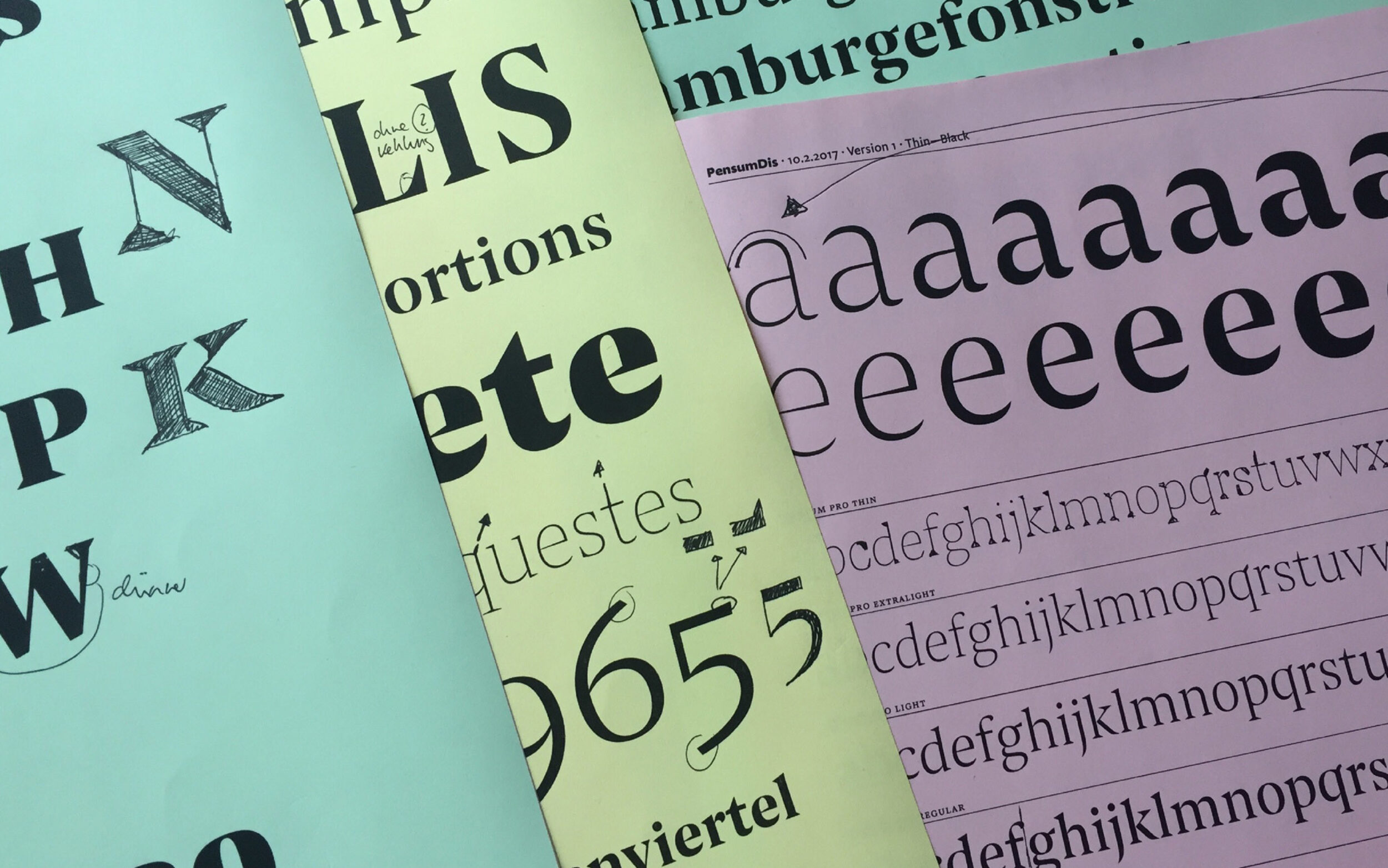
Like many good display fonts, Pensum Display has a higher contrast and slightly narrower proportions than its body text focussed cousin. But let’s get into the features: Pensum Pro already has some triangular details — but Nils really wanted to push them to the extremes. So, Pensum Display brings out the triangularity in each and every single serif.
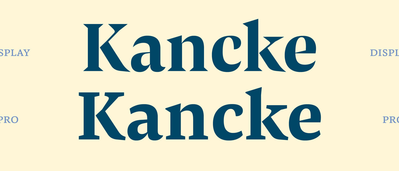
From text to display. Whereas the wedge serifs in K or n were put into complete triangles, details like the legibility-improving kink in K were refined and sharpened. Last, but not least, stroke endings in a, c or e were designed wickedly sharp.
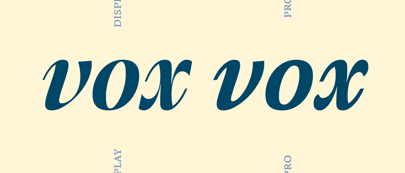
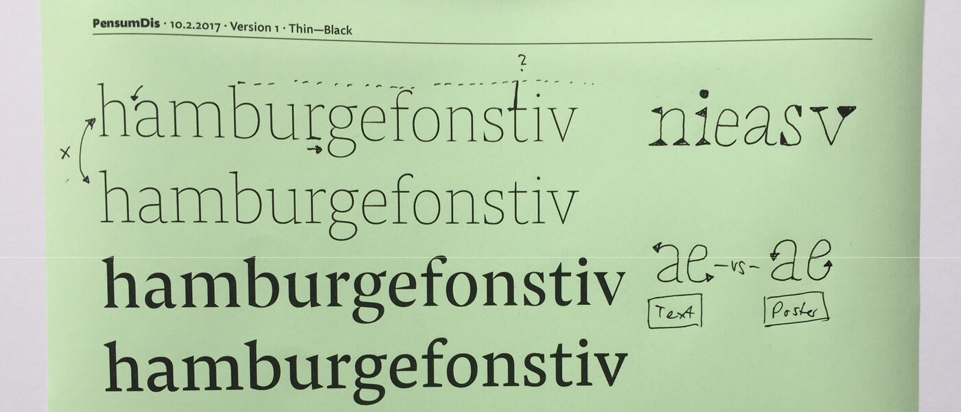
Nils made the italics more graphic: the x was clarified and its overall triangularity further accented. In the v, details that were originally only just hinted at, were brought out into the spotlight. Now we’re going to take a closer look at the g.
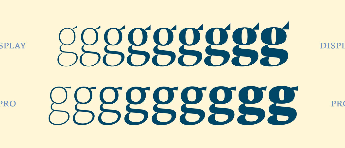
Triangularity as a design feature cannot just be found in Pensum Display’s serifs. The top flag of the g is lifted up and becomes more and more vivid as you move from the lighter towards the heavier weights. Sometimes you’ve got to go extreme to harmonise, and the triangularity of that tip is — you’ve guessed it — a key feature of Pensum Display.
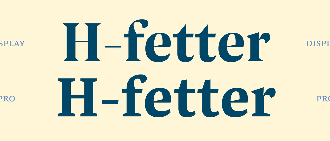
Nils kept the powerful horizontal strokes of the lowercase f and t, yet these letters still show Pensum’s quirky features. That makes them clearly visible in smaller display sizes and improves legibility even when Pensum Display is used at text sizes.
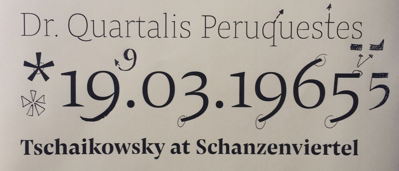
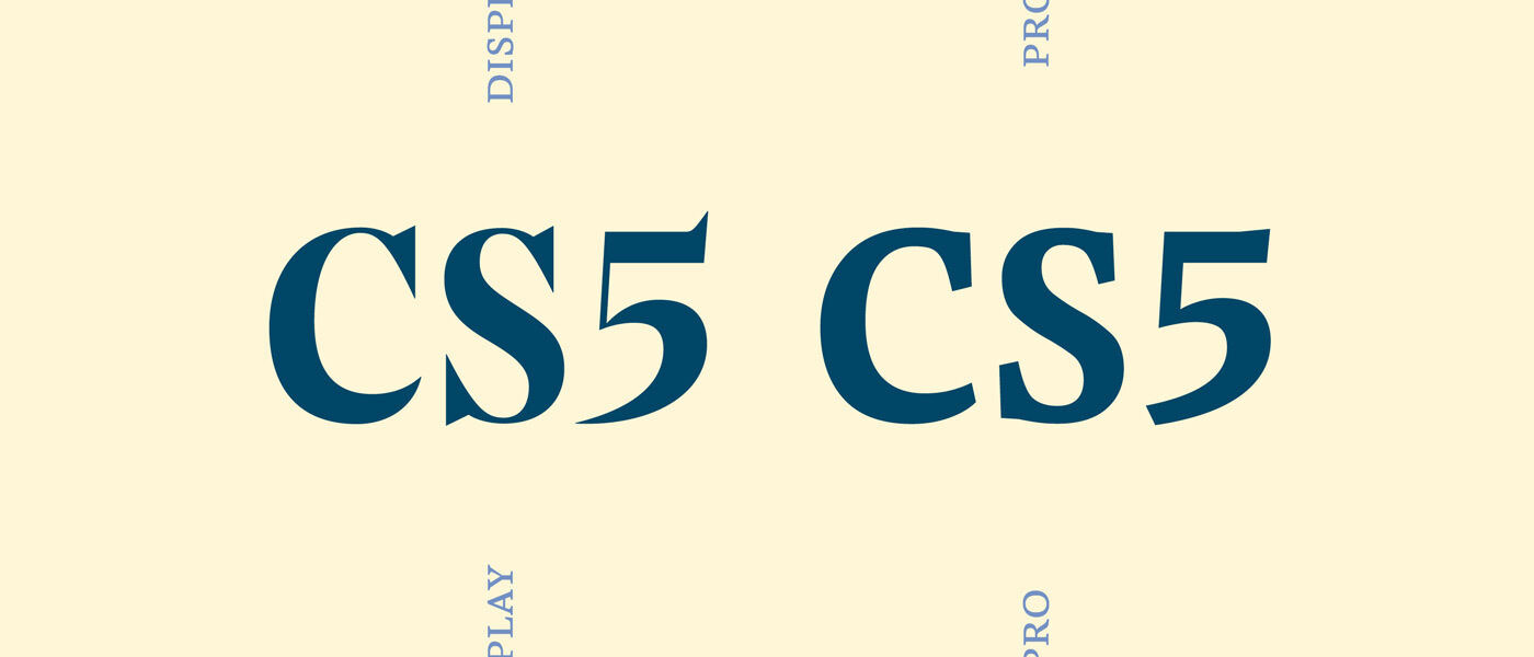
Where letters like C and S got slightly more angular serifs, the 5 went crazier. Its top tip isn’t a subtle emphasis, but a proud statement: Here I am!
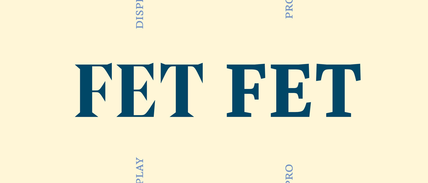
As well as the C and S, Nils brought emphasis to the uppercase F, E and T. The spiky serifs that extend into the overshoot create a certain charm – a detail that adds flavour, rather than distraction to text at large sizes.
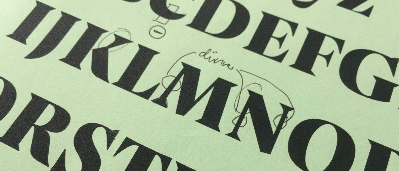
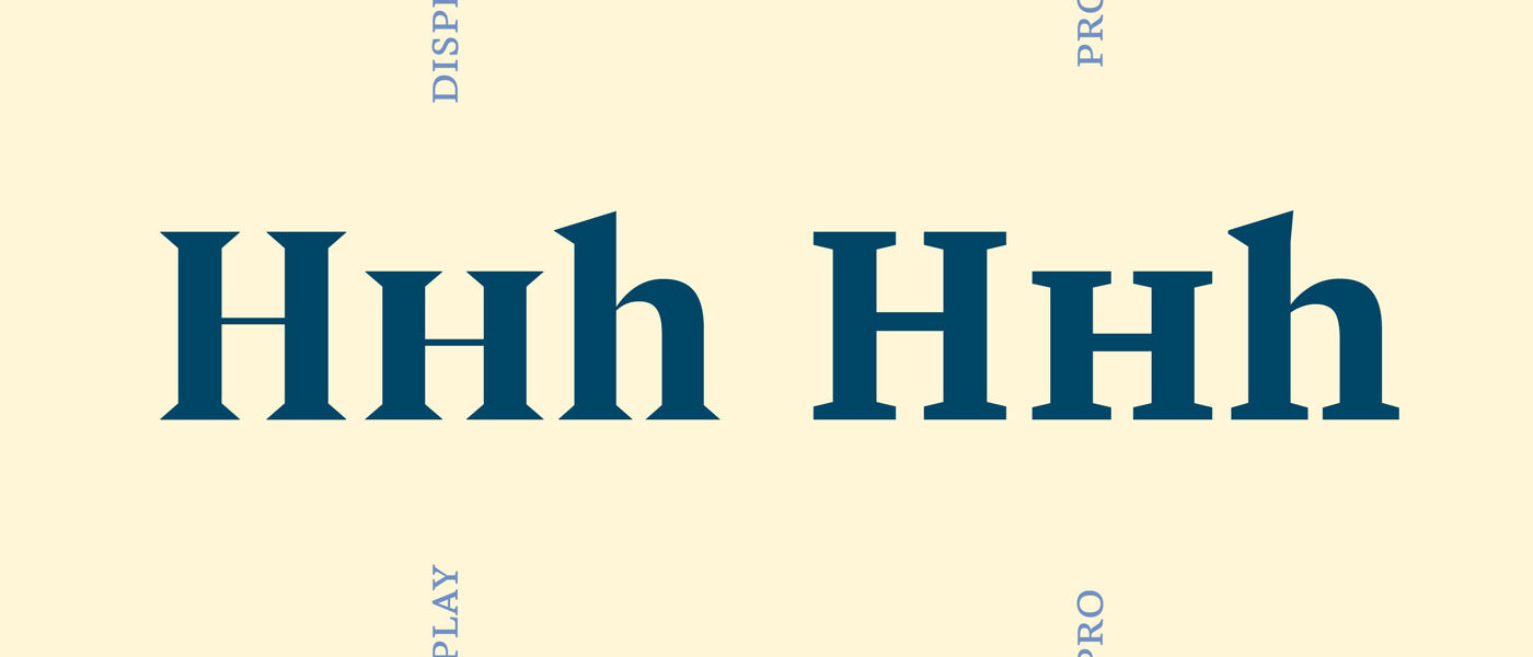
Just because Pensum Display is for big display text doesn’t mean it’s clumsy. With an eye towards the hardcore book typographers who will want to get their headlines and short quotes just right, Nils made Pensum’s small caps slightly wider. True small caps, for an elegant contrast to the uppercase.
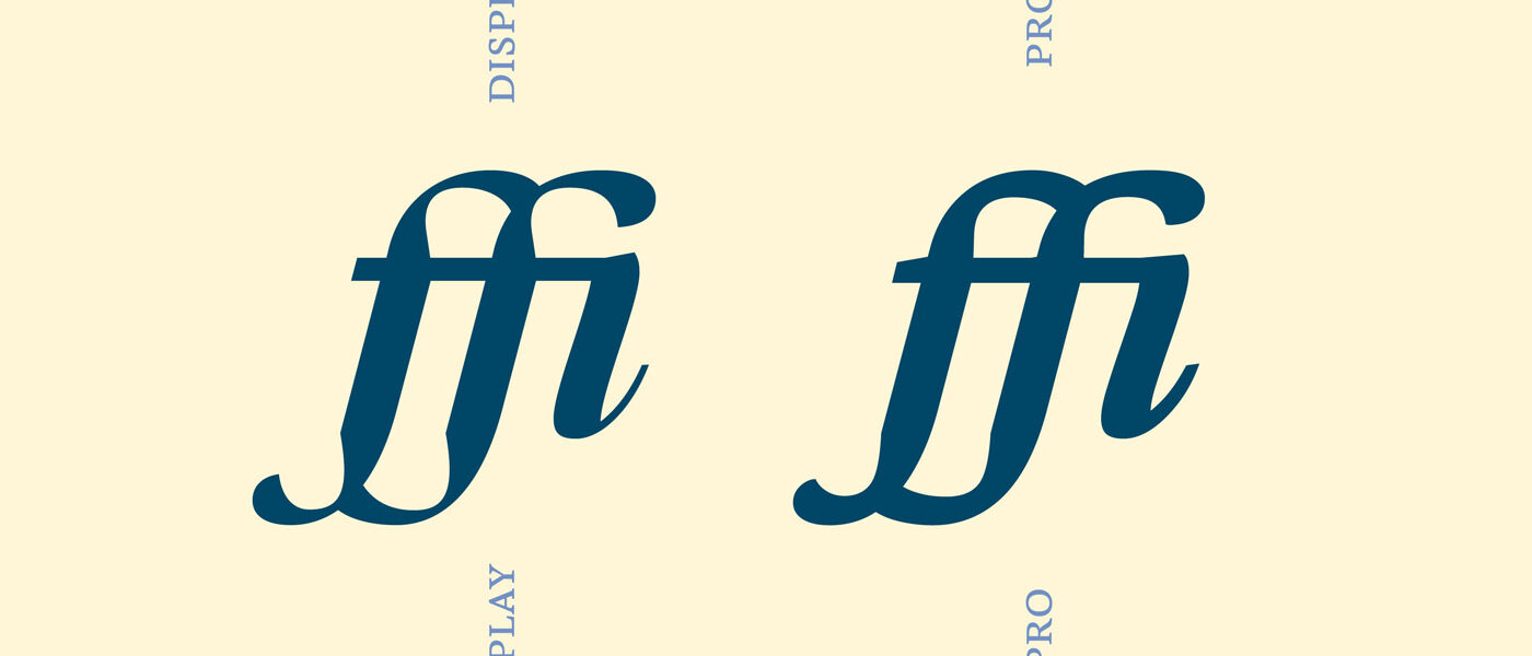
To summarise: Pensum Display distills Pensum Pro’s ingredients to create a typeface with a sense of clarity and precision. And, we have one last and significant example to show you: the little dent in the stem of f or j is exaggerated a lot. Haters gonna hate, but it's a beautiful design feature for those, who do not shy away from going a step further.
The character set of Pensum Display is nearly as comprehensive as you are used to from Pensum Pro. The only things missing are some superior and tabular superior glyphs, but these are only necessary for the typographic enhancement of small text sizes. Pensum Display is for display and nothing but display.
And if you’re not sure yet, take the chance to test both versions of Pensum for free. See for yourself how they can complement each other in different sizes.