NZZ.ch Relaunch
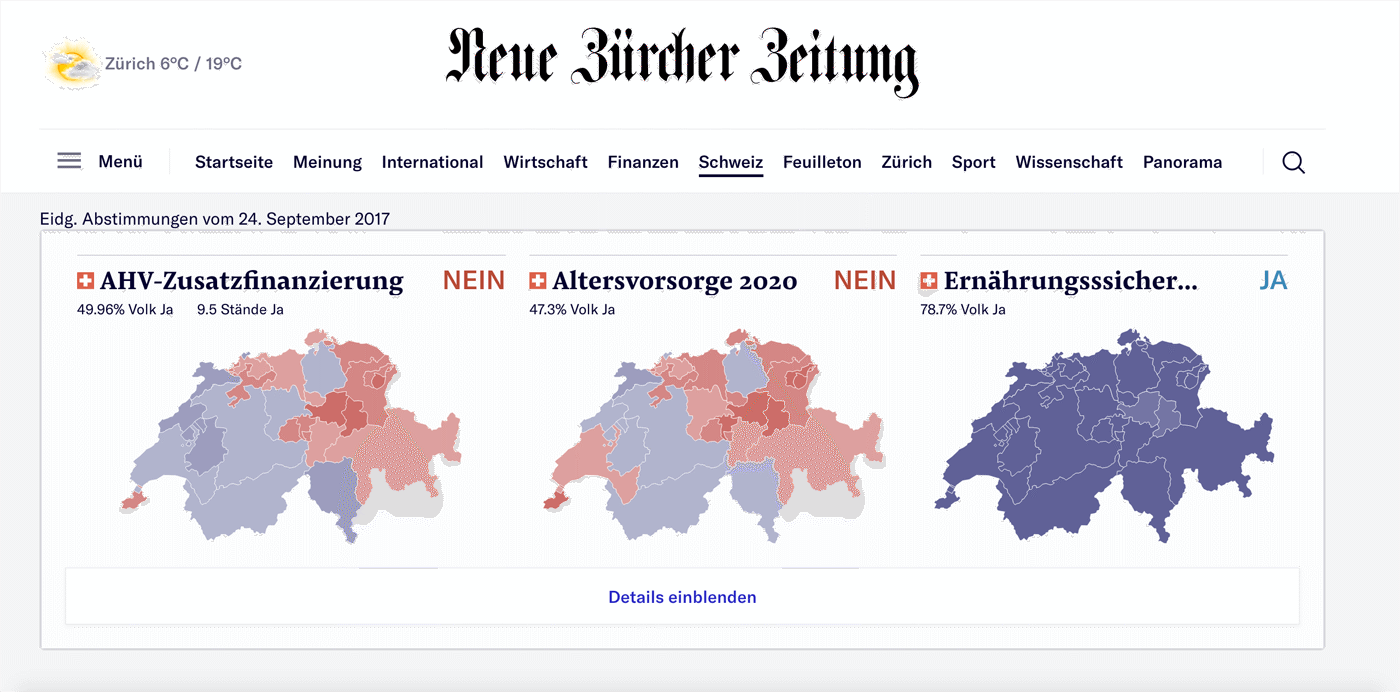
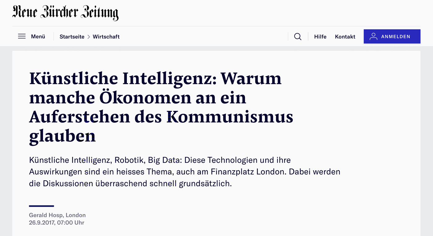
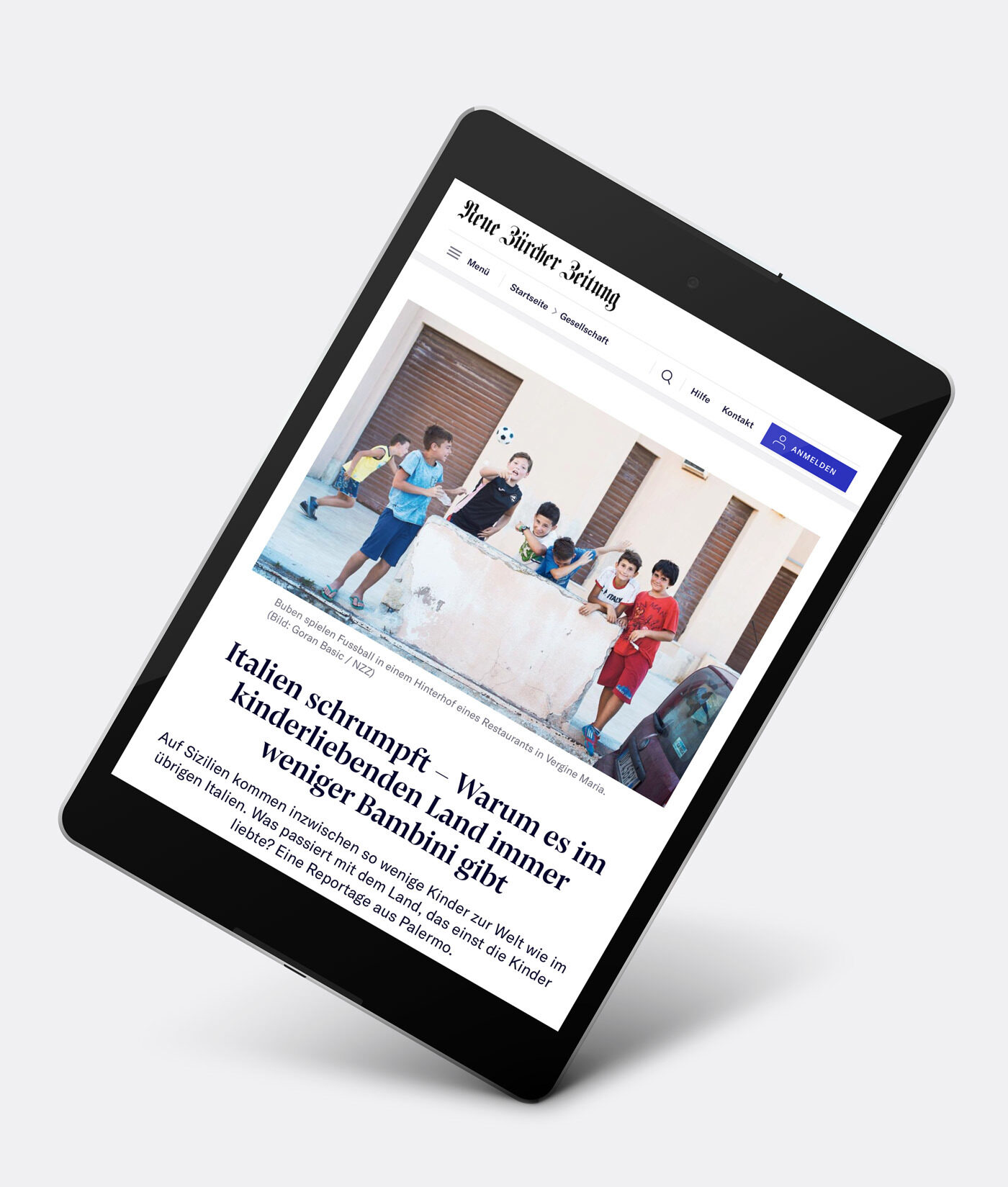
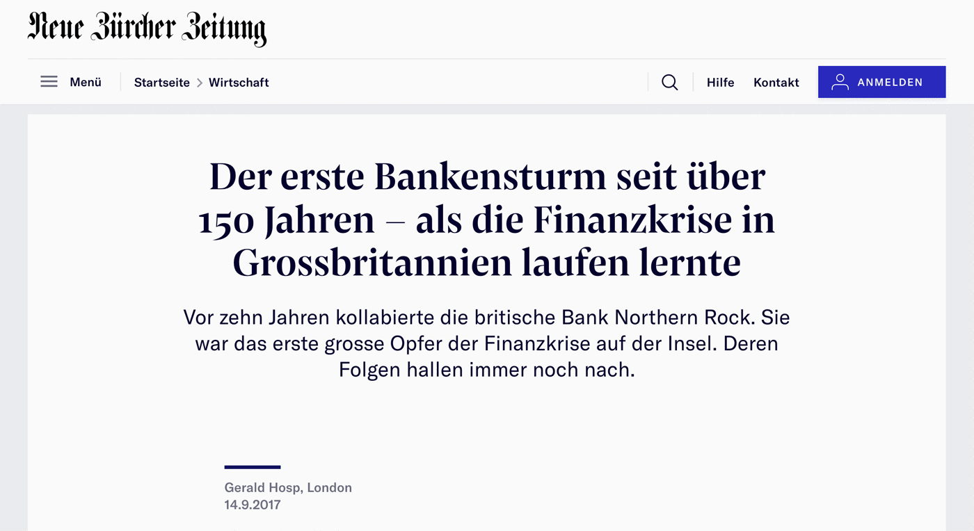
With Pensum Display for prominent headlines and Pensum Pro for text, Swiss newspaper “Neue Zürcher Zeitung” has launched a redesigned website.
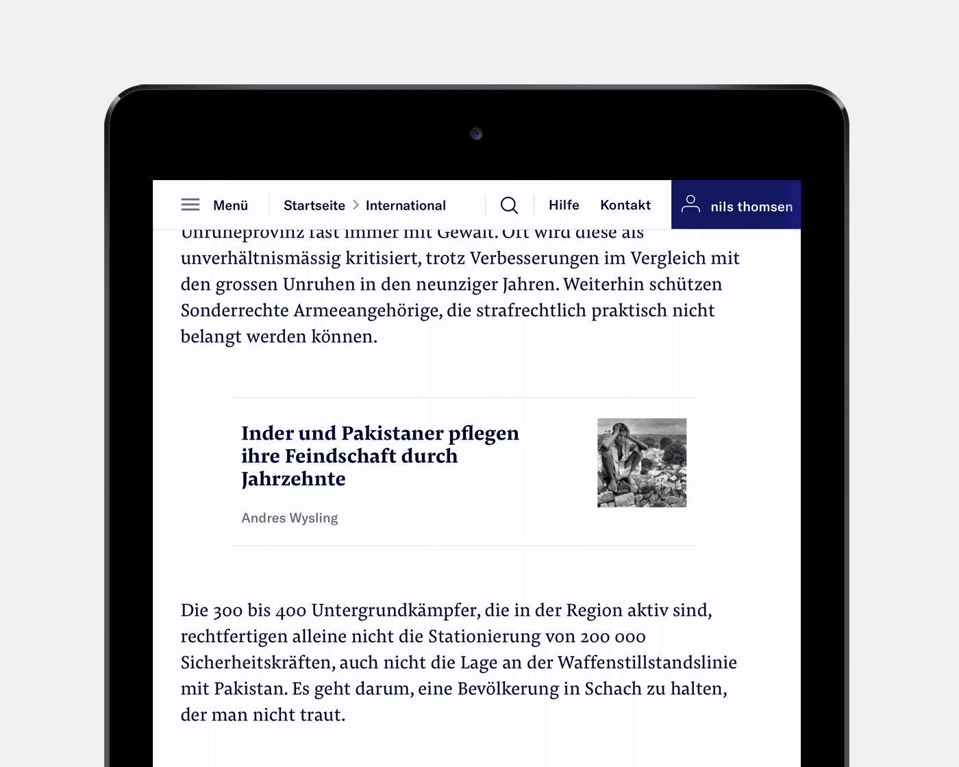
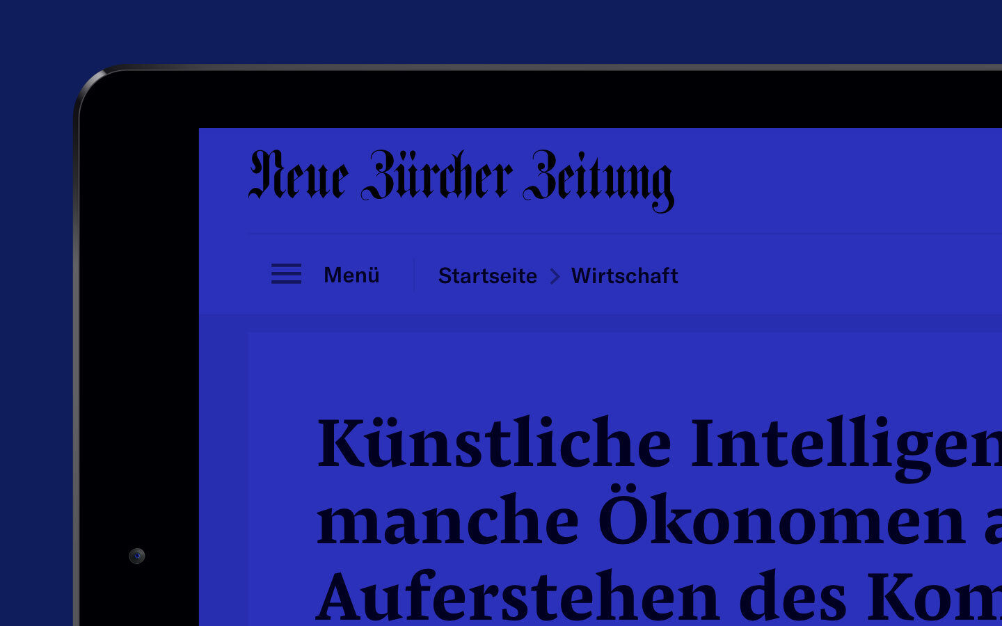
The confident rebrand of the newspaper’s website www.nzz.ch by Edenspiekermann introduces a new design language for Neue Zürcher Zeitung. With new typefaces, new colours and layouts, the NZZ brand is powerfully communicated by its digital incarnation.
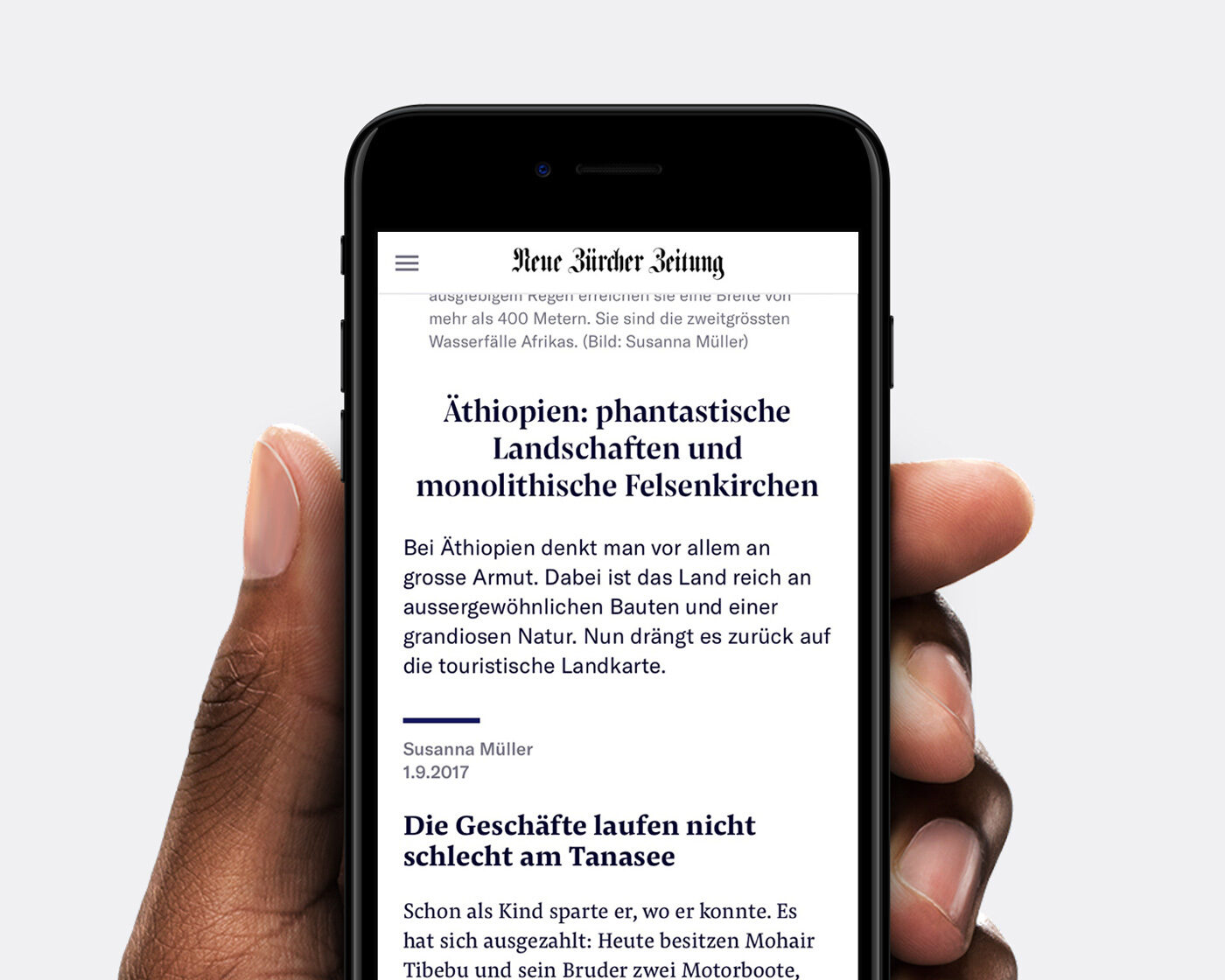
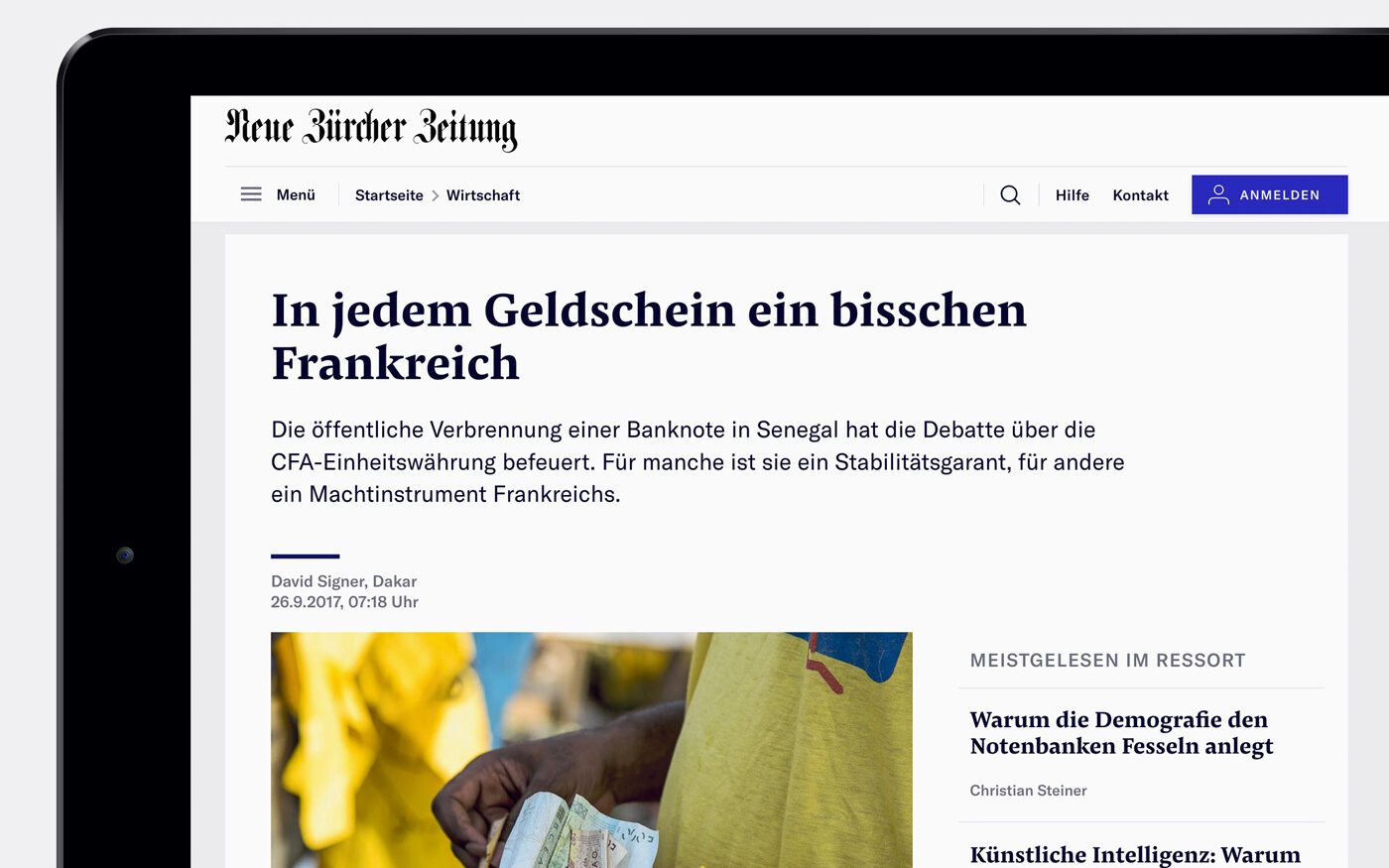
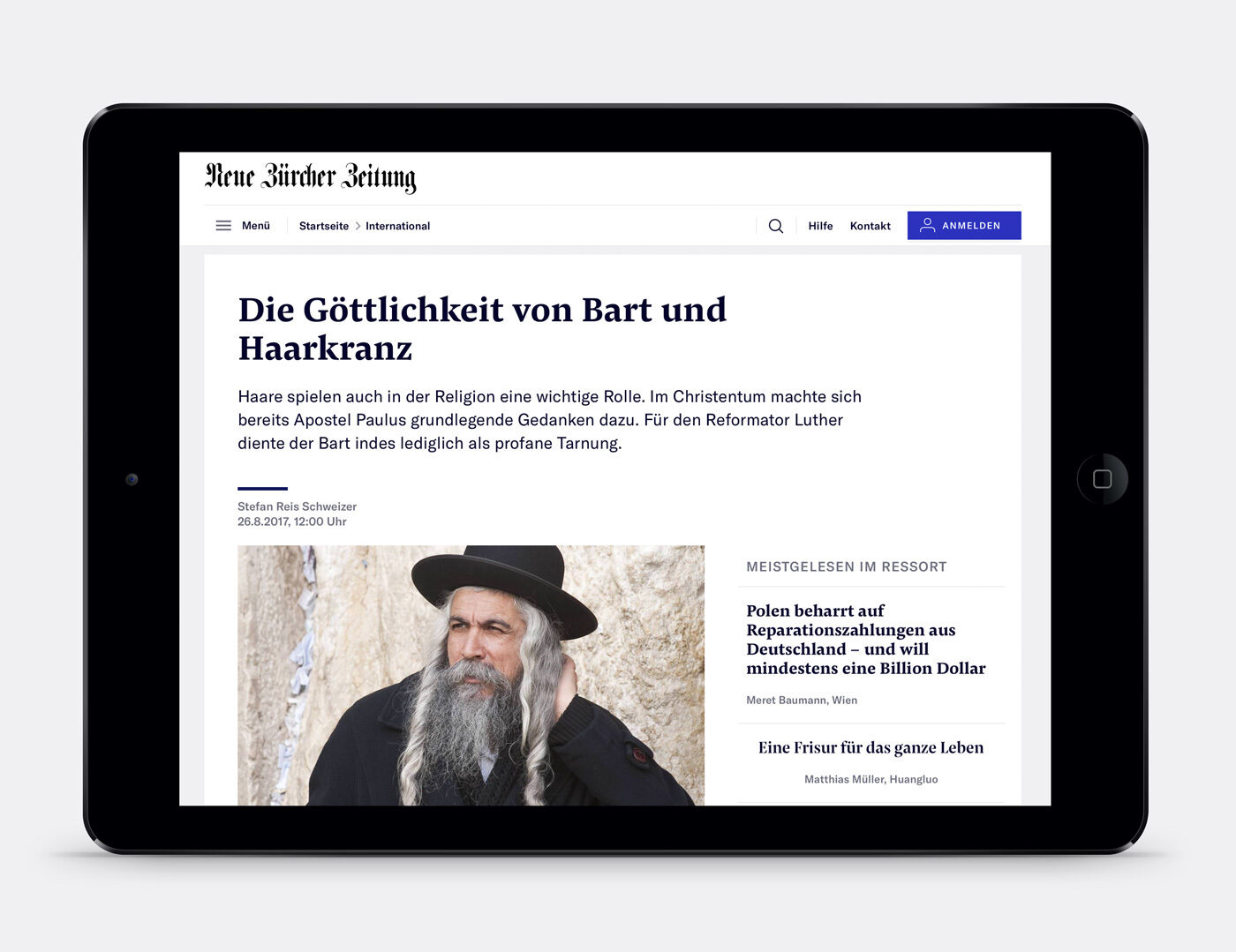
Our typeface for text is paired with GT America — a grotesque by the Swiss foundry Grilli Type — handling decks, captions and navigational elements. In a digital newspaper that embraces longform reading and other text-heavy content, Pensum Pro takes a primary role in shaping the newspaper’s content and digital identity.
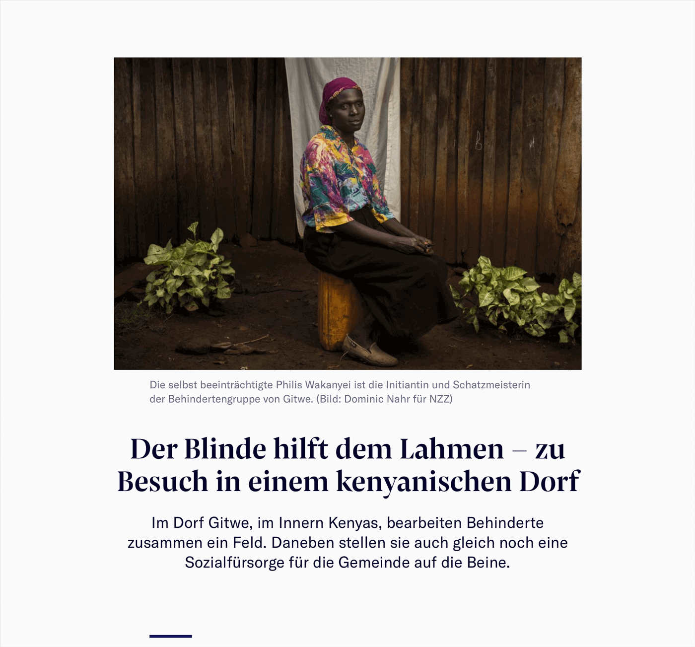
Beyond body text, the robust yet sleek Pensum Pro is used for headlines in the newspaper’s website. The digital NZZ Magazine adds Pensum Display for headlines and quotes, adding a crisp and elegant tone to the typography.
According to Edenspiekermann, the website’s new look is just a starting point in an ongoing process. The new design language won’t just be limited to the website: an app is currently in development which will feature the same design, guaranteeing a coherent visual identity for the newspaper’s content.
We are excited to see where and how Pensum Pro and Pensum Display will perform at Neue Zürcher Zeitung.
