New Identity for Bad Alexandersbad
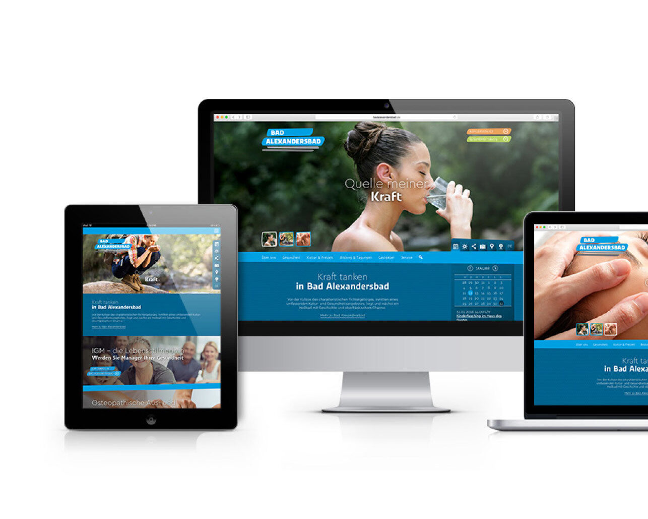
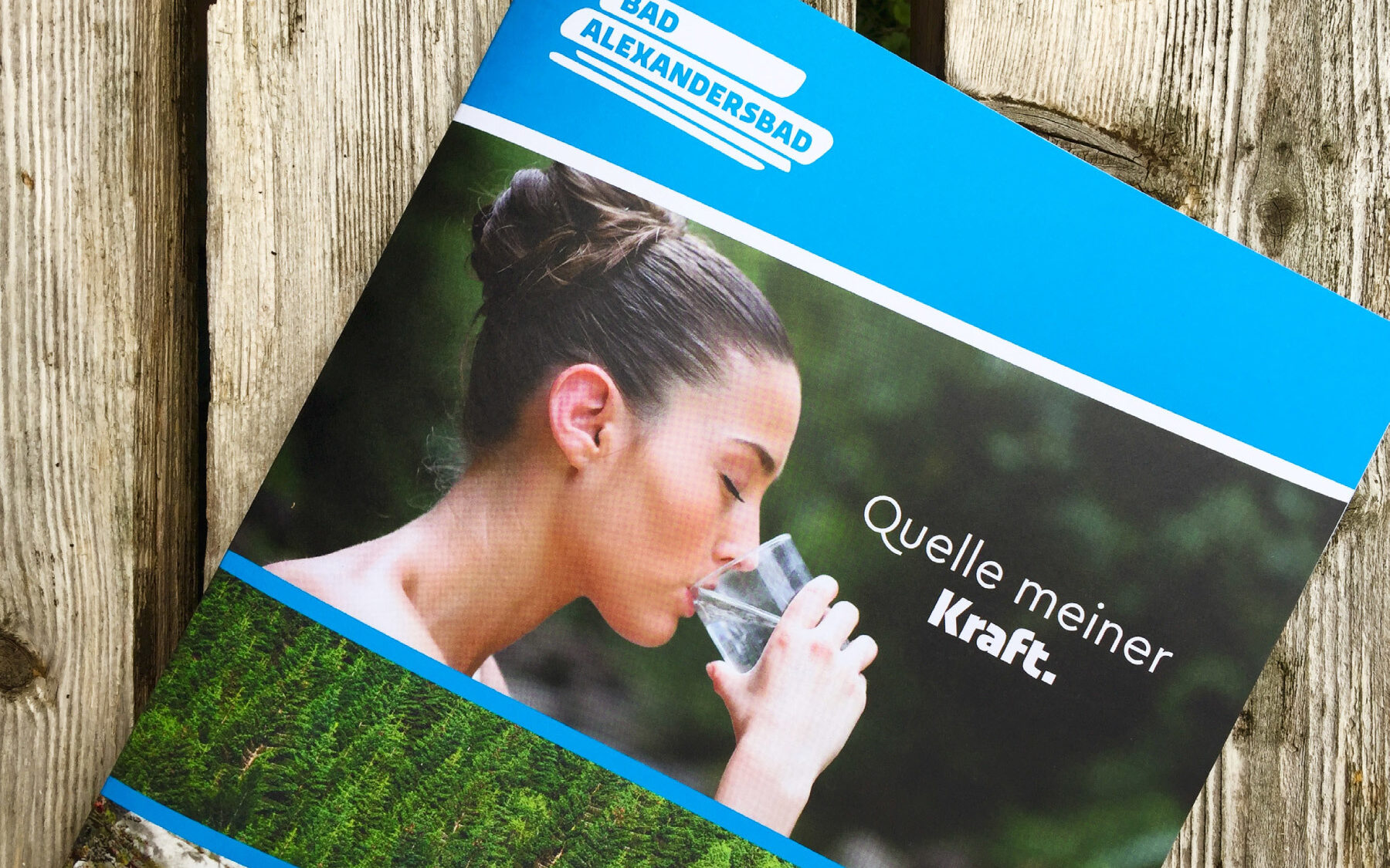
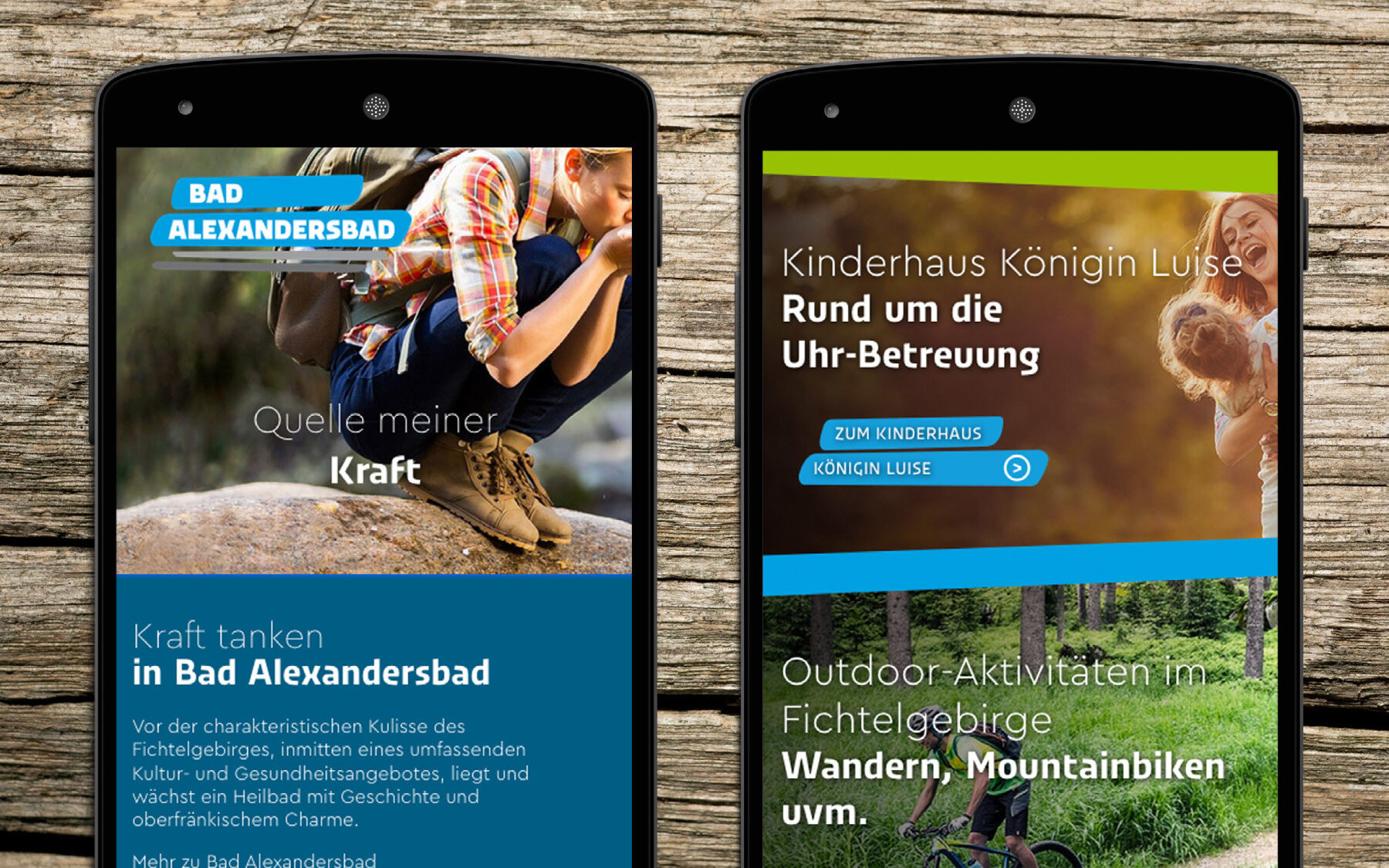
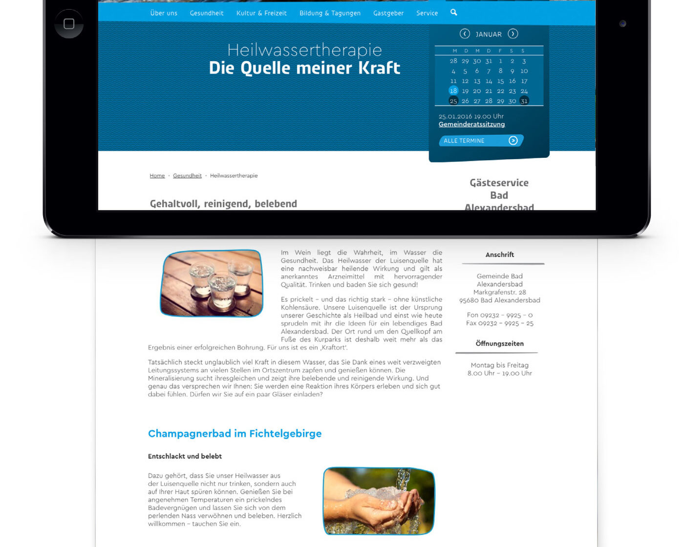
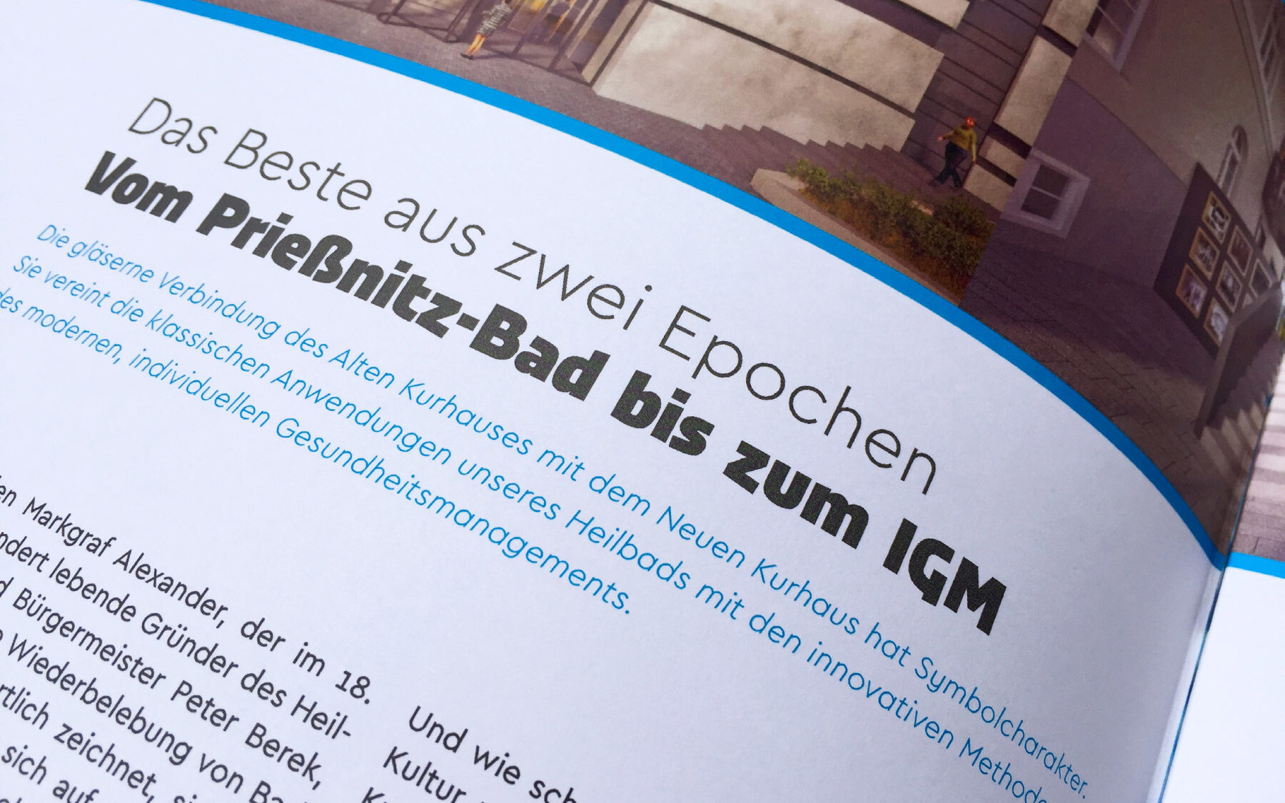
Munich design agency balleywasl* has created an identity using Urby and Cera Pro to brand German health resort Bad Alexandersbad.
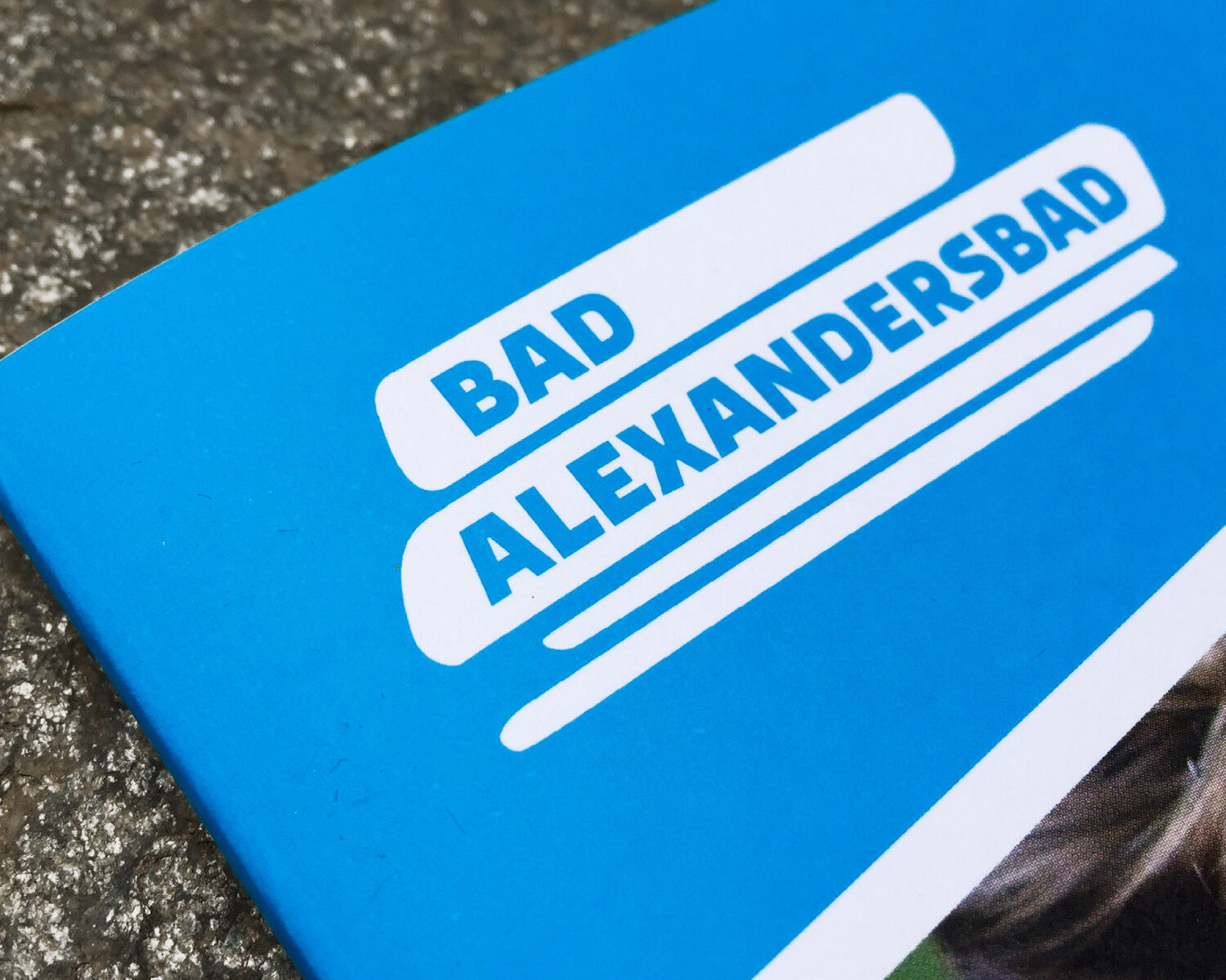
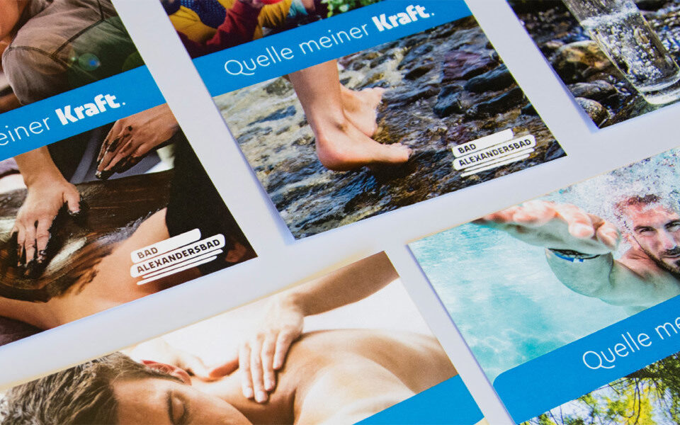
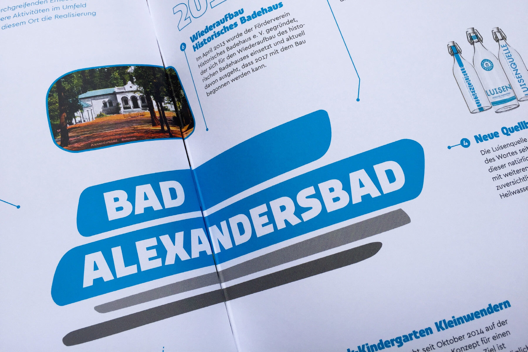
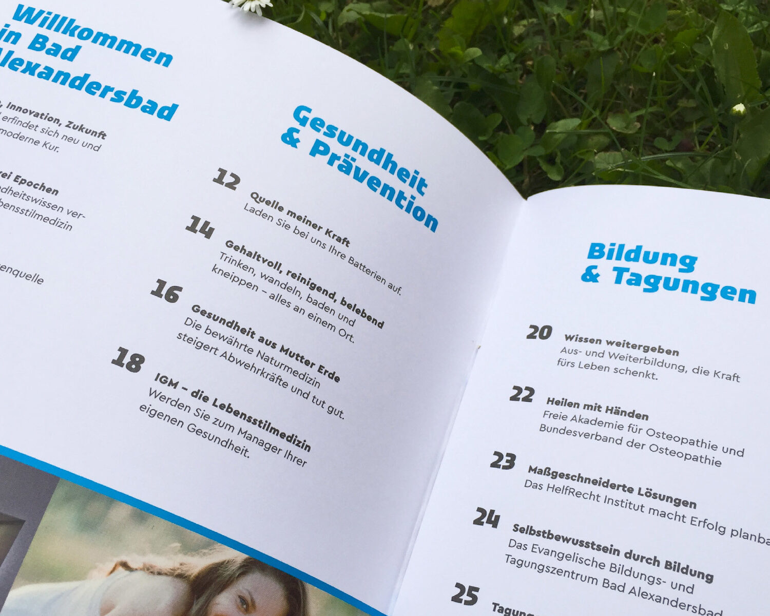
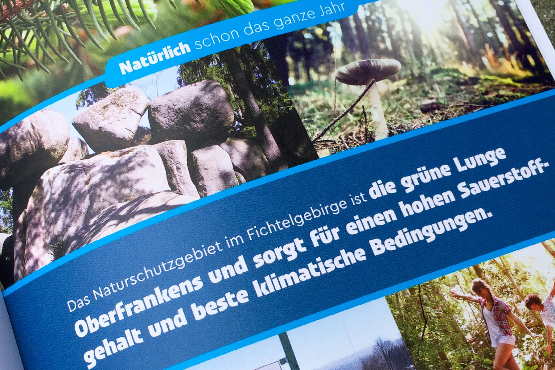
Inspired by the granite-influenced geology of the Fichtelgebirge, art director Franziska Runge referenced stacking stones in the logo. Since Urby also transports that rocky character with its dynamic shapes, it seemed logical to use it for the main typography.
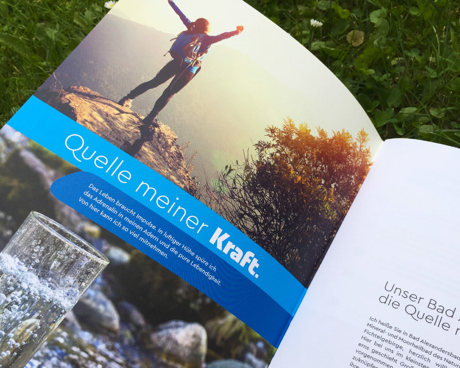
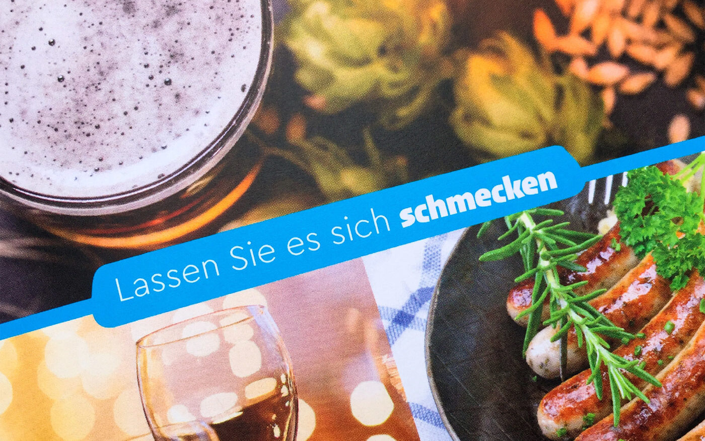
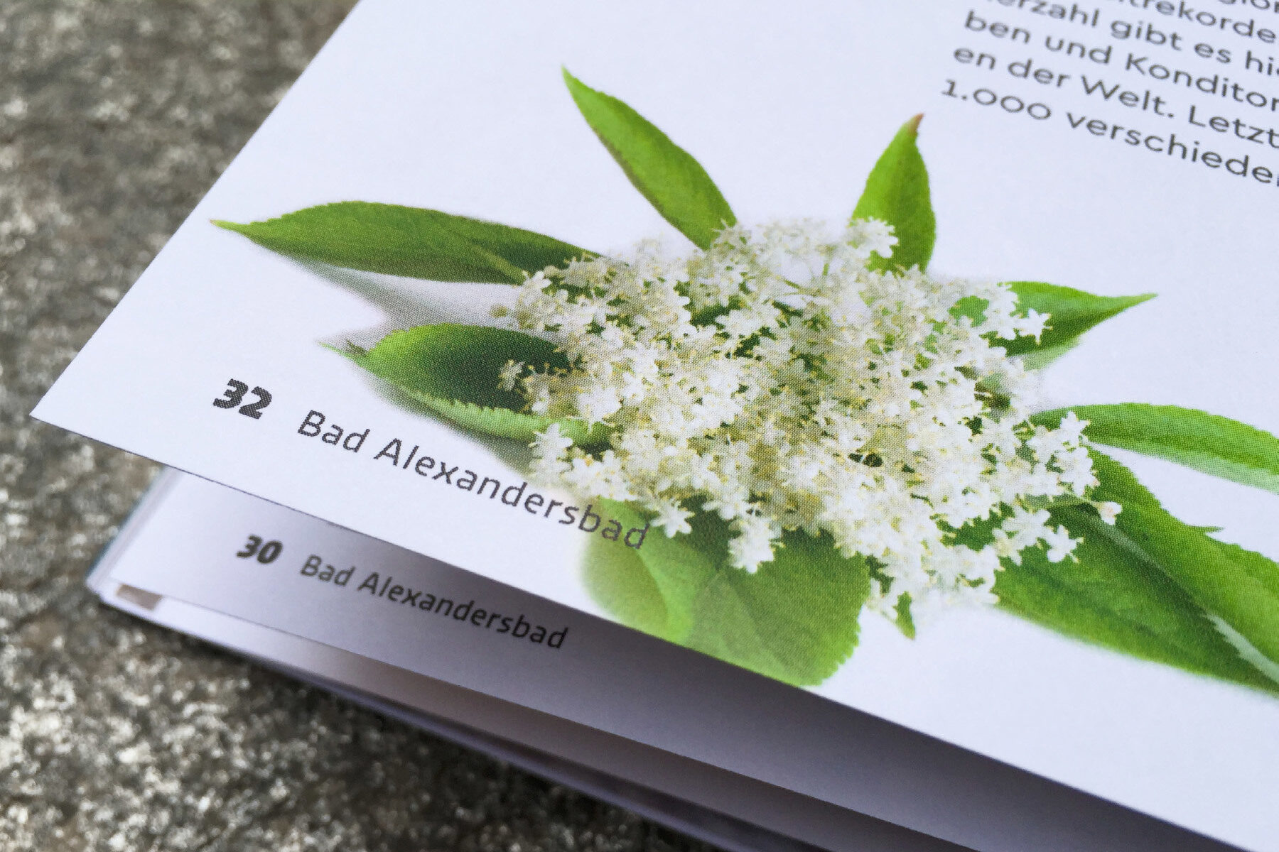
The strength and recognisability of Urby in the display text is complemented by the clarity of Cera Pro in the extended text. Cera Pro is not only responsible for the design of the body text: its distinctive uppercase Q gives special character to the spa's lettering: “Quelle meiner Kraft”.
Urby melts dynamic shapes with geometric construction for branding and editorial.
5
styles by Jakob Runge
Cera Pro is supporting pure geometry plus Latin, Кириллица and Ελληνικά script.
36
styles by Jakob Runge
