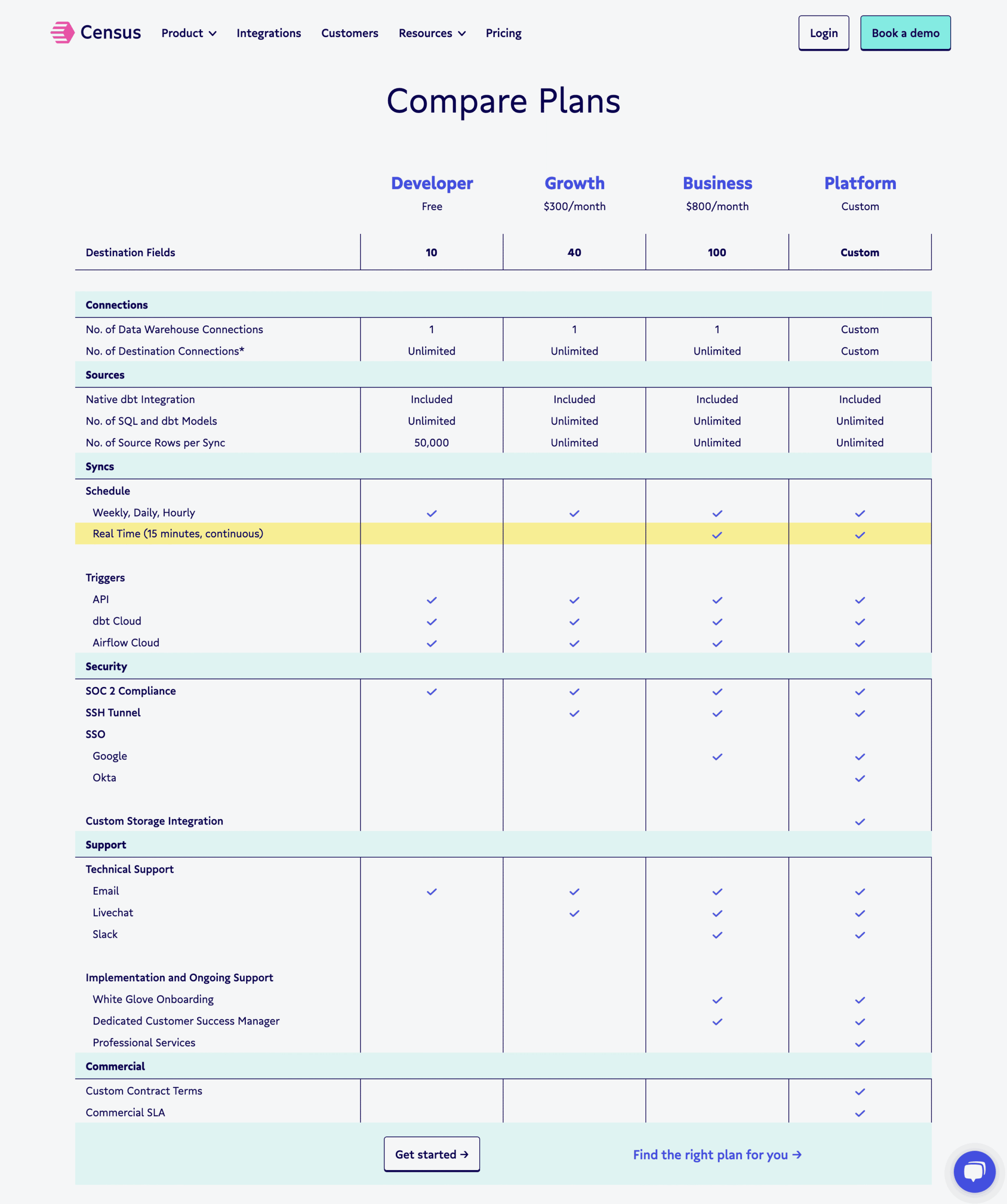
Census rebrand
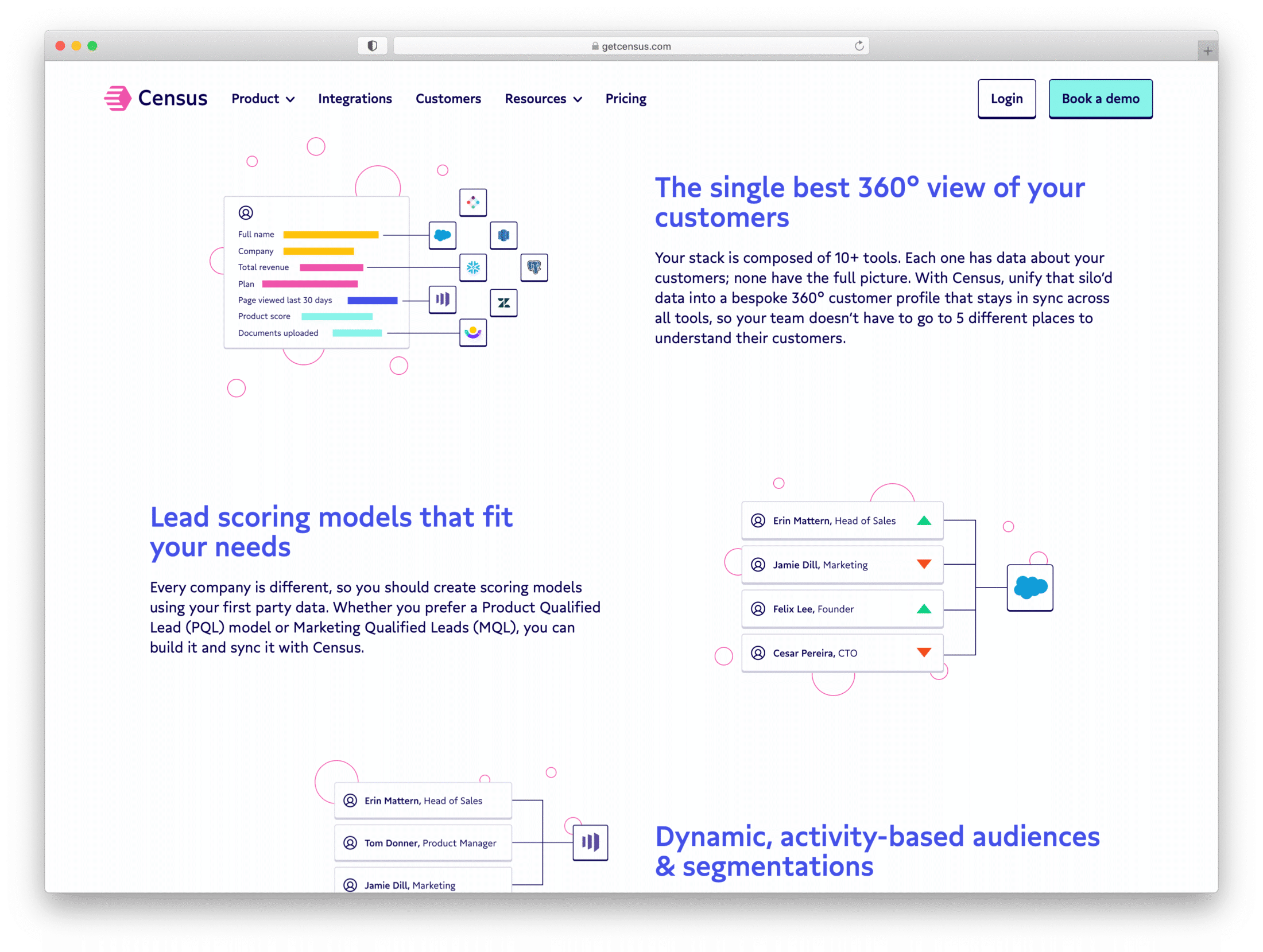
Census is about data. The operational analytics platform syncs warehouse data with daily workflow apps. Gratimo Classic is a great match for the simplicity and cleanliness of the digital brand.
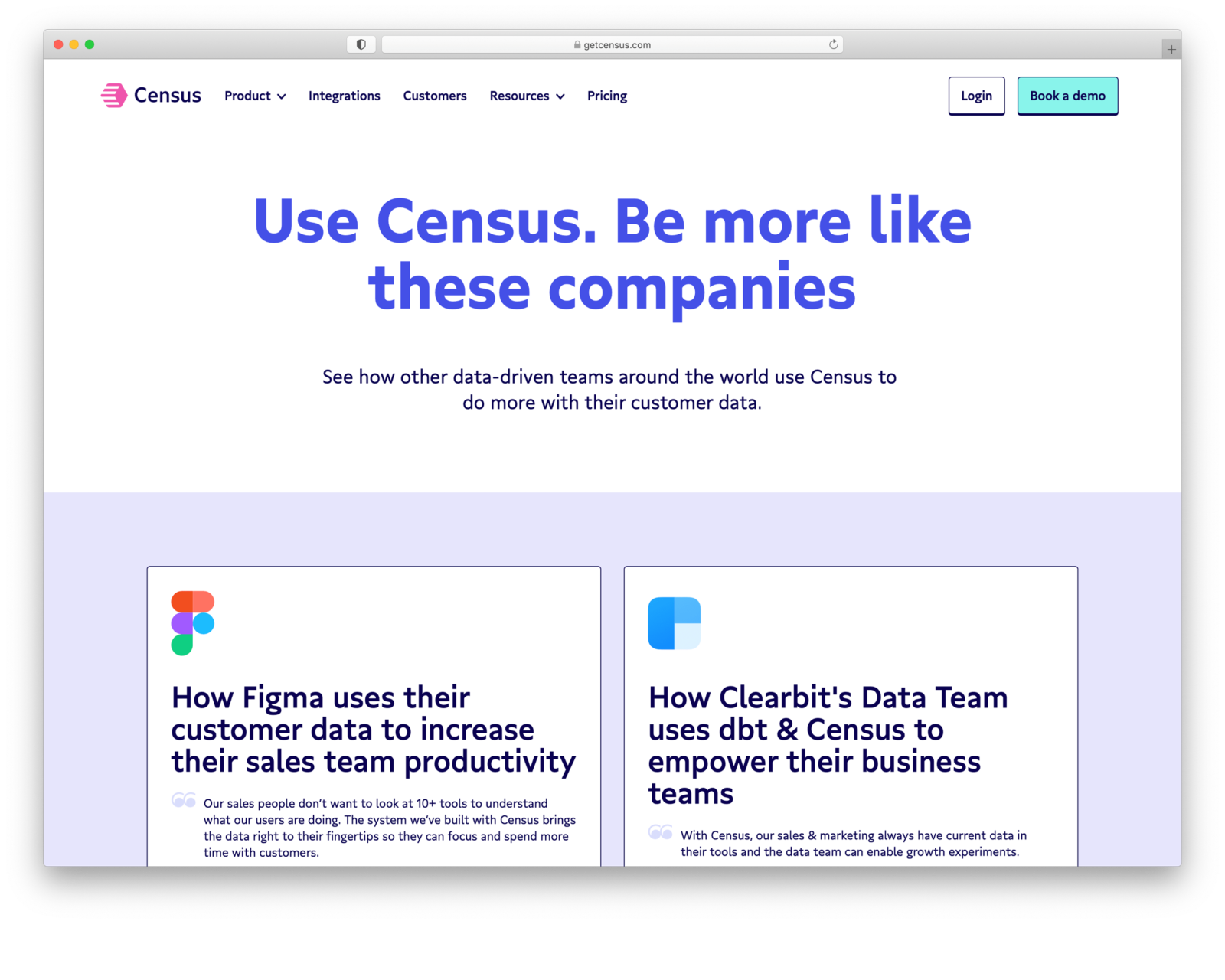
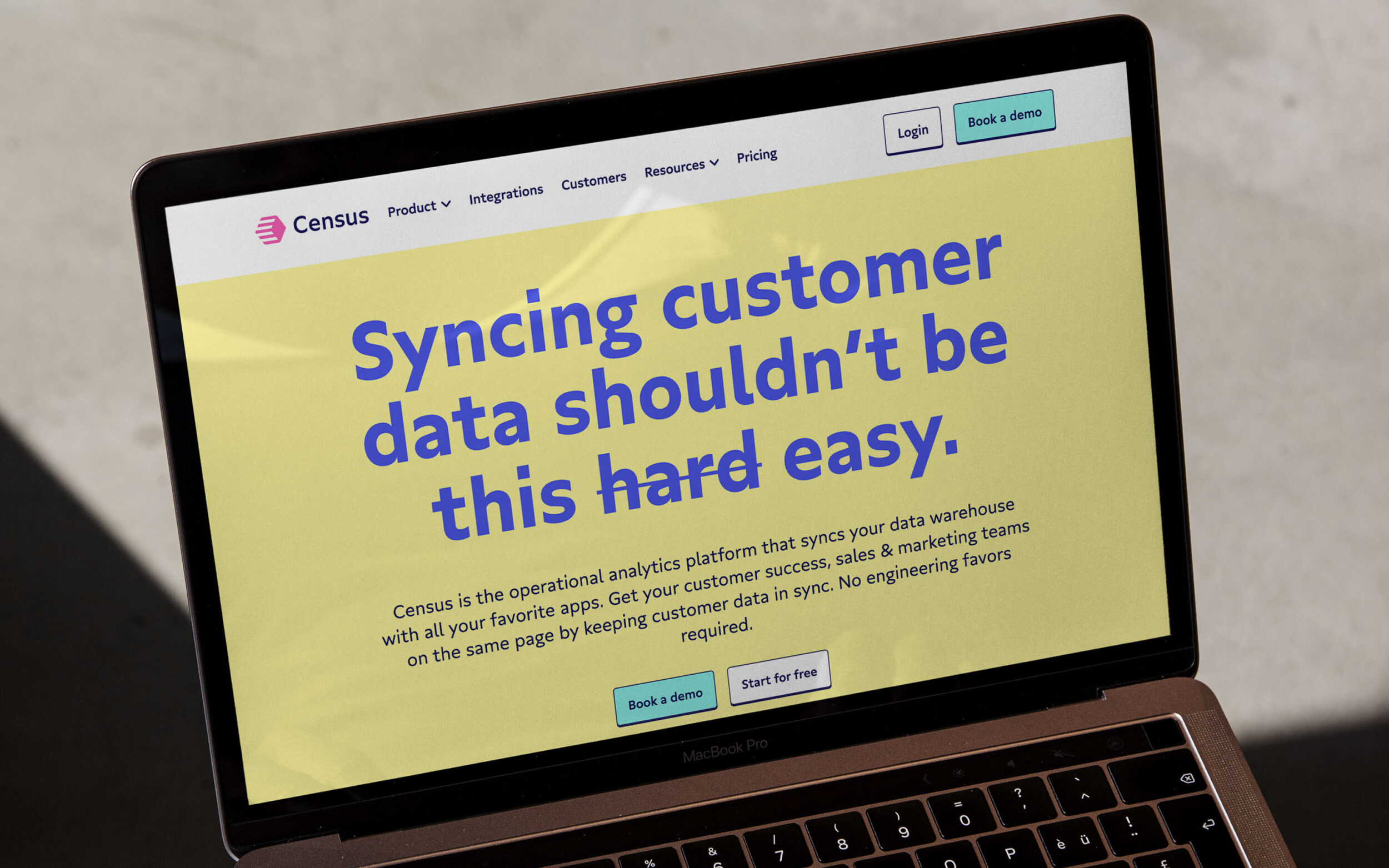
Designer Matt Yow joined the startup to take care of the rebranding and chose Gratimo Classic as the primary typeface. Both geometric and humanist in its construction, Gratimo Classic manages the balancing act between professional and personal. It perfectly aligns with Census as a data-driven, trustworthy brand with an expressive and bold look.
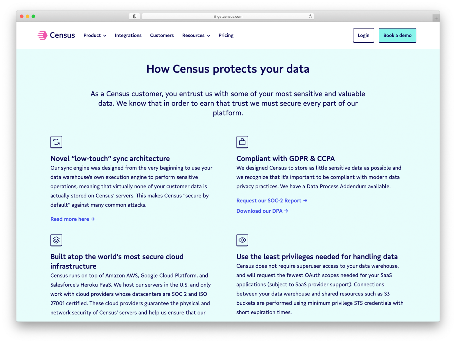
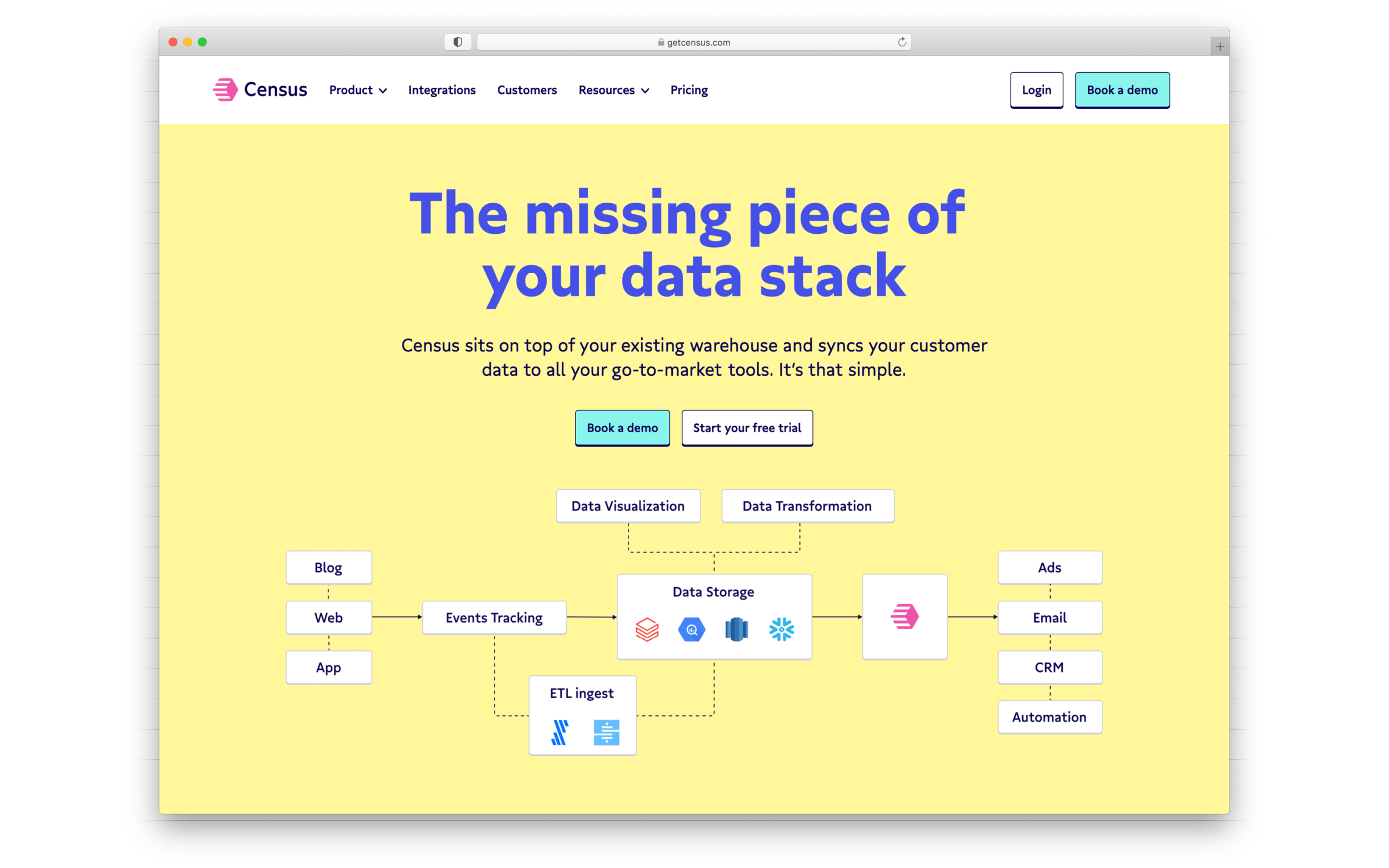
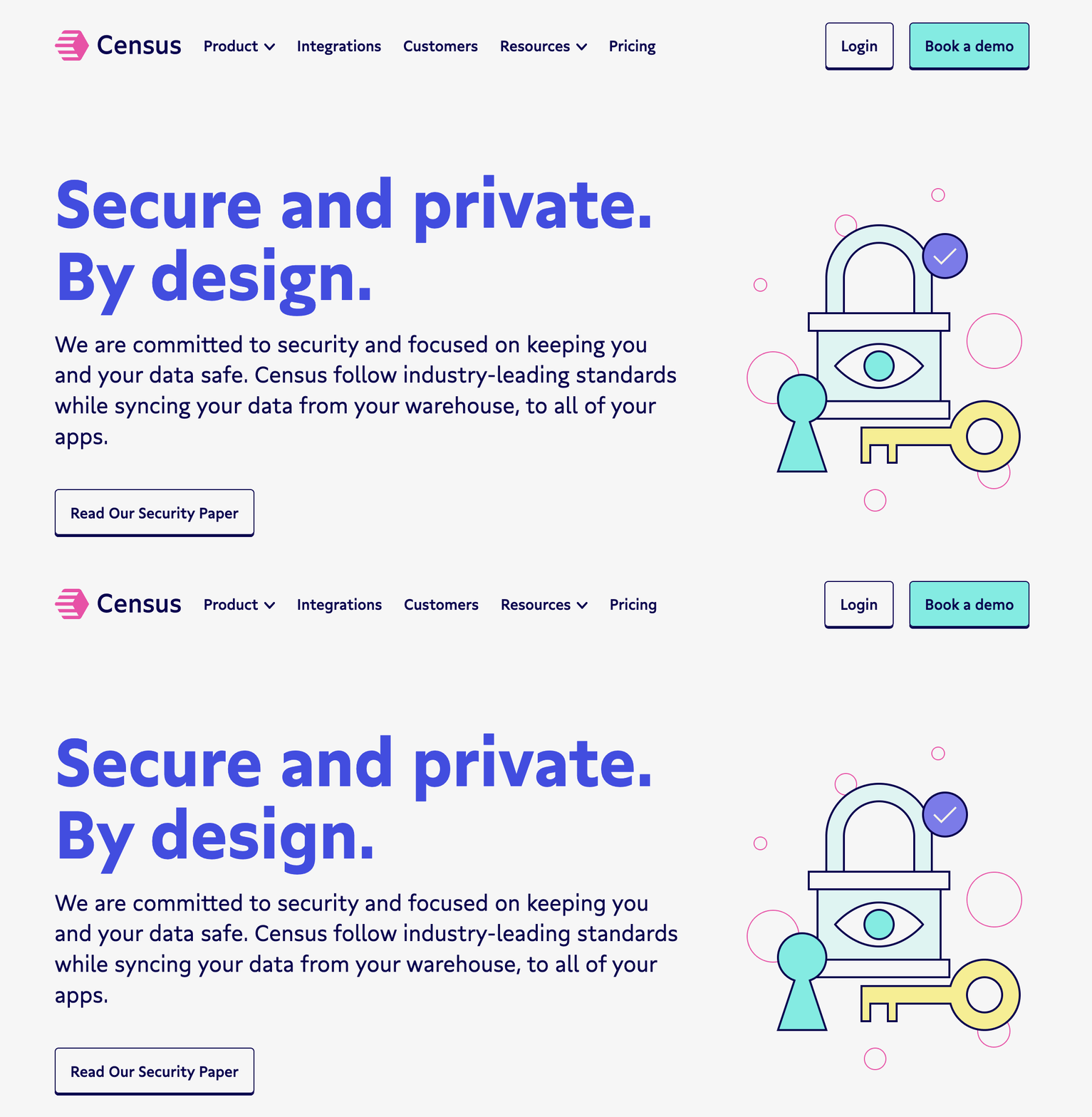
Matt wanted to emphasise the human aspect and chose the alternate double-storey g as default in this pre-release usage. Here you can see the default lowercase g compared to the customised double-storey variant that changes the entire texture of the text.

Old logo with Lato and new logo set in Gratimo Classic.
The weights are clean and easy to maneuver — they interpolate well for headline, subhead, and small text setting. This simplicity and cleanliness was a perfect match for Census.
— Matt Yow

