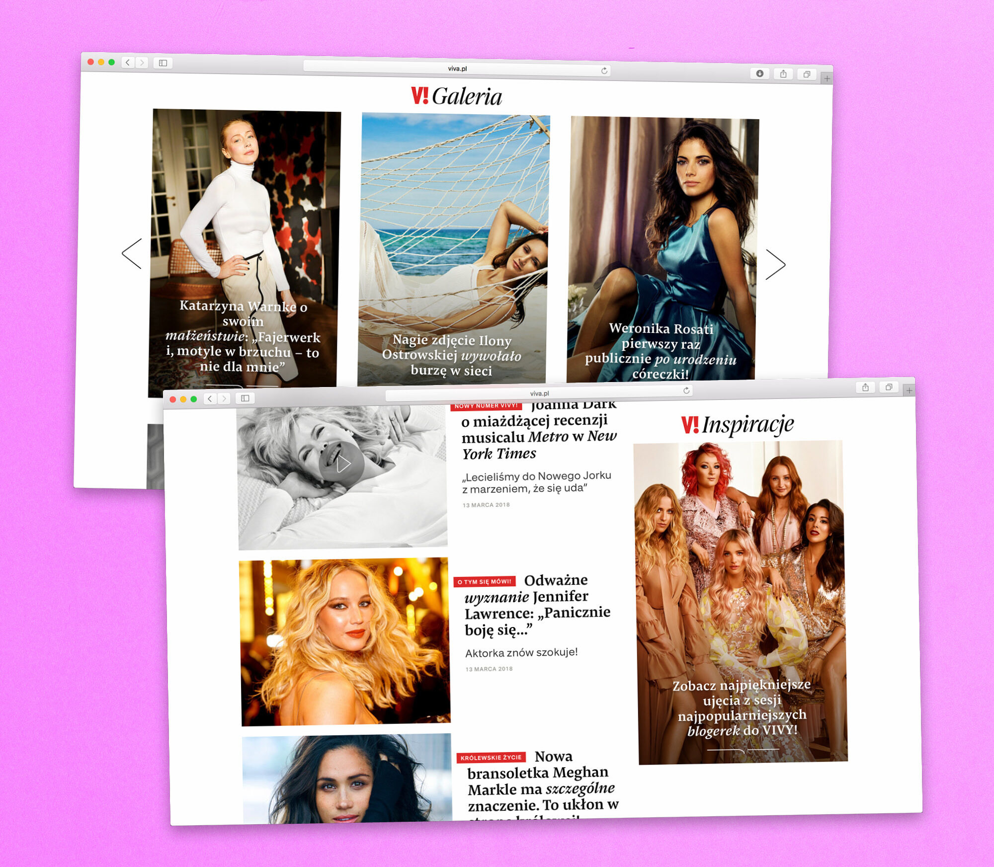
Fresh Website for Viva!
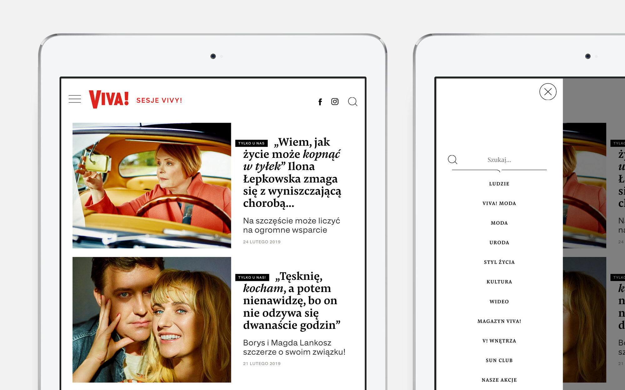
Since 20 years, Polish magazine Viva! is all about lifestyle and trends. Its fresh and rebranded online magazine Viva.pl uses Pensum Pro and Pensum Display.
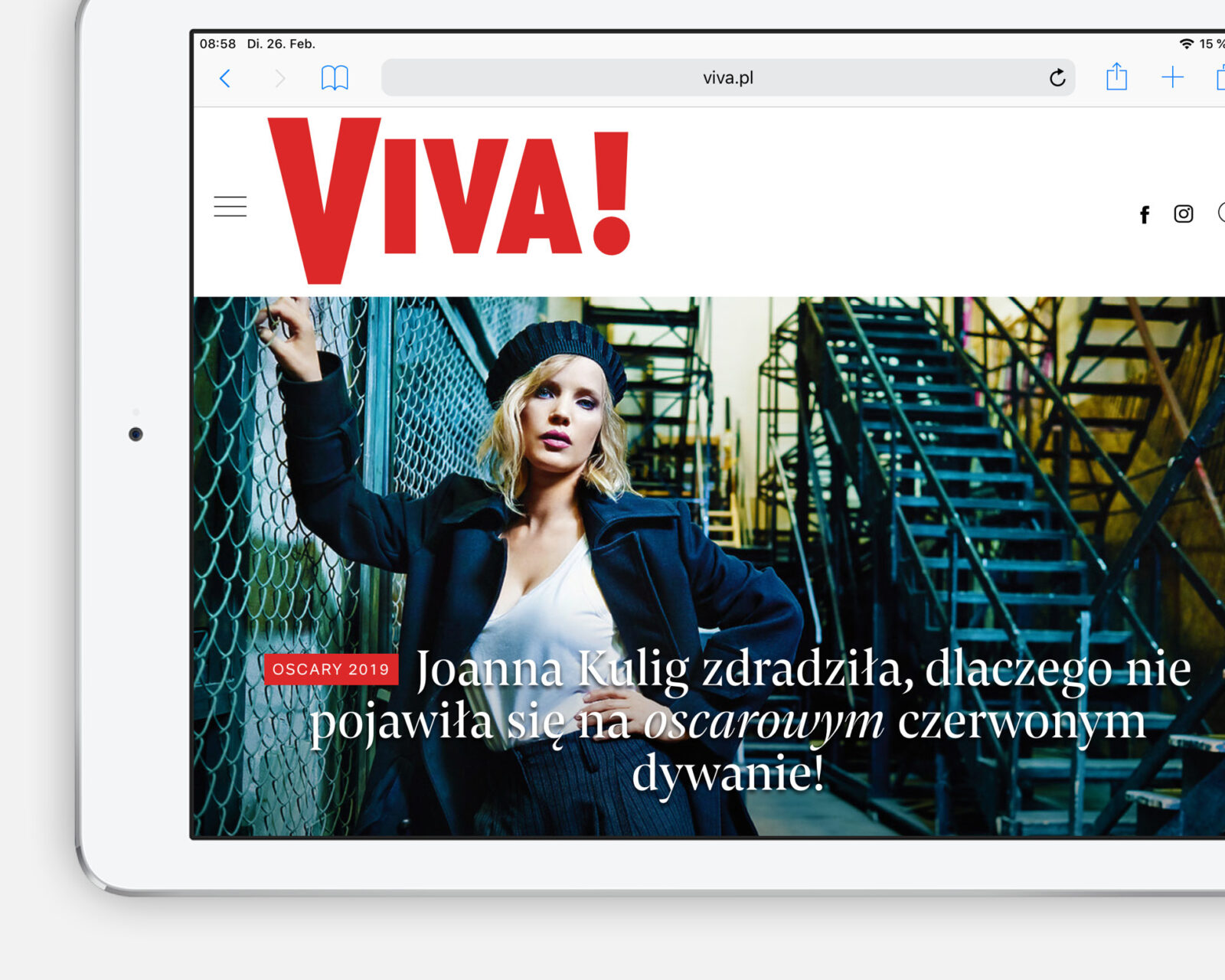
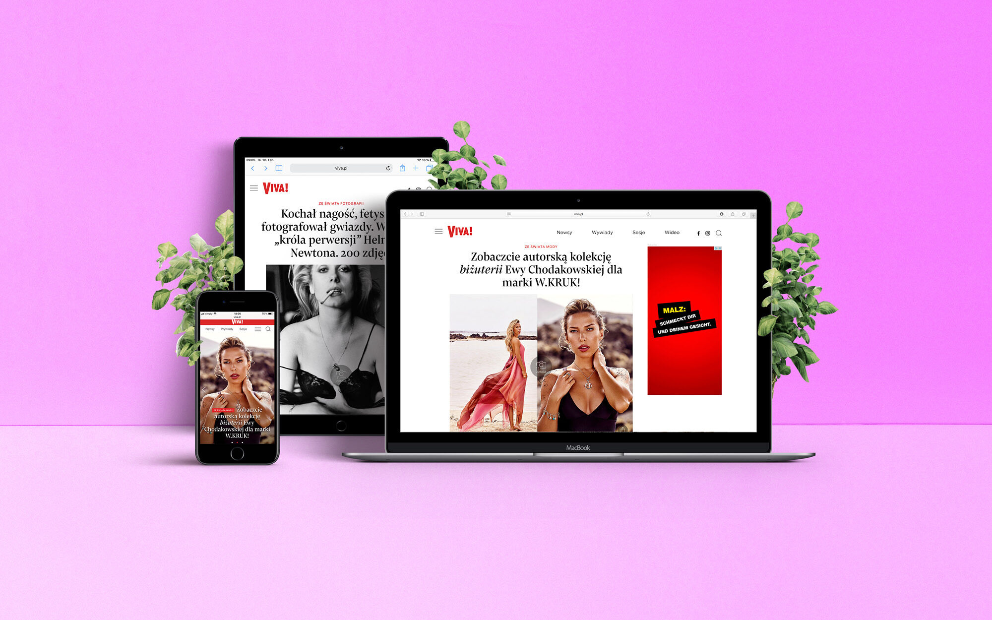
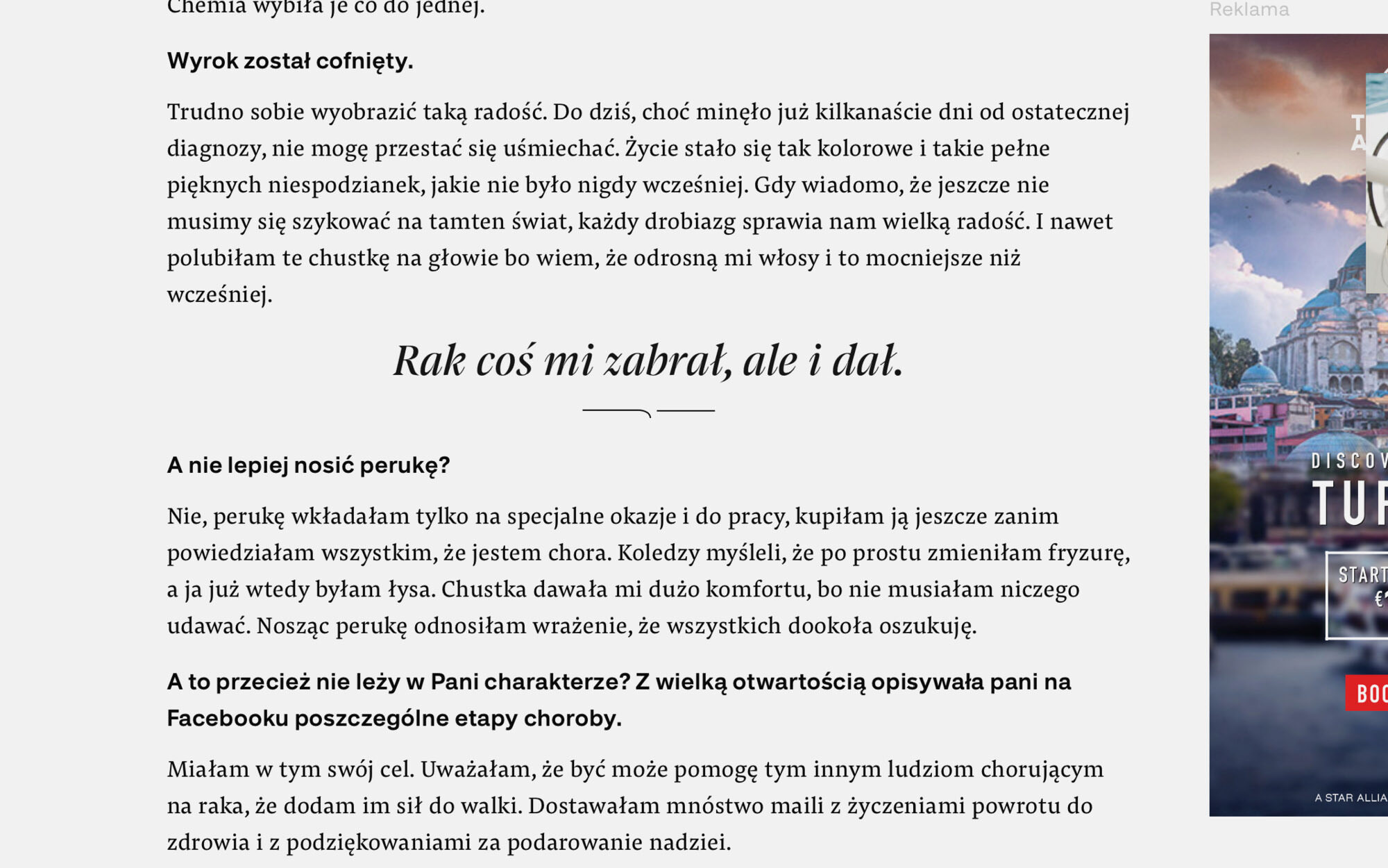
Pro as ever, Pensum takes care of the website’s text content. It is supplemented by Dieter Hofrichter’s grotesk Urania for some basic elements of the UI.
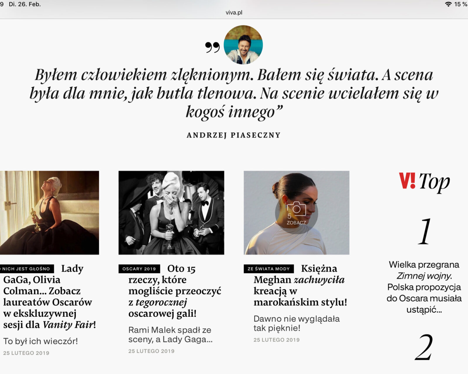
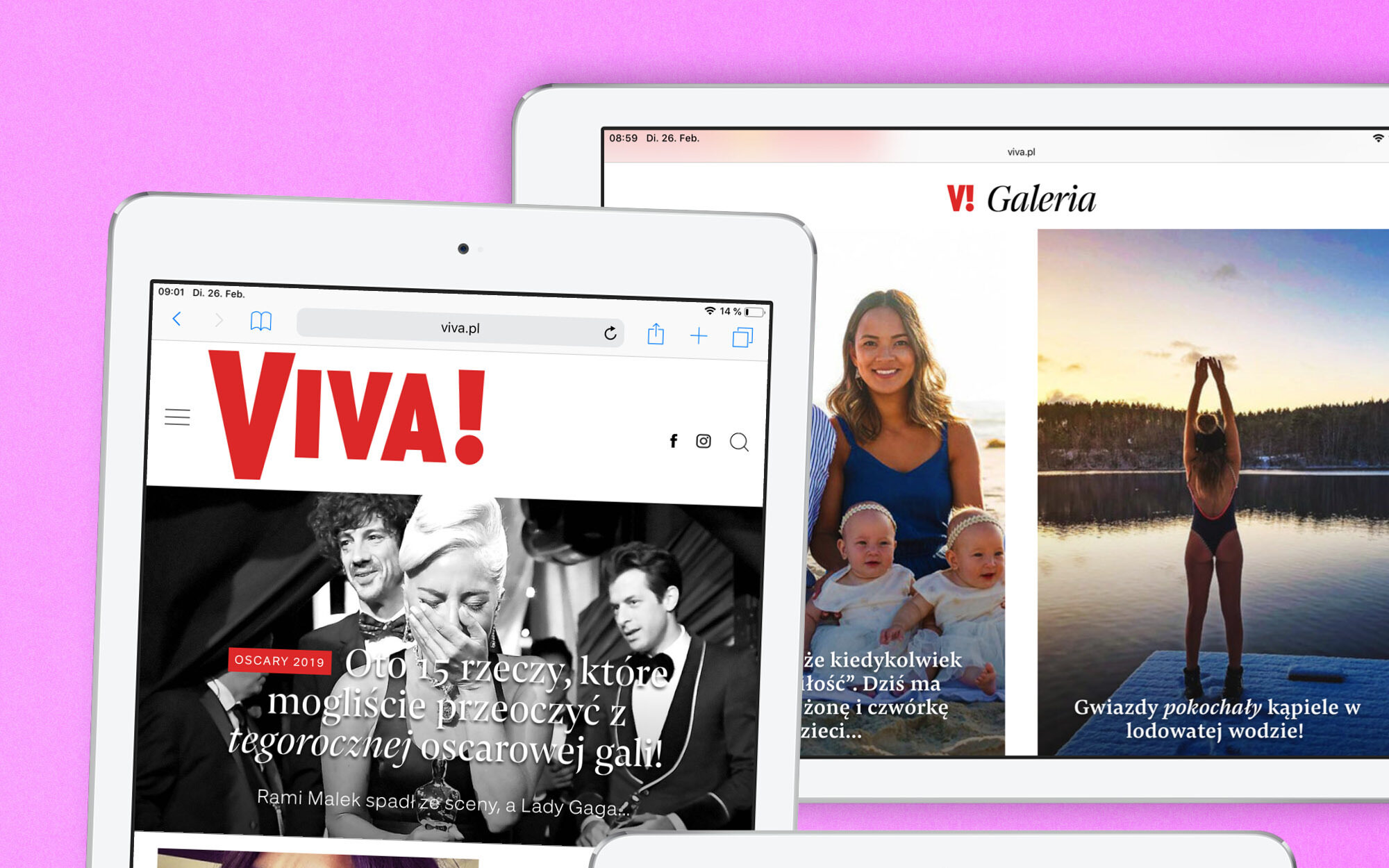
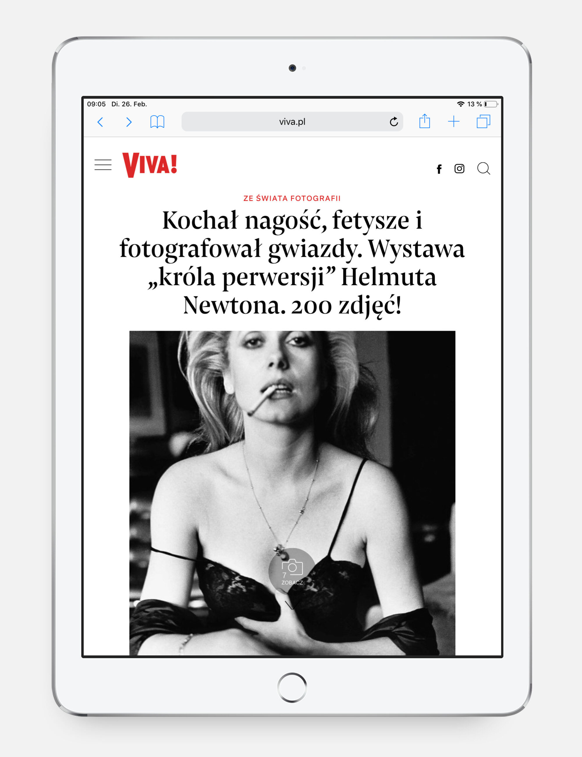
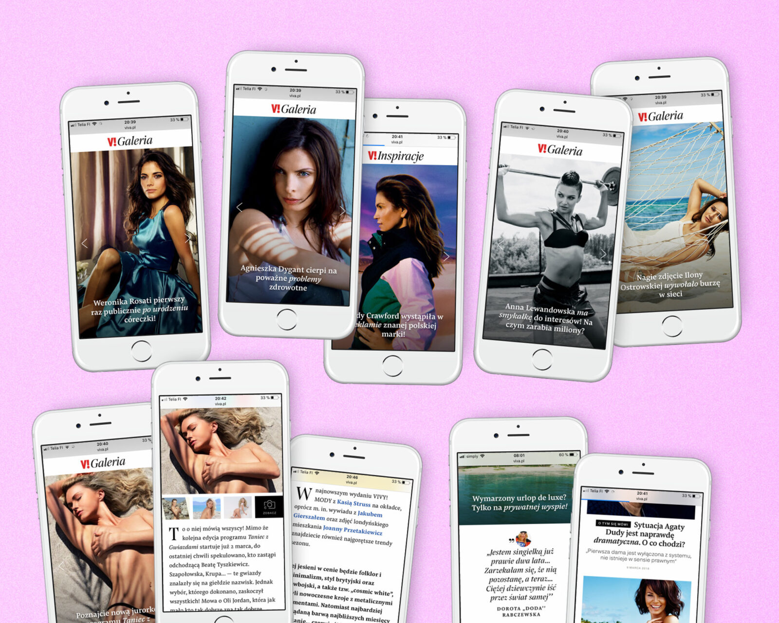
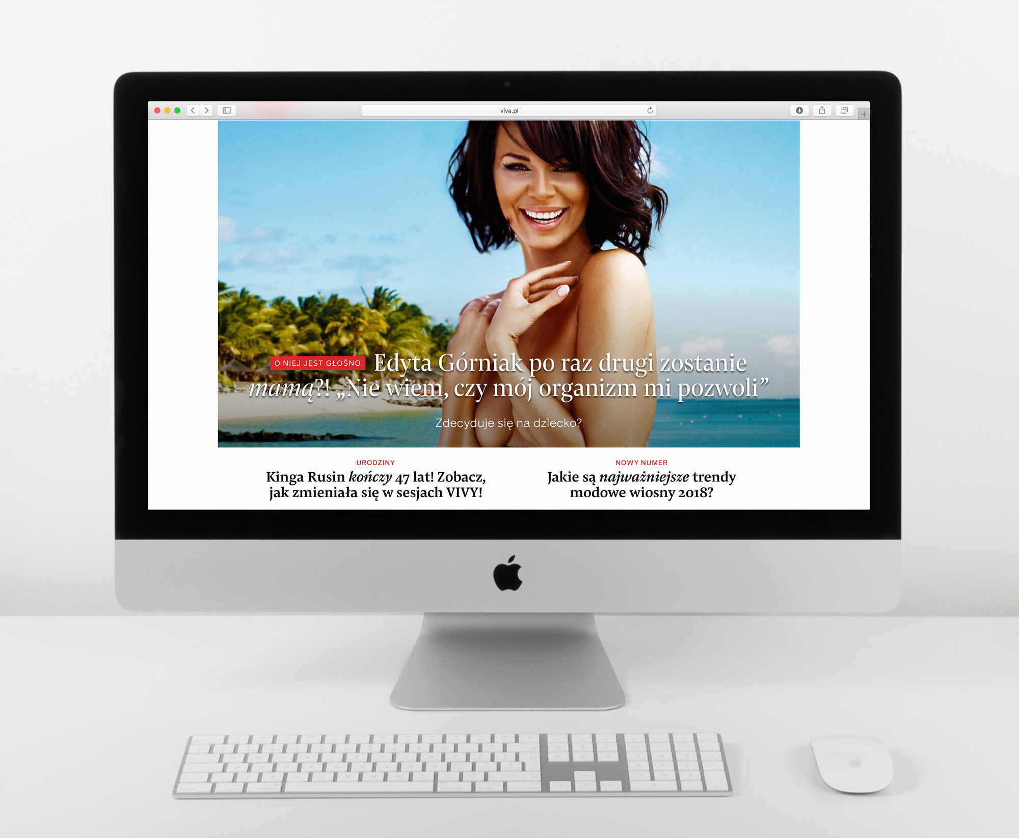
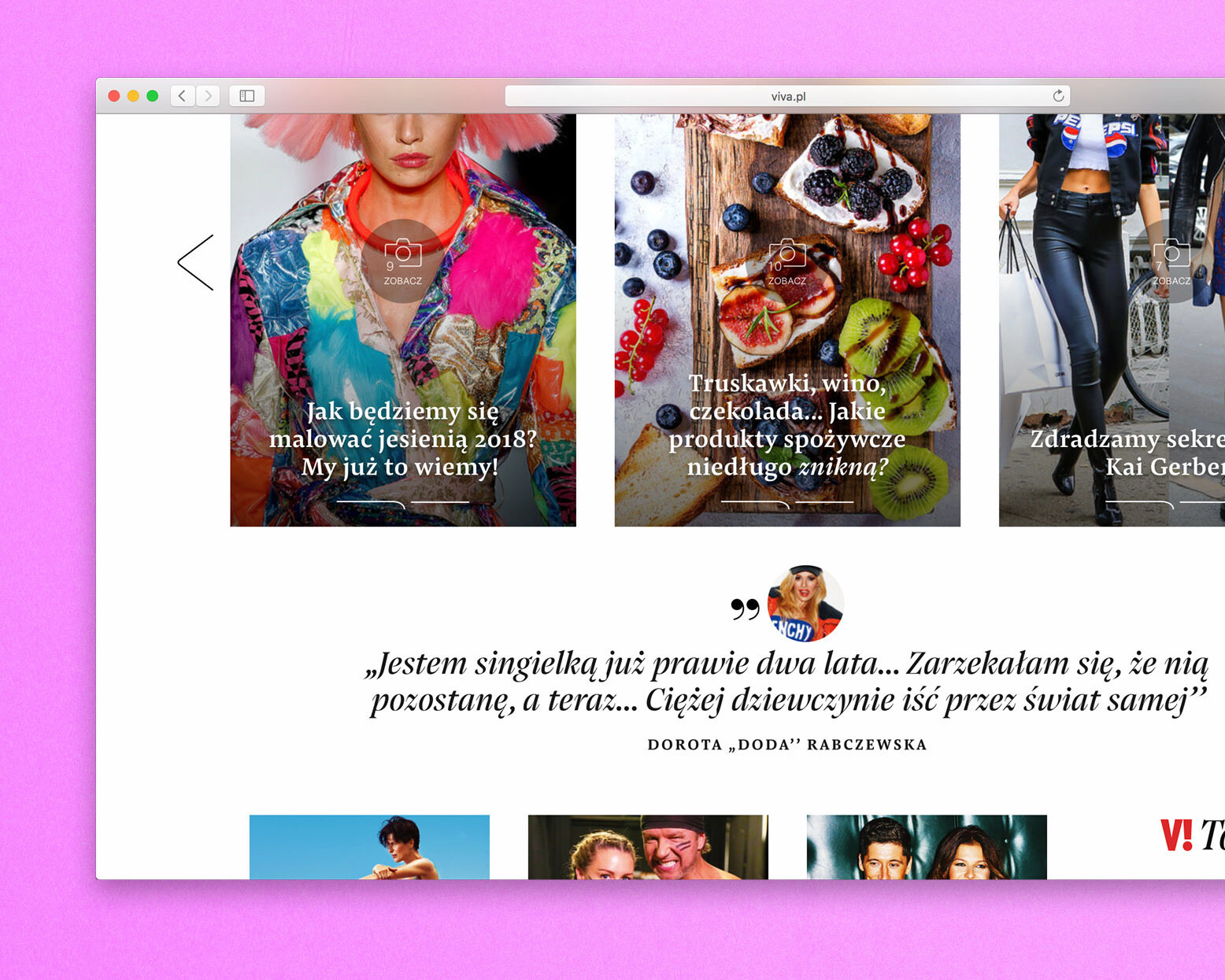
When dealing with beauty and fashion, Pensum’s high contrast mate Pensum Display is an obvious choice for headlines. Indeed, the use in big size brings a certain level of fashion to the photography centred layout. Moreover, as a feast for the eyes and a branding element, the curvy, yet sharp italics can be found in every single headline.
Pensum Display is the spiky and triangular mate of Pensum Pro, designed to be used for anything big
18
styles by Nils Thomsen
Pensum Pro is a typeface for text, text and nothing but text
18
styles by Nils Thomsen
Pensum Pro is a typeface for text, text and nothing but text
18
styles by Nils Thomsen
Pensum Display is the spiky and triangular mate of Pensum Pro, designed to be used for anything big
18
styles by Nils Thomsen
