From Commercial Success to Cultural Responsibility
This article is a little different from our regular news, it includes Jakob’s personal reflections and is an ode to the Cera collection, a type family that has had a huge impact on his commercial success and given him artistic freedom.

Initially, Jakob designed Cera to become a product for a
broad range of applications and tastes, paired with pan-European language
support. The result turned out to be commercially successful. Cera is
constantly reviewed and extended in order to improve it and respond to how it’s
evolved in designs by numerous designers and companies. Thanks for the
support!
So! There’s news: Cera Pro, along with the Round and Stencil variants, has been improved and updated. They all have new Cyrillics with the help of Ilya Ruderman and Yury Ostromentsky from type.today. Greek script support has been improved thanks to Irene Vlachou and, last but not least, Latin accents, kerning and combining marks plus minor curves have been optimised. Alphabet Type helped to improve TrueType hinting. Cera’s pan-European language support has been taken to the next level!
For us, designing for other cultures also means treating their alphabet with the necessary respect. Cera’s economic success enables us to incorporate native-language expertise into our workflow and to design fonts in a culturally sensitive way.

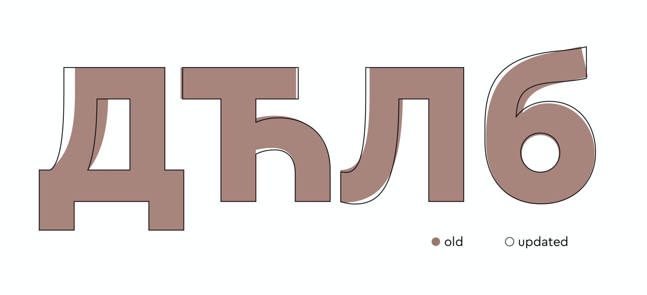
The proportions of most Cyrillic letters were changed slightly by Ilya and Yury to respect the native script. Others like the letters De, El, Tshe or the Serbian variant of be had to undergo a redesign to fit the standards.

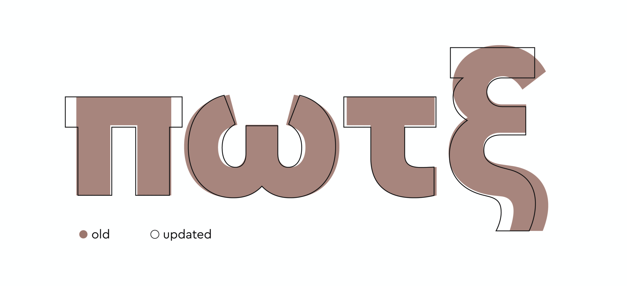
By changing small details and introducing a major change to the letter pi, Irene’s advice redefined the Cera Pro’s Greek language support.
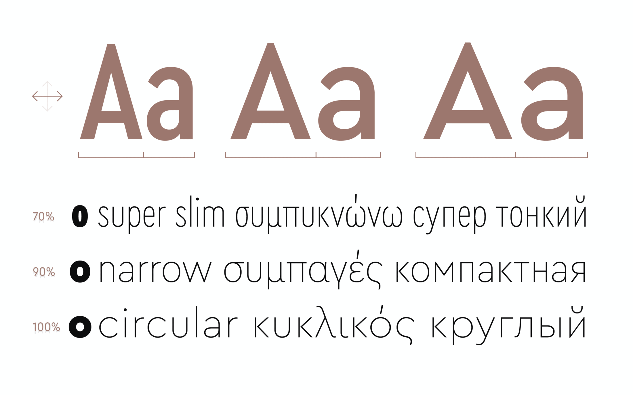
On top of all that, there are two new Ceras: Cera Condensed and Cera Compact. Adding flexibility to the Cera Collection, Cera Condensed is about a third more space-saving than regular Cera Pro. Even more interesting, from now on there is the opportunity to create a slightly narrower Cera or a slightly wider Cera Condensed — variable design space, here we are!

But let's go back to the personal impact Cera’s had on its designer.
Despite its clean and minimalistic design, Cera is quite an emotional product for Jakob. Cera is constantly reviewed and as Jakob advances as a type designer, he finds himself spending a lot of time on finding and fixing old bugs. Despite that, he is grateful to have this typeface and the financial freedom to be able to afford cultural improvements to other TypeMates fonts.
Without selling so well, Cera could not be constantly improved. Another review to its Greek and Cyrillic extensions could not have happened.
As 30% of all revenue go to TypeMates, Cera has had a huge impact on Nils’ and Jakob’s independence, helping to establish the foundry and its webshop. For Jakob, the remaining 70% have ensured that he can make a living from type design while budgeting and investing in new projects: whether it’s hinting for the (TDC award-winning) Harrison, involving other designers in the overhaul of Sinews Sans, or exploring variable font ideas without having to limit those explorations by commercial demands.
In short: Cera Pro is Jakob’s key to keep on developing professional type design.
We’ve also used Cera to benefit other designers, like Lisa Fischbach, our latest TypeMate. By creating Cera Round, Lisa not only added a new voice to the Cera Collection, but gets most of the revenue and greater financial independence.
Alongside improving and sustaining our work, Cera takes its responsibility seriously. You as a customer will
get an updated Cera Pro with better script support and access to an ever
wider design space with different widths, rounded strokes, stencils
and handmade brush variants.
We really want to thank everyone who gave us the freedom to make this
improvement possible. We look forward to seeing it in new designs containing the recent additions and the rest of the updated
collection.
If you have bought a licence for Cera before May 2018,
especially if you make use of the Cyrillic or Greek languages, send us
your invoice and we’ll send you an update.