Bio‑Hybrid Identity
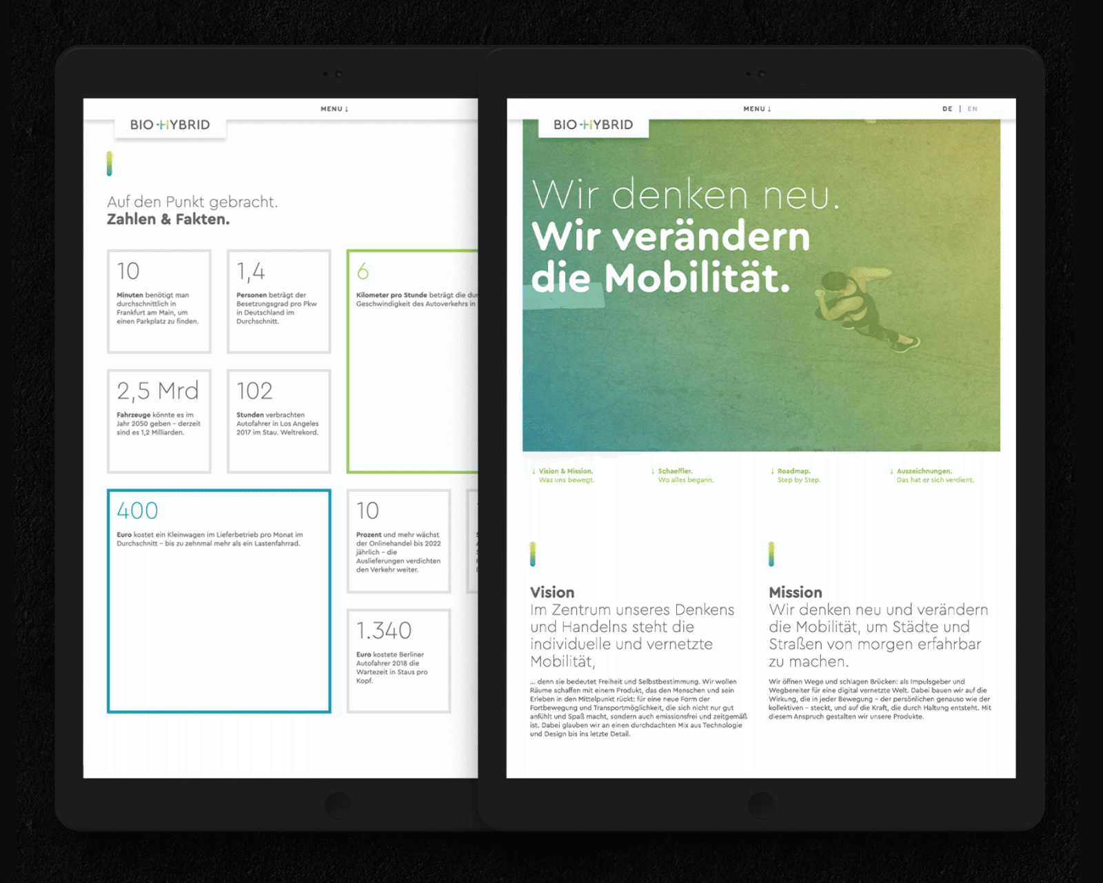
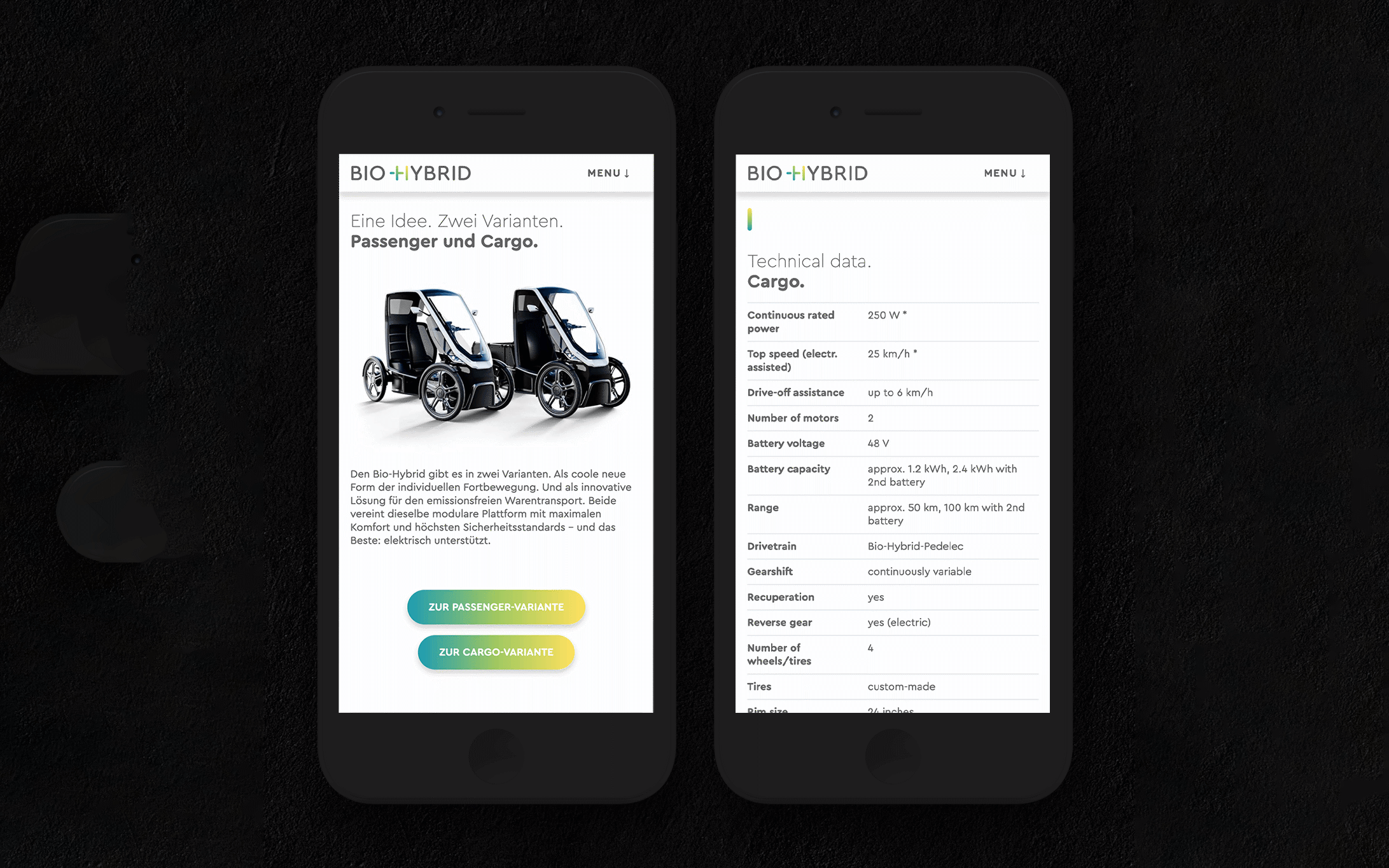
Munich based and digitally focused agency Brandcode created a visual identity for a mobility startup Bio-Hybrid by using Cera Round.
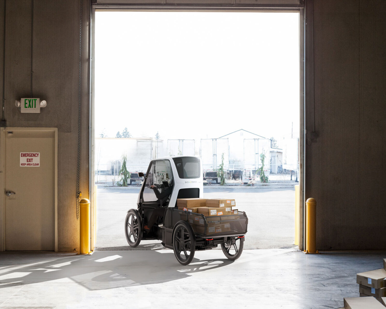
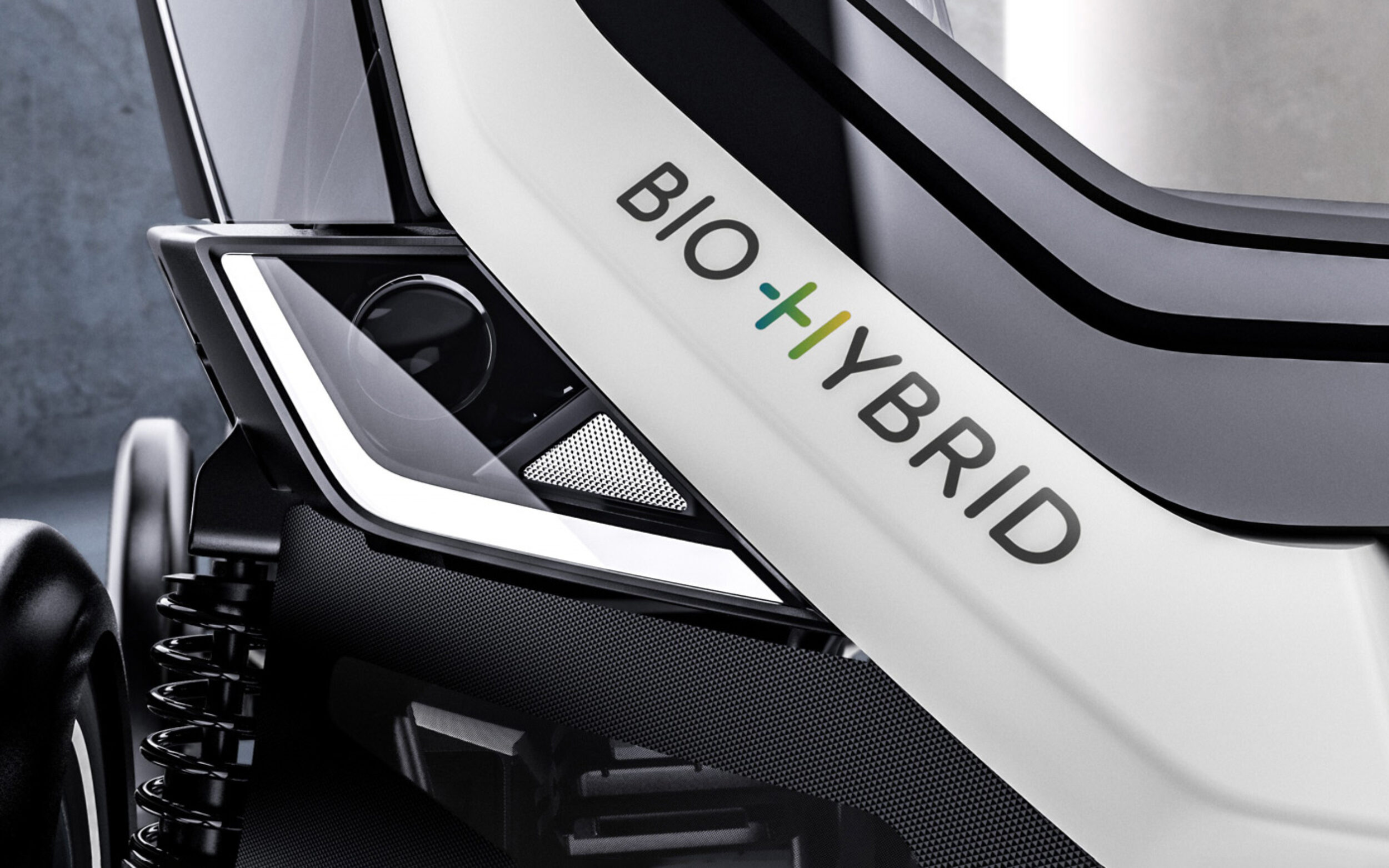
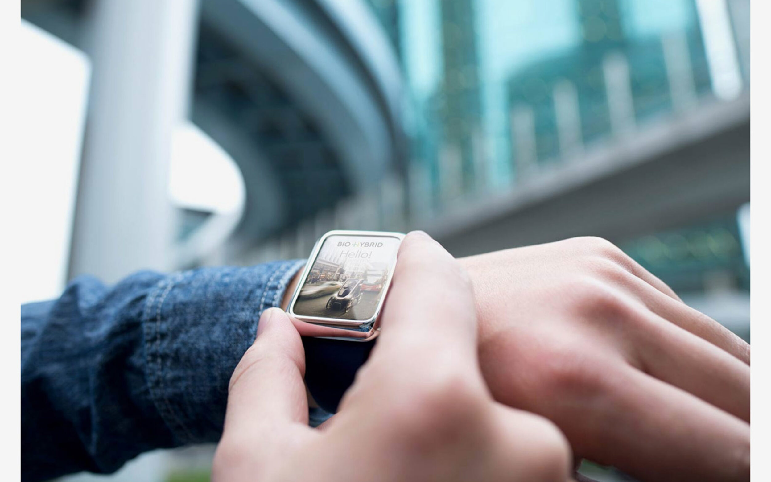
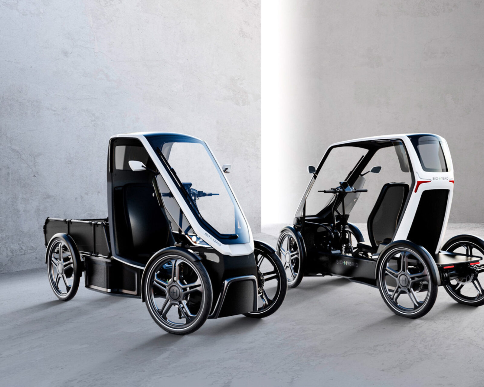
The Bio‑Hybrid stands for a new, contemporary form of personal urban mobility and means of transportation. We are committed to delivering a synthesis of functionality, design, technology, driving pleasure and zero emissions. We provide impetus and pave the way to a digitally connected world.
At this moment in time, the typography is only implemented into the branding. Omce the first vehicles will be delivered, Cera Round will also be used for apps and user interface. This project also proved that team work makes the dream work! The hyphenated brand name made TypeMates add the Non-Breaking hyphen (U+2011) to their standard encoding.

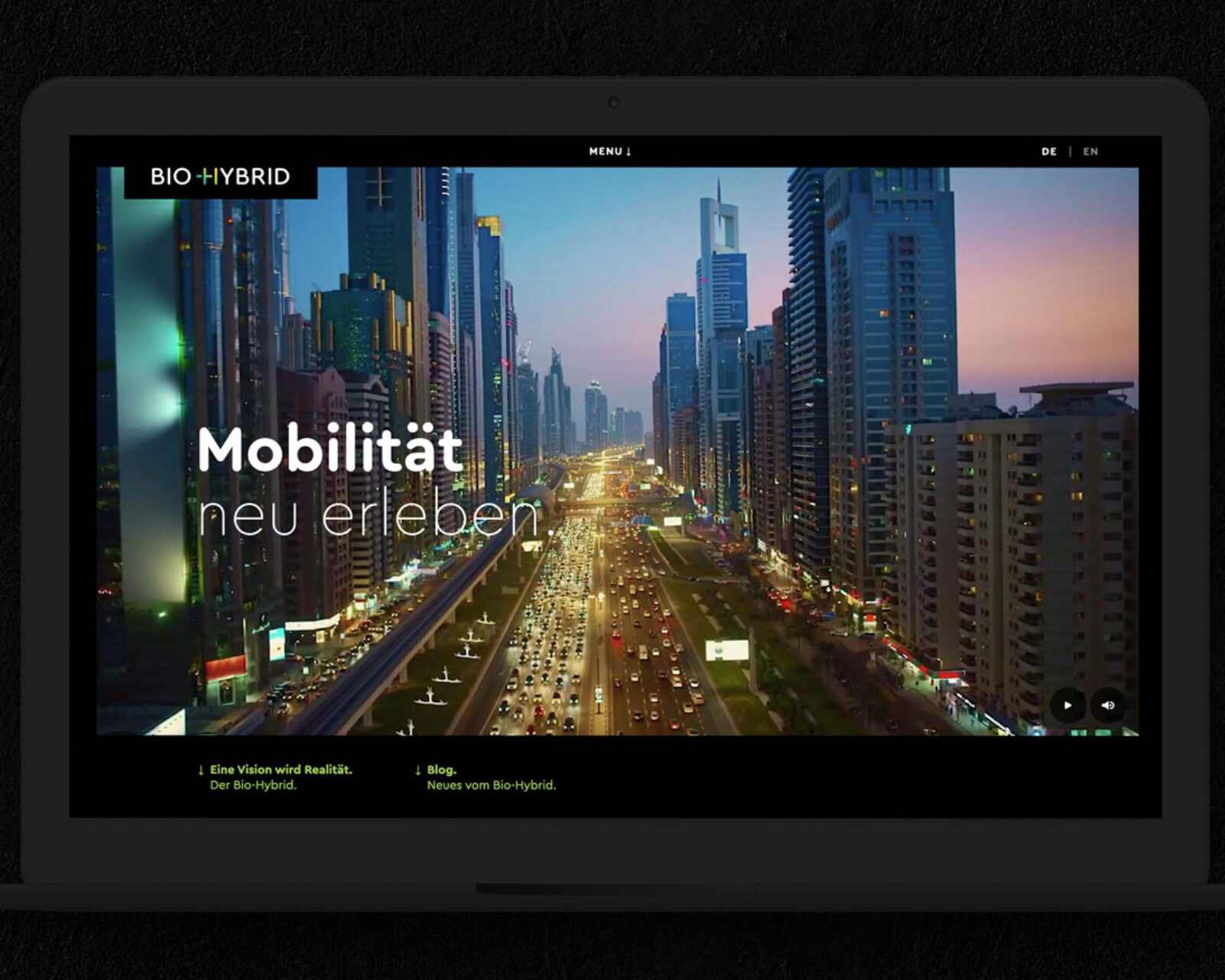
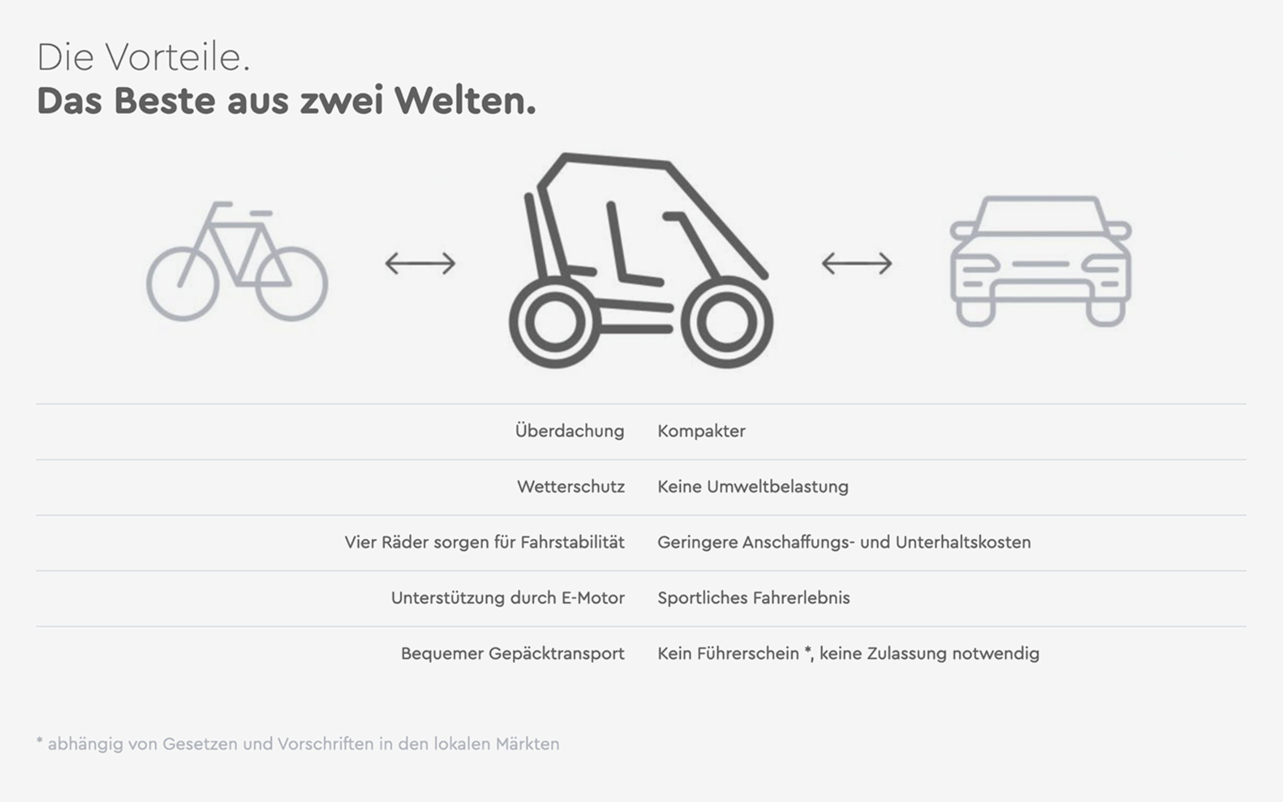
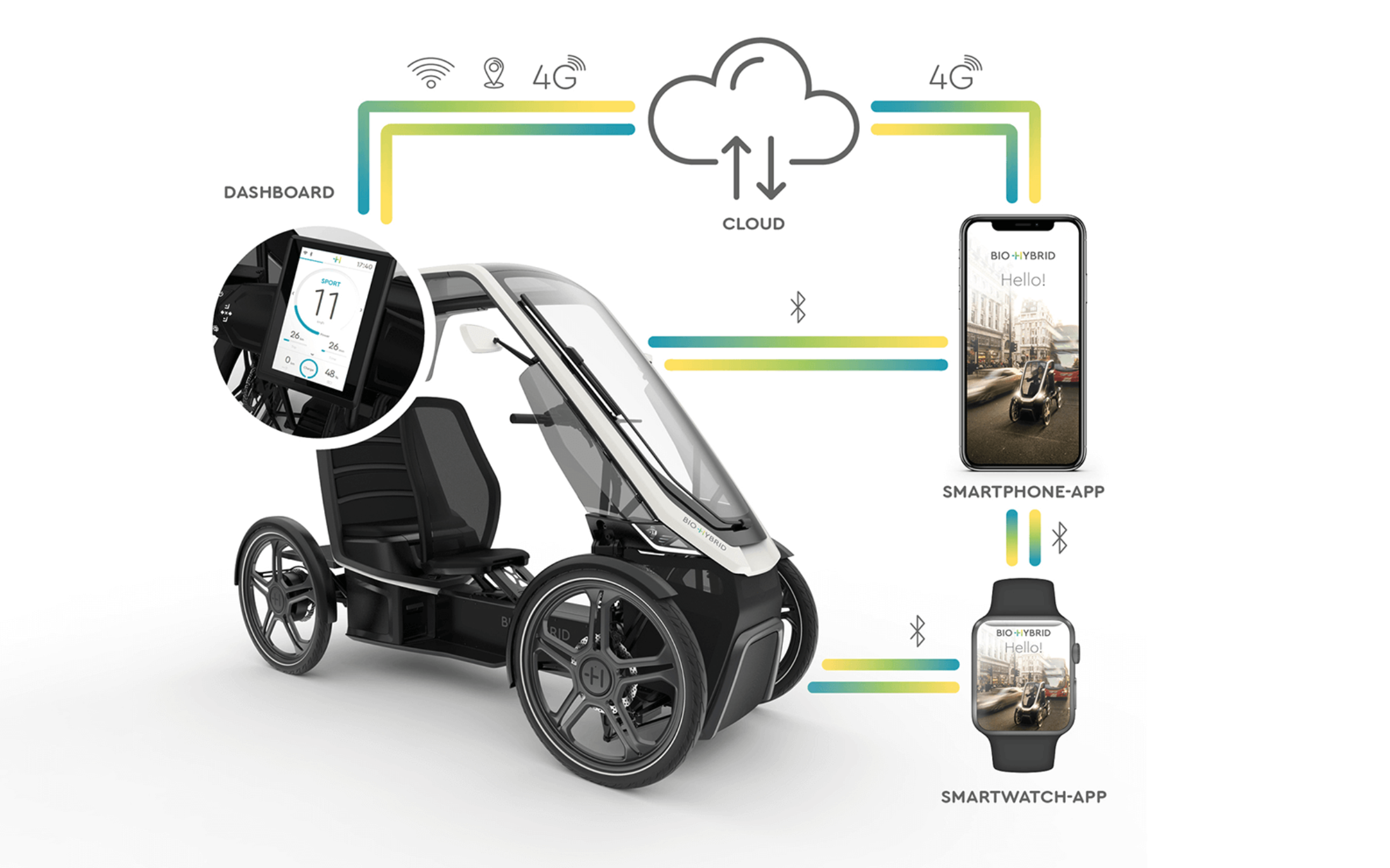
Thanks to Bio-Hybrid for the images.