Back in Black
According to some designers, typefaces are never finished, but only abandoned. But sometimes typefaces are found again. This is the story of Sinews Sans and how it was remastered and provided with pan-European language support.
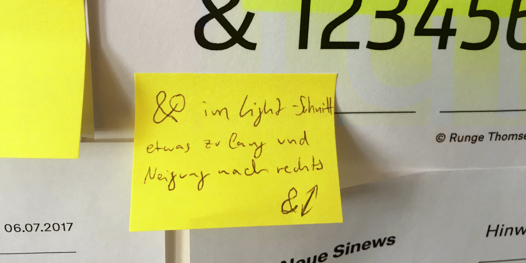
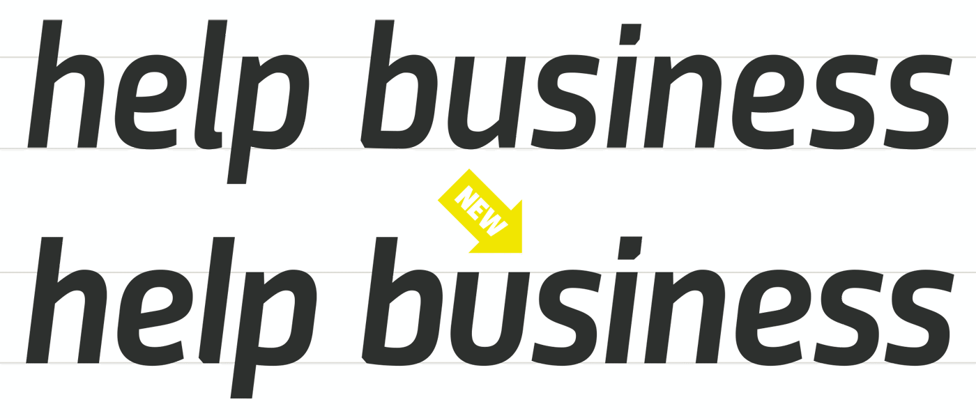
In 2017 the Regional Brands from BSH Hausgeräte GmbH needed a typeface for interface and information design. Thanks to them, TypeMates got to spend time looking back at one of Jakob Runge’s first designs. Originally released in 2012 at Gestalten Verlag, Sinews Sans is a technical sans with humanistic touch. Working with the Regional Brands, it has been comprehensively remastered. It stands a little straighter, its curves are more toned and it can stretch and flex in new ways.
Named after the fibrous connective tissue that binds muscle to bone, Sinews Sans takes square constructed forms as a base and invigorates them with organic twists and inflections. The combination of industrial structure and human spirit means that Sinews Sans can be calm and technical while being true to the Regional Brands Balay, Profilo, Pitsos und Constructa, whose household applications are designed by and for humans.
Collaborative Approval
For Jakob, returning to the design was an opportunity to engage with type design not as a one man job, but as a collaborative process. With essential work contributed by other designers — Nils Thomsen drew the light and extrapolated black master, Leo Philp contributed to the Italics, Natalie Rauch helped on the light Cyrillic and Lisa Fischbach was involved in absolutely everything and drew most of the Greek and Cyrillic — Jakob could (drink beers) focus on seeing the typeface as a whole. For Jakob, the improvements he saw in Sinews Sans were a point of honour:
"I could not help but do all these curve improvements to have a typeface with the level of quality TypeMates stands for today. Sinews Sans was my first complete type family, and I wanted it to benefit from the experience I have now."
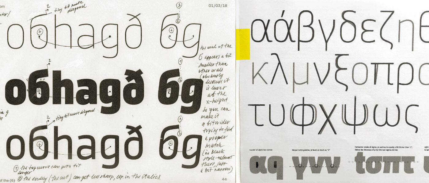
Adding language support to any typeface is not just a technical exercise, but a matter for cultural understanding. For Sinews’ expansion into Greek, TypeMates enlisted Irene Vlachou to give in-depth advice. While at a fabulous Cyrillic workshop, Lisa asked Maria Doreuli and Krista Radoeva for their feedback on Cyrillic.
However, the redesign of Sinews Sans is not just the story of type designers working together.
Functional Approval
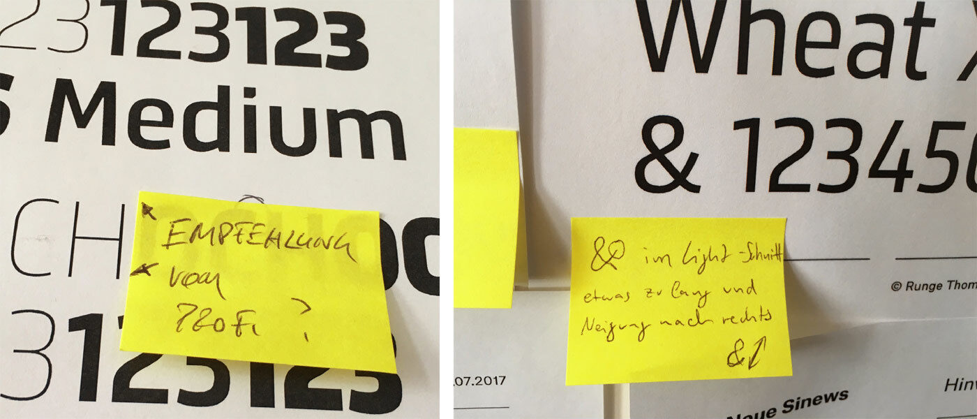
The designers at the Regional Brands from BSH Hausgeräte GmbH came to TypeMates with clear ideas about how Sinews might be improved and what features they wanted the typeface to retain during the remastering. With a precise eye, Martin Reichhuber, Sabine Groß and Jichao Zhu highlighted where the original design might be improved, where new features could be added and tested the results rigorously.
Their high standards and knowhow kept the work on Sinews Sans focussed, ensuring the typeface was tailored to fit branding needs and would excel in interface and information design.
Together with the Regional Brands, we expanded and improved Sinews:
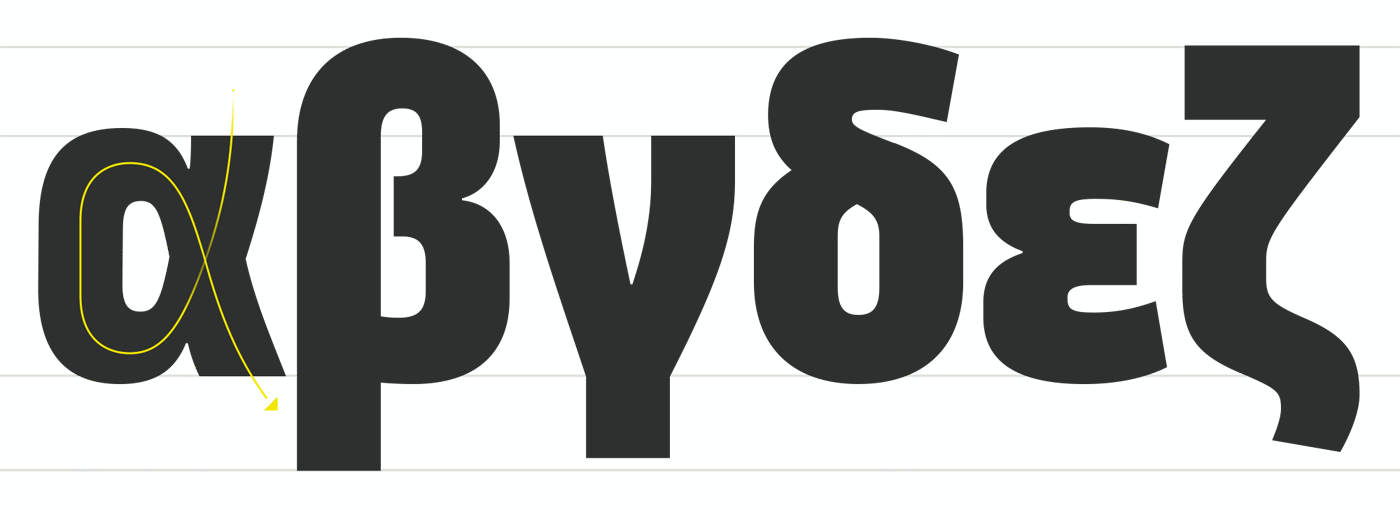
It now speaks Greek: the company had a market there, but didn’t want to depend on boring system fonts for their communications. A full pan-European language extension was natural.
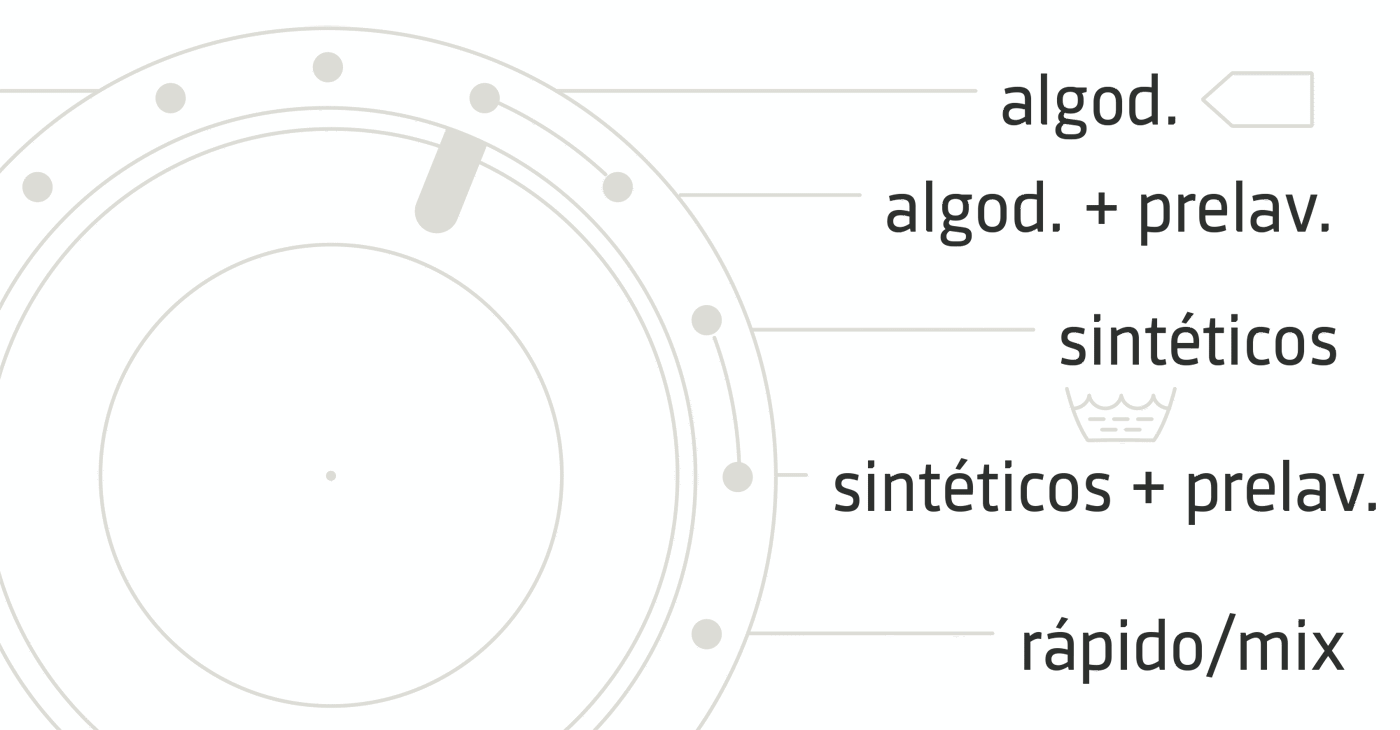
It’s still space-saving. Sinews Sans is a little more condensed than most regular typefaces, but not much: a nice fit for interfaces and narrow printed applications, like washing machine labels.

It’s uni-width: the typographic puzzle of interfaces and silkscreen prints for hardware can be complicated, Sinews Sans doesn’t get in the way. You can lighten and darken text set in Sinews without having to worry about reflow: text will stay where it is and won’t suddenly sprawl into places it shouldn’t be.
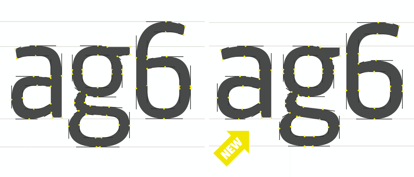
A complete refresh. Although happy with the atmosphere and style of the typeface, Jakob saw places where it could be improved: Lumpy curves are now smooth, spacing and proportions now sing, and every single letter has been redrawn and remastered.
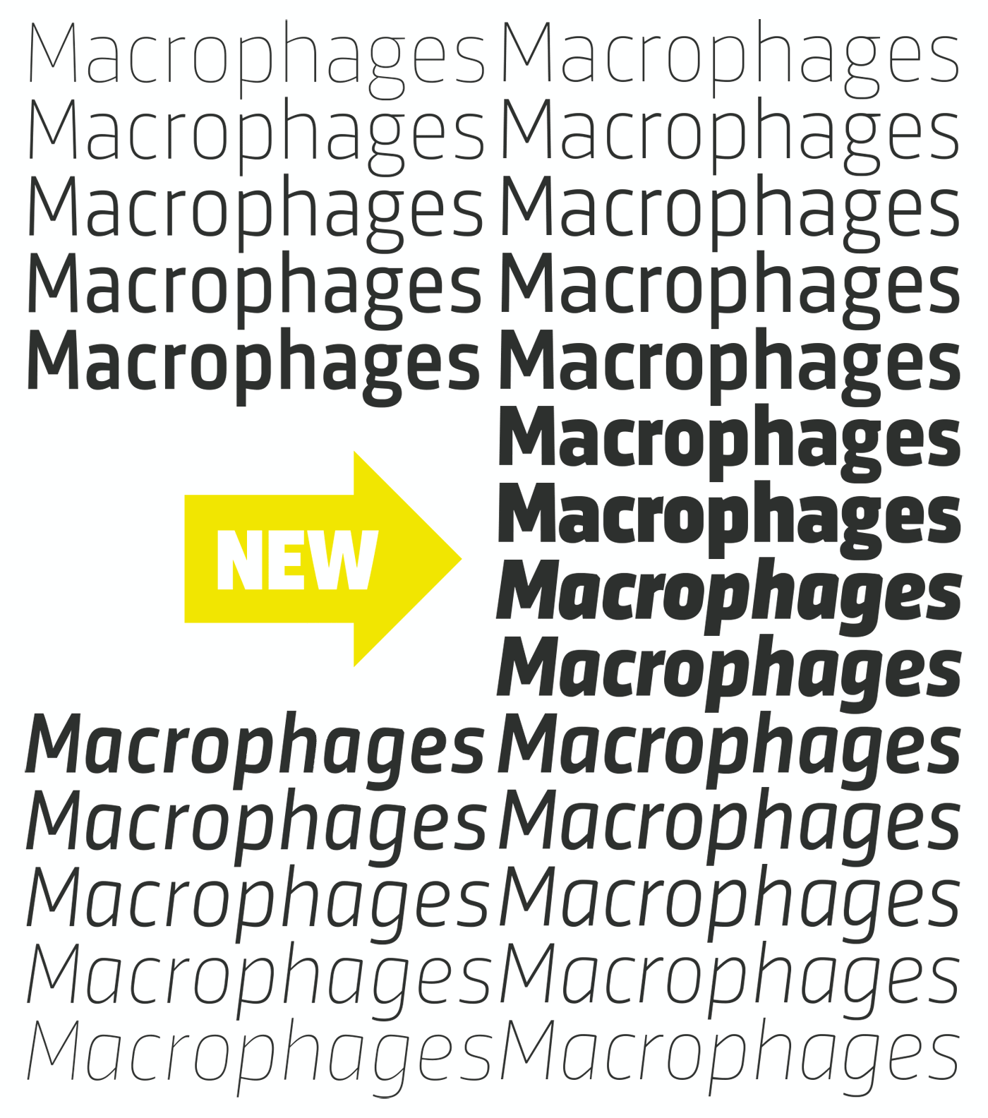
It has a new spectrum of weights. Almost every serious font needs a proper Bold, but for the old Sinews Medium was the boldest weight. Times have changed, and now Sinews has a proper Bold and a nice heavy Black: broadening its range of expression and expanding its usefulness to designers.
Completely remastered, with its wide character set extended to embrace Greek and Cyrillic, Sinews Sans has all the features you would expect from a TypeMates font. And like all TypeMates fonts, is available for print+web, embedding and server licensing. Plus, you can test all styles of the typeface for free, on your desktop.
Trained for branding, exercised in information design and ready for interfaces, you can explore Sinews Sans today.