From Corporate to Public
After being put to work as a custom font for the large hardware and software reseller Comspot, the eponymous typeface was extended and is finally available to the public. Here is how Comspot made it from corporate font to retail font.
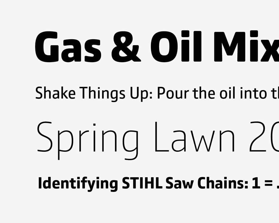
In the beginning of 2015, Nils Thomsen designed a corporate font for Hamburg based hardware and software reseller CPN Cooperation Network GmbH and its partner Comspot.
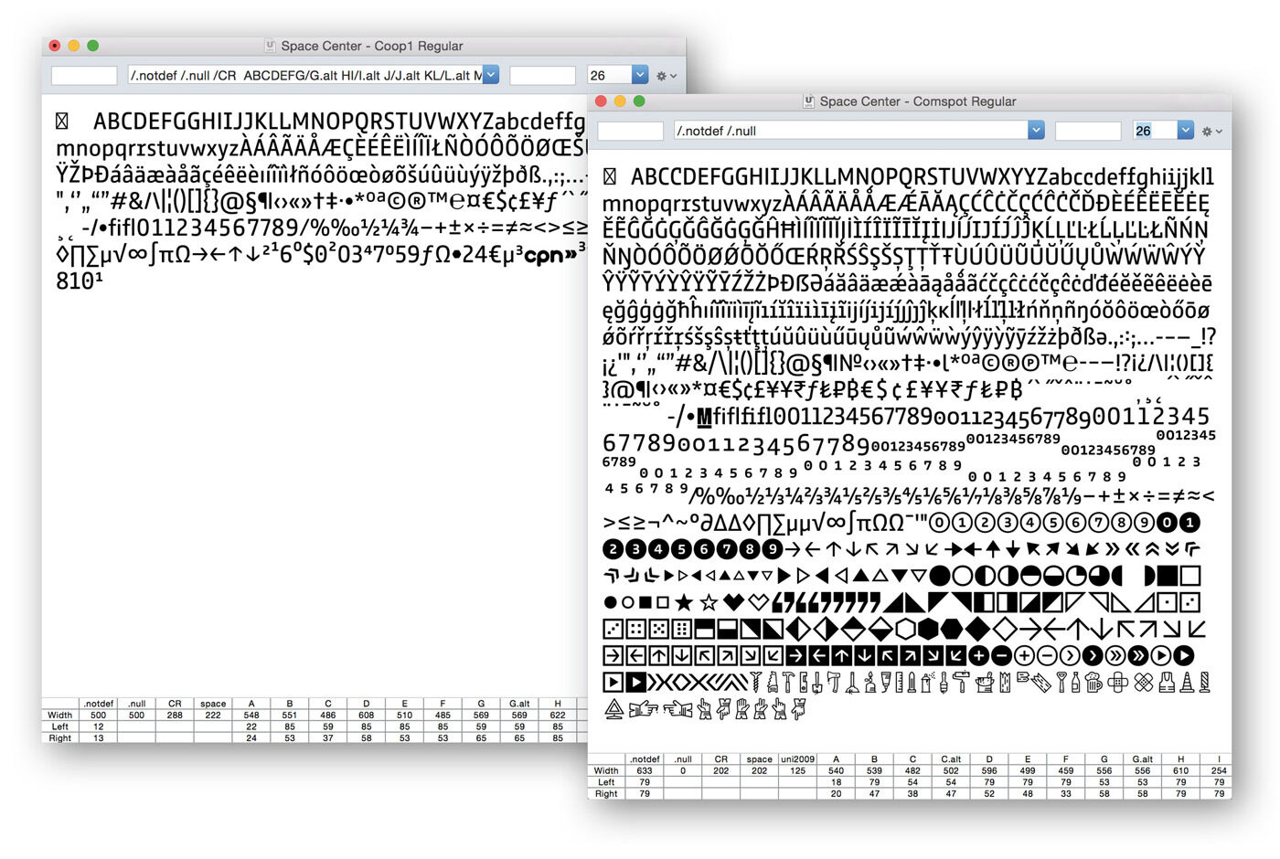
As CPN have their origins in programming code, Nils focused on monospace fonts when branding the identity with a custom typeface. As the legibility of non-proportional, monospaced, letters can be quite unsatisfying, the process of developing a custom font lead to modern and proportional letters with shapes, that suggest a monospace origin.
The process of Comspot lead to modern and proportional letters with some shapes that suggest a monospace origin.
You can call it “just a feeling”, but emotions are the most important aspect in branding and in type design too — all technical requirements aside. Where the original Comspot corporate font uses the monospace flavoured alternates as a subtle branding element, the retail version of Comspot separates them clearly. The 2017 Comspot is quite clean and more conventional, while in Comspot Tec all the striking typewriter shapes are default.

There’s no doubt that Comspot is a typeface with a technical focus. But adding a pinch of friendliness is not bad at all, especially when it was designed for communicating technical issues by humans to other humans. That is why Comspot is subtly rounded. The amount of rounding increases from Hairline to Ultra, creating fine and elegant light styles and approachable heavy weights.
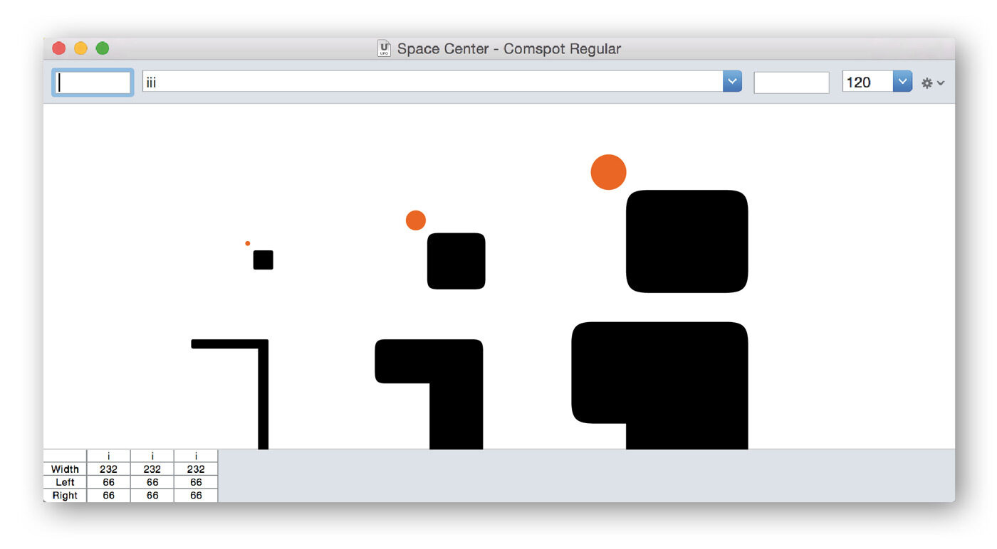
Because a reseller wants to sell — of course they want to — the figures were key during Comspot’s original development as a corporate font. Prices did not just have to look nice, they needed to work perfectly in tables. Although figures should display very well on products or ads, for we also added oldstyle figures for text lovers.

Like almost every client, Comspot needed an individual typeface for all media. Of course it should work in reading sizes and appear very distinctive in larger sizes. It’s worth mentioning some of the applications and usage Comspot/CPN required: body text in magazines, product packaging, office software (Microsoft), server software for their invoices (filemaker), website, newsletter, billboards and much more. Adding the individual roundness and stylistic alternates to Comspot, meant there was no need to draw an extra display or text face. Comspot covers it all.
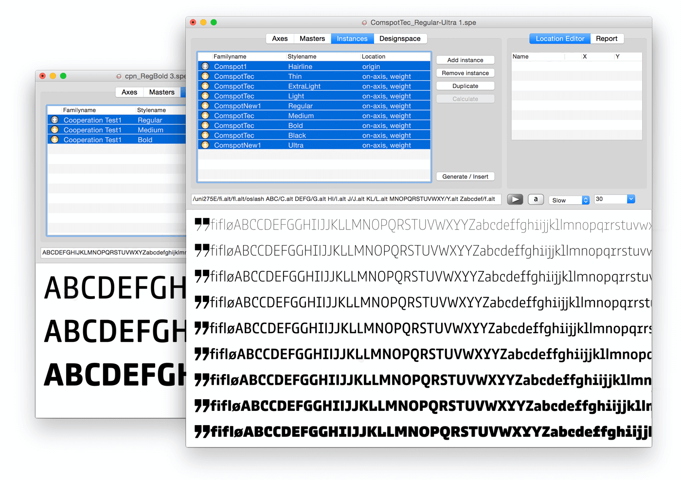
Whereas the original family needed just three weights to cover every necessary application, the 2017 Comspot has been extended to nine weights to cover extremes and make itself more useful in editorial and display uses.
The character set was also expanded. Starting with around 300 glyphs, the family now supports more than 870 glyphs in its current retail version.
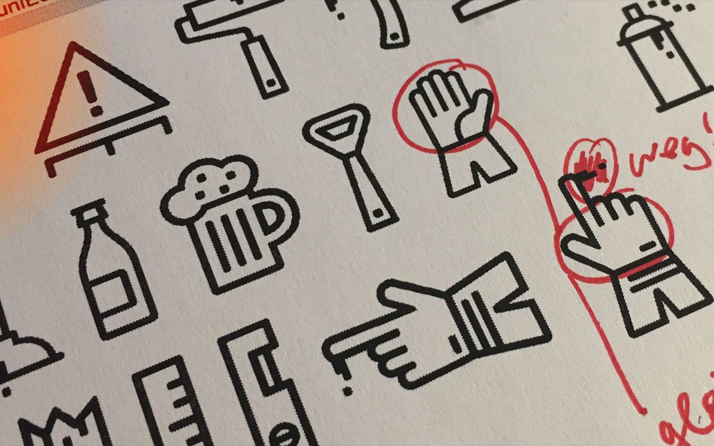
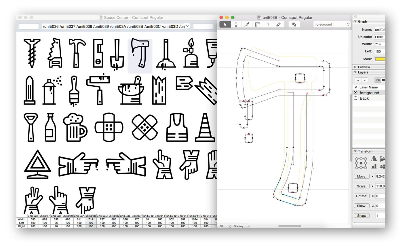
Language extension and more OpenType features are not the end of it — never stop a running Nils! Driven by the delusion of a do-it-yourself attitude he added more than 30 pictograms and icons with an amusing flair, especially the uniE03B, an axe that was not used for chopping wood…

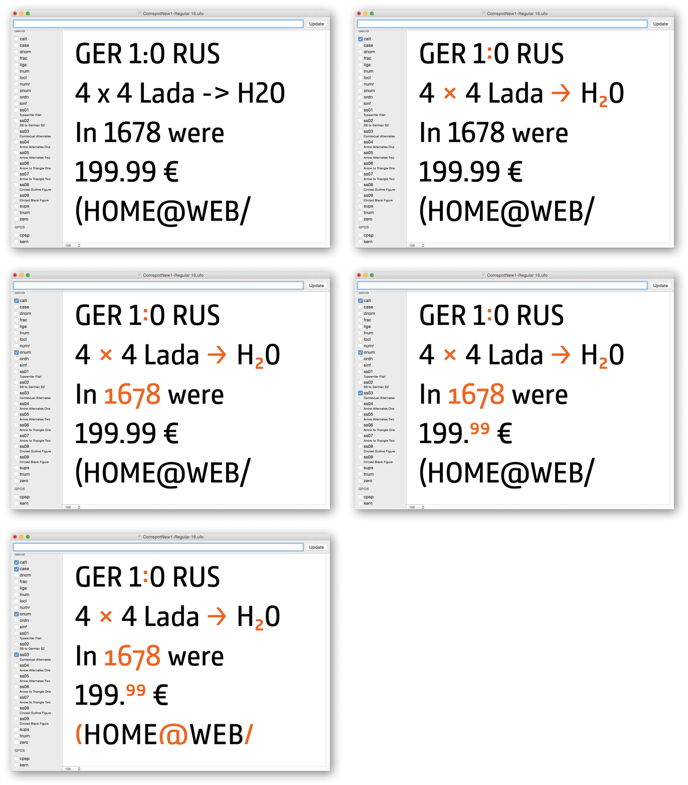
Comspot provides a nice OpenType feature for previewing contextual alternates and making some helpful auto corrections on the fly. Nils had a lot of fun estimating contexts that could benefit from such a solution. This feature doesn’t get in the way, it supports you in finessing text settings.
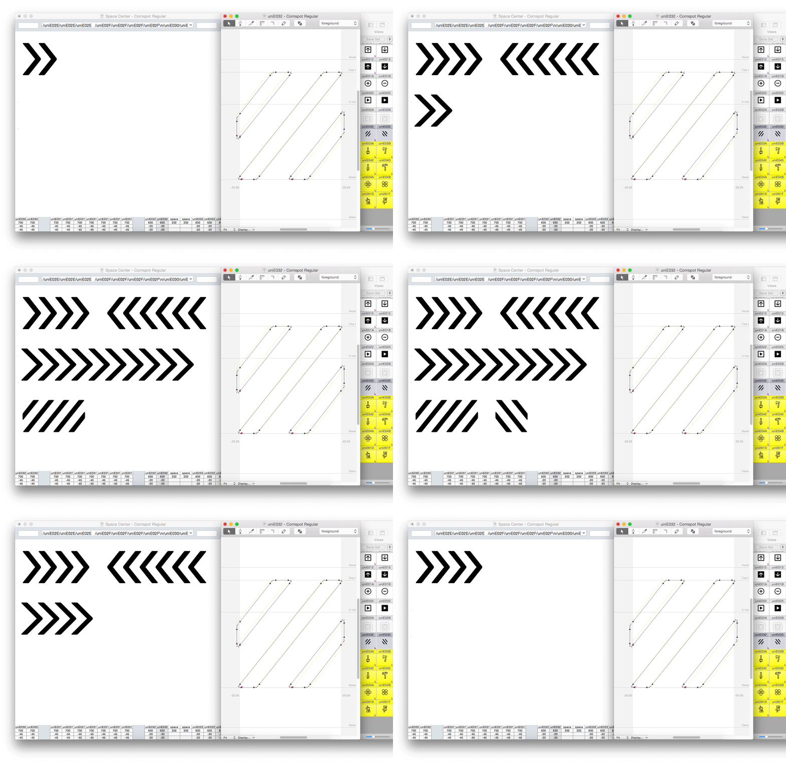
What to do when you have done all the systematic thinking for the letters and everything works fine? Coffee time? Nope, start with dingbats and geometric shapes.
Well, that was the Making Of Comspot.
Actually, wait a minute: what to do when you have done all the systematic thinking for the letters and everything works fine? Start with dingbats and geometric shapes. To extend the typeface — a tool itself — with a helpful toolbox of components to build nice patterns. Do-it-yourself style!
Finally, that was the Making Of Comspot. And now, a well earned beer for Nils and a Comspot’s product page for you.