Useful, but Not Always Easily Useful for Everything
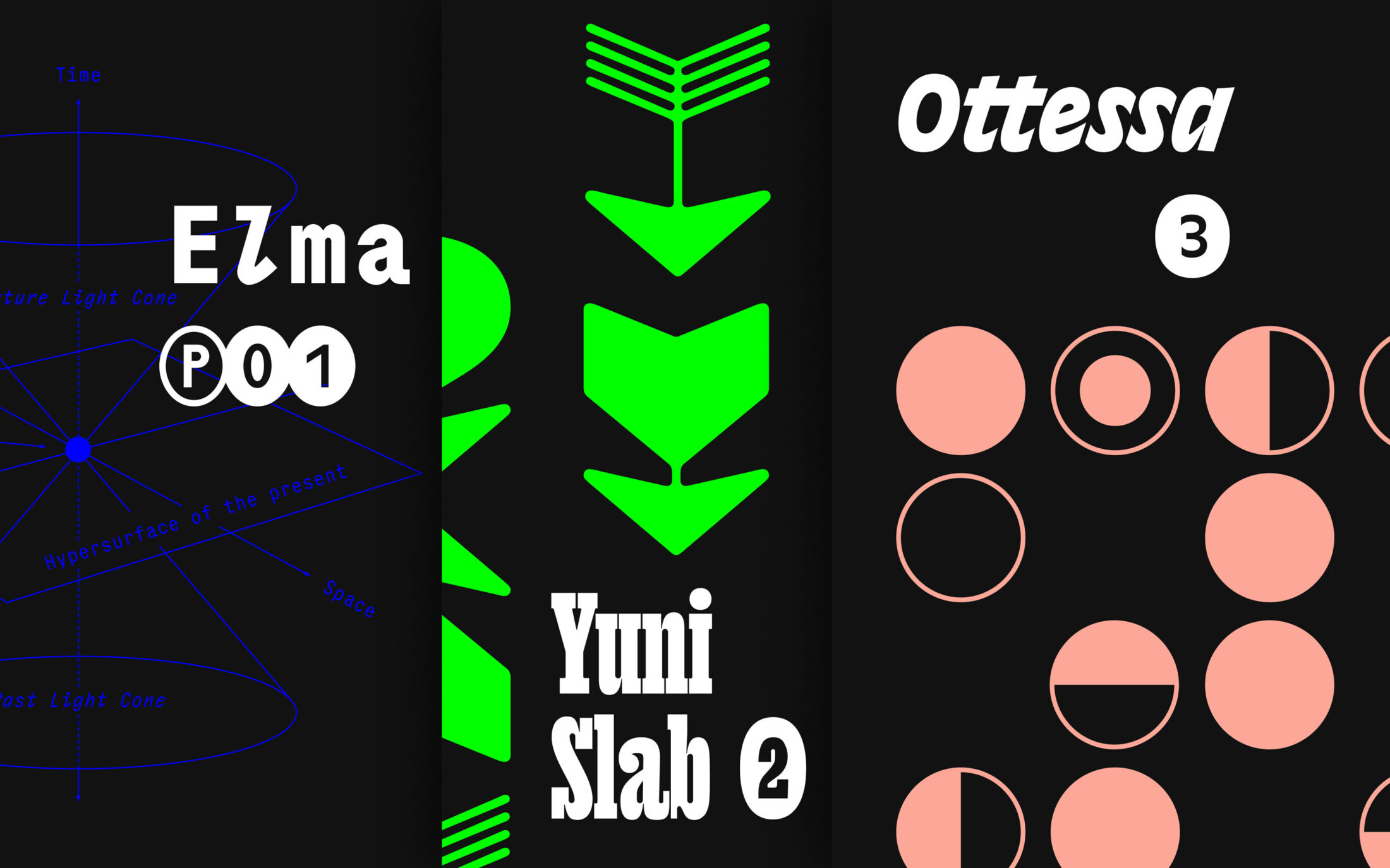
Our three fresh additions to the foundry have two things in common. Attitude: you do not have to follow trends to represent them. And Philipp Neumeyer, a multiple TDC award-winning type designer with unconventional ideas and a charmingly peculiar sense of style: “Ideally, I don’t create ready-made smooth pop, but something with rough edges that polarises. At least a little.”
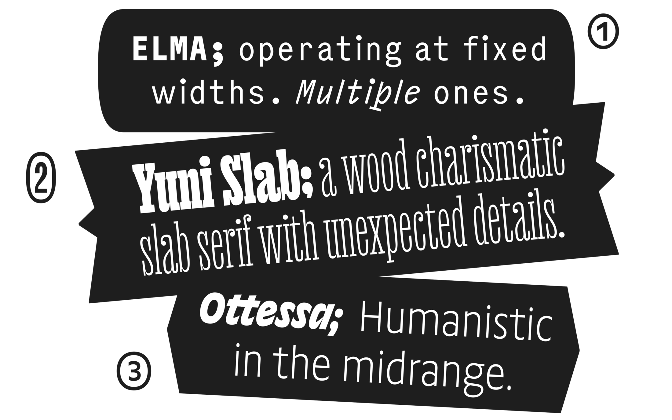
Three new faces: Elma for monospace lovers and connoisseurs of well-placed imperfection. Wood type charismatic Yuni Slab with unexpected details. Plus dynamic and refreshing Excoffon-flavoured sans serif Ottessa.
Elma, Ottessa and Yuni Slab all started differently. They all developed over years and staring at them for far too long inspired Philipp to add something special to each of them. In his design process, he is not forced to question established norms with eccentric forms, it’s more of an intuitive habit. The results are typefaces at the edge of the usable spectrum – usable, but not always easily useful for everything.
And that’s what this hat trick release is all about: something unusual. Let’s take a deep dive into something special.
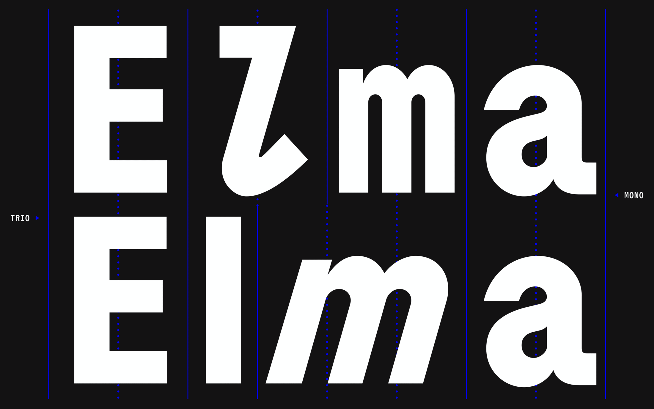
Fix pitched Elma Mono and faux-proportional Elma Trio
Trio and Mono Spaced
Trio was born after Philipp found out about typewriter typefaces introduced by IBM in the 1940s and Olivetti in the 1950s that used multiple character widths in seemingly monospaced designs. As he was working on Elma anyway, Philipp felt inclined to try multiple widths within its design.
Experiments revealed that a trio-spaced version can be a legit counterpart to a Mono. Although it feels like the proportional design at first, it actually isn’t. Instead, it can be understood as a parody and while it retains a lot of the monospace charm, it’s more comfortable to read, too.
Without a doubt, the experiment and its outcome justified Philipp’s extra work. The resolutely fixed pitch Elma Mono offers monospace’s benefits and, for some purposes, the faux-proportional Elma Trio offers more usability.
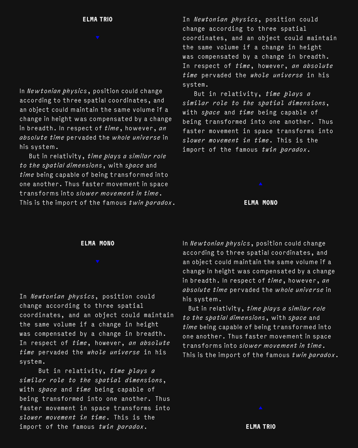
Toggling between Mono and Trio variants highlights the effect on layout.
Imperfection in Curves
Beyond the excitement of Mono and Trio versions, Elma has a “New Retro” thing going on. Its unconventional curve tension is reminiscent of pre-digital times.
The imperfection of the “angular” rounds was inspired by an encounter Philipp had with Futura, way back when he was at Muthesius Kunsthochschule in Kiel. Opening a Futura font in FontLab5 – recompiled font data, that cheeky monkey — Philipp realised its O did not look like a “perfect” circle. It felt like the vector handles were not extended enough to make it perfectly round. This bothered him a lot. Once this odd curvature had been seen, it couldn’t be unseen. This — “The Futura Incident” — was so traumatic that it stayed with Philipp for a long time. In 2015 he moved towards acceptance and as the imperfect detail changed from being bothersome to interesting Philipp started to design a proportional typewriter style slab serif with slightly “imperfect” curvature.
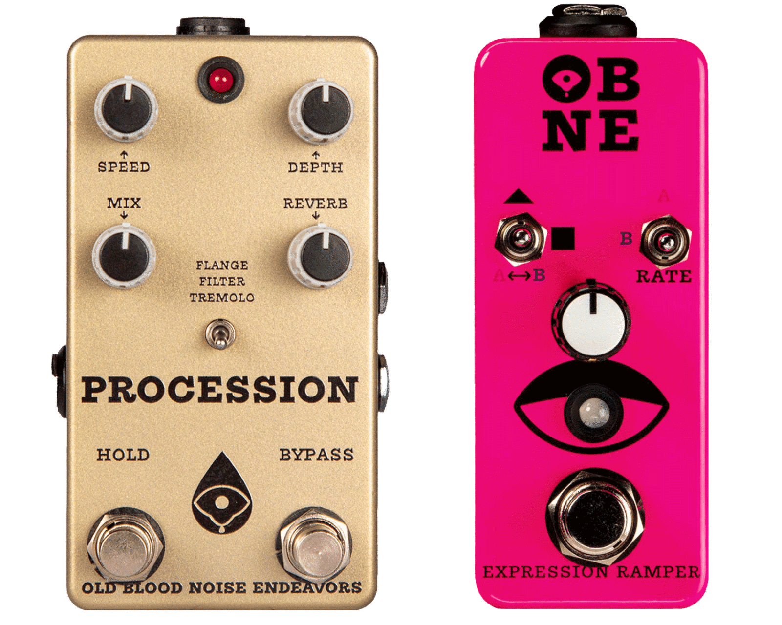
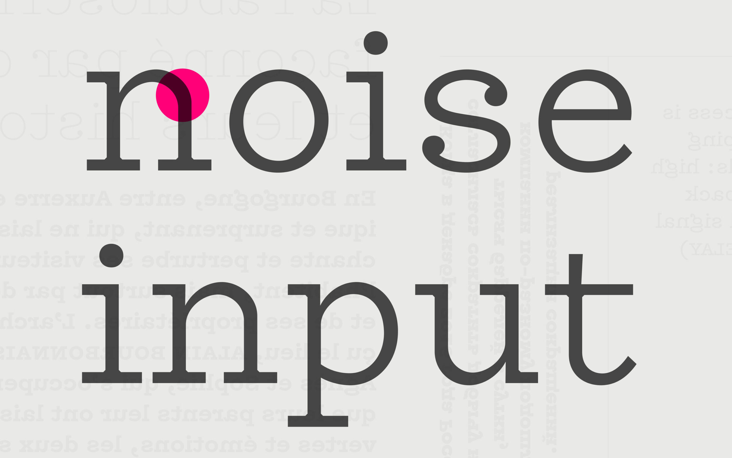
OBNE Text was a very first try with ‘imperfect’ curvature.
When Elma began in 2018 this idea of “imperfect” curvature was incorporated and became stronger and more visible. It’s the Bruce Wayne story — turning phobia into a source of strength.
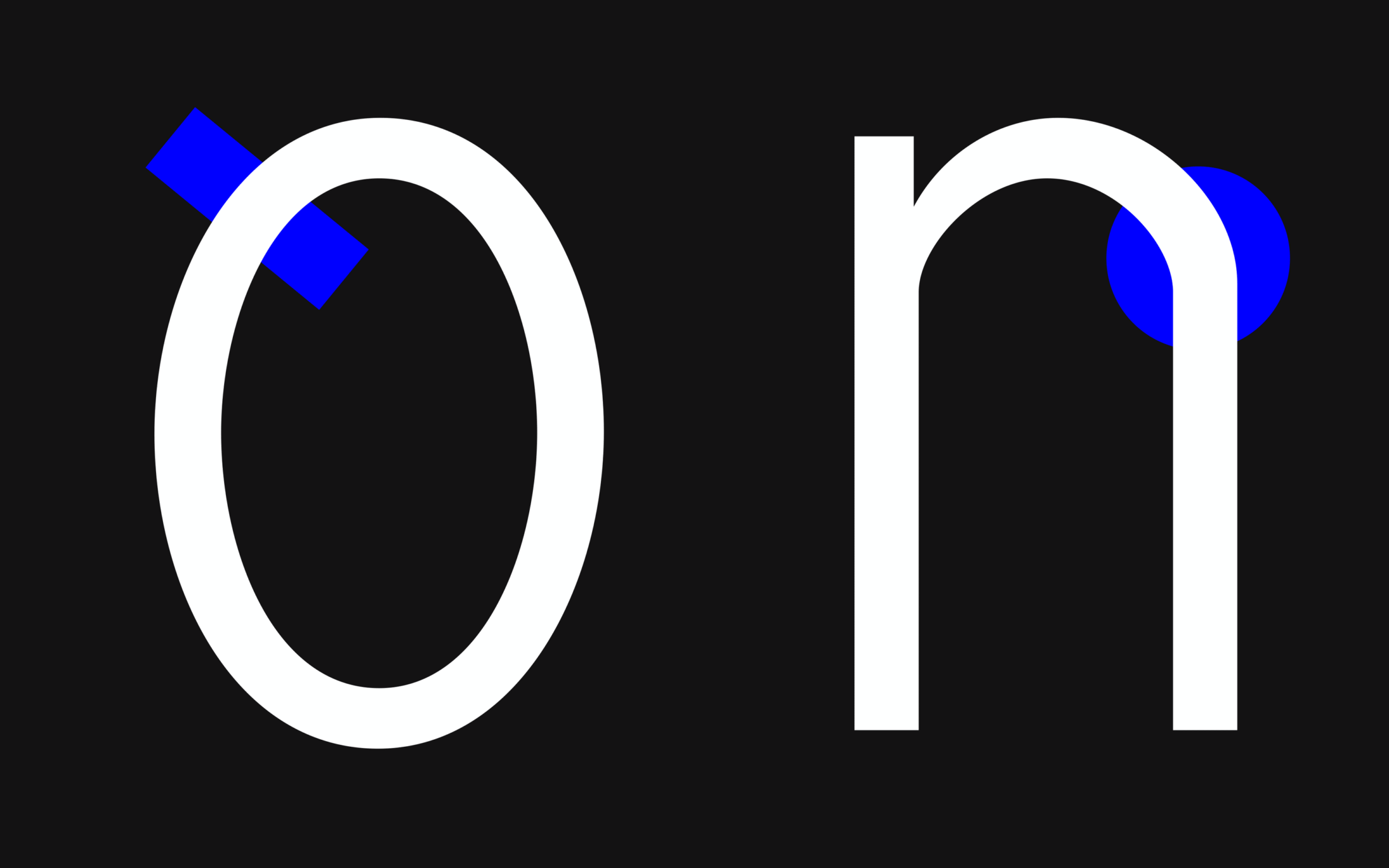
In an instant, the o and n show very clearly the ‘imperfect’ curvature of Elma an unmistakable detail in the whole type family.
Multiple Italics
Philipp thinks there’s more wiggle room in the Italics of monospace designs. Maybe because of the uniform metric, his mind feels a strong need for an otherness to further distinguish an upright from an Italic — like the syntax highlighting of coding languages does.
Conceived at the same time as the Upright, the Italic sports a prominent, humanistic design and plays with rotation, angle and upright details. The Italic Black p is a superb example of Philipp’s approach: “The serif is completely unnecessary, but I wanted to have something to emphasise that rotated feeling even more. So, I just added it.”
Further, the p is a quirky hybrid of the classical cursive style and modern construction. The vertical stem on the left extends the x-height but the bowl of the p doesn’t cross and stretch to the left.
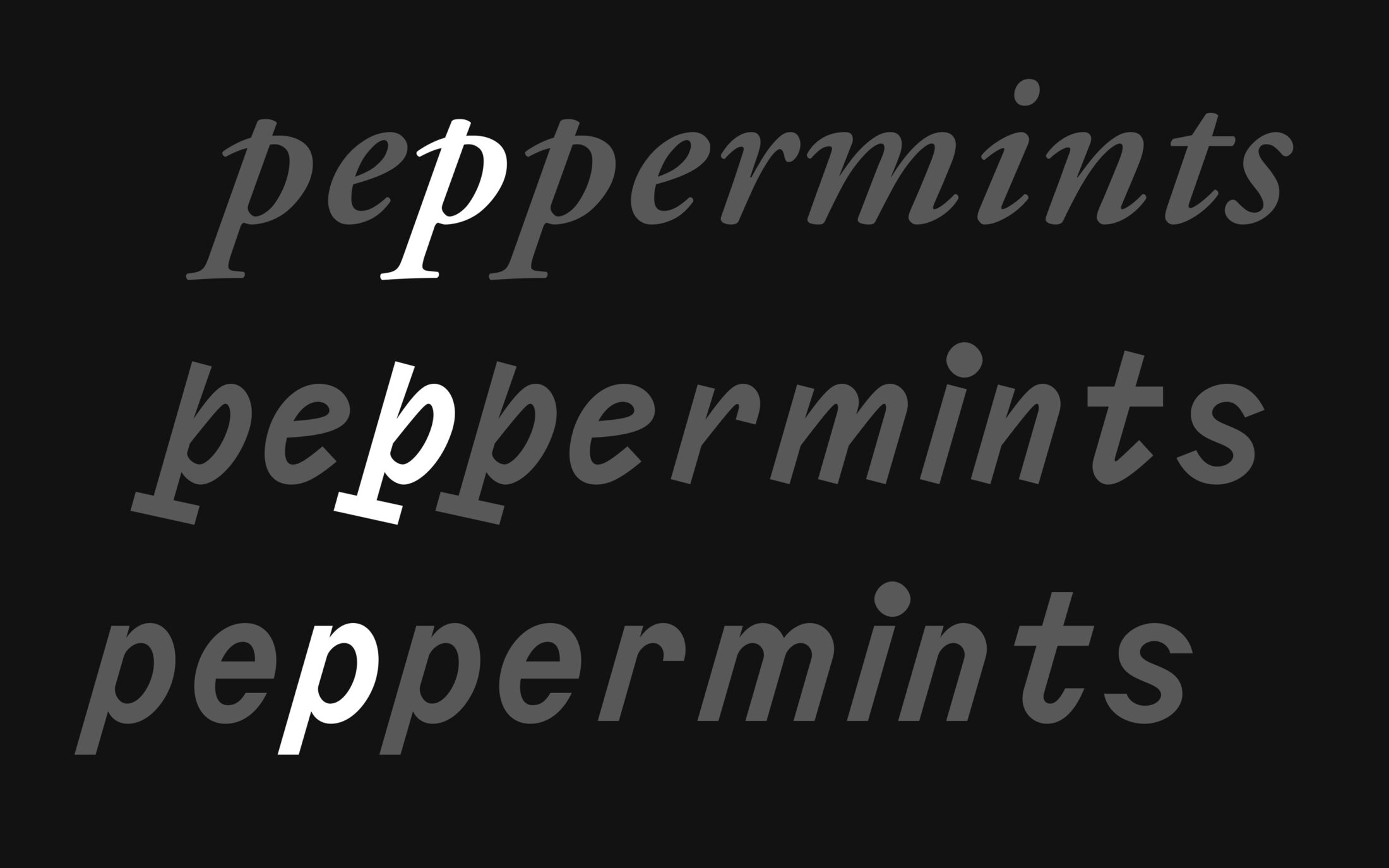
Comparing the calligraphic style of Garamond to the blended approach in Elma and a modern oblique like Elma Slanted.
This eye-pleasing detail is something that Philipp applies to many of his other type designs as well. He can’t help import interesting details from one typeface to another, exploring them afresh in a new context.
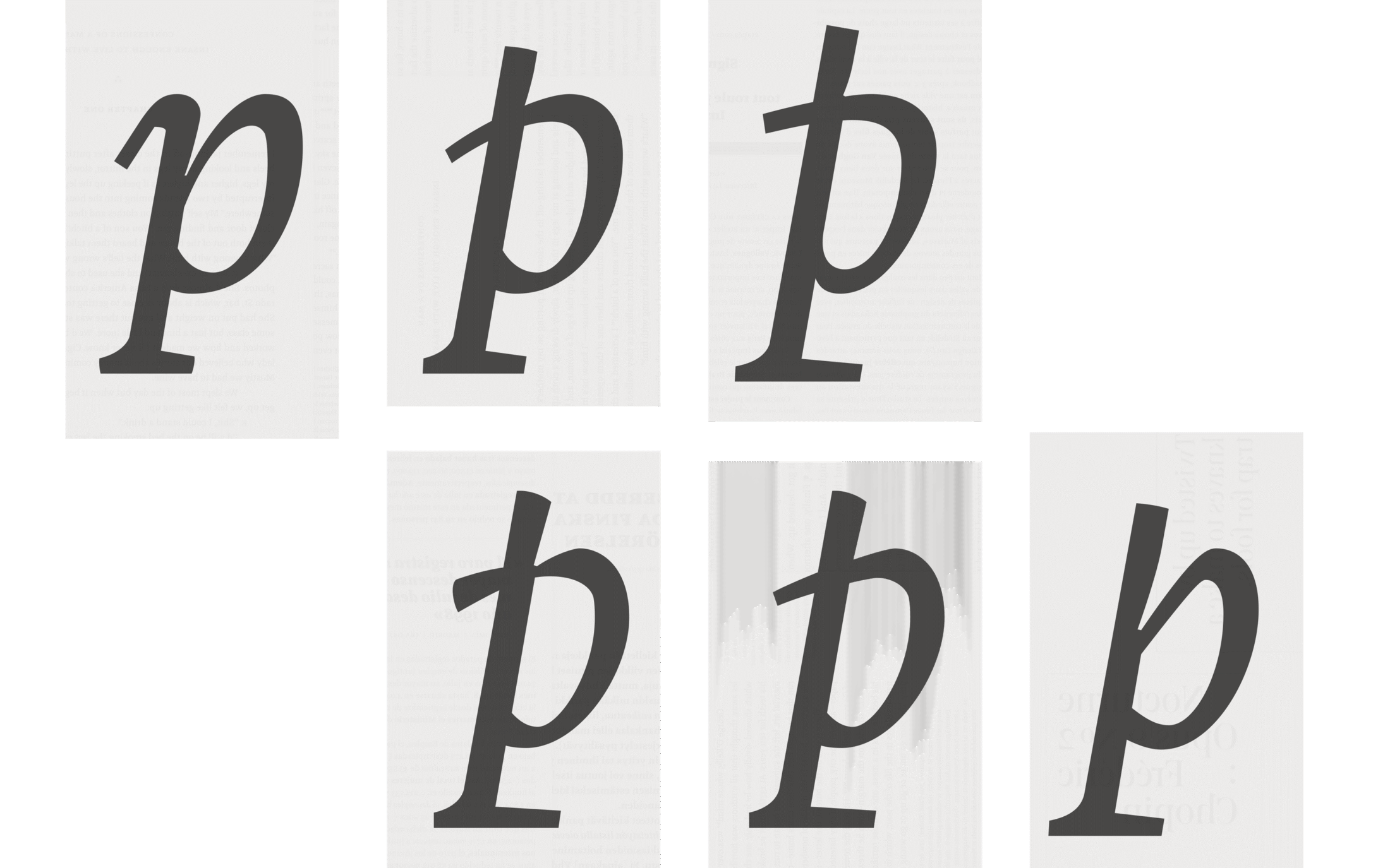
Philipp acknowledges: “Frederick ruined all my p’s. Since that evolution, many of my letters look like that.”
But after the initial design started, Philipp grew tentative about this very dynamic approach. So, he started a more traditional, plain Slanted, the usual approach in a Neo-Grotesque. In the end, he felt that both had their fair share of advantages and drawbacks and he realised he liked them both equally. As lost as Bill Murray in Tokyo, that guy Philipp. Fortunately, his Scarlett Johansson is his affection for polymorphism and as a result Elma has two Italics you can choose from.
Who needs two Italics? In most cases, it’s a question of either one or the other. But sometimes having another tool at your disposal, in addition to weights and Obliques, can make light work of heavy typography.
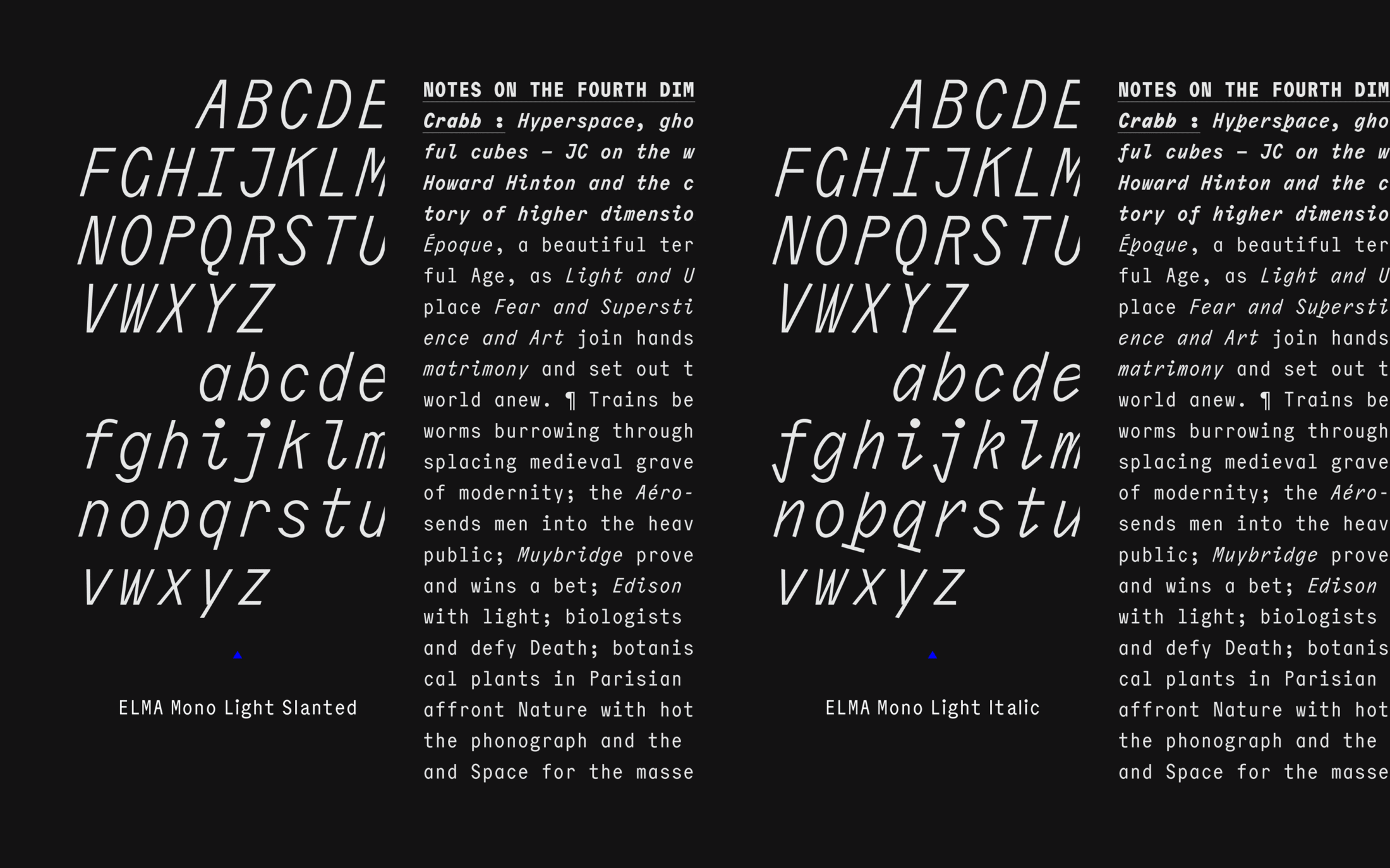
Like friends, you can never have too many italics.
Cyrillic at Heart
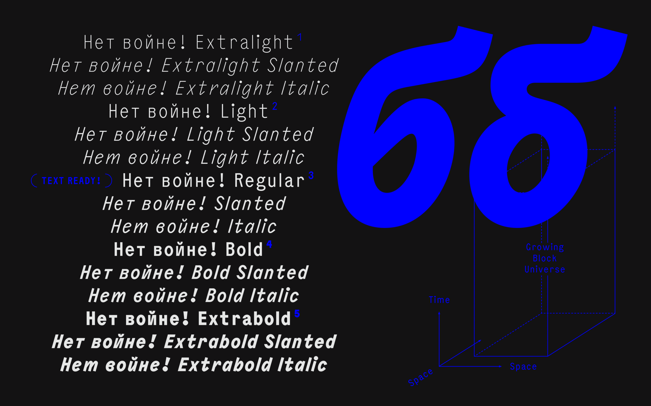
Elma has Cyrillics. In the current geopolitical context and disintegrating international relations with Russia, Philipp wondered if it made sense to continue designing for a Russian-dominated market. In the end, he designed Elma’s Cyrillics for the same reason he designs all his Cyrillics: out of admiration for the alphabet and curiosity about how it might apply to his design or vice versa.
Philipp’s interest started with Cyrillic’s otherness: “What’s different or foreign is always somewhat interesting to me. I grew up in the 90s, so there was always some kind of allure to Russia; as in the former USSR as a failed system and Germany’s history with it, constant allegations of widespread corruption, “the” Russian as “our” enemy as portrayed in western pop culture. It definitely always made me wonder, what’s up with all of that?”
As his love of letters grew and grew to include other writing systems, Philipp naturally focussed on the construction of Cyrillic characters. By adding Cyrillic to the glyph set, many Latin design choices can be re-examined and used in different places, and vice versa: despite a different written language, shared forms and strokes are still easily recognised. Without a doubt, meeting and becoming friends with wonderful people native to the script helped foster his love, as did travelling to Russia a couple of times.
Today, Philipp’s interest or admiration for the Cyrillic alphabet is not diminished by Putin’s cruel attack on Ukraine and all the suffering it entails, anything Putin did before February 2022, or before March 2014. “I can only hope for the bloodshed to end as soon as possible and for a democratic world in which Cyrillic is not automatically associated with a Russian dictatorship. Strictly speaking about Cyrillic of course. I do hope for many other things.”
We hope so! Caring about Cyrillic is a feature in all of Philipp's typefaces.
Yuni Slab — kinks, quirks and unapologetic curvatures
At first sight, Yuni Slab is a wood type-inspired serif. Pleasing with super cute, large ball terminals and a nostalgic charisma reminiscent of pre-digital 19th-century Egyptiennes like Clarendon or the Franklin Type Foundry’s Antique Condensed.
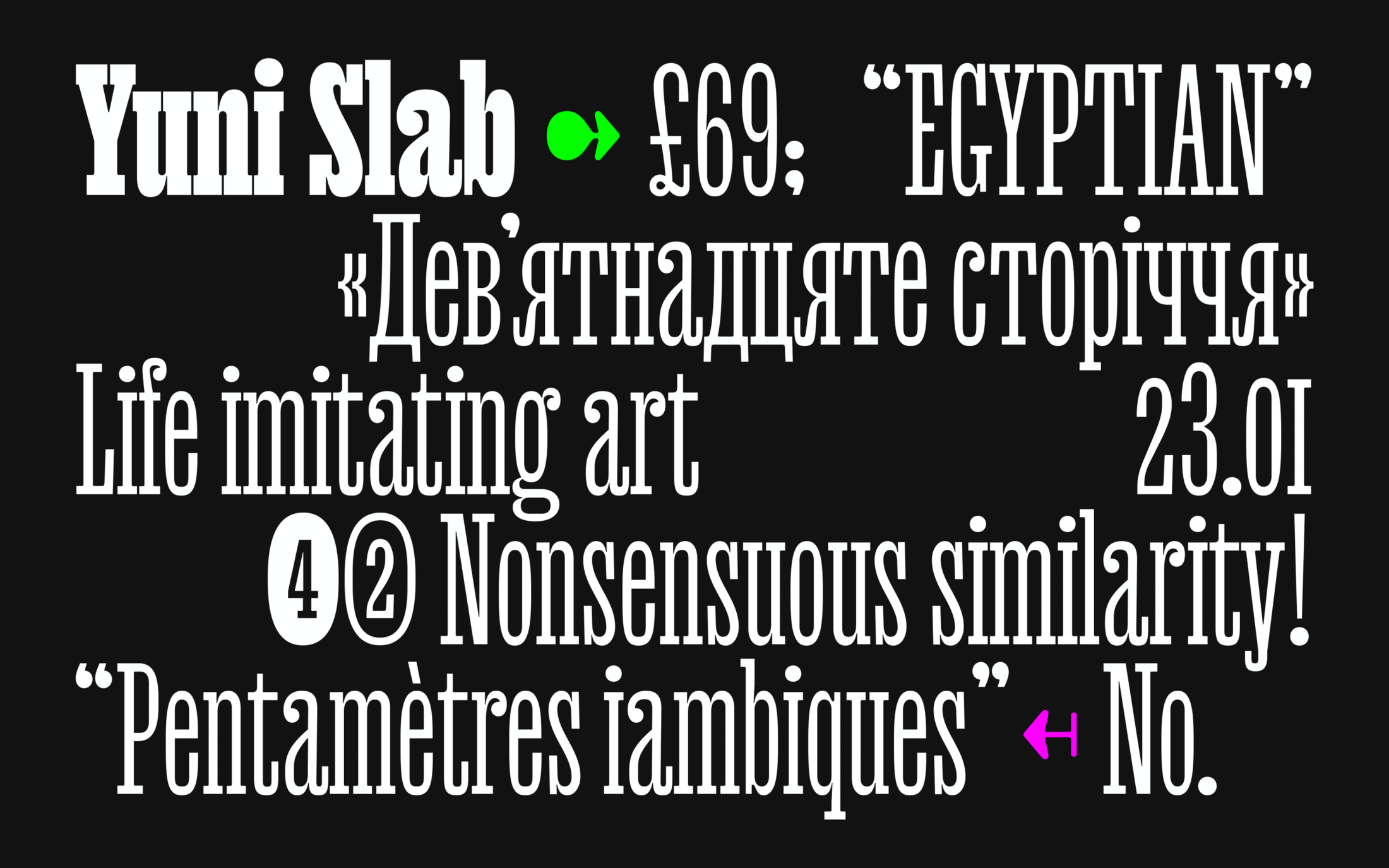
Nostalgic Cuteness for the Courageous
But Yuni is not for the faint-hearted. It features kinks and quirks, rough edges and an unapologetic curvature that resembles rough wood cuts that is especially prominent in the heavier weights. A crossover, mixing unfamiliar details and genres, not a feigned revival, Yuni plays with the addition and omission of the unexpected and expected. A surprising historic influence is the serif placement a-la 17th century France’s Romain du Roi.
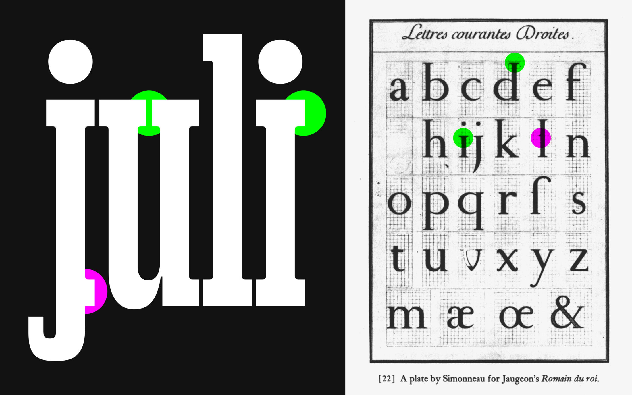
A few extra serifs to i, j, and u on the x-height, plus a half serif
on the baseline of j nod to the Romain du Roi. (historical figure: Public Domain)
Unconventional, Imperfect Ionic
Like the Simpsons only having four fingers, Yuni has some twists in logic. The “unconventional curvature” — a divergence between inner and outer shape — is inspired by the design of high contrast metal type, unconventionally applied to a slab serif style. Resulting in a warm, characterful slab.
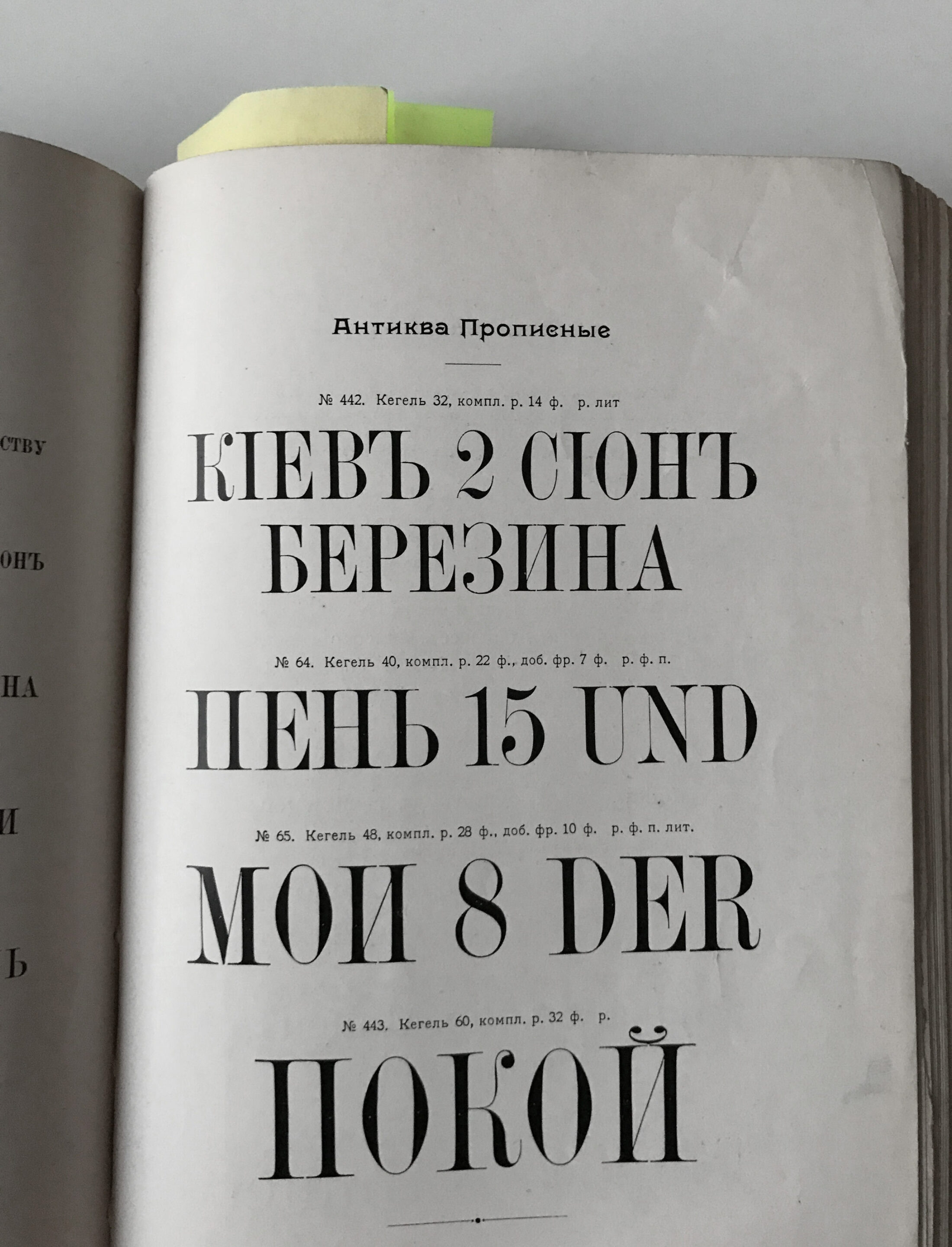
Specimen pages like this triggered Philipp’s idea of a special curvature style. The date and name of the specimen are unknown, but the photograph is from May 6th 2017.
In addition to the idiosyncratic curvature, Yuni has peculiar contrast and features horizontally squeezed terminals that thin even when they might represent a strong vertical stem. A characteristic that uplifts a historical background detail to the headline level: the limited contrast in sturdy bracketed serifs, like nineteenth-century Ionic and Clarendon faces, and the visible differentiation between thick and thin strokes.
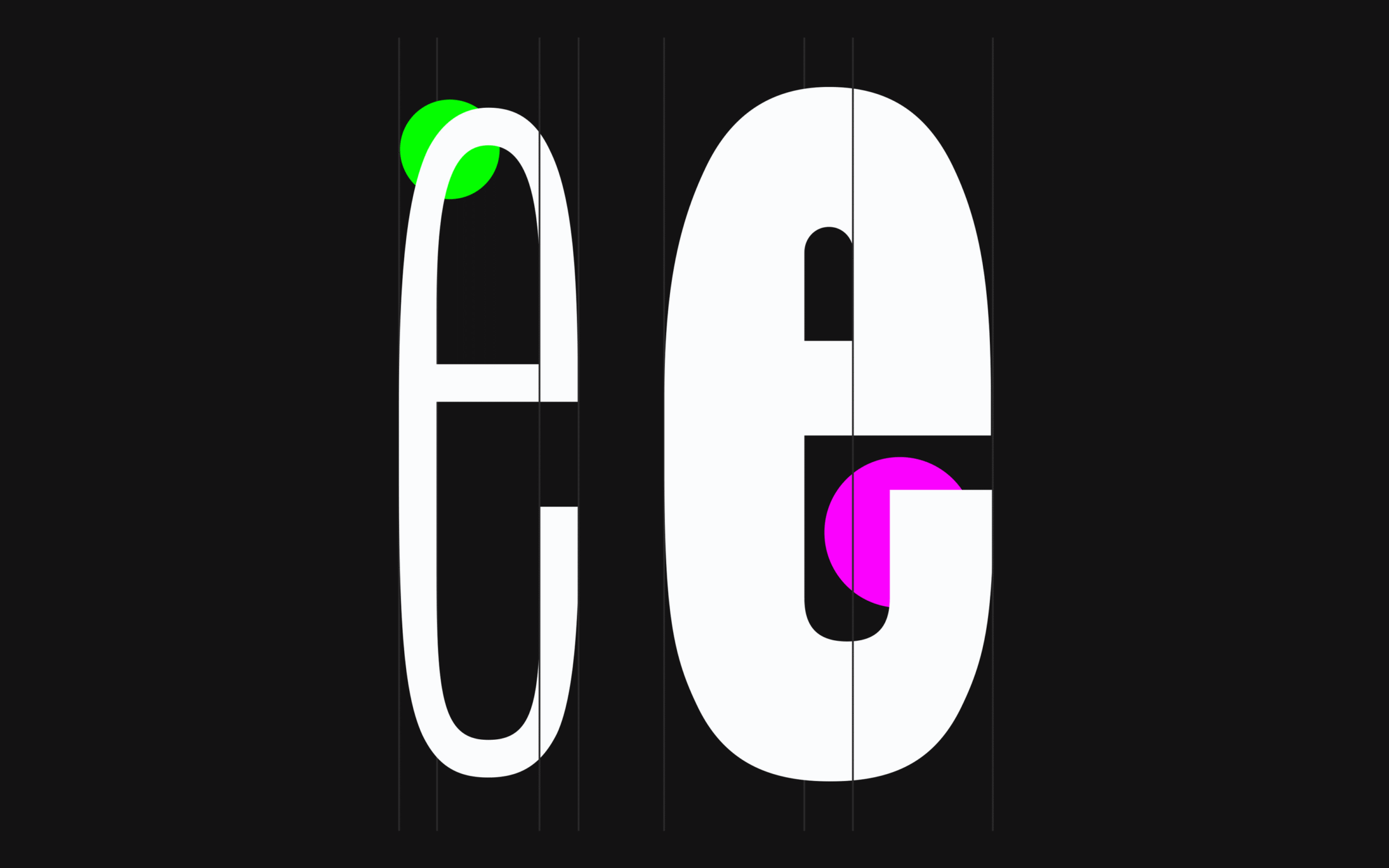
The Black e portrays this unique attitude very clearly. It has unconventional curvature and peculiar contrast at the terminal.
As the extreme weights take different approaches to modulation, the Medium was retouched to make something stiff and boxy, more similar to the high contrast model with a noticeable imperfection that suggests rudimentary tools imperfectly carved the type out of wood.
Hej kids, while reading, did you get the idea that being inspired can result in obsession and unhealthy addiction? For Philipp, all the lower and uppercase Ks were a pain in the butt. A constant back and forth, questioning whether to really go with a curly style or not. Picture him rushing to his computer early in the morning, manically pumped up and at the same time exhausted by contradictory emotions, yelling: “I kinda love it. But I also kinda hate it!”
With the different forms in the extreme weights and with something different between, it was even more work and overthinking than it ever needed to be.
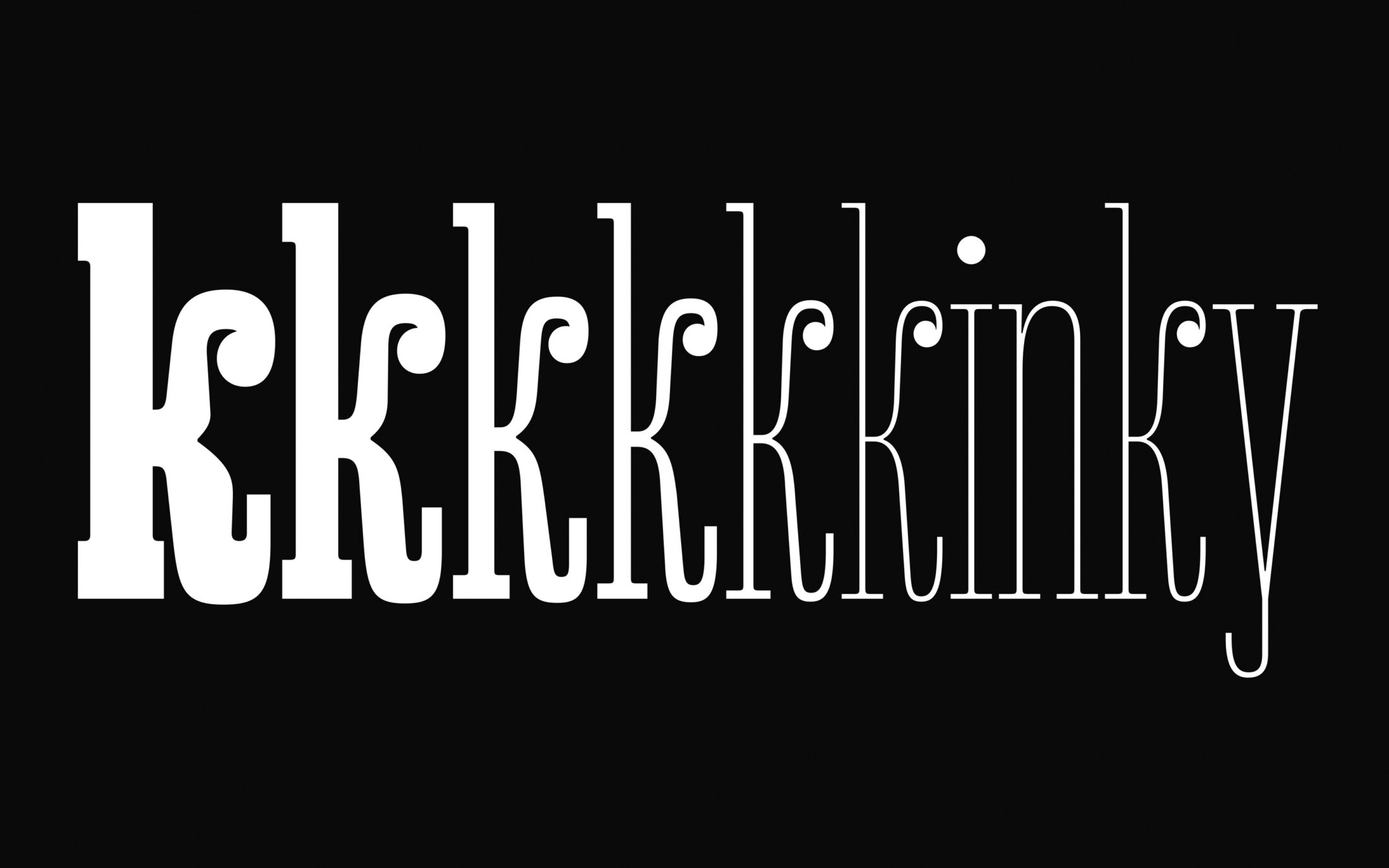
Boss level ‘tricky’ completed successfully.
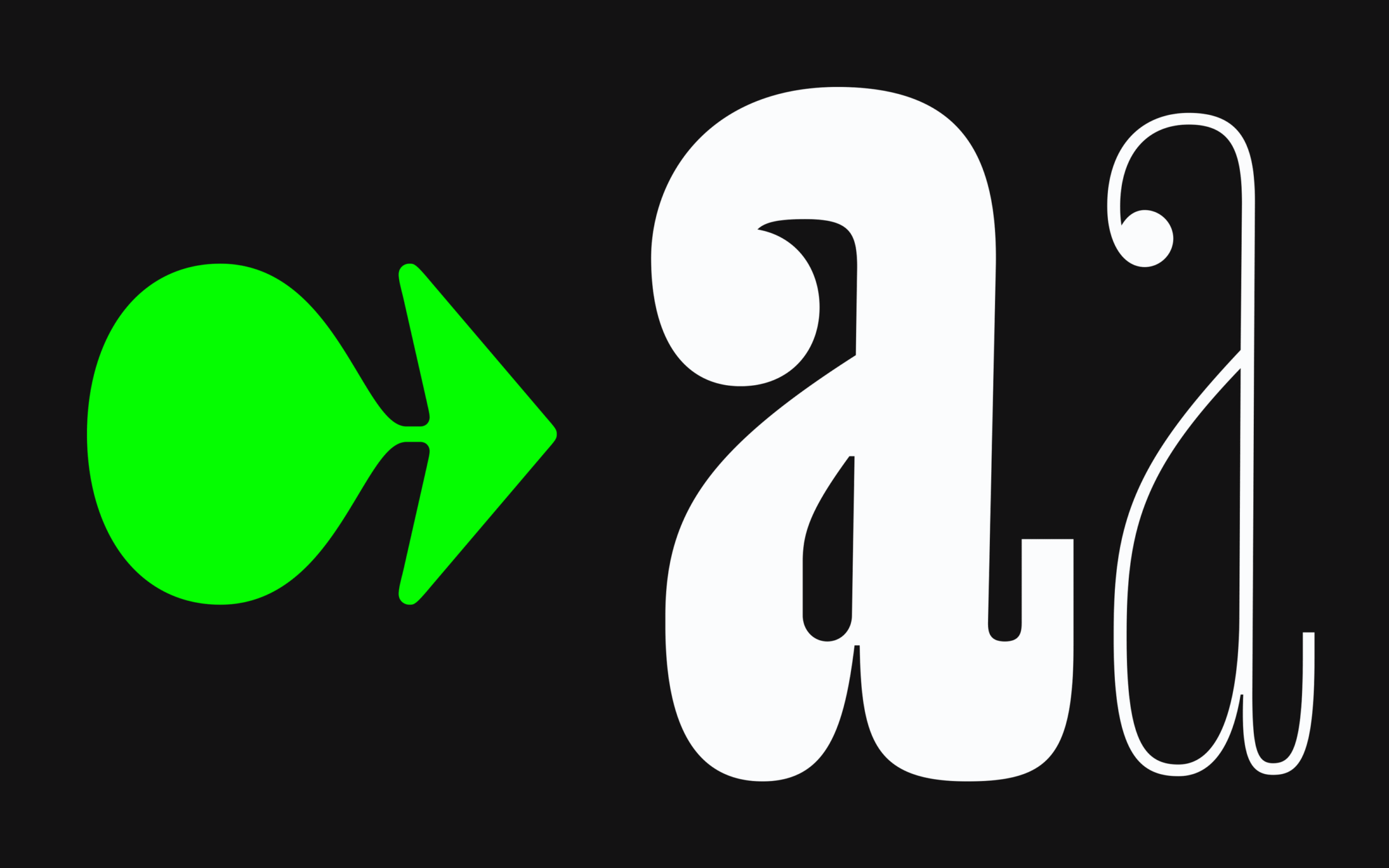
To share a happily-ever-after moment: look at that super hot lowercase letter a … yes, sure, Matthew Carter, “type is a beautiful group of letters, not a group of beautiful letters”, but this doozy takes it all: twisting curvature, chunky serifs and crazy kinks contrasted with the flourishing ball terminal and pleasing friendly appeal. So, obviously, Mr Sir Matthew Carter CBE never did a beautiful a like that! Well, let’s say allegedly. No need to be sued over an unbelievably nice a. Mr, Sir, your Majesty; we’ve always been big fans!
Ink Traps and Bold Heros
Along with the unconventional tension in curvature, Yuni has ink traps and super inclined strokes. These little details, intended for improving type at small sizes, are today trendy when displayed big.
As Yuni wants to be used big it obviously would have worked without the inktraps, but here it’s a charming, somewhat unexpected touch. The abundance of ink traps in this design makes it more contemporary and adds a little edge, contrasting an otherwise a cosily cute mood.
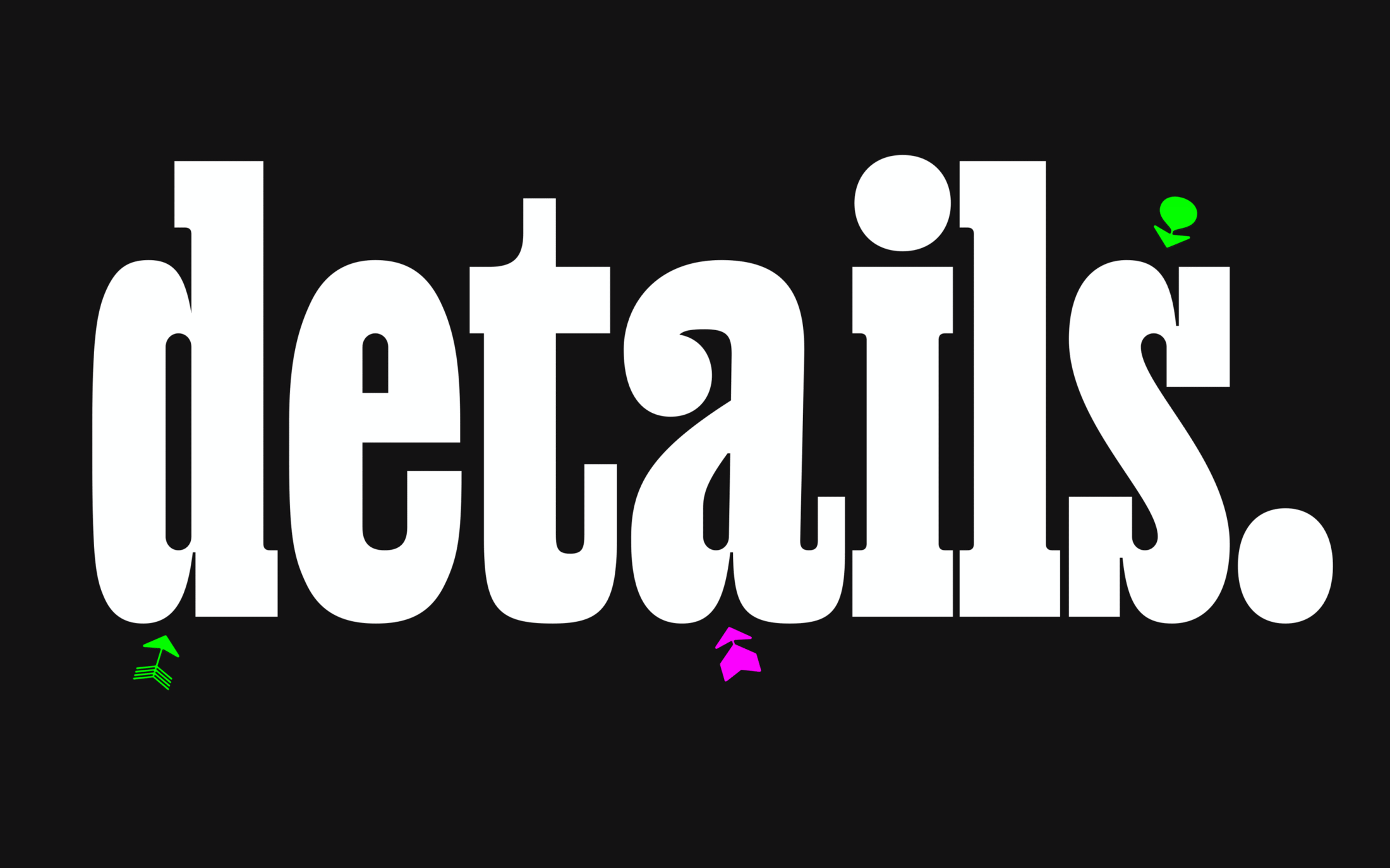
Ink Traps and inclined strokes.
Large, loud and proud and sufficiently condensed for posters and headlines, Yuni can rise to the challenges of the current trend for “Bold Hero” typography. Imagine a majestic lonely landscape photograph splashed with big white letters in Yuni… well you do not have to, but if you do: bang, you’re done.
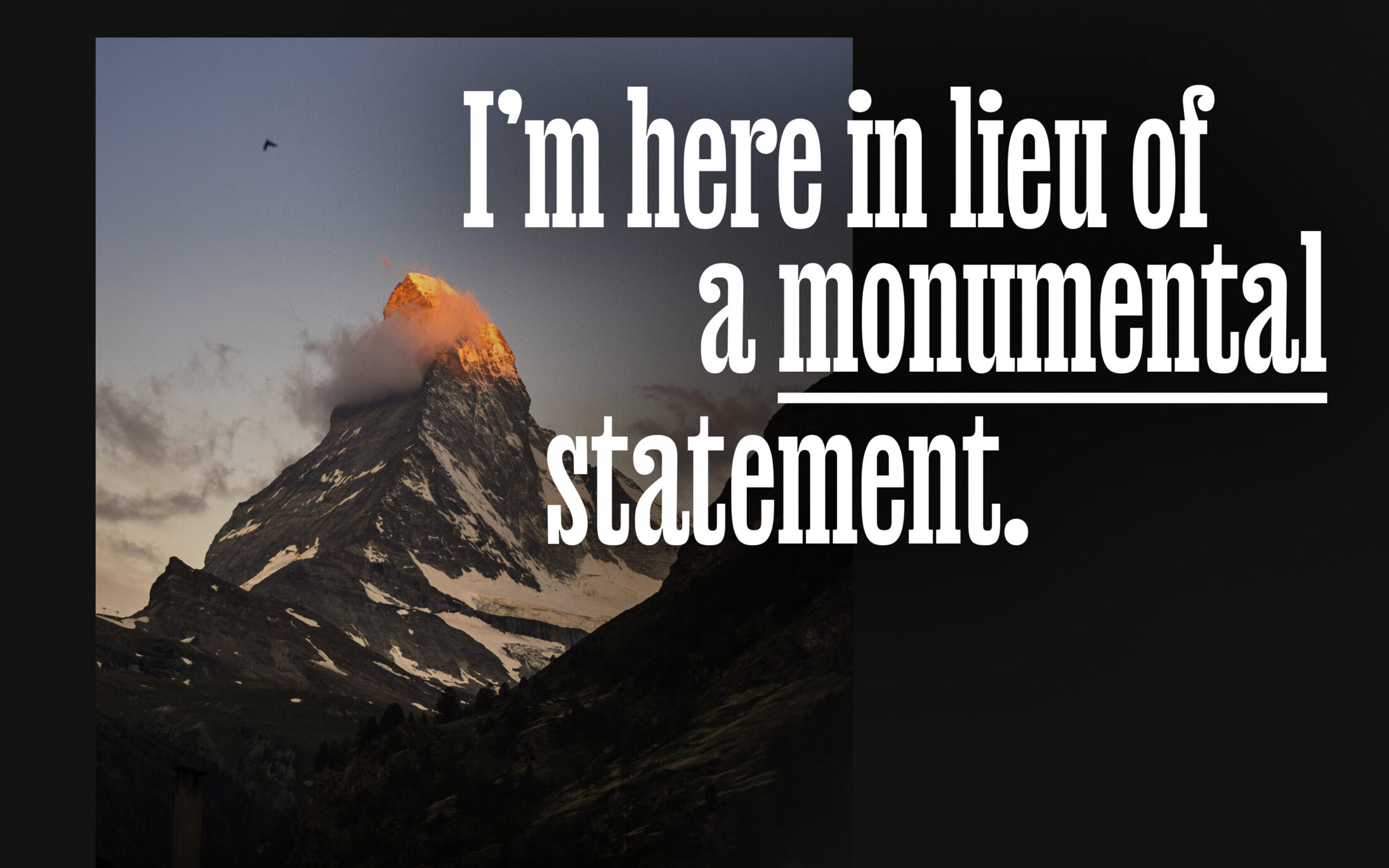
image source: Fabrice Villard on unsplash.com
Speaking of the rise of massive hero types, Philipp’s third release this November, Ottessa, is made for loud and bold typography too.
Ottessa — humanistic in the midrange
Compared to a plain geometric sans, Ottessa is different. It’s for those who have always been a little bored by pre-2019 minimalist geometric visuals and are looking forward to the dawn of a new era, beyond the crises of the past years.
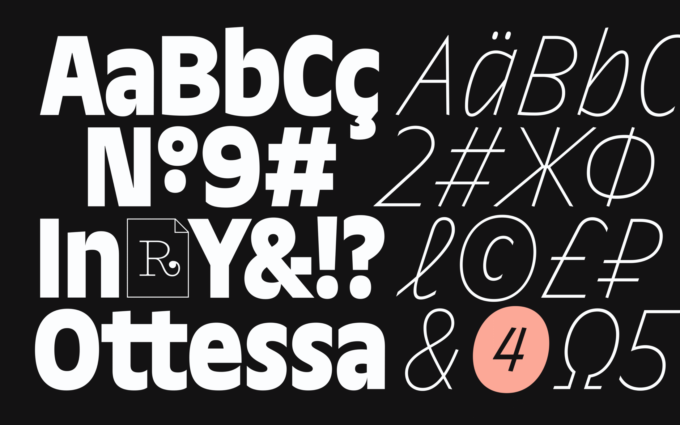
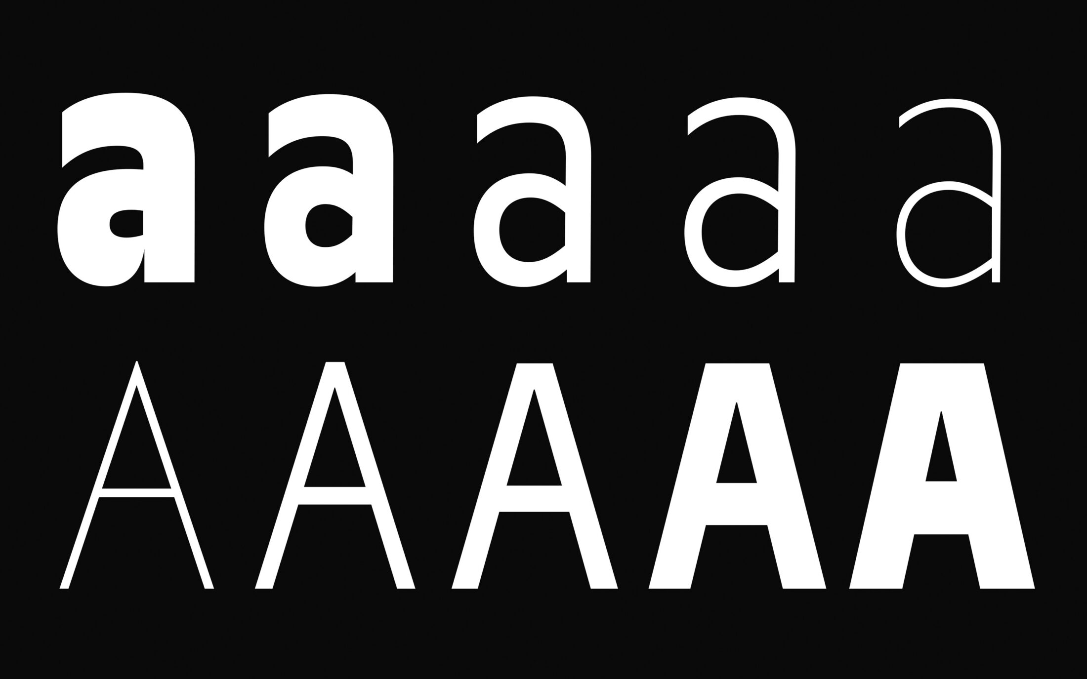
Both mannered and kind, this friendly nonlinear grotesk has an extra large x-height. While the lowercase a, with its kinked, Excoffon-esque aperture and non-linear interpolation, is nice, its uppercase buddy starts off feisty and spiky in the light before becoming more tilted and less exasperated as the weight increases, or (rather) the surrounding light vanishes.
Dedicated, Not Attached
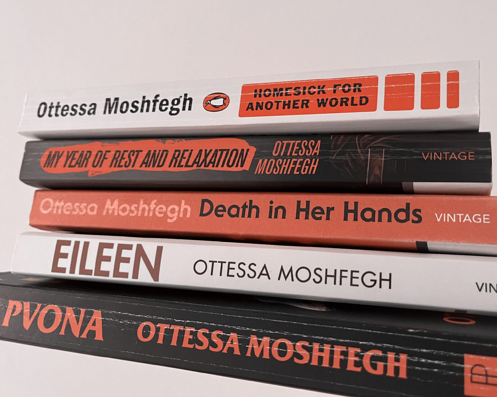
Ottessa shares its name with one of Philipp’s favourite authors, Ottessa Moshfegh, who is known for quirky and unconventional writing. Philipp didn’t name the typeface after her. Its design doesn’t resemble her work or character and it can’t be attributed to her in any way. Admiring her work, though, Philipp naturally took a liking to her name and luckily Ottessa hadn’t been taken as a typeface name yet.
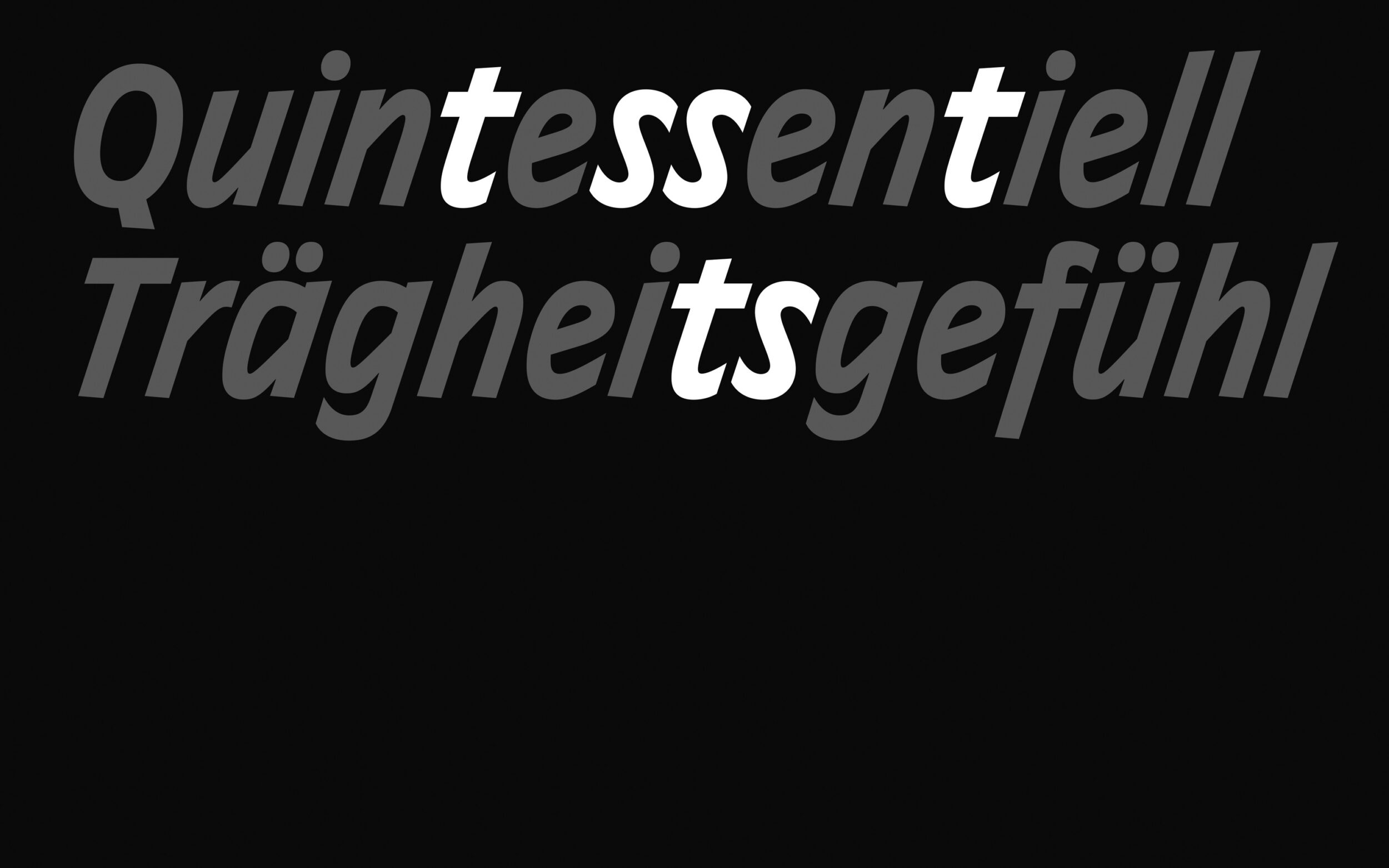
Ottessa is not the most beautiful word typographically. With a double
t and s it calls for a design with extra good-looking ts and ss.
Fortunately, Ottessa has them and all the Ss and ss in Ottessa’s Upright
and Italic have become Philipp’s favourite letters.
On the other hand, Ottessa’s polysemic Italics were hard to tackle, especially every rounded shape.
Polysemic Italics
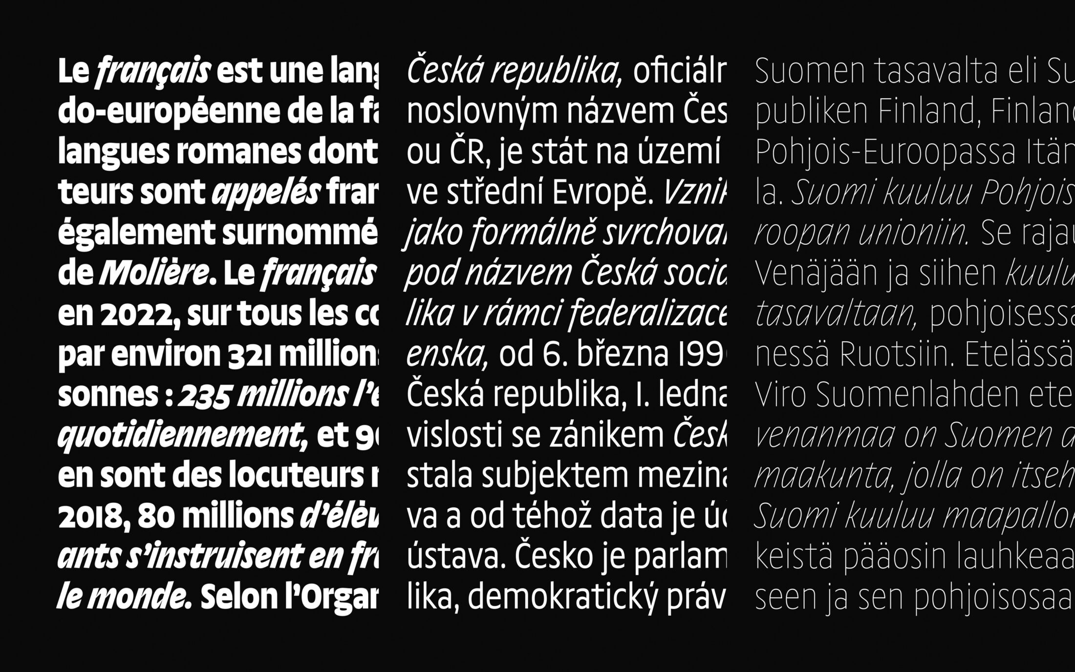
Ottessa’s unusually dynamic Italics are a take on a more humanistic approach, with a steep 18° angle, fast upstrokes and seemingly rotated rounds for clear differentiation between Upright and Italic. In a compact family, they represent a juxtaposition to the subliminal richness of the Upright styles, not contradicting but amplifying.
Non-linear Interpolation Is Key
Without over-pronunciation, or becoming a caricature of itself, Ottessa places an alluring emphasis on the horizontal. While the lighter styles are more constructed, cleaner and colder, Otessa becomes more warm and friendly as it gains weight. It’s definitely more humanistic in the midrange. The Extrabold styles are a different story: gaining a sporting, cunning or menacing vibe through the spiky, contrasted junctions.
Ottessa’s non-linear interpolation wasn’t necessarily planned. While he was reworking the design over and over again, Philipp applied spiky junctions to the heaviest weight to see what would happen. After building an interest in keeping the heaviest weights like that, he tried something similar with the light style and quickly realised the effect didn’t work there or in any of the interpolated styles between.
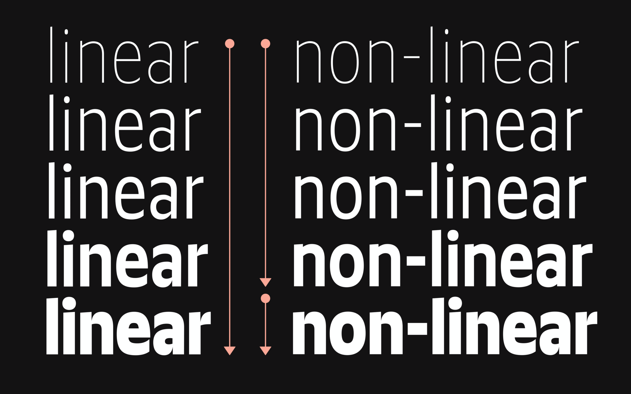
A former draft reveals that the spiky junctions do not fit every weight.
Inconsistency is key: the heavy weight just works well with spiky, thin junctions. Therefore, the idea of having two heavy styles emerged: one with and one without contrast, the latter to interpolate between extremes.
As Philipp didn’t see much use in having two heavy masters, he reworked all the Bold weights, for linear transition, and separated the Extrabold — the heaviest — style. It started as somewhat of an experiment, but this constellation makes the family more interesting as a whole. You have a bunch of normal styles that do different things and on top of them, you get the Extrabold styles with a bit more edge, facetiousness, or even viciousness
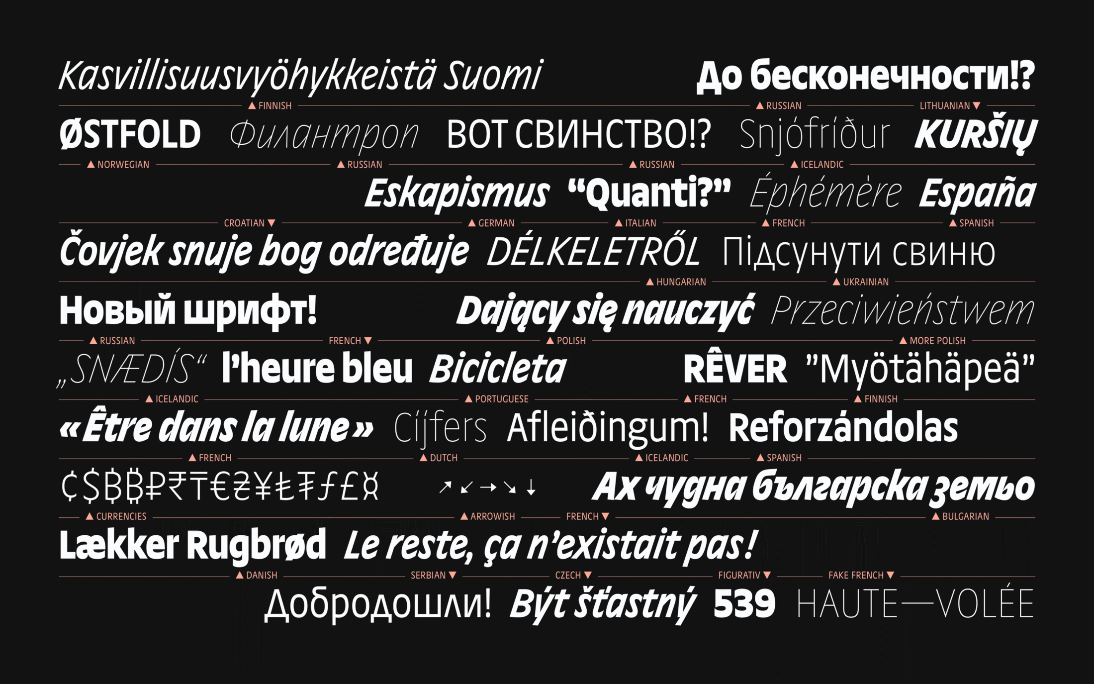
Concluding: Constant Inconsistency
Looking at Norbert, with its inconsistent proportions and shapes across weights and styles, and Juneau, with its refreshingly anti-modern uppercase, helps reveal a pattern in Philipp’s work. His signature approach is to inhale something from the past, shape something new with its vibe, and then add weird little irregularities while keeping the level of craftsmanship needed to make the result useful.
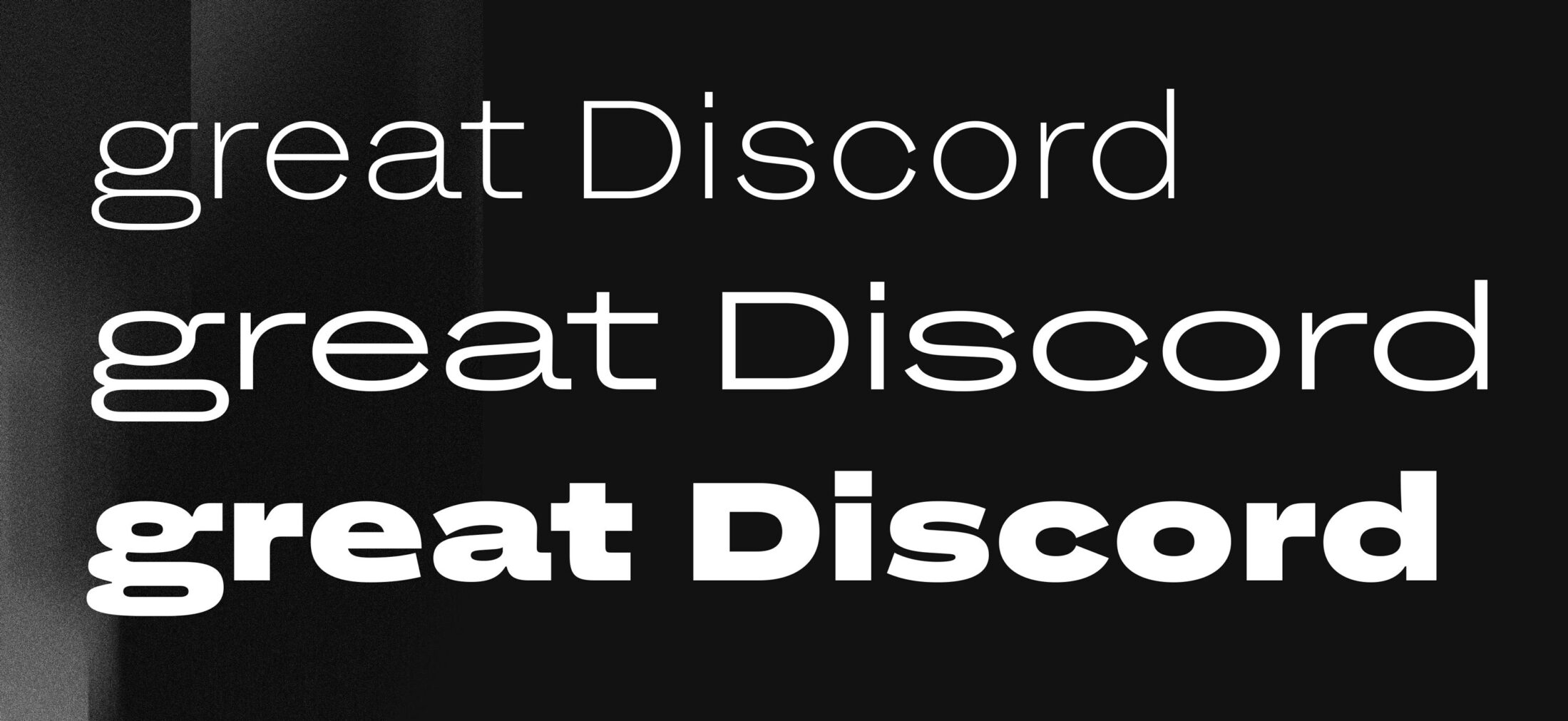
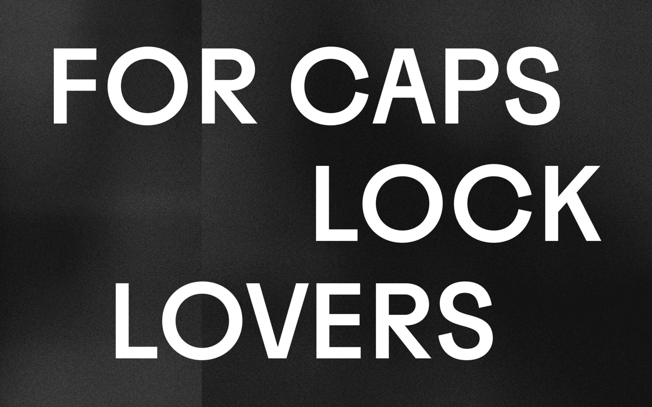
Norbert and Juneau, two earlier works released at TypeMates.
It’s no review of a lifetime’s achievement yet, but a unique blueprint in detaching the “normal” from the well-known, enriching typography with fonts that are usable, but not always easily useful for everything.