Turtle Beach Type
Turtle Beach creates high-tech and high-end gaming hardware. Their products range from headsets, to controllers, keyboards and flight simulators, enhancing the user’s gaming experience. They needed a new custom font and we were ready to take on the challenge.
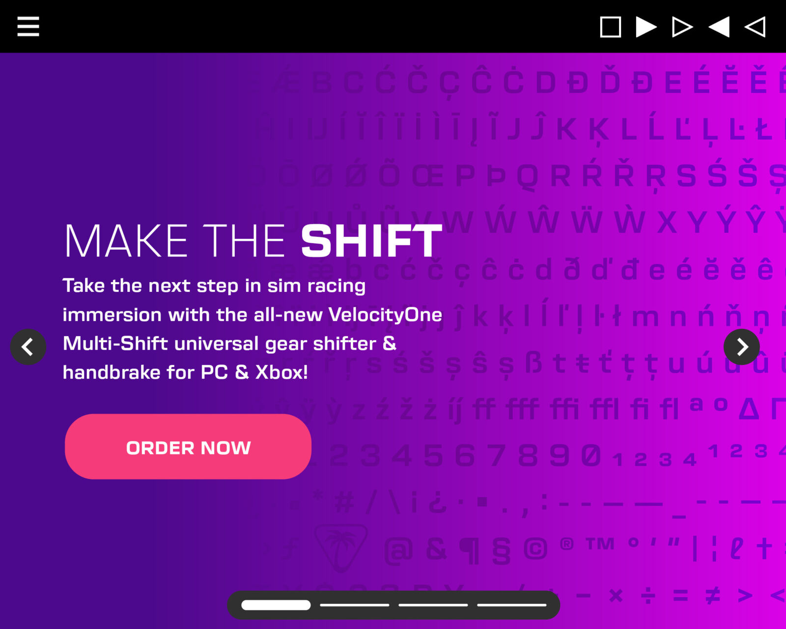
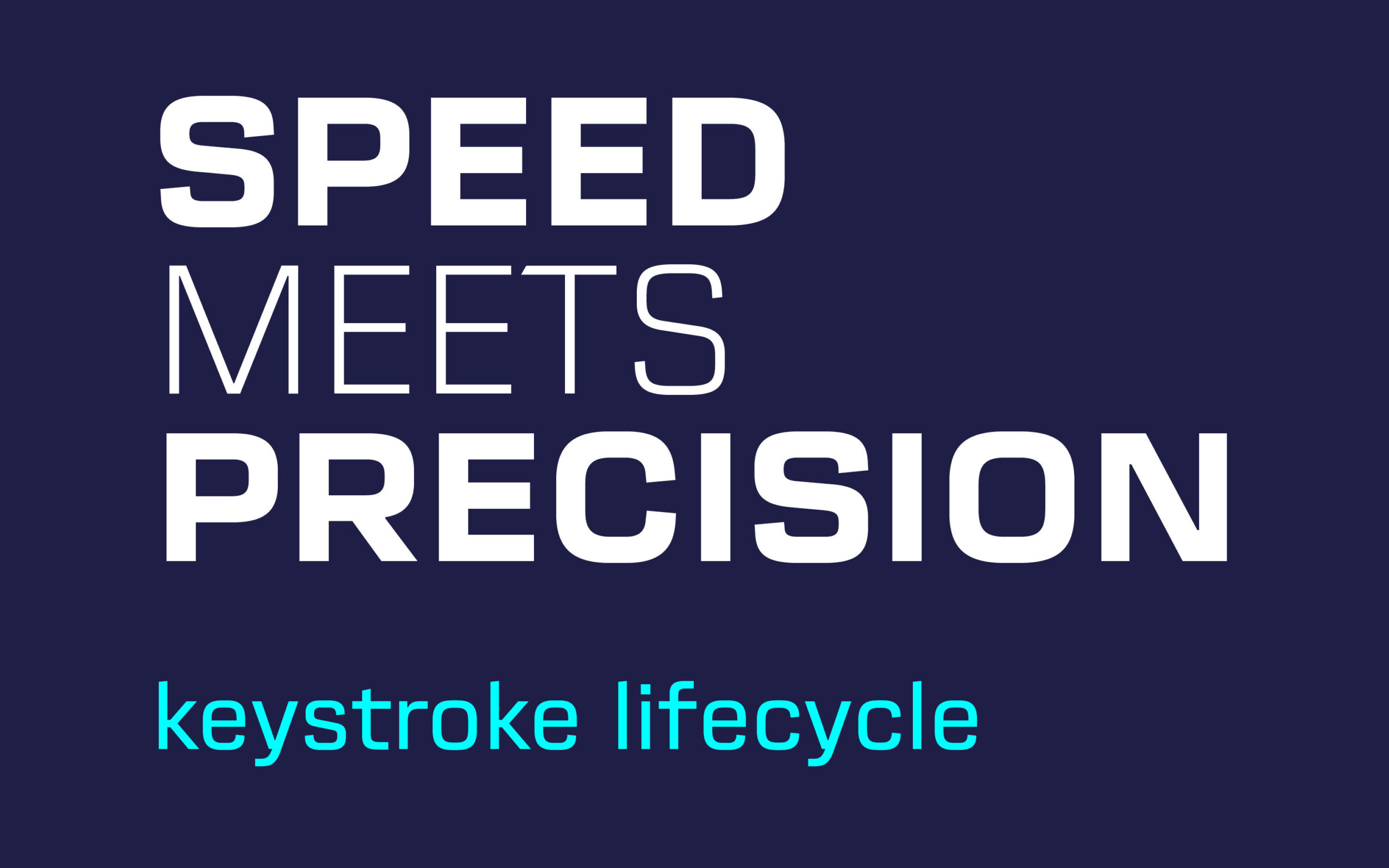
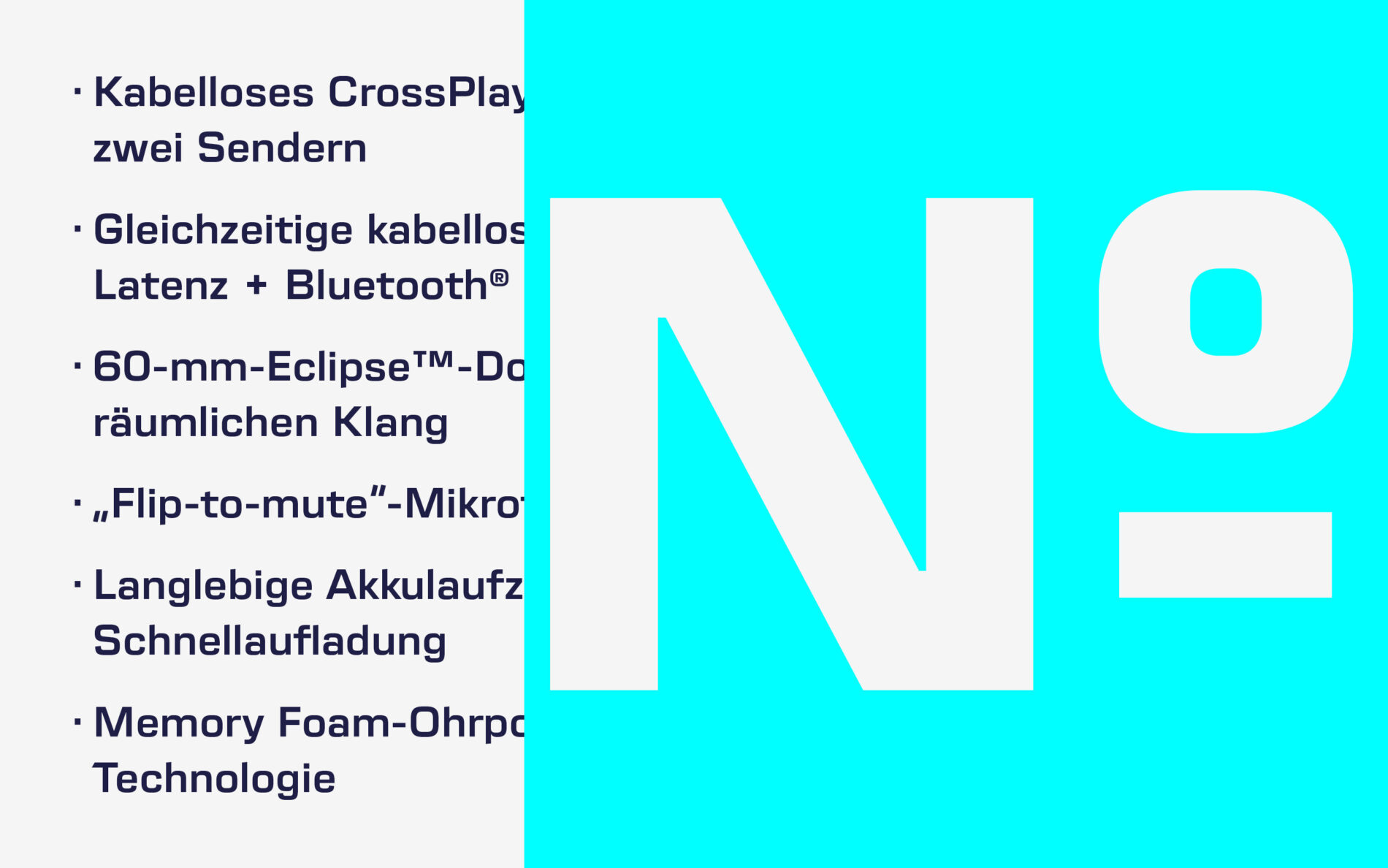
Our starting point was the interface for the illuminating KONE gaming mouse, which is used to fine-tune the brightness of the mouse’s light and change its buttons and functions. All caps, prominent figures, balanced number sign and fresh new look in a Light weight were the focus.
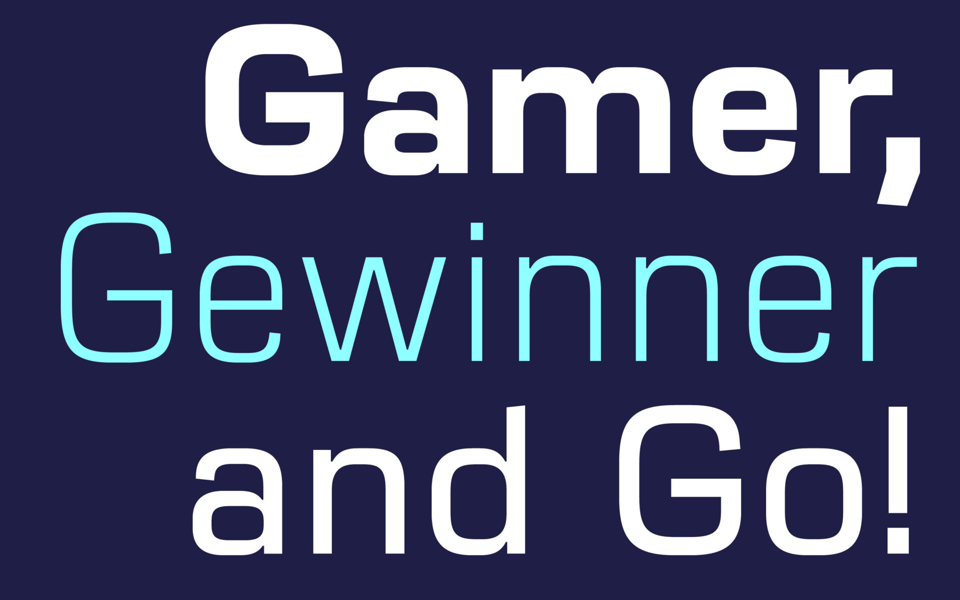
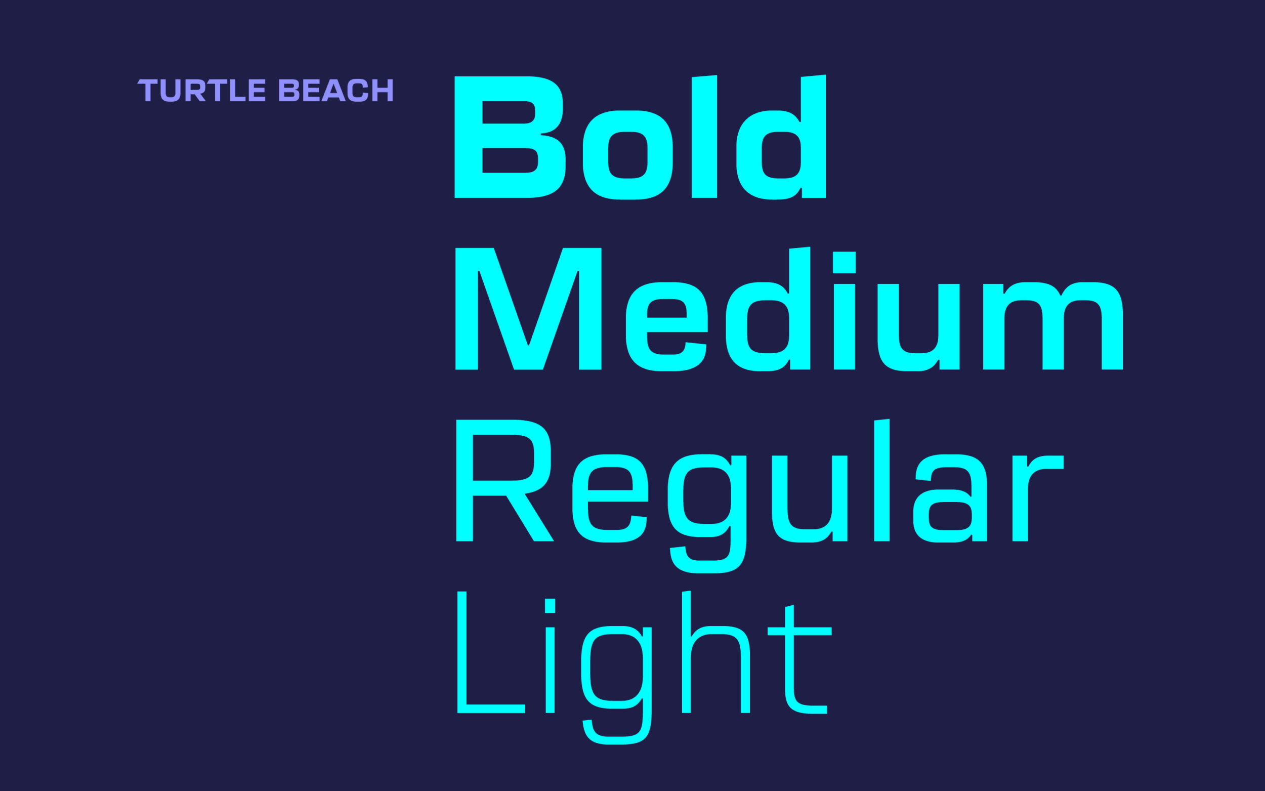
In 2020, Turtle Beach reworked their visual identity and wanted to expand the font and use it across their communications. The result is a family of four styles, Light to Bold, with massive curves, angled openings and a sporty, technical look.
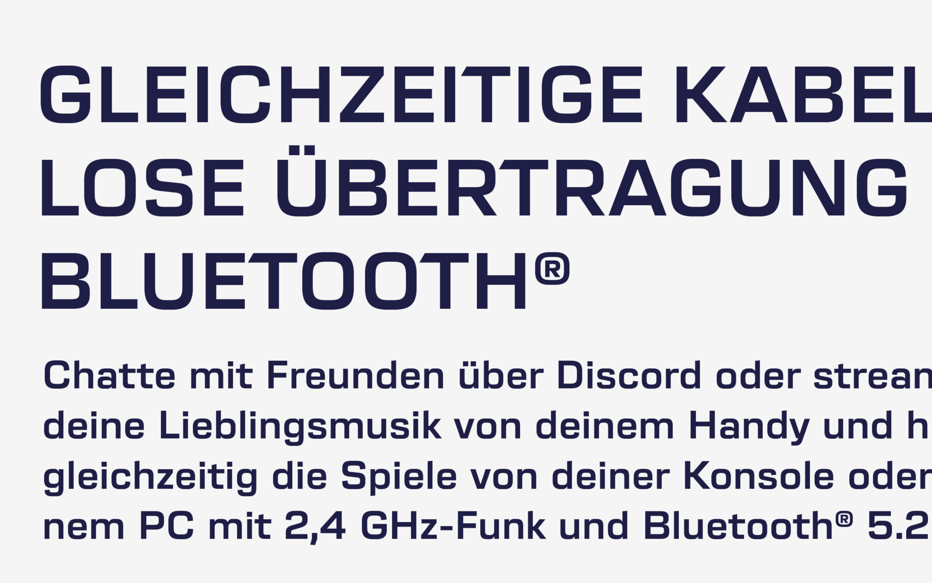
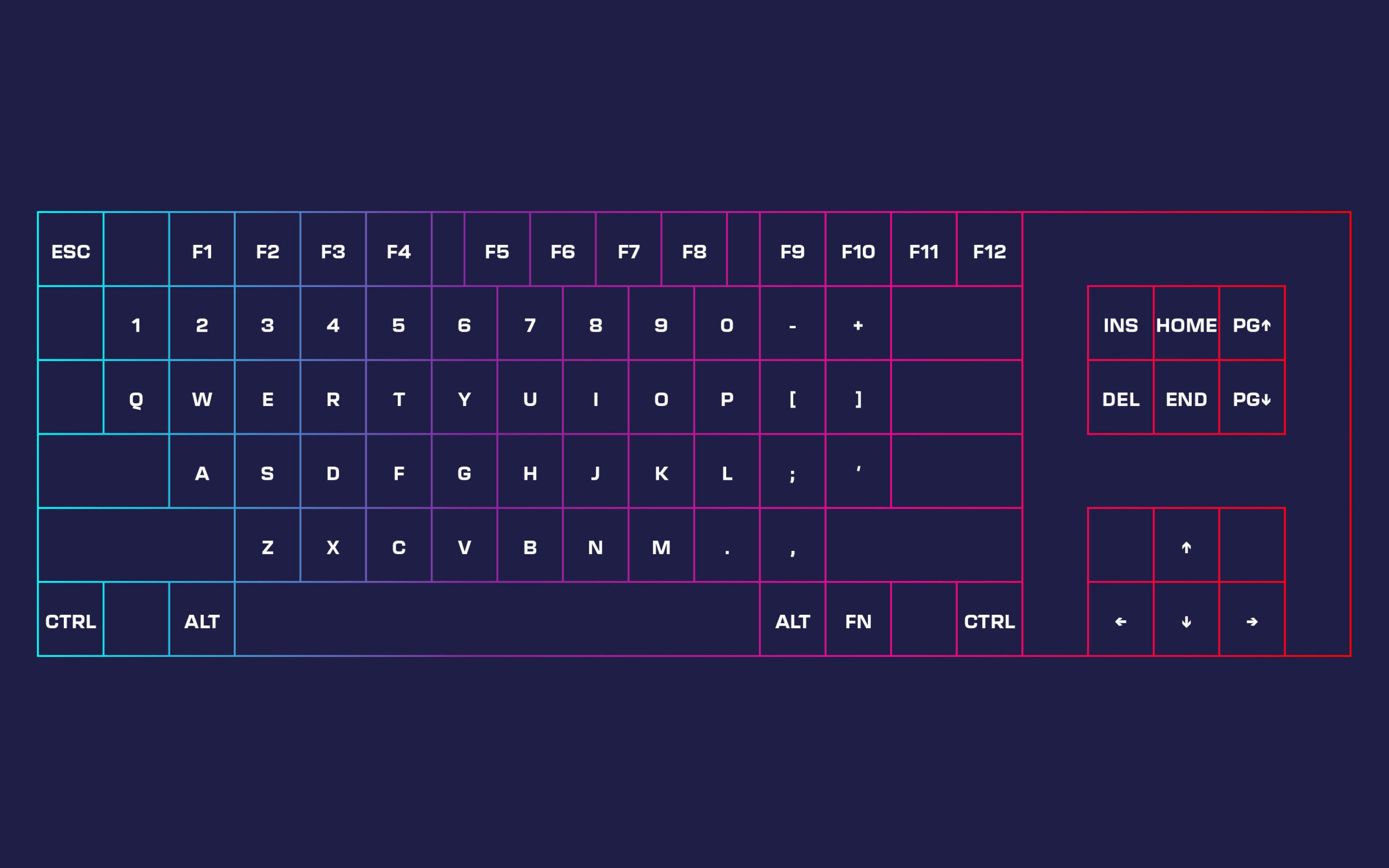
The fonts bring a distinct geometric character across all touchpoints: website, interface, packaging and even the keys of the keyboards itself – ready for your gaming adventures ahead.
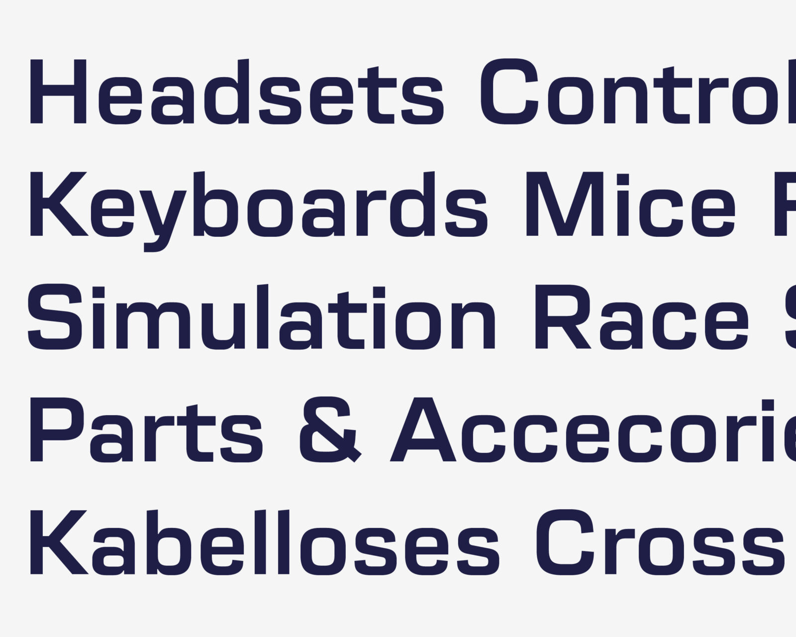
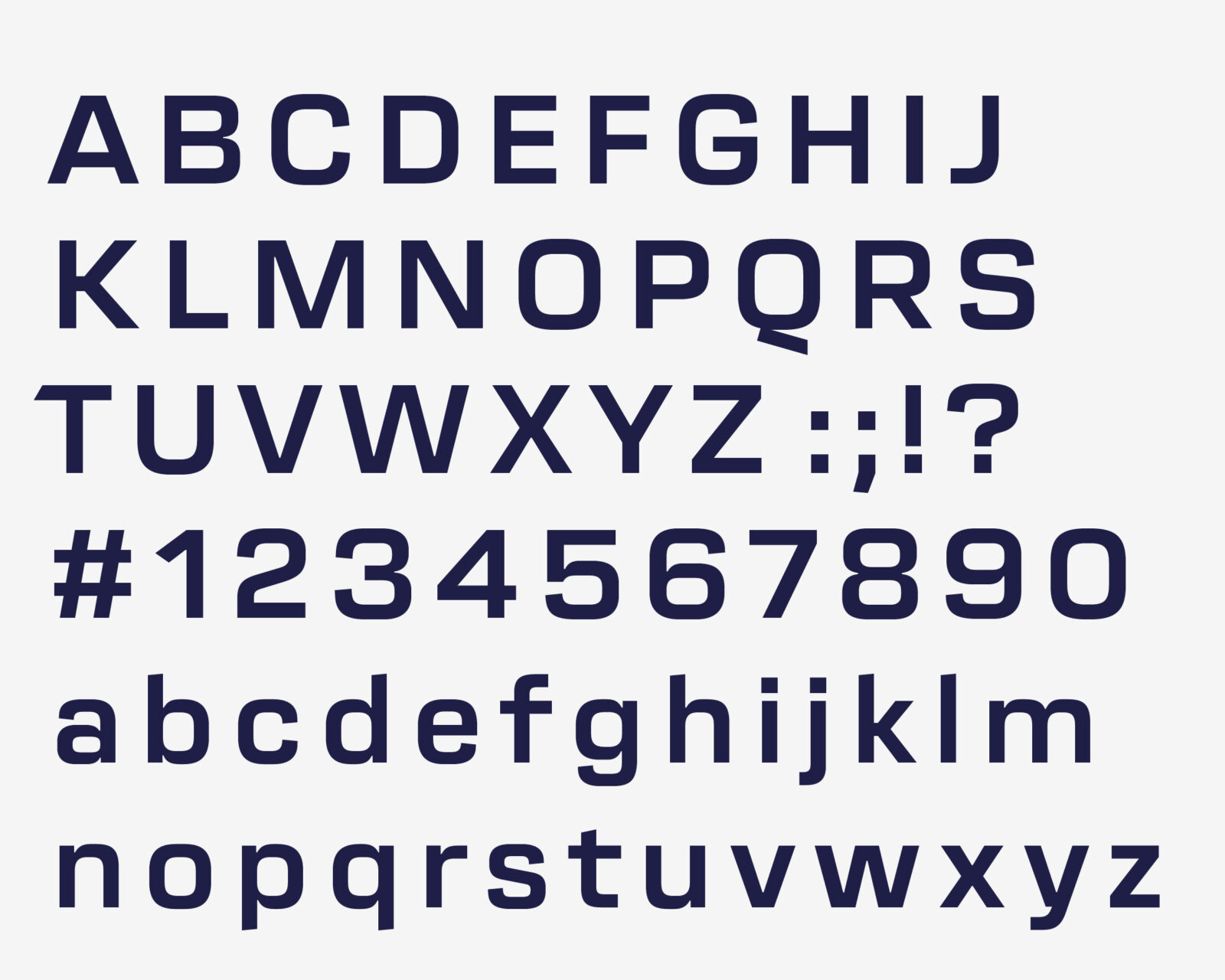
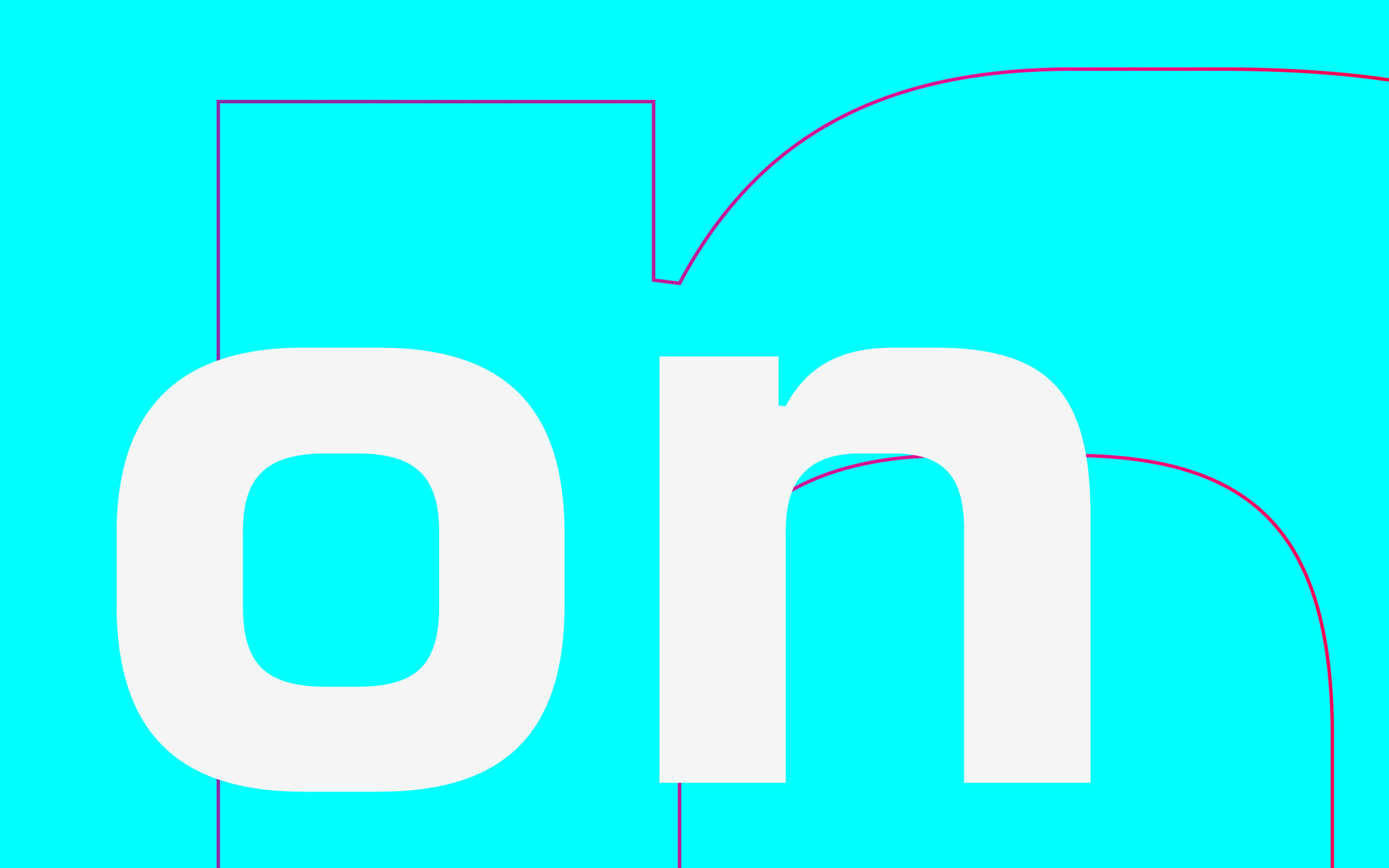
Wide counters and visible inktraps give it a luxurious yet futuristic manner.
The letters have daring inktraps that bring a technical appearance to large sizes, and balance the grayscale in smaller text. These help ensure the design works across all media, including Turtle Beach’s luminous keyboard keys. The sleek design, squarish curves, and distinctive cuts make the font a very prominent player in the overall design of the products and interfaces.
Delivered with a one-time licence fee and unlimited use, Turtle Beach Corporation has complete flexibility in realising the potential of its typographic brand voice.
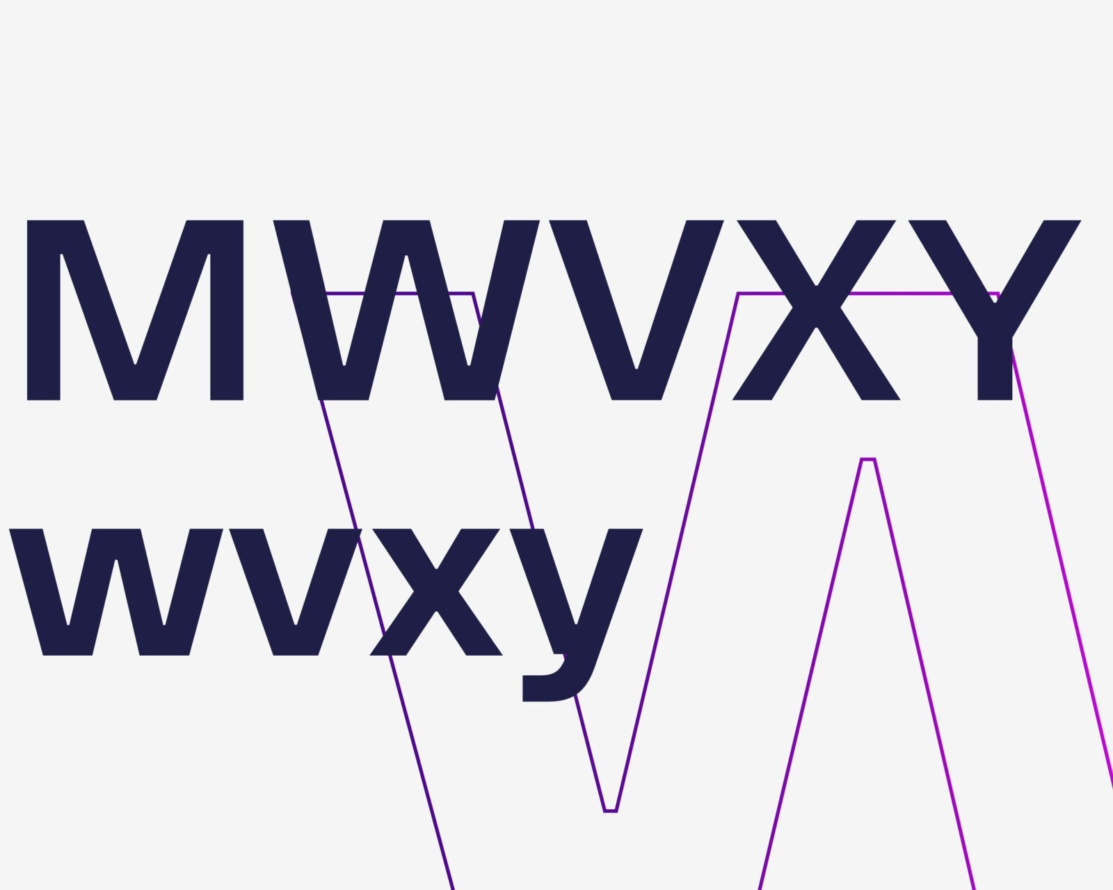
In the diagonal letters WVXY wvxy the wide design is quite a modern solution to keep the tips wide.
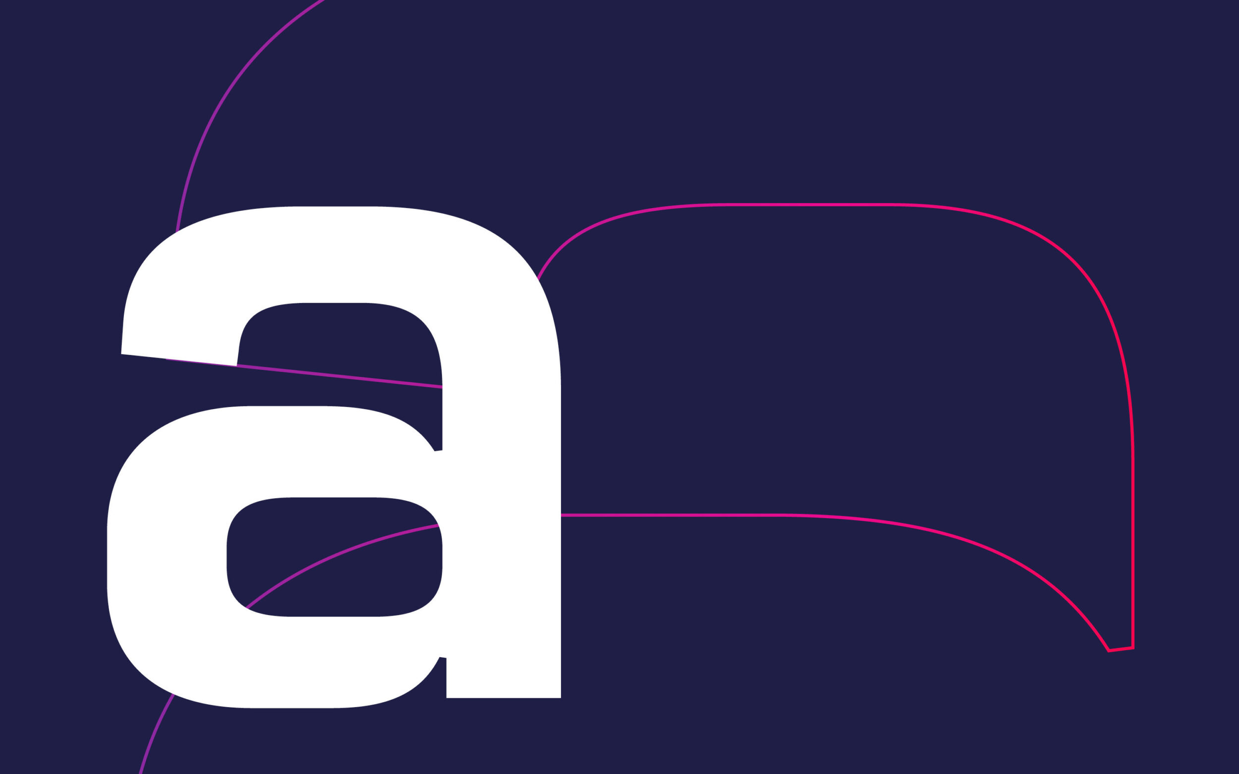
Apertures are cut in a visible angle, to add excitement to the forms
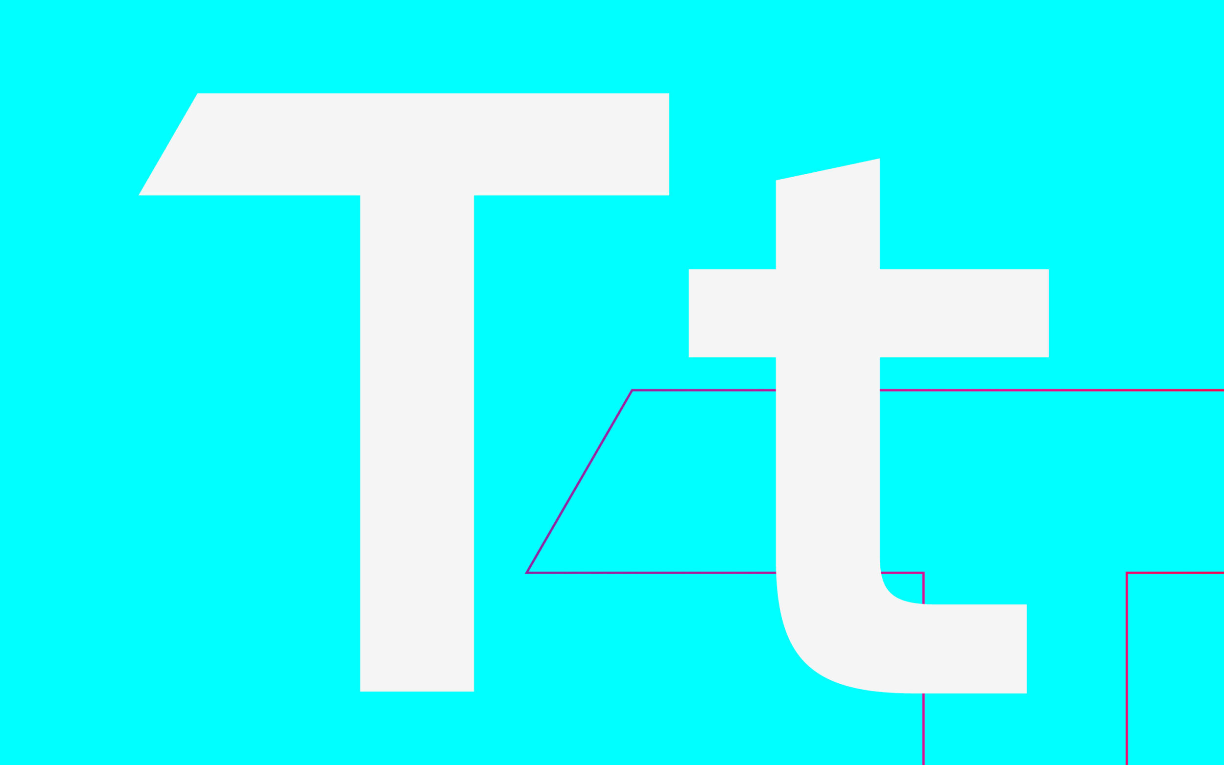
The capital T was cut to emphasize the connections to the logotype
