SBK Rumiko
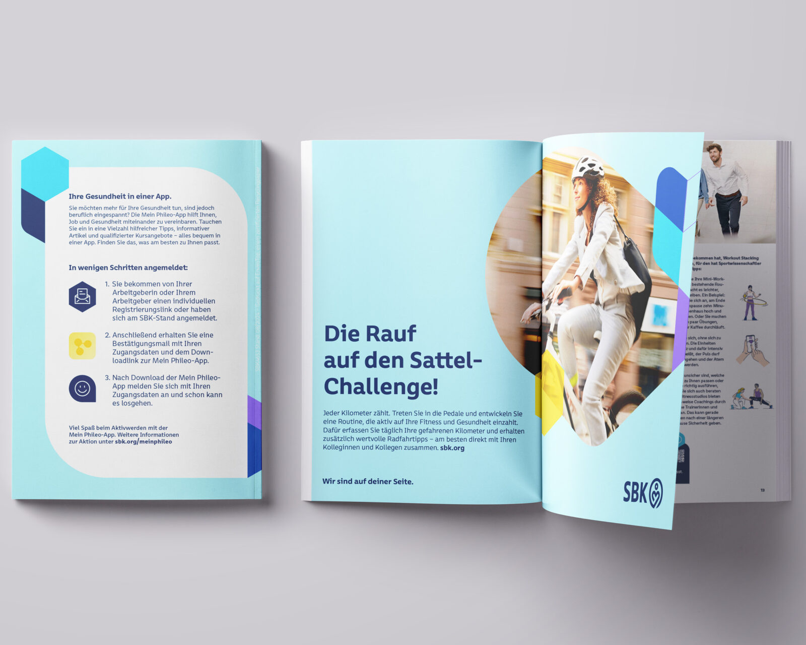
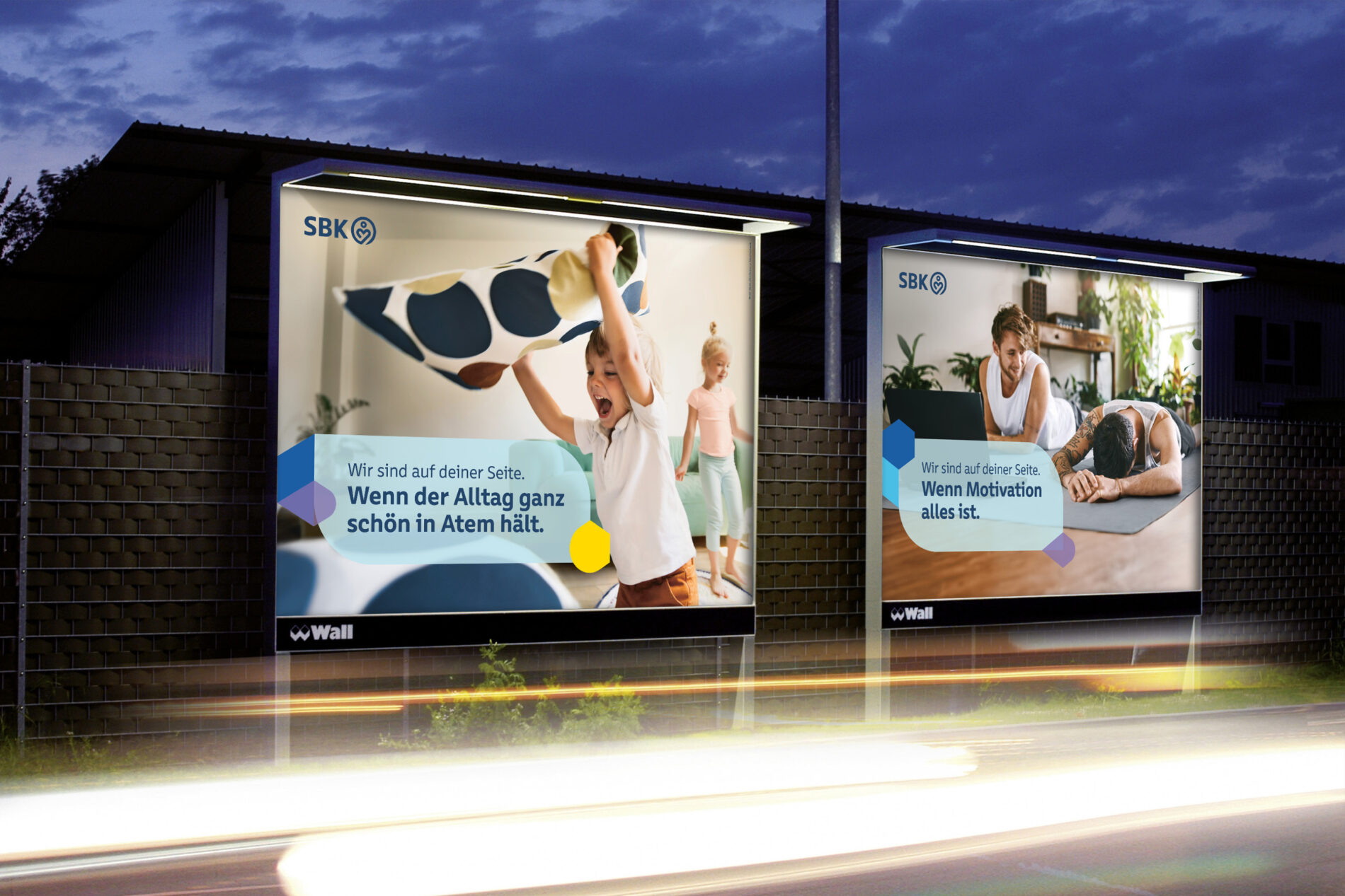
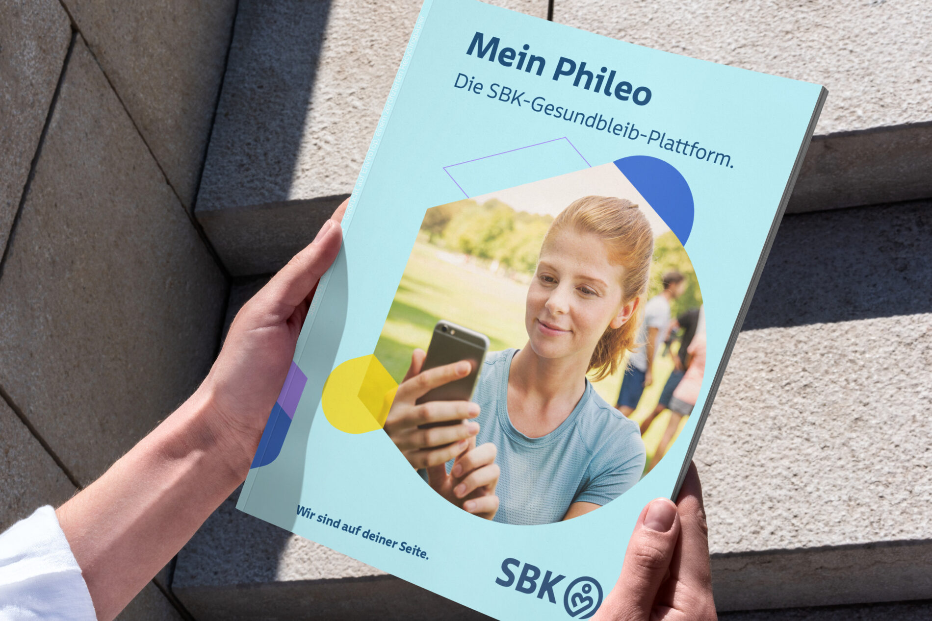
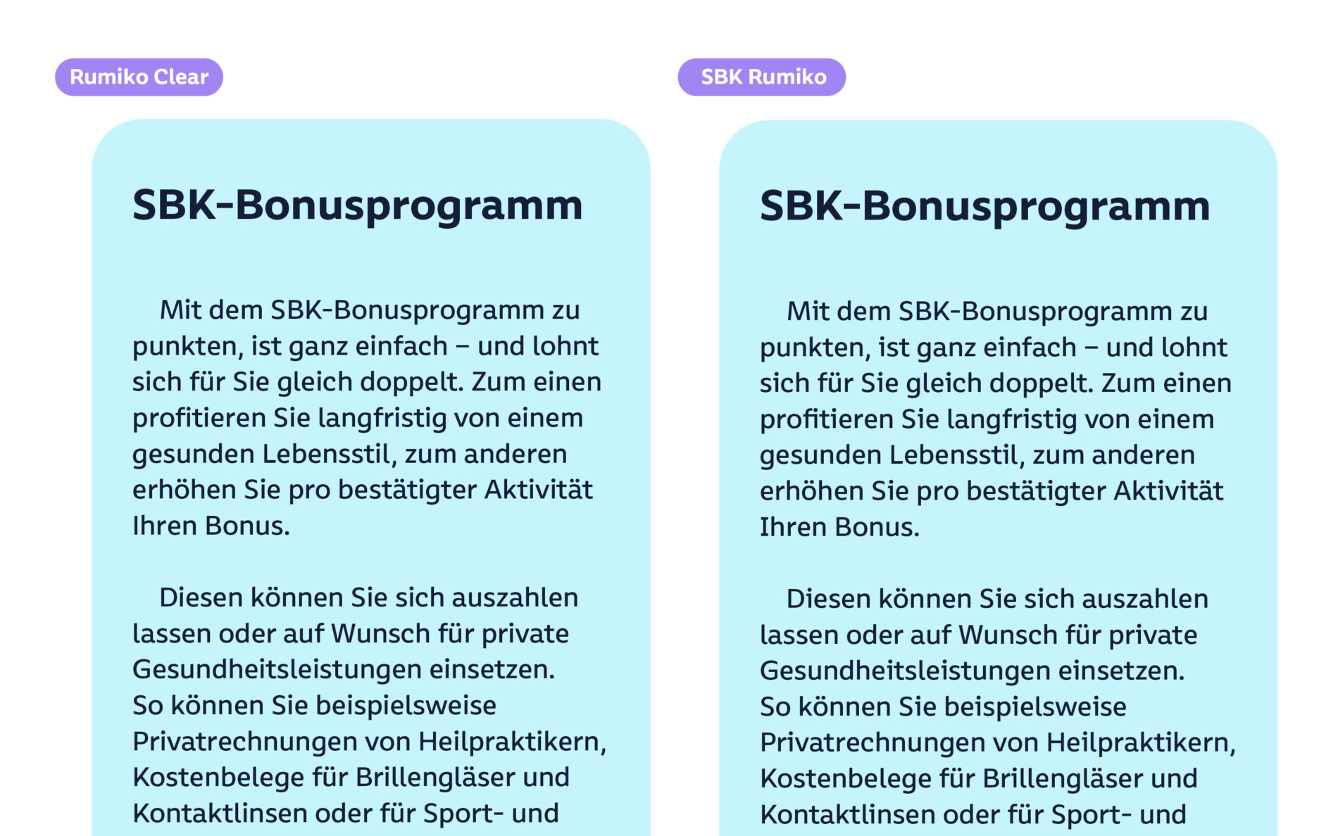
When developing the new brand identity for SBK, HAVAS is impressed by Rumiko Clear’s balance of humanity and legibility. By enhancing Rumiko Clear with distinctive details, SBK ultimately receives its own accessible and inclusive corporate typeface. The redesign was awarded the Red Dot Design Award.
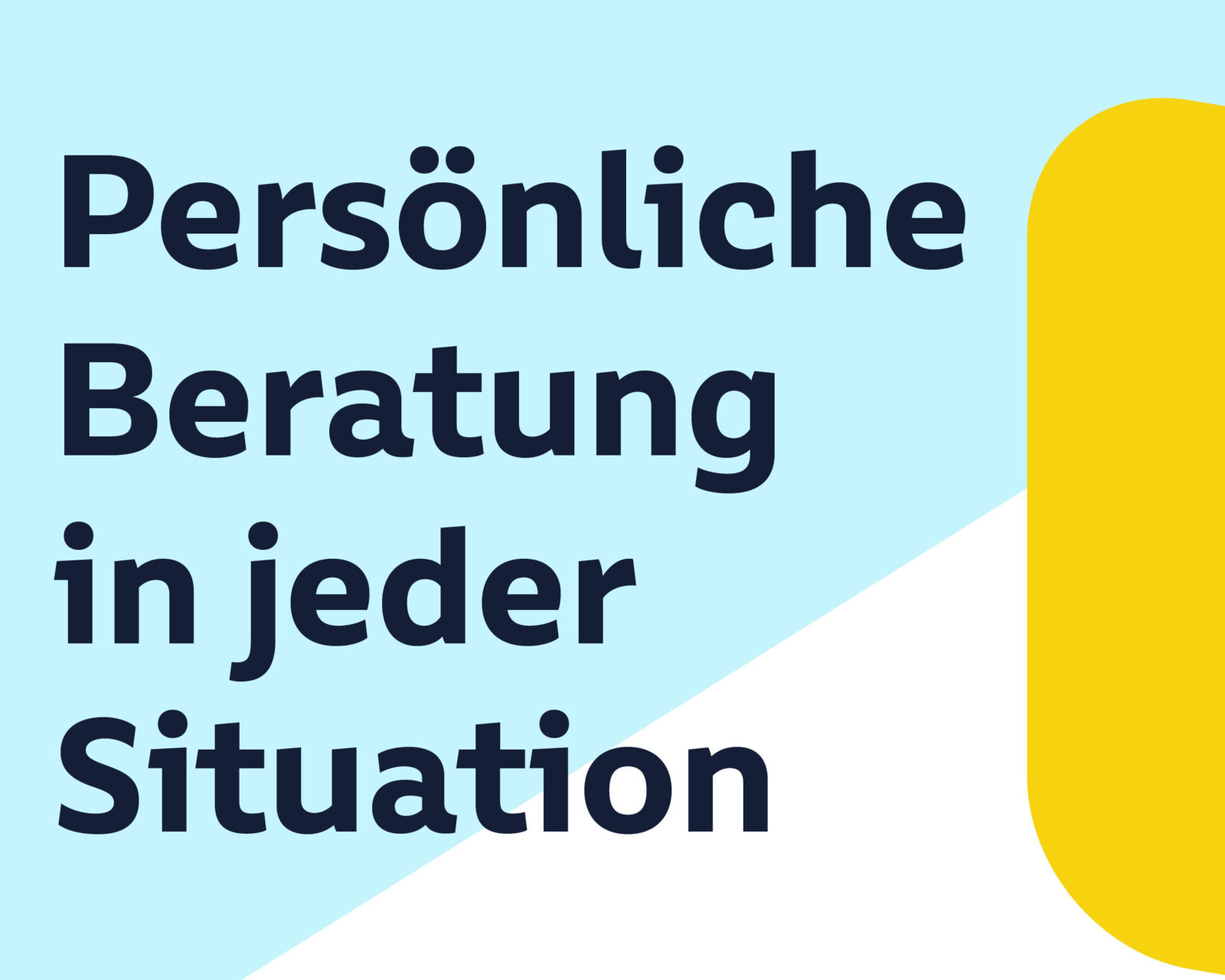
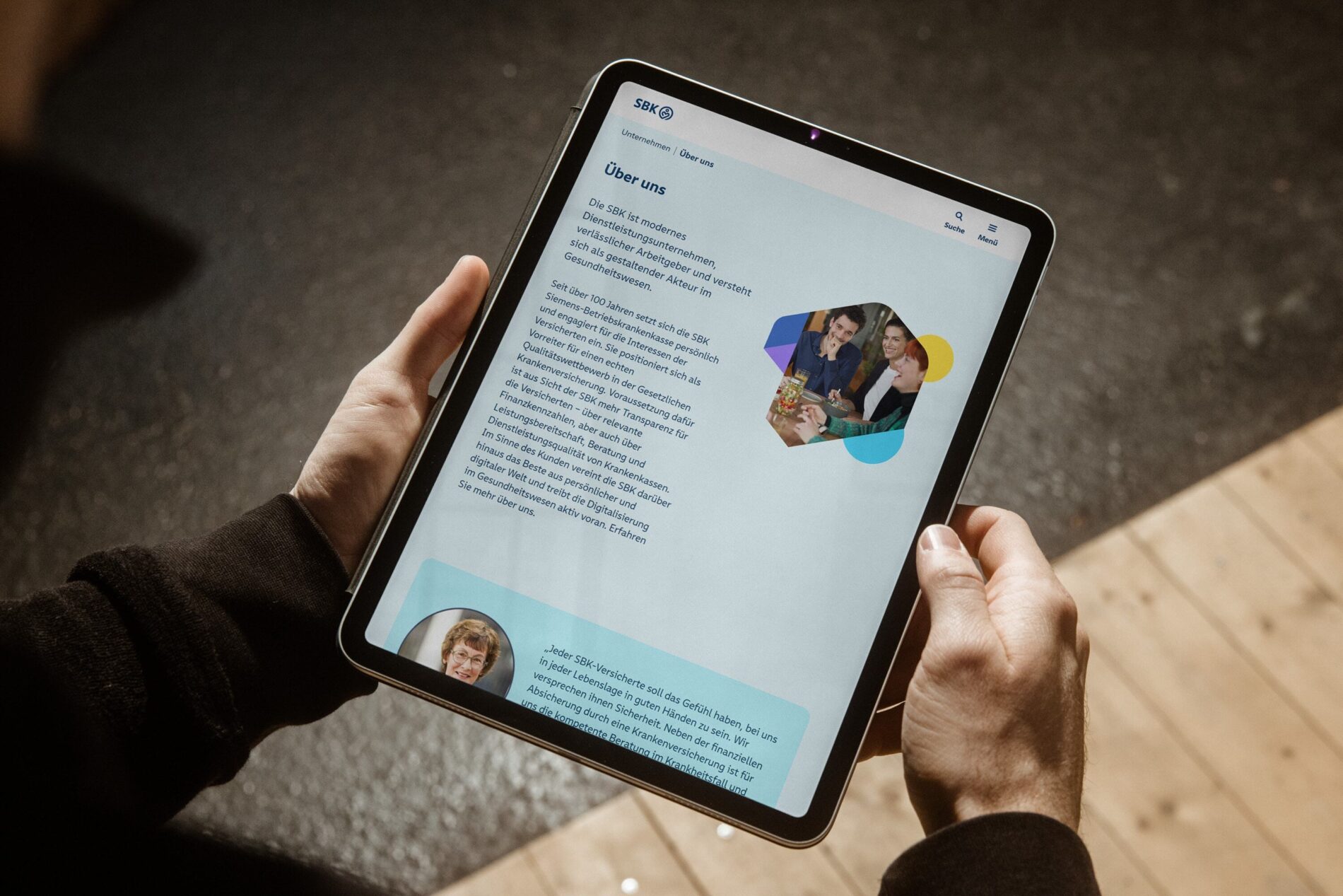
Rumiko Clear is a design that is developed with the aim of being friendly yet solid for digital applications. When HAVAS Germany is tasked with creating a new corporate identity for Siemens Health Insurance Germany, they find that Rumiko Clear is a right fit from the start. This is due to the fact that it strongly reflects the SBK brand values of empathy, personality, modernity, accessibility, and openness. In addition to its aesthetic appeal, Rumiko Clear also meets important requirements and principles of legibility, particularly in digital environments.
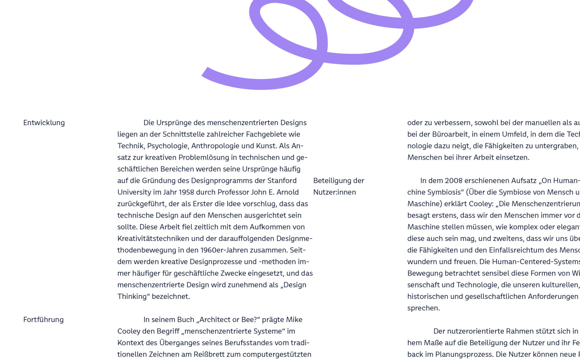
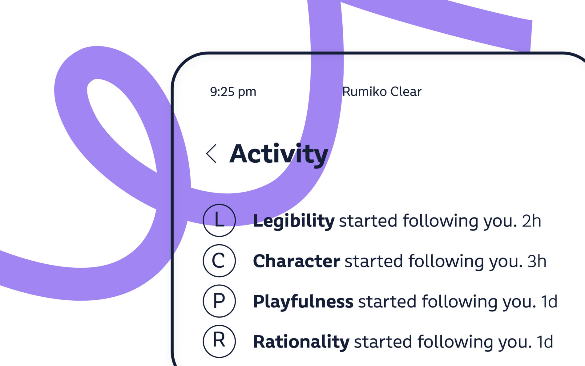
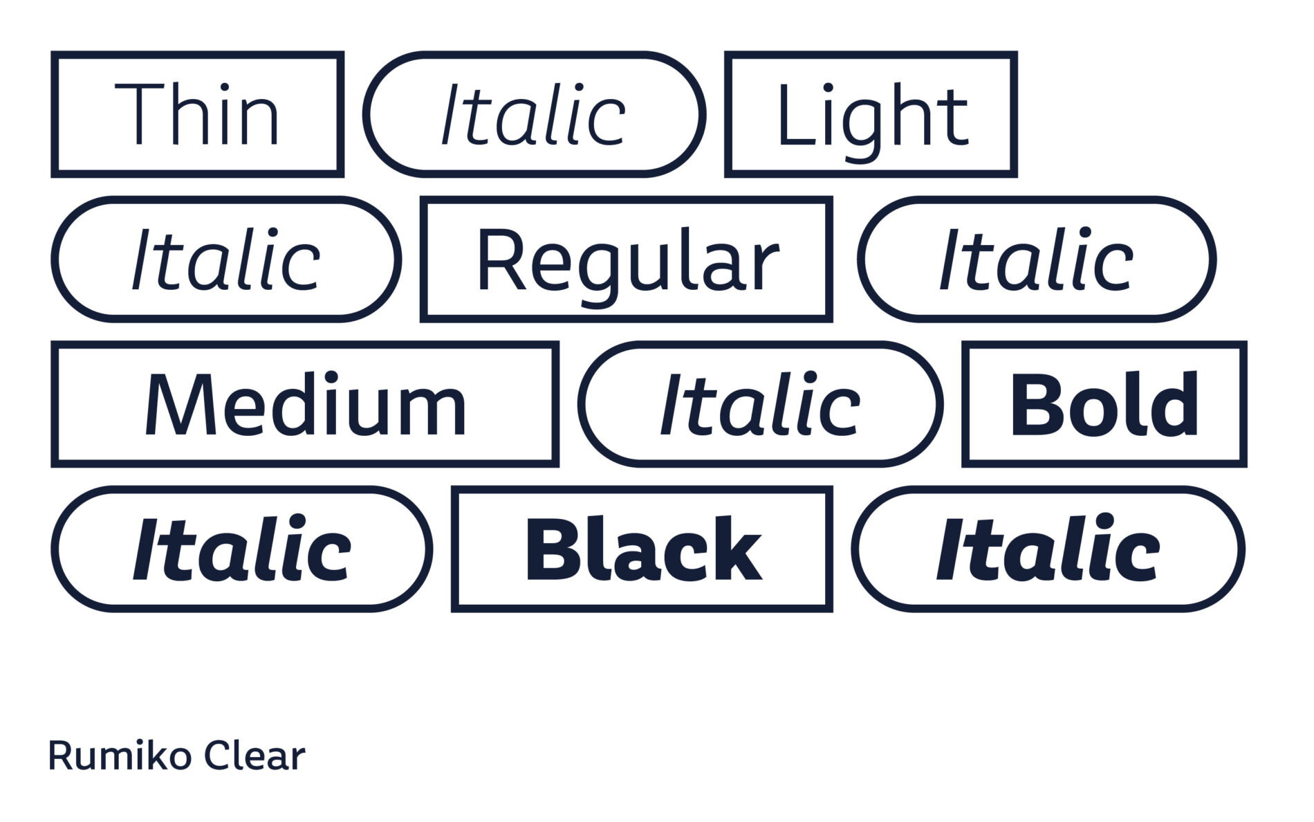
In the development of the new design, inclusion plays a significant role in making Rumiko Clear more differentiated and clearer in its forms. To achieve this, the focus lies on general legibility, with a particular focus on legibility for the visually impaired. The adapted Rumiko Clear characters stand for clarity and clear differentiation, ensuring that there is no confusion between individual characters when reading. Similar-looking pairs of characters are now distinguishable. These adjustments, coupled with Rumiko Clear’s warm character, provide SBK with a strong and charming corporate typeface.
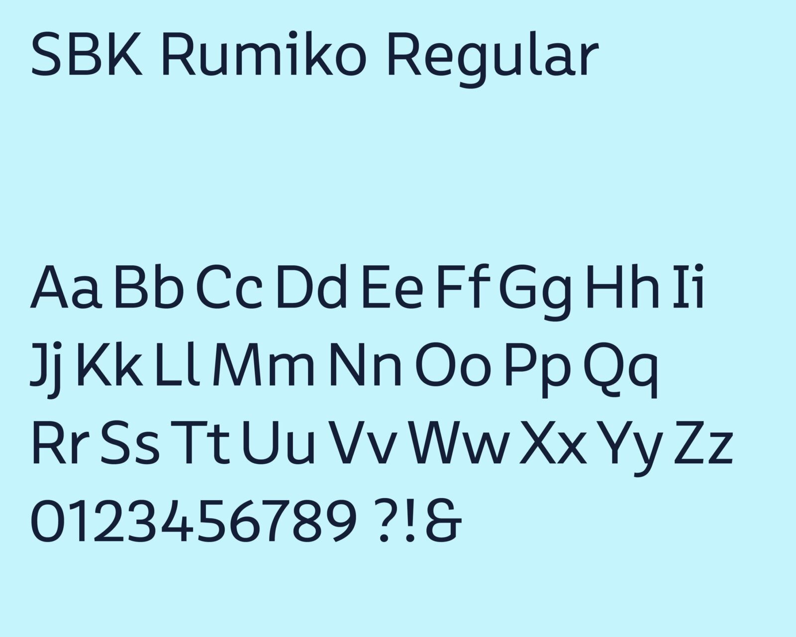
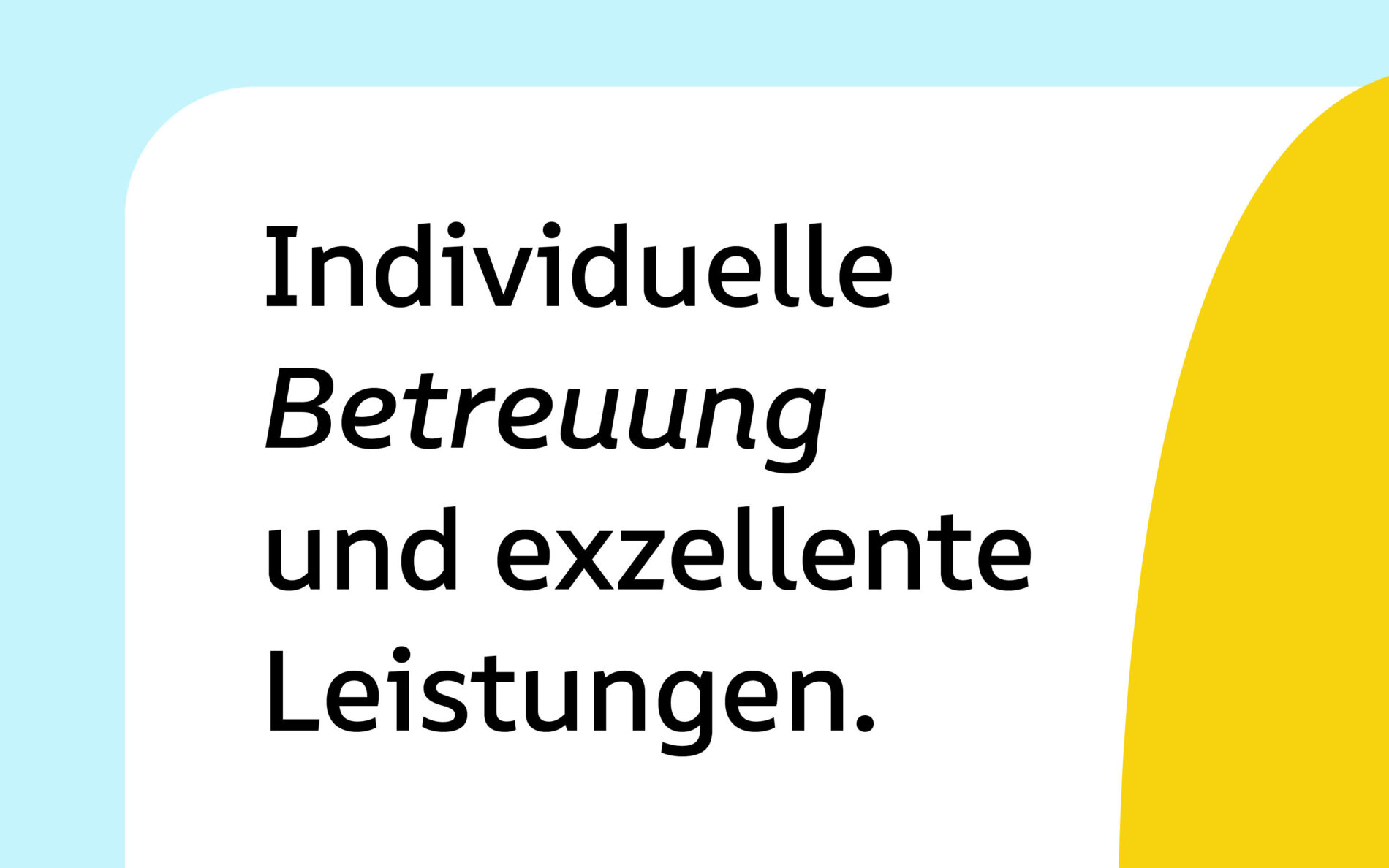
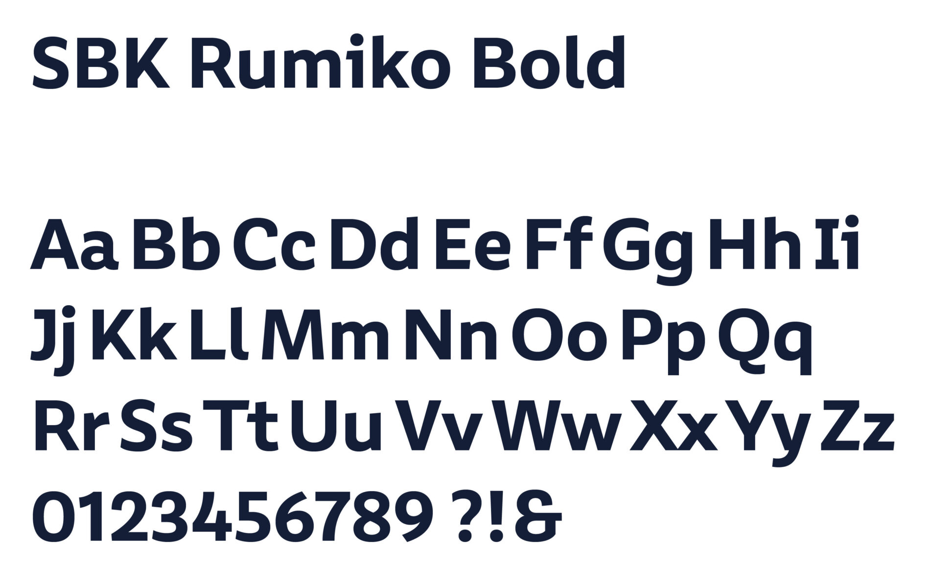
Alongside the new corporate typeface, there is also a change in SBK’s word mark and logo. The new word mark of SBK is redesigned in the corporate typeface while the new logo is improved and revised in its outlines. The letter's proportions, shapes, spacing, and widths are slightly changed to make it look balanced outside body text. As a result, both SBK trademarks complement each other perfectly and remain clear and legible even in smaller sizes.
Havas Germany: SBK Markenrevolution
