ROSSMANN
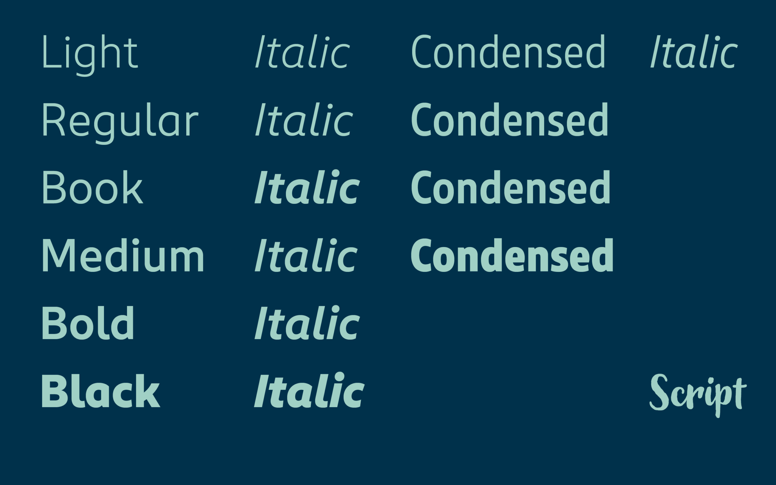
Being the pioneer of the drugstore in Germany, ROSSMANN developed into one of Europe’s largest health and beauty retail chains. We support that success with fonts: a kind Sans, an authentic Script and a practical Condensed bring out core values and meet the company’s typographic needs.
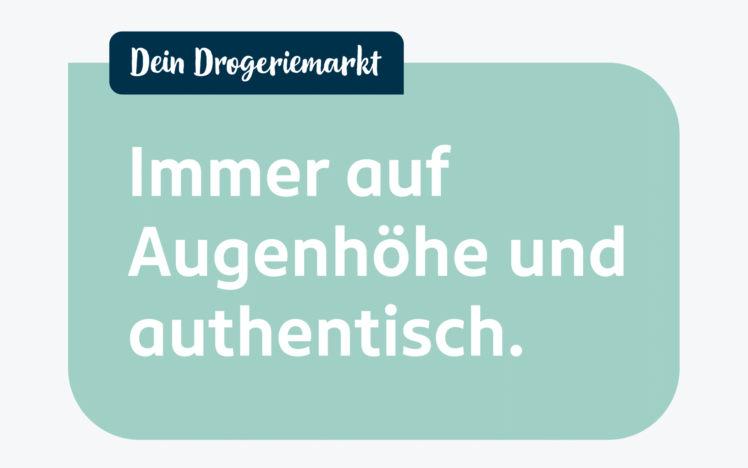
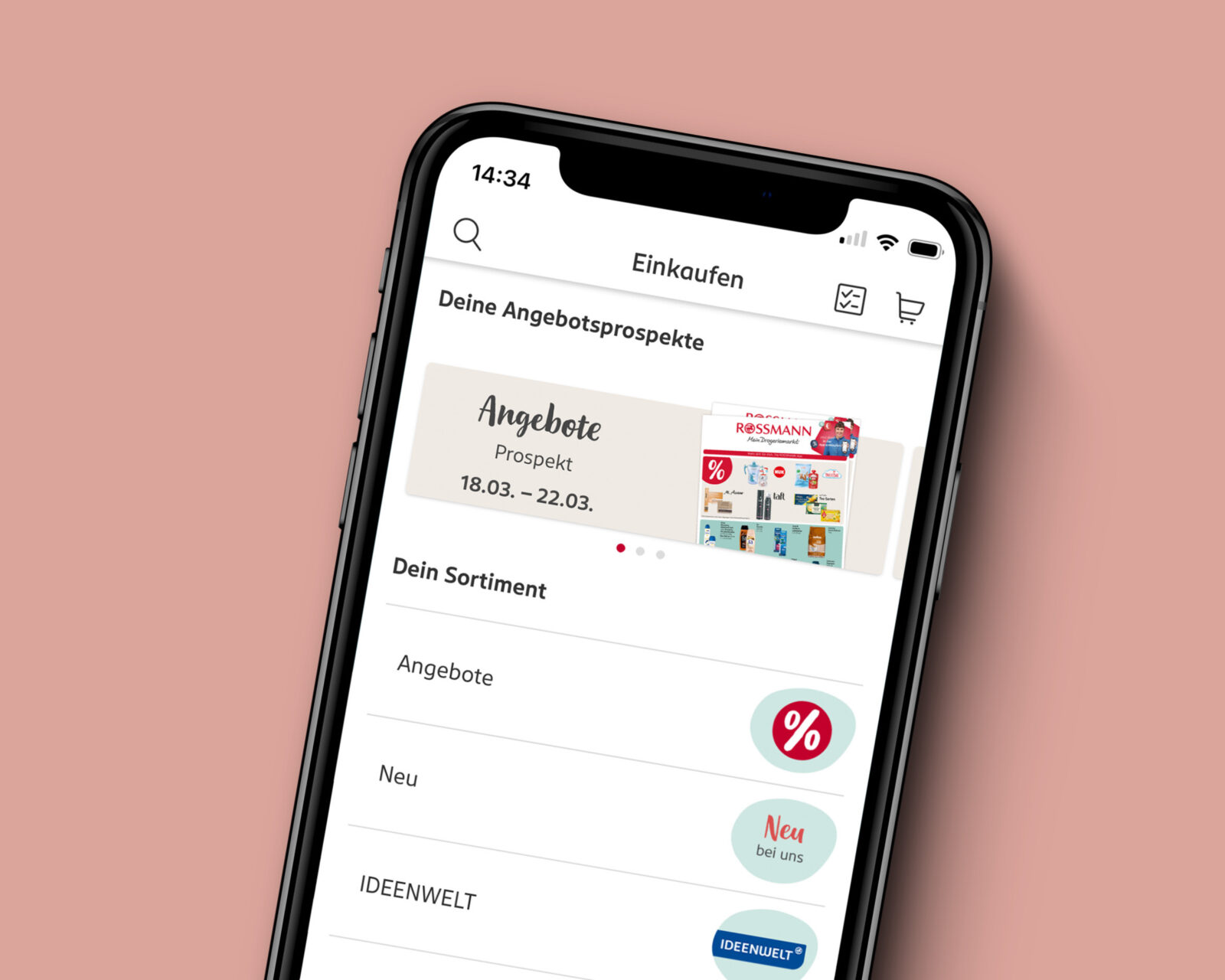
ROSSMANN is an established drug store in Germany and Europe offering a wide range of products. In close collaboration with ROSSMANN’s in-house Branding&Design and UI team, we collaboratively made it our goal to develop a modern and legible type design that feels warm, fresh and true to the brand values of diversity, empathy, authenticity and kindness. The typeface needed to be suitable for all kinds of applications and usages, such as print, website, app, TV, software, electronic shelf labels, self-checkout machines etc. With ROSSMANN being the store round the corner for everyday personal needs, the custom typeface had to subtly create an emotional connection with the customer.
ROSSMANN Sans: The Main Workhorse for Different Usages and Applications
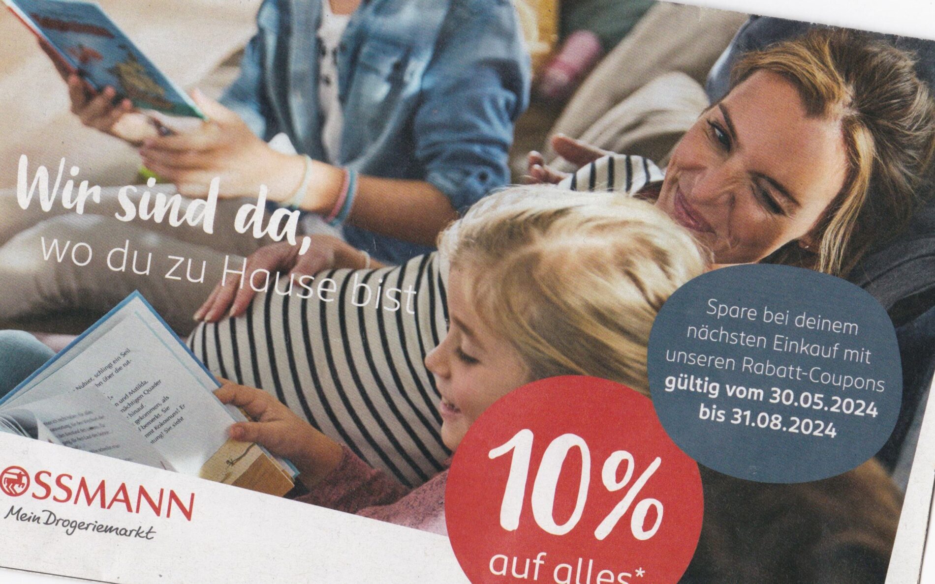
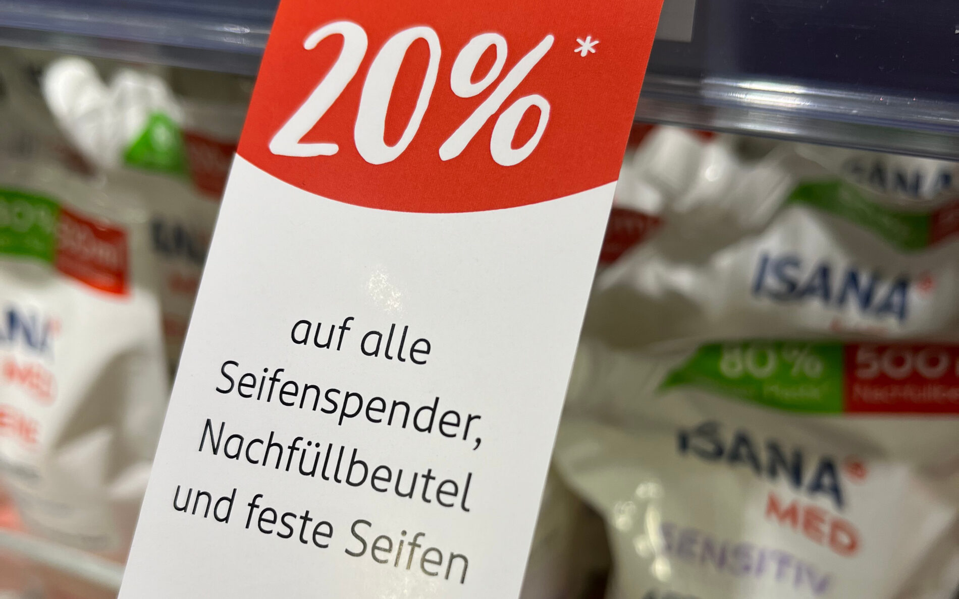
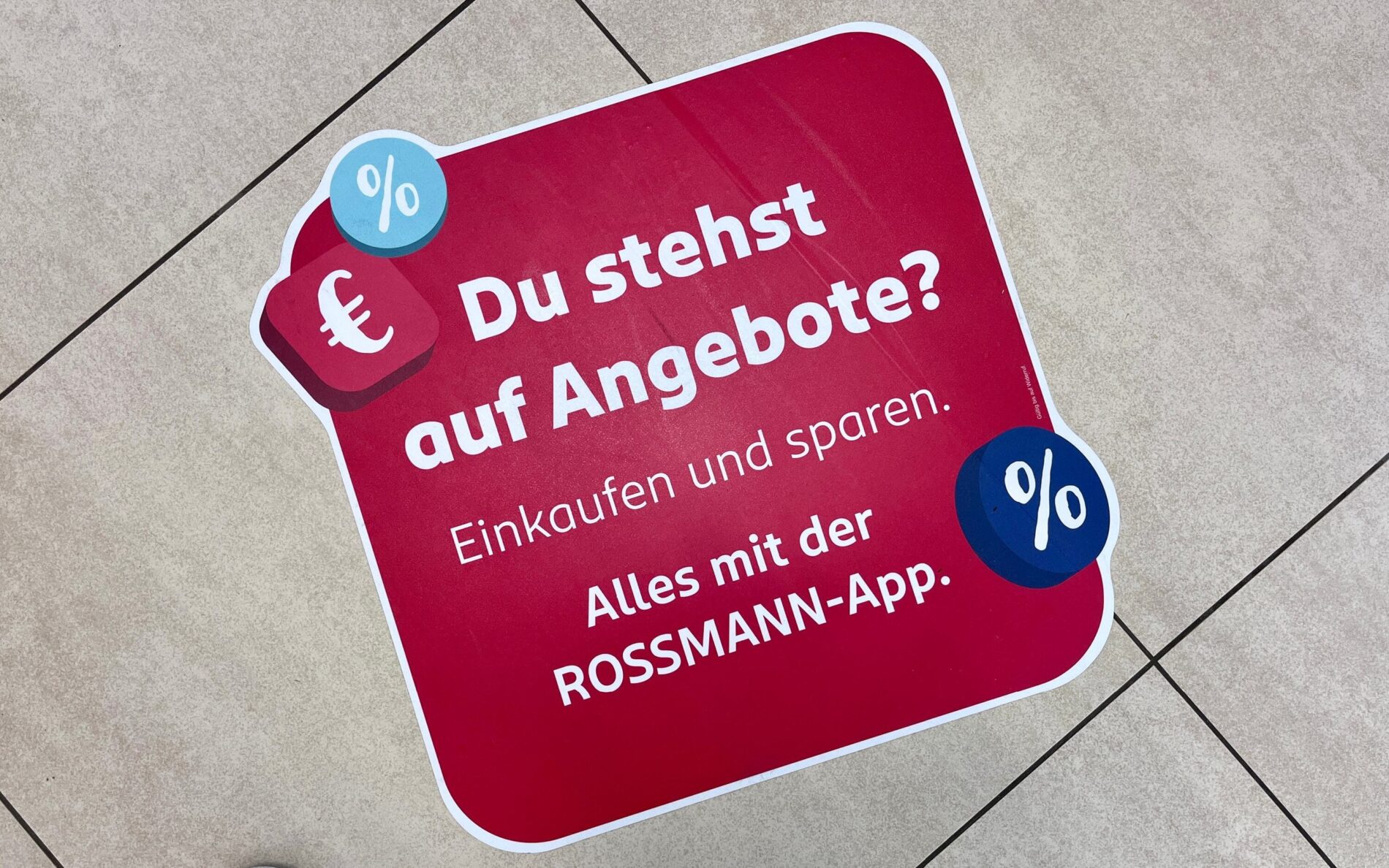
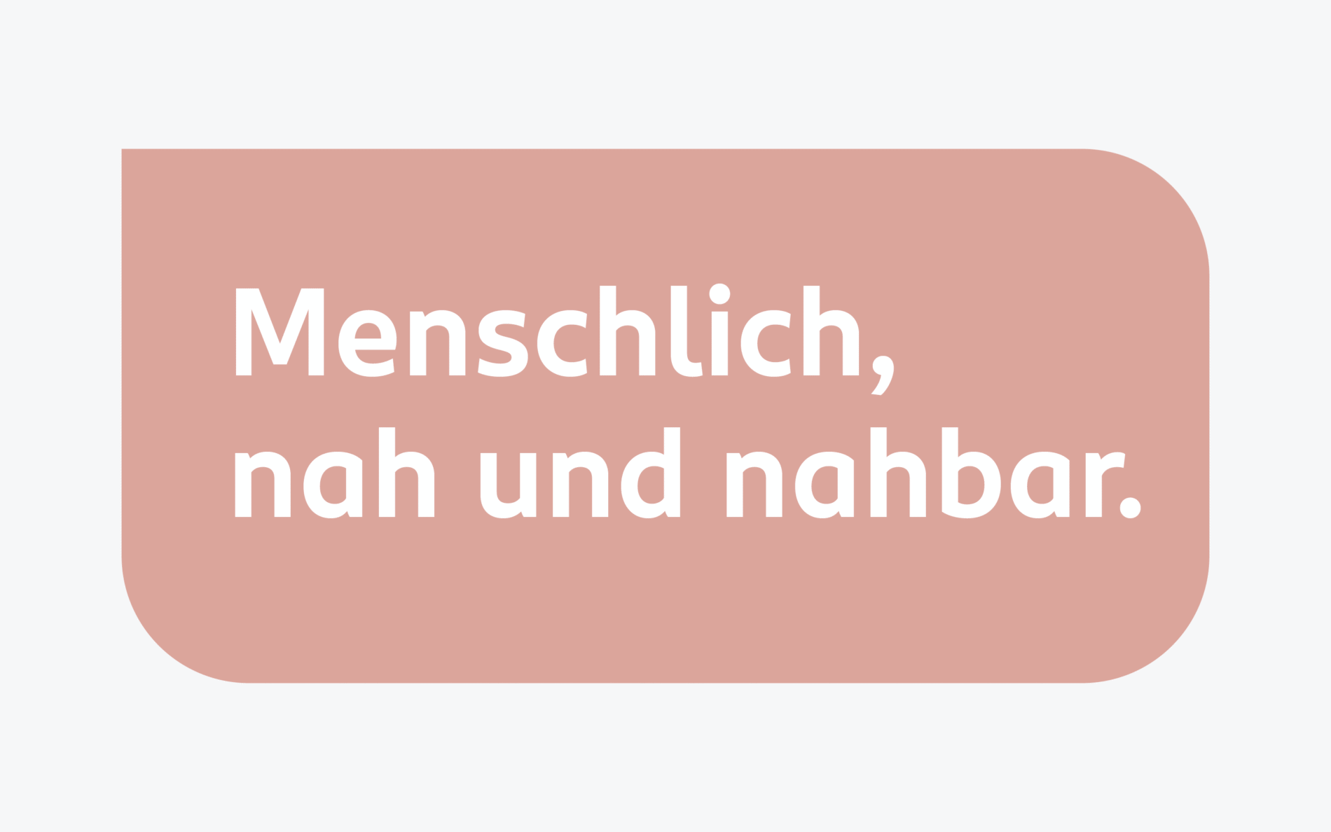
Being the representative typeface for ROSSMANN, it is clear that the Sans transfers the company‘s attitude and beliefs the most. Clear and open shapes, a finely crafted roundness and a few distinguishing characters result in a Sans that is pleasant and empathetic. Equally, these attributes create a clear brand identity and give ROSSMANN a personal and individual look.
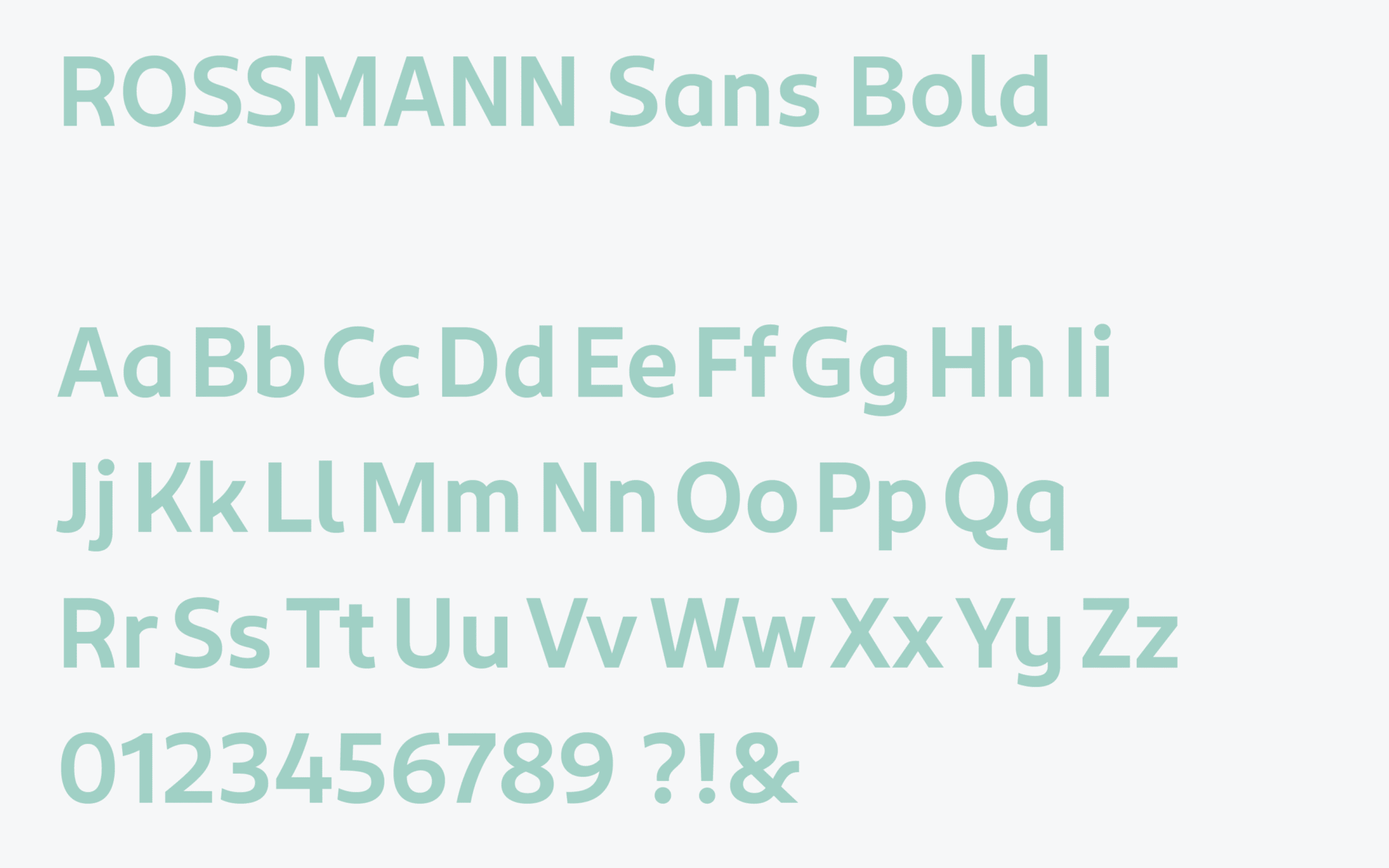
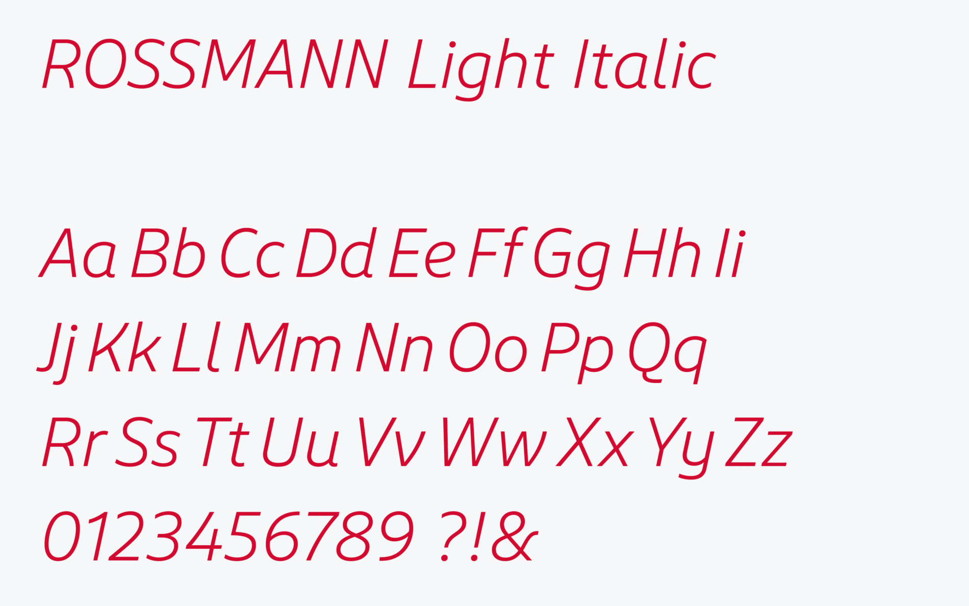
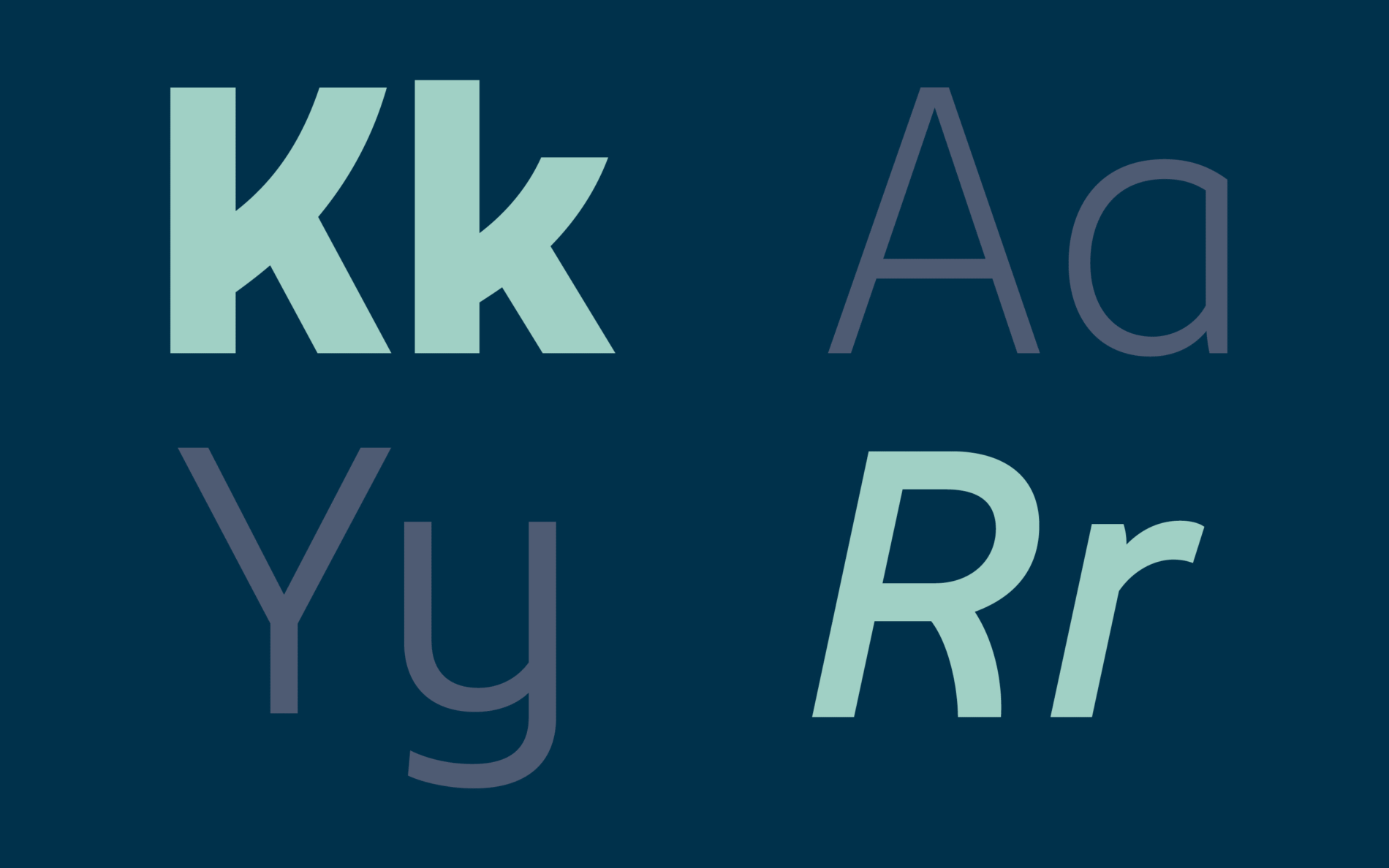
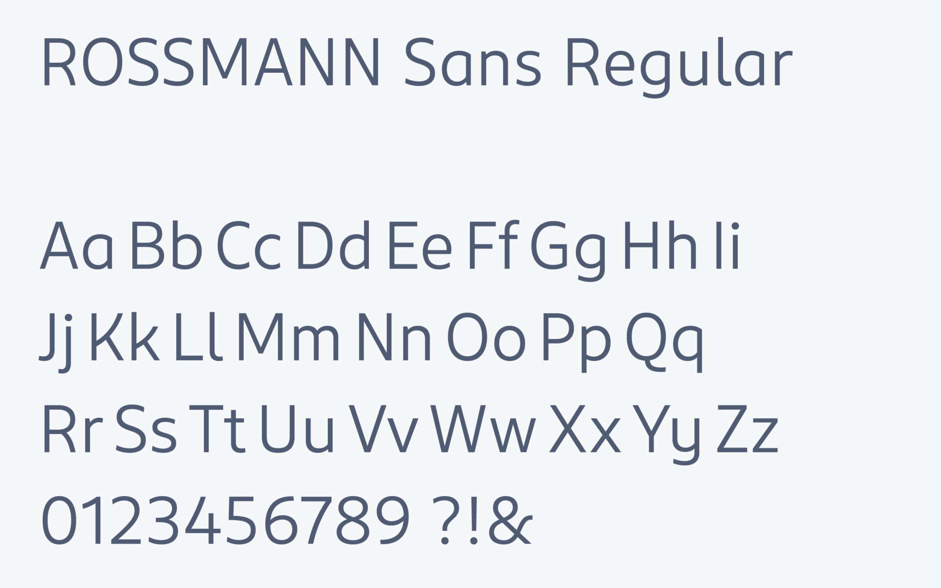
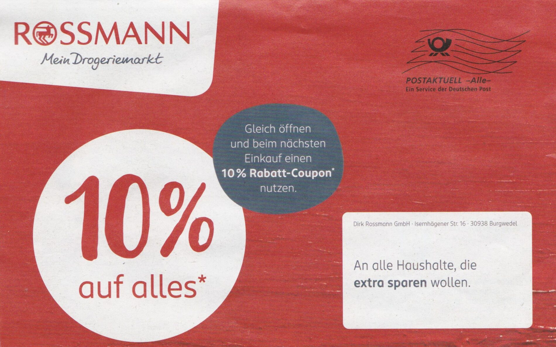
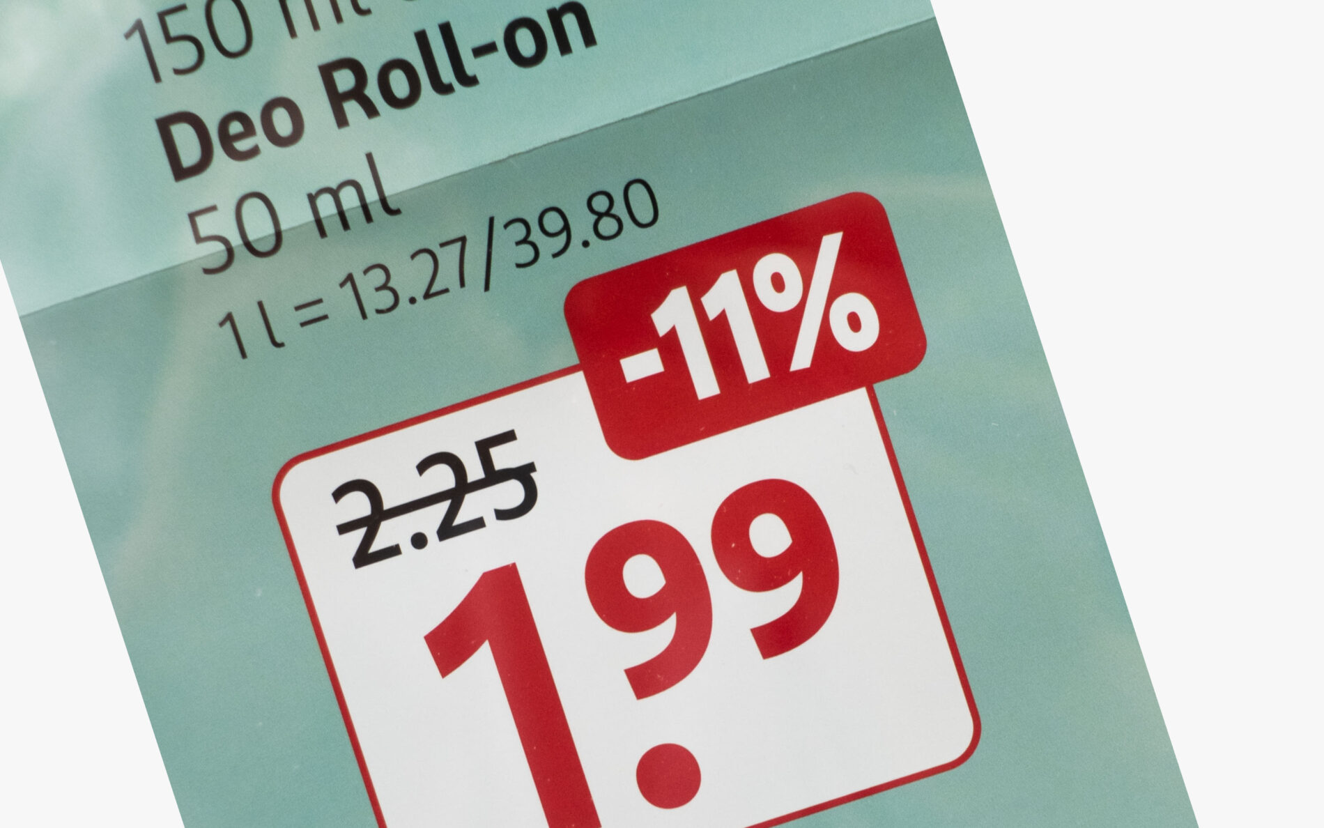
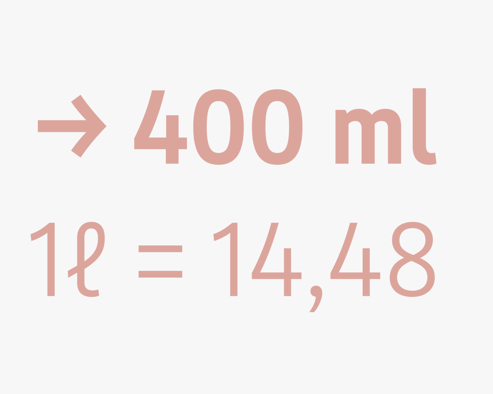
The corporate font pays particular attention to numbers, prices, currencies and country-specific abbreviations. The Sans is equipped with a handy feature that allows for a quick and automatic price conversion aligned with the brand’s typographic rules.
ROSSMANN Script: Headlines in a Flowy and Authentic Manner
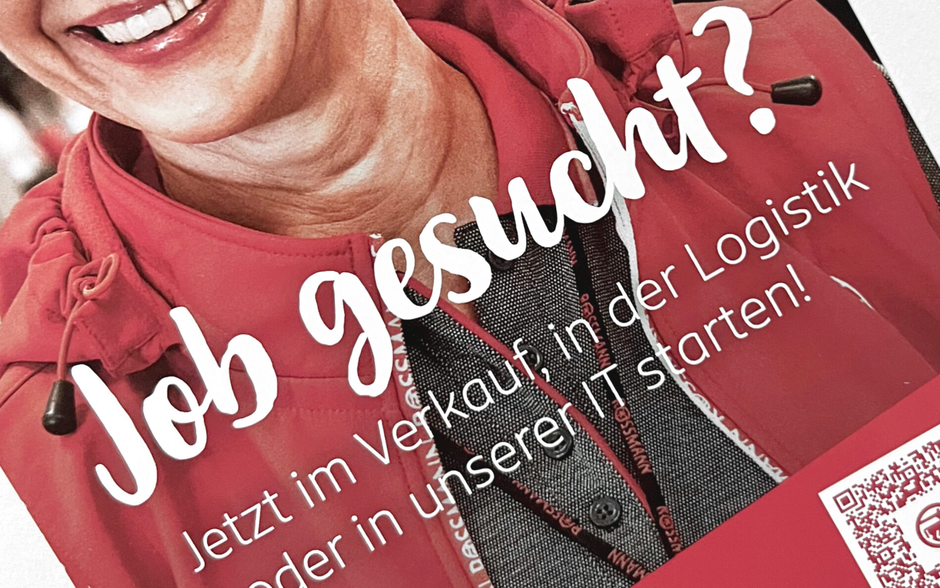
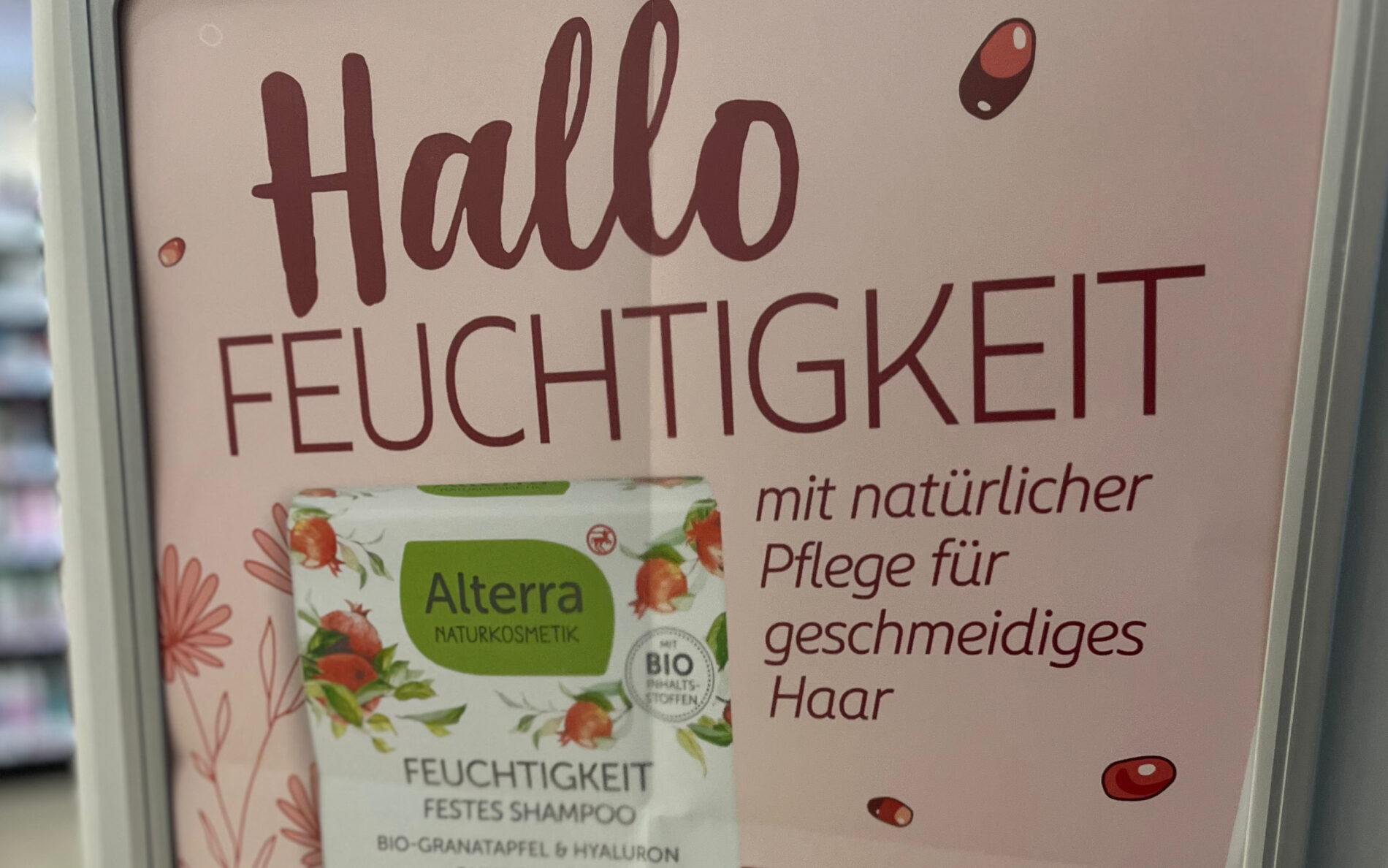
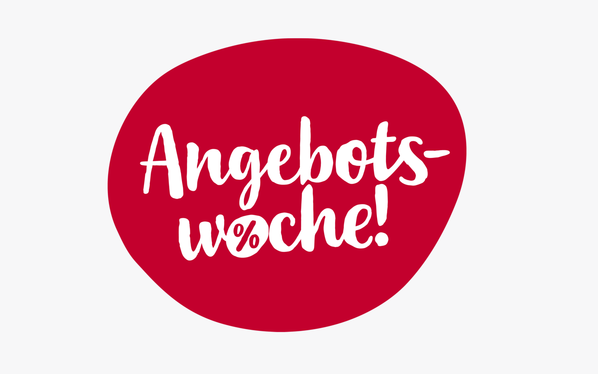
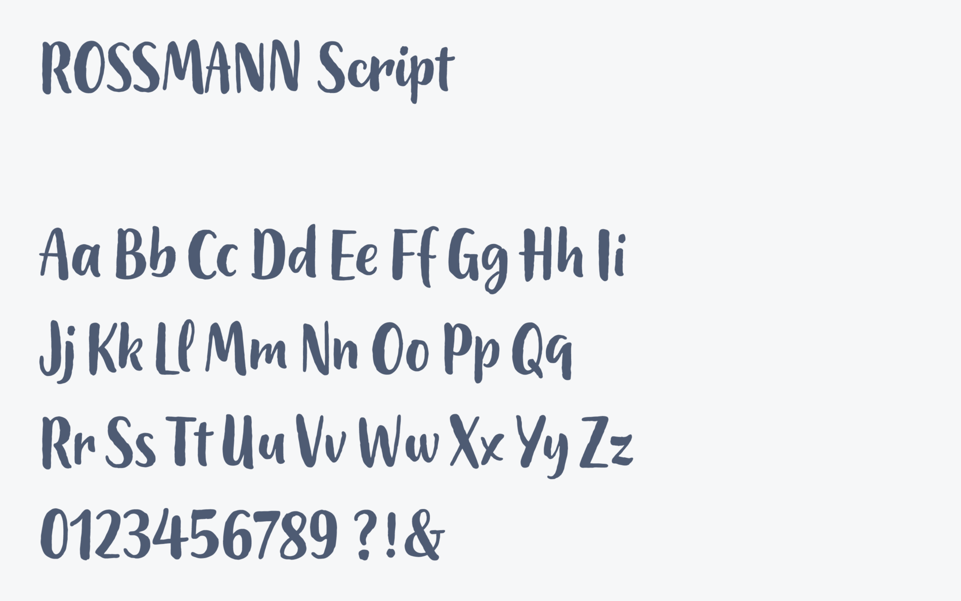
ROSSMANN Script is designed for headlines and typography that needs to stand out. With its emotionality and individuality, it represents authenticity in the communication of ROSSMANN. The handmade character and unpolished outlines, lots of variants and a clever OpenType code support its sincerity.
ROSSMANN Condensed: A Space Saving Companion for Typographically Strict Environments
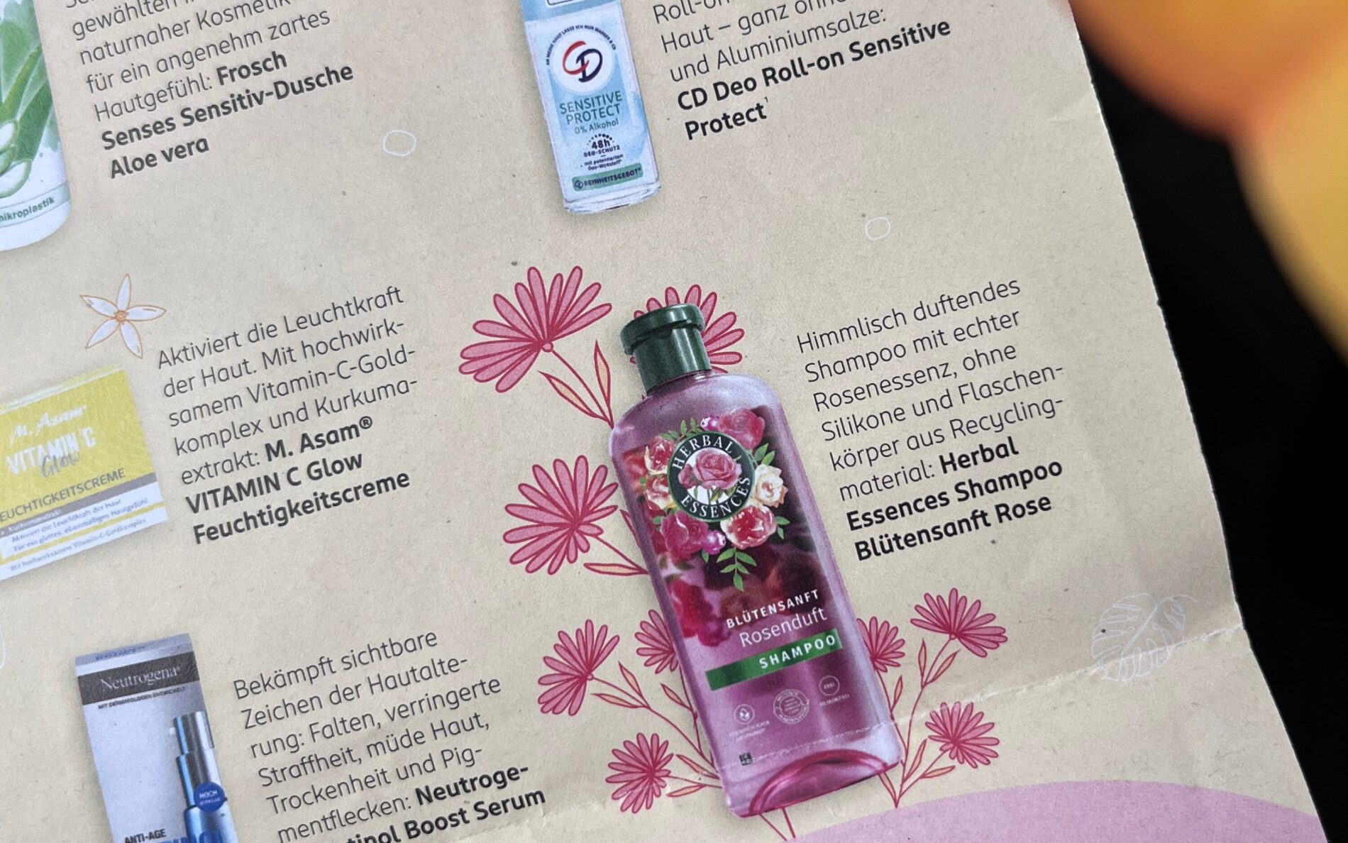
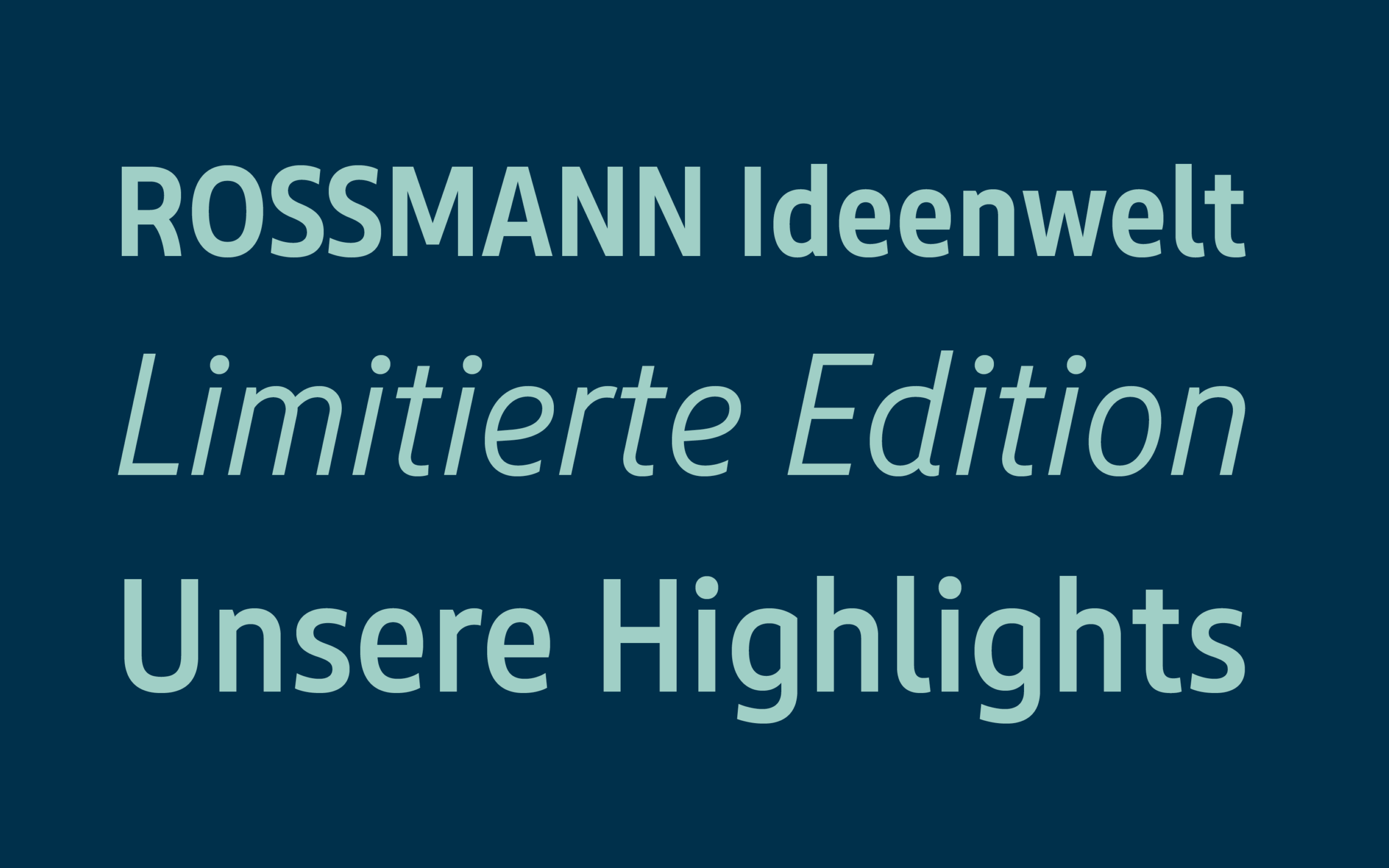
The condensed version of the Sans fits lots of text and information in tight grids. Mainly used for regularly printed leaflets, or small legal texts and add-ons, the Condensed family only consists of the styles and weights that are truly needed for the aforementioned environments. On one hand this smart and humble approach keeps the budget down for the client, on the other hand it also allows the Sans to be used as the main typeface wherever possible.
The new and exclusively designed ROSSMANN typefaces transport the personality of the brand and are characterised by a professional and technically clean implementation. Prepared for the typographic challenges of the future, the drugstore benefits from the unlimited licence for all media, which allows a flexible use of the typefaces.
