LH Hans & Icons
This font project was realised alongside the redesign of the Lufthansa Magazin with Max Nelles for TERRITORY MEDIA.
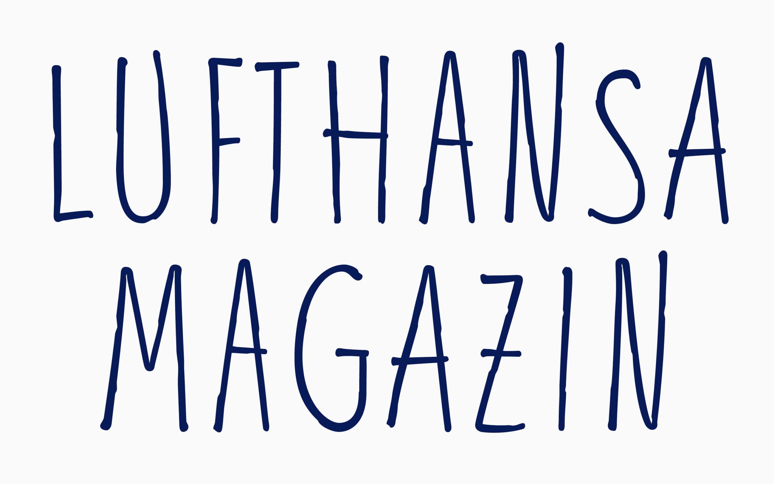
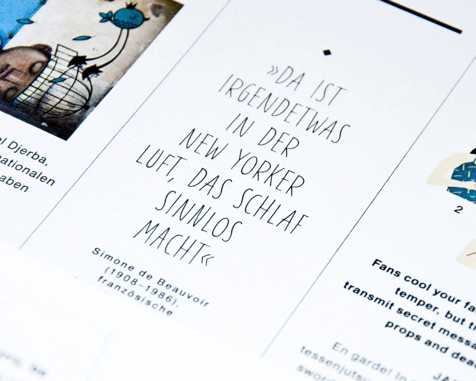
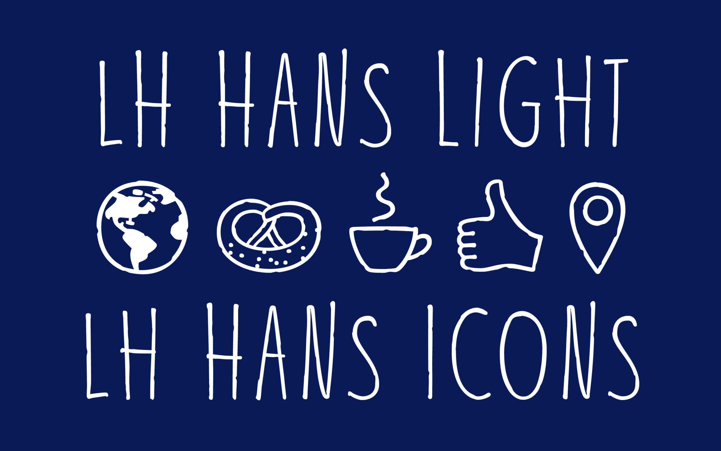
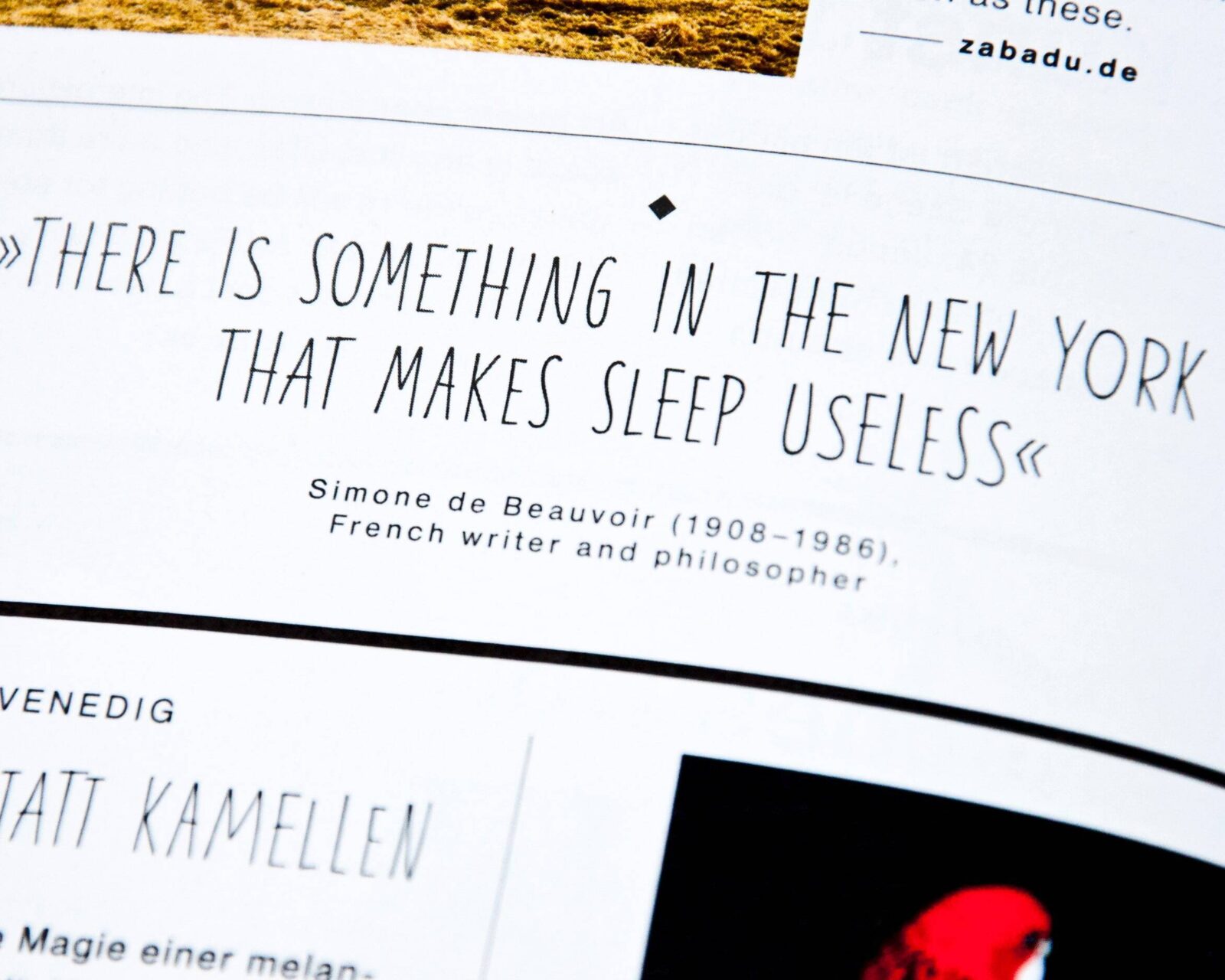
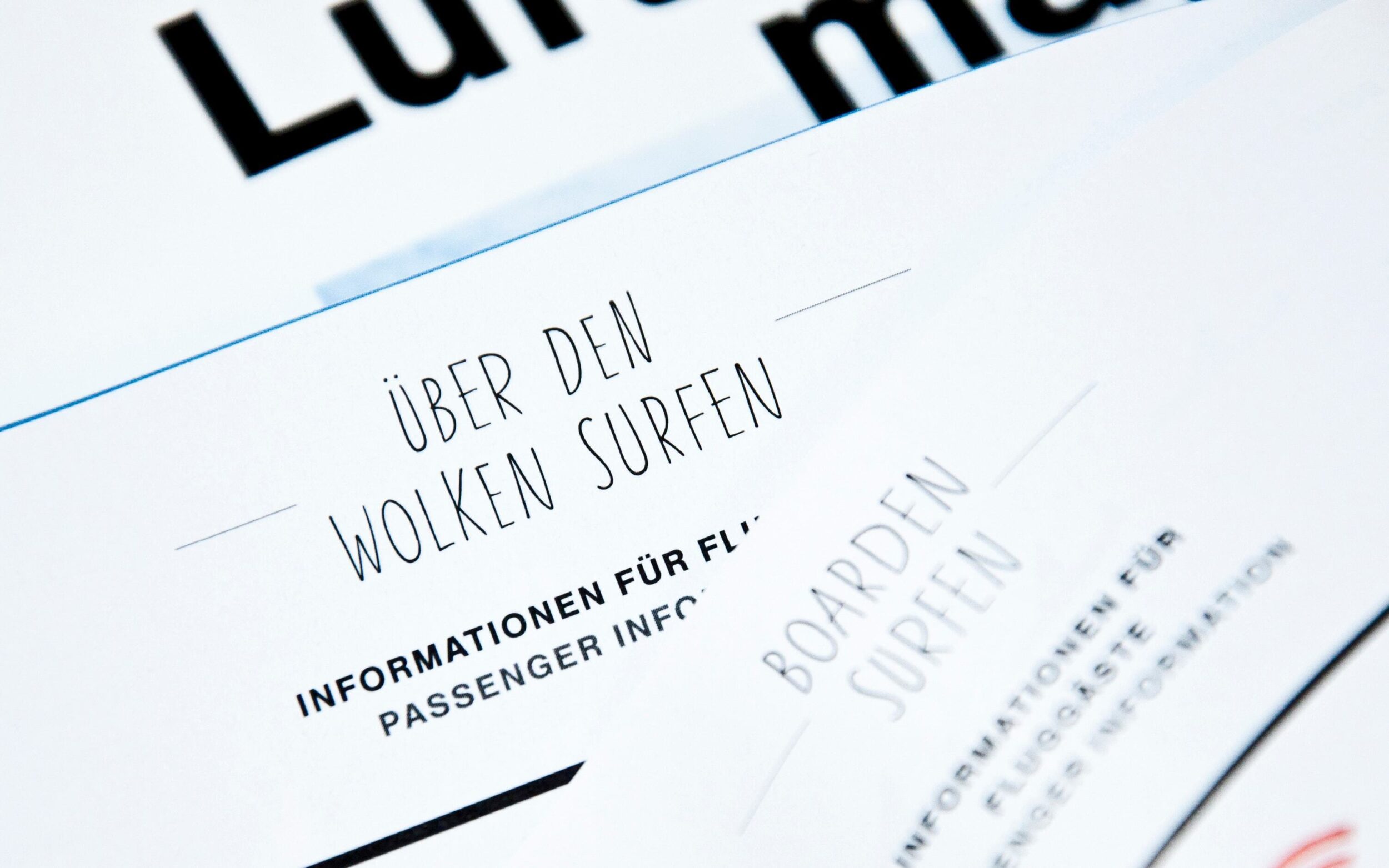
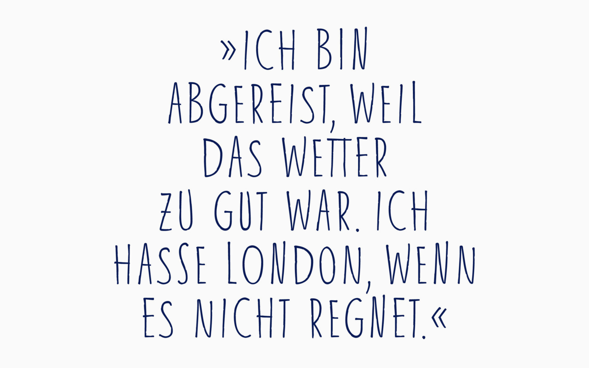
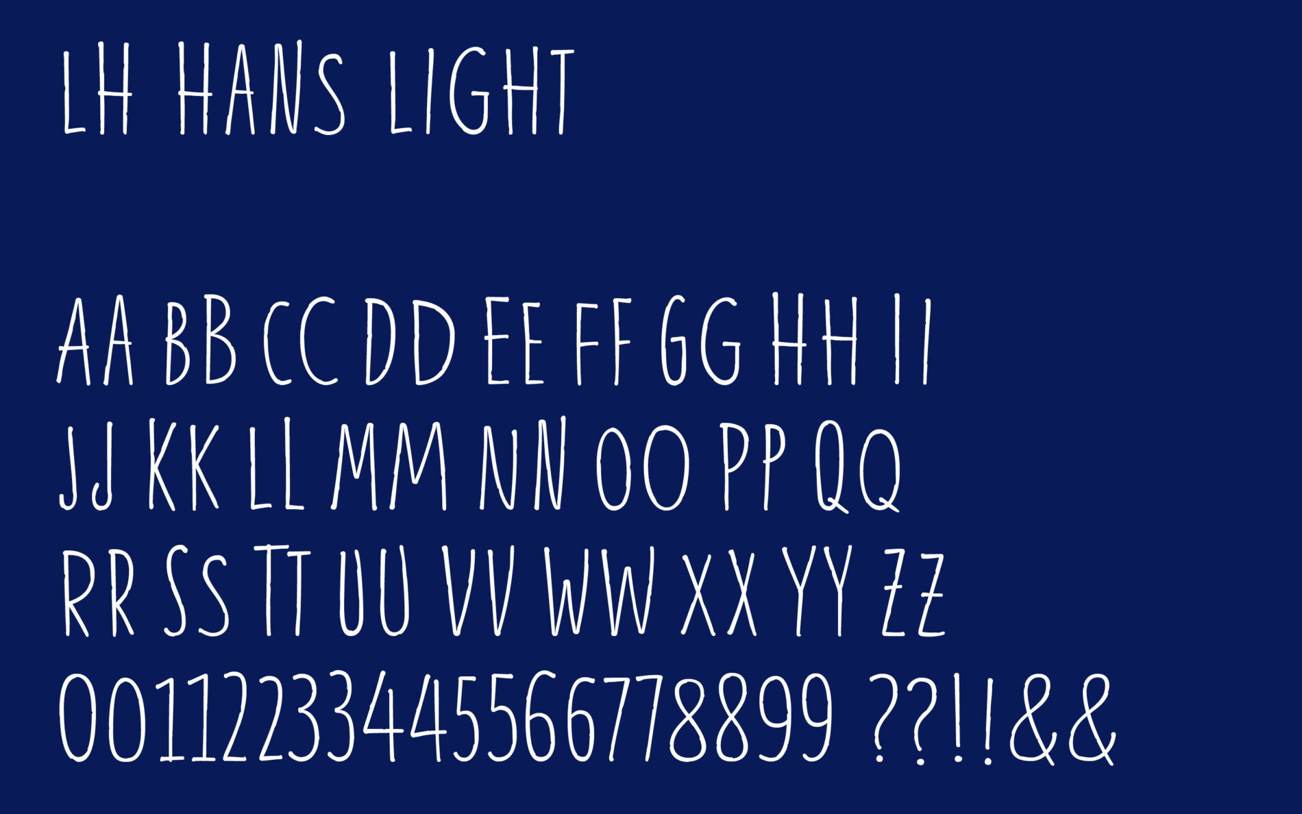
For this project we were asked to design a natural, handwritten font to accentuate certain text parts within the magazine. LH Hans is an uppercase only font, as the highlighted parts would mostly be shown in larger font sizes.
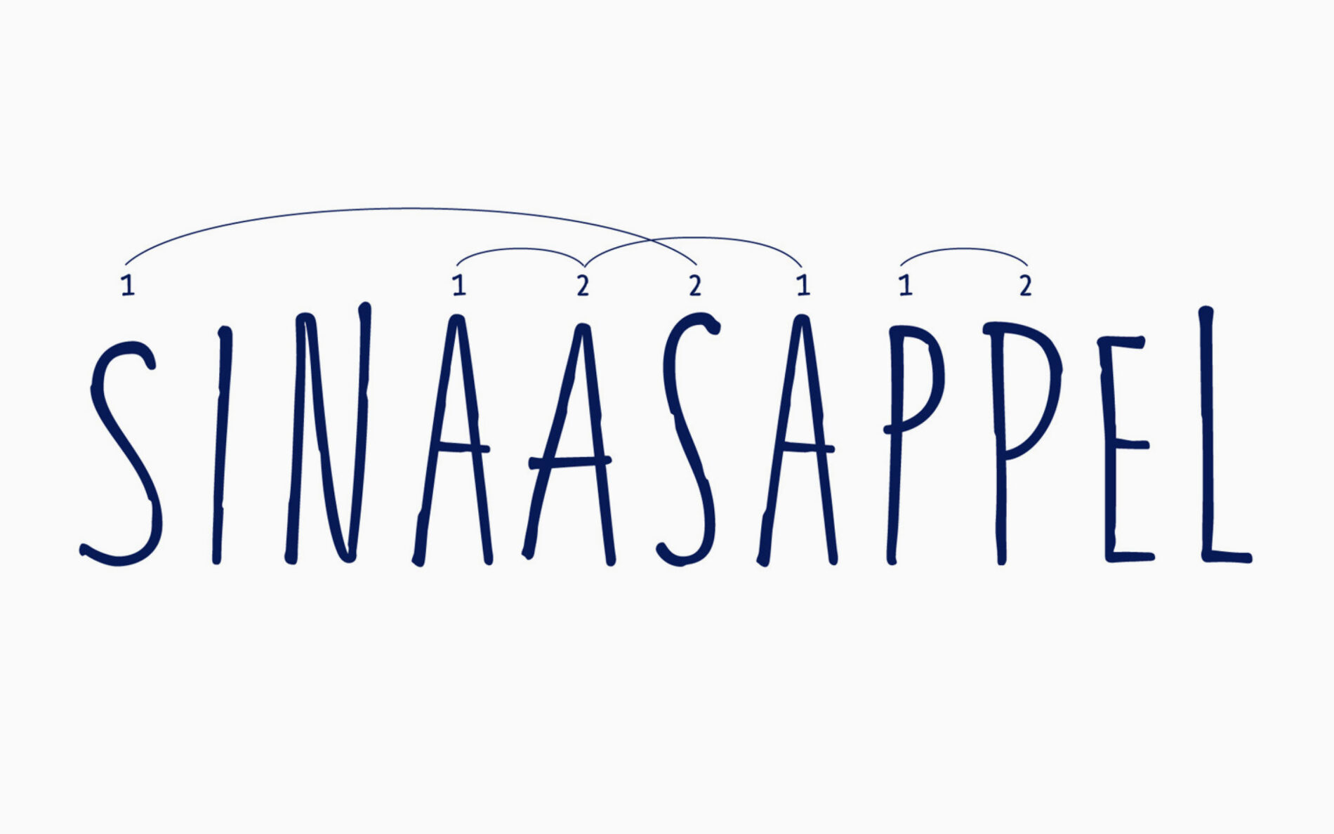
To get a strong handmade flavour, we decided to design two variants for each glyph. LH Hans’ automation was placed into the liga feature in order to make extra features obsolete. With the help of OpenType technology, the font automatically mixes the characters when writing and the user does not have to manually switch between the different variants. Bob’s your uncle, easy handling guaranteed!
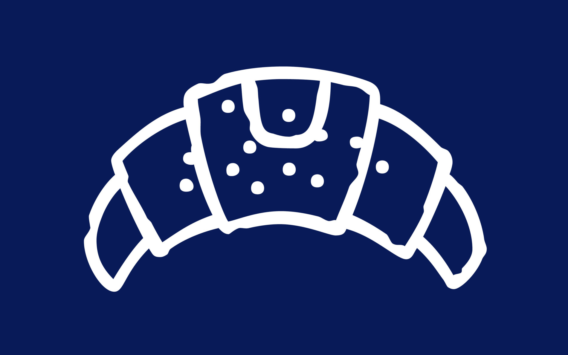
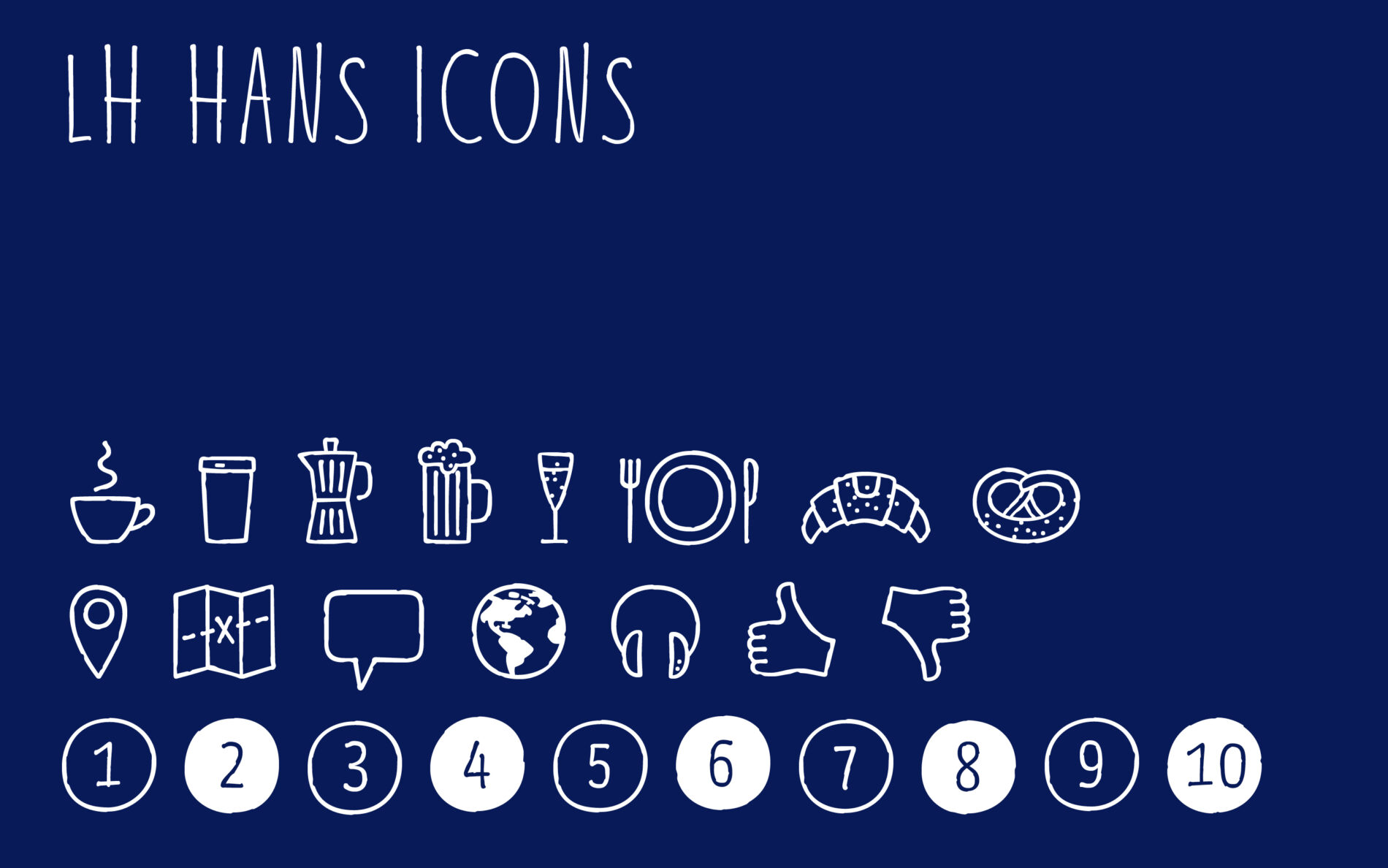
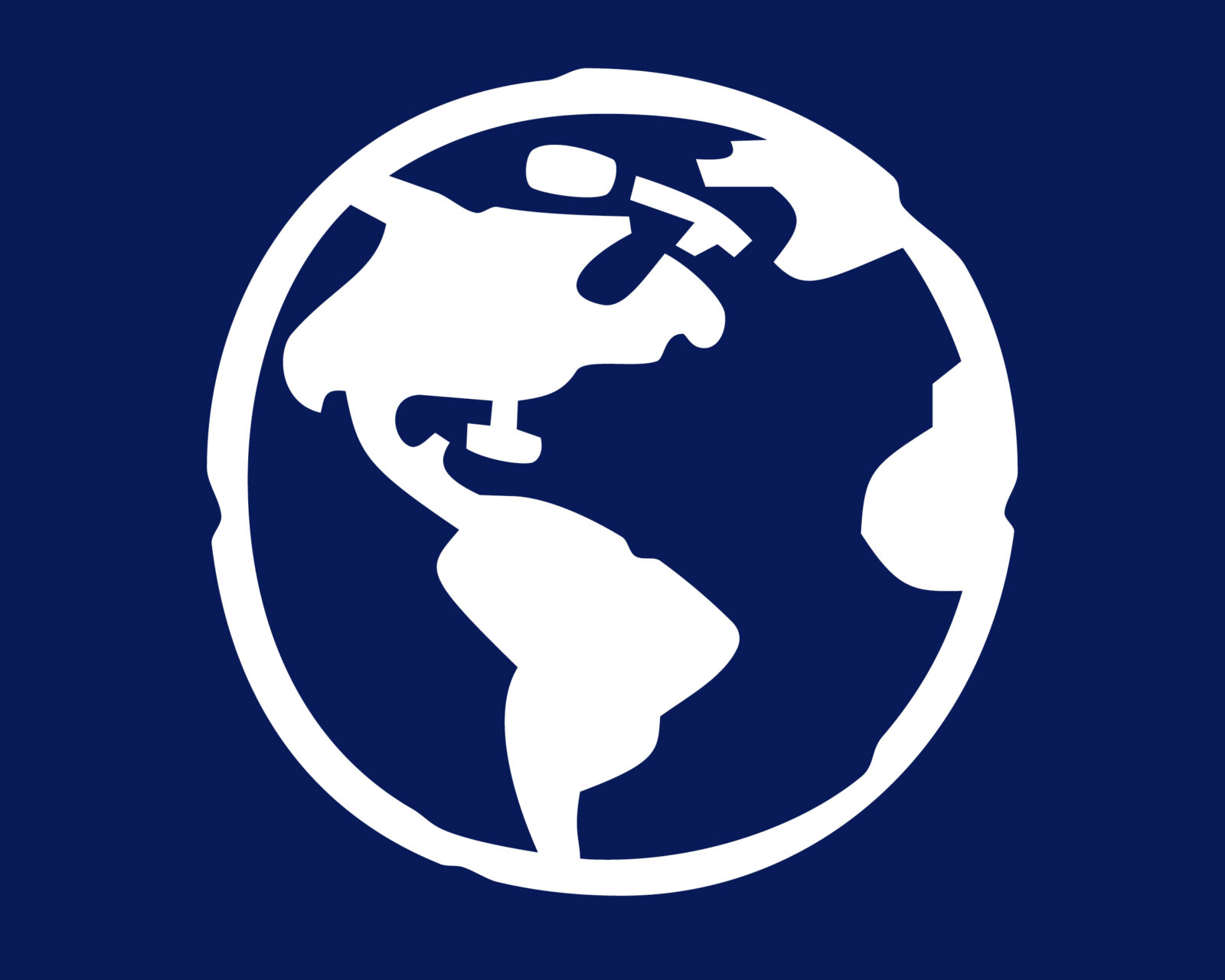
In addition, we designed around 20 icons that are related to the thematic field of flying and travelling and can be selected via an OpenType format set (SS03). This way, the customer can simply type a to o to get the desired icons. In case you fell in love with this feature, our TypeMate Nils previously developed a similar font called Jabana.
