FRoSTA Sans
Pan-fried dishes, vegetables, and fish; all frozen, delicious and tasty! And now also with fresh type. The new FRoSTA Sans isn’t just appealing, clear and high quality; it’s also a consistent tool for all applications of the international brand.


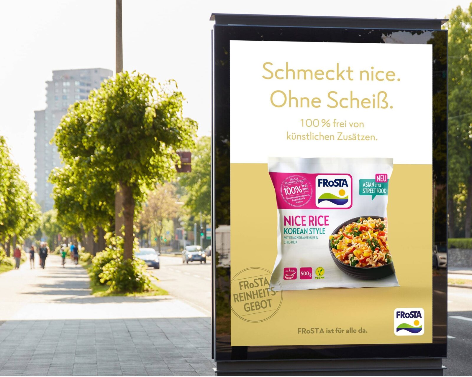
FRoSTA stands for frozen meals free from additives, artificial flavours or other supplements. They are completely dedicated to the belief: food as it should be. In contrast to the clarity of their brand promise, their previous typographic mix felt opaque. Different fonts were applied in print, online and across packaging. On top of that, different licenses and different licensing restrictions got in the way of trouble free applications.
Reason enough for FRoSTA and Art Director Joon-Sung Lim to clarify things. The new custom font ensures consistency and has a clear tonal balance across all touchpoints. The new type design can be used across all areas of the international company and at the same time offers plenty of options for individual brand typography.
The new FRoSTA Sans is a type family with a lot of identity and clear means of achieving its goal: communicating the values of the FRoSTA brand and unifying functional uses such as packaging.

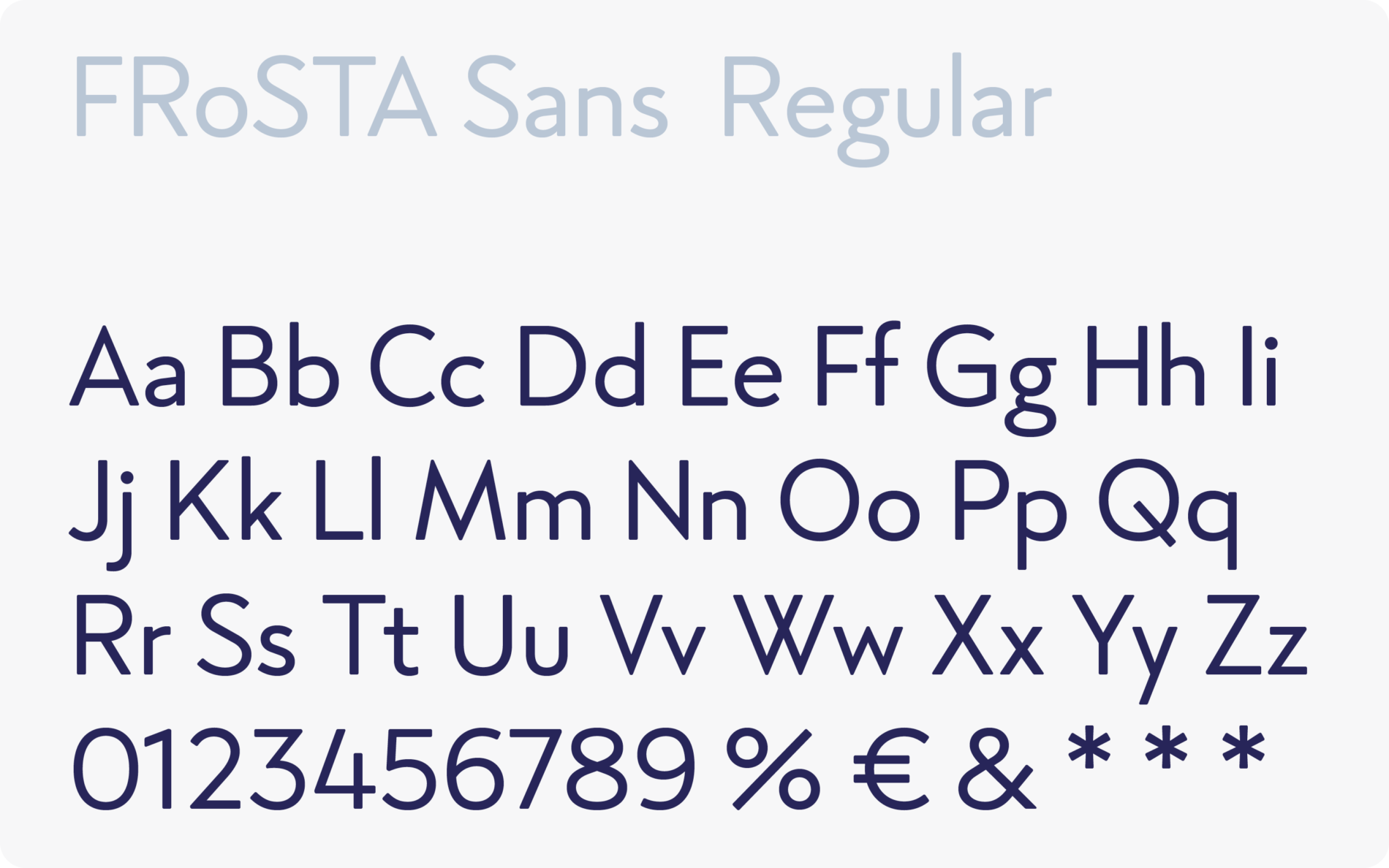
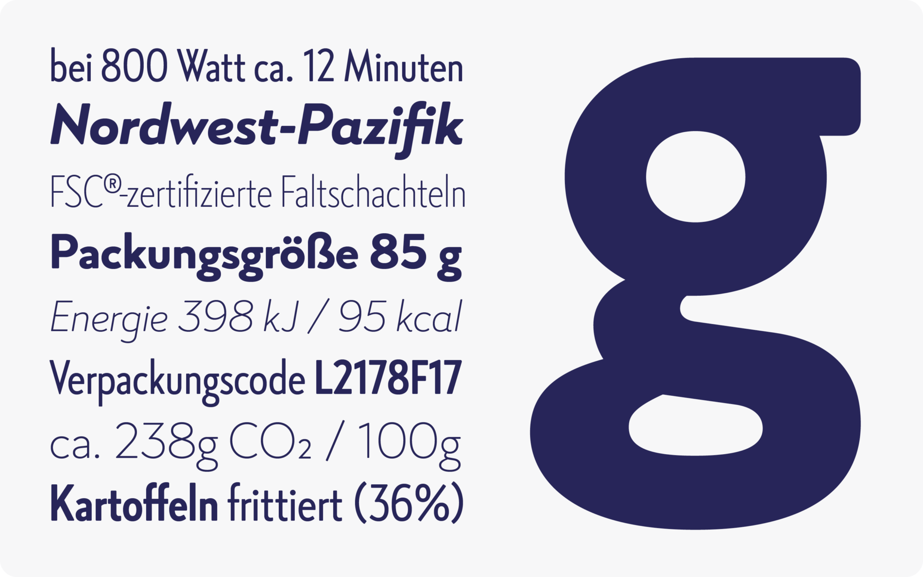
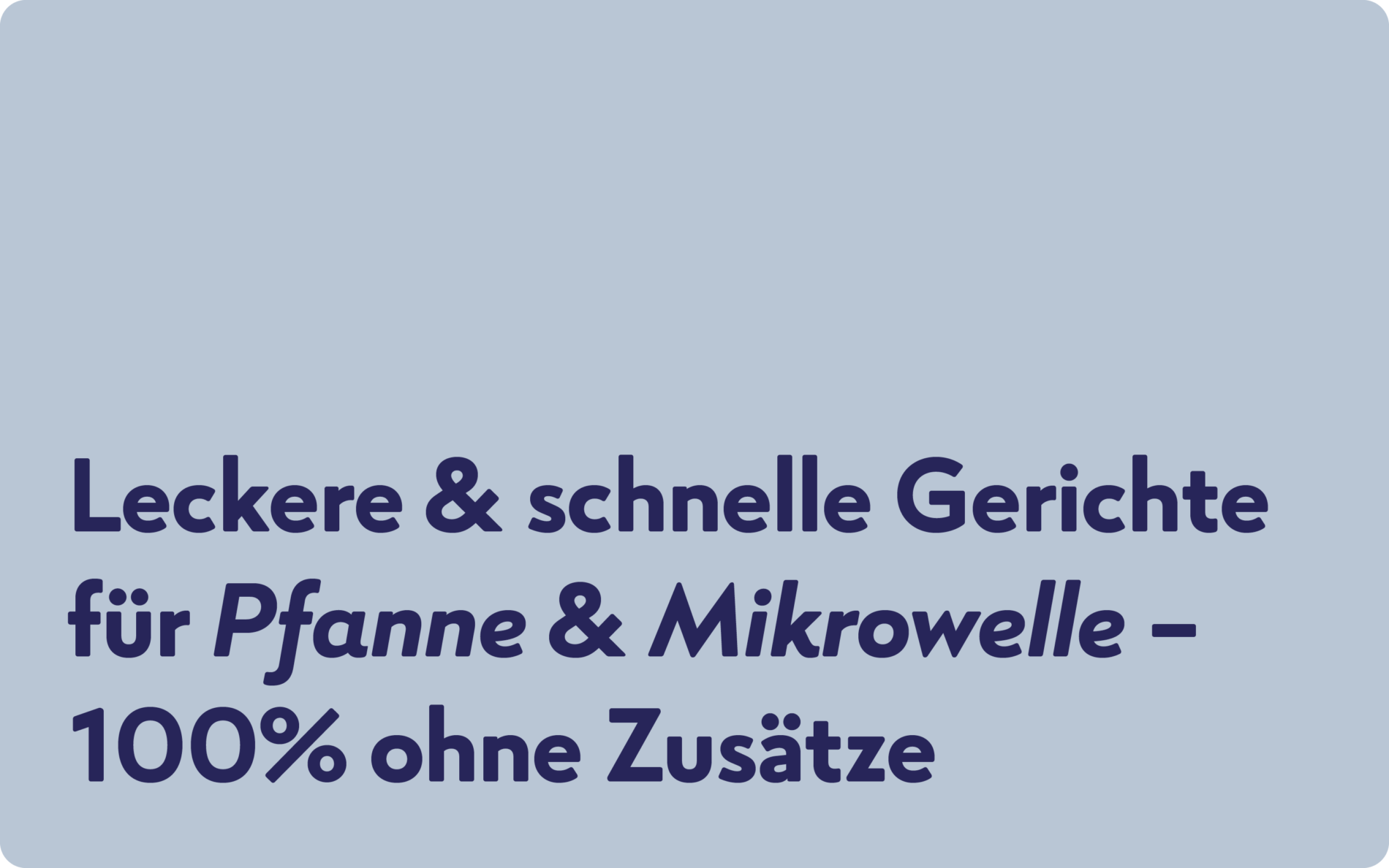
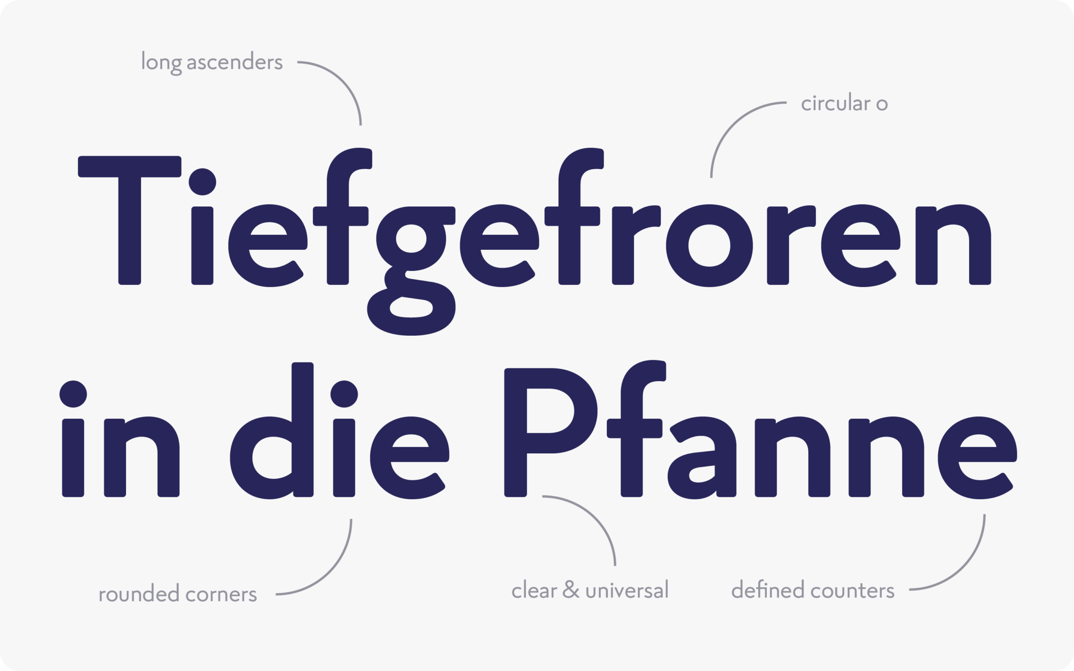
To combinethe demand to produce real food without additives with the simplicity of dishes that can be prepared quickly, the geometric o and the clearly defined counters form a fresh and modern look.
Within the contemporary design, the tall ascenders evoke familiar traditional moments and reference the quality of natural ingredients. Friendly and sympathetic, the rounded corners reflect the brand’s character: everything is uncomplicated and delicious.
No packaging without typeface, no FRoSTA “Reinheitsgebot” without text. The new typeface is an essential building block in FRoSTA AG's brand. It is ready for use in all areas, from compact packaging to text-heavy CSR reports and informative websites, social media and tv commercials, to appealing print media. Uncomplicated, familiar, and friendly in mood, delivering quality and clarity in effect: with the new FRoSTA Sans the values of the products are reflected in their typography.
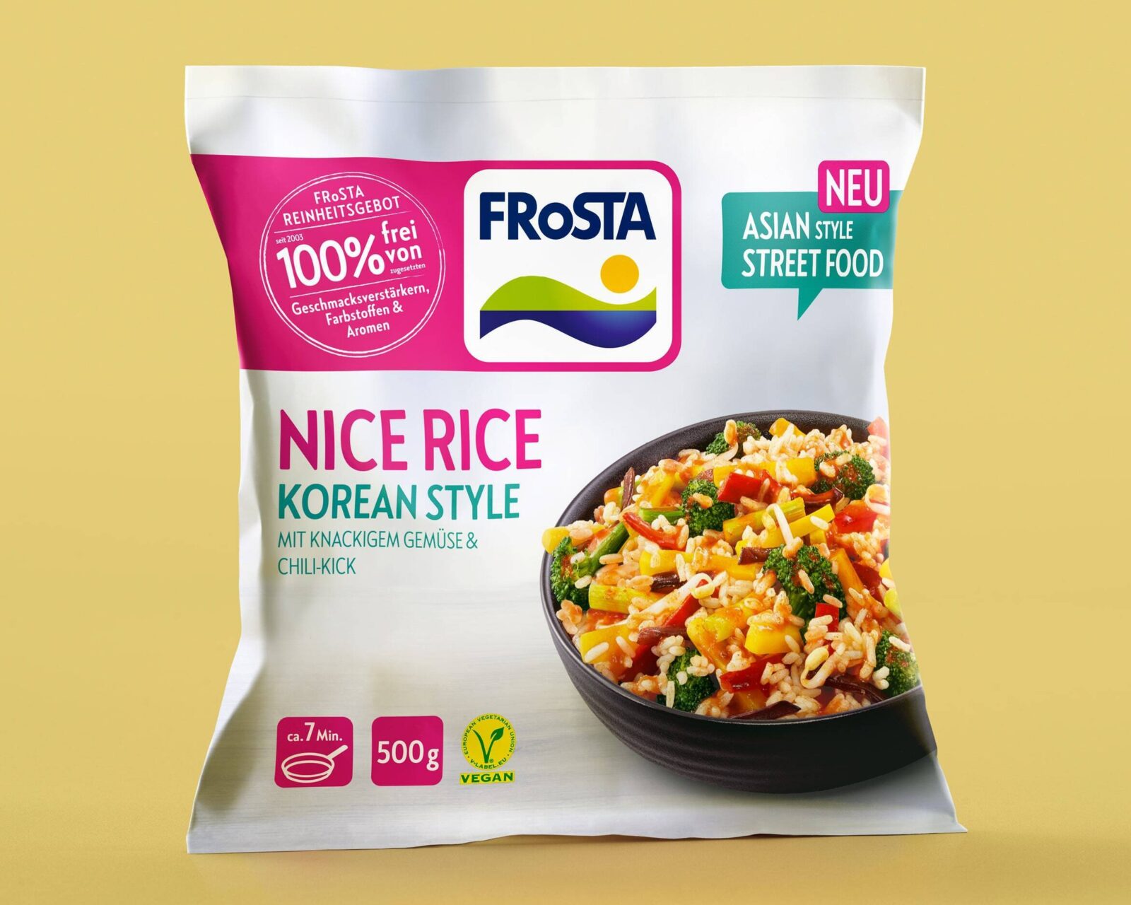
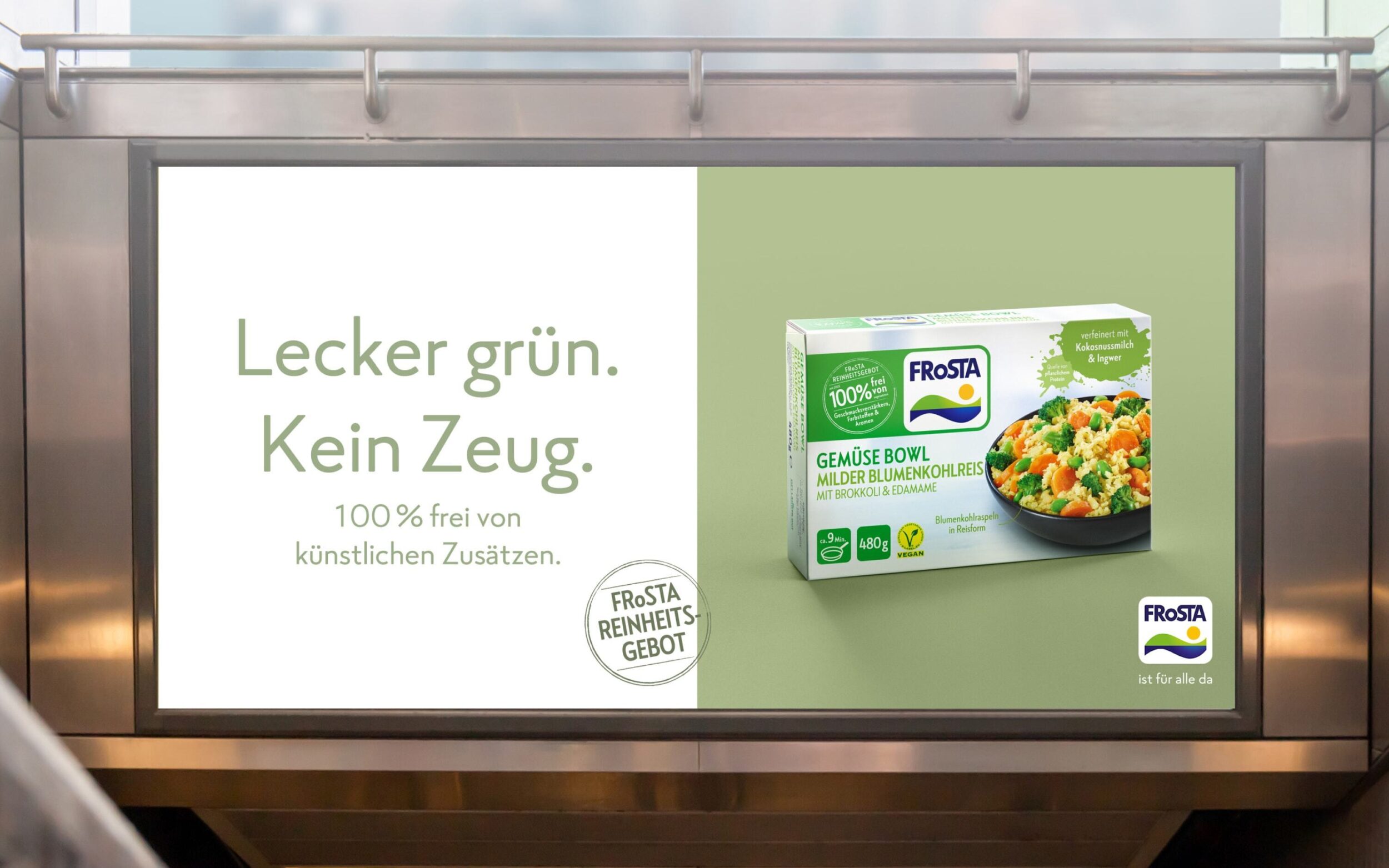

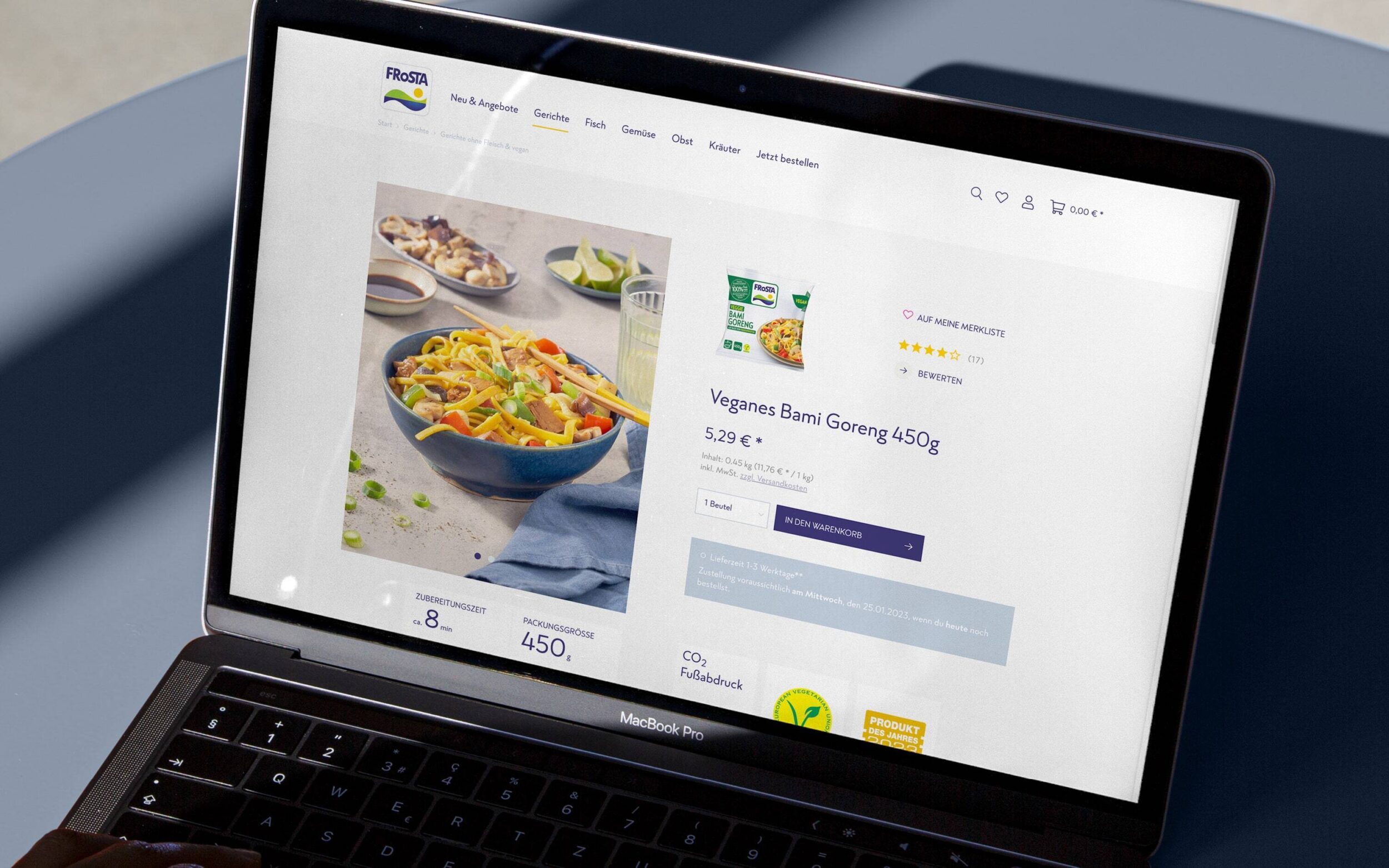
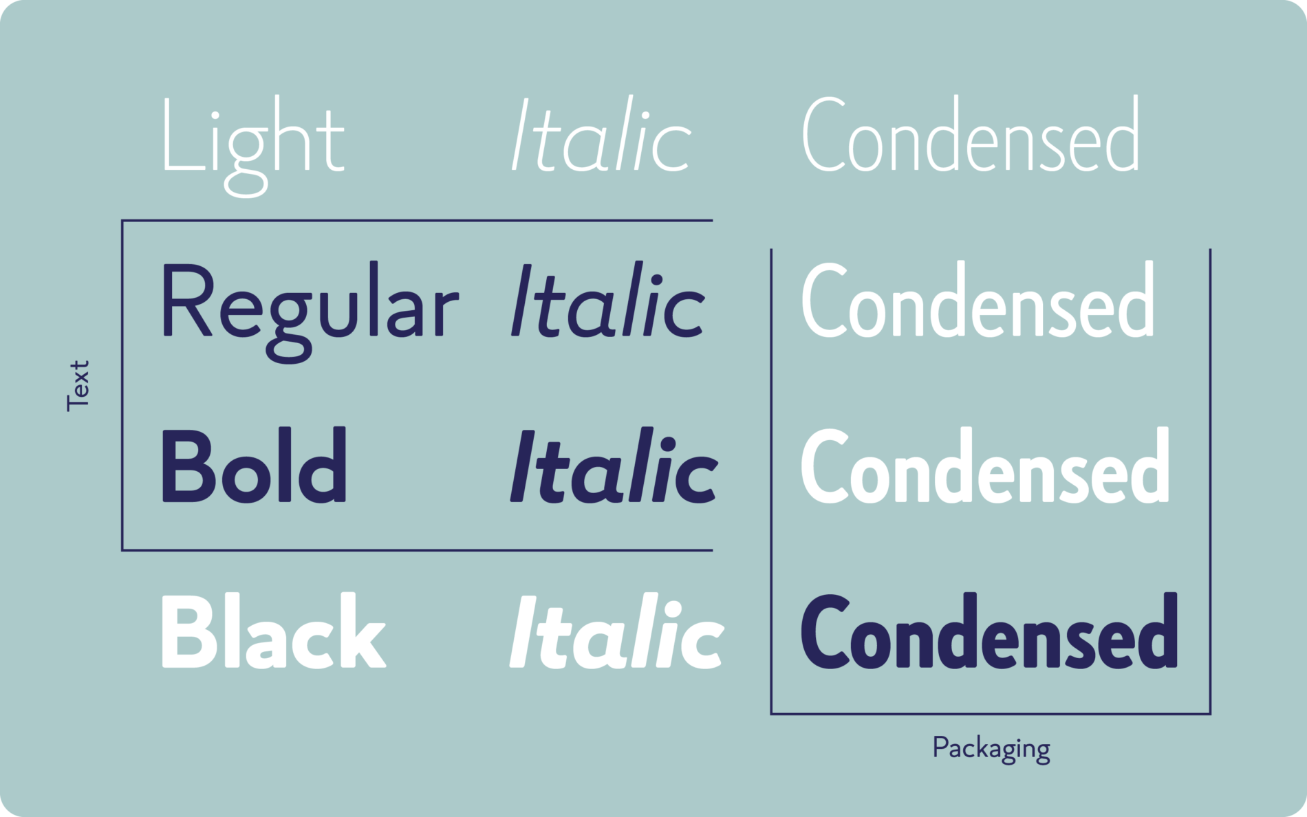
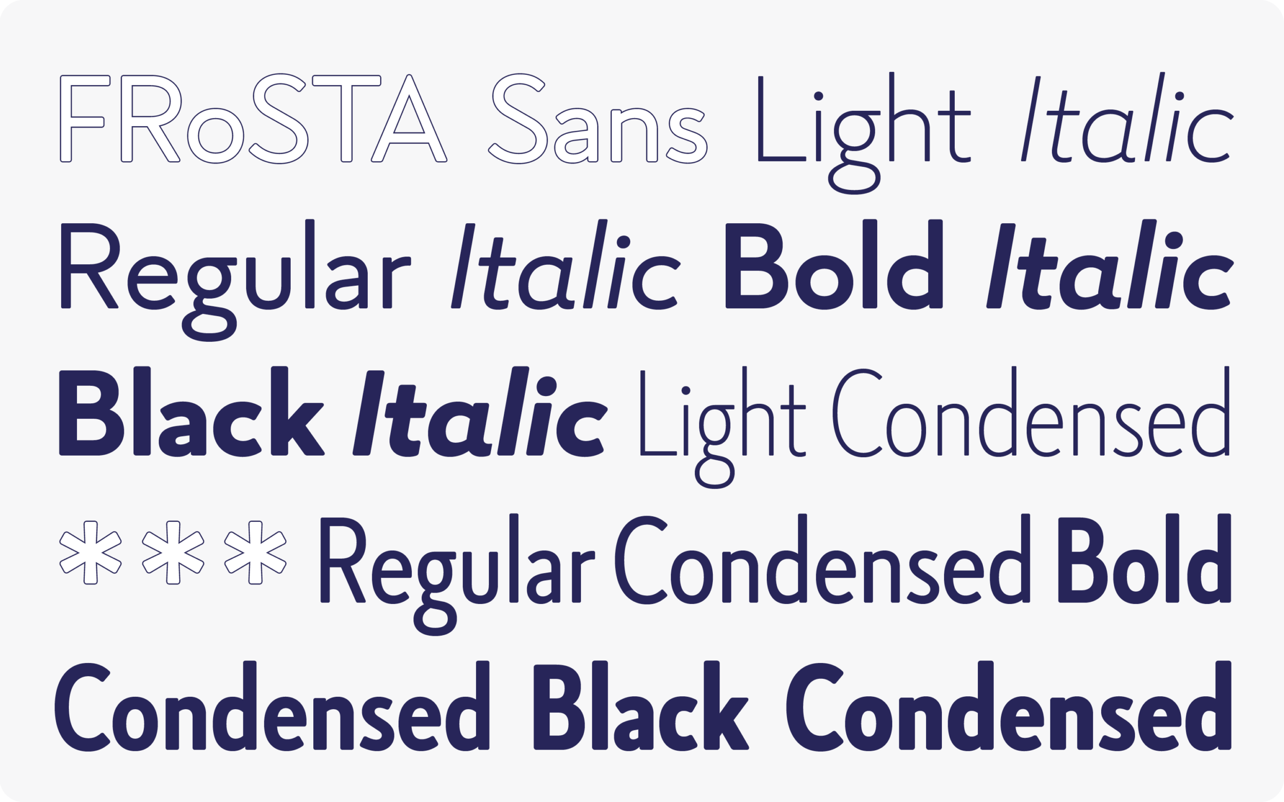
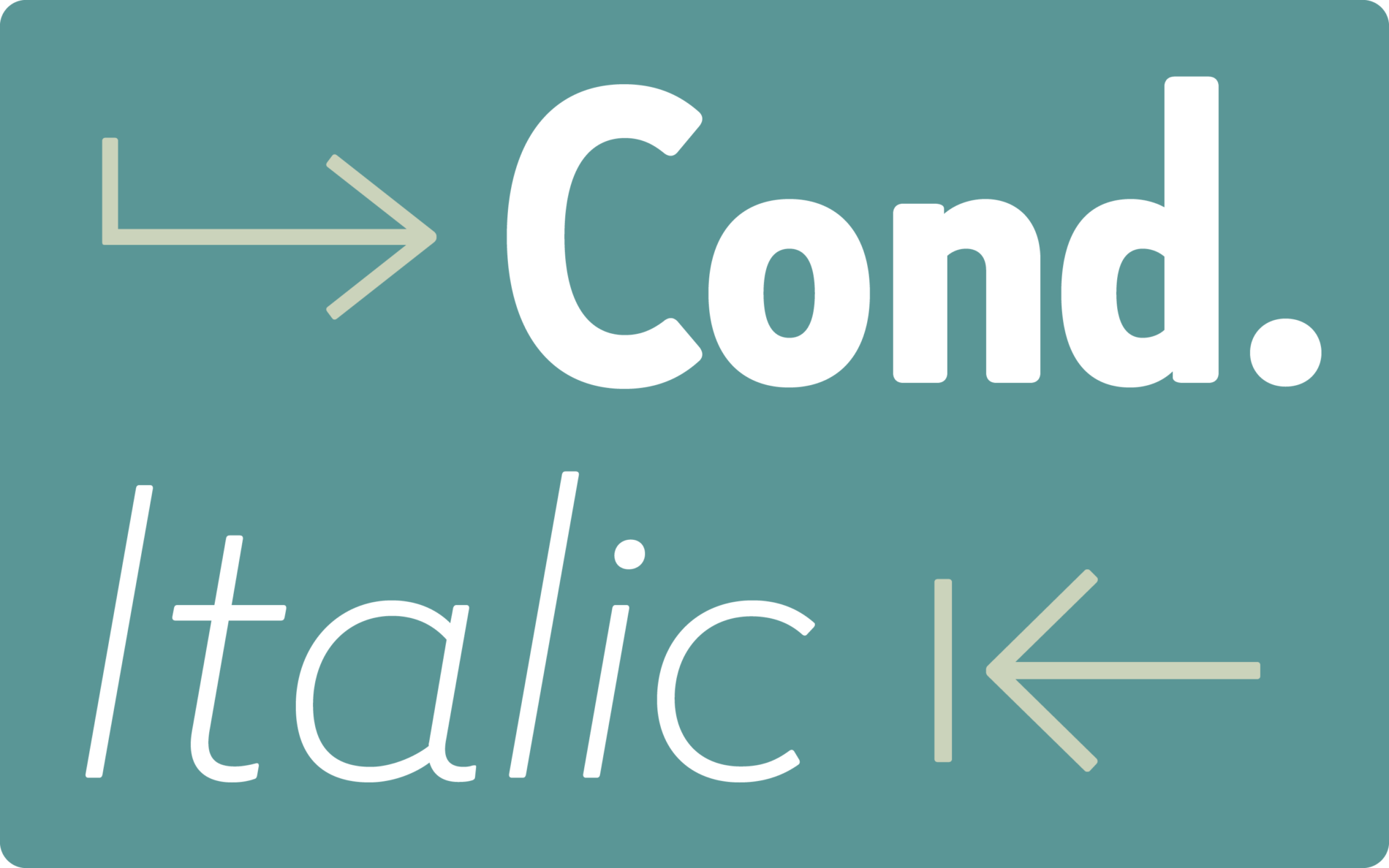
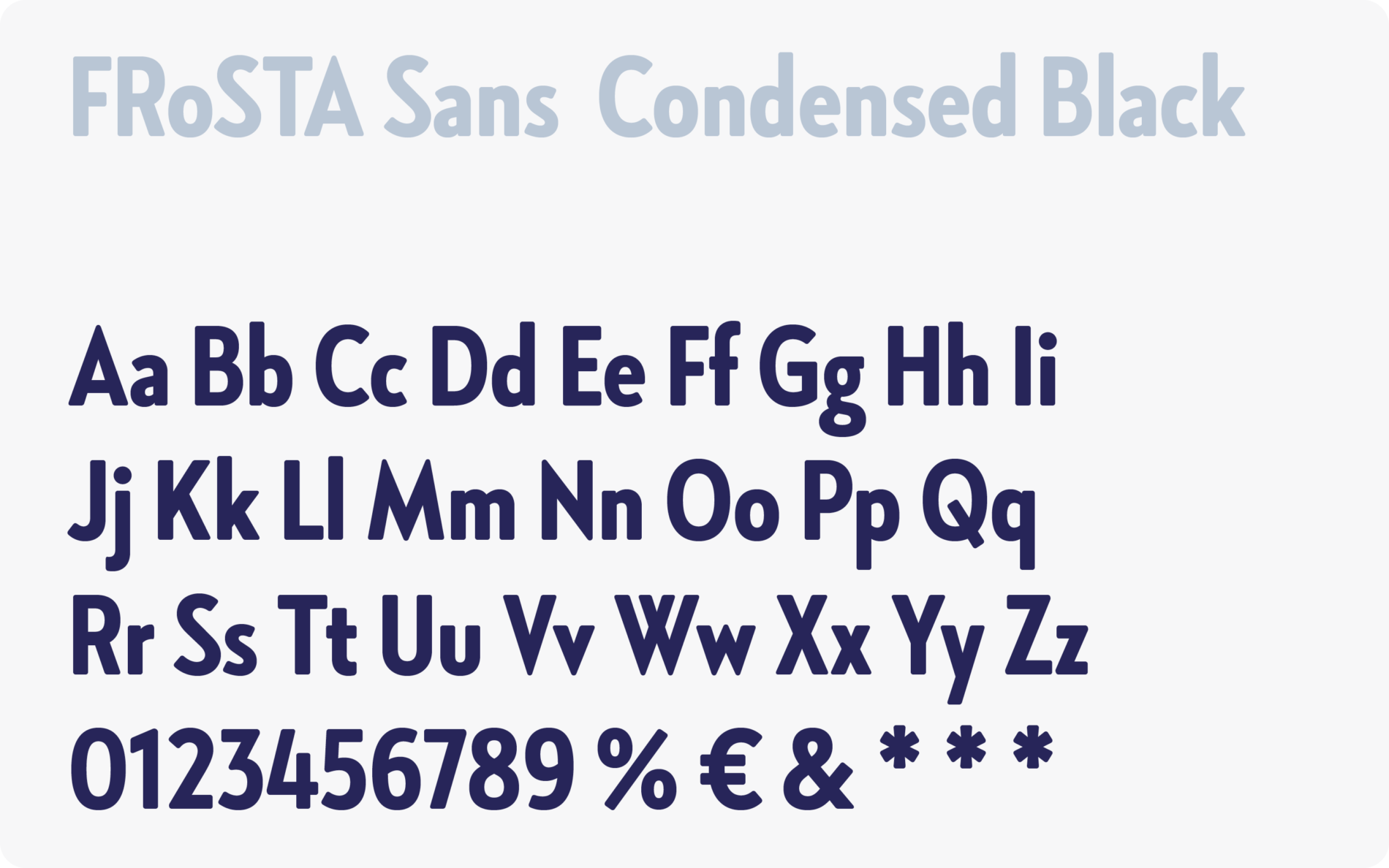
FRoSTA Sans offers a sensible spectrum of font styles. Four manageable and defined weights from Light to Black, are extended by independent and clearly distinguished Italics. Four additional, space-saving Condensed weights provide more flexibility and ensure consistent use of the corporate typeface in packaging design.

Individual characteristic letters ensure it’s recognizable and unique: the crossed ‘W’ and the structure of the ‘K’ emphasise the classic and traditional sides of the typeface.
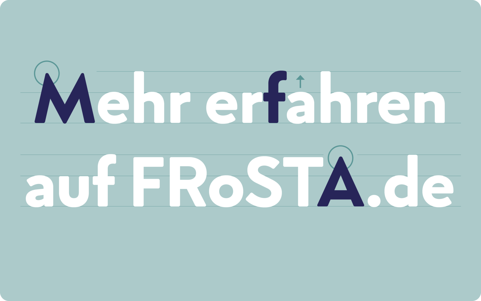
The tips in ‘V’ and ‘A’, among others, are nuances that emphasize the agility and self-confidence of the brand. The combination of modern proportions and traditional charm reflects the evolution of the company—consistent, yet forward-looking.
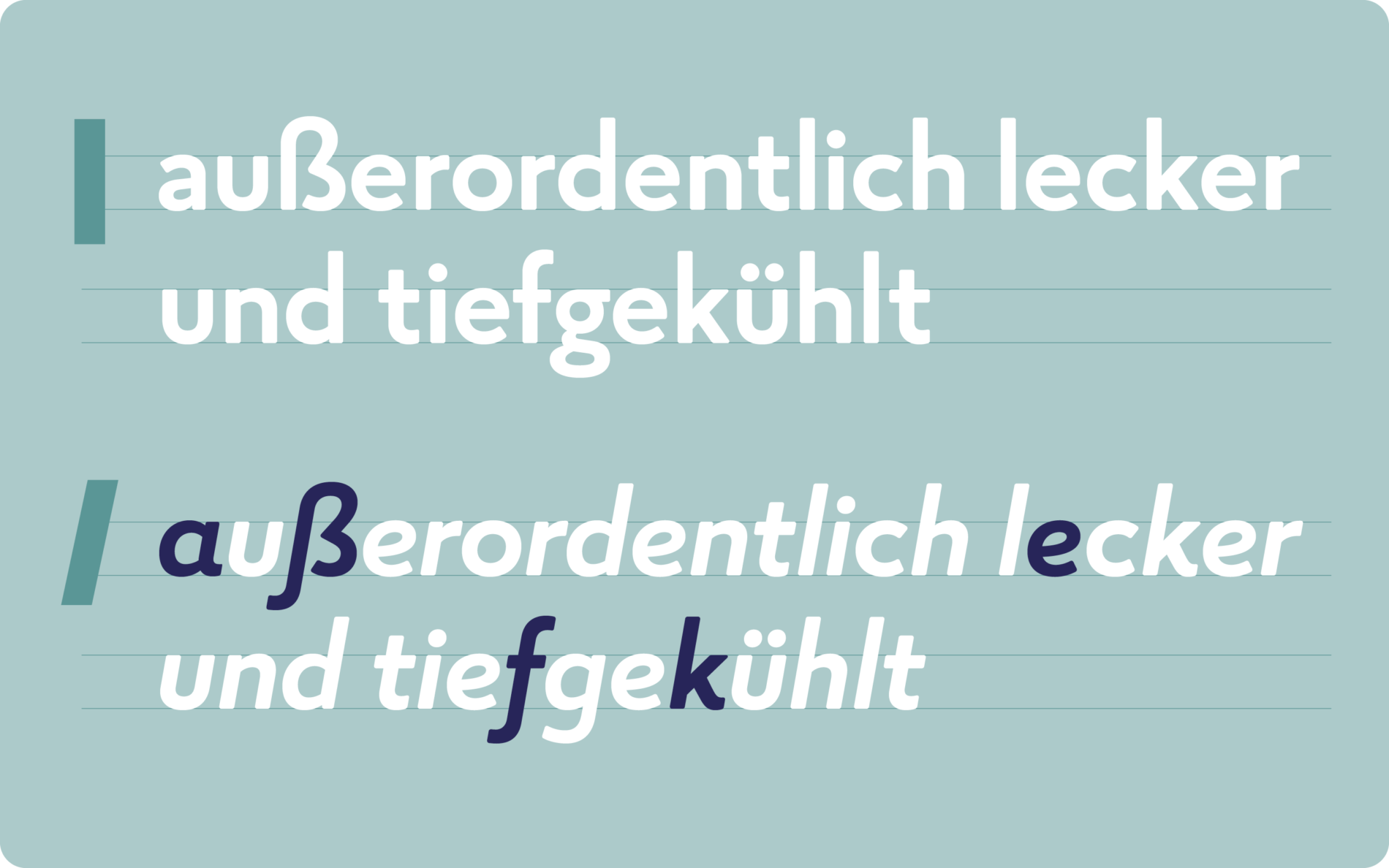
The likable and natural side of the brand are emphasised by the italics, their friendly forms and out strokes. The italics clearly stand out from the rest of the family, complementing the typographic palette and providing additional flexibility.
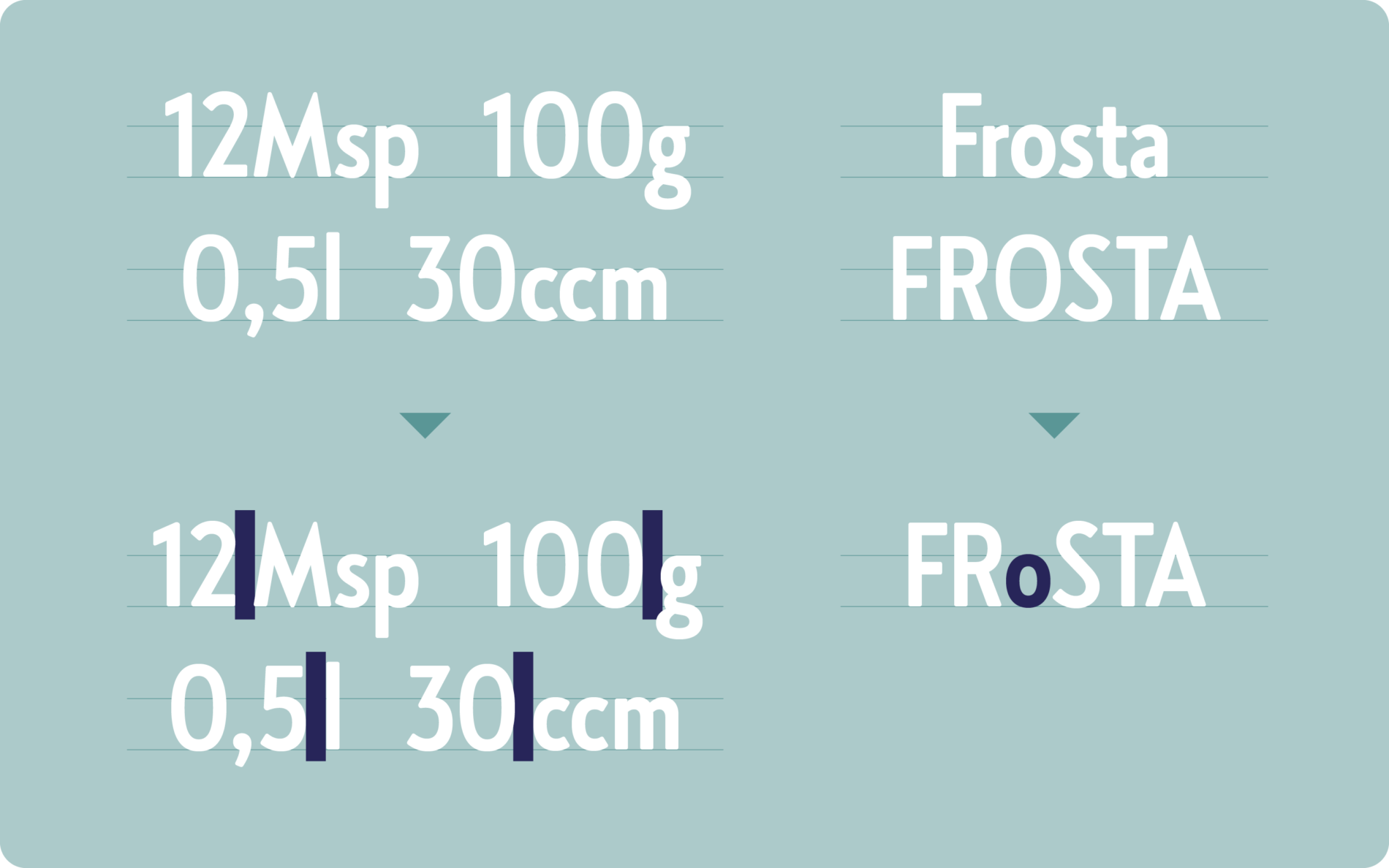
To make working with the font as easy as possible, OpenType features in the custom font are explicitly adapted to FRoSTA layouts. For example: numerals in combination with measurements and specific ingredient information are automatically given more tracking. Likewise, another feature ensures the proper rendering of the company name—FRoSTA with a lowercase ‘o’.