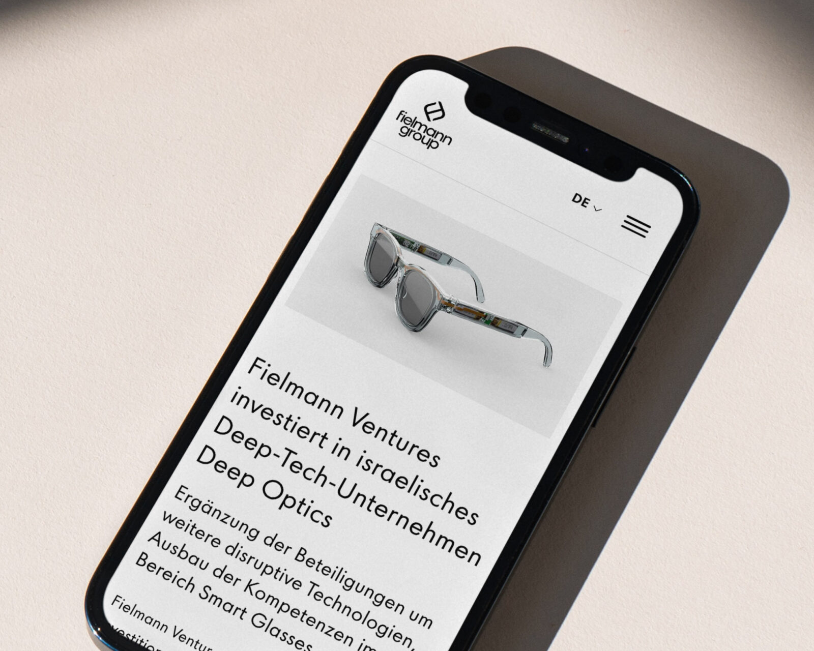
Fielmann Sans
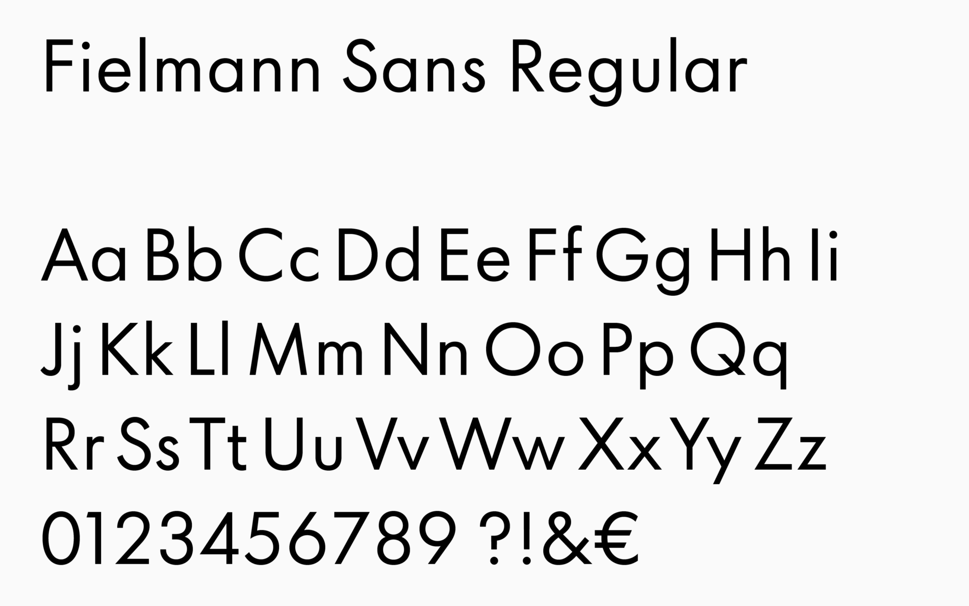
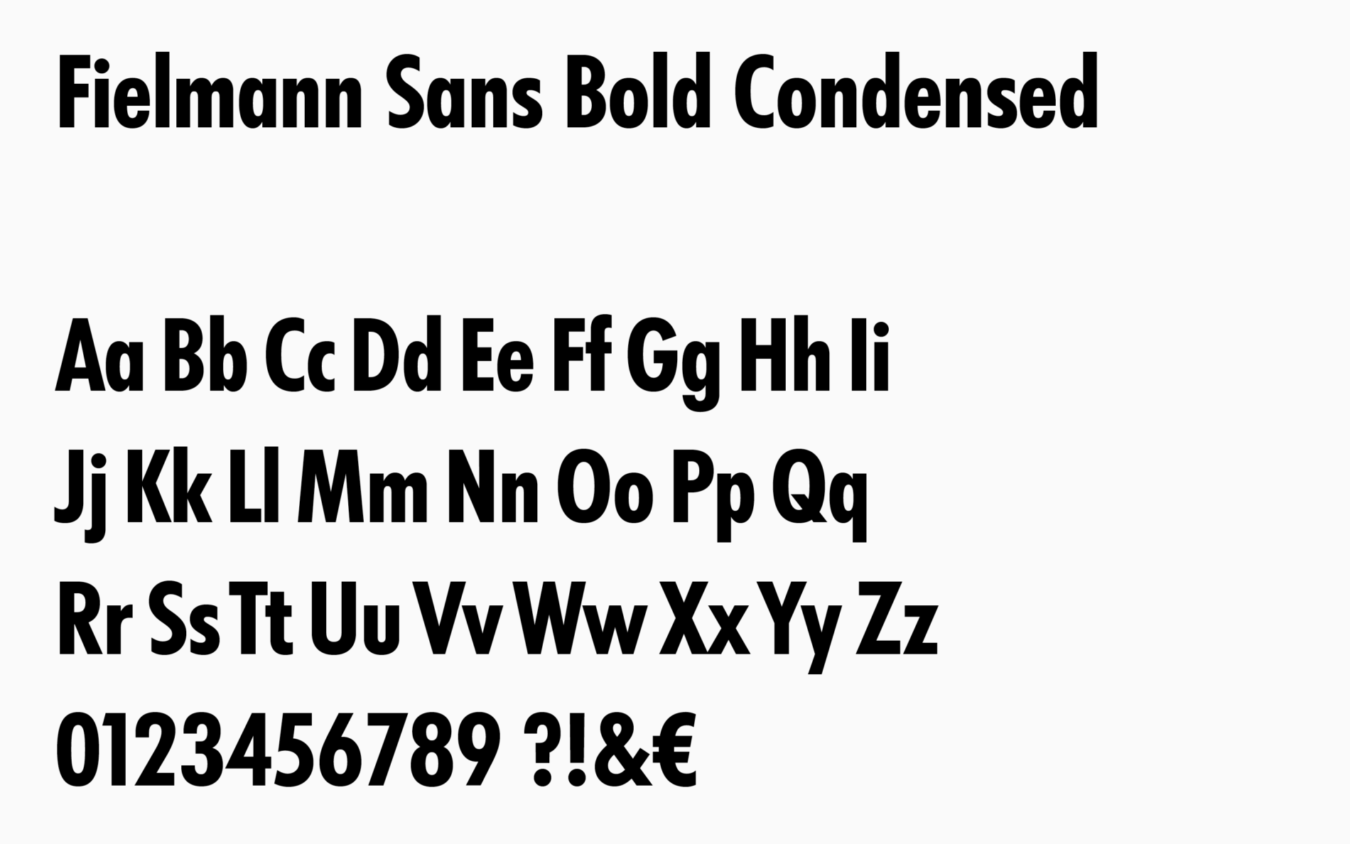
When opticians Fielmann wanted to update their brand, we had the opportunity to bring their corporate typeface Futura up-to-date with Fielmann Sans.
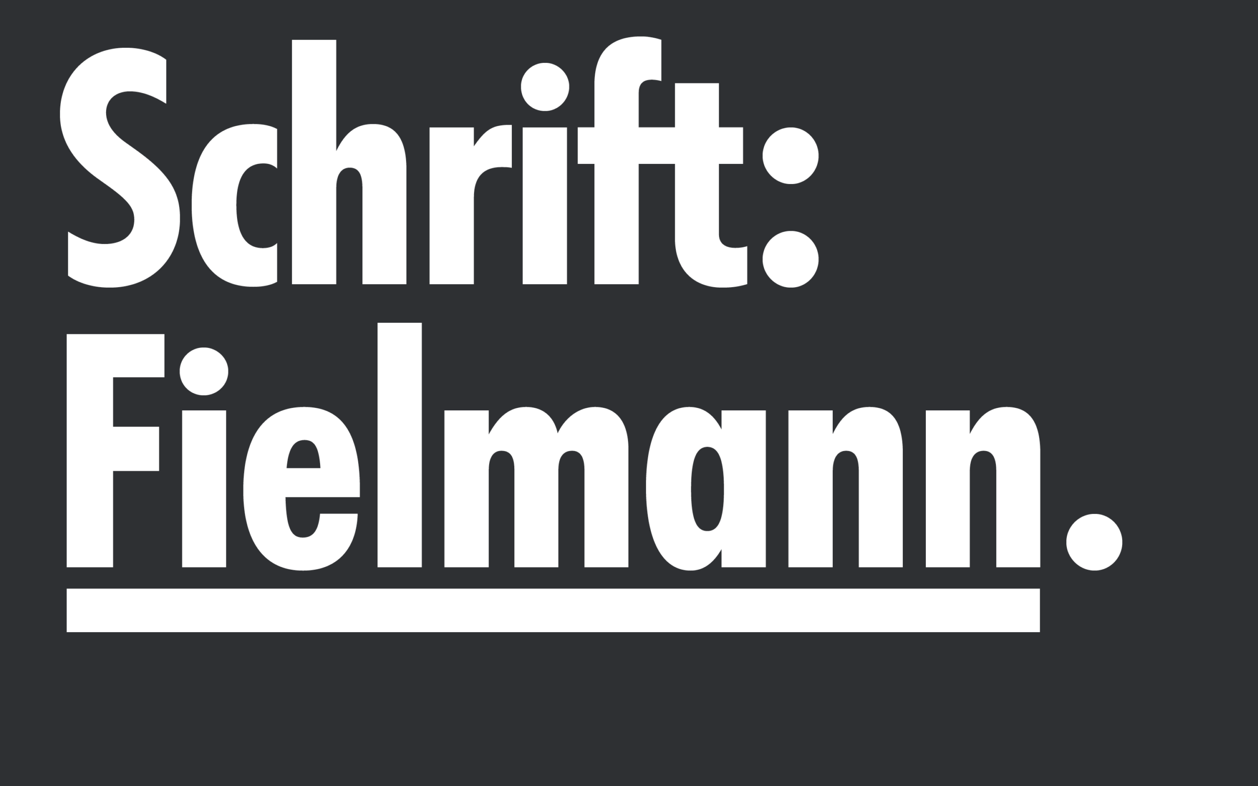
Paul Renner’s Futura is a timeless classic. An icon of the modernist Bauhaus, it has landed on the moon and you can say the Schrift unserer Zeit’s pure geometry makes it an everlasting Sans.
Europe’s largest optician, Fielmann, has used Futura for about four decades. Looking to the future, thinking about user interfaces on the web and mobile and the transition towards digital advertising, we revisited Fielmann’s Futura to make it future proof. Together with art director Sina Brinkmann, we focussed on four aspects:

Readable in Small Sizes
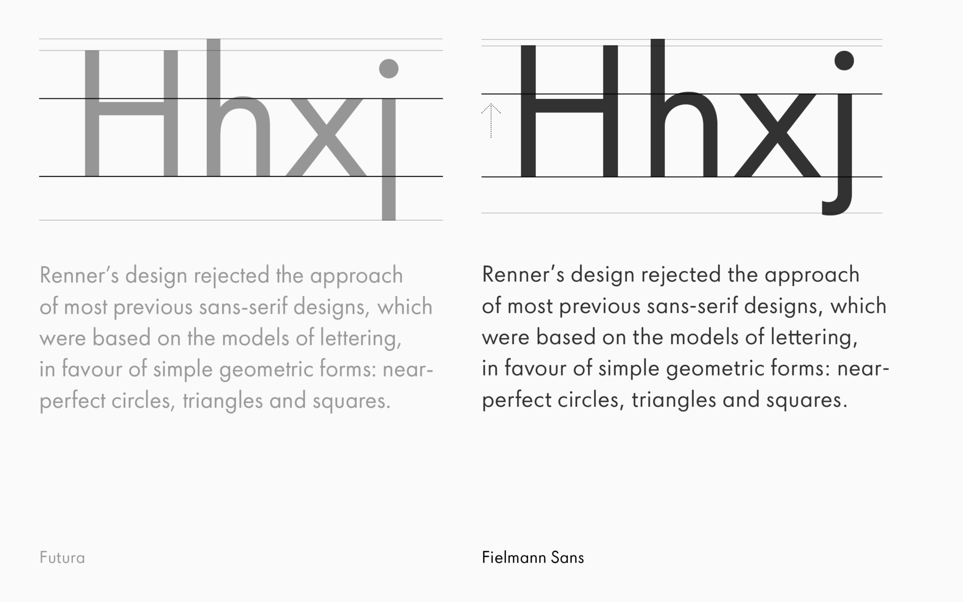
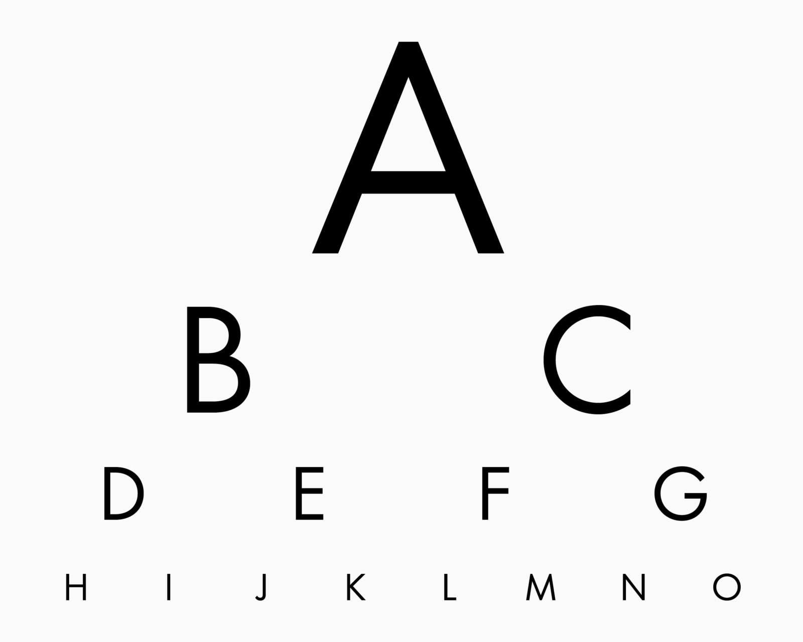
New screen-based tools at Fielmann call for a typeface that’s more readable in small sizes. We explored a larger x-height and adjusted characters to be easier to recognise and read.
Consistency and Clarity
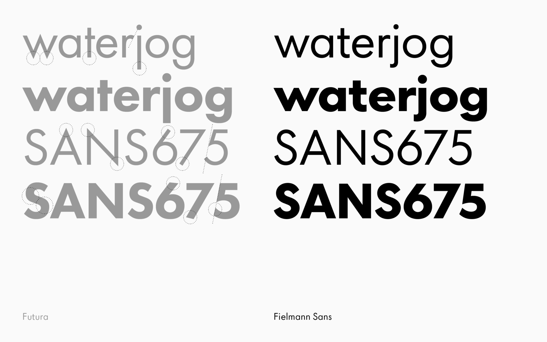
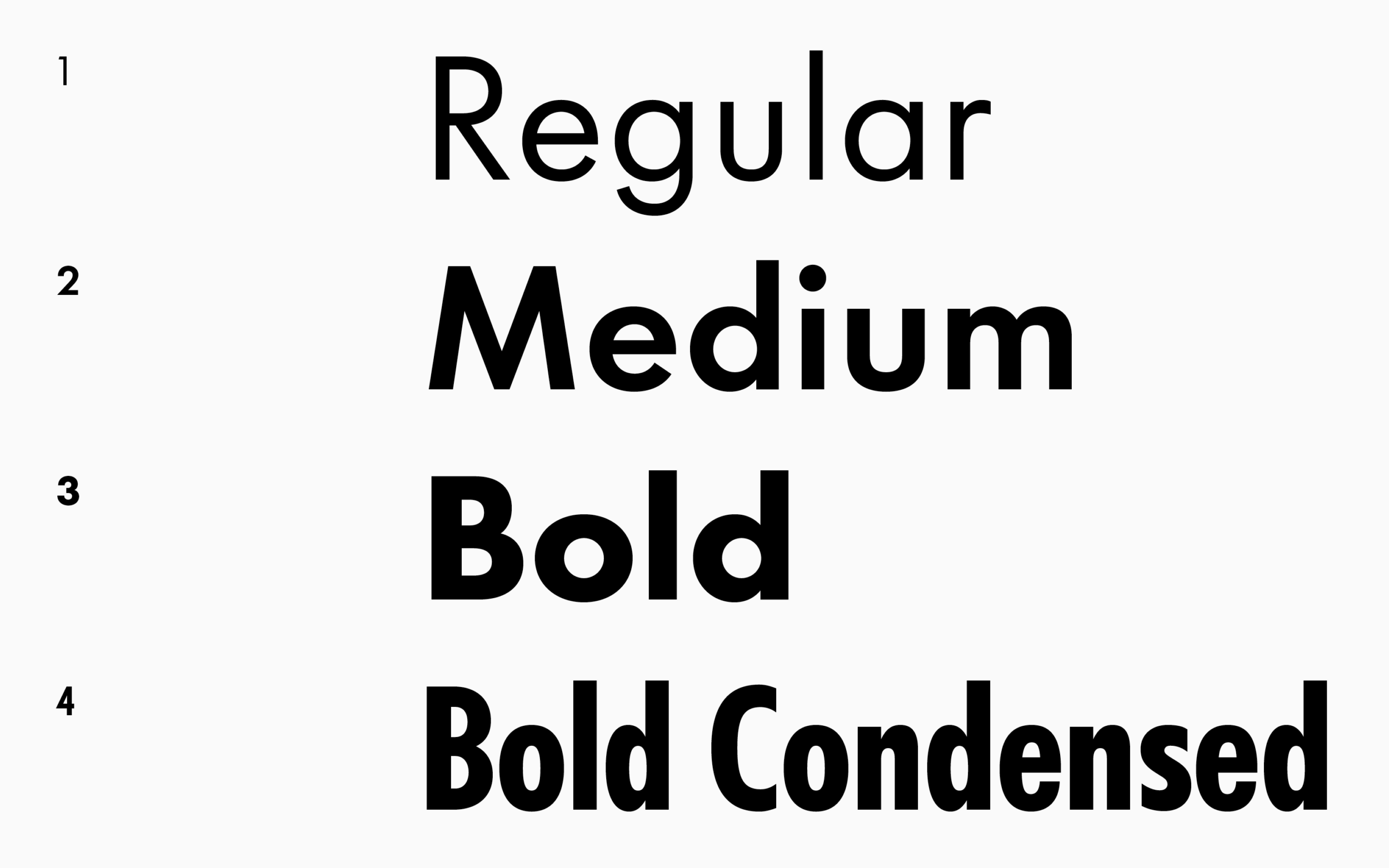
As weights and styles were added to Futura, the classic family developed some charming eccentricities. For Fielmann, a brand that’s focussed on clarity and consistency in all things, it was about time for a tidy up.
Smart Typography
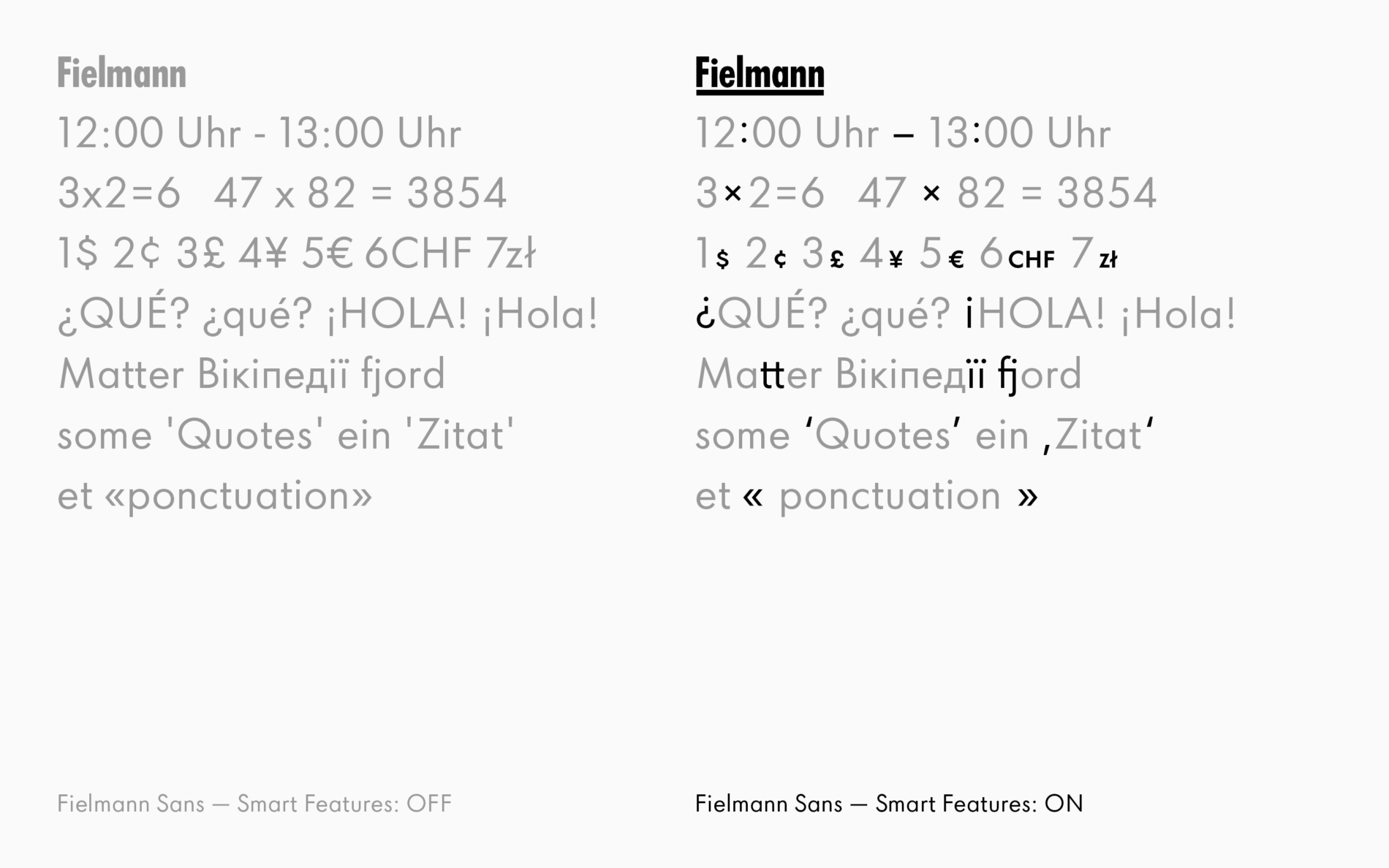
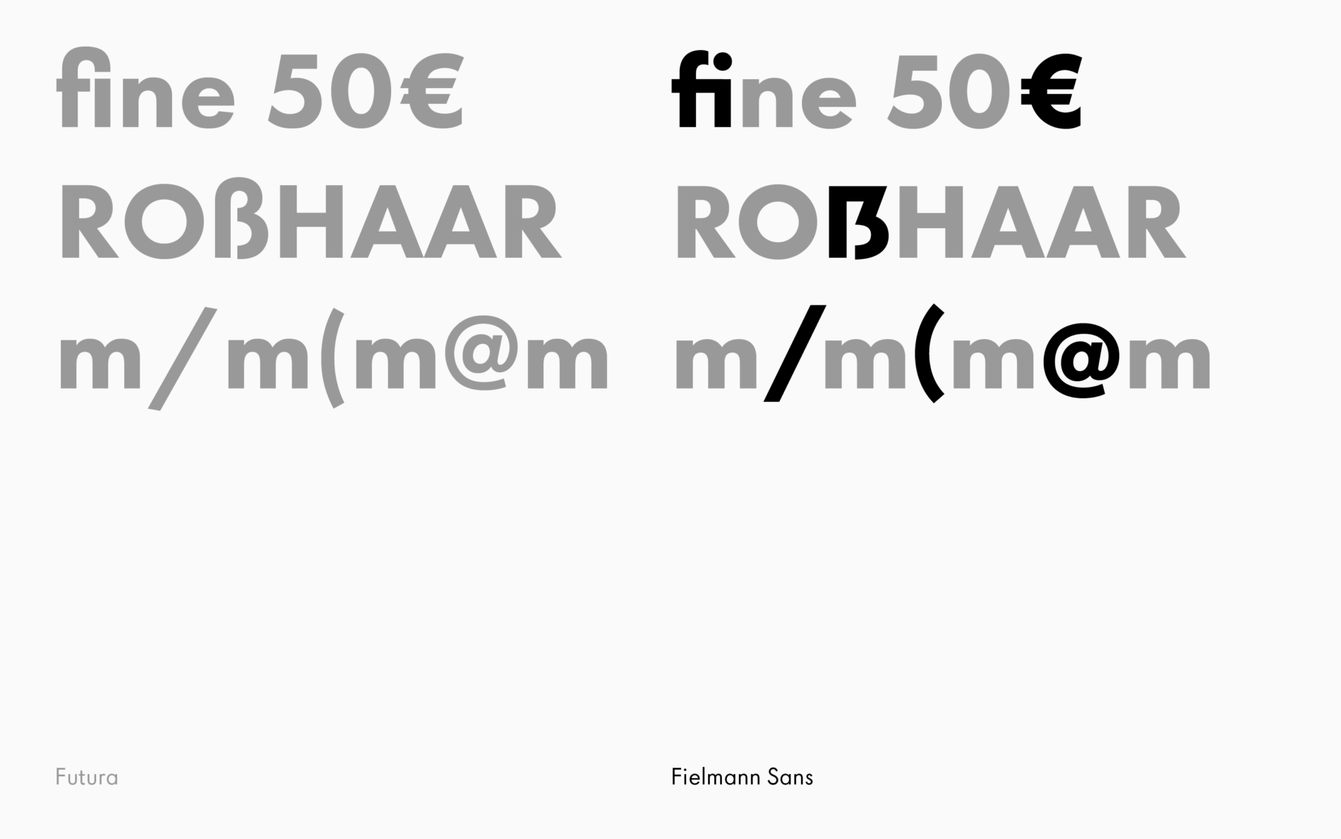
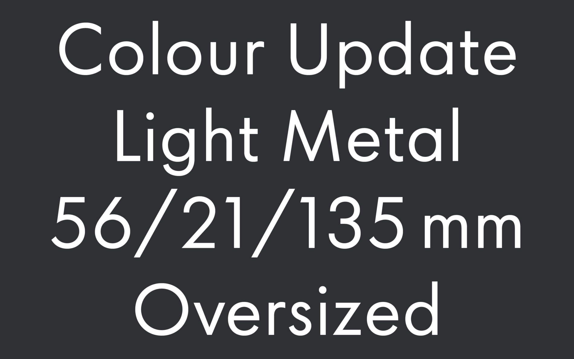
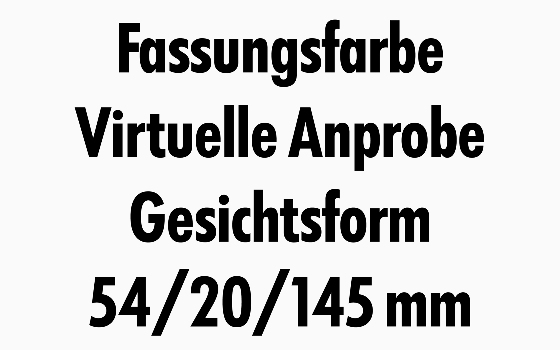
Style guides often include a lot of “don’t do this” and tricky work arounds to ensure consistent typography. We eliminated most of them by incorporating some clever OpenType features that automatically finesse the all important details:
A Schrift Unserer Zeit
The core of Renner’s design is timeless. All we needed to do was tweak the glyphs a little to help the Schrift unserer Zeit (typeface of our time) remain as fresh as ever.
